


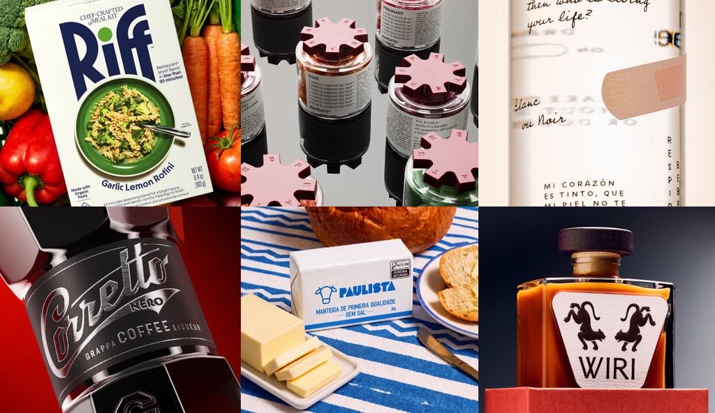
Monthly Discoveries, October 2026
Need a bit of inspiration? Look no further. We're always looking to recognise the best packaging design from agencies worldwide, so we have pulled together this month's most liked from our social channels to keep you inspired
Need a bit of inspiration? Look no further. We're always looking to recognise the best packaging design from agencies worldwide, so we have pulled together this month's most liked from our social channels to keep you inspired
Take a look below at some of the most popular designs we shared this month across our social media channels.
Corretto Nero by Voice Design
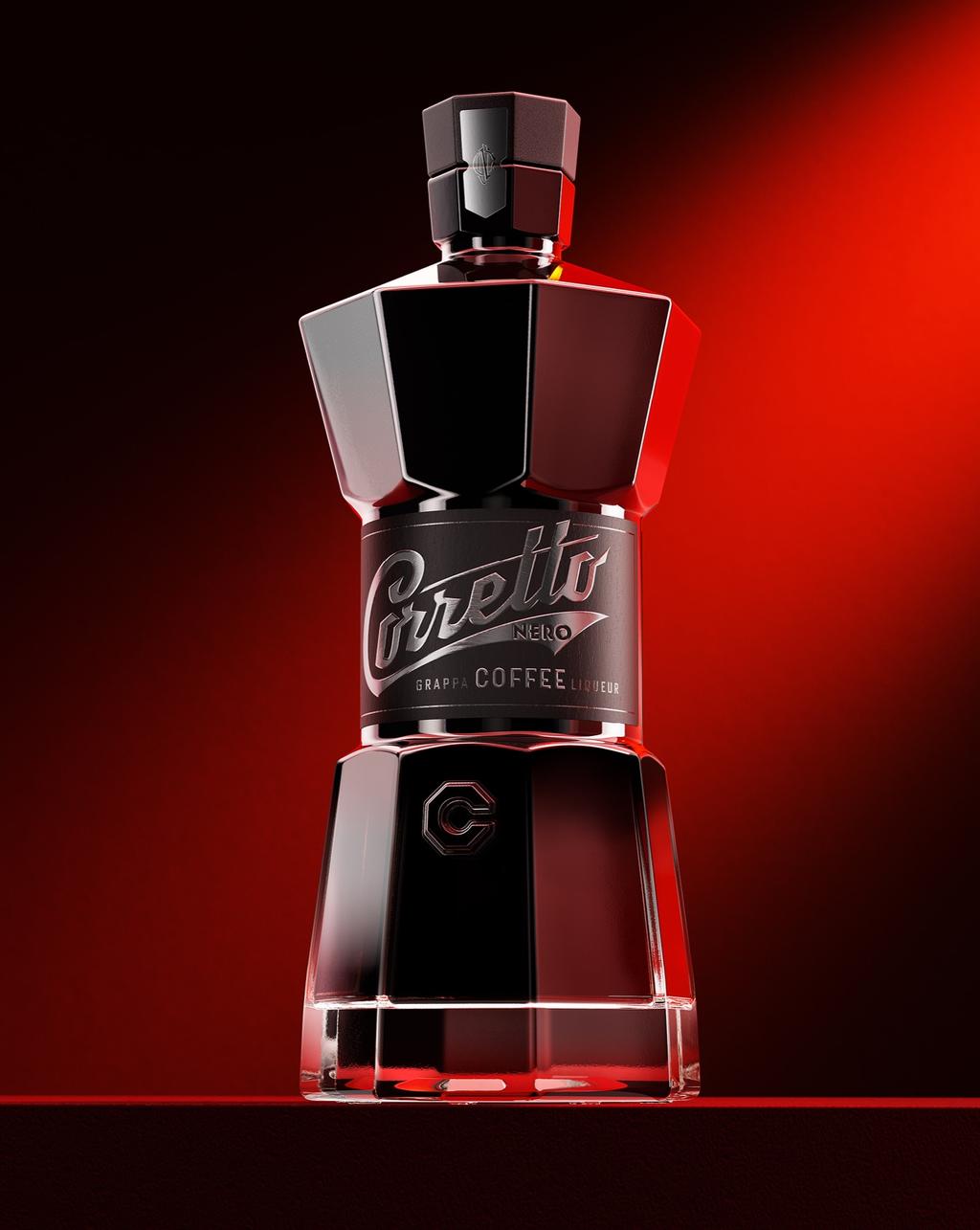
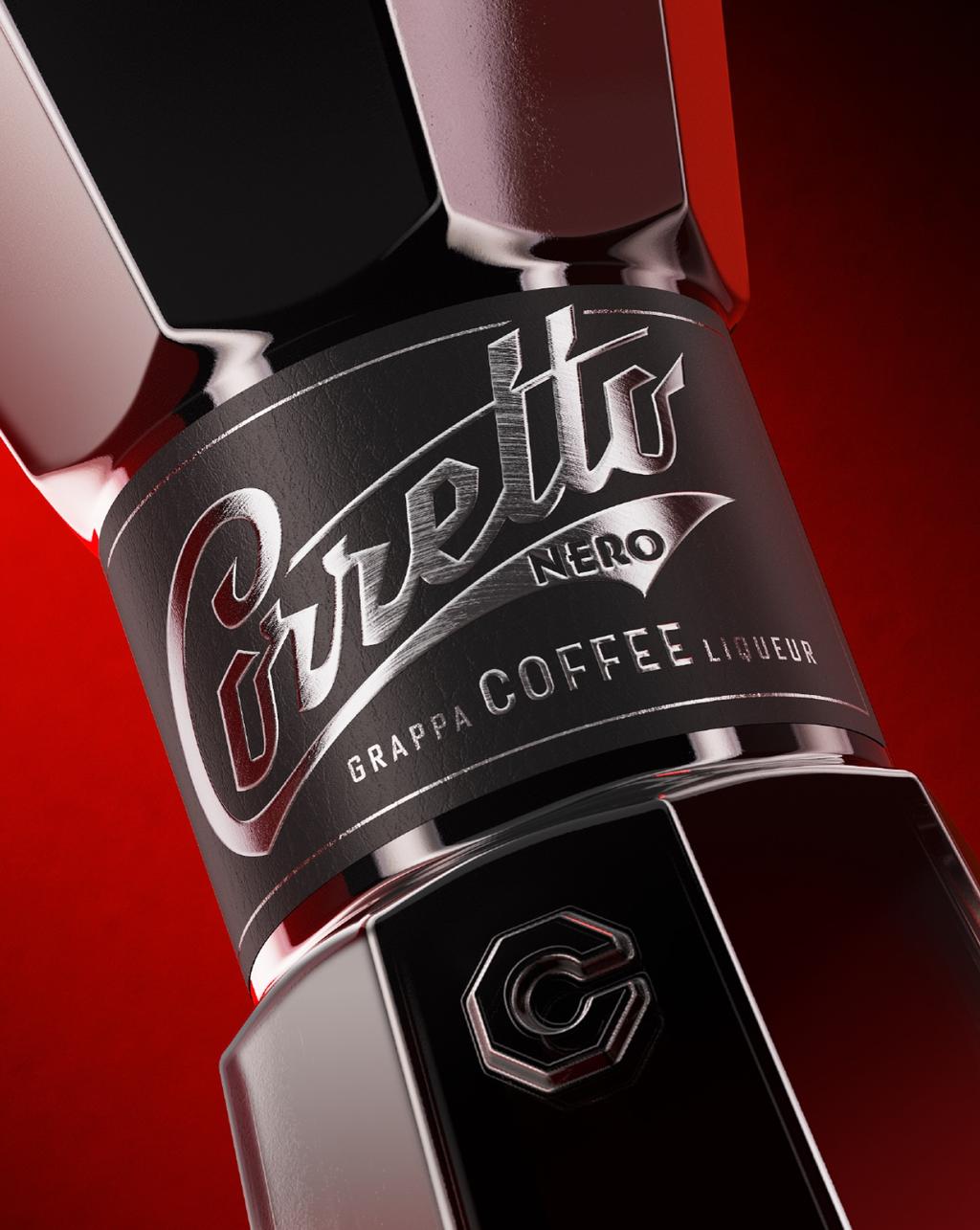
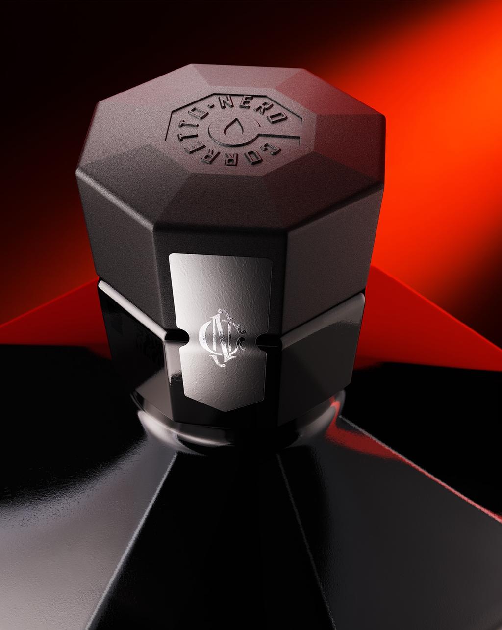
Voice Design's packaging design concept for Corretto Nero.
Created for Make A Mark and inspired by the moka pot, Corretto Nero brings Italian espresso culture to life through a bold, tactile liqueur packaging design. Matte black, metallic finishes and a bespoke closure create a distinctive, premium feel.
Find out more about Voice Design here .
Naked wine by MABA
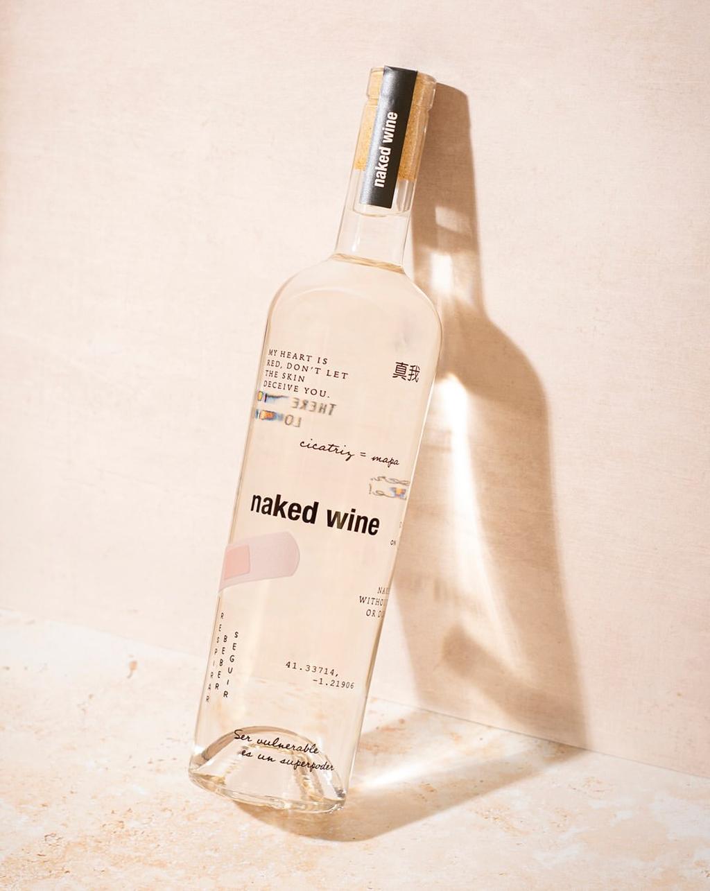
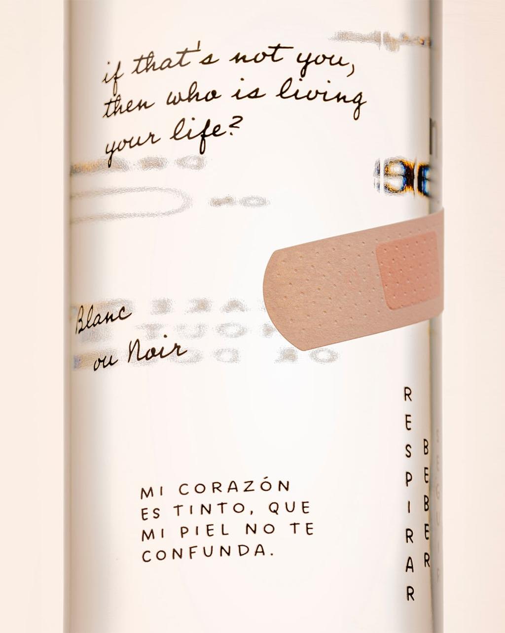
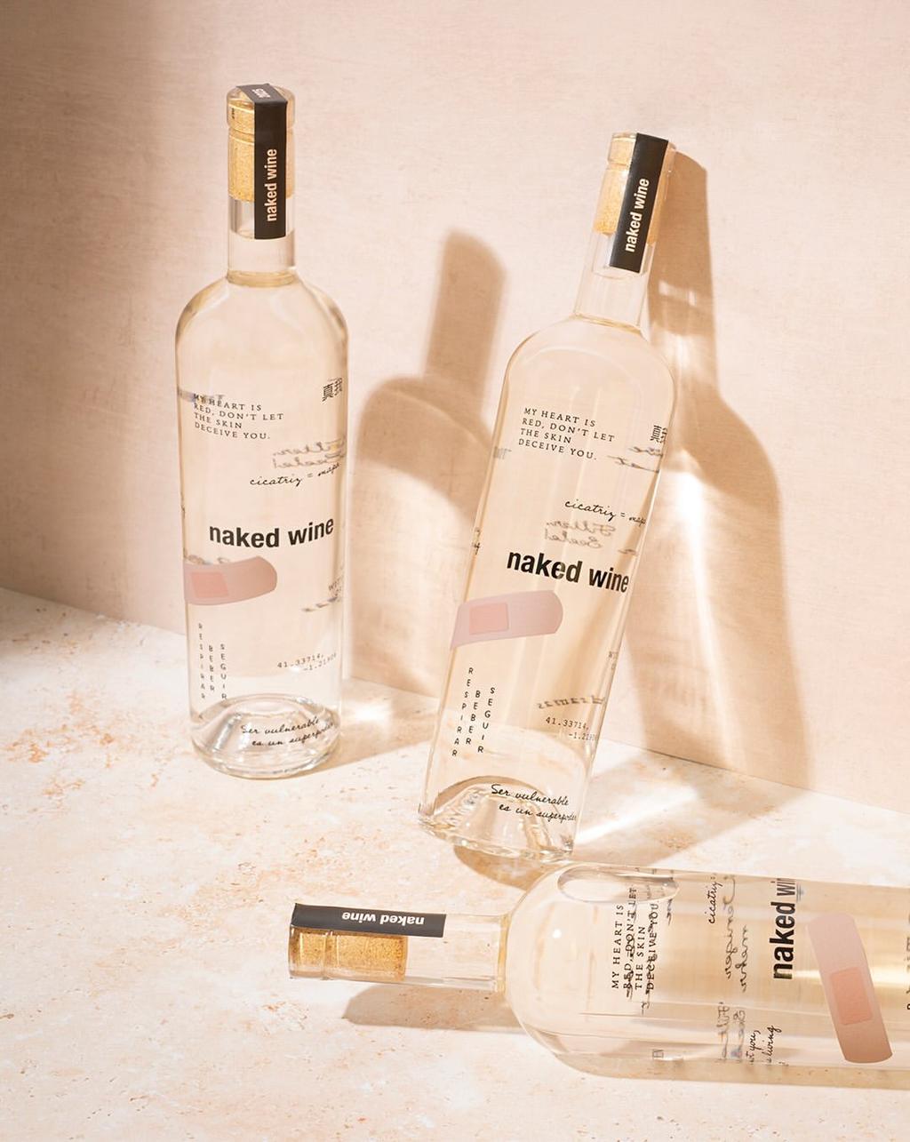
MABA's packaging design for Naked Wine.
Just as the human body is a map of our history, this bottle becomes bare skin: transparent, exposed and covered in tiny tattoos to reveal a luminous, transparent wine that, paradoxically, comes from a red grape that has been stripped of its skin.
Find out more about MABA here .
Riff by CENTER
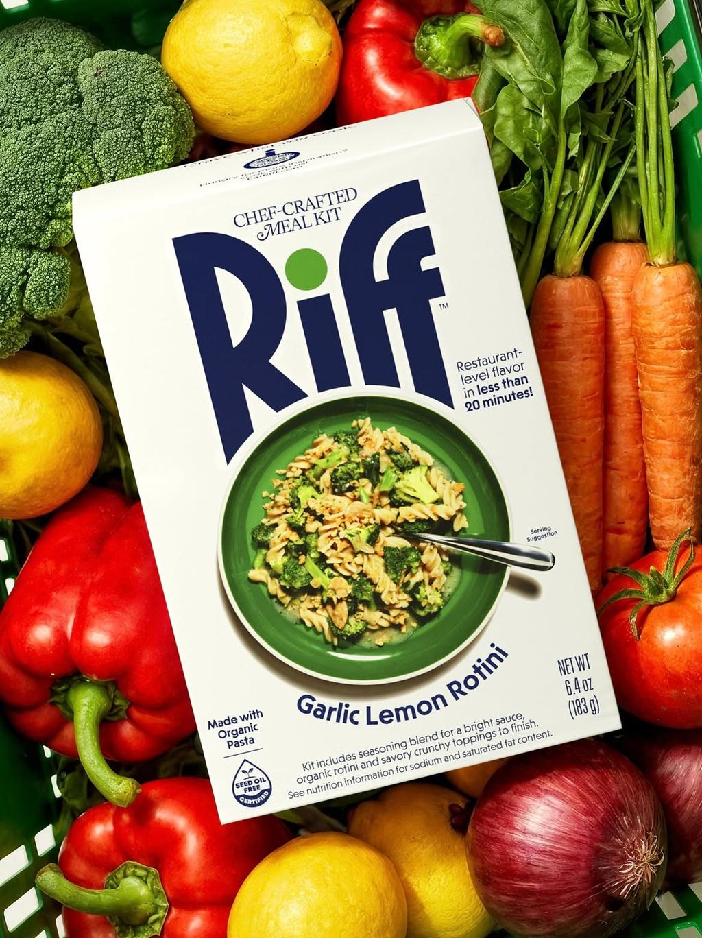
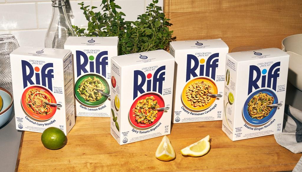
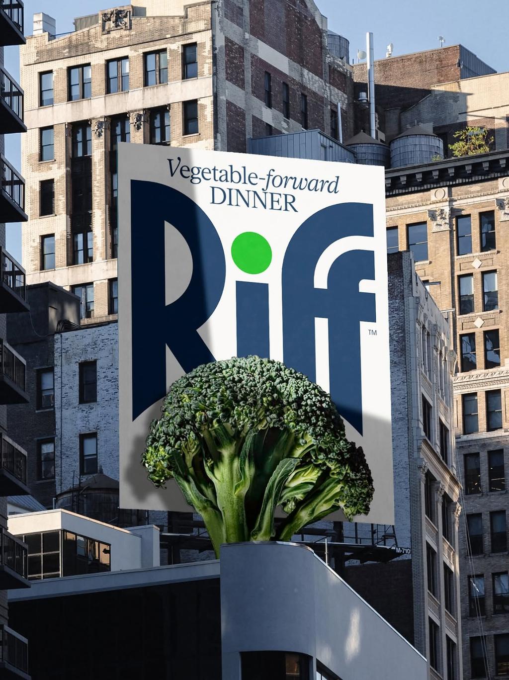
CENTER's packaging design for Riff.
These ready-to-cook dinner boxes give each flavour its own colour, while the front features a dish that feels genuinely achievable at home. Fresh produce takes centre stage on the sides, while the back guides you through the recipe. Each box also comes with its own playlist, timed to the length of the recipe to bring a little extra enjoyment to the cooking experience.
Find out more about CENTER here .
WIRI by High Tide
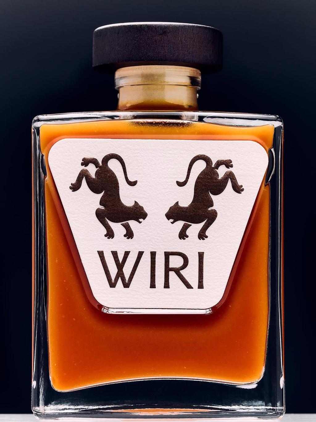
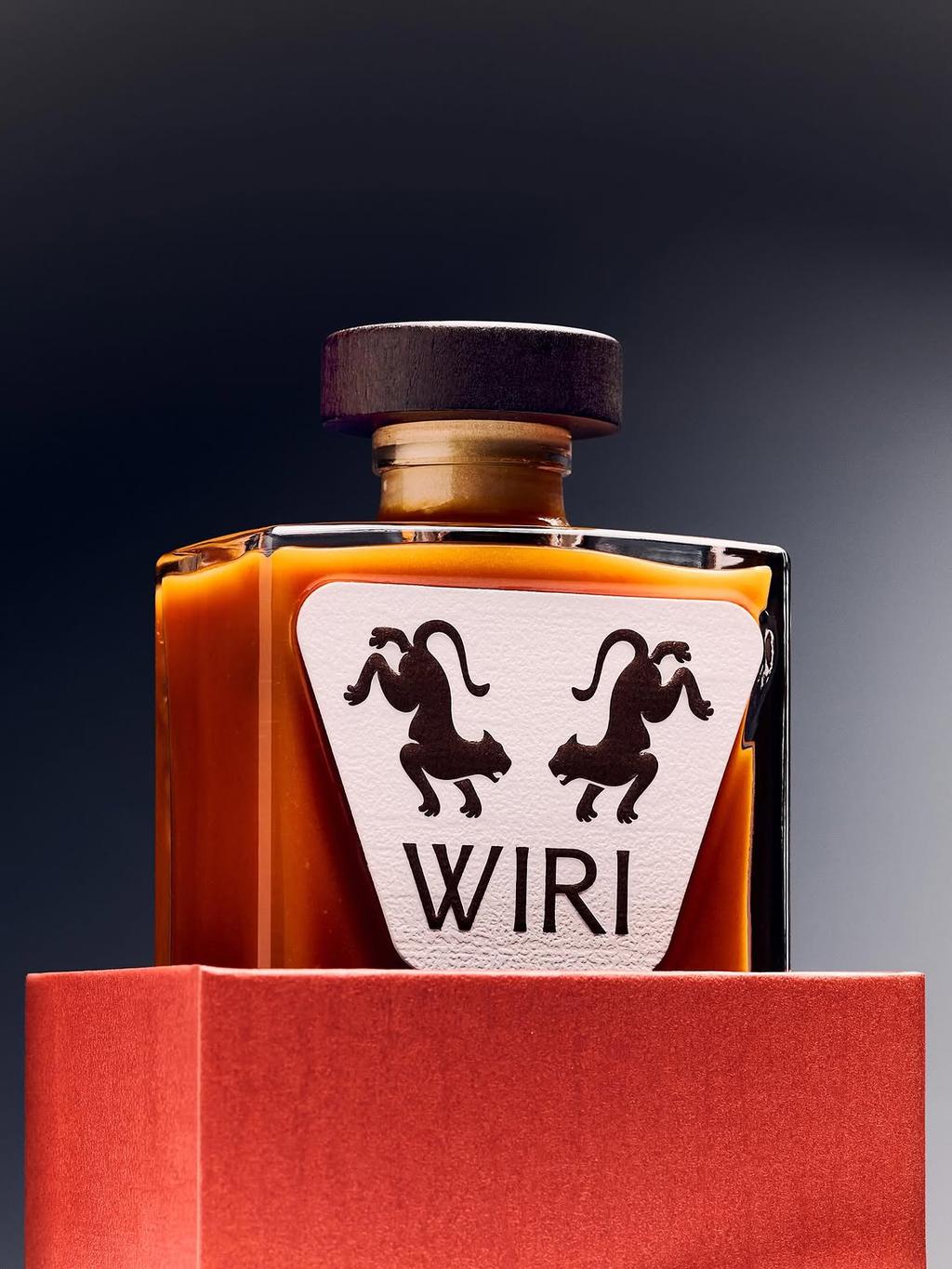
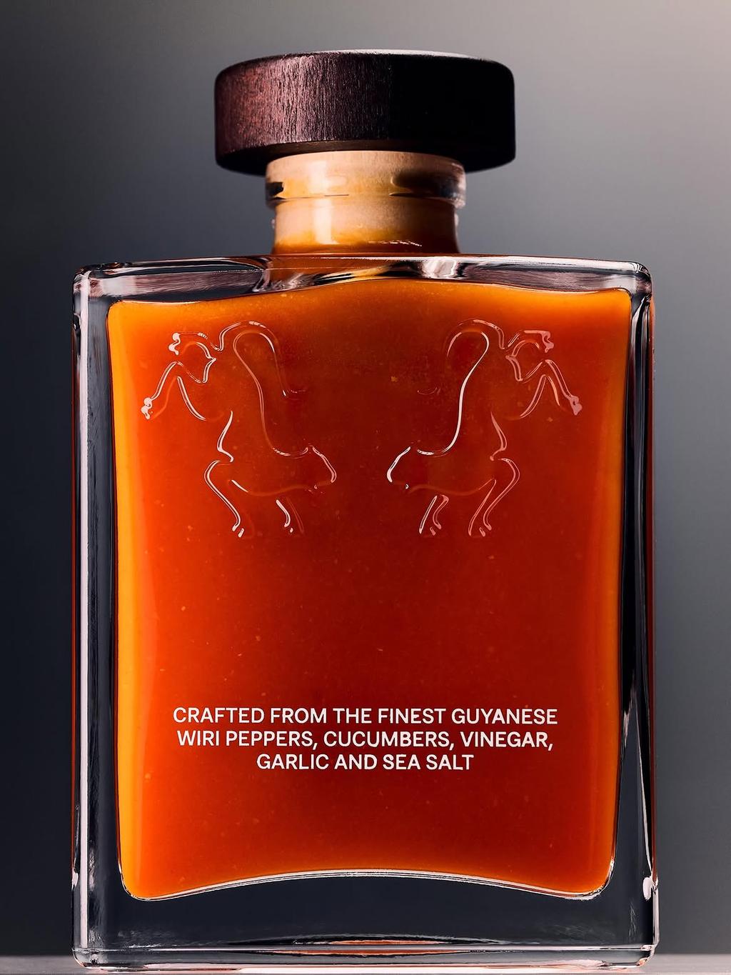
High Tide’s packaging design for WIRI.
A characterful pepper hot sauce bottle combining a sculptural shape with a bold hand-drawn motif. The minimal label creates a distinctive identity with a premium feel.
Find out more about High Tide here .
Repeats by Purple
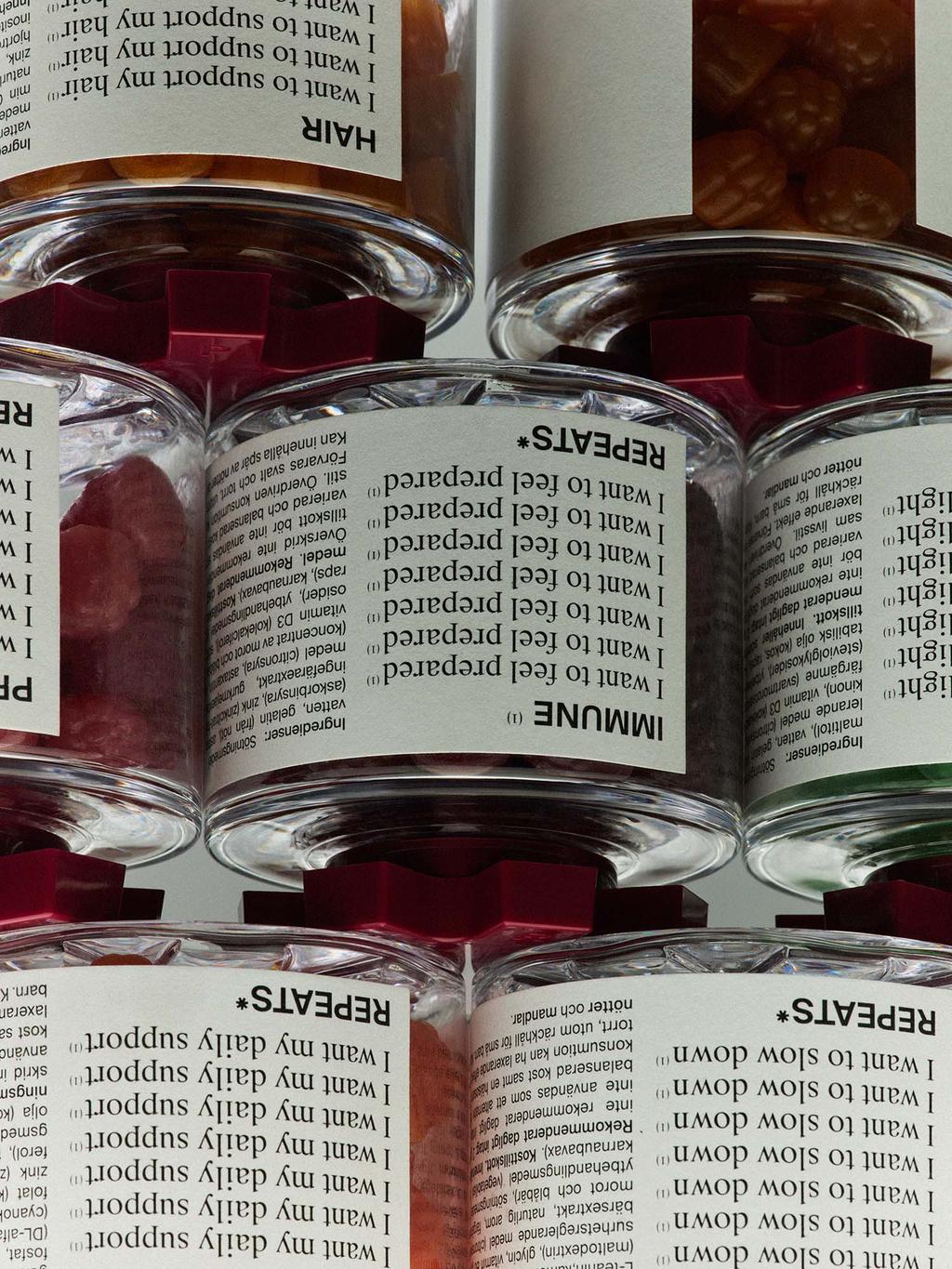
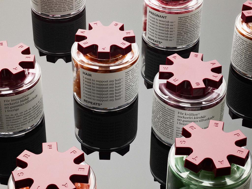
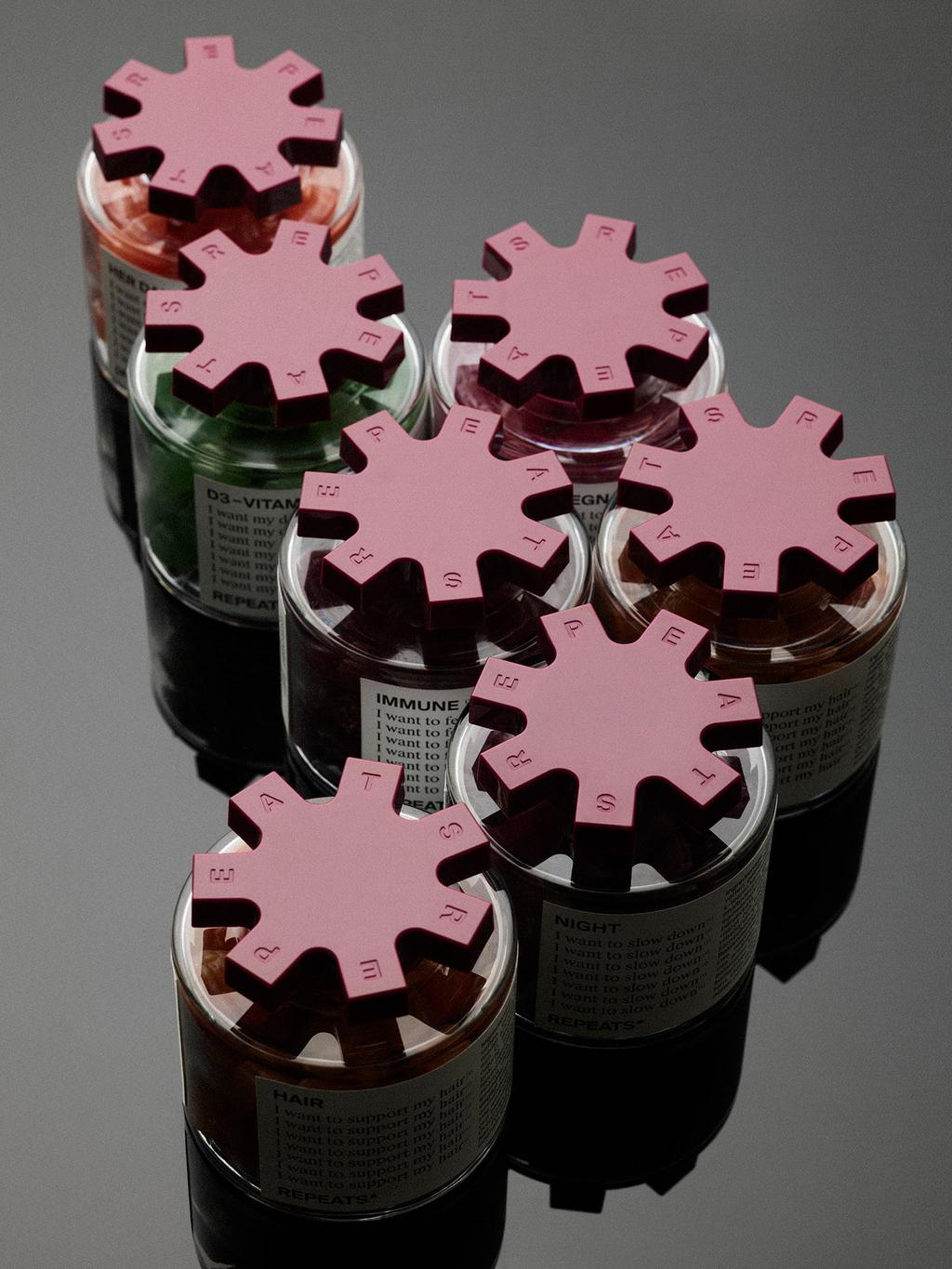
Purple’s packaging design for Repeats.
A gummies brand built around a bold, graphic identity inspired by repetition. Stackable jars create a sense of endless repeat, while circular asterisks and recurring graphic details bring consistency across the packaging. Simple, distinctive and modular, the design turns repetition into the brand’s visual language.
Find out more about Purple here .
Paulista by Agência BUD
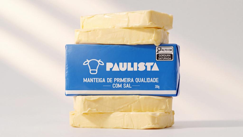
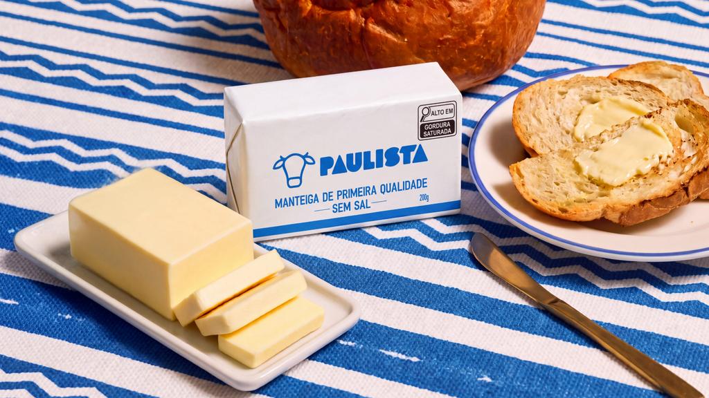
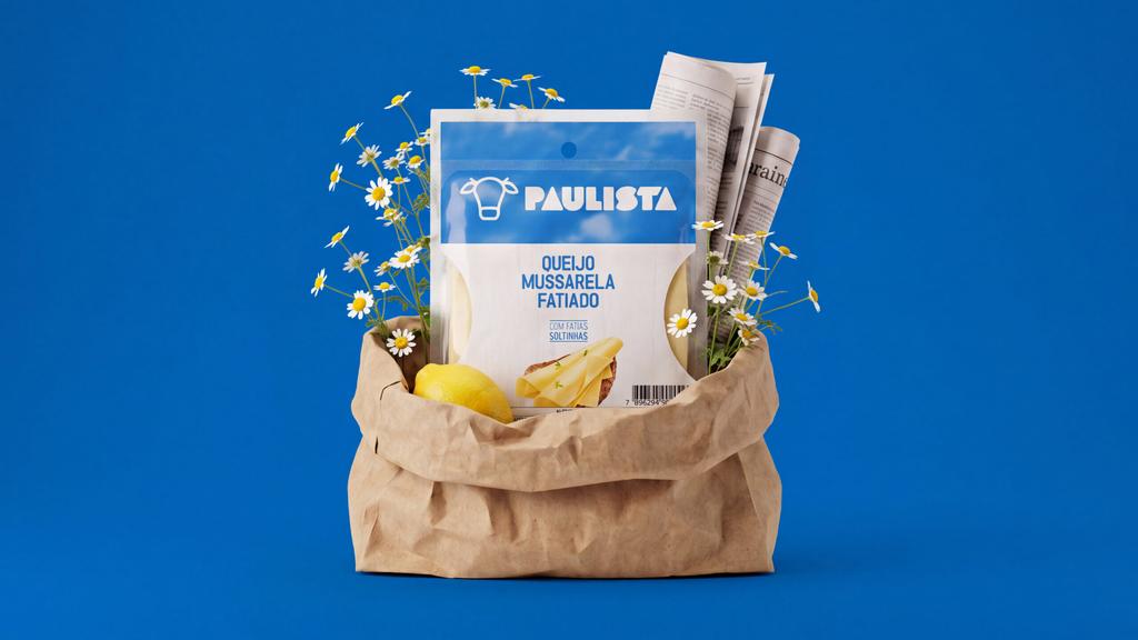
Agência BUD's packaging design for Paulista.
Expanding the brand range without losing its recognisable identity, this packaging system adapts the brand across different formats while keeping a strong, consistent visual language. Clear hierarchy, colour and typography bring the family together while giving each product its own distinction.
Find out more about Agência BUD here .