


Blending emotional growth with eco-conscious design with Mimi & Coco
Studio Zak transforms childlike creativity into standout brand and packaging design
Studio Zak transforms childlike creativity into standout brand and packaging design
Mimi & Coco is a sustainable body and hair care line created for toddlers — where playfulness meets purpose. The brand redefines the idea of “care” by blending emotional growth with eco-conscious design.
At its heart lies the belief that every child holds two sides: the brave and the gentle, the wild and the kind. Mimi & Coco celebrates both. The tone of voice and supporting visuals reflect this duality — lighthearted yet thoughtful, colourful yet calm, imaginative yet responsible.
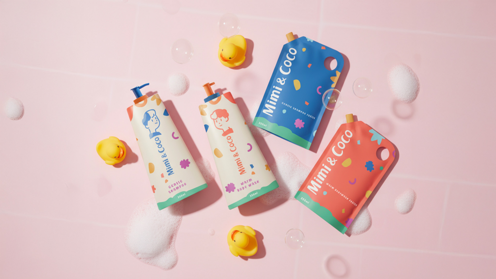
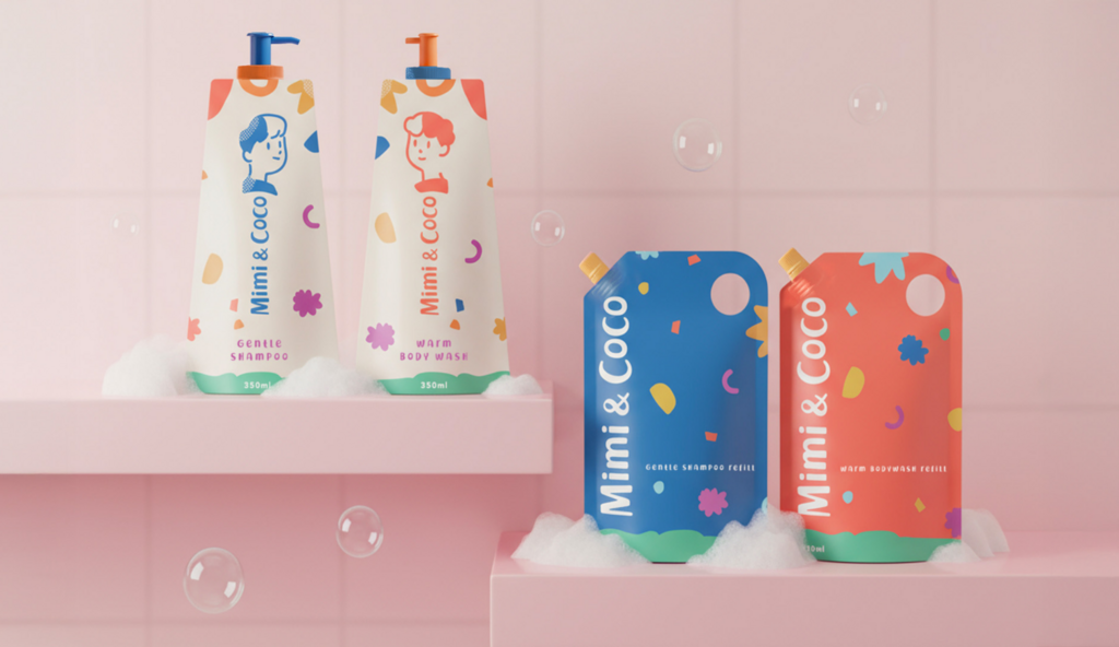
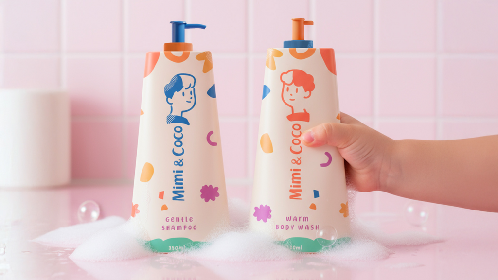
Visually, the branding draws from the unfiltered creativity of children’s drawings. The hand-drawn logo mixes upper and lowercase letters, while the illustrations of Mimi and Coco appear across supporting graphics in a style that feels both naive and authentic. A geometric pattern complements the duo, echoing building blocks and playful composition.
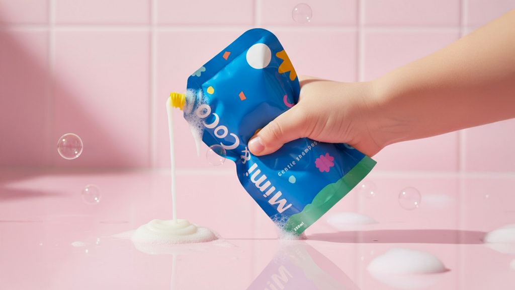
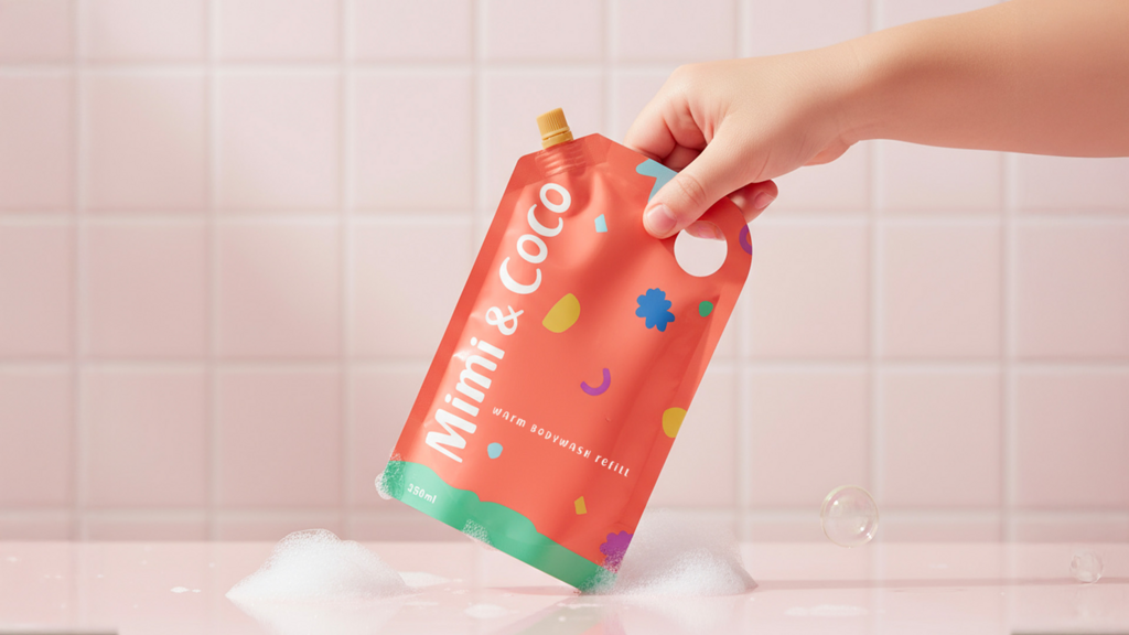
The packaging system continues this honest simplicity. Matte bottles in recycled plastic are silkscreen-printed in toned-down primary colours — deep orange for the body wash, dark blue for the shampoo — with contrasting beige backgrounds that bring softness and balance. The refill pouches invert this palette, underscoring the brand’s circular design approach while creating a clear visual rhythm between bottle and refill.
Sustainability is quietly embedded in every detail — from the refillable format to the minimal, durable finish. The result is a brand that feels fresh and familiar, playful and responsible, poetic and practical all at once.
For more information on the design, visit Studio Zak's website or follow them on Instagram .