


Osmoz and the art of AntiDesign
Embracing AntiDesign and digital nostalgia, Mattéo Tabutieaux turns bad taste into bold identity with Osmoz
Embracing AntiDesign and digital nostalgia, Mattéo Tabutieaux turns bad taste into bold identity with Osmoz
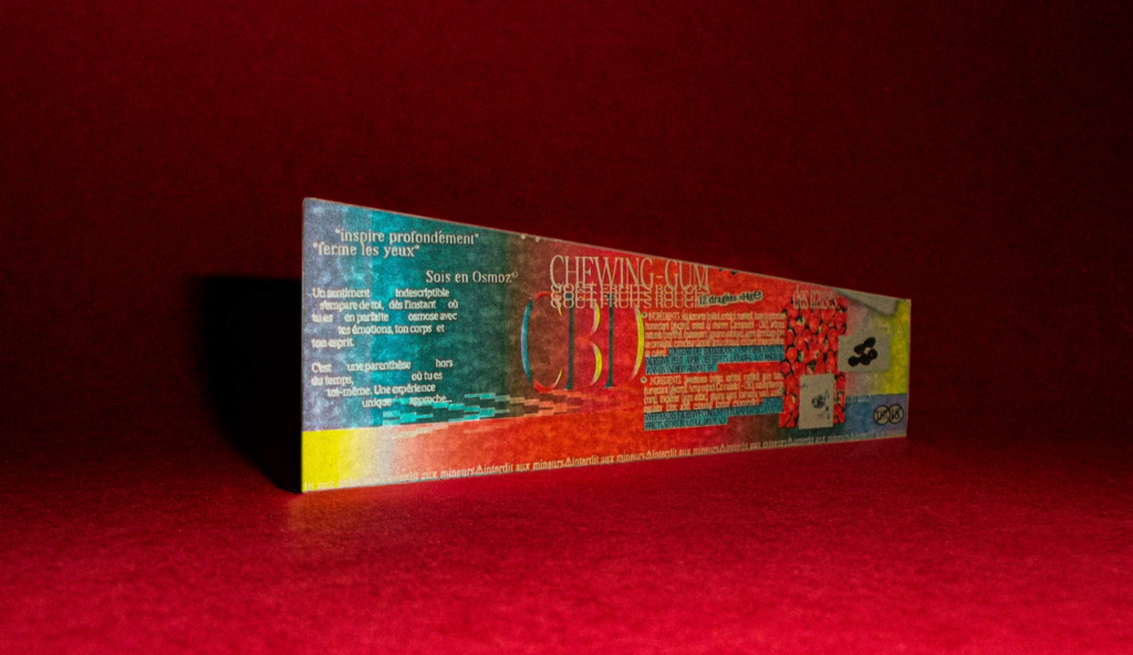
*Take a deep breath*, *close your eyes*, Be in Osmosis...
An indescribable feeling comes over you the moment you are in perfect harmony with your emotions, your body and your mind. It is a timeless interlude, where you are truly yourself. A unique experience awaits...
Osmoz is never the same; each letter is unique and constantly changing. The logo adapts to every taste, every feeling, every emotion conveyed during the experience. The identity is punctuated by jerky gradients. Dissonant colours alter the whole, creating a real singularity and anchoring us a little more in AntiDesign, or even WordArt. Osmoz's identity is in bad taste, but it breaks free from norms, taking kitsch to another level.
A chaotic harmony emanates from Osmoz. Saturating its packaging with graphic elements, it takes the opposite tack to the market and positions itself as an outsider. Osmoz follows the AntiDesign approach, which encourages experimentation and rejects standardisation. Design thus regains its uniqueness, mirroring the early days of digital creation in the 2000s. A plethora of completely outdated effects accumulate on the packaging: drop shadows, curved or even distorted text, rough gradients, and overlapping colours. An aura emanates from it, inviting everyone to see an alternative to reality.
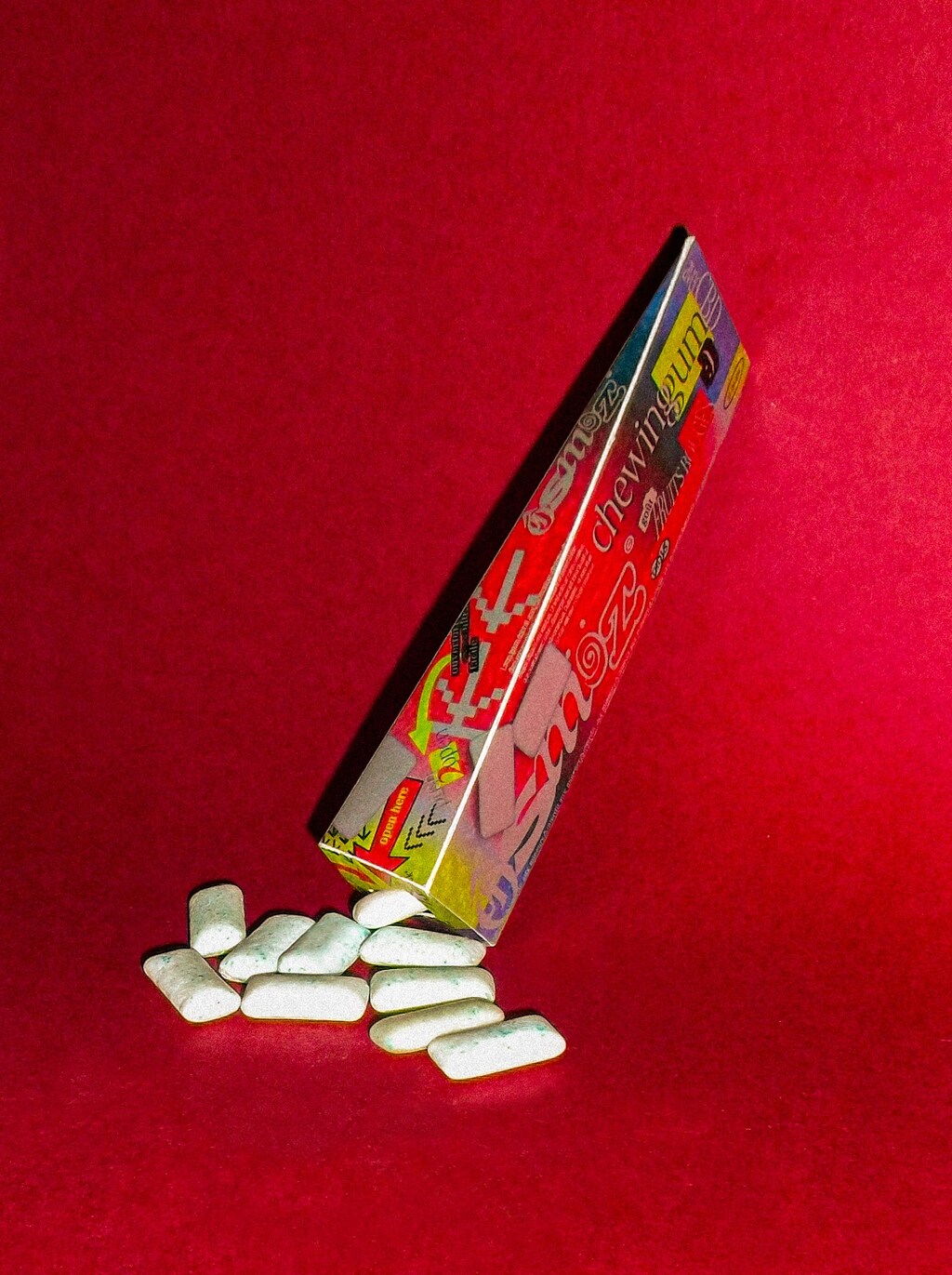
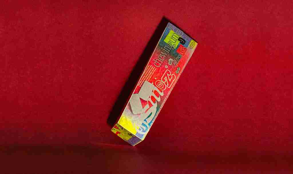
Rectangular at first glance, the shape turns out to be more atypical, oscillating between a pyramid and some kind of polygon. It is impossible to name the exact shape. This uncertainty disappears after consuming CBD. The boundary between the rational and the dream becomes tiny, and Osmoz takes on its full meaning.
For more information on the design, visit Mattéo Tabutieaux's website or follow them on Instagram .