Thirst launches Gold Bar Whiskey’s first-ever RTD, Double Gold
In collaboration with Hall of Fame quarterback and 49ers legend Joe Montana, the design brings the golden age of San Francisco to life
In collaboration with Hall of Fame quarterback and 49ers legend Joe Montana, the design brings the golden age of San Francisco to life
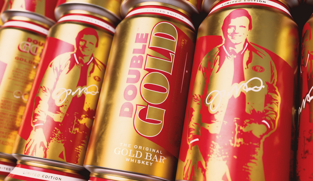
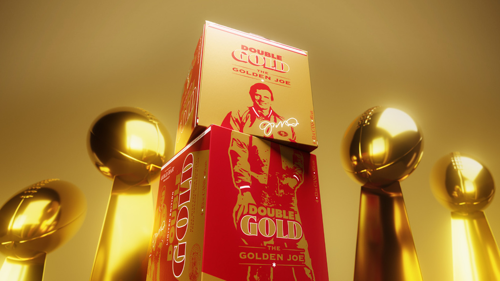
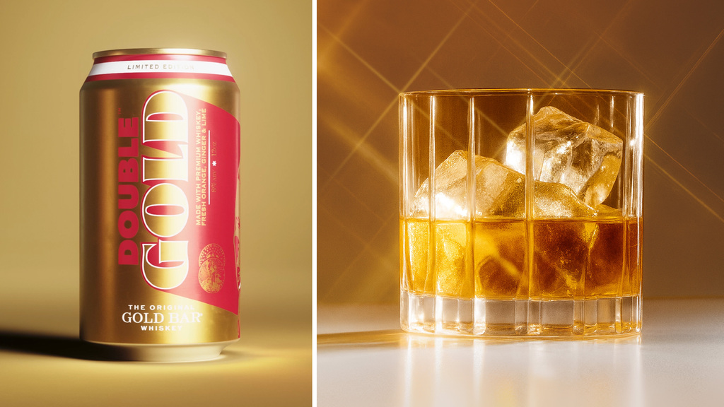
Thirst has partnered with Gold Bar Whiskey to create Double Gold – a new brand and Gold Bar’s first-ever ready-to-drink cocktail. The design reimagines 1980s San Francisco through the lens of Hall of Fame quarterback and 49ers legend Joe Montana, bringing back the golden-era energy of the city he helped define.
Rooted in the belief that drinks can move culture, Thirst’s design for new brand Double Gold revives the optimism, ambition, and shine of the City by the Bay. Inspired by Montana’s heroic presence and the original Gold Bar bottle – itself a symbol of treasure and transformation – this new expression turns nostalgia into iconography.

To commemorate the 40th anniversary of the 49ers’ historic 1985 championship, Gold Bar Whiskey and Thirst set out to create a design that captures the essence of San Francisco’s golden age. Working closely with Gold Bar founder Elliot Gillespie, Thirst took cues from an original 80s poster of Montana, pairing it with a striking red-and-gold visual world. The result: a new RTD brand that feels like a collectible, radiating weight, victory, and nostalgia

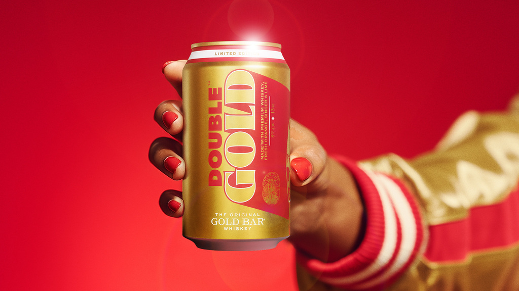
The design dials up the heft of gold – literally and metaphorically. From metallic typography to rich golden grounds, every element is built to feel solid, tactile, and valuable – a visual metaphor for the golden standard Gold Bar is setting in whiskey RTDs.
At its heart sits the gold varsity jacket – the defining visual cue from Montana’s era, reinterpreted by Thirst as a symbol of victory and belonging. Even the red-white-red sleeve detail from that original jacket became a design reference: it inspired the band of colour that wraps around the top of the can, a subtle nod that connects the pack directly to its 80s sporting roots.

For more information on the design, visit Thirst's website or follow them on Instagram .


