
Hello, I am Mattéo Tabutieaux, a young French student in the field of visual communication. Since 2019, I am passionate about the world of graphic design such as creating visual identities, advertisements, object designs, packaging or even motion design. I am inspired by everything around me, and I aspire to innovate to find the idea that will make my project unique. To succeed in conveying emotions in a graphic or advertising concept is fascinating and I love this feeling of sharing, it motivates me to surpass myself and especially to question everything.

Fleurettes offers flower seeds to be planted outside or inside. The typography is fluid and light, evoking the roots of flowers, a tree structure that extends underground. This logotype, made of curves and interlacing, also takes up the Arts Nouveaux movement. Floral ornaments and flora in general were overrepresented in all fields of art. The typography was also characteristic of this period, with typefaces mimicking nature, such as Hector Guimard's cult "Métropolitain". Here, the logo is more refined to enhance the typography. The purple color brings a touch of modernity. A coherence between letters and colors is created. Fleurettes retraces its origins while being in tune with the times. Fleurettes takes its packaging concept from planting cards. The whole packaging allows you to grow flowers (Cosmos Bipinnatus or Achillea Ptarmica pearl). Thanks to the recycled paper in which the seeds of the flowers have been integrated, all you have to do is plant the petals, which can be separated from the packaging, in the ground or in a pot, water regularly and nature will take care of the rest. The packaging is biodegradable and the natural inks do not pollute the ground. Fleurette aims to be ecological in every aspect, from production to use. Based on origami, the packaging plays with simplicity, as only a wooden stem (which can be used as a stake) and cut and folded paper are used. The shape of the packaging schematizes the flower that will grow. A floral pattern reminiscent of my primary source of inspiration, the Arts Nouveaux, enlivens and dresses the paper flower. Some essential information is present to guide the user. The movement to detach the petal is taken from the game we all played as children: to tear off a daisy, saying "I love you, a little, a lot, passionately, madly, not at all. .. ". And so on. Fleurettes' packaging combines fun and ecology to make children and adults want to garden.


Made for teenagers and young adults, Lilips is a fresh and energetic lipstick brand. The movement created in the typography of the logo is inspired by lipstick and the effect it has when written with it. The curves made of full and loose lines make the name soft, supple and graceful, just like Lilips products. A mouth is subtly added in the negative space created by the capital "L" and the "il", reinforcing the understanding of the logotype. The colour, halfway between the traditional red and fuchsia pink, rejuvenates the world of cosmetics and finishes the brand identity with softness, punch and a touch of originality. The slogan "difference matters" punctuates the whole and sets the tone and direction in which Lilips is committed. The lip-shaped packaging is derived from the mouth in the negative space of the Lilips logo. This hand-held packaging does not go unnoticed and stands out from all its competitors. A thick foam is hollowed out in the middle to accommodate the lipstick. The lipstick is curved to symbolize a smile but also for a better grip. In addition to ergonomics, this lipstick is designed with a brush for a quality and precise application on the lips. The label connected by a metal ring, evoking a piercing, covers this foam on the front side. It allows the label to be turned from the side like a binder. The label itself plays with the idea of tone on tone: "Raspberry", "Peaches" or "Plums" are revealed in a subtle way with an embossing. A touch of white provided by the logo and the slogan illuminates the packaging as well as a trace of lipstick giving rhythm to the whole. Lilips wants everyone to affirm and show their difference with this lipstick.


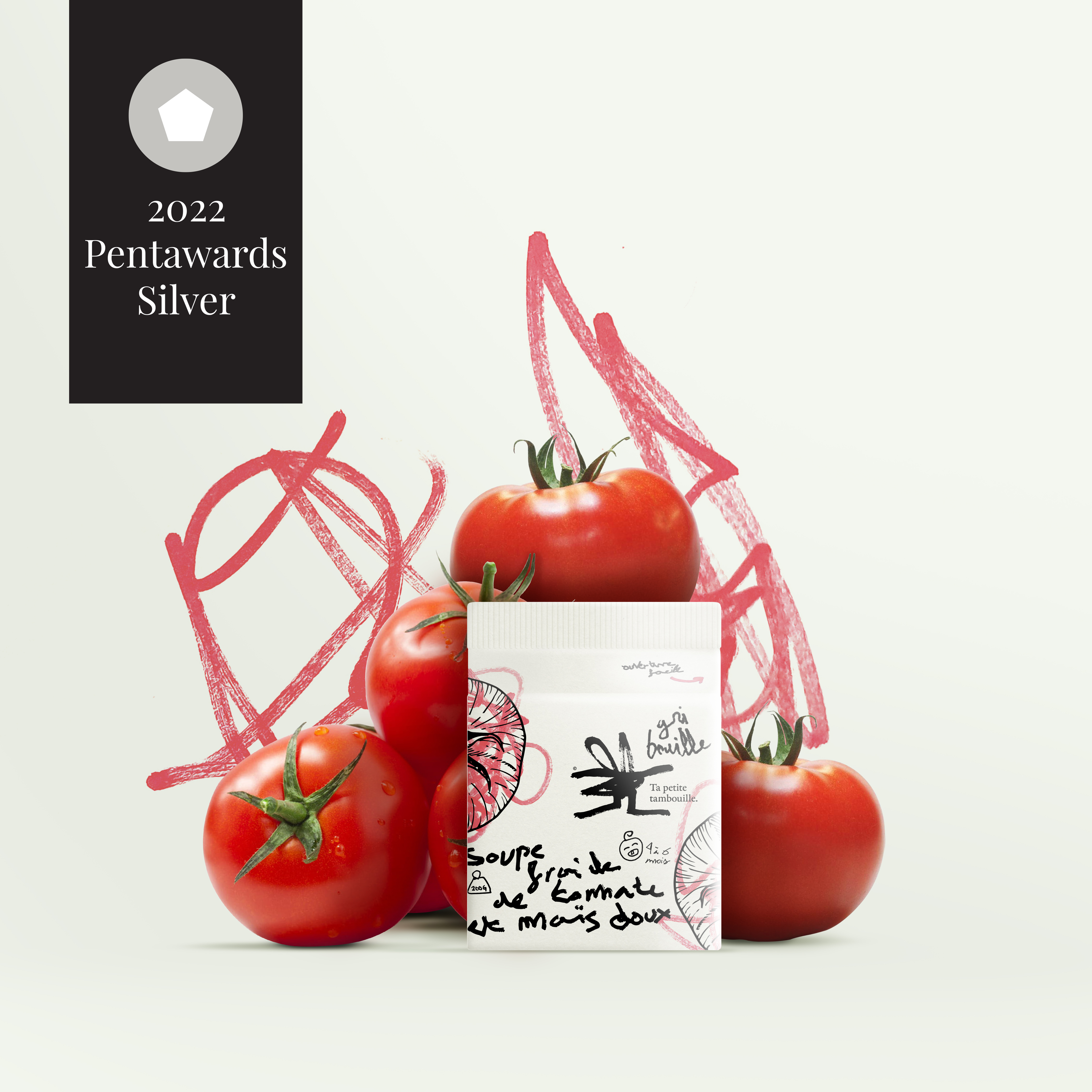
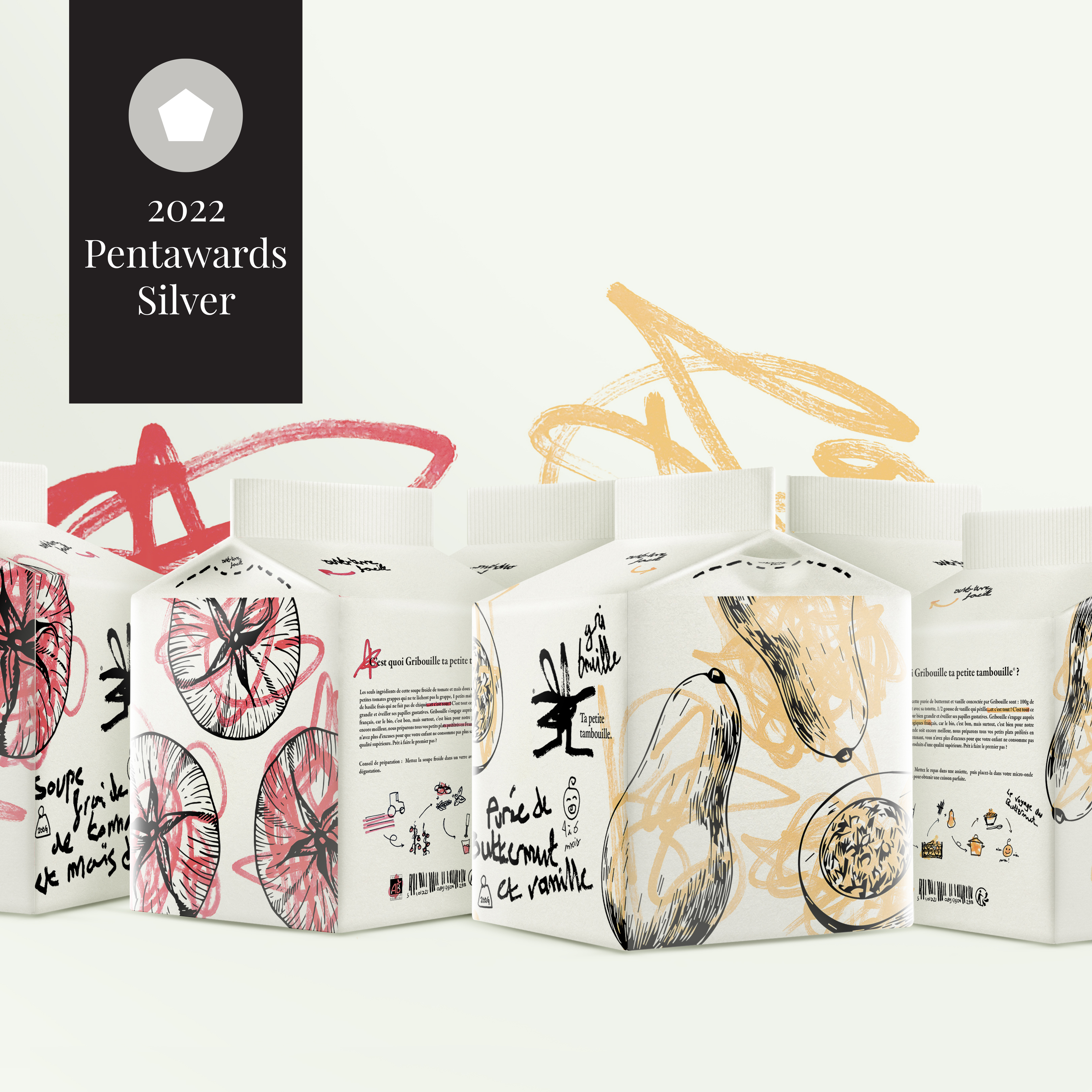
Gribouille is a brand offering organic ready meals for babies. Newborns are constantly discovering new things and learning. Scribbling is one of these discoveries that is universal to all babies. lt allows them to shape their imagination and practice while communicating with others: it’s spontaneous and limitless. Gribouille takes up this theme that speaks to both parents and children to transmit its main value: the simplicity of its recipes that leads to a healthy dish. A doodle is just as simple to make as Gribouille's dishes. This pictogram with its strong personality is open to interpretation and is as spontaneous as a doodle. The very childlike writing refers to babies and in particular to their beginnings in writing. The layout of the logo is deliberately disordered to give the illusion that a young chiId is at the origin of it. The baseline "ta petite tambouille" is phonetically similar to a children's rhyme and is a familiar French way of referring to a meal. The logotype is thoughtfully designed to look like something a baby does without thinking. The little dishes prepared by Gribouille are cooked with healthy vegetables produced by our French organic producers. These little cardboard bricks are made up of several things that make up the world of childhood. First of all, the doodles on the vegetable illustrations. This is a nod to all the coloring where babies or young children are constantly scribbling on them. This spontaneous movement, understood by all, is an immediate reference to childhood. The typography allows to support this aspect of "discovery" already present in the scribbles. Indeed, a young child discovers and tries his hand at writing. It is not neat or even neat, but that is the charm of Gribouille: imperfection. The texts are also very meaningful because the description on the back is written like a nursery rhyme, another characteristic of the world of childhood. The small handmade pictograms placed in such a way as to "fill in the gaps“ punctuate this packaging with a soft, childlike note. The scribbles, the writing, the texts and even the pictograms are drawn in the manner of a child and this is what makes this packaging meaningful for them but also for the parents who can see their child through Gribouille. This packaging attracts the eye because it goes beyond the framework of "perfection". This little brick could be entirely made by a child himself and it wouldn't matter. This is the message that Gribouille wants to put forward: to put oneself in the place of the chiId in order to know him better.


ln Greek, Okeanós means the ocean. I made this choice to give the brand a top of the range feel. Similar to the words in the sustained vocabulary, it brings a certain nobility to this visual identity, just like the products offered by Okeanós. The name inspires Greece and its freshness in the colors, with a bright white and an intense and characteristic blue. The typography, with its "engraving" look, is taken from the Greek style. The logo has a lot of personality. The fish illustrations are the essence of the Okeanós packaging. The grain of the paper is felt on the illustration and gives charm while keeping the typical Greek "white stone" spirit. The graphic motifs contrast with the simple, even basic shape of the fish. The principle of opening the packaging is common, but combining it with the illustration, making it part of it, is new. By doing so, the packaging gains in originality and is recognizable, it even becomes its main characteristic. The typography chosen complements the very angular logo perfectly. lt brings a touch of modernity while remaining in line with the brand's universe. The small details such as the circle made in the same way as the illustration, the side motif that takes up that of the fish and the "stamp" on the back confirming the date of fishing of the product bring a "handmade" side and emphasize all the traditionalism in fishing that Okeanós promotes.


I created El Poco, a new brand of hot sauce with Mexican origins. I was inspired by the Mayan civilization to create its visual identity. The logotype is a wordmark made of letters organized in the way of Mayan representations and with bright color codes evoking Mexico. A "worn" effect, inspired by Mayan engravings, was applied to the logotype giving an authentic look. Inspired by a maracas, El Poco's packaging is shaped like the famous Mexican instrument. To fully enjoy the taste of the sauce, you have to shake the bottle to mix the ingredients, which echoes the maracas. Latin American-inspired motifs adorn the handle of the bottle and Mayan mask-like caps enhance the whole. These masks bring a mystique and intensity to the product. The spiciness of the El Poco sauce is only accessible to hotheads.


“Ô comme 3 pommes“, “Me prends pas pour une poire“ and “Ramène pas ta fraise“ are product names for a French brand of children's compotes. Coming from popular expressions, they are often heard by children as for example "Haut comme trois pommes" (high as three apples) designating the latter. This touch of humour from the brand allows it to communicate simply about its products so that children understand better. On the Ô comme trois pommes pictogram alone, arms give energy and make them more expressive. These small stacked apples are enough to understand that this is an apple-based product for young people. The typography used in the logo gives the impression that it was written by the child himself and is therefore linked to his daily life (learning cursive writing at school). The whole has a strong personality that allows it to stand out from the rest and to develop a recognizable universe at first glance. Here are three product names "Ô comme 3 pommes", “ Ramène pas ta fraise“ and “Me prends pas pour une poire" for a compote brand. Their names are taken from French humorous expressions such as "être haut comme trois pommes" (to be tall like three apples), which refers to a child's short stature. The packaging of these products takes the shape of the fruit and is assembled in groups of 3 (or more) by means of a straw symbolizing a fruit stalk that fits together on the underside of each package, its separation recreates the sensation of picking a fruit. The shape of the container allows instant identification of contents. Arms and eyes added to the packaging give life to playful characters for children. As compotes are often snacks at school, I chose to put games on the back to distract them during a school break. These little compotes play with our curiosity and encourage us to discover them.


Beeo is a concept for a new brand of honey that strictly adheres to the criteria of organic farming and above all the good remuneration of the affiliated beekeepers. Modern in its way of producing honey, it is also modern in its graphic identity. Beeo is the contraction of the words "bee" and "organic". The name is a powerful evokes the world of honey and organic products. I created the "B" pictogram of the logotype from the symbol of a natural hive. I associated this pictogram with a freehand typography for the authentic aspect and an orange panel reflecting the diversity of honeys. The Beeo container is the perfect reflection of the brand itself: modernity and authenticity, two key words of this object study. It stands out from conventional brands using cheap design and communication. Beeo wishes to convey the taste of excellence through an innovative honey pot whose shape is inspired by a simplified hive icon. Exception and excellence highlight the authenticity of this elixir appreciated by all. Noble materials such as wood and glass evoke and respect nature while remaining distinguished. The packaging is as unique as the honey it contains.


Ice Queen is a chic French brand of sorbets made entirely of organic products from local farmers. These gourmet sorbets, with a very fruity taste, are made according to a recipe of yesteryear. The name Ice Queen is a play on words between "Ice cream" (which means ice) and "Queen" (which means queen). The brand name is associated with the image of a queen for her charisma, beauty and strength. The Ice Queen logo is sober and noble, it reflects the quality and naturalness of the products. The pictogram is composed of a simplified sorbet shape, a crown and the letter Q of "Queen". The crown makes the sorbet shine and shows the elegance and grace of a royal figure. Graphically effective, the logo is used in black or white and evolves in a range of bright colors reminiscent of sorbets. The brand signature is "deliciously iced", suggesting the delicacy and delicacy of the product. Packaging is the first interaction between the customer and the brand, so it is important not to neglect it. I opted for the creation of a new form for this range of 10 fragrances. It's not insignificant since it takes the shape of the logo with its rounded edges for better brand recognition and its stick on the outside makes it easier to hold the sorbet. The packaging opens from the side thanks to a small notch which allows an easy and very elegant opening like a case. 3 key words define Ice Queen: chic, natural and gourmet. The chic aspect is expressed by the sobriety and simplicity of the packaging design. The naturalness is illustrated by the fruits represented on an ice cream stick. And greediness is expressed by the colorful universe. The whole forms a harmonious packaging.


