


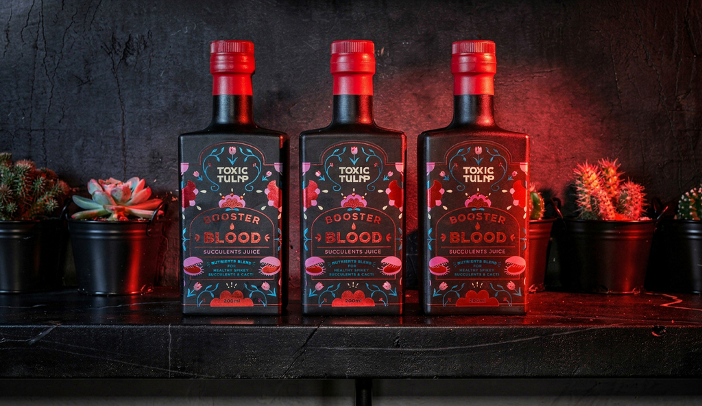
Toxic Tulip: a rebellious flower shop with its own line of bloody products
Studio Zak creates branding and packaging for Toxic Tulip that strikes the perfect balance between playful and dangerous
Studio Zak creates branding and packaging for Toxic Tulip that strikes the perfect balance between playful and dangerous
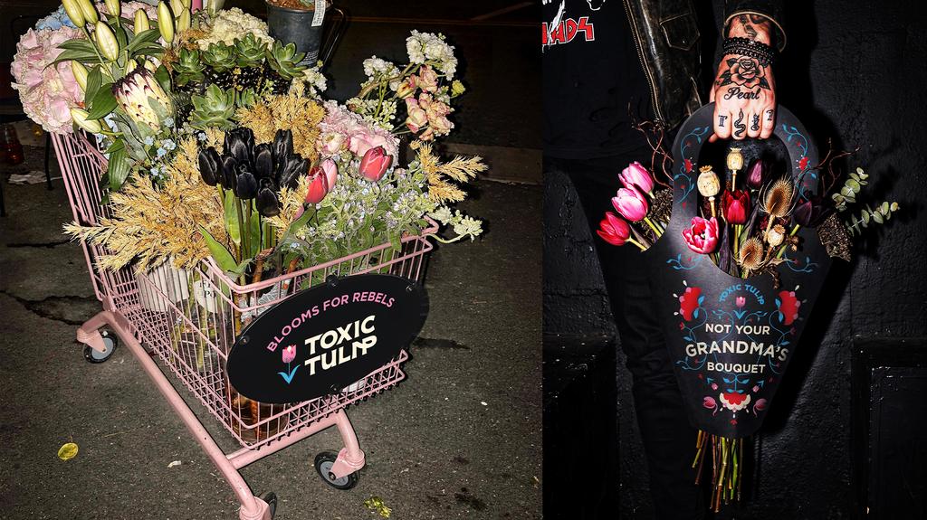
Toxic Tulip is a flower shop like no other. No romantic florals or soft pastels. This is rebellious, it is toxic, it’s not your grandma’s bouquet. In every category, we see products and brands that disrupt the market, go against the current, and set the tone. Toxic Tulip did just that in the flower shop market, turning something traditionally delicate into something strange and bold.
With its own line of products, Boaster Blood is the hero product. The storytelling is clearly shown in every choice: from the product names and tagline to the imagery, packaging, and selection of flowers; carnivorous whenever possible.
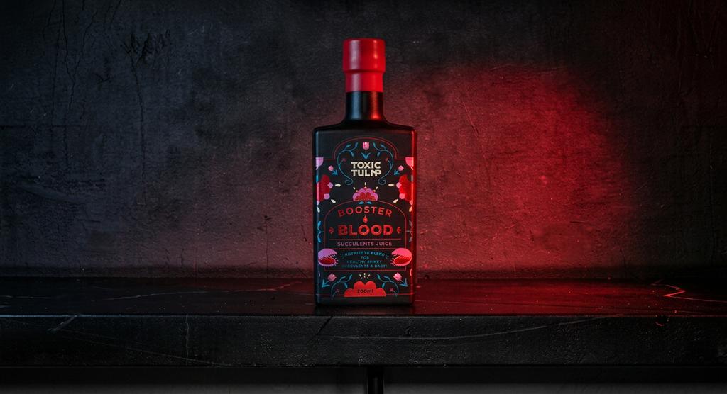
There are still delicate flowers in the branding, along with pinks and blues. But that’s where the sweetness stops. This contrast between cuteness and rebellion is what makes the brand completely different. It feels playful and dangerous at the same time.
The hero product features a tactile label finished with red and blue foil, making it as irresistible to touch as it is to look at. It’s truly drop-dead gorgeous. Created for a young generation of proud homebodies and self-proclaimed flower parents, Toxic Tulip is here to make flowers and gardening cool again.
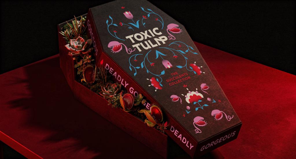
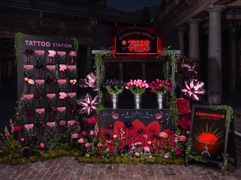
With brand activations involving temporary tattoos, a goth pop-up store, and special coffin-shaped flower boxes, the storytelling is carried across each touchpoint. Everything about Toxic Tulip screams toxicity, in a playful way.
For more information on the design, visit Studio Zak's website or follow them on Instagram .