Back Interview with graphic design and visual communications agency Estudio Maba
We speak to Beatriz Suárez López, one of the founders of Spanish graphic design and visual communications agency Estudio Maba to find out more about their work and their success at this year's Pentawards.
Tell us a little bit about the story behind Estudio Maba
Before we set up Estudio Maba, Miguel Angel (Estudio Maba Co-Founder and Creative Director) and I both worked in the communications team at the same company. After working together for years, we decided to start up our own studio. Having our own studio was a way to feed our curiosity, to discover new sectors, and to learn new graphical languages from other cultures as well.
Five years later, we still cannot believe how far we have come!
Which type of products and clients do you work with?
Our studio creates all types of packaging for consumer brands. We believe it is an honour to help create something that people are willing to take home with them, that they relate to, remember, and buy again. Packaging is design that you can touch, that you sometimes come across in stores and homes. It is a wonderful feeling.
We also work with all types of clients, large and small, and find them all equally exciting. A large customer gives you visibility and sets ambitious challenges. Still, when a customer is small, we are keenly aware that we are responsible for helping them grow. Our work can make a massive difference and streamline things for companies that are short on resources. We have the possibility and the responsibility to have a great impact on their projects.
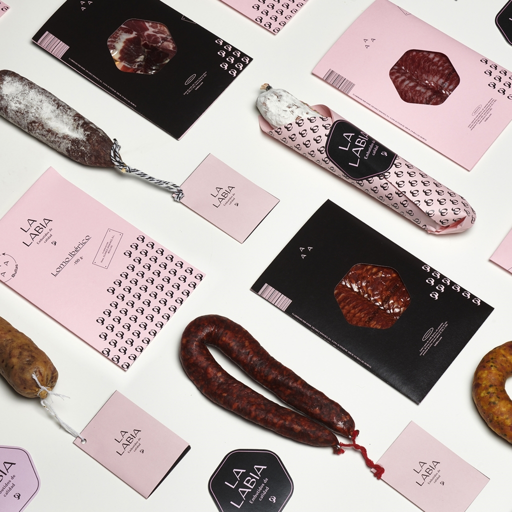
La Labia Sausages - redesign project

Bravo Carmen - 2020 Pentawards Bronze winner
Your work Códice, has been be awarded a Gold Pentaward as well as the People’s Choice Award by our followers around the world. Congratulations!
We are so proud of how far this design has come. Viñedos y Bodegas Sierra Cantabria, who we created it for, has been around for 150 years.
It is a classic design, but that does not mean it is dull. Finding the excitement in such a timeless design makes us really happy. It also gives visibility to codes that are not too common in design competitions, it is a resounding success, also for the company that engaged us for the work.
What's the creative idea behind the packaging?
Codices were manuscript books prior to the invention of the printing press, in which the capitular letters played a fundamental role and were used as pieces of art. Large embossed letters build the delicate and sensory label surface, almost sculpted on paper.
For the outer packaging a great vintage illustration and narrative is used as the user gradually discovers the product.
Like a page torn from a manuscript, the paper around the bottle opens to reveal an exquisite label embellished with reliefs and stamping. A dialogue between typography and images forms a ritual.


Códice - 2020 Gold Pentaward and People's Choice Award winner
You have been running the business together for a long time, what is the secret to running a successful studio like yours?
I think you need to be truly passionate about what you do. That keeps you focused and your energy levels high. You need to trust the people around you. If you know that you share the same goals, everything is easier.
Another trick is humour, which is essential for creativity and also for life.
How do you find your design inspiration?
We drink quite a lot of wine... Maybe that helps!
Over the past few years, you have won many Pentawards, do you have any favourites?
Asking us to choose a favourite project is like asking a mother to name her favourite child. Each design has its challenges, anecdotes, and emotions. They all teach you something, you explore, you get mad, and you try harder.
However simple or small it might be, starting each new design is exciting, like a first date.
Other Pentawards winning work from Estudio Maba

Paranormal Wines - 2020 Bronze Pentawards winner
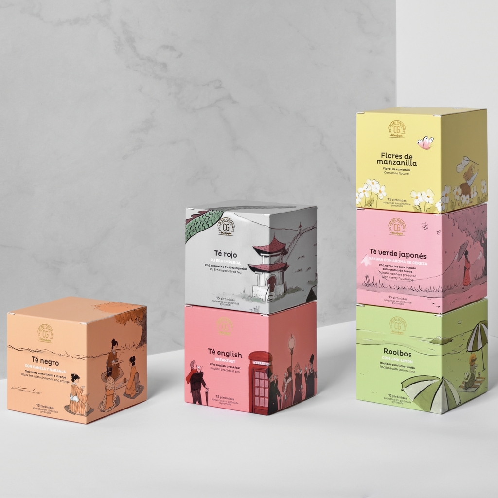
Tés Club Gourmet, El Corte Inglés - 2018 Bronze Pentawards winner
You recently re-branded, how did this come about?
Five years down the line, we still had our initial identity. This pandemic has had one good thing about it - it has given us time to think about ourselves, look back and to take stock. We needed to think about who we really are, the way we work, what we believe.
Our new identity is neutral yet descriptive, the letters in bar code that disappear to make space for each design. We do not want to stand out for our symbol, but for the work we do.
We are interested in the personality of the projects, which is naturally more important than our own.
Do you have any exciting new projects that you can share with us?
We are currently working on a wine project for a country a long way from ours. Projects for other cultures have a great impact on the studio when it comes to learning and difficulty. Although we are well versed in the world of wine, these producers are uncharted territory for us.
Find out more about Estudio Maba
Visit their website: https://estudiomaba
Follow them on: Instagram , Linkedin , Facebook , Twitter and Behance