


“Smart” Chocolate Packaging concept by Student Nata Tarasova
Smart chocolate packaging designed as a Rubik's Cube-inspired typographic puzzle highlights both flavor variety and cognitive benefits, blending playfulness with brain-boosting appeal
Smart chocolate packaging designed as a Rubik's Cube-inspired typographic puzzle highlights both flavor variety and cognitive benefits, blending playfulness with brain-boosting appeal
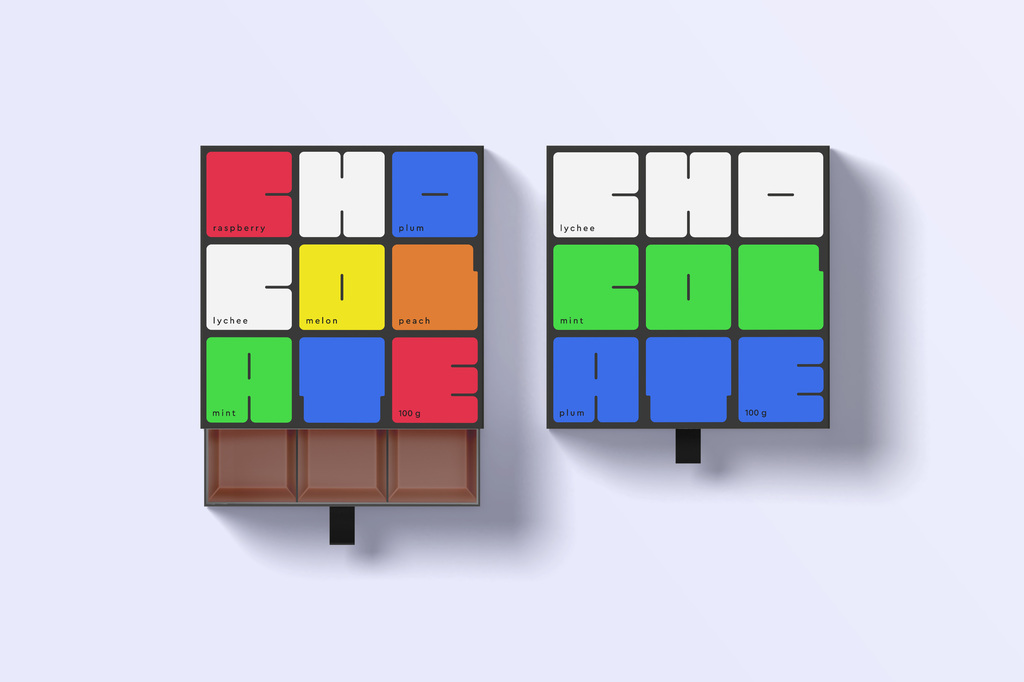
The concept for the “smart” chocolate packaging was developed using only typography. The main idea revolves around the image of a Rubik’s Cube—a popular puzzle associated with training and enhancing cognitive abilities. This association perfectly conveys the essence of “smart” chocolate, which, like the game, stimulates brain activity and improves its functions.
In the packaging design, each color on the “cube” in the typographic image corresponds to a specific flavor hidden in the chocolate filling. Thus, the packaging not only grabs attention with its original concept but also serves as a hint to the variety of flavors.

This concept reflects the core values of the product, highlighting its health benefits and positive effects on mental activity. Here, chocolate is not just a treat but also a product that enhances brain function—from improving concentration to stimulating creativity and memory.
The use of the Rubik’s Cube as a visual symbol reinforces the concept of brain training, as solving this puzzle requires attention, logic, and analytical thinking. The same can be said about the effect of “smart” chocolate: its consumption not only brings pleasant taste sensations but also serves as a kind of “workout” for the brain.
The typographic approach to the packaging design makes the product unique and recognizable. Every design element works to convey the essence of “smart” chocolate—an innovative product aimed at enhancing cognitive functions.

For more information on the design, visit NataTarasova's website .