


Who will be the Pentawards Diamond Winner of 2023?
With the Pentawards Gala 2023 fast approaching, we are excited to reveal the Pentawards Diamond Award winner 2023 on 10th November at the Magazine London. Until then, let’s have a look at the previous Diamond - Best of Show winners
With the Pentawards Gala 2023 fast approaching, we are excited to reveal the Pentawards Diamond Award winner 2023 on 10 November at the Magazine London. Until then, let’s have a look at the previous Diamond - Best of Show winners
Since our launch in 2007, Pentawards has evolved into a global competition for packaging design. With each passing year, the competition continues to elevate in both quality and quantity, adding to the thrill of the race to win the highest position.
This year, we were thrilled to receive over 2,000 entries from more than 60 countries. These were meticulously reviewed by our esteemed International Jury, resulting in a handpicked selection of exceptional designs. Yet, it's only the absolute best of the best that will win the 'Diamond - Best of Show' Award.
In addition to Gold, Silver, and Bronze distinctions, Pentawards also recognizes exceptional accomplishments with special awards, including the People's Choice Award, where our audience has the opportunity to cast their votes at the Pentawards Festival at the Flight Gallery, Science Museum. The winners will be celebrated at the Pentawards Gala Ceremony on 10 November at Magazine London.
Last Year's Diamond - Best of Show winner (2022)
Pocket Neck Pillow, Urban Forest

Shenzhen Urban Forest designed a travel neck pillow that's both stylish and eco-friendly. The outer silicon packaging also acts as an air pump, making it compact and portable. The tree-shaped shell functions as a storage bag and an air pump due to the silicon's elasticity. This innovation encourages users to reuse the packaging, transforming how inflatable pillows are used.
Find out more about the 2022 Diamond - Best of Show Award here.
Diamond Award winners 2007 - 2021
2021- Eminente Reserva, Moët Hennessy, and Stranger & Stranger

This pack is inspired by Cuba's "Isla del Cocodrilo," which has a unique crocodile-shaped logo and a textured glass bottle. The bottle is eco-friendly, as it can be repurposed as a candle holder, vase, or water jug. The labels are made from recycled materials, with the front label displaying the brand logo and product description using special techniques. The back label looks like a train ticket, making each bottle unique with individual numbers.
2020 - Air Vodka, by Air Company
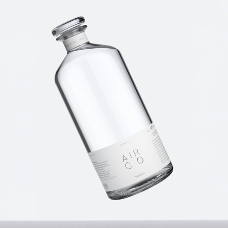
The design stands out by combining sustainability and luxury. Air Co. aims to be the world's most sustainable alcohol brand, achieving the first carbon-negative vodka brand. They collaborated to create a reusable and 100% recyclable bottle with a sleek, modern design. Minimal labelling is applied with a natural, non-toxic adhesive for easy removal, encouraging bottle reuse. Carbon offset printing and eco-friendly messaging complete the eco-conscious approach.
2019 – Xbox Adaptive Controller by Microsoft

The Xbox Adaptive Controller is made for gamers with limited mobility. The packaging was carefully designed to make it easy for them to open. They considered feedback from beta testers and user experience responses. They focused on making it accessible and created a "no teeth" principle because some users with limited mobility open packages with improvised methods, like using their teeth. They added loops and an open area under the controller to make it easier to take it out of the box.
2018 - Mutti, Auge Design

This special Italian tomato ingredient range combines tradition and innovation using symbols. These symbols represent various tomatoes and sauces in the range, creating a beautiful pattern for the entire collection. The range now has a luxurious look with gold foil and ivory surfaces, giving it a glamorous and high-end appearance.
2017 - Starck Paris, Perfumes y Diseño

Philippe Starck, famous for his designs in various fields, entered the perfume industry with Starck Paris. He made three perfumes for women, men, and both. He designed three separate bottles and packages that, when combined, form a single sculpture. The design's flow connects the three fragrances, creating a consistent look for the entire collection.
2016 - Domino's, Jones Knowles Ritchie

Domino's pizza boxes in the UK had too much generic information, losing impact with customers, and their brand logo was small. They redesigned the boxes, simplifying them and focusing on their two-color logo. Most Domino's pizzas are sold in pairs, so they used this idea to create a new design – one red box and one blue. This design encouraged sharing and conveyed the message: "Don't just order any pizza, order Domino's.
2015 - Marc Jacobs, Established

Kiss Pop was a new makeup collection by Marc Jacobs Beauty. It included lipsticks, eyeshadows, and face sticks. The design of these products, with vibrant colours and pencil-like shapes, resembles the artist's crayons or paint sticks, making it a fun and creative way to add colour to your face.
2014 - Evian Drop, Group Danone

The new design focused on simplicity, offering a bottle meant to be enjoyed like a glass of water. It had a lid instead of a cap and a sticker on top instead of a label. These bottles were sold in upscale non-food shops, hair salons, and pharmacies. Interestingly, they were also sold from mobile units in busy Paris traffic, flipping the script: water came to the consumer instead of them searching for it in a store.
2013 - Absolut Vodka, Family Business

Absolut Vodka has been a pioneer in innovative vodka packaging for years, with limited-edition series like Absolut Disco, Absolut Rock, and Absolut Illusion. In 2012, they aimed to redefine the concept of limited editions. Their goal was to create 4,000,000 unique bottles, turning each one into a limited edition. Achieving this required rebuilding the production line and reimagining glass decoration. Remarkably, nearly every bottle was sold out before the campaign period ended.
2012 - Diet Coke, Turner Duckworth: London & San Francisco
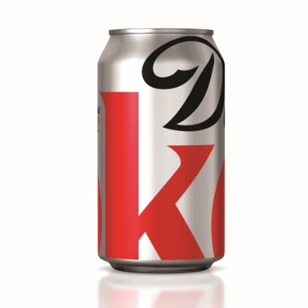
Diet Coke, a popular sparkling beverage, wanted to boost trust in its packaging. The design achieved this by highlighting the "D" and "K" in the logo, creating a unique look at the centre of its visual identity. This fresh design is seen in stores and ads, giving the brand a bold and recognizable presence.
2011 - Ramlösa, NINE

Ramlösa, a natural mineral water, was being offered in upscale restaurants, venues, and nightclubs. To set it apart from the regular PET bottles found in stores, it needed a premium packaging solution. The new premium PET bottle, which isn't typically associated with exclusivity, received praise for its aesthetics and its eco-friendly advantages compared to glass. The bottle's form and shape were inspired by antique crystal glasses, and designing it was a challenge due to the expansion of plastic materials caused by carbonation in the water.
2010 - HOYU3210, ADK

Hoyu, a well-known brand in Japanese professional hair colouring, wanted to enter the competitive hair styling market in top salons. They used a bold approach with the concept of "countdown," where their styling products are the final step that adds excitement to the finishing of a customer's hair.
2009 - Kleenex, Kimberly Clark

Sometimes, the simplest ideas are the most creative. Kleenex wanted a special summer-themed carton, and their designers came up with something unique. They created a "slice of summer" – a triangular box that looks like a piece of delicious watermelon, orange, or lemon. It's a clever combination of structure and graphics that celebrates the season and brings joy to consumers.
2008 - Rosé Sauvage, Viktor and Rolf

To breathe new life into a timeless product, Dutch fashion designers Viktor & Rolf took a unique approach to Piper Heidsieck champagne. They retained the essential classic elements of the champagne market like the bottle, cork, ice bucket, glass, and labels. However, they turned the concept on its head. By reversing these visual elements, they amplified the product's impact and set it apart from competitors, effectively recreating the packaging to make the champagne stand out.
2007 - Swinckels Beer, Design Bridge
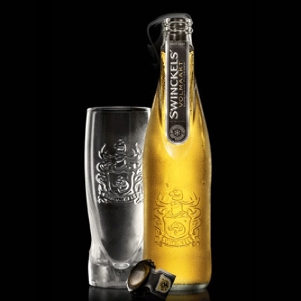
The bottle's design, with its unique flat panel bottleneck, label, and colour scheme, emphasizes the brand's freshness and top quality. The clear glass bottle showcases the pure golden colour at its best. The combination of black, gold, and silver graphics adds to its premium positioning. The embossed brand name, signature, and family crest reflect their commitment to quality.
Join us at the Pentawards Gala to celebrate this year's competition winners!