


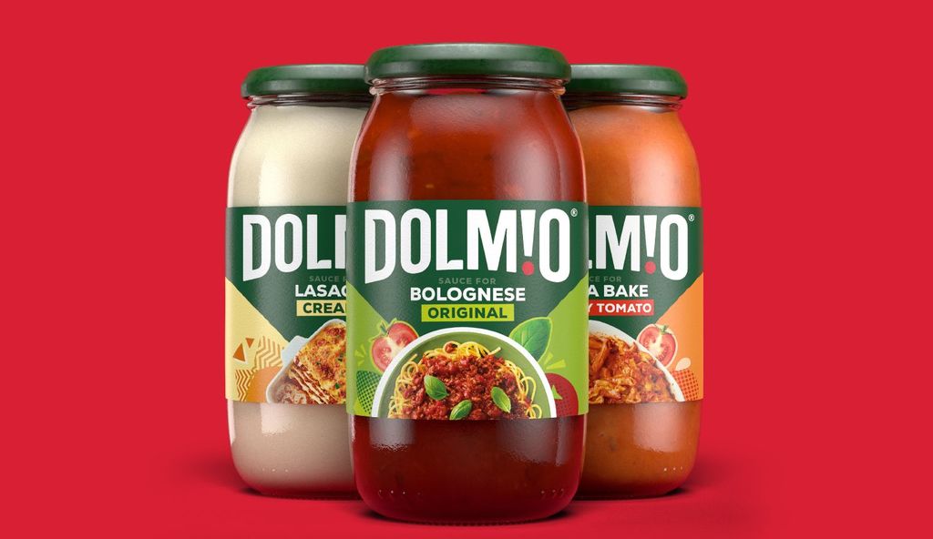
Dolmio by Elmwood
Elmwood crafts an exciting new look for the UK’s well-known brand, Dolmio with the goal to shake up Italian pasta sauce category
Elmwood crafts an exciting new look for the UK’s well-known brand, Dolmio with the goal to shake up Italian pasta sauce category
Launched in the 80s, Dolmio, a brand of pasta sauce gained popularity along with the fondness of Italian food in the UK. Since then, it has remained a popular ingredient in UK homes. Dolmio tasked Elmwood to deliver a rebrand that is fresh, while introducing new products with the goal to shake up the Italian pasta sauce category. With the aim to deliver more despite their success, Dolmio now wanted to capture the attention of a younger audience alongside the traditional family based audience.
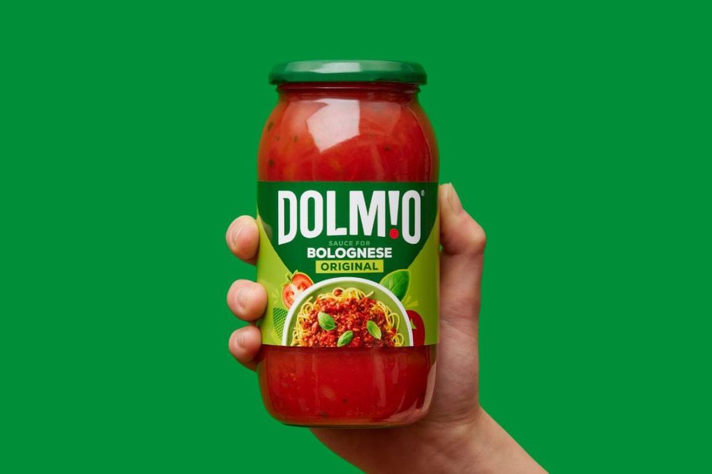
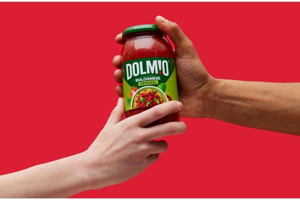
With freedom, fun and a goal to modernize the brand’s visual identity, Elmwood incorporates the wordmarks which transforms into an eye-catching visual that emanates a feeling of cooking warm, homely meals. This is portrayed in the exclamation, indicating boldness fused with generosity and warmth. The exclamation mark’s red dot acts as a lens into Dolmio's world represented through the letter ‘i’ when flipped.
Other letters such as the ‘D’ and the flicking of the ‘L’, captures Dolmio's personality, with a speech bubble effect that appears to be the brand itself talking to the consumer as an attempt to connect with the Gen Z audience.
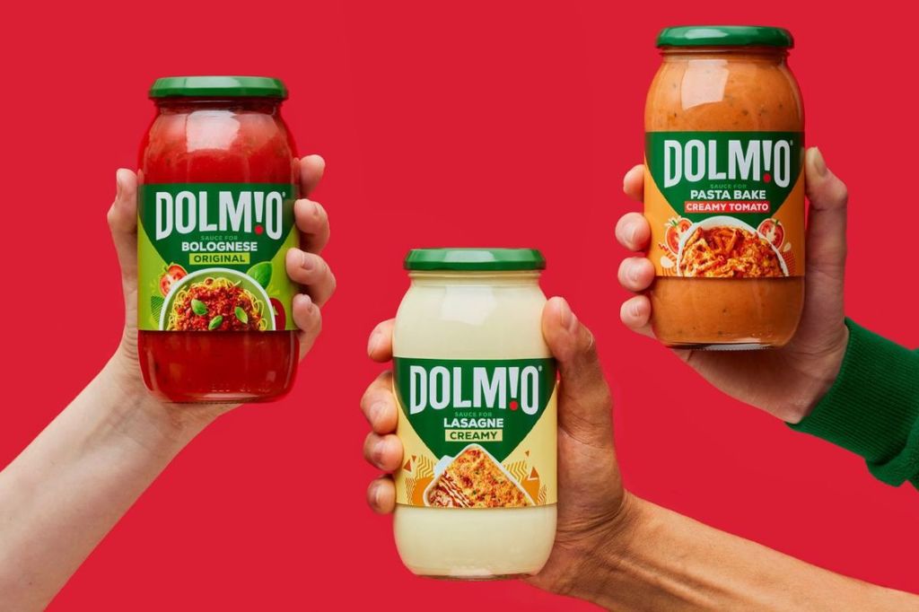
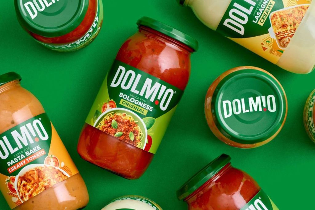
The end result is a dynamic and reinvigorated visual identity that positions Dolmio as the category leader and conveys the brand's focus on delivering great tasting ingredients and celebrating consumers' ability to create tasty meals.
For more information on Elmwood’s design, visit their website or follow them on Instagram.
Do you have a new packaging you would like to share? Get in touch with us
here.