


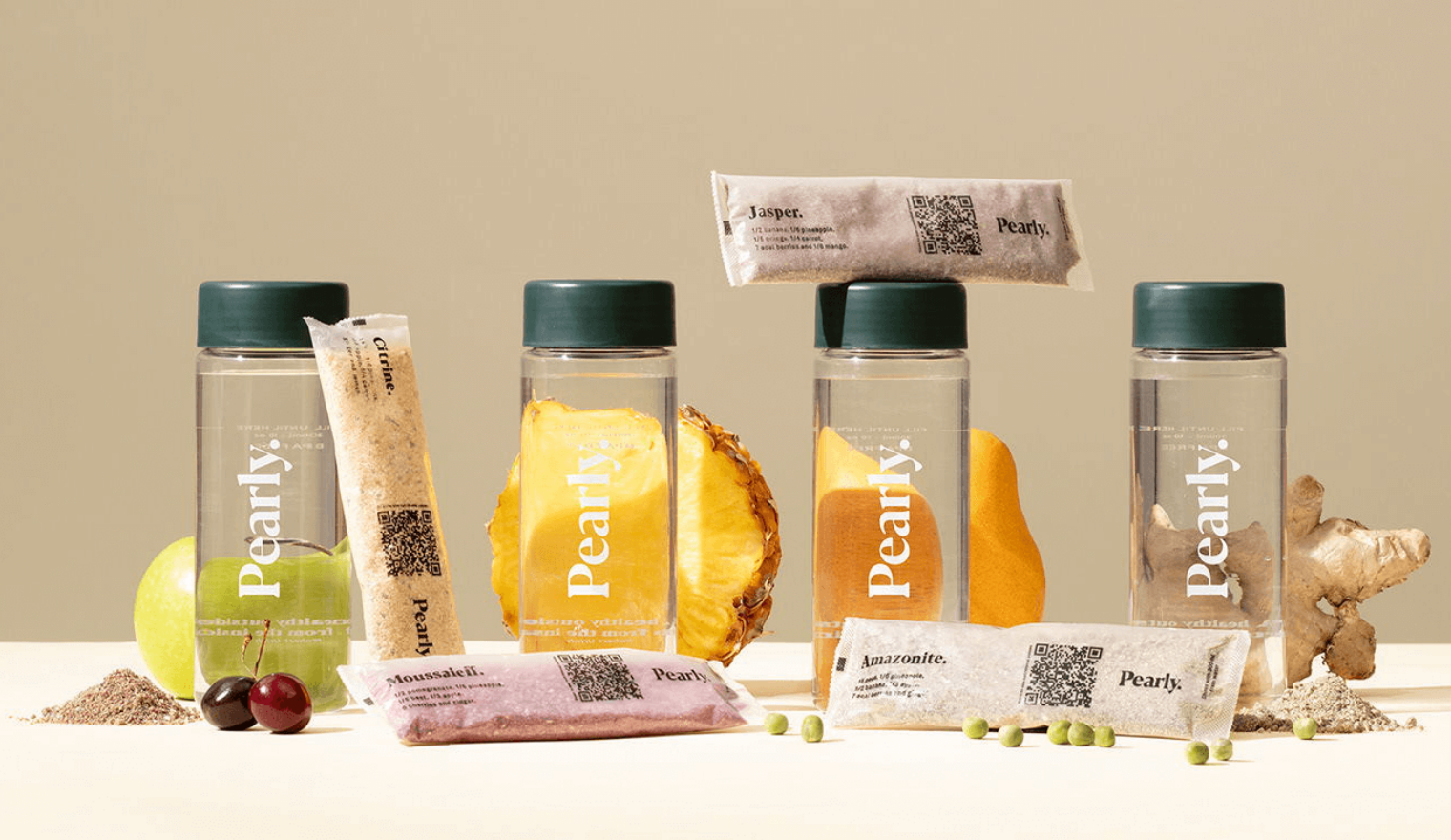
Pearly superfood brand design by The Branding People
The Branding People design studio delivers a progressive and dynamic packaging design for superfood smoothie brand Pearly.
The Branding People design studio delivers a progressive and dynamic packaging design for superfood smoothie brand Pearly.
Pearly
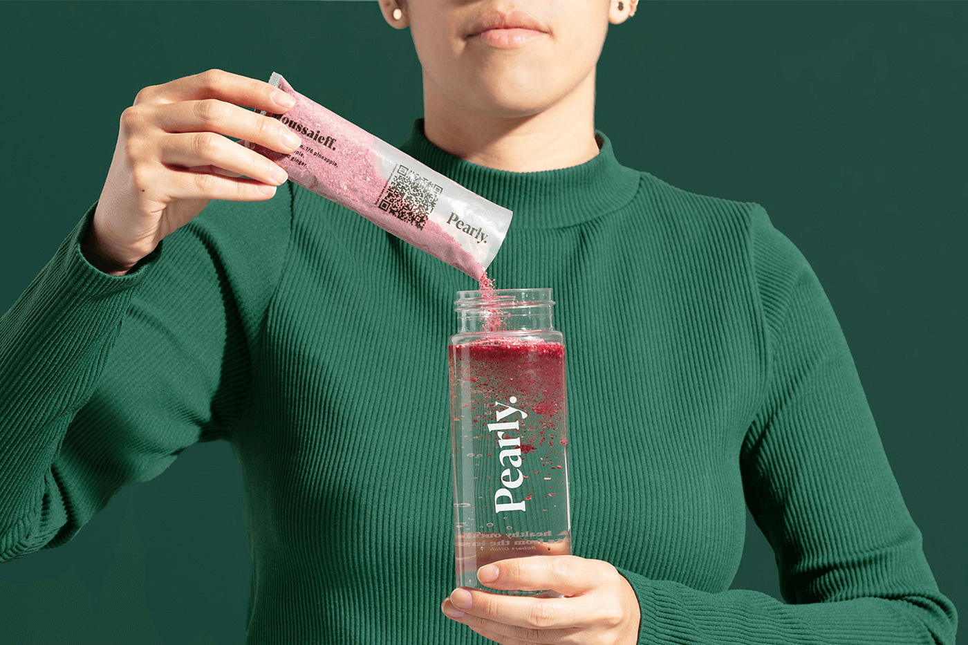
Pearly, a plant-based nutrition brand, implements innovative technology of freeze-drying to deliver instant, high-quality smoothies. With health as the core brand value, Pearly wanted a design that communicated the essence of the product: organic and transparent.
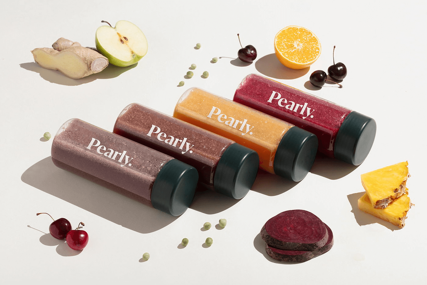
The visual identity conveys these values by using a soft and natural colour palette, showcased through translucent packaging.
The Branding People
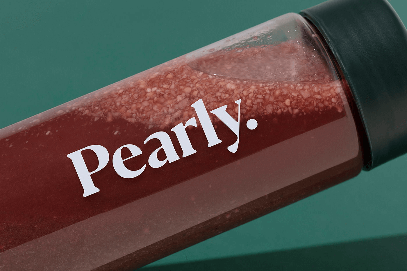
The Branding People, a design studio based in Mexico City, delivered a visual identity for Pearly with modern, minimalistic design elements centered around the authenticity of the product. The transparent outer packaging displays graphic elements of the logotype that are inspired by a pearl’s quality.
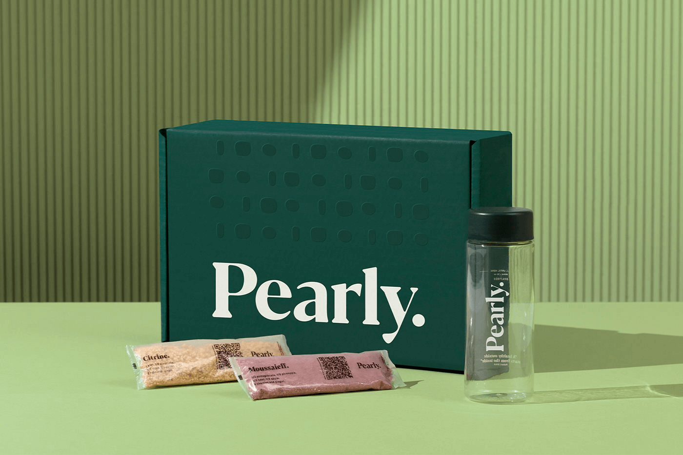
Inspired by fruit and vegetable hues, the colour scheme displays an earthy palette complemented with a green tone that sparks freshness and balance. The secondary packaging is designed with translucent packaging that holds the naturally toned product and makes it shine through.
For more information on The Branding People’s design, visit their website or follow them on Instagram.