


SunRype - Shine On's packaging design by Crew Marketing
Crew Marketing delivers a lively design inspired by the sun and all the goodness it brings into our lives
Crew Marketing delivers a lively design inspired by the sun and all the goodness it brings into our lives
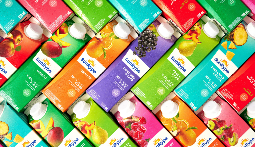
Over the years, SunRype has grown from delivering apple juice to their communities in Kelowna to a national brand across Canada. Their promise has always been to use real fruit and simple ingredients for a perfect balance of great taste and healthy goodness. But their brand and packaging felt stale and complicated. It was hard to distinguish between flavors and lines, and lacked the element of refreshing taste.
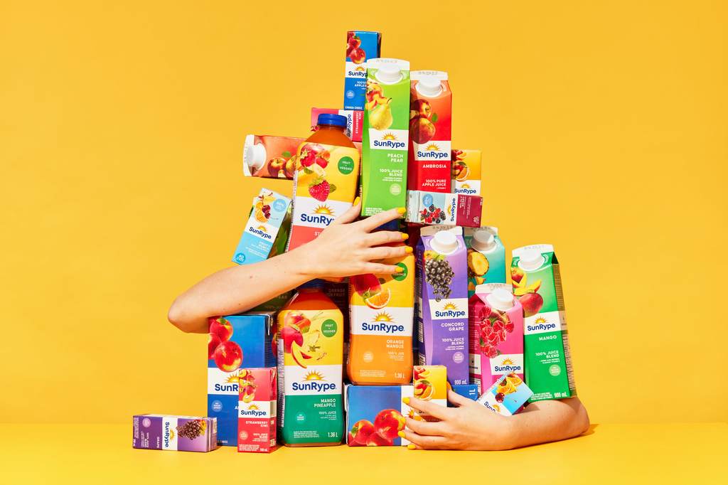
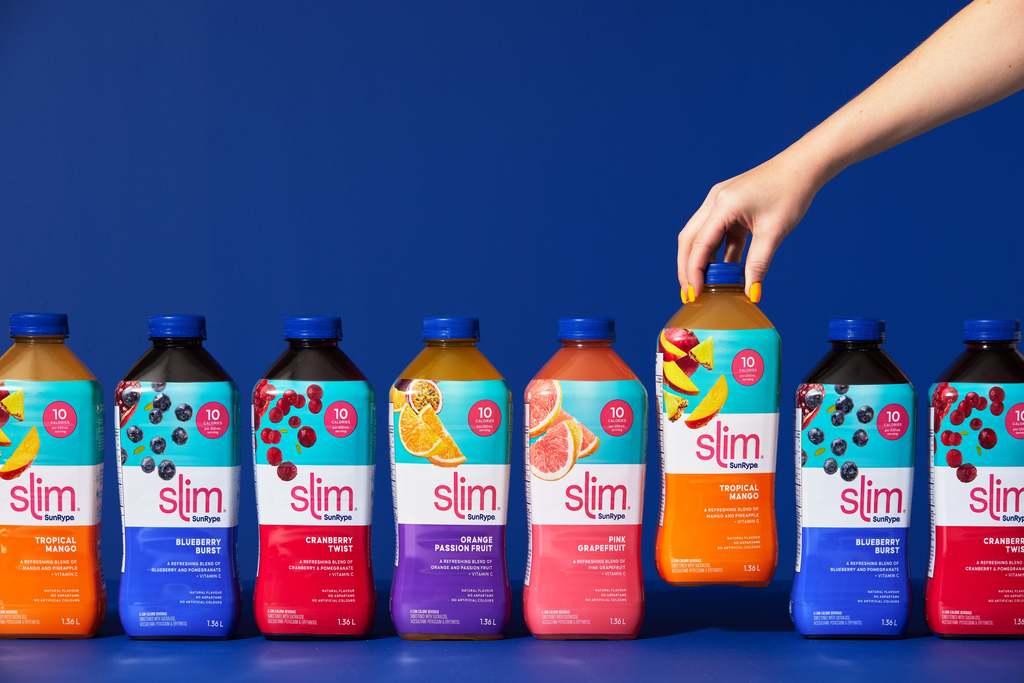
To start, Crew Marketing breathed new life into their brand with the brand platform “Shine On”. This platform was inspired by the sun and all the goodness it brings into our lives. Crew Marketing used vibrant gradients to represent this idea on packaging. From bright teals and greens to oranges and pinks, the product portfolio was filled with new color. With over 28 flavors and four sub-brands, the designers came up with an intuitive color system and messaging hierarchy for ease of navigation through simple layout for messaging and colors to identify sub-lines, while still making them all feel consistent. And overtop the floods of color, fruit falling from the top was photographed left corner on each pack to showcase real fruit in a new and fresh way.
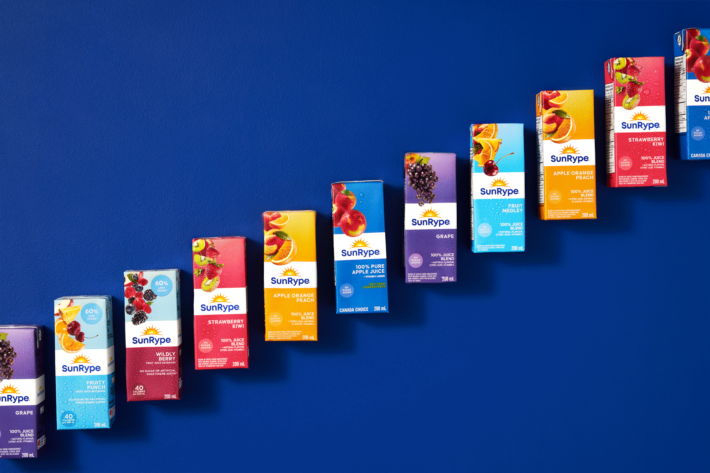
And finally, the logo. Every Canadian knows the SunRype sun and Crew Marketing wanted it to stay that way. So instead, they changed the wordmark of the logo to a friendly, more approachable sans serif, giving the logo a sense of warmth and bringing the mark to a more modern space.
For more information on Crew Marketing's design, visit their website or follow them on Instagram.
Want to receive more monthly packaging inspiration? Sign up for our newsletter !