


Back Monthly Discoveries, April 2020
As the most prestigious packaging design award in the world, Pentawards not only recognise the best packaging design via the competition but also promote the importance of packaging design through live events and social media. We are committed to being the bridge between excellent design organisation and brands that are always looking for the best packaging design solutions.
Take a look at the below for some latest inspiration, some of the most popular designs we shared this month across our social media channels.
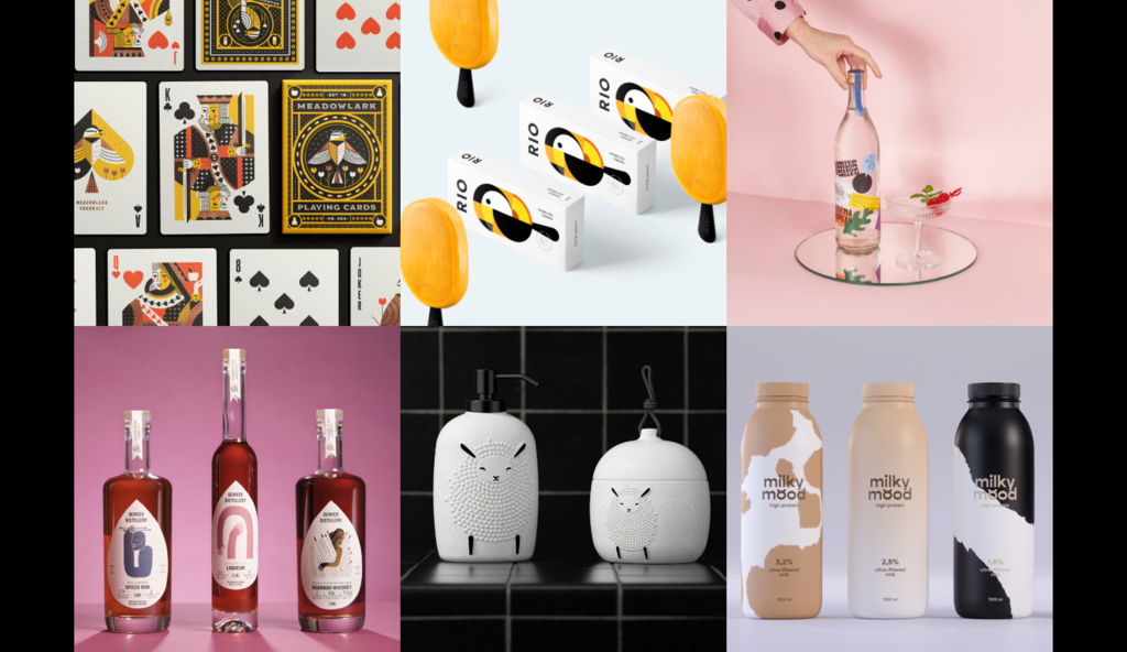
Meadowlark Playing Card Deck concept by Russ Gray


A self-promotion concept designed by Russ Gray for Meadowlark Pharmacy. Based on the Bicycle standard court cards, the deck design is minimal by nature, with sophisticated illustrations and icons indicating the element of the pharmacy business. The tuck boxes will be embossed and utilize a small amount of copper foil and the cards will be printed with metallic copper ink.
RIO ice cream by Berik Yergaliyev


Feel the summer Concept of ice cream was inspired by one of the most colourful cities in the world – Rio de Janeiro. RIO ice cream reflects the main associations of this city – bright, yummy and sunny. Beautiful toucan bird which also reminds us of city Rio was chosen as the main mascot any symbol. The main idea for the packaging is to convey the bright taste and its natural ingredients, simple graphics says it all. Ice cream’s main flavours are mango, watermelon, berries, melon and coconut. It is supposed that ice cream will be made based on coconut milk. It has no gluten, soy, eggs and refined sugar. This ice cream is perfect for people who take care of their health and enjoy the taste of tropical fruits.
G Gin by G Design Studio


Nothing enhances the every day like a stiff drink. Like the tingling feeling brought on by a perfectly dry martini, there’s something intoxicating about shaking off your inhibitions and liberating your imagination. The designers believe good design is a tonic best enjoyed with a tall glass of gin and a twist of citrus. As the saying goes: “Candy is dandy, but liquor is quicker.” The limited-edition ‘g’ gin is a Mediterranean blend of spontaneity, zest, lightness, and joie de vivre, but also juniper, lavender, mastic tears, mandarin, orange, lemon, chamomile and angelica.
Milky Mood by Lilit Vartanyan


Thanks to the advertising cliche, we get used to think that all the cows are black and white. But there are a lot of cow breeds. They have different colours – and fat content in the milk they produce is also different. Each type has its special taste and health benefits. The designer created Milky Mood, the first milk package that reflects the variety of cows and fat percentage of their milk. The colour-coding helps to navigate in product portfolio and levels up the product perception.
LIL’LAMB Innocence by Kate Zakharova


This is the LIL’LAMB brand reflecting the idea of a newborn INNOCENCE. More is Less is the main inspiration for this packaging. The use of cardboard, durable ceramic accessories and reusable dispensers helps #saveplastic, money and the planet.
Spirits of the Queen City by O Street Studio


Nestled in the historic Baker neighbourhood, Denver distillery is the city’s first distillery-pub in town. They had gathered a loyal following but was lacking a strong label system for their extensive range of spirits. It was in this spirit that we created the concept behind their packaging. Ron and his team are deeply interested in the stories and art that define the human condition and experience. We drew a multitude of illustrations based in lore and legends.
Interested in a feature?
If you think your work deserves to be featured on our social channels, feel free to send us your design via info@pentawards.org. We look forward to hearing from you all!