


6 Student Packaging Designs we'd love to see on the shelf
From bold new concepts to clever details, these six student packaging designs have us wishing they were on the shelf.
From bold new concepts to clever details, these six student packaging designs have us wishing they were on the shelf
There’s something exciting about student work: fresh ideas, bold choices, and no rules holding anyone back!
We’ve come across some standout conceptual packaging designs from students, and honestly, they deserve a spot in the real world. See them below!
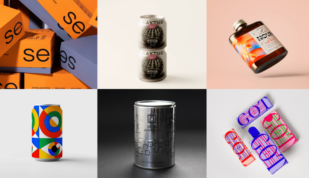
Setz by Gautami Upadhyay (Maryland Institute College Of Art)
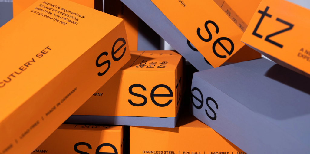
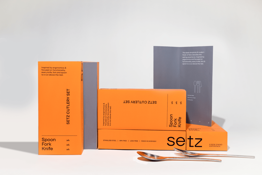
Setz is a premium cutlery brand with a focus on form and functionality. Inspired by the Bauhaus structure and bold clarity, the packaging houses a pop orange to stand out on the shelf with the product information on the front of the pack to highlight the simple and direct functionality of the product itself.
Find out more about Gautami Upadhyay here .
Nova by Hobert Nguyen (Vancouver Community College)
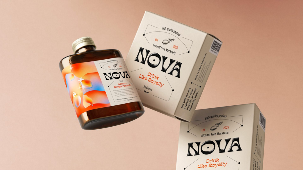
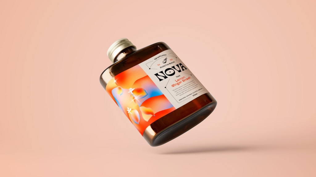
Nova is a bold and modern mocktail brand that transforms the non-alcoholic beverage experience into something exciting and sophisticated.
The challenge was combining two contrasting vibes—fun and elegant—into one cohesive design. These two are inherently different, with fun often leaning toward bright colours and playful elements, while elegance tends to favour minimalism and subtlety.
A vibrant gradient illustration injects a sense of playfulness and energy whilst maintaining a refined look. The minimalist typography layout, with exciting lines and sketches, provides just the right amount of dynamic flair without overwhelming the design. This kept the overall feel fun yet luxurious. The shape of the bottle also played a crucial role in enhancing the elegance, elevating the entire visual identity and creating a balance between both vibes.
Find out more about Hobert Nguyen here .
Google Fashion Accessories – Cans and Bags by Milosz Poprawski
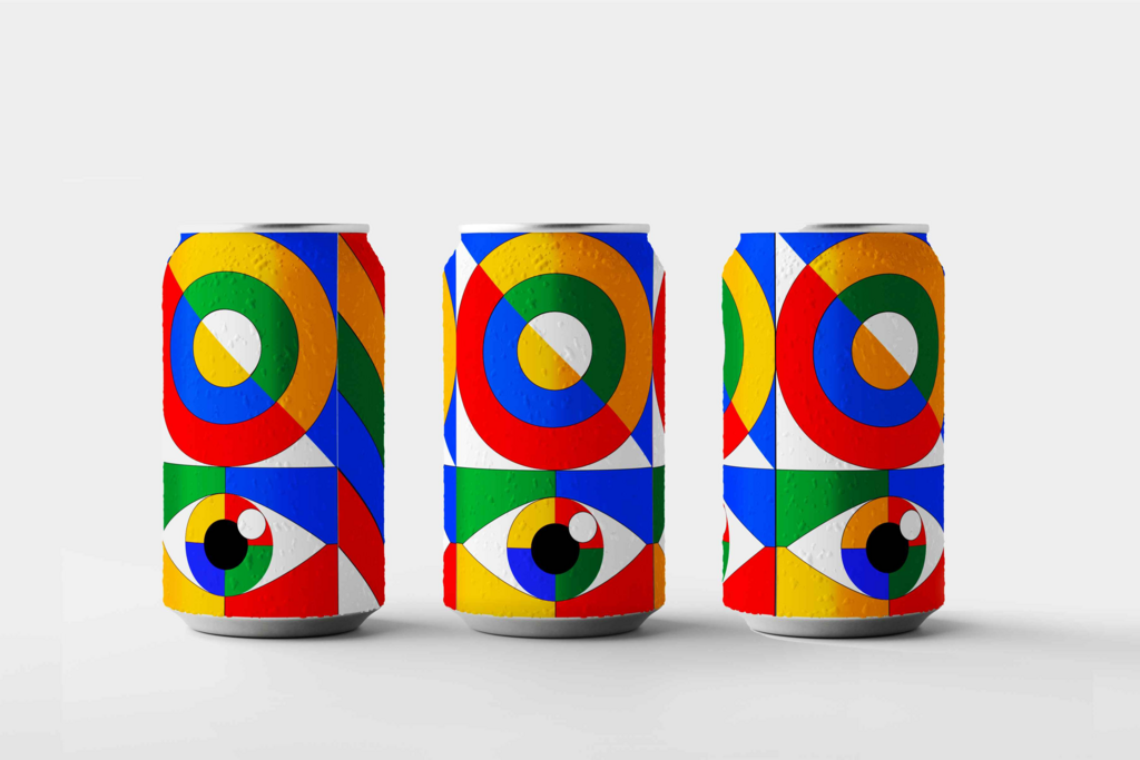
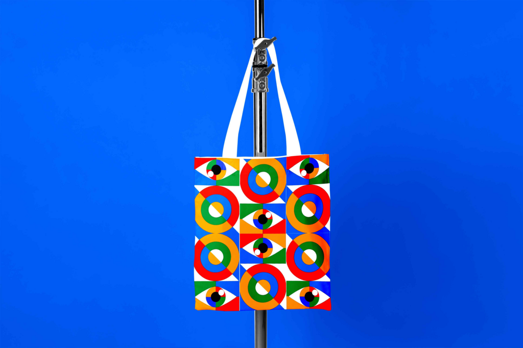
The collection features Google's signature colours, characterised by sleek, geometric lines that evoke a sense of modernity and sophistication. The bags are crafted from high-quality, eco-friendly materials like recycled polyester and organic cotton, ensuring that they are not only stylish but also environmentally responsible. The cans serve a dual purpose, acting as both functional containers for drinks and as decorative storage solutions for home or office use. They are designed with a glossy, durable finish that showcases the vibrant colour scheme and geometric shapes that mimic the playful nature of the Google brand.
This project not only emphasises the bold and innovative spirit of the brand but also promotes a lifestyle that embraces creativity and sustainability.
Find out more about Milosz Poprawski here .
KAKTUS by Marco Arroyo-Vázquez (DEUSTO Formacion)
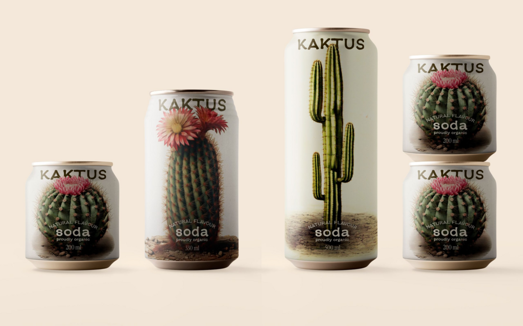
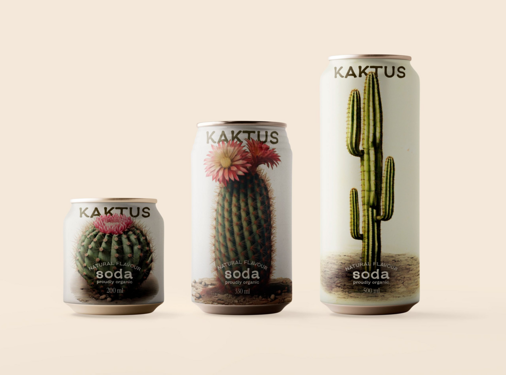
Kaktus is an organic soda that celebrates body diversity through playful, thoughtful packaging. Each can features a different cactus, highlighting the natural variety in shape, size, and form — just like human bodies. The design reminds us that every body is unique and beautiful in its own way. The blooming cacti symbolize resilience and inner beauty. Like these desert plants, we thrive in tough conditions, and when we embrace who we are, we flourish.
Kaktus is more than a drink, it’s a refreshing nod to self-love and acceptance.
Find out more about Marco Arroyo-Vázquez here .
Got Chew by Huguiko
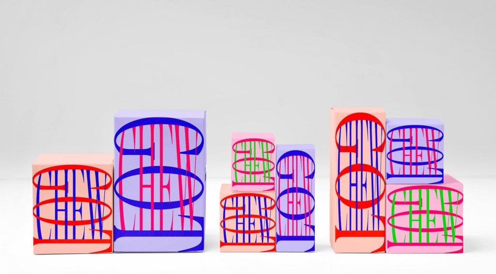
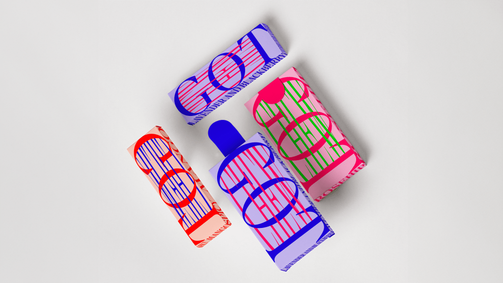
Inspired by the chewing action and elasticity of gum, this bold and playful packaging design captures the brand’s fresh, dynamic, and fun essence.
The use of vibrant, contrasting colours and stretch-like typography evokes the sensation of gum being pulled and snapped. Vertical lines mimic motion and flexibility, while the oversized lettering reinforces the product's energetic personality.
Find out more about Huguiko here .
Bon Appétit by Nóra Boronyák (Budapest Metropolitan University)
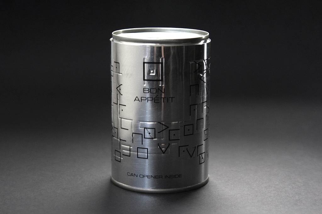
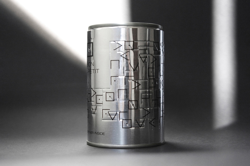
The packaging project uses a tin can to symbolise the vicious cycle of war and famine, where access to food is obstructed. Instead of containing food, the can holds a can opener, referencing the historical irony that while tin cans were developed during the Napoleonic Wars to solve food supply issues, the can opener came decades later.
Visually, the design features a custom typeface inspired by the Napoleon cipher, forming a typographic maze around the can. This maze, which reveals the message “Any person marches on his stomach”, emphasises the role of logic and humanity in solving crises. The packaging becomes a tool of empathy and reflection, prompting viewers to consider not just the existence of solutions, but our responsibility to use them.
Find out more about Nóra Boronyák here .