


Vladyslav Koval's conceptual packaging design for Weilà!
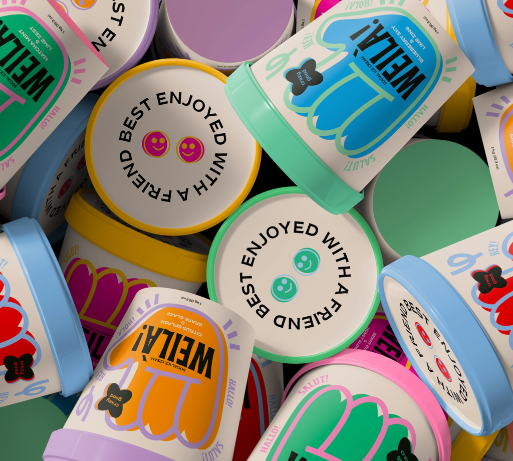
The designer crafts a bold, playful aesthetic for ice cream brand Weilà!
The designer crafts a bold, playful aesthetic for ice cream brand Weilà!
Weilà! (aka "Hey!") is an informal Italian greeting or exclamation, commonly used in Northern Italy, especially in regions like Lombardy and Veneto.
Inspired by this lively expression, this ice cream brand encourages people to savour life’s little moments and bond over scoops of delicious ice cream. The brand’s mission is to bring people together, fostering fun and quality time with loved ones.
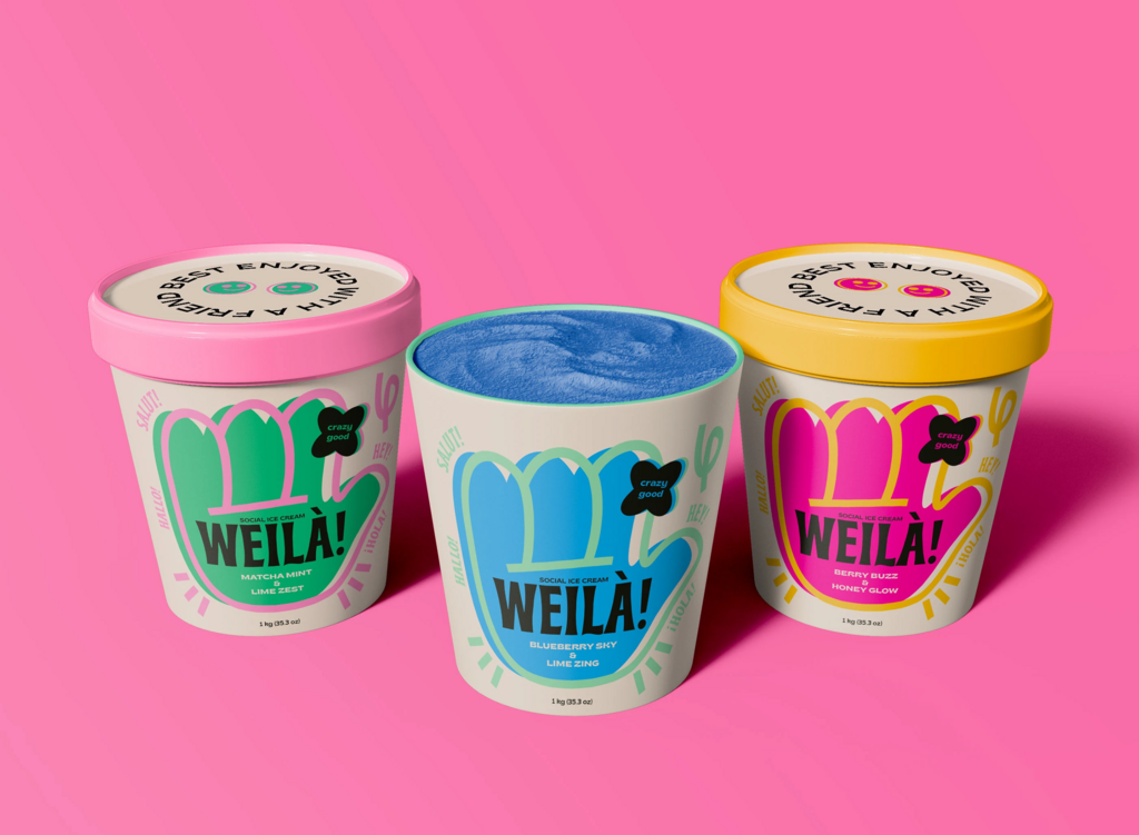
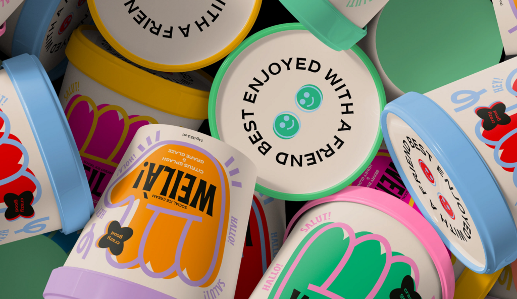
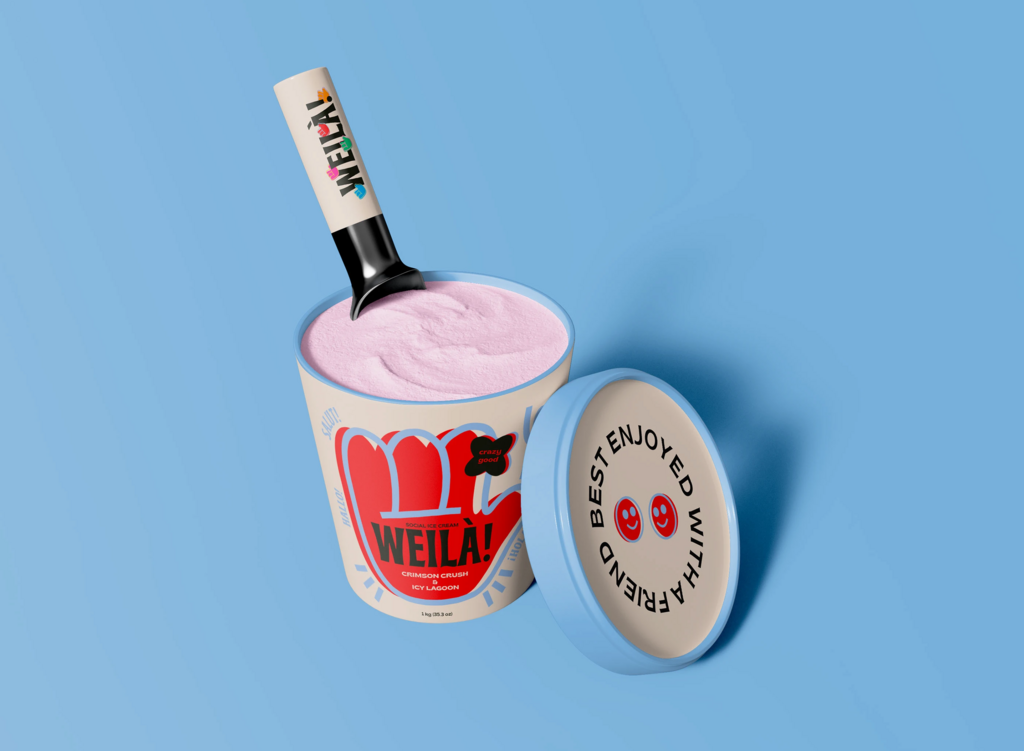
The packaging features a bold, playful aesthetic with vibrant colours and a hand-shaped graphic that gives it a fun, social vibe. Each flavour is distinguished by a unique colour palette—green for Matcha Mint Lime Zest, blue for Blueberry Sky Lime Zing, and pink for Berry Buzz Honey Glow.
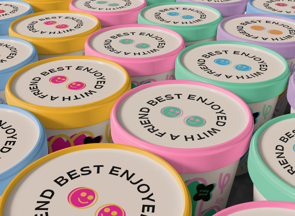
The cheerful typography and expressive words like “SLURP!” and “HECK YEAH!” add to the energetic, youth-oriented appeal. With a tagline on the lid reading "Best enjoyed with a friend," the design emphasises connection, enjoyment, and a “crazy good” experience.
For more information on the design, visit Vladyslav Koval's website or follow them on Instagram .