


Monthly Discoveries, May 2025
Need a bit of inspiration? Look no further. We're always looking to recognise the best packaging design from agencies worldwide, so we have pulled together this month's most liked from our social channels to keep you inspired
Pentawards, the world's most prestigious packaging design award, not only recognises the best packaging design through competition but also promotes the importance of packaging design through live events and social media. We are committed to being the bridge between excellent design organisations and brands that are always looking for the best packaging design solutions
Take a look below at some of the most popular designs we shared this month across our social media channels.
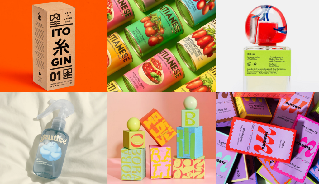
ITO Gin by Analogue
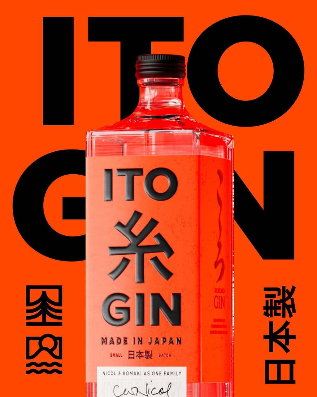
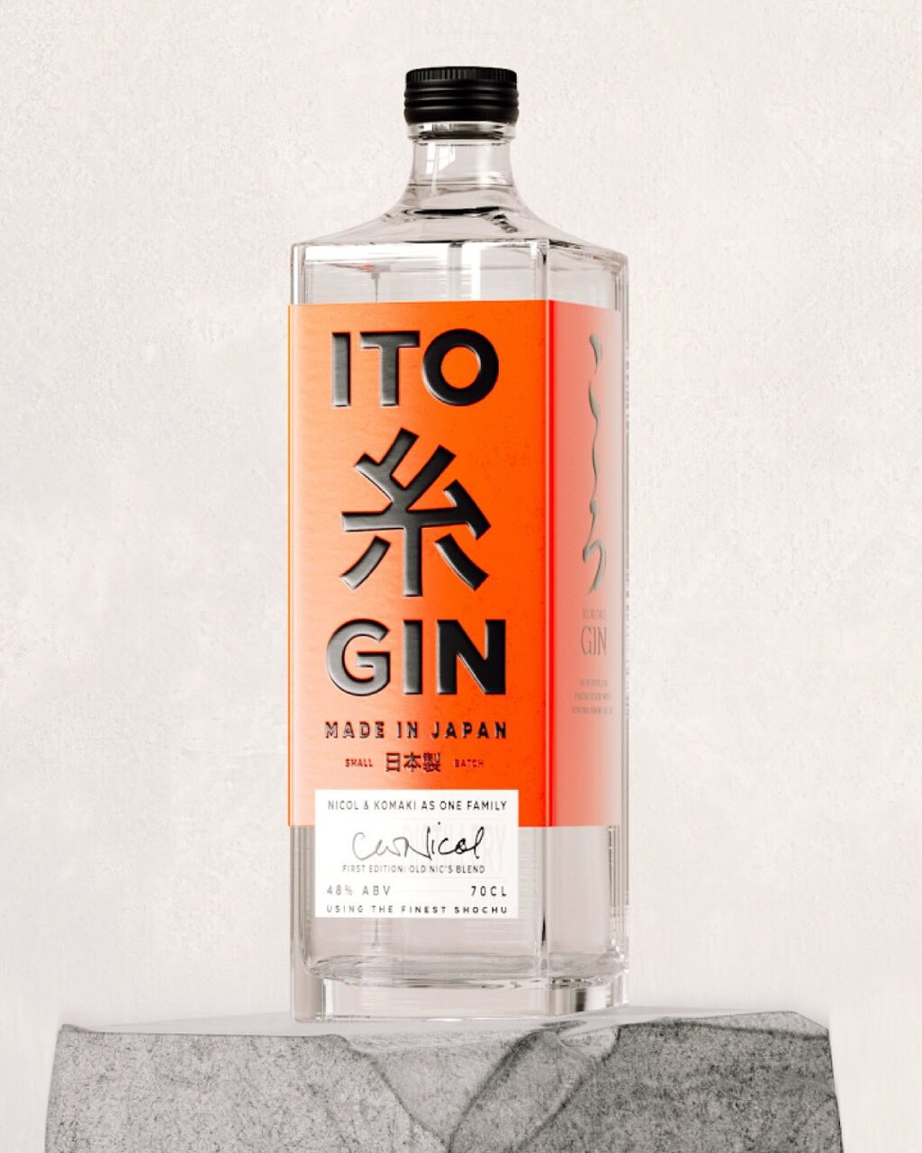
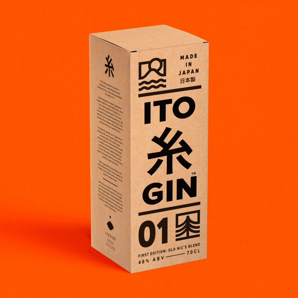
Analogue's packaging design for ITO Gin.
Inspired by Tokyo’s bold visual culture, the design pairs fluorescent orange with rich black for maximum impact. Gloss UV details add striking tactility, while confident, minimalist typography bridges kanji and Roman scripts for cross-language clarity.
Find out more about Analogue here .
Delulu by Oddity Studio
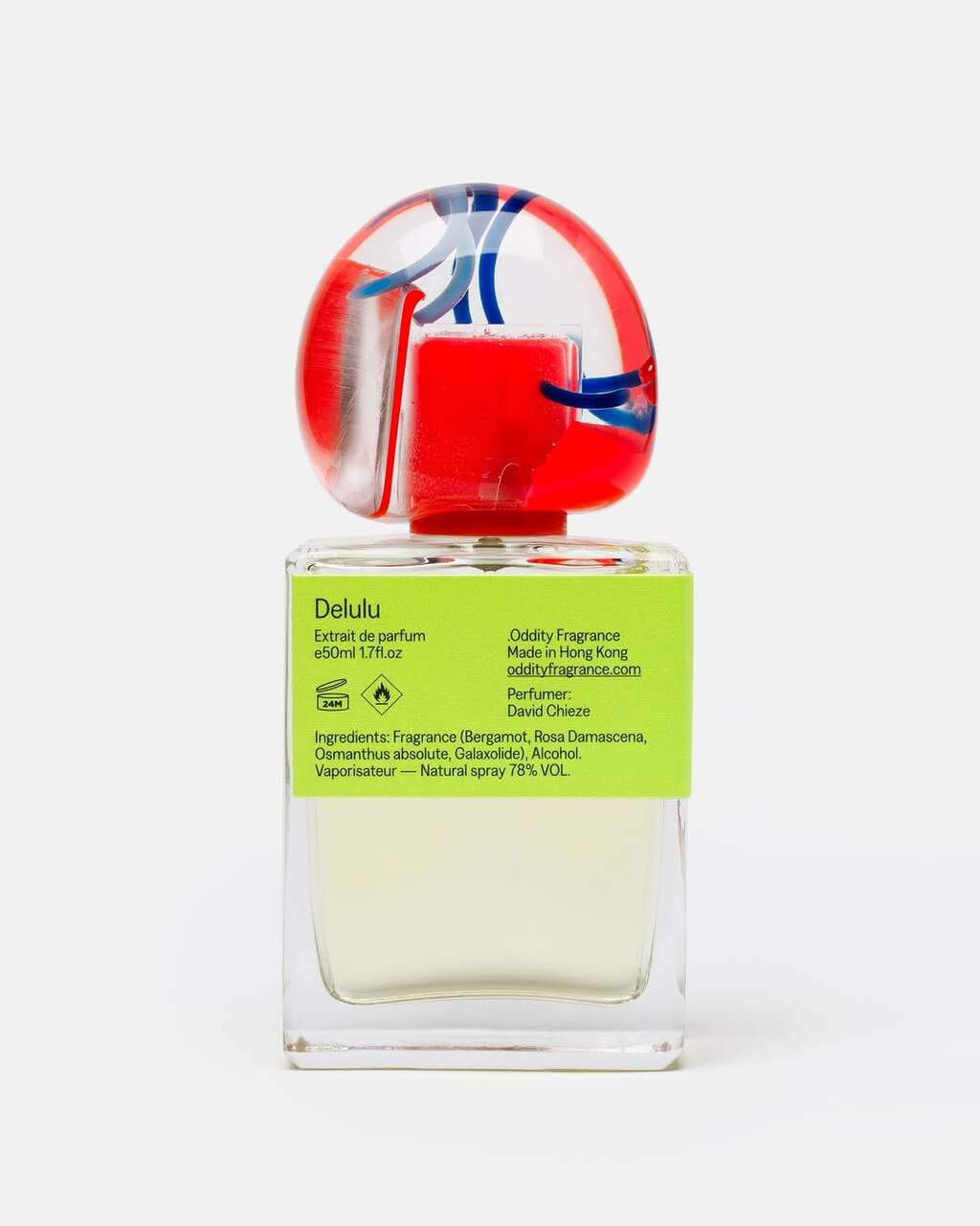
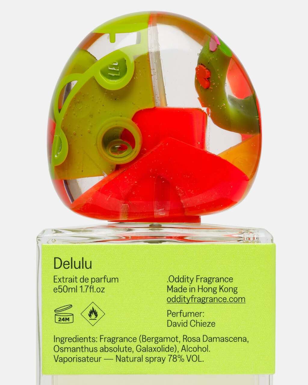
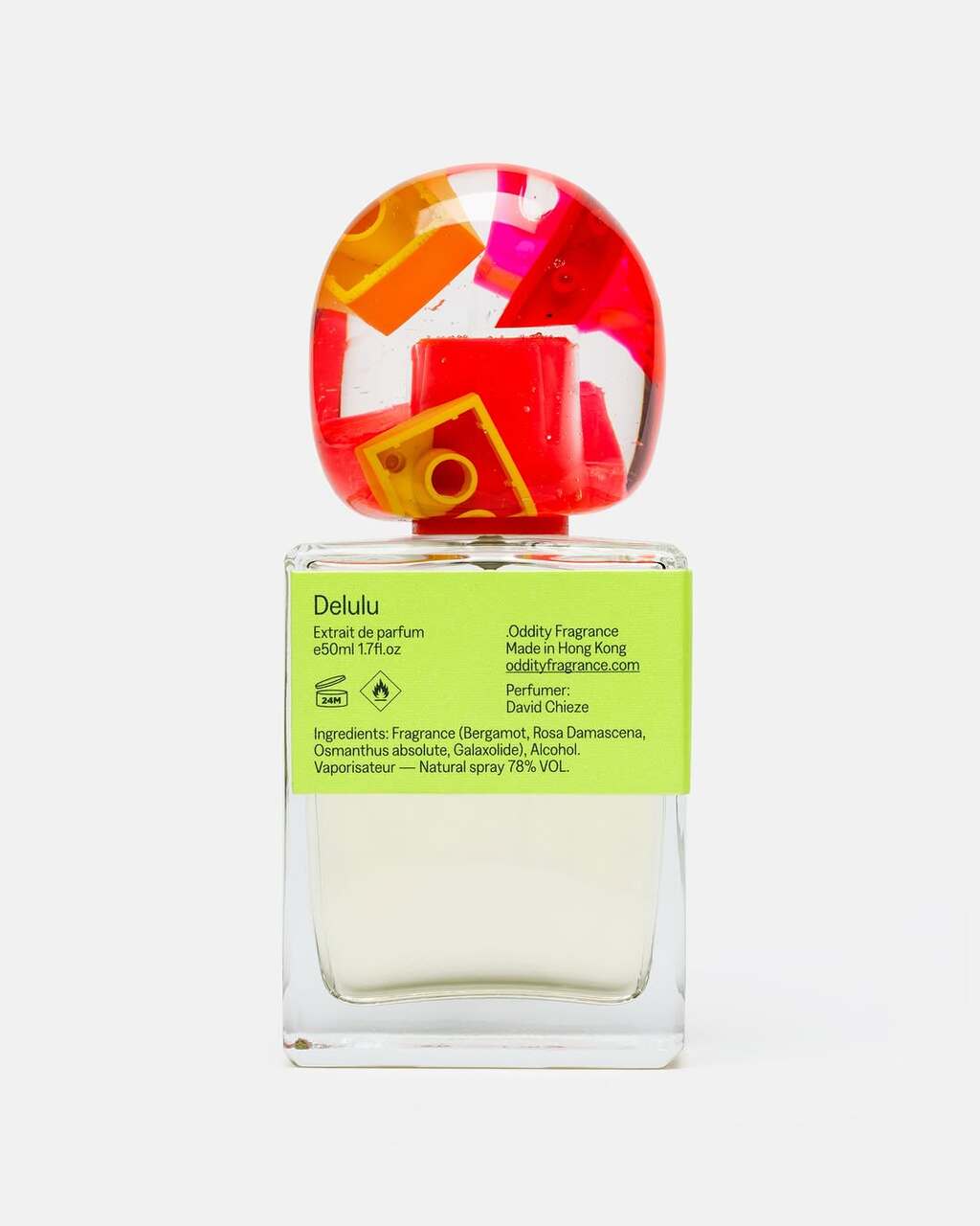
Oddity Studio's packaging design for Delulu.
The design captures the spirit of escapism and the desire to turn back time. Created for grown-ups who refuse to grow up, the packaging features caps crafted from reclaimed toys — plastic treasures collected along Hong Kong’s shores, in abandoned buildings, and second-hand stores.
Find out more about Oddity Studio here .
Studio West by Studio Payne
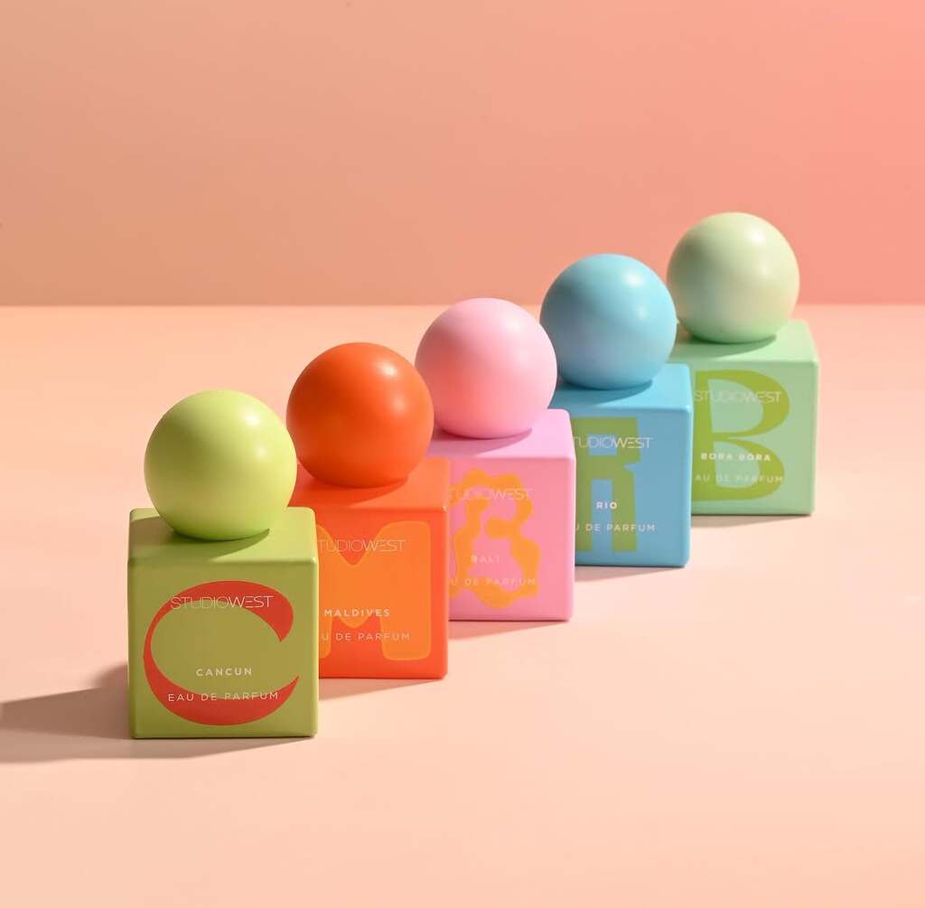
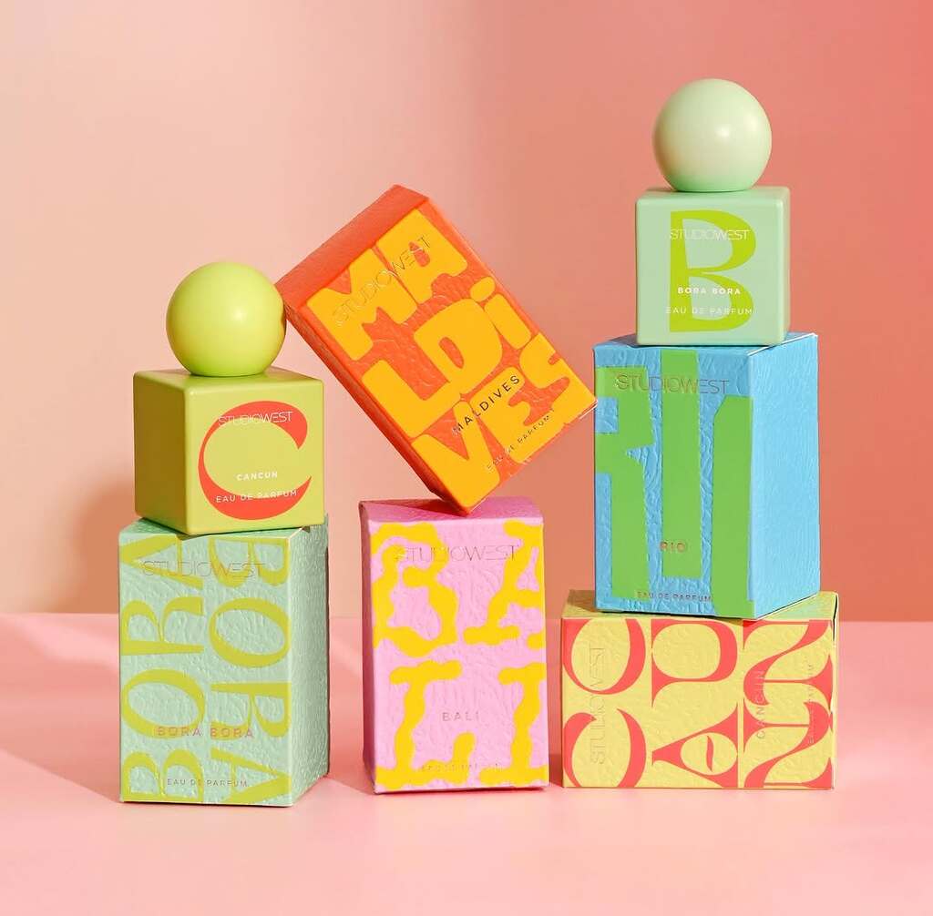
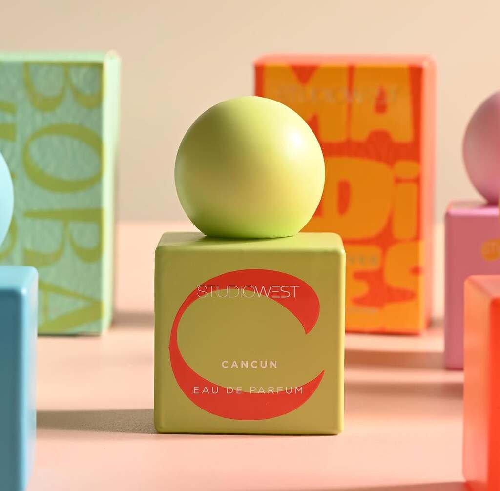
Studio Payne's packaging design for Studio West.
The packaging captures the spirit of a tropical holiday. From its form and typography to the vibrant colours, every element of the design emphasises collectability and playfulness.
Find out more about Studio Payne here .
Attianese Conserve by nju:comunicazione
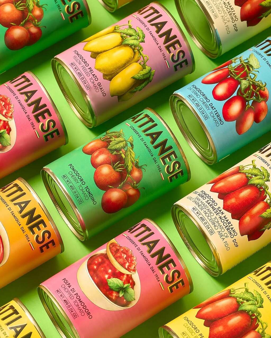
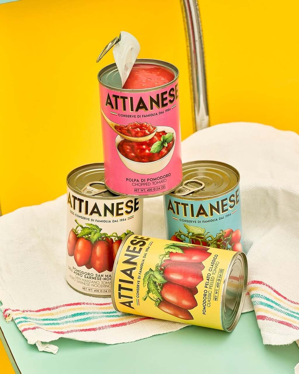
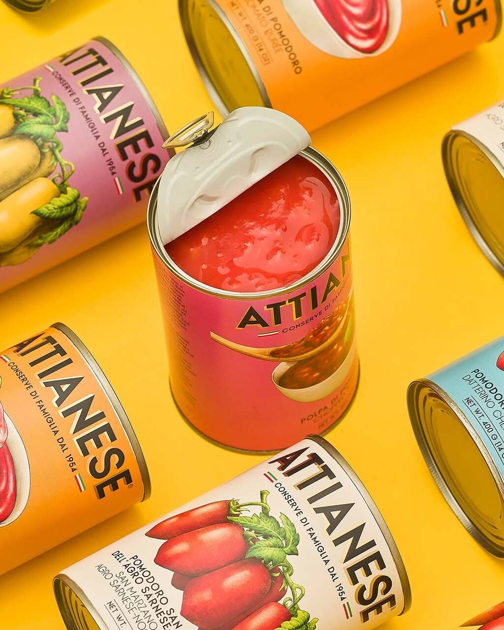
nju:comunicazione's packaging design for Attianese Conserve.
The packaging is inspired by vintage Campanian canning labels that once brought regional tomatoes to the world. Hand-drawn illustrations, vivid colours, and a clean layout revive the charm of 1950s design, creating a look that feels both nostalgic and contemporary.
Find out more about nju:comunicazione
here
.
Moments by
Date Of Birth
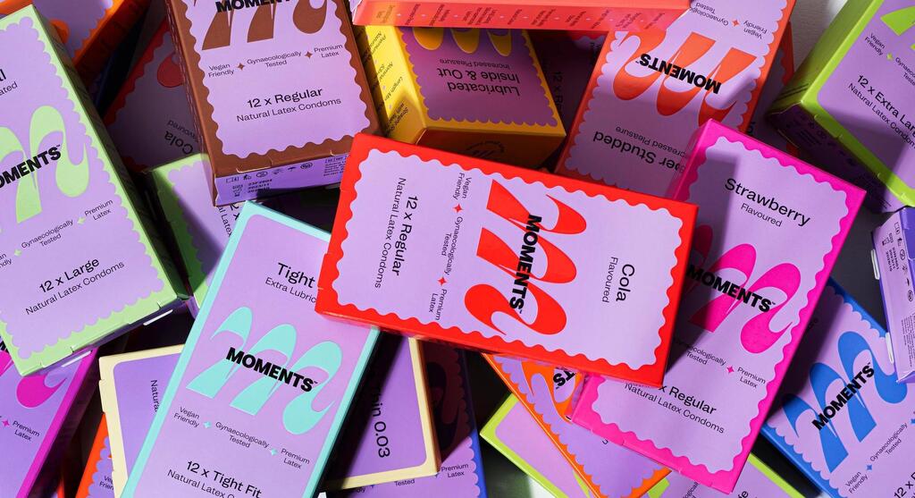
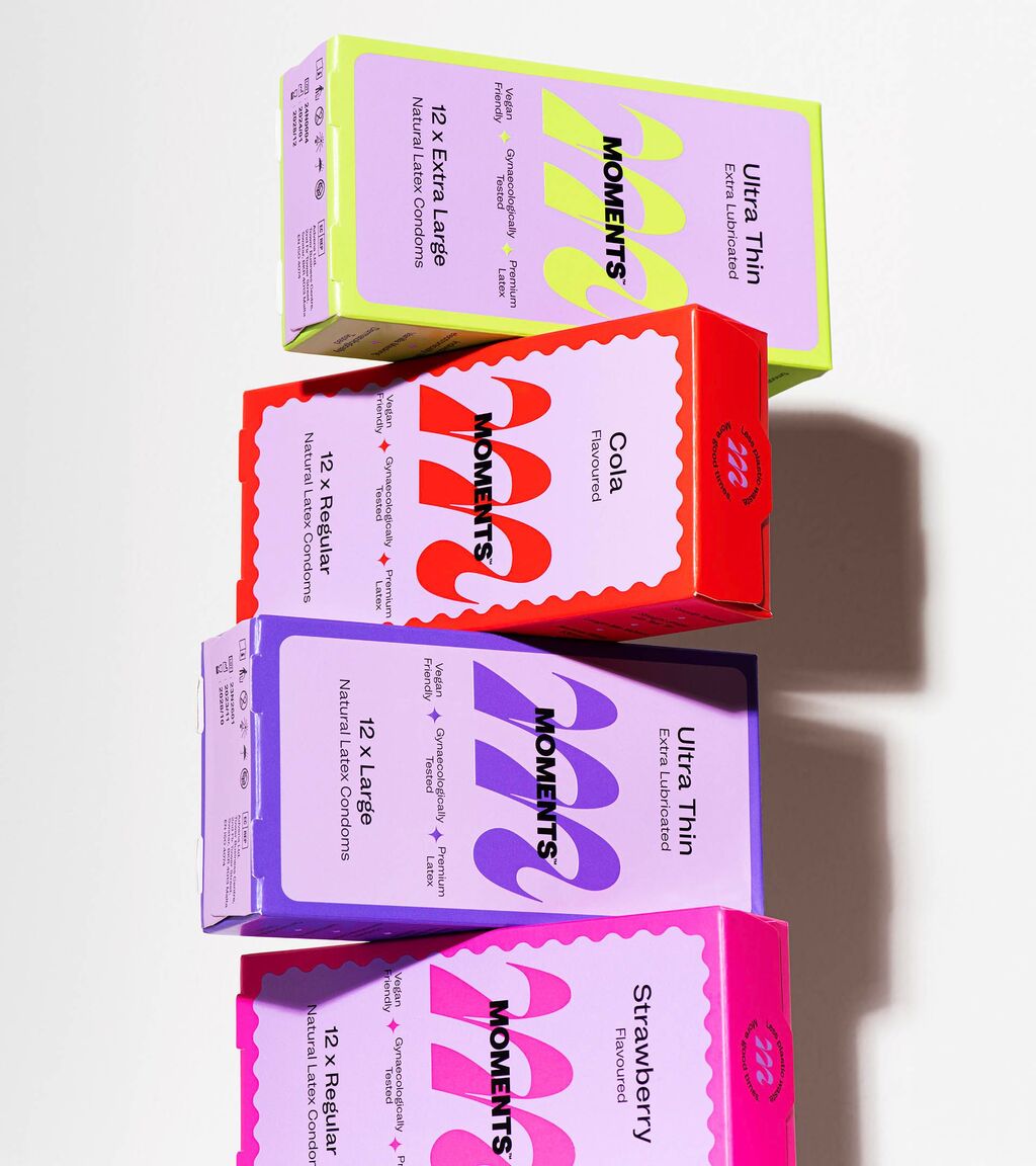
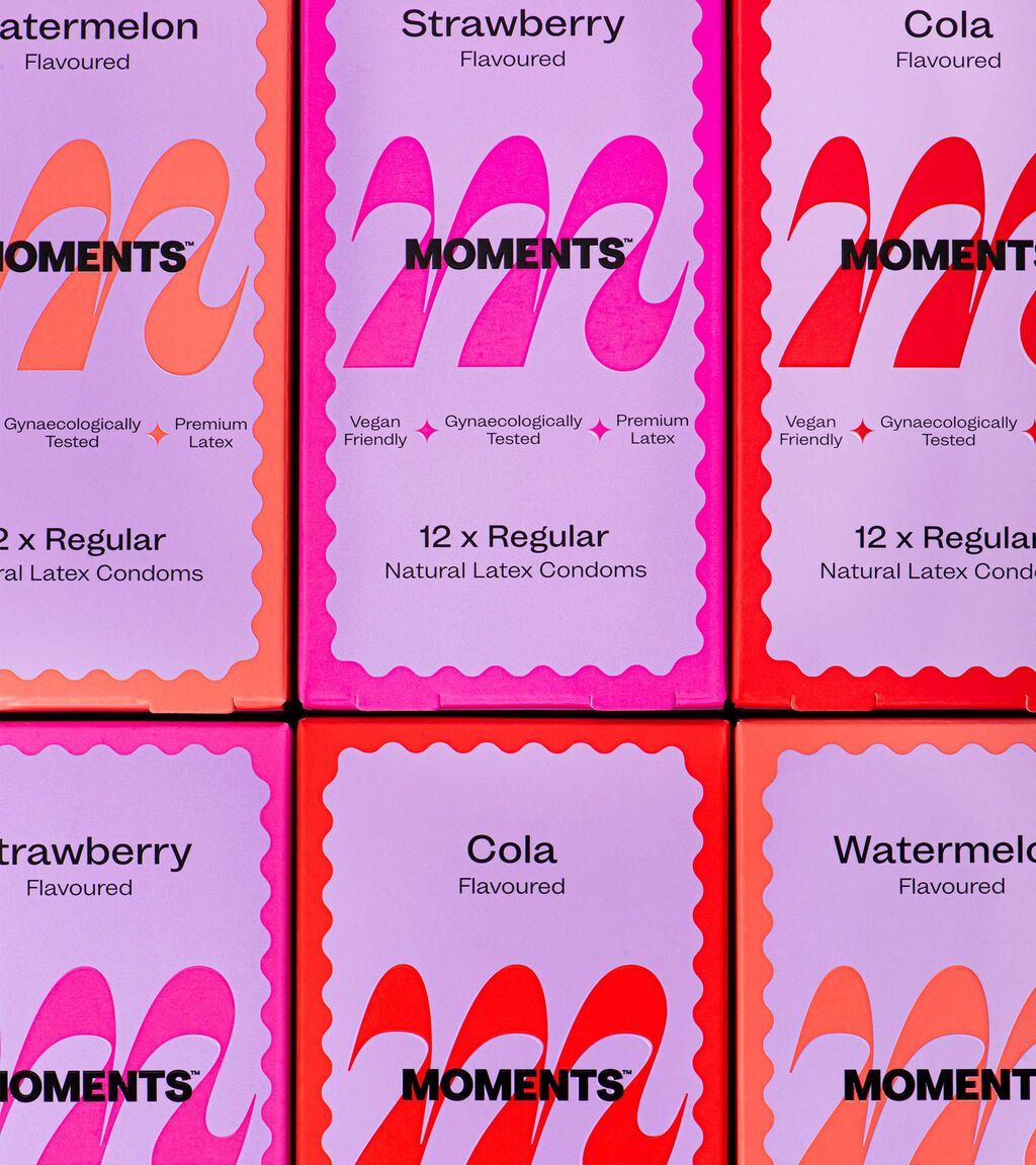
Date Of Birth's packaging design for Moments.
Inspired by the original branding, the identity was refined through distinctive elements, including a flowing 'M' monogram used as both a standalone mark and a dynamic background motif. A bold purple primary colour differentiates the brand within the category and challenges conventional gendered design cues, while blind embossing on the side of each pack reflects product variety and texture through a tactile experience.
Find out more about Date Of Birth here .
Gentlee by WeWantMore
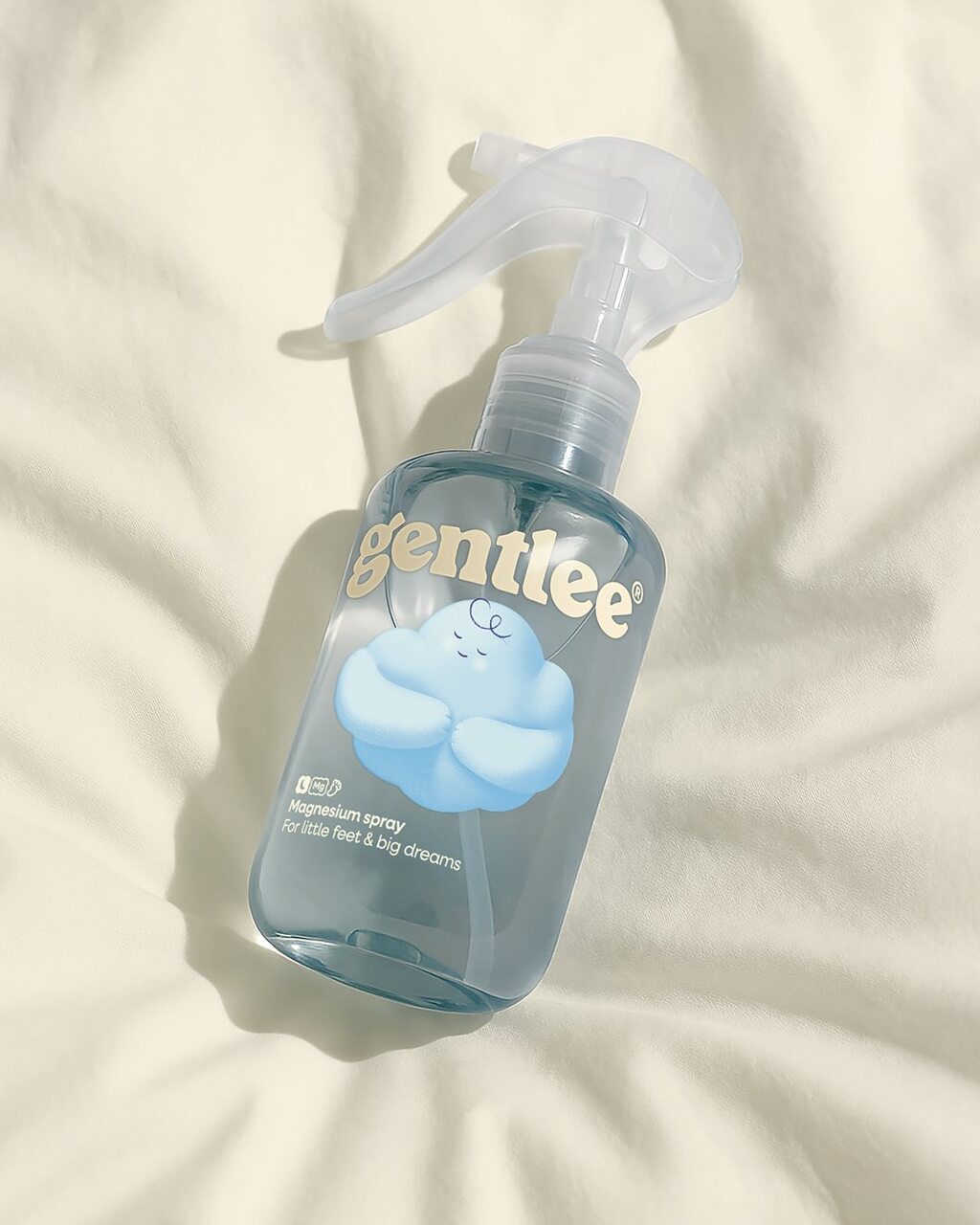
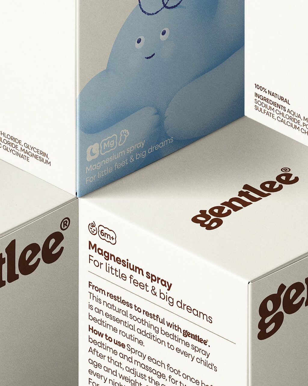
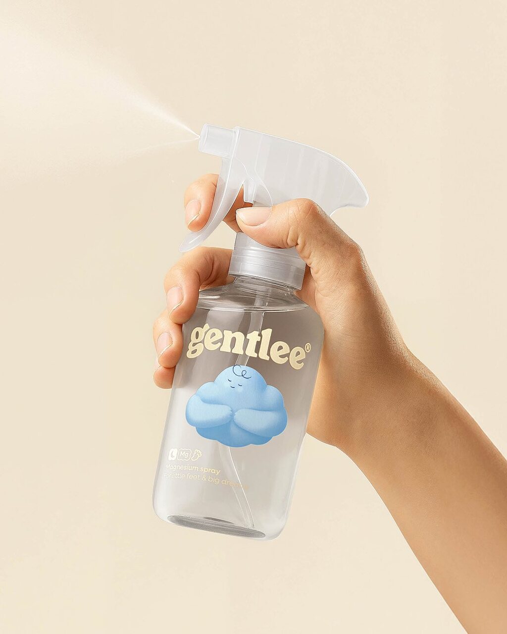
WeWantMore's packaging design for Gentlee.
The packaging is designed as a comforting bedtime companion—trustworthy, nurturing, and child-friendly. Featuring Lee, a soft, cloud-shaped mascot full of curves and quirk, the design avoids typical sleep cues in favour of light tones and sensory textures that promote connection and calm
Find out more about WeWantMore here .