


Cansu Ferreira's identity and packaging design for Miracle Oats
The designer delivers a visual identity that encapsulates this spirit of giving and wellness
The designer delivers a visual identity that encapsulates this spirit of giving and wellness
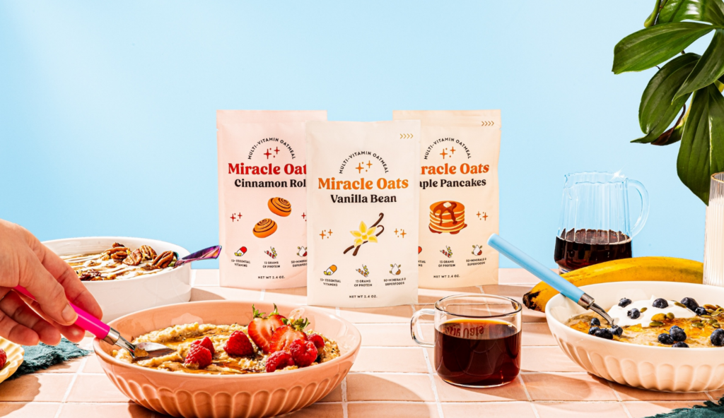
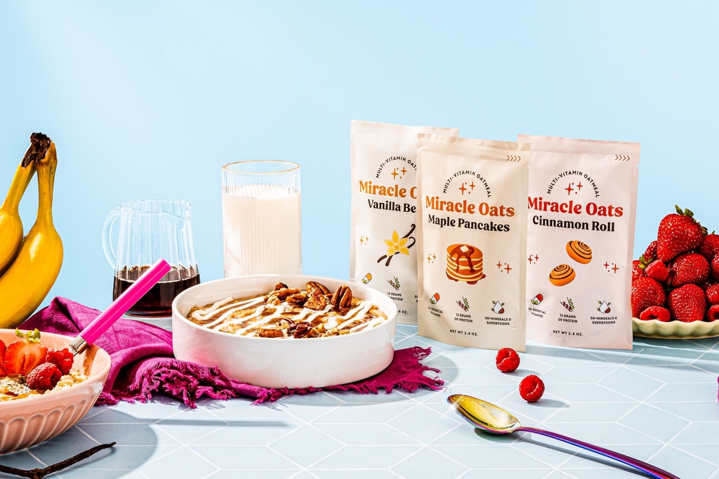
Miracle Oats is a subscription-based breakfast service that aims to bring the world’s most nutritionally complete breakfast to customers. Each pouch is brimming with a powerhouse of essential vitamins and minerals, ensuring that you start your day on the right note. Miracle Oats offers a nutritious and delightful start to the day while contributing to a greater good. It promotes a healthier lifestyle and provides an opportunity to support global childhood nutrition.
Crafted in the USA with clean, responsibly-sourced ingredients, Miracle Oats is designed to help you achieve all your health goals, whether it’s improved energy, better digestion, or simply a more balanced diet. But there’s more to this story than just personal health benefits. For every box purchased, Miracle Oats pledges to provide a supply of essential vitamins to up to four children through their partnership with Vitamin Angels. This means that every time you choose Miracle Oats, you’re not only nourishing yourself but also playing a part in combating childhood malnutrition across the globe.
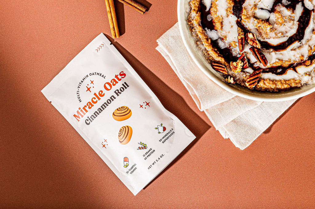
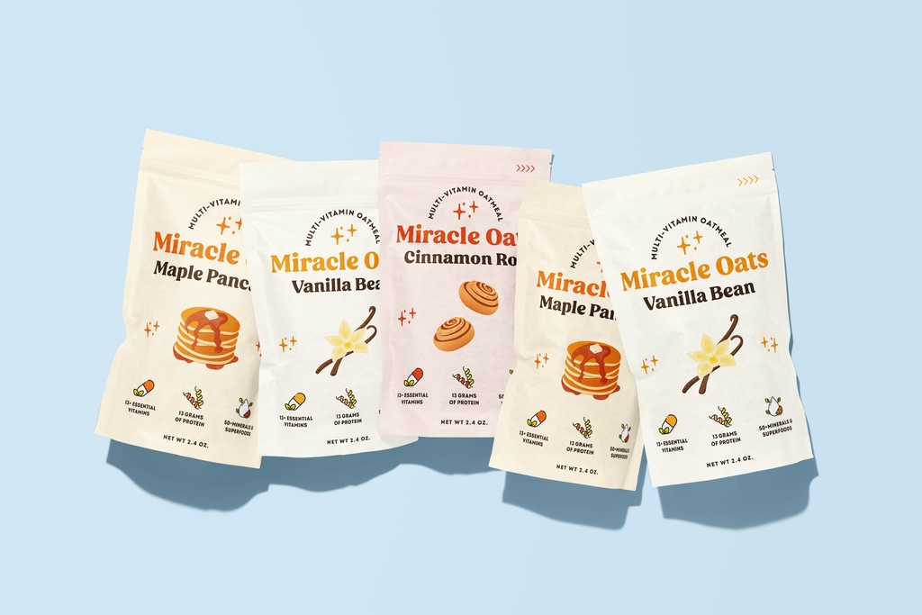
Inspired by this heartwarming mission, Cansu Ferreira designed packaging that encapsulates this spirit of giving and wellness. The design is light, fun, and approachable, resonating with the joy and positivity that comes from both eating right and helping others. Each flavor is vividly represented by an engaging illustration at the center of the packaging, signaling the delicious and varied options available. The packaging’s bright, youthful design conveys not just the freshness of the product but also the vibrant energy it can bring to your mornings.
For more information on the design, visit Cansu Ferreira's website or follow them on Instagram .