


Easter packaging picks
Easter’s here, so we couldn’t resist rounding up some of our favourite packaging designs this season
Easter’s here, so we couldn’t resist rounding up some of our favourite packaging designs this season
Take a look below - and if you’ve worked on a limited-edition Easter pack yourself, why not submit it to the 2026 competition ?
Fortnum & Mason by Here.
![]()
Easter has an origin story most people don’t know. A bird transformed by Ostara, Goddess of Spring, into a hare who laid coloured eggs in her honour. It’s ancient, strange, and rather wonderful, and it’s the myth that gave us this collection.
Working with Fortnum & Mason, Here designed Ostara: a range of over 20 products rooted in that story, with the hare as protagonist throughout. From a 500g milk chocolate Spring Hare to praline eggs laid in real shells, miniature matchbox hares to a full children’s line featuring Harrie, a bird-turned-hare with her own tale to tell.
The illustrations are by Lou Benesch, whose watercolour worlds bring together plants, animals, and folklore in ways that reward looking closely. Her work runs across the entire range, from the premium gifting tier down to the children’s collection.
Find out more here .
Selfridges x Torres: The Crisp Egg
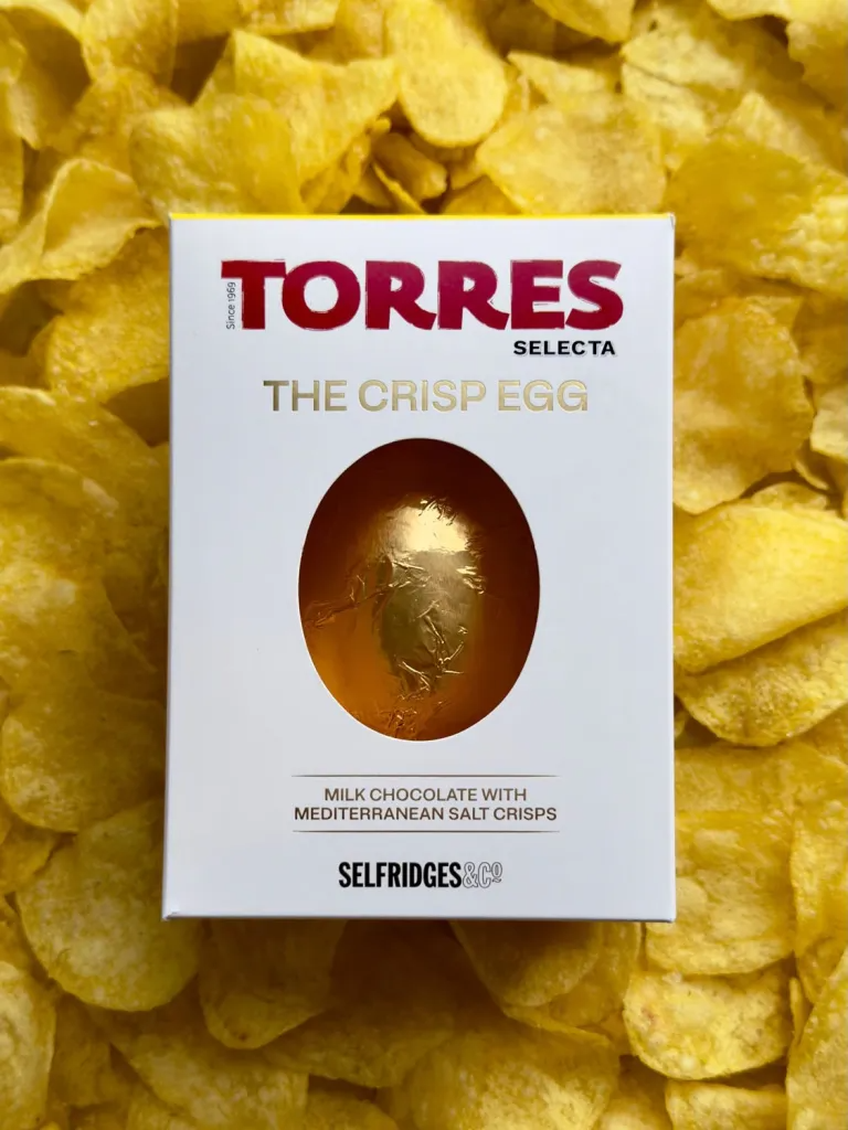
This Easter, Selfridges has collaborated with cult Spanish crisp brand Torres to unveil the ultimate sweet-and-salty treat: Selfridges Selection Torres Crisp Egg, a silky milk chocolate shell flecked with golden crisps.
The egg comes presented in gold foil and custom-made Torres box, immediately signalling a premium product.
Find out more here .
INCARDONA by Rosario Lo Iacono design
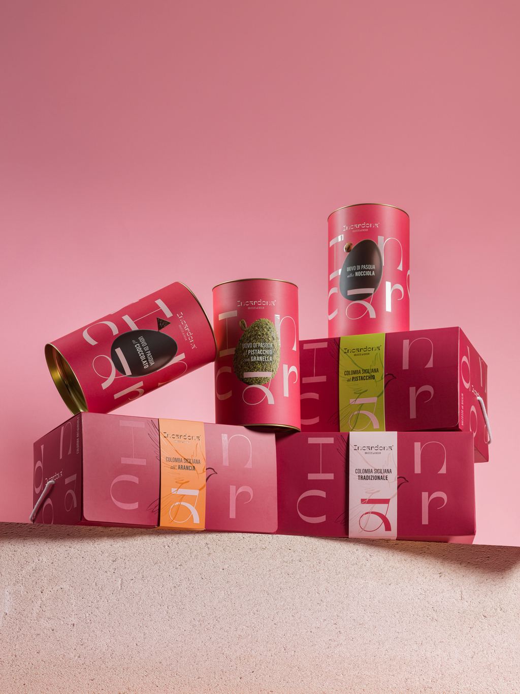
The Easter collection for Incardona builds on a coherent visual language, carefully adapted to new formats — the box for the colomba and the cylindrical packaging for the eggs — without altering its balance, proportions, or overall structure.
Colour becomes the key differentiating element, allowing each variant to be clearly identified while preserving consistency across the range. Vertical bands guide the reading and organize information, reinforcing clarity and hierarchy within a minimal and structured layout that prioritizes legibility and visual order.
The typographic system introduces a subtle play of balance: the eggs visually rest on the letter “a”, which becomes an integral graphic element within the composition, while a key ingredient is delicately positioned on top of each egg. This creates a controlled visual tension that enhances the perception of the product and adds a narrative layer to the overall design. On the colomba packaging, a precise visual overlap is created between the dove illustrated on the band and the one printed on the box, aligned in scale and position to generate a coherent layering effect that reinforces the relationship between graphic elements and strengthens the visual system.
The result is a modular and flexible system, designed to extend over time and adapt to different contexts while maintaining coherence, recognizability, and a strong visual presence.
Find out more here .
Lindt Masterbrand Easter
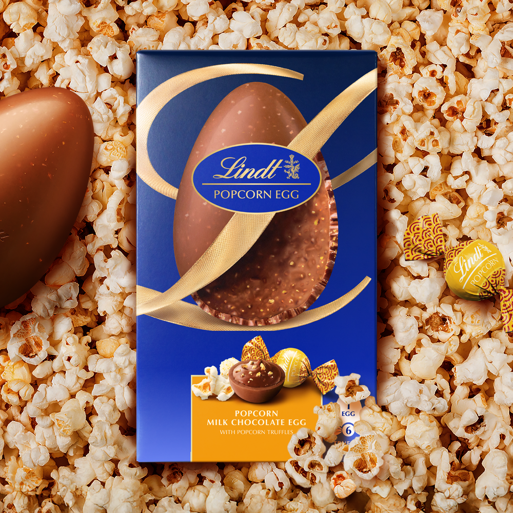
Introducing a Masterbrand approach to Lindt Easter. Combining Lindt’s indulgent chocolate with exquisitely selected inclusions that delivers a multi-sensory experience. But how does a heritage brand innovate meaningfully while strengthening the core brand?
The solution was to utilise a combination Lindt’s iconic assets in a way that heroes the unique properties of the egg. A golden ribbon crafted into an elegant typographic ‘L’.
This iconic ribbon not only transforms the egg into a gift, but creates a design system that shows off the inclusions inside. Elevating a familiar format into something more premium, crafted, and desirable.
Find out more here .
Denzel’s Easter Nibbles
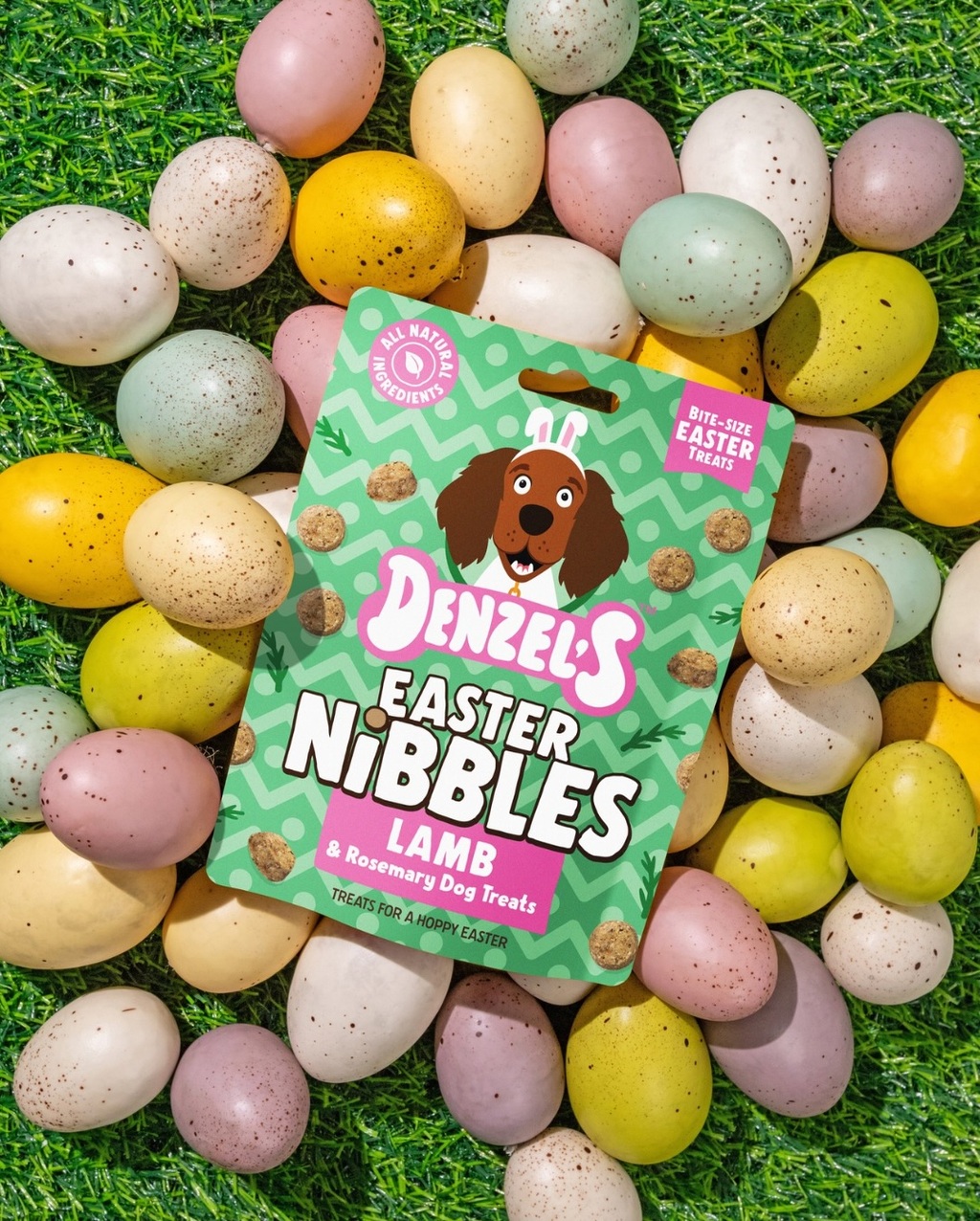
A vibrant dog treat packaging featuring a playful illustrated dog wearing bunny ears. The design uses pastel colours, bold typography, and festive patterns, highlighting its natural ingredients and bite-sized treats.
Find out more here .
Epik Easter Eggs
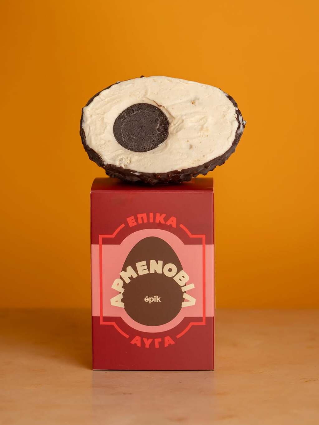
A bold, contemporary Easter egg packaging featuring a rich colour palette and a central egg-shaped graphic that frames the product name. The design combines clean geometry with playful typography, creating a strong shelf presence whilst maintaining a premium feel.
Find out more here .