


Monthly Discoveries, March 2025
Need a bit of inspiration? Look no further. We're always looking to recognise the best packaging design from agencies worldwide, so we have pulled together this month's most liked from our social channels to keep you inspired
Pentawards, the world's most prestigious packaging design award, not only recognises the best packaging design through competition but also promotes the importance of packaging design through live events and social media. We are committed to being the bridge between excellent design organisations and brands that are always looking for the best packaging design solutions
Take a look below at some of the most popular designs we shared this month across our social media channels.
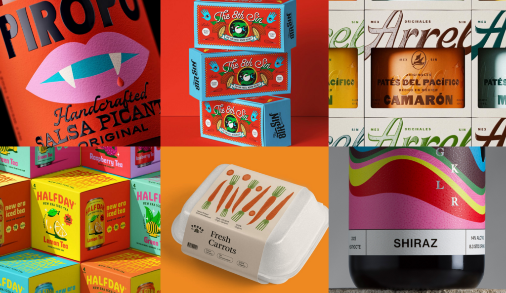
The 8th Sin by Leo&Co.studio
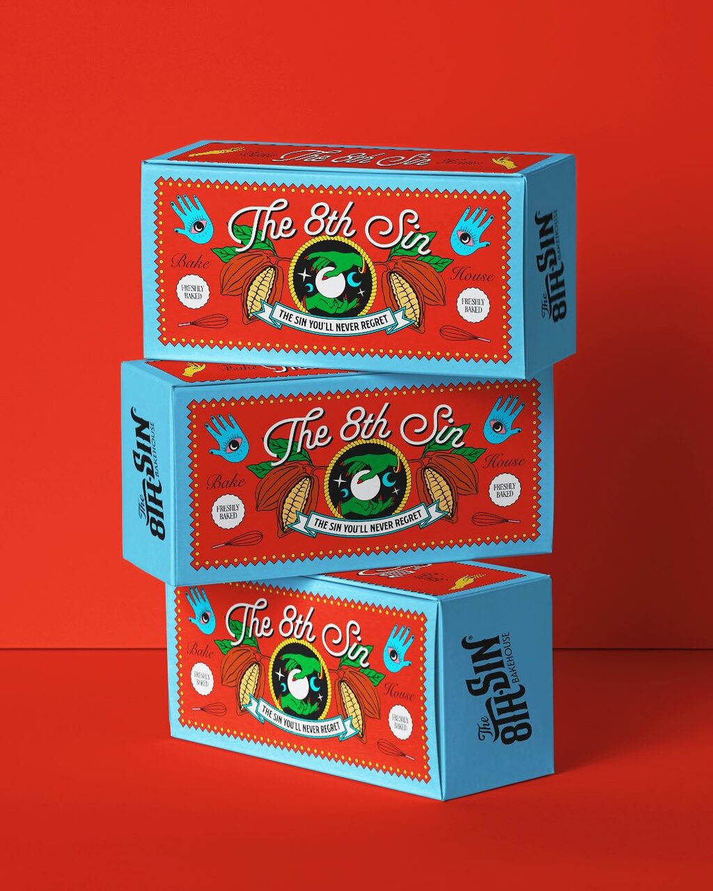
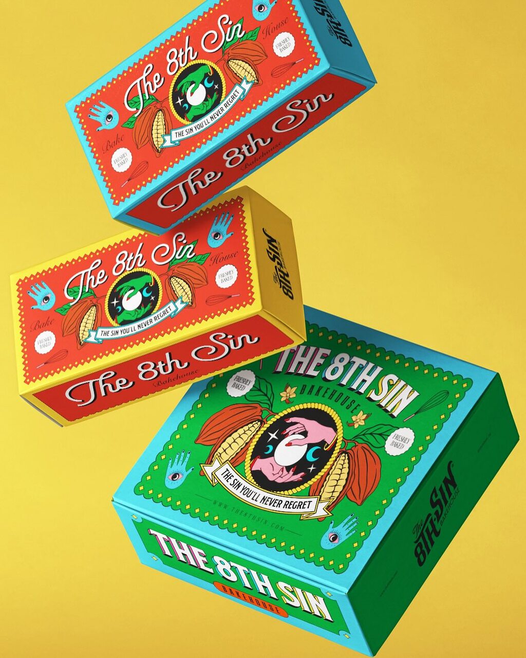
Leo&Co.studio's packaging design for The 8th Sin.
Inspired by the allure of the seven deadly sins, the bold branding and vibrant packaging mirror the rich, chunky cookies and treats inside. Striking visuals and graphic elements spark curiosity and craving at first glance.
Find out more about Leo&Co.studio here .
Canned vegetables mock up by tubik
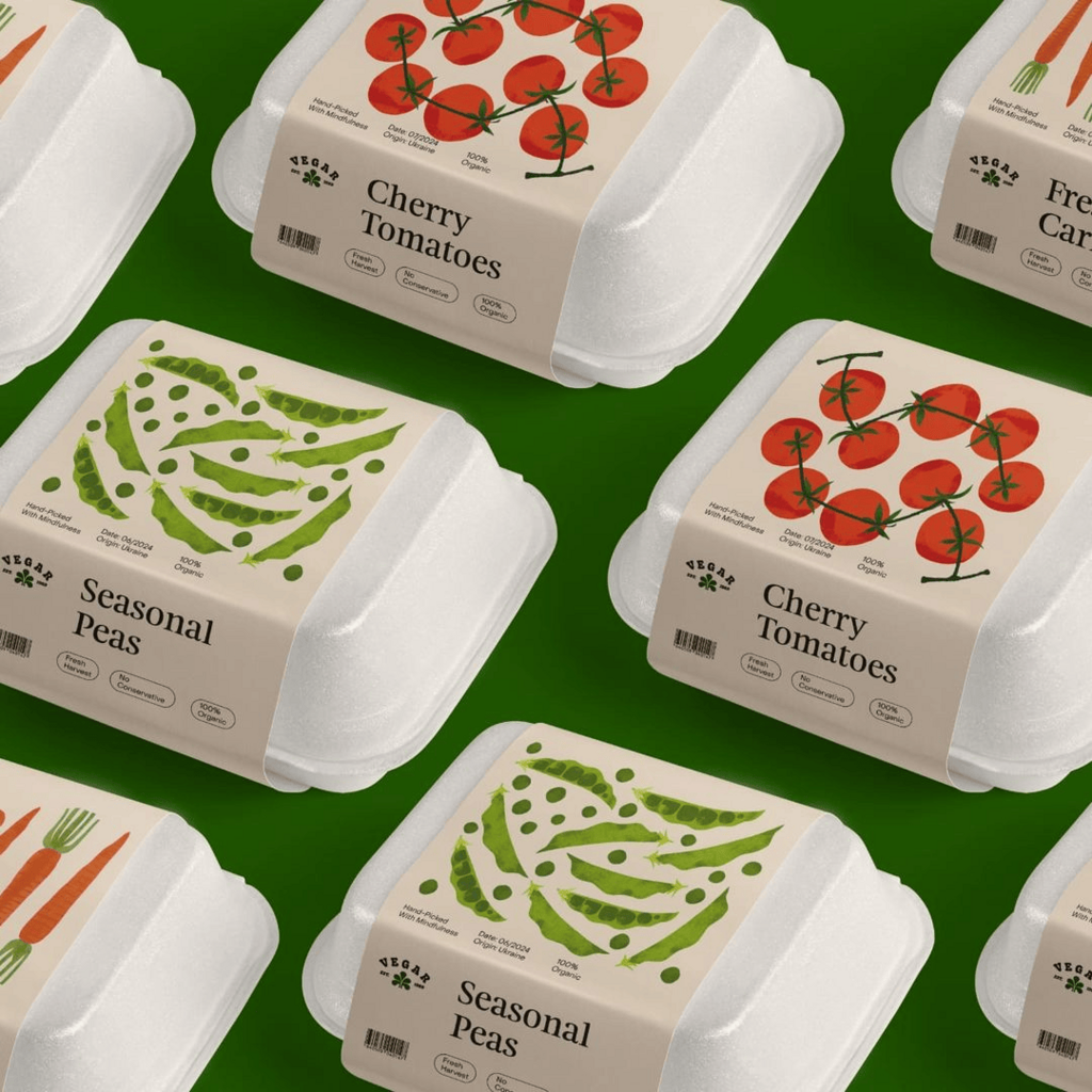
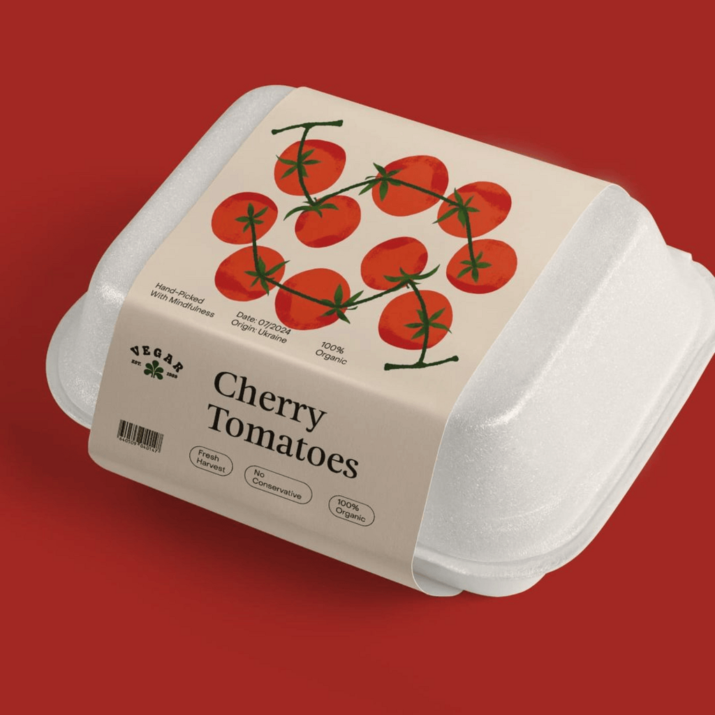
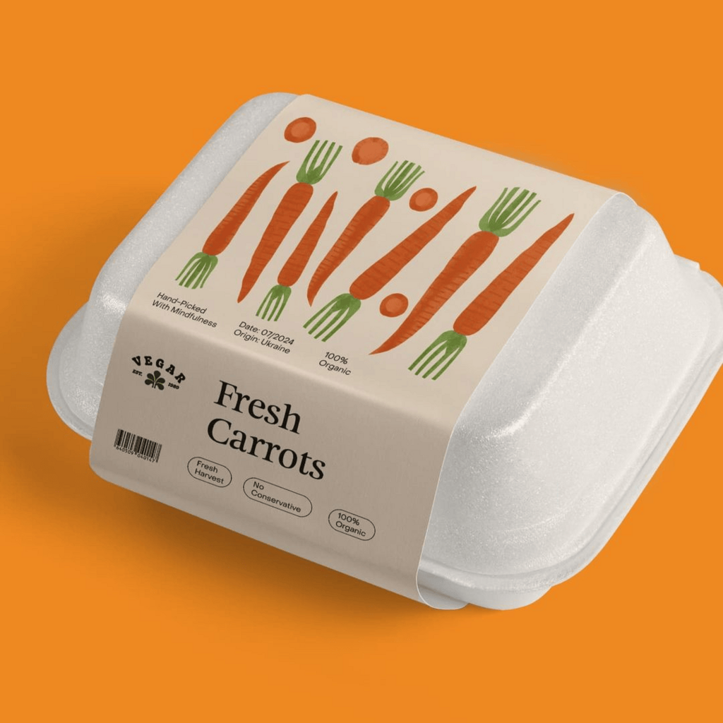
tubik's canned vegetables packaging design concept.
This packaging mockup features a modern and playful design for canned vegetables. The biodegradable white containers are wrapped with minimalist beige labels, showcasing hand-drawn illustrations of fresh produce. The labels highlight key selling points, reinforcing a natural and sustainable brand identity.
Find out more about tubik here .
GKLR by Marilyn & Sons
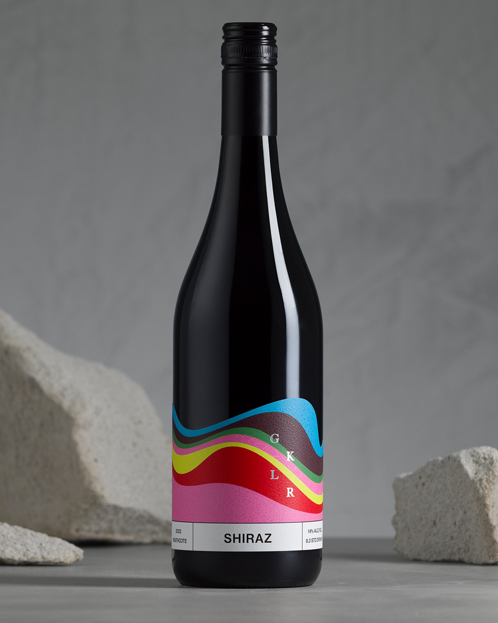
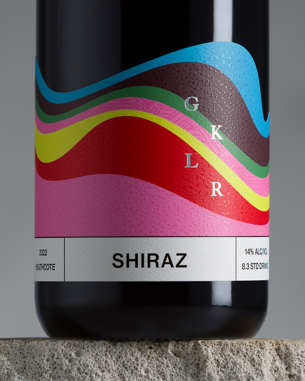
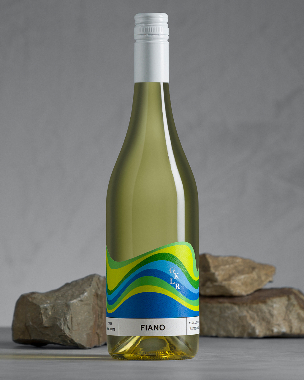
Marilyn & Sons' packaging design for GKLR.
The agency built the brand around "Form + Reform," reflecting the winery's grounded yet exploratory nature. A classic serif typeface and black-and-white palette convey timeless authenticity, while a flexible logo and diverse colour palette allow for adaptability without compromising the core identity.
Find out more about Marilyn & Sons here .
Arrebatos by FAENA
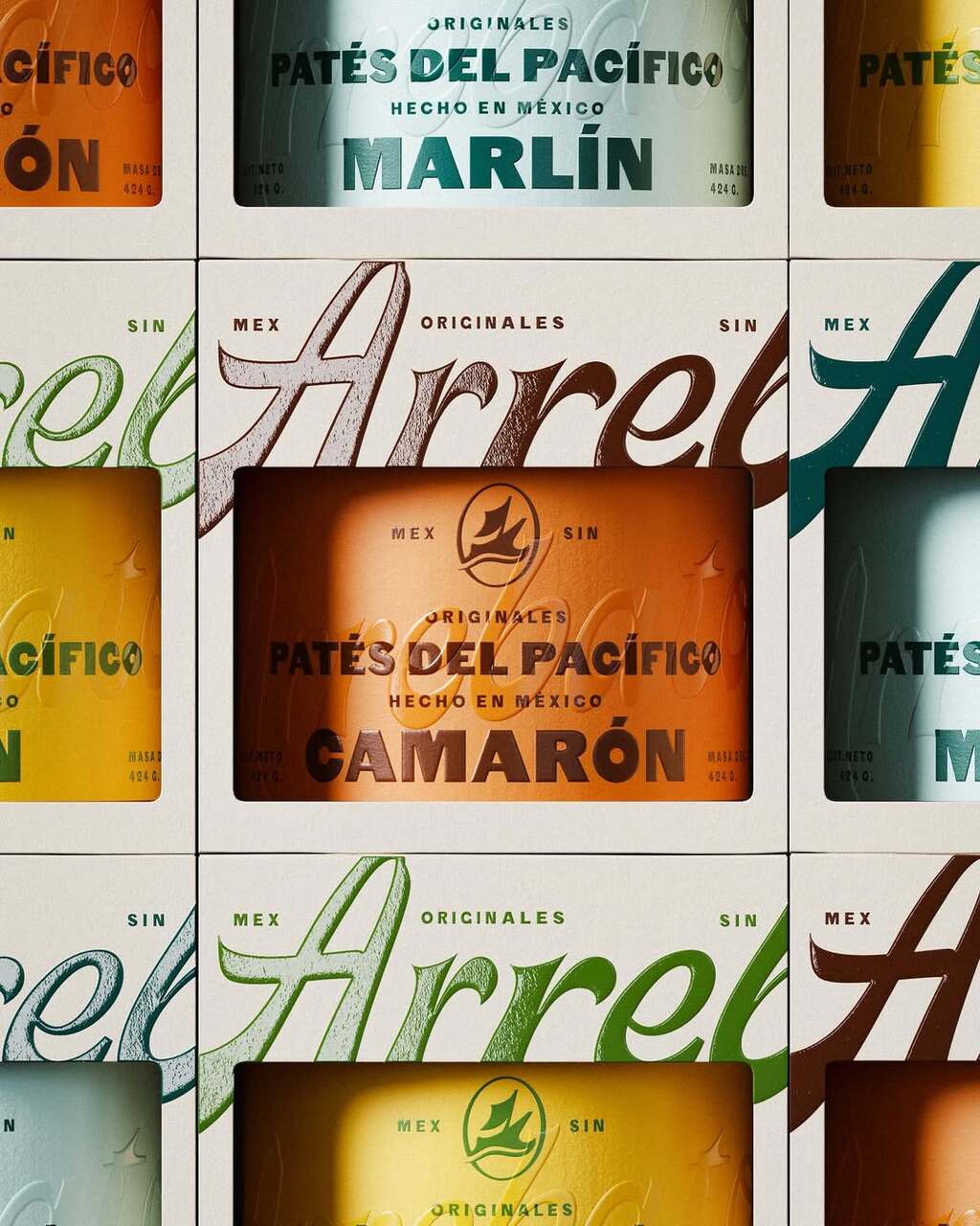
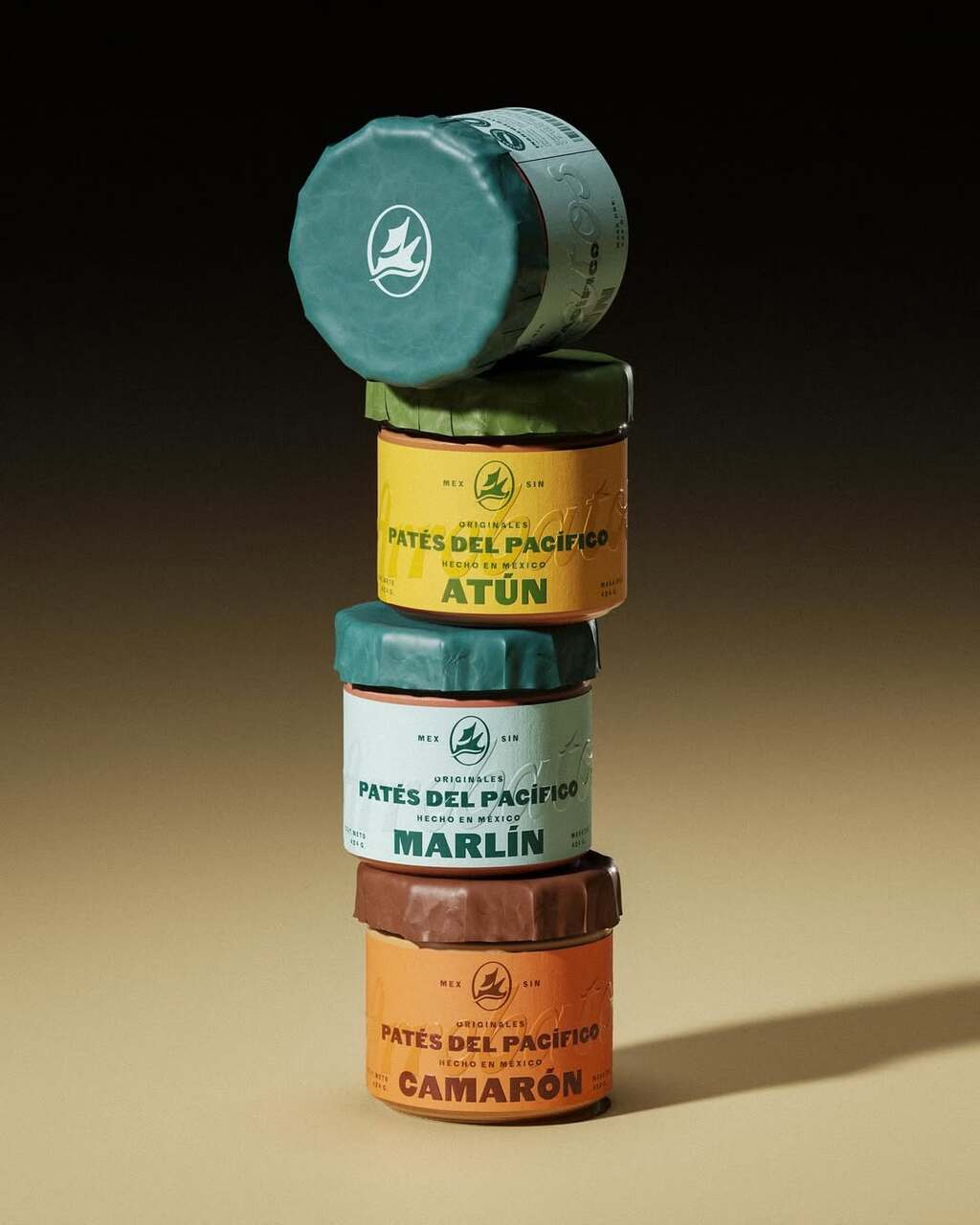
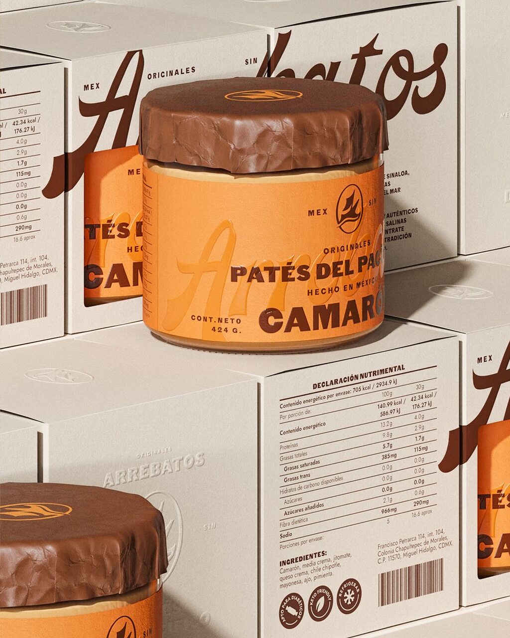
FAENA's packaging design for Arrebatos.
A striking stack of pâté jars featuring a bold colour palette and vintage-inspired typography. Each jar is wrapped in textured paper with an embossed effect, and the lids are sealed with rustic, wax-like coverings. The earthy tones and hand-lettered style evoke artisanal quality, while the balanced composition highlights the variety of flavours.
Find out more about FAENA
here
.
Half Day by Earthling Studio
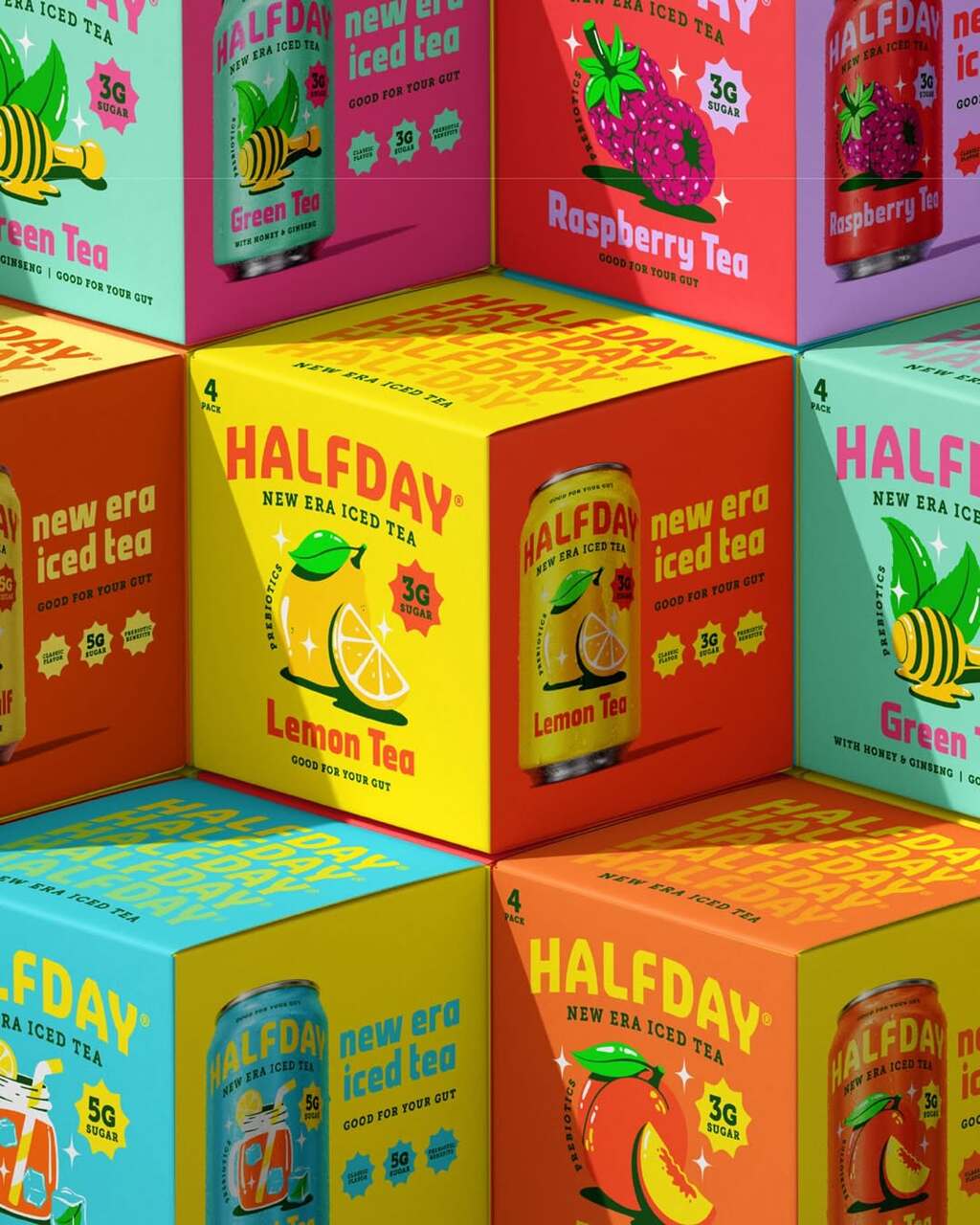
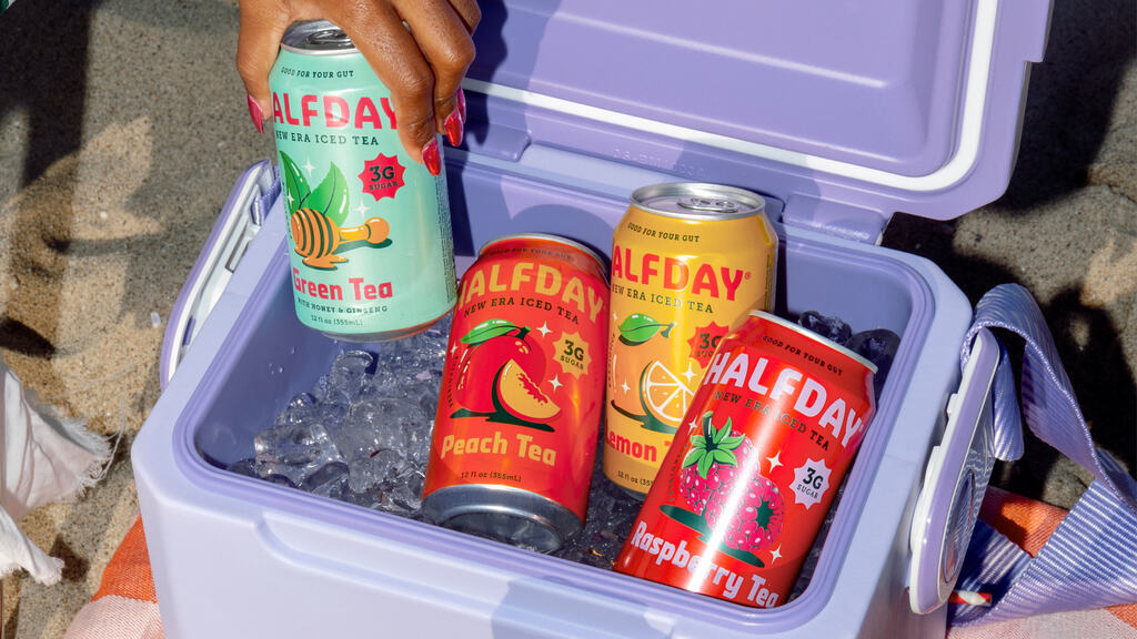
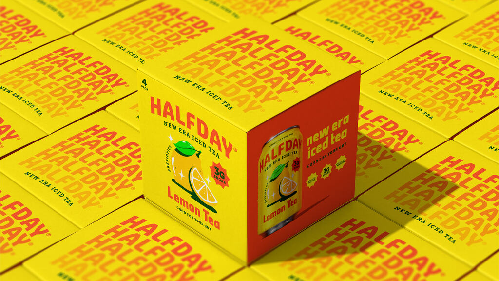
EarthlingStudio's packaging design for Half Day.
The packaging combines nostalgia with a focus on health and nutrition. The arched logo, designed with Rob Clarke, evokes a refined, contemporary take on a nostalgic era, enhancing clarity and brand visibility. Inspired by 90s posters, the bold Strippy regular font adds charisma, while the sub-headline font brings a premium touch.
Find out more about EarthlingStudio here .
Piropo by Oveja & Remi
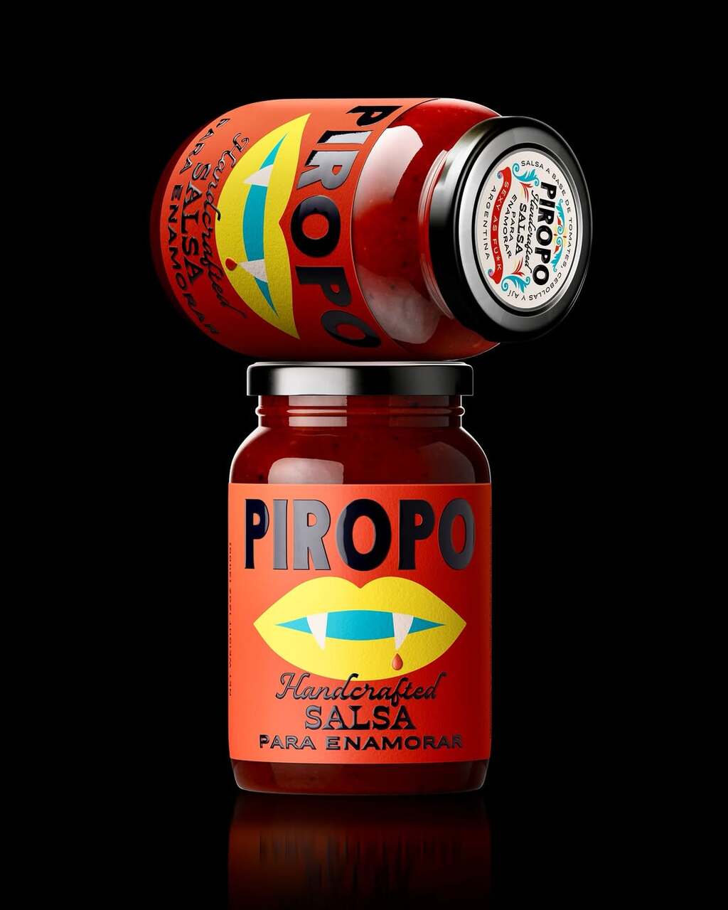
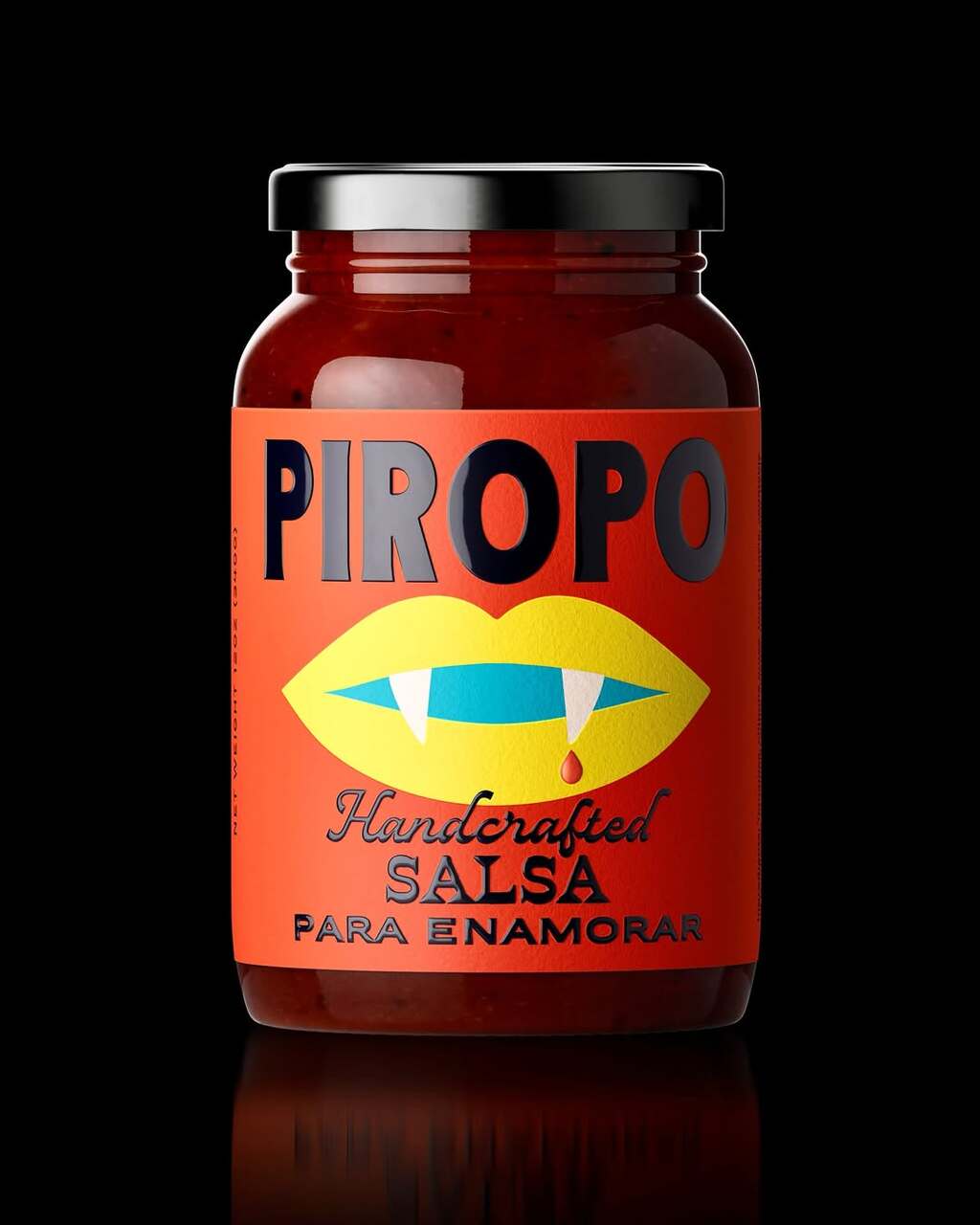
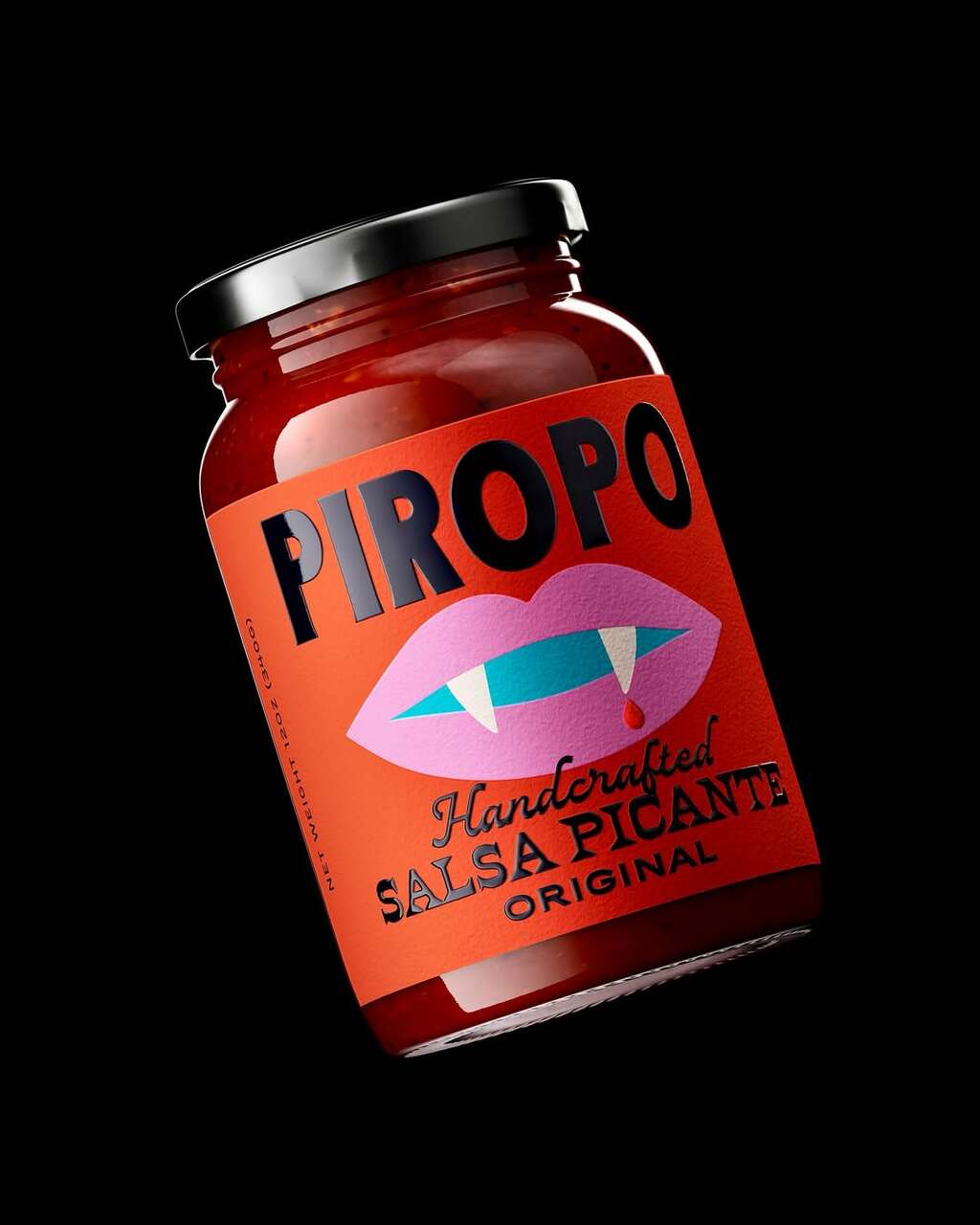
Oveja & Remi's packaging design for Piropo.
The packaging is bold and fiery, featuring a striking red-orange background with strong black typography. A playful illustration of fanged lips with a dripping detail adds intrigue, while the messaging reinforcing its passionate theme.
Find out more about Oveja & Remi here .