


Repackaging a 93 year old legacy brand in India: Dinshaws
NH1 Design reimagines Dinshaw’s iconic heritage into a unified, future-ready brand world - built around one unforgettable ‘D’
NH1 Design reimagines Dinshaw’s iconic heritage into a unified, future-ready brand world - built around one unforgettable ‘D’
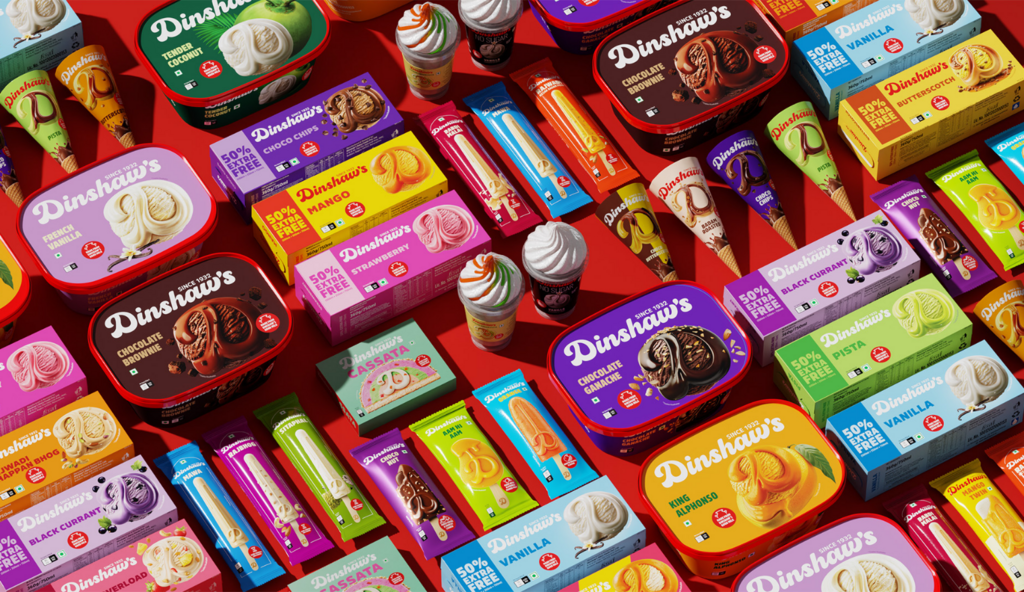
Dinshaw’s is Nagpur’s favourite ice cream and dairy brand. Established in 1932, it is present across multiple Indian states, from neighbourhood stores in Maharashtra to retail markets beyond. Over decades, it has become closely associated with celebration, summer and the comfort of something familiar.
When NH1 Design began working on a new identity and packaging system, the objective was clear. This was not a brand in decline. It was a brand that had outgrown its visual expression. As the portfolio expanded across ice cream, dairy, bakery and namkeen, each category evolved independently. What began as organic growth gradually resulted in fragmented design systems, inconsistent colour logic and a weakened master-brand presence.
The brief was to build a cohesive brand architecture that would unify the portfolio while preserving the trust customers already held. The new system needed to deliver clarity at shelf, strengthen recognition across formats and create a scalable foundation for future growth.
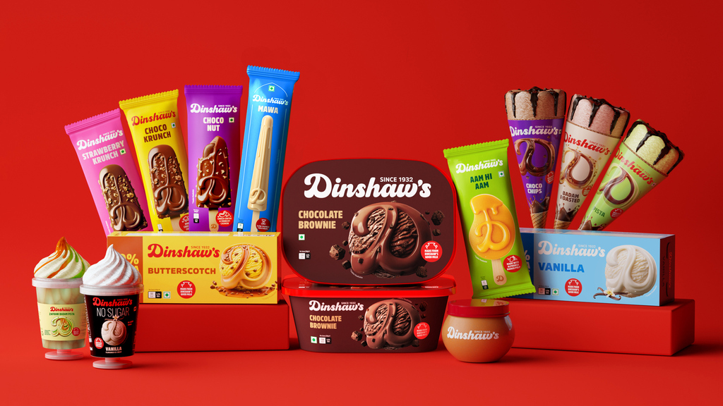
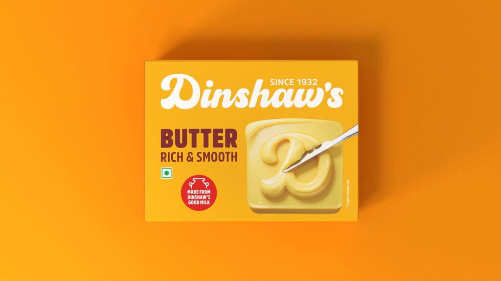
The 'D' is no longer just a monogram. It is a Dinshaw's world; a powerful brand identifier that extends across every product in the portfolio, turning a single letter into an entire universe of indulgence, memory, and belonging.
NH1Design challenge was to honour the legacy of Dinshaw's while shaping a visual identity that feels as rich and irresistible as the product itself. The heartbeat of Dinshaw’s remains - the signature red, inspired by the emotional equity. But legacies must evolve. They unboxed the logo, allowing it to breathe freely across packaging. At the heart of this transformation lies a powerful detail: a single drop of milk embedded within the ‘D’ - a quiet yet bold promise of purity, authenticity, and the wholesome abundance that defines Dinshaw’s.
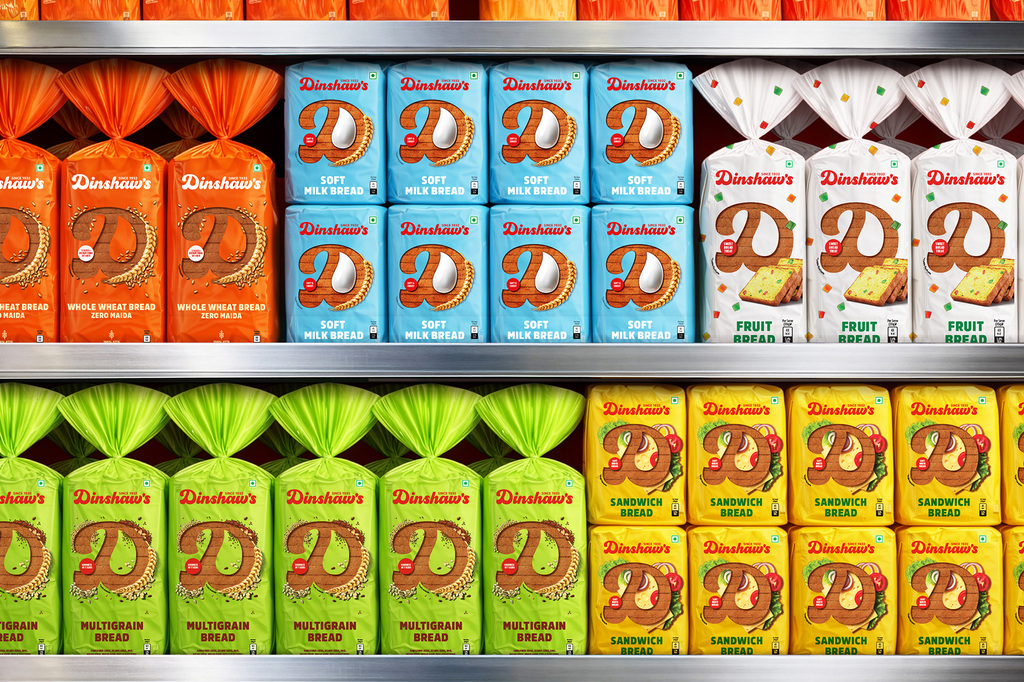
The objective was simple. You see the 'D'. You know it's Dinshaw's.
For more information on the design, visit NH1Design’s website or follow them on Instagram .