


Ruby Hibiscus Sparkling x BjornQorn
Ruby Hibiscus Sparkling and BjornQorn, solar popped popcorn collaborate to deliver a new seasonal limited edition flavour
Ruby Hibiscus Sparkling and BjornQorn, solar popped popcorn collaborate to deliver a new seasonal limited edition flavour
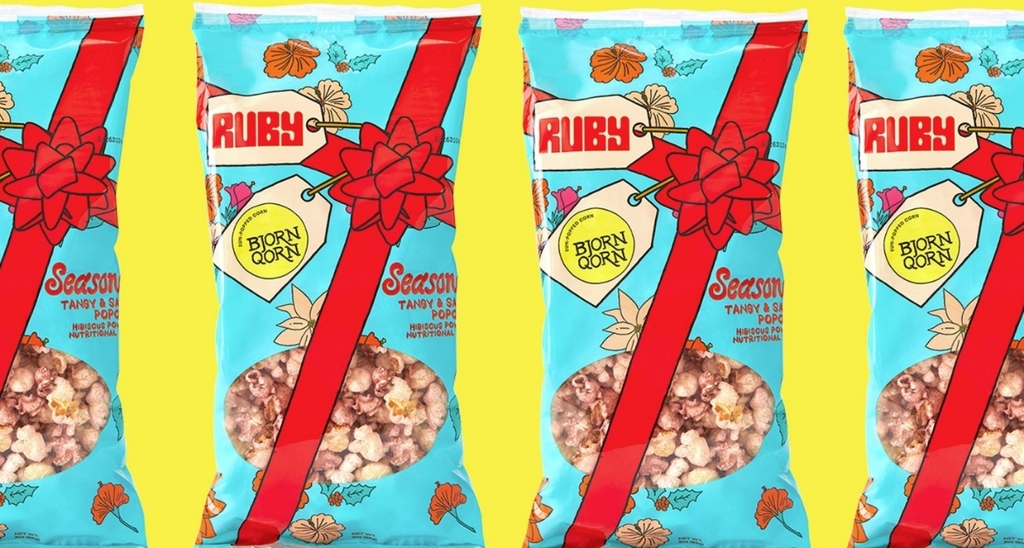
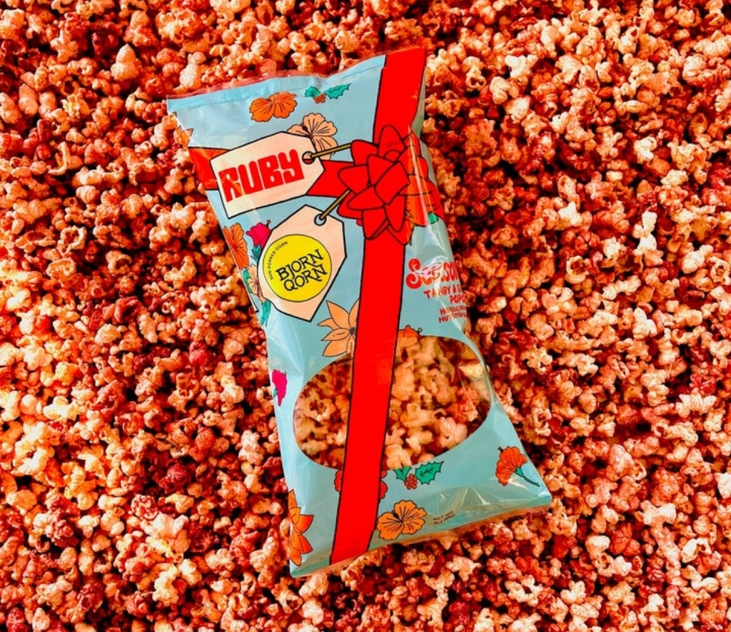
The holiday collaboration between Ruby and BjornQorn brings a festive packaging design to the popcorn world. The packaging is like a holiday gift wrapped in art, with a lively design featuring a big, red bow that wraps around the entire bag. Both brands shine equally with their logos, a powerful symbol of their partnership.
The hibiscus, the hero ingredient, takes centre stage in the illustrations, capturing the tangy essence of the popcorn. This design not only looks great but also echoes the commitment to pure ingredients, showcasing the simplicity and goodness of this zesty holiday snack. Ruby Sparkling Hibiscus drink’s packaging design is a visual feast.
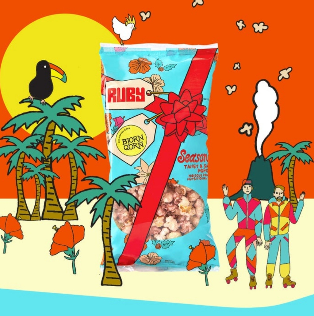
It cleverly combines form and function, ensuring the preservation of the beverage's natural goodness while delivering a visually striking product. The can itself becomes a part of the experience, inviting consumers to indulge their senses from the first glance. BjornQorn’s solar-popped popcorn is filled with personality in its packaging design.
The bags, adorned with solar-powered whimsy, mirror the sustainable ethos of the brand. The visual appeal is not only on the popcorn inside but in the packaging that tells a story of eco-conscious indulgence. Both brands come together to deliver a visual identity that celebrates the features of both the drink and popcorn.
Find out more about Ruby here and Bjorn here.
Want to receive more monthly packaging inspiration?
Sign up for our newsletter!