


Eze Perfumes: packaging and branding for for Gen Z by Affogato Design
Indian agency Affogato Design delivers a bold, youthful, and fluid identity crafted specifically for Gen Z
Indian agency Affogato Design delivers a bold, youthful, and fluid identity crafted specifically for Gen Z
Eze Perfumes draws inspiration from the fluid and boundary-pushing nature of Gen Z. This generation does not adhere to rigid definitions; instead, they embrace change, adaptability, and uniqueness. The brand’s identity reflects this ethos by:
- Being Pop and Vibrant – Eze Perfumes embraces pop culture aesthetics with bright, engaging colours that captivate attention instantly.
- Being Bold and Fearless – The visual language is designed to be confident, unapologetic, and daring, much like the generation it caters to.
- Being Fluid and Seamless – Fluidity is at the heart of the brand’s philosophy, ensuring that every aspect of the design aligns with the non-conforming, free-thinking spirit of Gen Z.
- Emphasizing Expression and Individuality – The brand recognizes that fragrance is a personal statement, encouraging users to embrace their identity through scent.
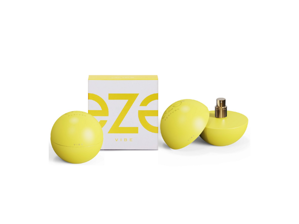
The Eze logo is a palindrome and an ambigram, meaning it can be read the same way forward and backward, as well as from different orientations. This reflects the adaptability and fluid thought process of Gen Z, where identity, opinions, and expressions are constantly evolving. The typography is sleek, modern, and dynamic, with custom lettering that reinforces the seamless, free-flowing nature of the brand. The choice of pop colours ensures that the logo does not just blend into the background but instead makes a bold statement that is instantly recognizable and shareable on social media platforms.
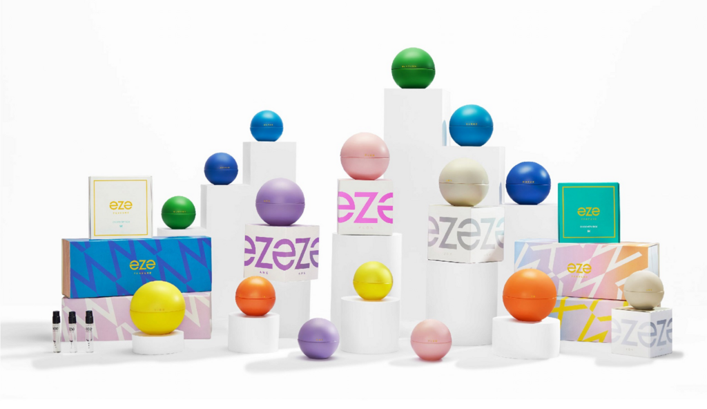
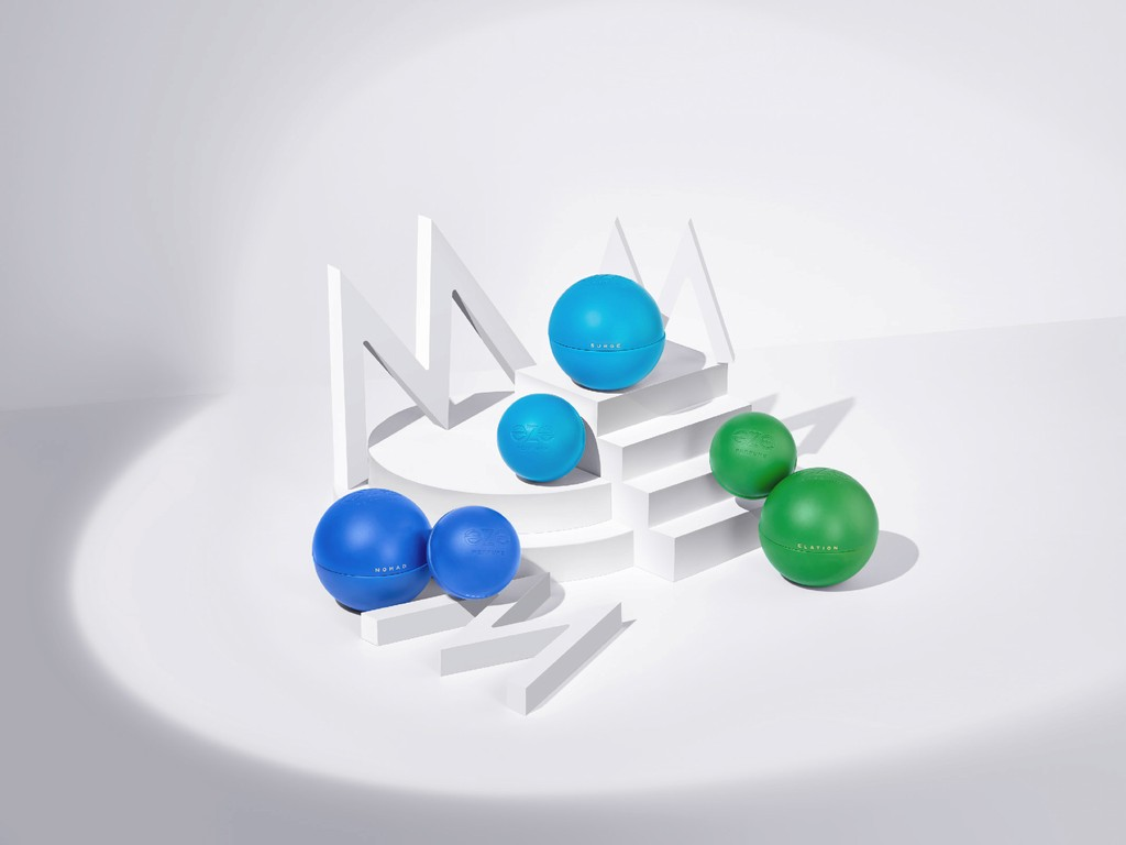
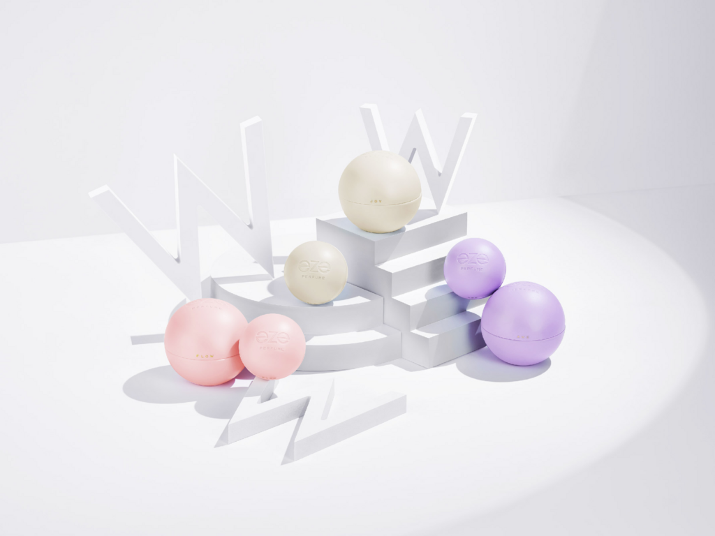
The colour selection is intentionally bright, dynamic, and full of life, ensuring that the brand stands out in a crowded marketplace.
The bottle follows the spherical format, which is a deliberate choice to signify unity, inclusivity, and seamlessness. Unlike traditional perfume bottles that have sharp edges or defined shapes, the sphere represents a world with no boundaries—a metaphor for oneness, openness, and adaptability.

The secondary packaging complements the brand’s identity with a seamless design featuring the Eze logo on repeat across all four sides.
The brand design, packaging, and identity of Eze Perfumes are crafted with a deep understanding of Gen Z’s values and preferences. The pop colours, fluid logo, spherical bottle, and seamless packaging work together to create an experience that is bold, youthful, and adaptable. Every design decision ensures that Eze Perfumes is more than just a fragrance—it is a statement of individuality, fluidity, and modern self-expression.
For more information on the design, visit Affogato Design's website or follow them on Instagram .