


Could you be a Special Award winner?
By entering the Pentawards competition, you are also giving your team and your work the chance to be one of our Special Award winners.
For a chance to be one of our 2024 Special Award winners and get extra recognition for your work, enter this year's competition.
Special Awards are given to winning designs who have made remarkable achievements, and are additional to the Platinum, Gold, Silver and Bronze Awards.
That means that by entering the 2024 competition, you are also putting yourself, your team and your work in the running for additional awards and recognition. Find out more below about some of the top awarded packs for last year's Special Award winners.
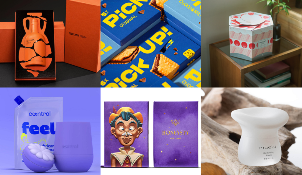
Best Use of Colour selected by Pantone
Istriana by STUDIO TUMPIĆ/PRENC, Croatia
For the first time ever, we partnered with Pantone to create a brand new Special Award 'Best Use of Colour'.
After careful review, the Gold was given to Istriana by STUDIO TUMPIĆ/PRENC, with Silvers to BYCOLOR Dental Beauty and Doritos Rainbow Limited Edition 2022 by PepsiCo, and Bronzes to BY FAR: The Daydream Fragrance Collection by Vincent Villeger and Mozzo Coffee by B&B Studio.
Istriana’s olive oil bottle design represents integrated fragments of old amphorae, once used for storage and transport of olive oil in the Roman era. Just like the clay that was used to make these, red Istrian earth from olive groves was mixed into the color pigment of the bottle, with cracks in between made of glass, allowing the consumer to glimpse inside the bottle.
Educator of the Year
ELISAVA, Spain
A brand new award for 2024, which celebrates the exceptional educators who inspire and support their students to achieve remarkable success in academic and creative endeavors.
The winner, The Barcelona School of Design and Engineering (ELISAVA) led their students to win 12 Pentawards trophies, including Control Feel and Bizarre which both won Gold awards.
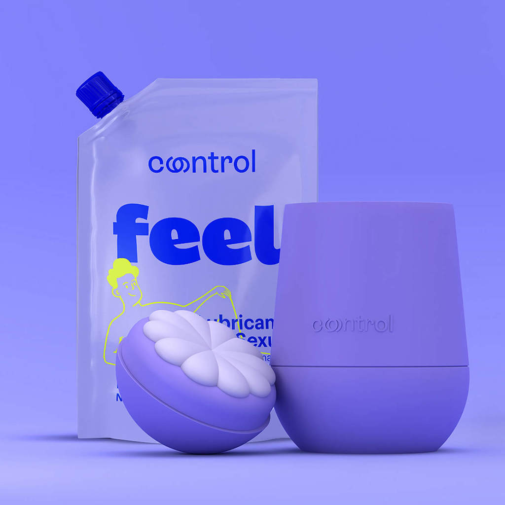
The packaging for this lubricant aims to improve how users interact with the product. The graphics focus on making the experience more intuitive and open, with bright colors, bold typography and playful illustrations.
Made entirely out of body-safe silicone, with a pleasant soft touch and a friendly shape, this lubricant comes in a reusable and refillable bottle, designed for all gender identities, sexual orientation and desires. It features a massager on top created to enhance pleasure before sex. Perfect to be used in solo play or with company.
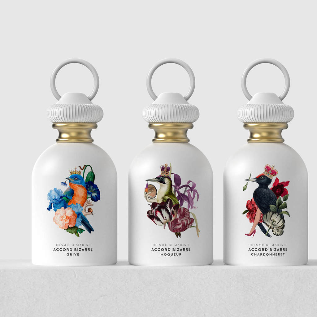
The challenge for Accord Bizarre was to create from scratch the identity of a new perfumery brand under the concept of "Bizarre".
The formal and conceptual inspiration is born from the desire to let our sensuality escape, catch and release our spirits and reflect it through the song and flight of birds. Accord Bizarre is a fragrance that originates from bird cages, their desire to break free, take flight and unleash their sensuality.
NXT-GEN Award
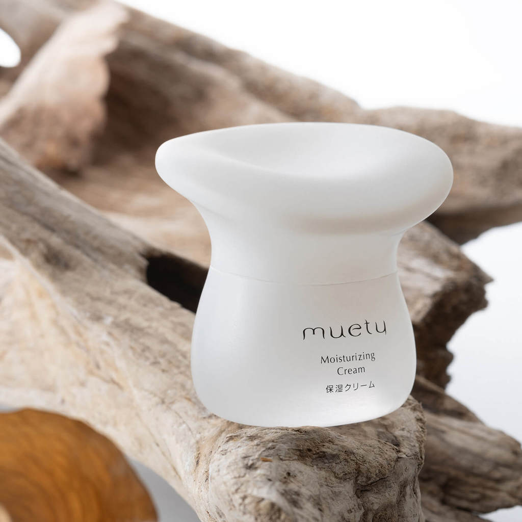
Muety by Yun Zhu, Kuwasawa Design School, Japan
Every year, the Pentawards International Jury selects one of the best student works among all categories for the NXT-GEN Award, which this year went to Yun Zhu, Kuwasawa Design School, Japan.
The bottle design draws inspiration from mushrooms, symbolizing diversity and vitality. Its white gradient colour imparts a clean and transparent aesthetic, enhancing the overall visual appeal.
Design with Purpose
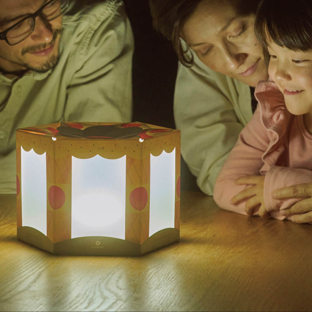
Bosai Gift by drawrope, Japan
This brand new award celebrates packaging design that adds extra value to the needs of its target audience, or to those involved in creation of the product. The winner was drawrope, Japan, for BOSAI GIFT.
The Bosai Gift was created for the Japanese earthquake prone community and is designed to be given as a gift and displayed rather than hidden away in the cupboard. It holds supplies like water, food and batteries, and it also doubles up as a lantern to help keep families feeling safe during a natural catastrophe.
Now a brand new category you can enter into for 2024.
People's Choice Award
Honeysty by Supperstudio, Spain
In addition to professional expert opinions, we listen to the voice of the public.
As part of the 2023 competition, we gave our Pentawards Festival attendees a chance to vote for a winning entry, the People's Choice Award. 10 designs were selected and put to the vote at the Pentawards Festival, with Supperstudio's Honeysty winning people's hearts.
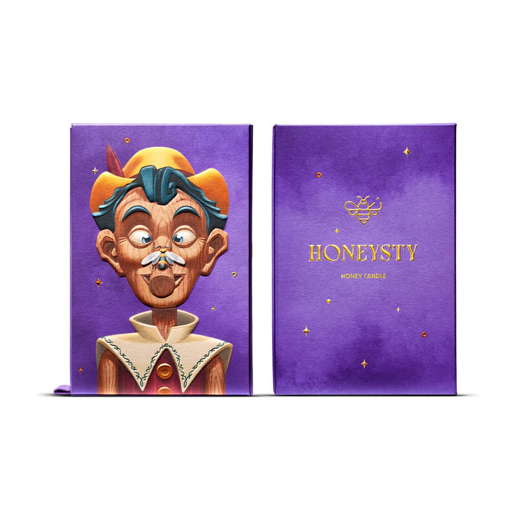
The concept proposes a fun game where Pinocchio's nose grows as you open the box. For the printing of the case, a multilevel emboss has been used, which enhances and gives volume to the illustration and gives a 3D effect.
‘Pinocchio' is part of the 'Once upon a time' project that seeks to inspire brands through technical innovation and social commitment, launching a simple message: always go with the truth first.
Design Agency of the Year
Auge Design, Italy
Auge Design wins the Design Agency of the Year after winning the Diamond - Best of Show, Food Platinum and other 4 awards in the 2023 competition.
The awarded designs include CASA MARRAZZO 1934 (Diamond), PICK UP GLOBAL RELAUNCH (Platinum), LEIBNIZ GLOBAL DESIGN RELAUNCH (Gold), CLITA (Silver) and PASTA TIRRENA.
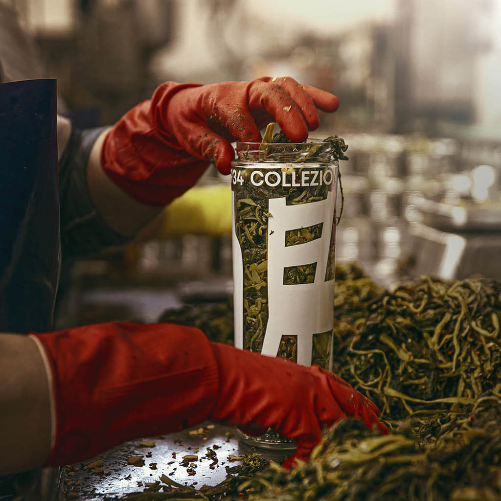
Inspired by the company's rich heritage and nostalgic appeal of Casa Marrazzo 1934, the oversized objects are screen-printed with an opaque finish on clear glass, using the colour of the ingredients as a background. The custom caps and elegant palette identify each product, while the simple and colourful gold-printed labels make the jars stand out on the shelf as design objects.
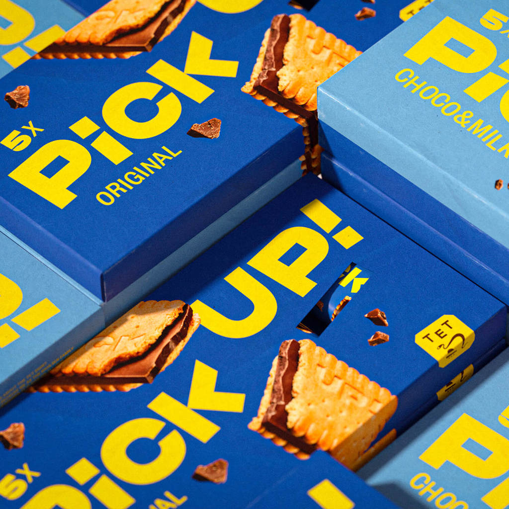
Pick Up! is the youngest brand in the German family enterprise Bahlsen, an international sweet biscuit manufacturer. For its 22nd birthday, Pick Up! was ready to develop a new personality that fully embraced its distinctive asset: The Knack. The brand system needed to reflect both the physical and the attitude of The Knack to capture the youthful energy of the brand.
To achieve this, they developed four different flavors of Pick Up! that were distinct from each other through the use of color, with each flavor represented on different packaging sizes and formats, from cardboard boxes to single foils.
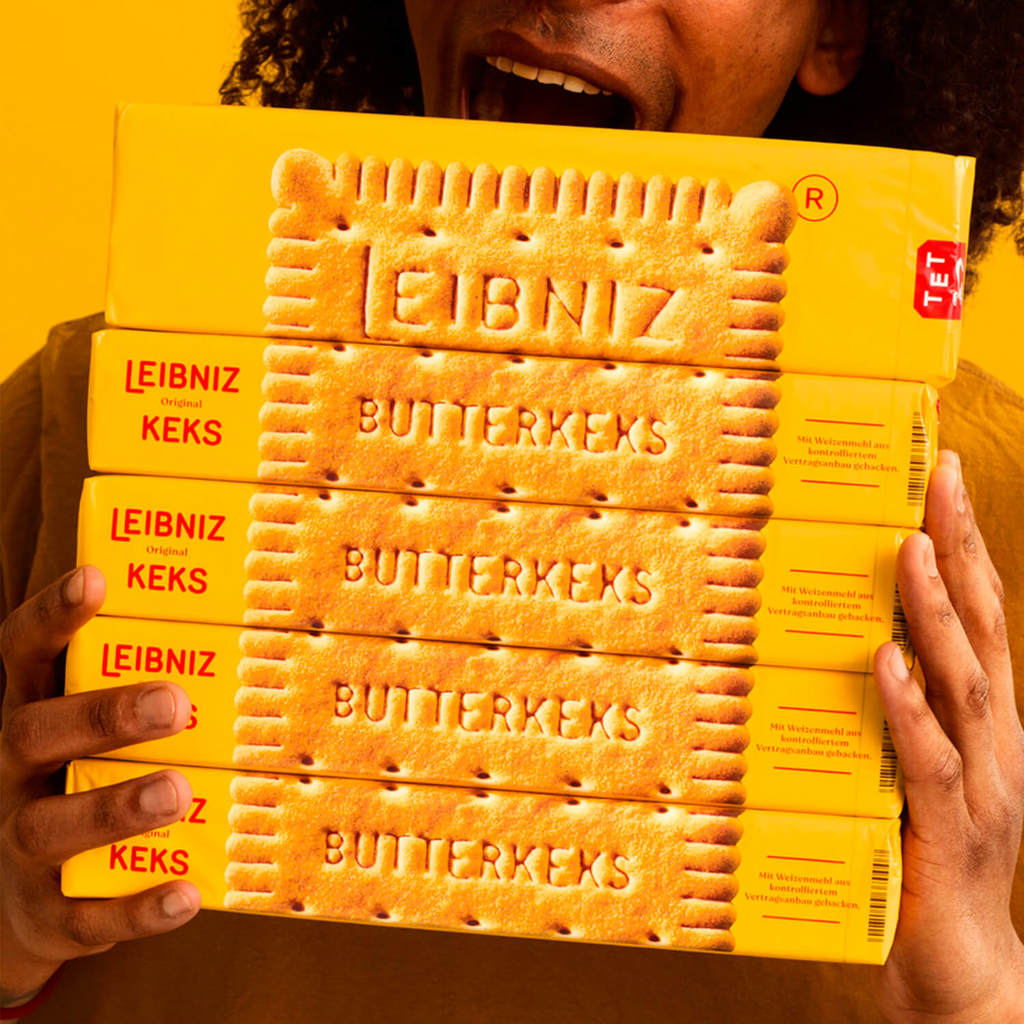
Leibniz is a beloved German biscuit brand that has been an icon since the early 20th century. Its original design features a simple rectangular shape with the "Leibniz Butterkeks" imprint and 52 "teeth" framing the edges.
To showcase the biscuits in a new and innovative way, they created an architecture consisting of six different ranges that put the biscuits front and center. Macro photography was used to capture every detail of the biscuits' texture and enhance the flavour profile. The use of Leibniz's signature yellow colour increased the wall impact on the shelf, while the use of kraft paper for the outer packaging and colour-coded graphics for each flavour communicated the brand's new natural direction.