


Expert Insights: Brand Evolution with Lisa Desforges at B&B Studio
In conversation with Lisa Desforges, Head of Strategy at B&B studio, we discuss the fine art of evolving brands and delving into the agency's approach to managing creative change.
In conversation with Lisa Desforges, Head of Strategy at B&B studio, we discuss the fine art of evolving brands and delving into the agency's approach to managing creative change.
The first question on everyone's lips when a redesign is mooted is 'evo or revo?'
And it's a valid - in fact, crucial - question. But it's not one that needs to be answered for the initial brief; it's one that should be answered as part of the strategic design process. Often, having appraised the brand, its context, and whatever problem prompted the brief in the first place, we've been able to turn evolutionary briefs into revolutionary design solutions – and vice versa.
Change looks different for everyone. But there are key themes that emerge over and over:
Defining what change should look like for your brand means aligning your business goals (which are likely to be fairly universal) with your brand essence (which is hopefully distinct and unique). There's no one size fits all solution, but here are some common project types that we often come up against.
DECLUTTER - how to pare back and spark joy
After a series of iterative design changes and additions, brands can often find themselves adrift from their true essence and personality. When you're struggling to see the wood from the trees, a thorough equity analysis can help discern what's working – and, crucially, why – in a way that consumer recognition tests can't.
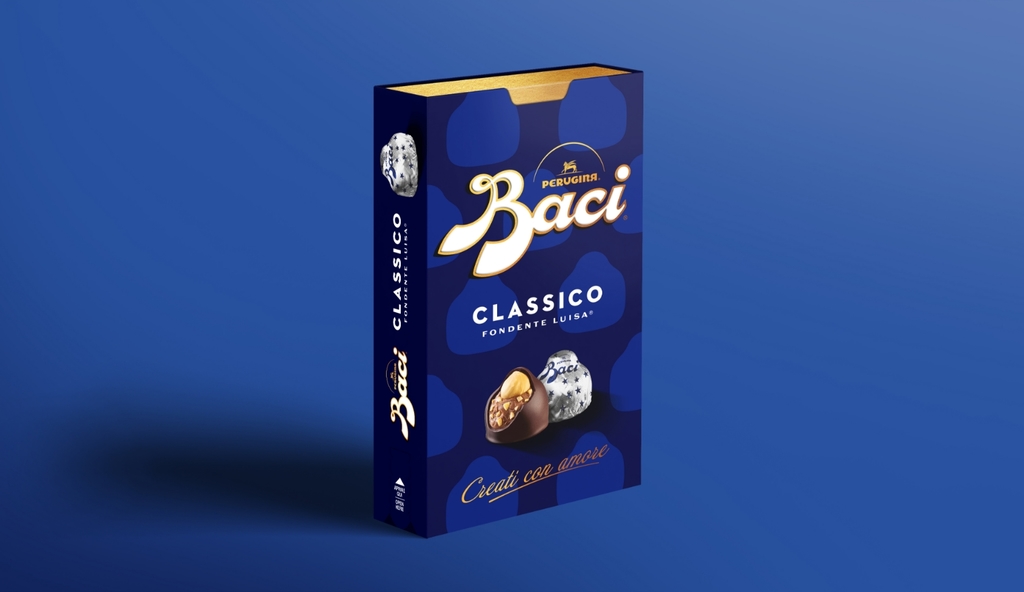
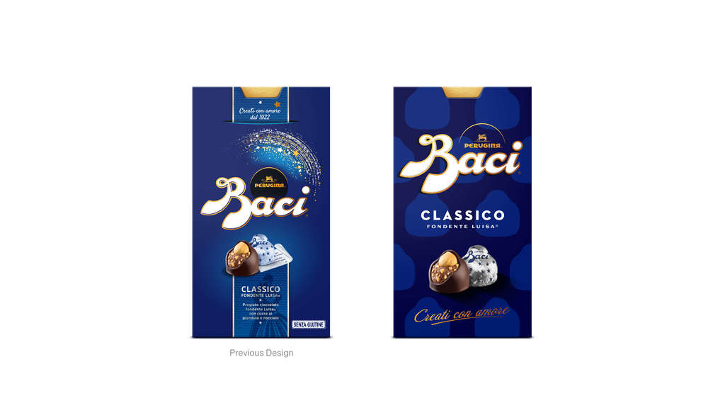
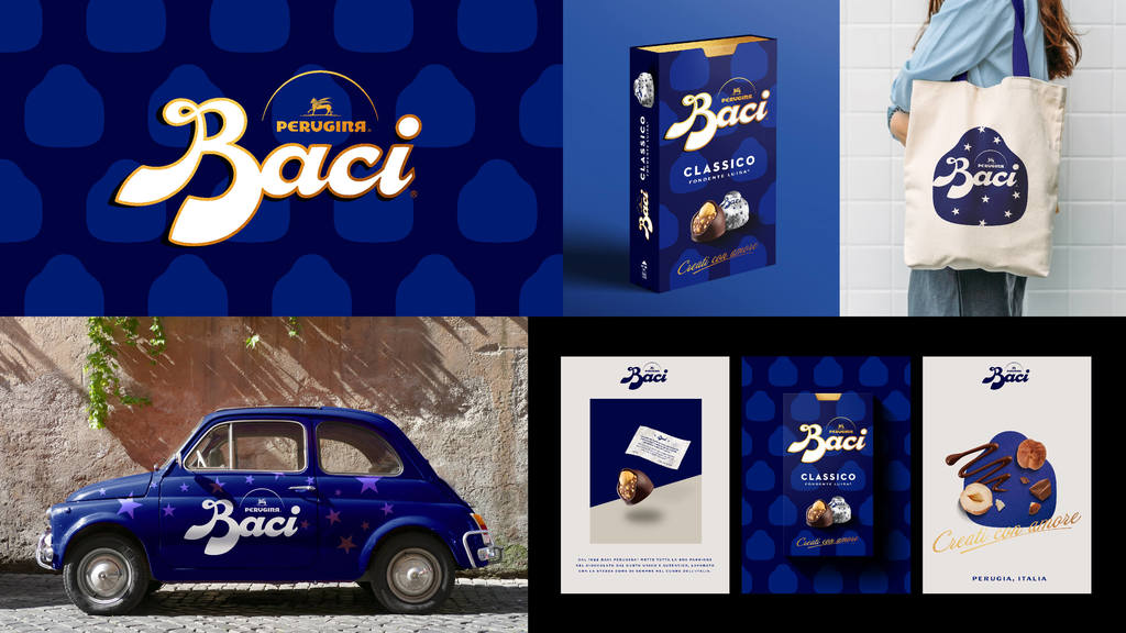
For chocolate brand Baci – a much-loved Italian icon – attempts to make the brand more 'global' had resulted in an overly corporate design that lacked the authenticity that makes the brand so special. By emphasising the emotive equities that spark consumer joy, and losing the brand's more generic design assets, Baci's recent rebrand re-establishes its iconic status, transforming perceptions while retaining every bit of recognition.
SAME, BUT DIFFERENT - how to make your equities work harder
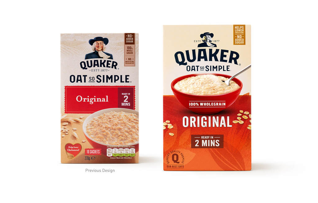
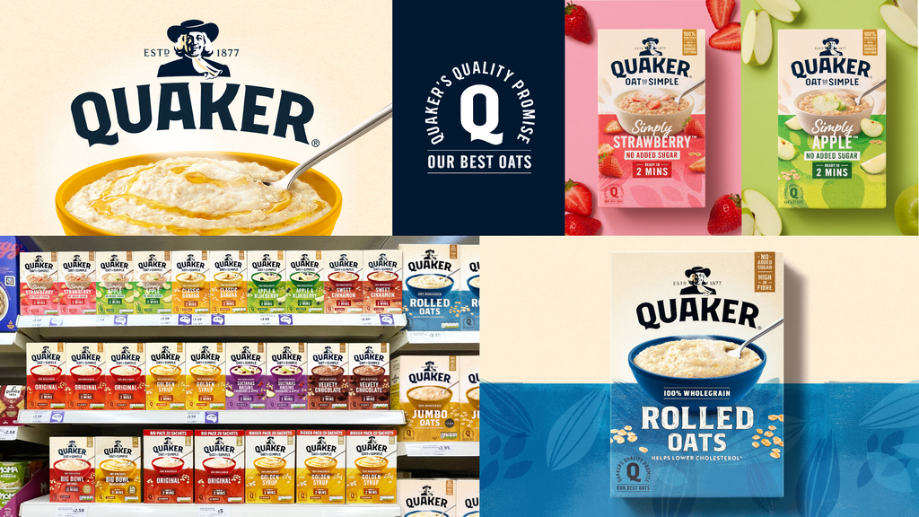
Sometimes your design is playing all the right notes, just not necessarily in the right order. Layout and emphasis are critical in elevating standard pack elements into a powerful design system, delivering greater clarity, readability and impact without changing the basic building blocks. Redesigns seen recently on Quaker demonstrate this principle, introducing strong design systems with clear coding rules that make their larger ranges easier to decode without layers of extra communication.
TIME TO GROW UP - how ambitious young brands can smarten up for success
The world of packaged food and drink has been revolutionised over the past two decades by a host of start-up and entrepreneurial brands seeking to provide new and better options for consumers. Often launched with a minimal branding budget, such brands frequently seek out a refresh once they've cemented their position in the marketplace.
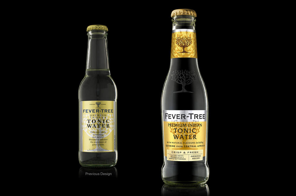
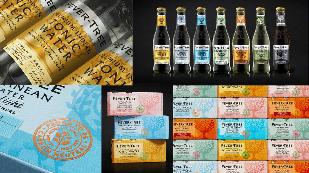
For a passionate brand owner, letting go a much-loved design can be an emotional journey, but a sensitive evolution can set the foundations for exceptional brand growth. Fever-Tree is a great example of how design expertise can transform an awkward bit of branding into an truly iconic design, creating packaging that truly meets the standards set by the product.
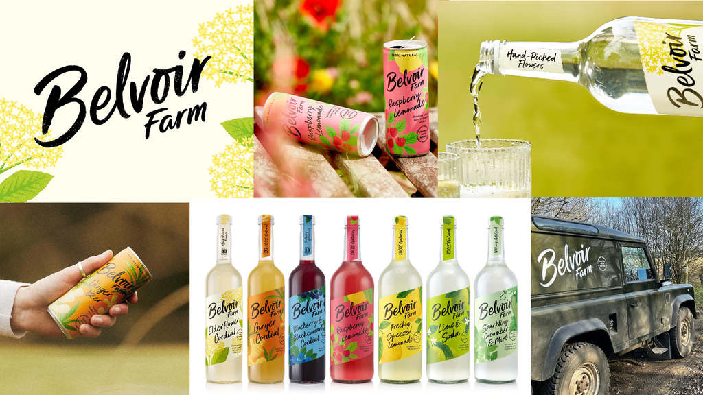
BE MORE BENJAMIN BUTTON - how to stay relevant as time marches on
For many brands, a redesign is prompted by the recognition that their loyal consumer base is getting older, and younger consumers are looking elsewhere. A stylistic update can be of great value here, where the brand's recognisable equities remain broadly in place but undergo a facelift in terms of their aesthetic.
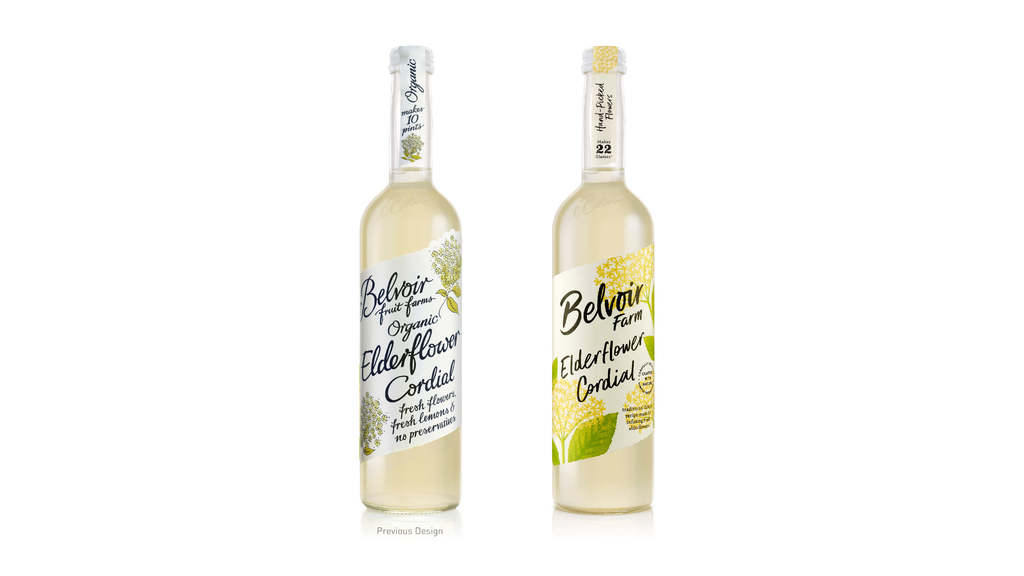
This approach can be seen in the recent refresh to Belvoir Drinks. In Belvoir's case, the brand's recognisable equities - a diagonal label, handscripted font and ingredient illustrations - all remain in place, but are redrawn in a more youthful and contemporary style.
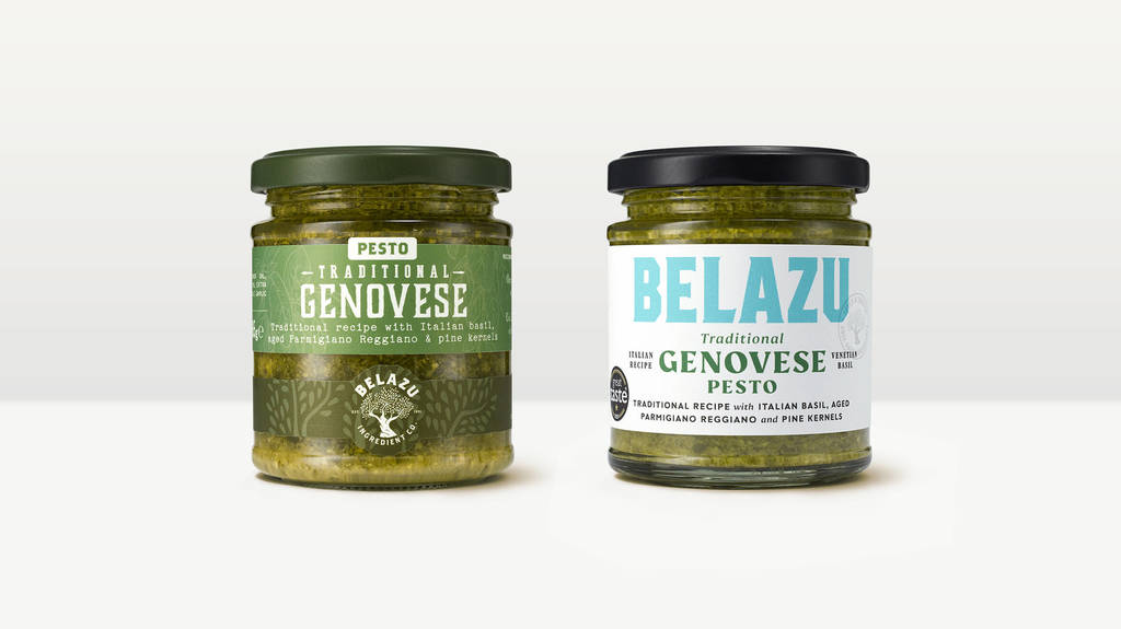
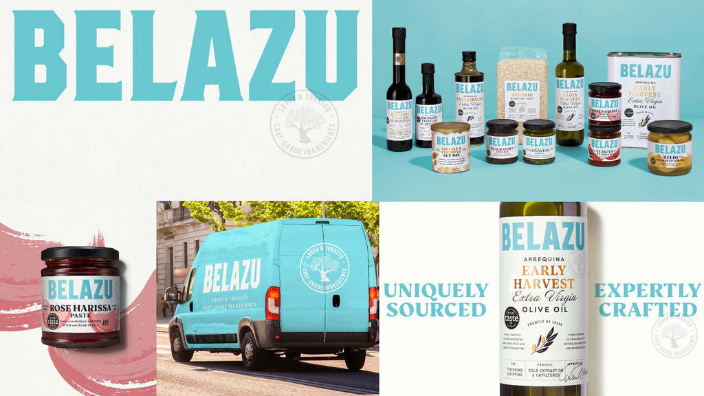
DON'T FORGET YOUR ROOTS - how looking back can help you look forward
A brand can undergo many twists and turns on its journey, from changing direction in terms of its product offer, to changing its management team or ownership. Often these new directions are reflected in branding alterations that make sense at the time, but distance the design from the brand's true origin story.
Belazu is a brand with a strong founder story at its heart, yet its design had become product-led, with packaging failing to reconcile the broad range with the central story that makes those products special. While the initial brief had called for some evolutionary pack changes to achieve greater stand-out, the strategic journey soon demonstrated that the brand's story needed to be told in a much bolder and clearer way - leading to a dramatic redesign. Like a lot of successful rebrands, the new Belazu identity has energised the brand inside and out.
For more information on Lisa's work and B&B Studio take a look on LinkedIn .
The 2024 Pentawards competition opens on 29 January - find out more here .