


Instagram at 100k: Your most liked posts
We have reached a huge milestone of 100k Instagram followers. To celebrate, here's a quick round up of 10 of our most popular posts in the last 2 years.
We reached a huge milestone of 100k Instagram followers. To celebrate, here's a quick round up of 10 of our most popular posts in the last 2 years.
This is a huge milestone and we could not be prouder of this incredible and inspiring community. Thank you for your continued support, stay safe and creative!
Unblackit by Backbone Branding


Posted July 2019
Unblackit milk is the opposite of an ordinary, cream-coloured milk bottle. It stands out on the shelf by embracing a black – not white – design. At first, customers are drawn in by the black perforated paper surrounding the bottle. Then, once they have taken the product home, they start unwrapping the dark exterior or … “unblackit”. The product’s packaging continues to surprise as the milk-coloured glass bottle is revealed and you discover the cow-like black spots decorating the exterior. By also featuring a cow-spotted logo and encouraging an interactive customer experience, Unblackit looks set to achieve its aim and disrupt the dairy aisles.
Find out more about Backbone Branding here .
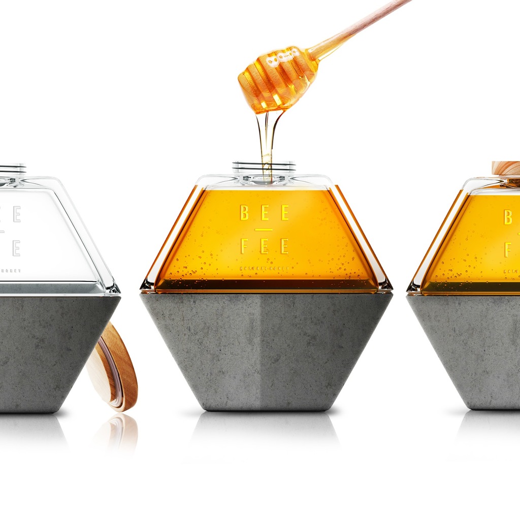


Posted 17 July 2019
BEE-FEE is a concept design that balances two elements: BEE – a glass jar that contains organic honey and FEE – a slim concrete flowerpot that will pay these little helpers back. Behind BEE-FEE’s delicious honey product are busy bees, who are threatened by the pollution in our cities. Providing a flowerpot with a hexagonal space-saving design, as well as its honey, BEE-FEE wants consumers to get planting beautiful flowers on their balconies. As these flowers grow, BEE-FEE hopes not only that we will have more honey, but more bees for the future.
Find out more about Opus B Brand Design here .
CanO Water by Perry Alexander Fielding


Posted 13 August 2019
CanO Water was created in response to the damaging effect plastic bottles have on the environment. The cans are made from aluminium, an infinitely recyclable material which can be recycled over and over again whilst never losing its quality! Recycle your can and it could be back on supermarket shelves within as little as 60 days. The aim is to provide consumers with an environmentally friendly alternative that not only does good for the planet but looks good too. The can reflect the simplicity of water with a minimalist, clean aesthetic that attracts a diverse demographic. With a resealable lid on the can, the consumers can pop it in their bag for later and stay hydrated.
Find out more about Perry Alexander Fielding and CanO Water here .
GÜDO by CaroselloLab


Posted July 2019
Based the brand essence on the insight that a gluten free diet can be colorful, tasty and happy: to create great recipes you only need to play around with the right ingredients. The team named the brand GÜDO, mixing up the words “good” and “gusto”, adding also a smile on the logo. The insight “Gluten Free & Happy to be” and the payoff “Do it con Gusto” became the root of the brand identity. The mix of photography, illustration and typography create an impactful yet clean presentation of the visual system which allows the designers to be more playful with the colors used for the packaging.
Find out more about CaroselloLab here.
Stash by Hunger Craft


Posted 16 July 2019
Inspired by the fast life and the rule-breaker, this concept pack for Stash snacks embodies the idea of ‘grab and go’ through design that is unwaveringly bold and imposing.
Stash’s signature vigilante is Bazington, an unabashedly law-breaking bear, who brings to life to the concept behind their product – snacks so good, they’re criminal. Unlike the wholesome, safe and serious nature of Stash’s competitors, Stash’s design makes its mark on the shelves within the fruit and nut sector with its bright colours and stand-out text. Having Bazington to aid them, Stash snacks also utilise secondary assets that look set to continue this criminal theme with personality.
Find out more about Hunger Craft here .
Conservas Son Sardina by barceló estudio


Posted 29 April 2021
The design concept is inspired by the ‘glass half empty or half full’ metaphor, reflecting the way we may see our daily lives. This is visually represented by clean line illustrations that reflect the shape of the can but with one half filled with a pattern and the other blank. The simplicity of the design creates a sense of tranquillity, further complimented by block muted colours that also provides variant indication and minimal copy in white font. It's about getting out of the routine and breaking with what we do every day. A way to go beyond a simple product, or a snack. Maybe new ways of seeing, understanding and reflecting on the everyday and turning it into something more special.
Find out more about barceló estudio here .
Pastis 12/12 by Monge Quentin


Posted 31 March 2021
Pastis 12/12 is a popular, chic brand that made a new generation of pastis that combines in a modern and fun way with the famous Place des Lices, pétanque. The bottles of Pastis 12/12 are inspired by the pastis glass carafes of the 50s. Each decoration is engraved in the glass by chronography, was designed by Monge Quentin , Tropezian by birth and internationally renowned illustrator. And by its name, “12/12” means “match ball” in pétanque, each game being played in 13 points. Exclusivity of Pastis 12/12, the detachable jack ball located on the top of the cap to play Pétanque with friends while drinking a glass of Pastis.
Find out more about Monge Quentin here .
Manta Roasted Coffee by Alejandro Gavancho


Posted 22 October 2019
Manta Roasted Coffee have excelled in illustrating packaging that uniquely displays the culture of Peru. The term “mantas” are patterned knitted blankets that are typically worn by the females in the Peruvian Andes. Mantas are said to be created in a rustic, handcrafted tradition. The idea of this is that it reflects the technique of how coffee is made in Peru. The bright palette within the packaging, as well as the striking illustrations, expresses the rare nature of Peru. From the flowers that grow there to the hummingbirds that are close to extinction. The brand has captured the most imperative areas that Peru focusses on.
Find out more about Alejandro Gavancho here .
4Life Mineral Water by Prompt Design


Posted 13 July 2020
Springwater is naturally produced and is available from the source of mineral water from Doi Chaang, Chiang Rai (Northern Thailand). This water is the natural product from the abundant fertile forest where we have to respect for habitat and environment.
Designed by Prompt Design, the package illustration is to convey how the animals live their lives with the water. The wavy lines and animals explain about the animals living with the water resource. For example the flamingo flying, the tiger swimming and the crocodile crawling in the wavy lines which represent the beauty of water waves. These pictures are reminding us that water is the life support of all living things. This is where the brand 4Life Mineral Water comes from!
Find out more about Prompt Design here .
Made Coffee by Break Maiden


Posted 19 June 2019
Cheers to the sunshine and good times. After they opened up shop in 2015, Made Coffee figured they'd pay homage to their home state - Florida. The bright baby blue of the can remind you of the cool and amazing taste of the cold brew coffee. The illustration depicts the classic Florida summer and the love about the Sunshine State.
Find out more about Break Maiden here .