


Back Monthly Discoveries, October 2020
As the most prestigious packaging design award in the world, Pentawards not only recognise the best packaging design via the competition but also promote the importance of packaging design through live events and social media. We are committed to being the bridge between excellent design organisation and brands that are always looking for the best packaging design solutions.
Take a look at the below for some of the most popular designs we shared this month across our social media channels.
CROON by Kvint Design


CROON is an eco-friendly beauty brand from Austria, and its product "ANGELPUFF" is a chemical-free and sustainable cleansing puff which is based on special microfiber technology. It removes dirt and waste from skin pores with just water. For CROON, Kvint Design wanted to create a modern but also feminine form. They decided that the shape of the 'squircle', a hybrid between square and circle, would be an interesting choice and used uncoloured pulp and coated paper as contrasting materials. Raw and organic but also vivid and modern at the same time.
Bean Playing Tennis by Bowler & Kimchi - Gold Pentaward 2020 winner


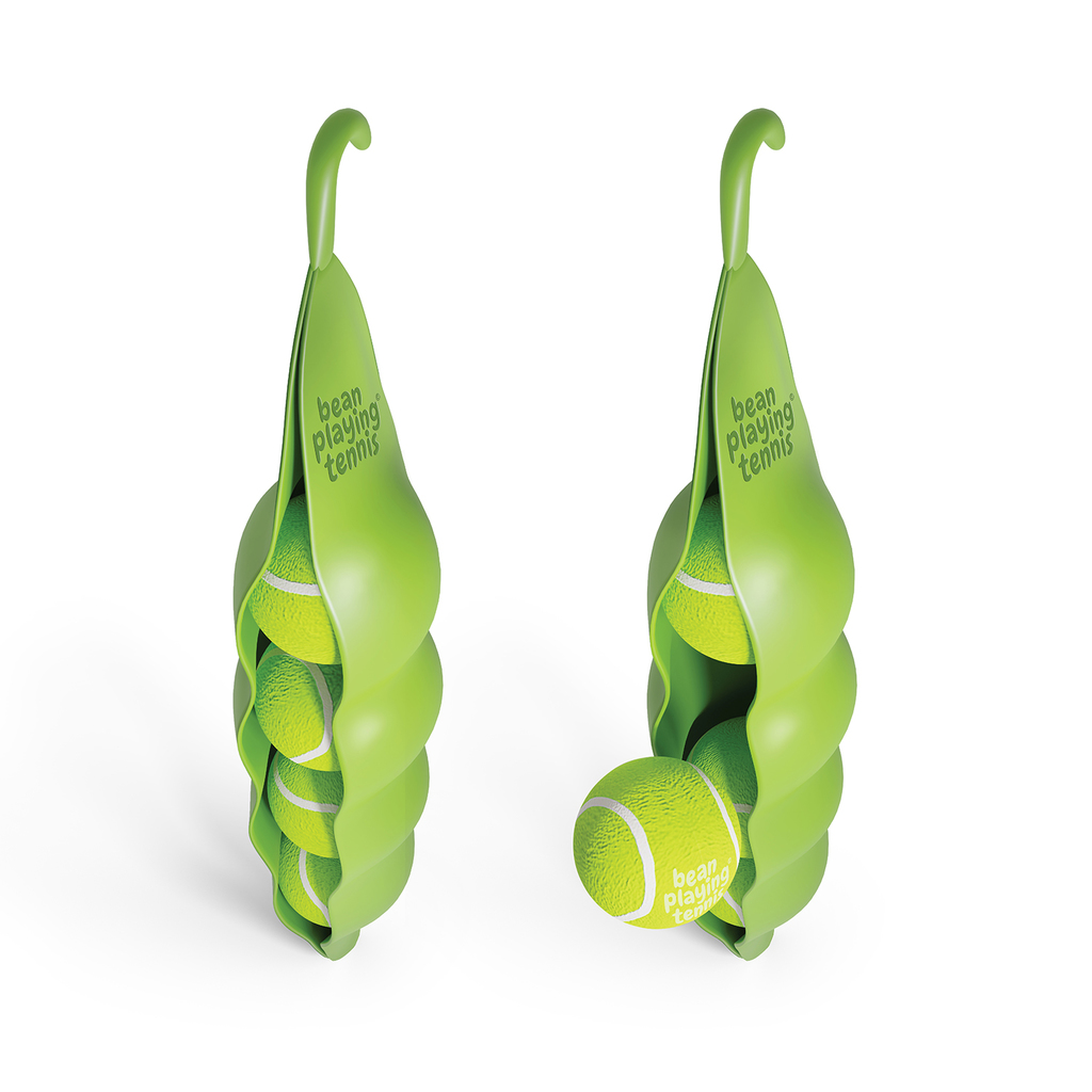
Bean Playing Tennis is a packaging concept which not only has great standout but that helps motivate kids to get outside, have fun. Inspired by the green bean, this tennis ball pack is transformed into a massive bean which holds four green bean tennis balls. The semi-matt finished hard-plastic clamps the balls in place but is soft enough to allow enough movement to pull the balls free from the front of the bean. A hook extends from the top of a bean as an organic natural shape, allowing it to be hung in-store or on the mesh fence found at a tennis court.
Milgrad by Depot branding agency


The blue cat travels across the packaging of different dairy products. It stares with interest, plays with a string, spies and skips a beat with expectation. The illustration starts from one side of the packaging and continues on the other to create the interaction with it straight from the supermarket’s shelf layout. Milgrad logo was also redesigned but in a lighter and more modern way. M is for milk. M is for Milgrad as well. M looks like a kitty’s muzzle. This playful design not only increased sales but also created many conversations across social media around the world.
Figlia by Superunion - Silver Pentaward 2020


Figlia is a limited edition batch of handcrafted olive oil from Agricola Dargenio. The edition was inspired by the Idea Feminine by Nature – which relates to both the product, how it’s made and the Agricola’s first female CEO. Each bottle is unique and designed to evoke a sense of femininity along with the organic nature of the product.
Superunion expressed the concept through 300 ceramic bottles hand made in the same region. The bottles were designed to resemble a feminine form, with each one completely unique reflecting the beauty in individuality. Aside from a subtle stamp in the base, the bottles are purposefully left unlabelled so they may be re-purposed. The series of illustrations are inspired by the bottle design and make use of soft organic shapes to form delicate and minimal depictions of female faces. Like the bottles, the illustrations aim to celebrate the uniqueness of all things natural and come in a multitude of variations set around the same style and colour palette.
Juniper by Invade Design


Based in Colombia, the label for Juniper's new sparkling water collection followed their previous design for Elderflower tonic water to keep the consistency of the category. Inspired by the English Victorian style, the labels reflect their attention to detail and unique taste, whilst the new colour palette reflects the refreshing flavours for this new sparkling water collection.
Vacay by The Refreshment Club


Vacay was born as a confident, quirky, sophisticated, unique and stylish new canned cocktail brand taking cocktails out of the bar to new horizons. The packaging designed by The Refreshment Club, used illustrations to highlight the brand role in people's lives: broaden tastes & broaden cocktail moments.
Each flavour illustration involves a sophisticated and serious stereotype doing something quirky, unexpected, and out of the ordinary while having a wink back at the flavour/cocktail provenance like a stiff straight cactus doing the can-can for the Paloma. Keeping with the sophistication and minimalism, this design took inspiration from one line Japanese illustrations and kept the rest of the design extremely clean, premium, and simple reflecting the product flavours and ingredients. The campaign created shows the drink surrounded by the multitude of ways consumers can enjoy our cocktail as they enjoy themselves calling out this sophisticated yet eccentric brand positioning.
Interested in a feature?
If you think your work deserves to be featured on our social channels, feel free to send us your design via info@pentawards.org. We look forward to hearing from you all!