


Pueblo's packaging design by Simple Studio
The Spanish agency delivers a bold design that leans on three pillars: typography, materials, and presentation.
The Spanish agency delivers a bold design that leans on three pillars: typography, materials, and presentation
In Spain, village life hasn’t always been celebrated, but it’s where the richest traditions, flavors, and stories are born. “Pueblo” is a bold tribute to these roots—honoring authenticity, tradition, and generations of craftsmanship. This line of Spanish cold meats captures the essence of village life: care in every detail, passion for quality, and pride in simplicity. Because deep down, we all carry a piece of the village within us.
To bring the spirit of “Pueblo” to life, the design leans on three pillars: typography, materials, and presentation.

The name itself exudes strength and meaning, so it became the focal point of the design. Bold typography, paired with earthy, nostalgic colors like the red of adobe bricks from old village homes and the golden yellow of sun-dried straw, evokes a deep connection to Spanish heritage.
Kraft paper, chosen for its natural and unrefined texture, perfectly conveys the artisanal nature of the product. It avoids unnecessary embellishments while maintaining a sense of quality and authenticity.

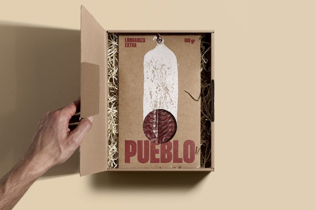
Finally, no Spanish cold meat would be complete without the iconic rope used in the drying and curing process. This essential detail, rooted in Spanish culinary tradition, adds the perfect finishing touch to a minimalist yet impactful presentation. Together, these elements deliver the essence of the village—a vacuum-packed artisan cold meat, ready to be taken, shared, and enjoyed with pride in its authenticity.

For more information on the design, visit Simple Studio's website or follow them on Instagram .