


Five beer brand and packaging designs
For International Beer Day we’ve collected a few exciting beer label and packaging designs showcasing some of the different styles and trends in the industry today.
For International Beer Day we’ve collected a few exciting beer label and packaging designs showcasing some of the different styles and trends in the industry today.
The craft beer industry has forever displayed a variety of design trends and styles that’s ever changing, from the brightly coloured, to the elaborately illustrated to the minimalist. Therefore, it’s tricky to pinpoint any one leading trend. Below we have collected a few designs from the last year that exhibit a variety of styles today.
Viharsarok Lemon Meringue Pie by Studio Nabi

Studio Nabi create a unique and tactile label for Viharsarok Brewery’s limited-edition lemon meringue craft beer. With the use of real lemon zest and vanilla extract, the craft beer’s unique Lemon and pastry flavours inspire Studio Nabi ‘s packaging design.


Combining all the colours of this classic dessert along with a few additions that evoke the feeling of a perfect summer day, Studio Nabi create a lively design, visually depicting a burst of flavour. The colourful dot pattern is formed using a layered printing technique on the smooth matt surface, creating a tactual sensation, and finished with a 3D varnish foil to make the colours pop. Opting for a sturdy, heat, and water-resistant printing base gives the labels protection from damage during transportation or refrigeration.
The rebrand and packaging sets out to support the brewery’s entry into the nationwide craft beer market, transforming it into a worthy competitor.
Find out more about Studio Nabi here .
Utopian Brewing by Kingdom & Sparrow

Utopian Brewing Co produce naturally brewed larger with 100% British grown ingredients from their brewery in the heart of Devon. Using a combination of traditional and modern methods, the brand aims to be the first independent, premium British lager brand for discerning drinkers nationwide with sustainability at the core of what they do, with long-term plans to become totally carbon neutral.

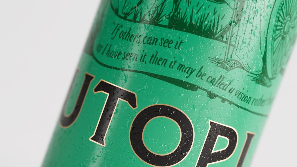
For their introduction into the market, Utopian turned to Kingdom & Sparrow to create a brand that communicated their strong history, environmental values, and reflected the quality of their premium beer. Stepping away from typical brand cues, The brand agency balance classic styes with forward thinking innovation. A hand drawn illustration of a strong female warrior raising a glass adorns the can, surrounded by wildlife and the lion, representing the brands British roots and natural process and ingredients. A stripped back colour palette keeps the identity contemporary while a robust logo with classic lettering provides gravitas and a premium feel.
Find out more about Kingdom & Sparrow here .
EBBS by Pentagram

EBBS is a new Brooklyn-based craft brewery taking beer back to basics. Based in Williamsburg, NY, the brewery uses locally sourced ingredients and operates with a locally obtained no-nonsense attitude. This straightforward approach is carried through to the packaging, designed by Pentagram who are also based in New York.


With its local pride and deep-rooted New York character, the brewery’s visual identity becomes an homage to the iconic city, especially the people starting with their tagline: “Born in Brooklyn, brewed for the people.” A simple, plain-speaking structure and typographic framework adorn the label with a clean black and white palette. Beer variations are identified using a number coding, such as ‘Lager No. 1, Stout No. 1 and IPA No. 5’, all set in the bold Original Sans, and further distinguished by different humorous, witty, or abstract visuals. These are created in collaboration with illustrators Chris DeLorenzo, Lennard Kok, Pol Monserrat and Andreas Samuelsson. The name “Ebbs” is short, strong and simple, evoking water and New York’s rivers and harbour, as well as Ebbets Field, the home of the Brooklyn Dodgers baseball team.
The black and white identity provides just-the-facts but still makes space to be creative with the possibility for colour in the future.
Find out more about Pentagram here .
Tin Whistle Brewing Co by Wall Flower Studio

Situated in Penticton of South Okanagan, Tin Whistle Brewing Co. is the first craft brewery within the British Columbian region. Since a change of management in 2020, the brewery has now become one of the first carbon neutral breweries in the province. To match this new shift, the brand set out to reimagine their visual identity through collaboration with Wall Flower Studio.


To reflect the company growth, local area, and the exploratory nature of the train the brewery was named after, Wall Flower Studio created a brand narrative that revolves around the idea of adventure. The locomotive is repositioned as the brand logo and conductor of the adventure, but now with a simplified and more modern aesthetic. Drawing direct inspiration from the Penticton area and local folk art, vivid and playful illustrations depict identifiable locations with local wildlife and characters engaging in activities and adventures, further complimented by the variant names taken from these animals or places. More simpler designs are given to the brewery’s “Classics” collection, comprised of their original recipes.
The fresh new visual identity gives the brand approachability and familiarity, enticing consumers to gravitate towards the cans on liquor store shelves.
Find out more about Wall Flower Studio here .
Stubbie by Creative Platform

Brewed by the award-winning Gage Roads Brew Co in Western Australia, Stubbie is a Kölsch-style beer made with homegrown hops and malt and designed for a new generation of Aussie beer drinkers.


By identifying that a simpler lifestyle has become more appealing to the modern generation, Creative Platform uses a more traditional, stripped back aesthetic, ironically taken from an older era often referred to as ‘simpler times’ or the ‘good old days’. The bare brown colour of the iconic glass bottle became the driving force of the palette and identity, with the label information kept to a minimum and screen printed in a white, classic yet playful font. The blue colour used for the outer packaging and cap contrasts with the brown bottle adding a modern twist. The visual identity is designed to communicate the new brand in an authentic and humorous way with tag lines like “stubbornly refreshing”, balancing tradition in a new modern style.
Find out more about Creative Platform here .
Have some new packaging you’d like to share? Submit your project here for a chance to be featured!