


Reese’s Ice Cream rebrands in partnership with Turner Duckworth
Turner Duckworth and Reese's design team partnered to deliver a confident and bold rebrand for their ice cream line.
Turner Duckworth and Reese's design team partnered to deliver a confident and bold rebrand for their ice cream line
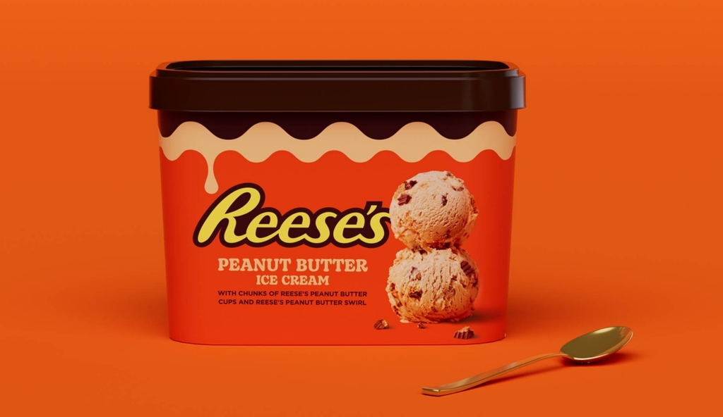
Reese’s design team partnered with Turner Duckworth for a rebrand of their packaging for a refreshing and distinct look for their ice cream line. Prominently known for its bold visual identity, the rebrand once again portrays vibrance and confident visuals for a shelf that stand out with aesthetics crafted to hone Reese’s imagery in the market.

The packaging portrays a consistent pattern with an orange colour palette, and tempting illustrations of the ice cream adorn the pack to capture immediate attention, portraying an irresistible treat. Reese's is often associated with Peanut Butter Cups but failed to deliver the imagery for their frozen treats. Drawing from their success with Peanut Butter Cups the design agency delivered a playful and engaging imagery for their ice creams.
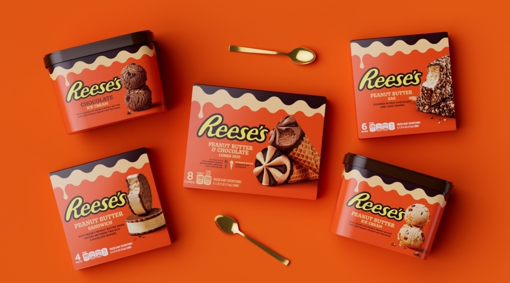
Turner Duckworth worked with the brand's strongest feature, the peanut butter cup, and delivered an illustration that created a fusion between the brand’s signature visual and its frozen treat. With the added illustration, the pack features a composition of stacked food imagery, capturing a drip and adding to the aesthetics of Reese’s ice cream.
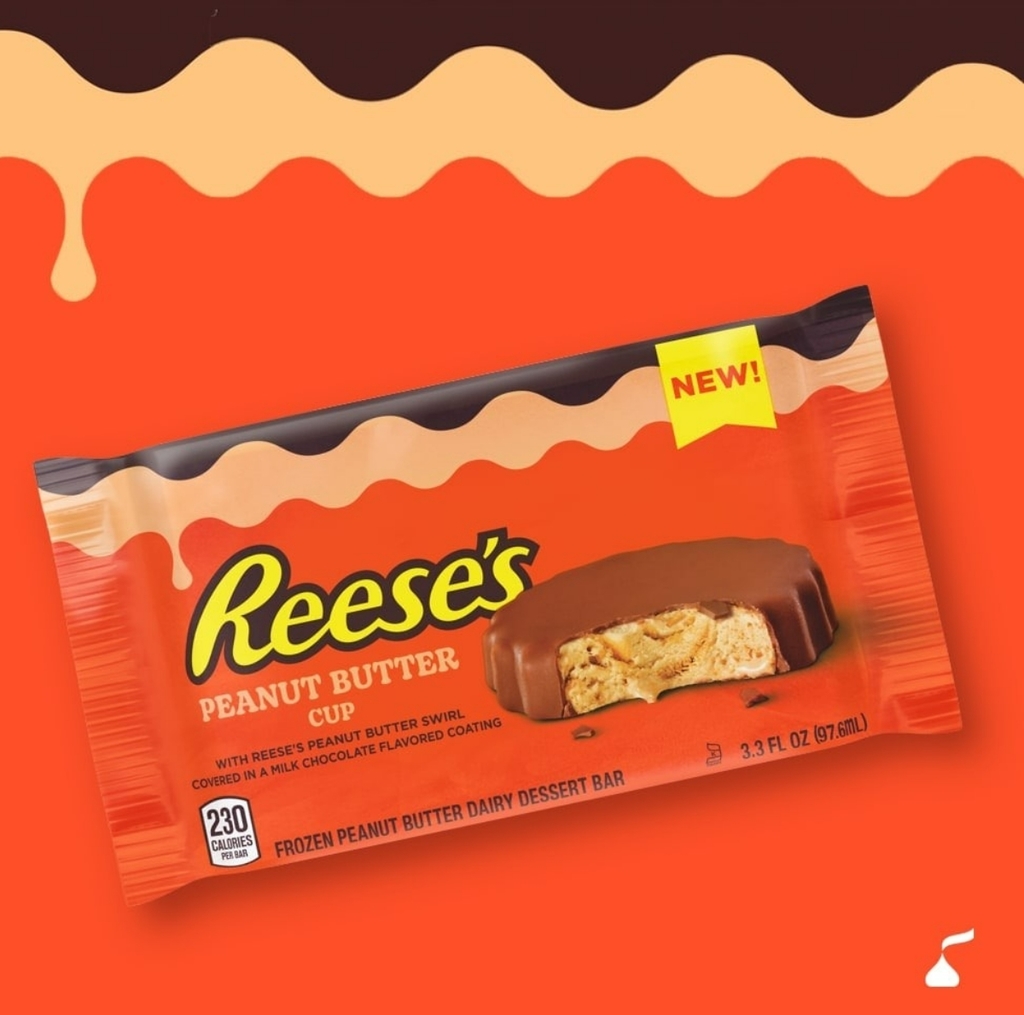
Inspired by the consistency of the ice cream, the team chose a thick and bold typeface against a colour palette that indicated mouth-watering peanut butter ice cream.
For more information on Turner Duckworth’s design, visit their website or follow them on Instagram.
Do you have a new packaging you would like to share? Get in touch with us
here.