


Back Fourpure rebrand takes this craft beer back to its roots
Thirst Craft’s complete brand identity for Fourpure craft beer that delivers a much-needed revamp for the long-established London brewery.
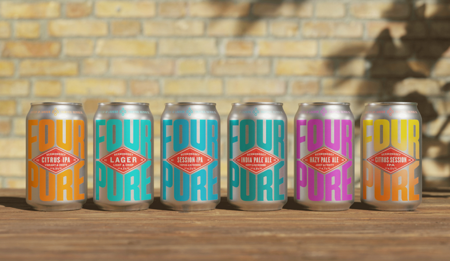
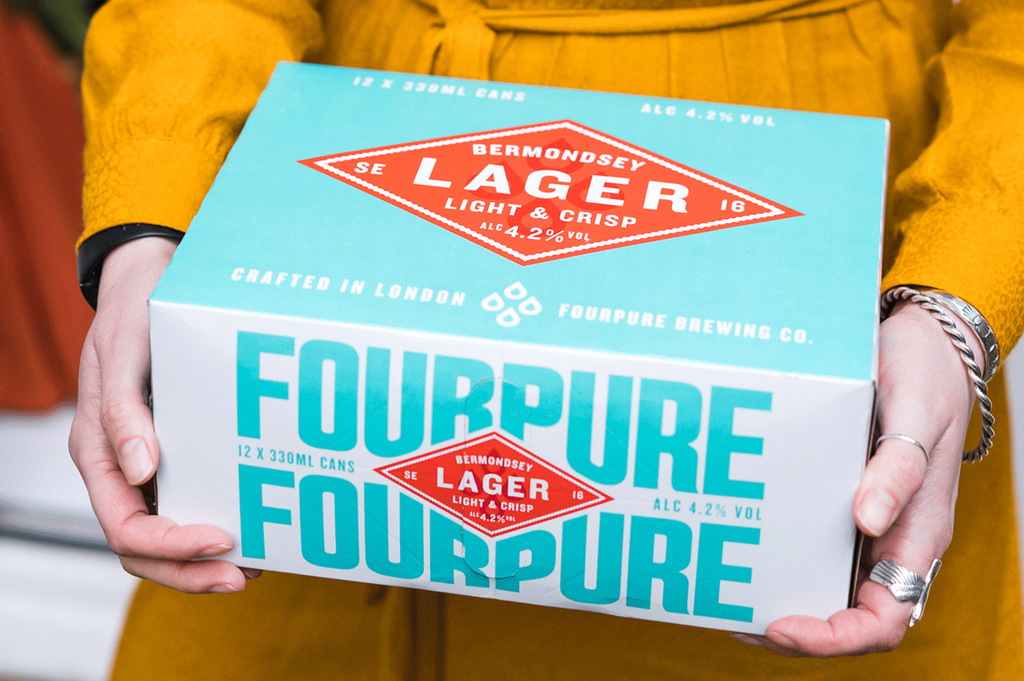
A proud product of its postcode, Fourpure’s new refreshingly simple ethos is brought to life by Thirst Craft’s full repositioning and redesign, starting with their flagship lager.


Extravagant, hyper illustrations and label designs are more commonly synonymous with the craft beer industry, however, Thirst Craft knew this design needed to reflect the brand’s uncomplicated philosophy, opting for a clean, simplistic approach, also making the brand stand out and accessible to all. This is further amplified through the use of contrasting colours and minimal yet bold characters.

With Bermondsey at the heart of Fourpure, a distinctive red diamond sits central to the label, featuring the locations postcode and intricate detailing at the edges, giving a subtle nod to the area’s textile past. Confident, industrial lettering surrounds the diamond shape, flexing to fill its canvas.

Fourpure’s name is symbolised by a simple Four Drop icon, alluding to each beer’s four base ingredients.

The brands no nonsense philosophy resonating throughout this visual identity right through to its advertising featuring the tag line; “Serving Suggestion: Drink it”, the new branding is a return to Fourpure’s fundamentals: great beer meets Bermondsey attitude, pure and simple.
Find more about the Fourpure rebrand by visiting Thirst Craft’s website or following them on Instagram .
Have some new packaging you’d like to share? Email us info@pentawards.org for a chance to be featured!