


Back Monthly discoveries, June 2020
As the most prestigious packaging design award in the world, Pentawards not only recognise the best packaging design via the competition but also promote the importance of packaging design through live events and social media. We are committed to being the bridge between excellent design organisation and brands that are always looking for the best packaging design solutions.
Take a look at the below for some of the most popular designs we shared this month across our social media channels.
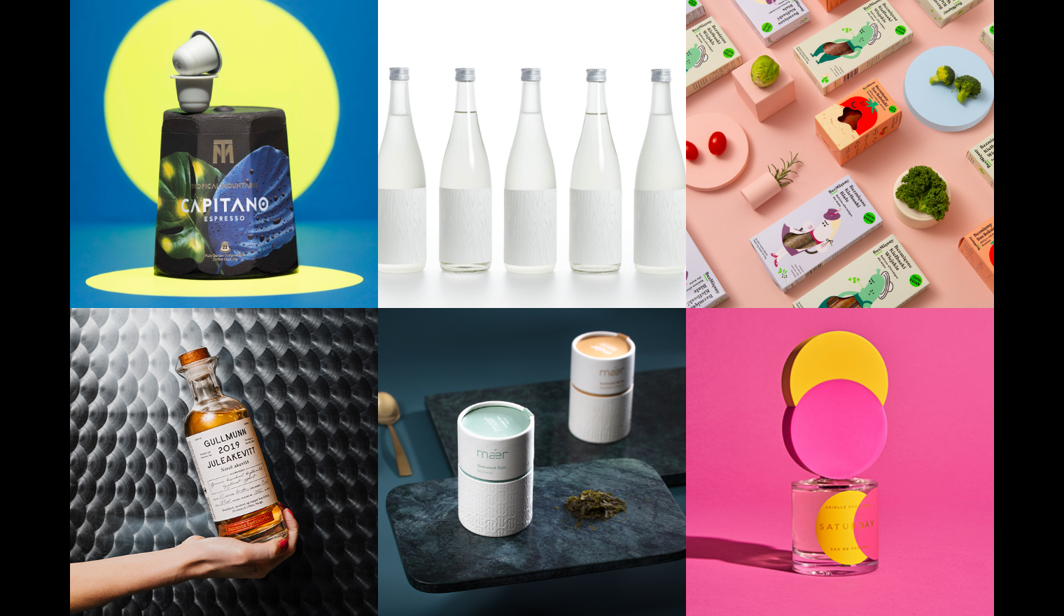
Tropical Mountains by Walker


The Tropical Mountains capsules follow an innovative concept grounded in the idea of respecting the coffee trees, the local farmers and the environment. The design, developed by Walker, is influenced by the rich flora and fauna of tropics. And in keeping with the brand’s ethical and sustainable ethos, the designers developed bespoke packaging made from fully recyclable and compostable materials. Included under the lid is a coffee bean ready to plant so that environmentally responsible coffee lovers can complete the cycle and plant their own tree.
Hitoto Kito Hitotoki Sake by Bullet Inc


The tradition of brewing sake in wooden barrels is a prominent feature in the Japanese sake culture. However, the tradition is disappearing from the brewing scene as there is only one company remaining in Japan that is capable of building the large wooden barrels.
Determined to maintain the culture of wooden barrel brewing for the next 100 years, Imayo Tsukasa Sake Brewery commissioned craftsmen to build a pair of new 4,000-litre-class wooden barrels, and employees of the brewery took an active part in their production as well. The sake brewed in those barrels has been named “Hitoto Kito Hitotoki” —Japanese words meaning “human, wood and moment.” The design of its label needed to live up to the special passion behind the creation of this sake.
For the label design, Bullet Inc traced a part of the grain pattern from the cedar wood barrels which the brewery's employees had poured their hearts into. The label is made of a special paper called Pachica, which melts and turns translucent when heated in the de-bossing process. By applying two different levels of pressure, a sense of depth was achieved in the wood grain pattern. The pattern was decided to be white because it is meant to complement the sake gracefully, rather than standing out on its own. The product name is also written on the edge of the label to give a subtle impression. Through this design, we wanted to encourage the viewer to touch and feel the product rather than read and understand the information on it. Sake brewed in a wooden barrel takes on a light yellow colour, which can be seen through the translucent part of the wood grain pattern, and it is also interesting to see the label through the liquid from the back. The appealing label design beckons viewers to touch and obtain it, and it has effectively led many to purchase the product.
Meatless packaging by Podpunkt


By using quirky and funny vegetable characters, Podpunkt wants to deliver the idea that the food can also be as flavourful of meat without consuming any products of animal origin. Each character has attributes that correspond with the product category and taste, helping customers find what they are looking for.
Gullmunn Spritfabrikk by Olsson Barbieri


In the world of distillation is usually dominated by men, making Gullmunn Spritfabrikk special as it's distilled by a female Cognac distiller Marthe Bøhn. Female vision opposes the Anthropocentric vision that has dominated our society, with a belief that human beings are the most important entity in the universe.
Olssonbarbieri wanted to portray an image of nature where every being is equally important. The naming of the distillery is inspired by Herman Hesse's novel 'Gullmunn og Narcissus' in which the protagonist Gullmunn represents nature, exploration and a “feminine mind”. The illustration is a homage to Maria Sibylla Merian (1647-1717) and her study of the butterfly’s symbiotic relationship to plants. Maria Sybilla herself worked in a male-dominated profession and her studies are today considered the very foundation of the term ecology. The butterfly´s metamorphosis on the oak branch represents rebirth and change and is a metaphor to the process of distillation itself where the liquid turns to vapour, before reappearing again as a purified product.
Oak barrels are used in the maturation of the akevitt. The glass shape is inspired by vintage apothecary bottles and the engraved cork is made in oak. The illustration technique is pointillism and is silkscreened on the bottle with 7 colours. The decorated bottle is inviting to be reused as a carafe once the bottle is empty and the label is off. The main typographical label is inspired by taxonomical documents employing a subtle grey paper, while the foot label is gold hot-foiled. All collaborators in this project were women.
Mǽr seaweed by Kind


 SUPERFOOD WITH ZERO FOOTPRINTS
The word "Mǽr" means "pure, untouched". Just like the seaweed from Lerøy Seafood's brand “Mǽr”, which hides in the depths of the sea, pure and untouched. The products live up to their name and are both pure and organic. The Mǽr spices range consists of healthy gourmet ingredients available to everyone. Small amounts of seaweed from Mǽr can yield massive health benefits. This formed the basis for the slogan; "Less is Mǽr ". The design philosophy "Less is more" is the very definition of Scandinavian minimalism. Mǽr, as a brand, is shaped through the aesthetics and active ingredients of the product. The identity is inspired by dancing seaweed and visualized in minimalistic packages of sustainable material. The paper used in the printed matter is produced from organic seagrass.
Arielle Shoshana by Wadeandleta


After working in the scented luxury sector for years, DC-based fragrance boutique Arielle Shoshana wanted to create their own scents to capture the days of the week. Wadeandleta developed a custom-made injection moulded caps to allude to the irresistible vibrancy of each scent's notes of daily escapism. Utilizing the simple shape of the bubbly circle, this design coupled the designs of the label and box to create a rich colour story that looks great on its own and even better when stacked together on a shelf that can be expanded upon with future releases.
Interested in a feature?
If you think your work deserves to be featured on our social channels, feel free to send us your design via info@pentawards.org. We look forward to hearing from you all!