2024 PEOPLE'S CHOICE AWARD SHORTLIST
In addition to professional expert opinions, we listen to the voice of the public. As part of the 2024 competition, we gave you a chance to vote for a winning entry, the People's Choice Award.
Announced at the 2024 Gala Ceremony, the winner is BANANOSTAFIDO by Loukas Chondros!
See more details on the shortlisted packs below.
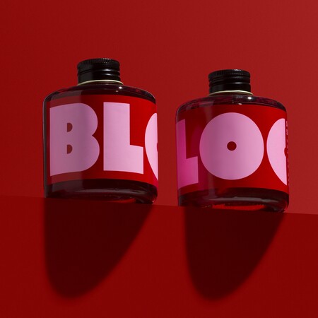
BLOC BOTTLE COCKTAILS
THE BAR BRAND PEOPLE, AUSTRALIA (BEVERAGES - COCKTAILS)
BLOC is a bottled drinks company building ultra-new classics for the adventurous at-home cocktail enthusiast. Just like the way they blend their ingredients - some rare, some unfamiliar, all delicious - the bottles are shaped to stack up, each BLOC building on the one that came before it.
The experimental nature of the flavours are communicated through the bold contrasting colours which change to complement each hero ingredient.
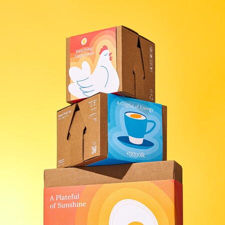
EGGYOLK TABLEWARE PACKAGING
HANDS COLLECTIVE, VIETNAM (SUSTAINABLE DESIGN – HOME, LEISURE & OTHER MARKETS)
A small coffee brand known for its signature egg coffee, Eggyolk challenged us to reimagine how it approaches packaging for its new tableware collection.
The design features only necessary information and simple use of colour and illustration to limit the usage of ink and paper, whilst the structural design eliminates adhesive creating a unique unboxing experience that resembles the motion of cracking an egg.
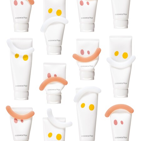
POLA COSMOLOGY
POLA INC., JAPAN (BODY, HEALTH & BEAUTY - SKINCARE)
We believe that embracing the full spectrum of our human emotions, both positive and negative, is what makes life fulfilling. Reflected in this packaging design, the main feature of the tube is the squeezer clip that slides on from the top, which can be positioned anywhere along the length of the tube to display a different expression.
Designed with facial elements as motifs, it engages the consumer both when using the product and when it sits on the shelf.
ISLE OF WIGHT TOMATOES
B&B STUDIO, UNITED KINGDOM (FOOD – FRUIT AND VEGETABLES)
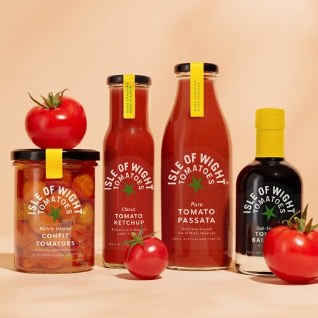
This rebrand involved a name change to better emphasise provenance, and a new logo to help deliver stand out in an area dominated by supermarket own label.
On pack the logo takes centre stage, and where possible, the design is printed on clear labels to showcase the product inside. We also introduced die cut coloured labels to represent the complex flavours across the range, using the warm yellow on tamper seals and neck capsules, and a green tomato calyx as a standalone icon on lids.
PETAL DANCE TABLES BLOOM
MOSI MOSI, HONG KONG (HOME, LEISURE & OTHER MARKETS - STATIONERY)
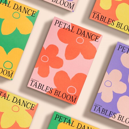
The Petal Dance Tables Bloom Calendar is a monthly calendar created in collaboration with autistic artists, where each page come alive like vivid flowers.
The calendar itself is an art piece, that features over 20 Pantone spot colours and uses different printed techniques such as hot stamping, foam ink, glow-in-the-dark ink, thermo-ink and embossing. The hope is that the sight of a lively dance of blooms on your desk will ease stress and make you feel re-charged.
OT
BRAND FORMA, KAZAKHSTAN (BRAND IDENTITY & CONNECTED PACKAGING – PACKAGING BRAND IDENTITY PROJECTS)
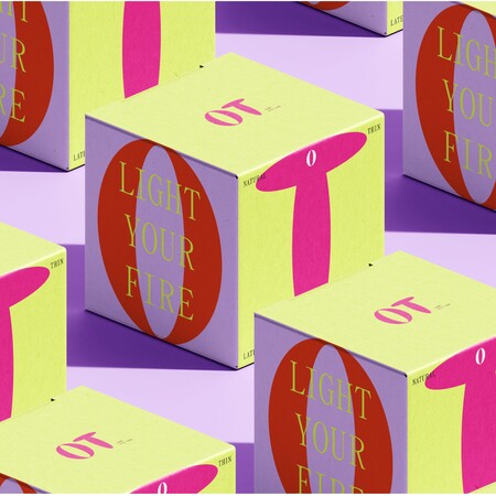
In Kazakhstan, a lack of comprehensive sex education, gender inequality, and a culture of shame around sexuality persist. OT aims to be more than a product—it's a symbol of healthy, equal relationships, promoting mutual understanding in intimacy.
Through the use of words and symbols, where for example "O" symbolizes a woman, "T" represents a man, OT is a domestic condom brand created to redefine sexual culture through design and communication.
OREO x PAC-MAN COLLABORATION
THE OTHERLY, UNITED KINGDOM (BRAND IDENTITY & CONNECTED PACKAGING – BEST COLLABORATION)
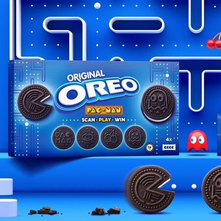
To amplify Oreo’s ambition to become the gaming snack of choice, The Otherly created a unique visual identity for the collaboration between the cookie and gaming icon PAC-MAN. Realising that the embossing on the Oreo looks like PAC-MAN’s maze, they turned each of PAC-MAN’s distinctive assets into a maze created with a blend of Oreo florets, dot-dash linework, and playful patterns.
Bringing both brand worlds together, six bespoke cookie designs in limited-edition scannable packaging were created, with each unique embossment allowing consumers to unlock special mazes and win prizes.
THE PACK BY KOTEX
PEARLFISHER, UNITED KINGDOM (BODY, HEALTH & BEAUTY – HEALTHCARE)
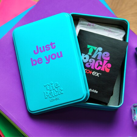
The Pack by Kotex is an educational platform, educating South African girls on periods through a personal kit, posters, leaflets, and through an online community with a group of four female digital characters.
Brands often adopt a clichéd, naive aesthetic when engaging young girls with periods, which couldn’t be further from the tech-savvy world of Gen Alpha. Taking this into consideration, a gamified aesthetic was developed, resonating with the modern lives of tween girls and making the brand relevant, fun and engaging.
BANANOSTAFIDO
LOUKAS CHONDROS, GREECE (FOOD - PLANT-BASED, VEGAN & ALTERNATIVE FOODS)
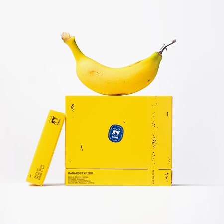
This packaging design for a whole dried Cretan organic banana, a 100% natural vegan snack, takes all of its design cues from its product.
Inspired by the banana peel, the embossed brown spots imitate the markings that naturally appear on banana skin, and a designated perforated area on the packaging to open the pack mimics the act of peeling a banana. Additionally, the inner surface of the box features the same pale yellow colour as the inner side of a banana peel.
BABADITTO
HEAZ, REPUBLIC OF KOREA (HOME, LEISURE & OTHER MARKETS – HOUSEHOLD MAINTENANCE)
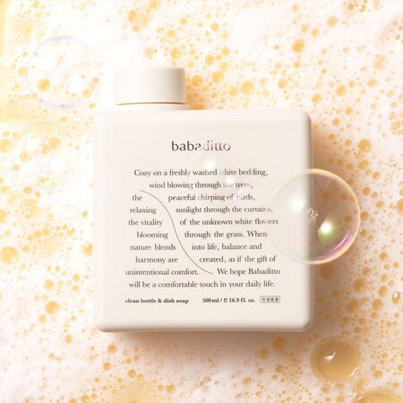
The name for Babaditto, an organic baby-friendly detergent, blends the words “baba” (baby) and “ditto” (alike).
The brand identity, symbolized by a soft, rhythmic curve like a “gentle wind”, is enhanced with the other senses, complemented by a subtle and comforting scent, and an aesthetic reminiscent of a baby’s tenderness and purity. Heaz rounded the corners of the products and selected a soothing beige hue to evoke a sense of soft comfort, and to distinguish from our competitors’ angular, transparent containers.
NOLLA CARE
DESIGNREPUBLIC, BELGIUM (SUSTAINABLE DESIGN – BODY, SKIN, HEALTH & BEAUTY)
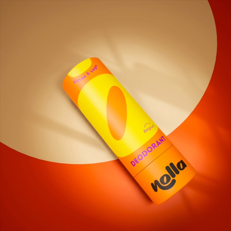
Tasked with re-working the logo and developing a visual identity for eco-conscious cosmetics brand Nolla, the approach was to go in the opposite direction to the usual soft colours and delicate fonts in the market.
The recurring graphical element in the design is the ‘O’ from the brand name Nolla, which means zero in Finnish and symbolises the zero use of plastics in the packaging, and zero use of non-natural elements in the product.
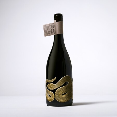
LAOCOON WINE
ALLIANCE ETIQUETTES, FRANCE (BEVERAGES – WINE DARK)
The snake label is a nod to the Trojan priest Laocoon, and is made entirely of sculpted pewter that adorns the entire bottle of wine like a piece of jewellery. Despite its malleability, fastening such a large pewter piece required a great deal of ingenuity.
In addition to its visual appeal, pewter is an infinitely recyclable, water-resistant and non-toxic material. The neck finish, made from paper with recycled fibre content and one-color printing, completes the visually impactful and eco-conscious packaging design.
