
Numeroquattro is an Italian design studio specialized in visual identity, web design, corporate communication, and advertising, with award-winning projects in packaging design at both national and international levels.

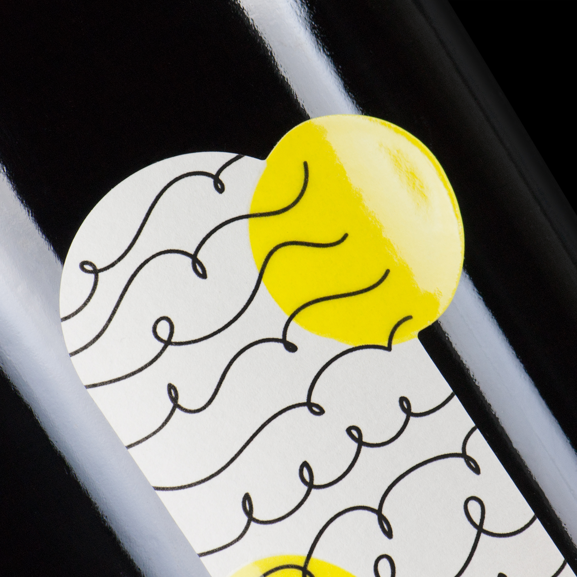
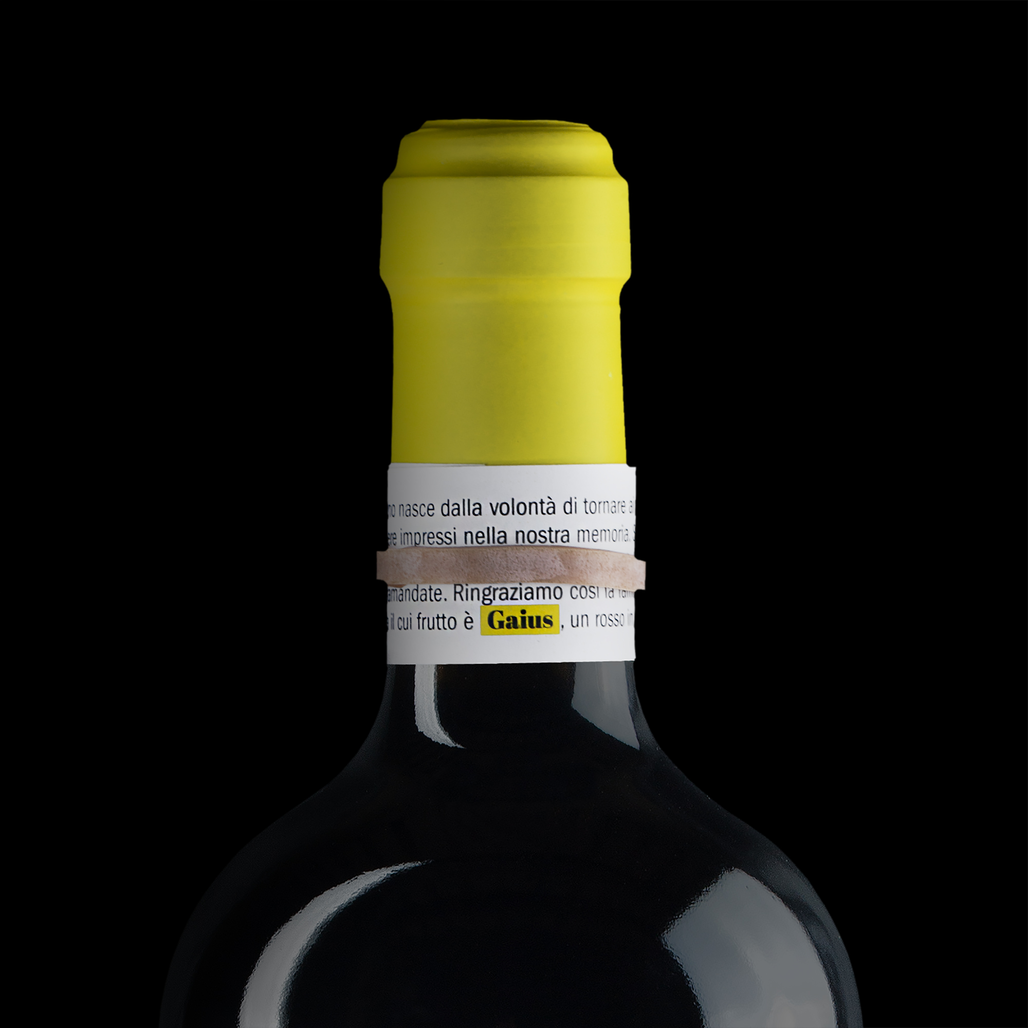
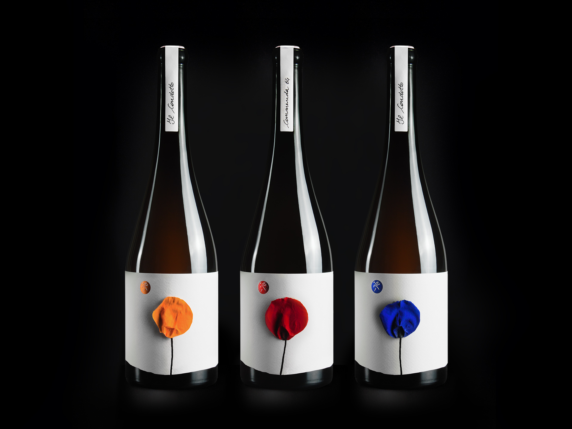
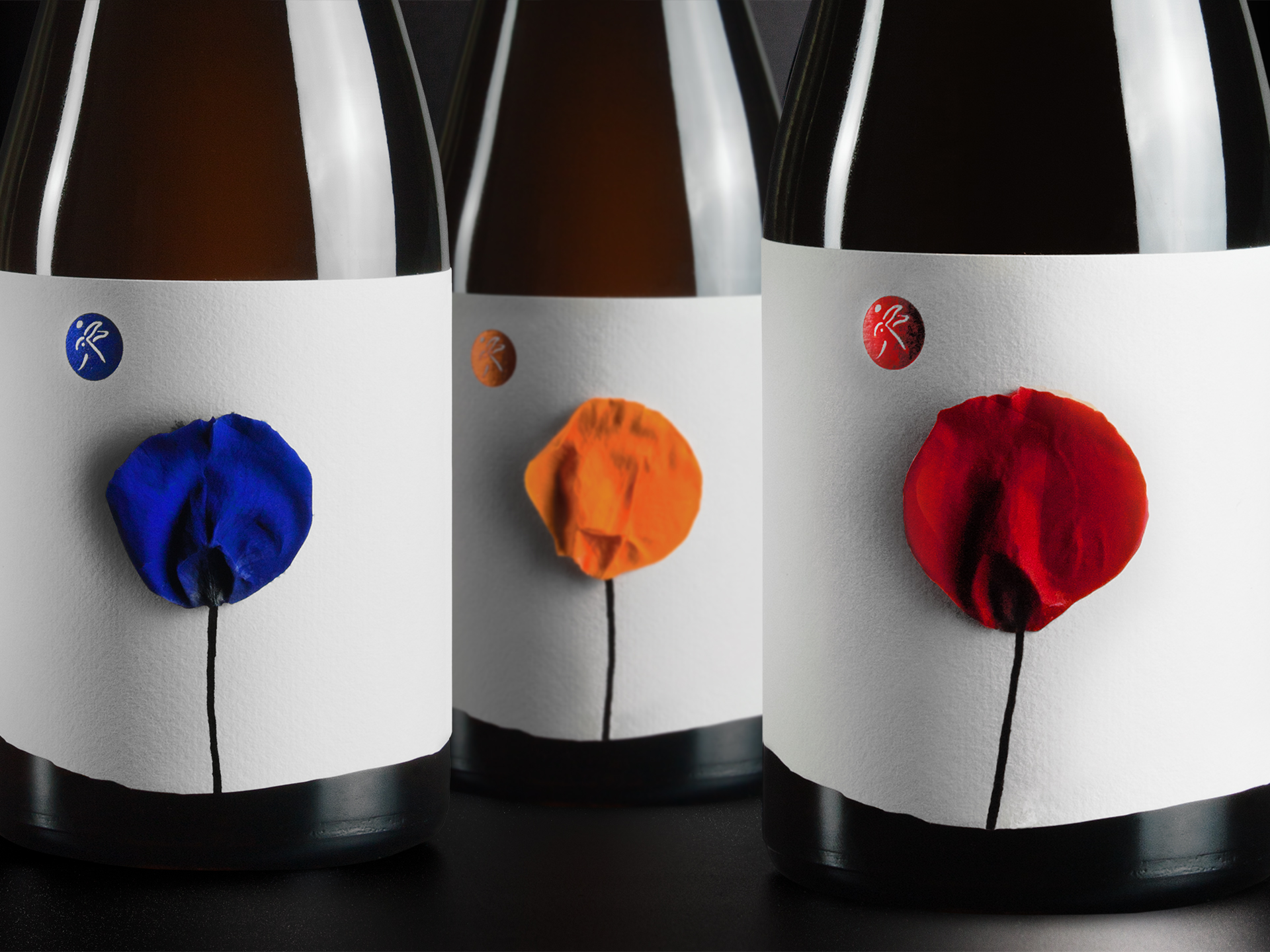
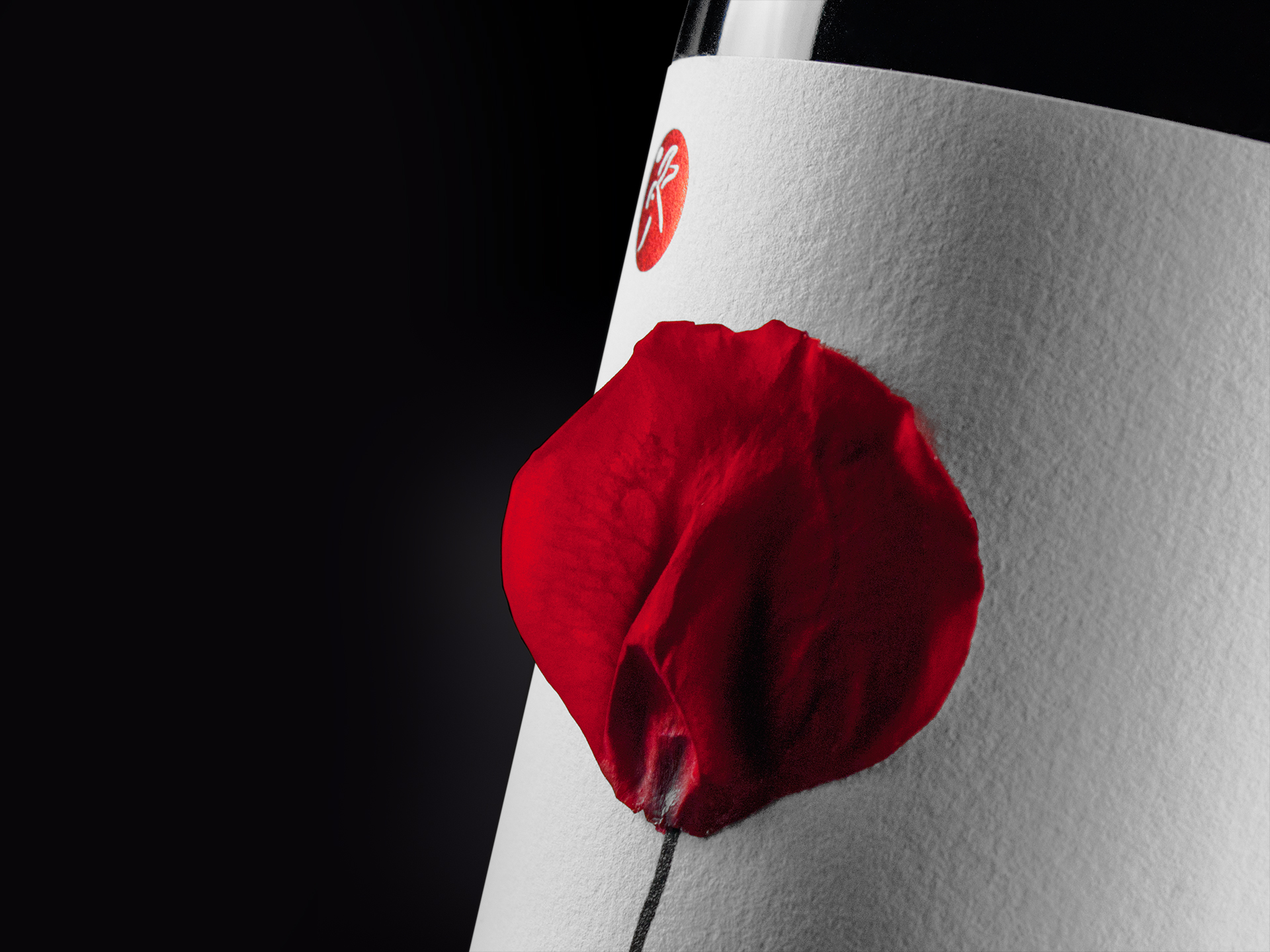
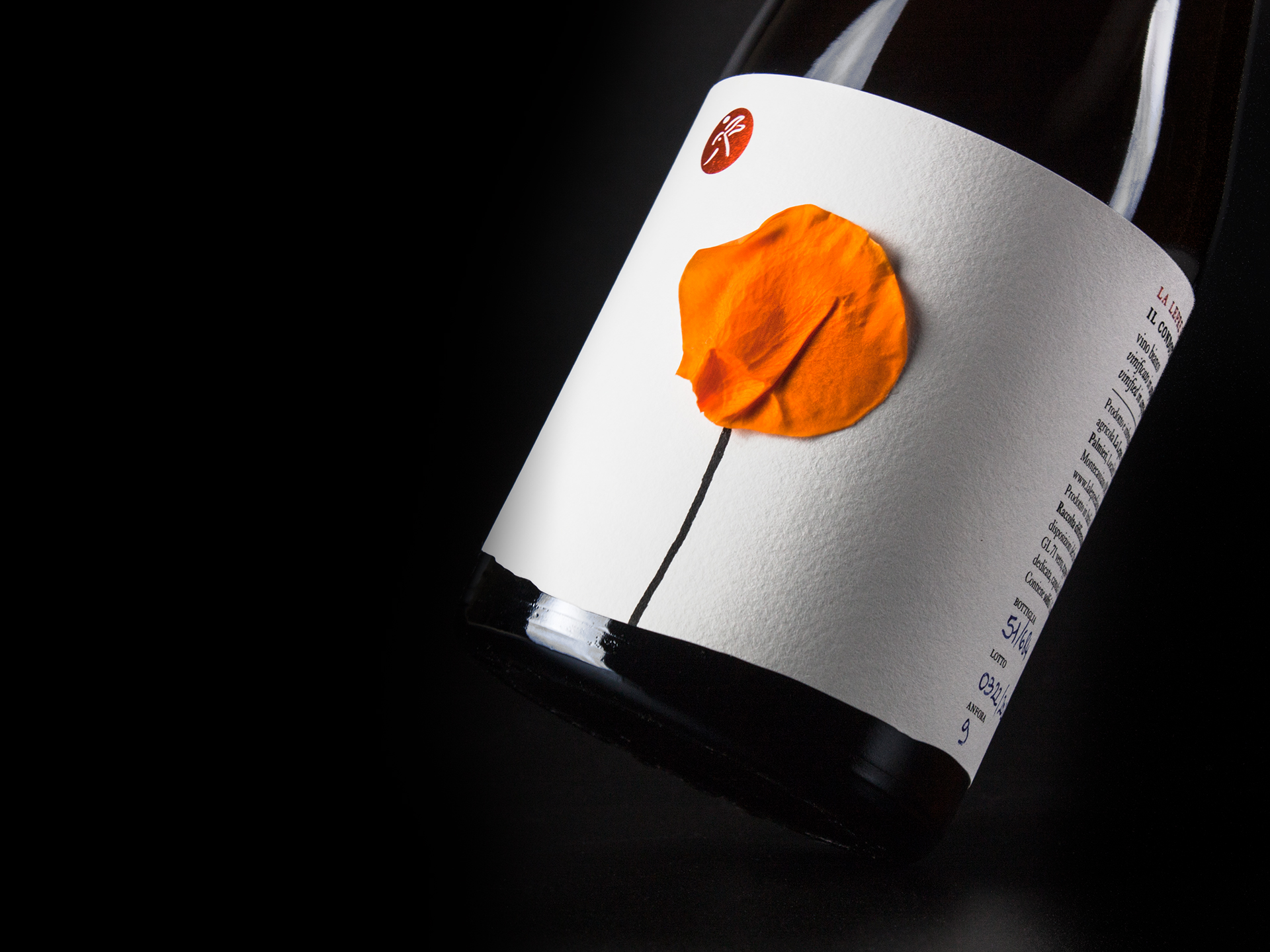
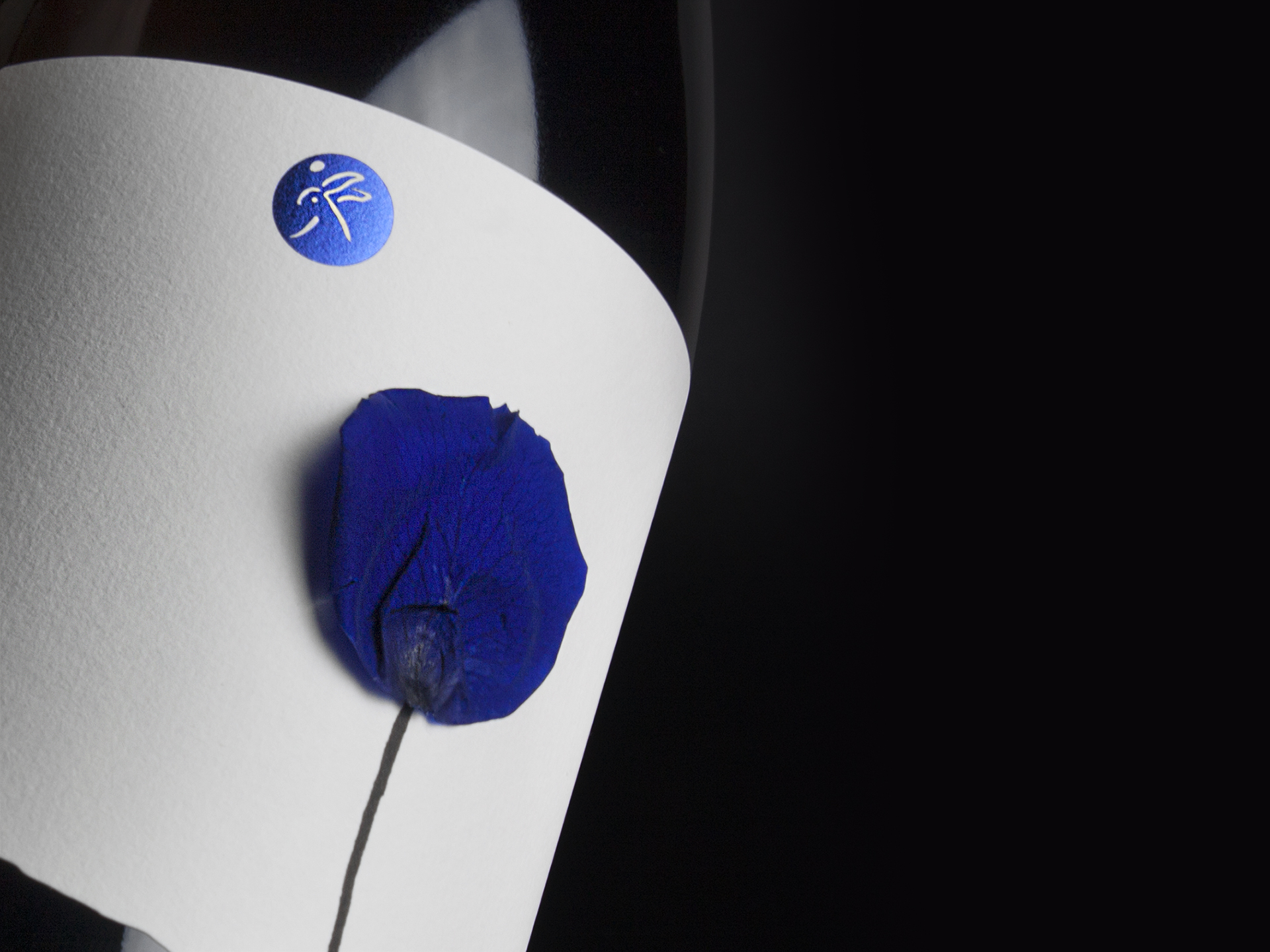
In the Italian countryside, it is not uncommon to find a rose near each row of a vineyard. What may seem like an ornamental aspect actually allows growers to address nutritional deficiencies or plant diseases. For this reason, these flowers are nicknamed “sentinella” (in English, “sentinel”), because being more fragile and susceptible to these issues, acts as a warning, alerting the vintners in time and allowing them to take action before the problem spreads to the vineyard. This story is depicted in a series of three labels for natural wines produced in amphora and barrique, on which a real rose petal has been glued. Thanks to the petal, each bottle is different from the others, seeming to come to life while showcasing the beauty and delicacy of this blossom. The irregular cut at the bottom of the label replicates the soil on which the crops grow, while the flower looks upwards towards the moon (hot-stamped) shining with the producer’s logo. The choice to incorporate a real rose petal into each label is a nod to the traditional agricultural practices of Italian vintners. By using a plant as a natural sentinel, these wine producers honor a time-honored method of protecting their crops. This not only serves a practical purpose but also adds a layer of storytelling to each bottle, connecting the consumer with the heritage and care of the product. To improve the sustainability of these wines, a slightly asymmetrical bottle made entirely of PCR (post-consumer recycled) glass was chosen, and the paper used is made from cotton fibers. Additionally, instead of an aluminum or plastic capsule, a paper seal has been applied. The end result is a product that not only delights the senses but also tells a meaningful story about the land, the people, and the passion behind every bottle


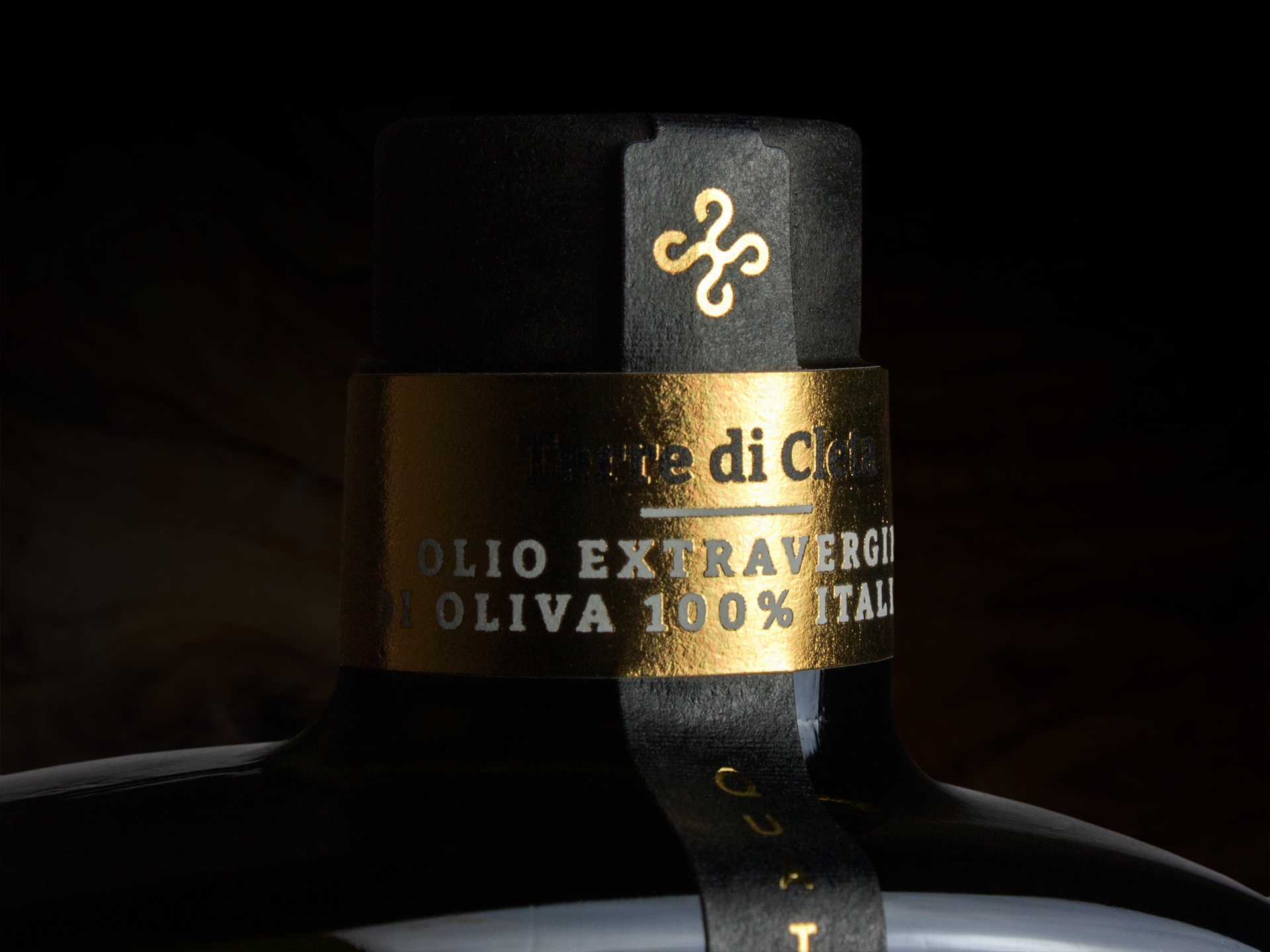
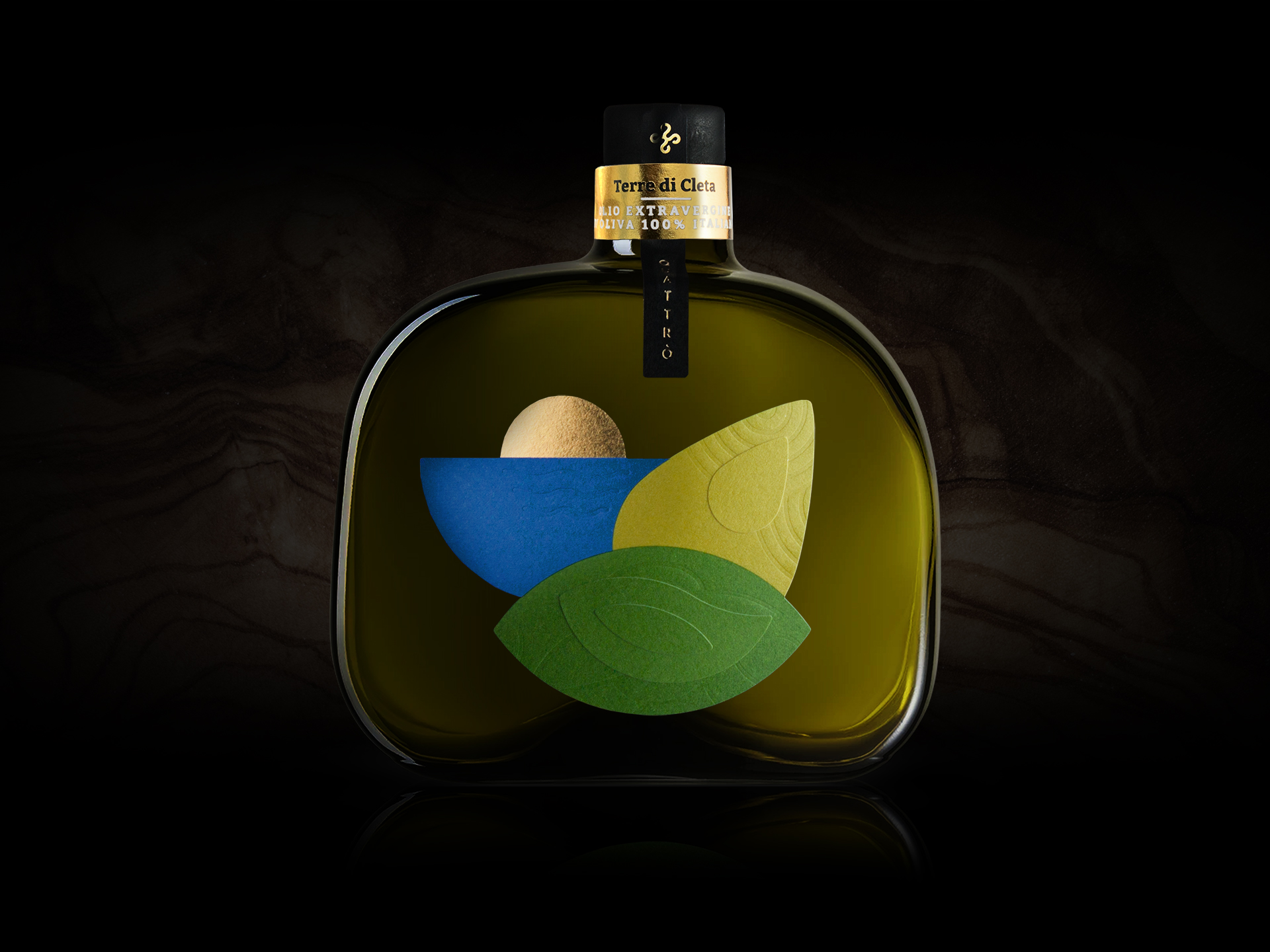
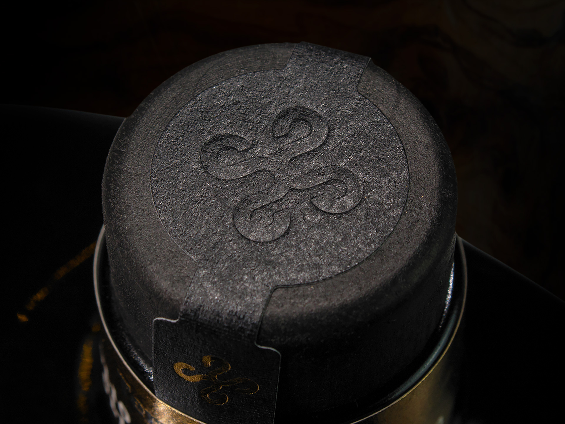
The story goes that for millennia, Italy has woven deep connections with numerous countries and diverse cultures, creating a rich tapestry of influences and cultural exchanges. Among these connections, the relationship between Greece and Calabria, a region located in southern Italy in a strategic position at the heart of the Mediterranean, stands out. This ancient bond is narrated through the label of a 100% Italian extra virgin olive oil, celebrating this historical and cultural connection. Legend has it that Penthesilea, queen of the Amazons, a tribe composed entirely of warrior women, died in Troy in the war against Achilles. Her nurse, Cleta, upon learning of this, set sail for Asia Minor to recover the body of her queen, but, caught in a terrible storm, she shipwrecked on the shores of Calabria where she decided to build a city named after herself. Here lie the olive groves of Tenute Quattrò, and its scenic views become the subject of the label: the golden sun shining at dawn, the blue sea and its waves, the beaches with sandy dunes, and the lands with green hills. These elements are drawn with simple geometric shapes, embellishing an oil with olfactory notes ranging from aromatic herbs, to tomato, and to fruit. Thanks to an interplay of overlapping papers, bas-reliefs, and hot stamping, the label becomes three-dimensional and harmoniously merges with a special glass bottle, characterized by rounded corners and four sides different from one another. The neck, placed off-center, is protected by a golden band on which the name of the oil is written, while the Tenute Quattrò logo is embossed like a seal of quality, guaranteeing the excellence of the product.


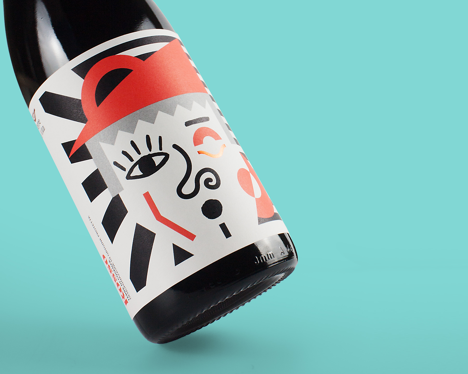
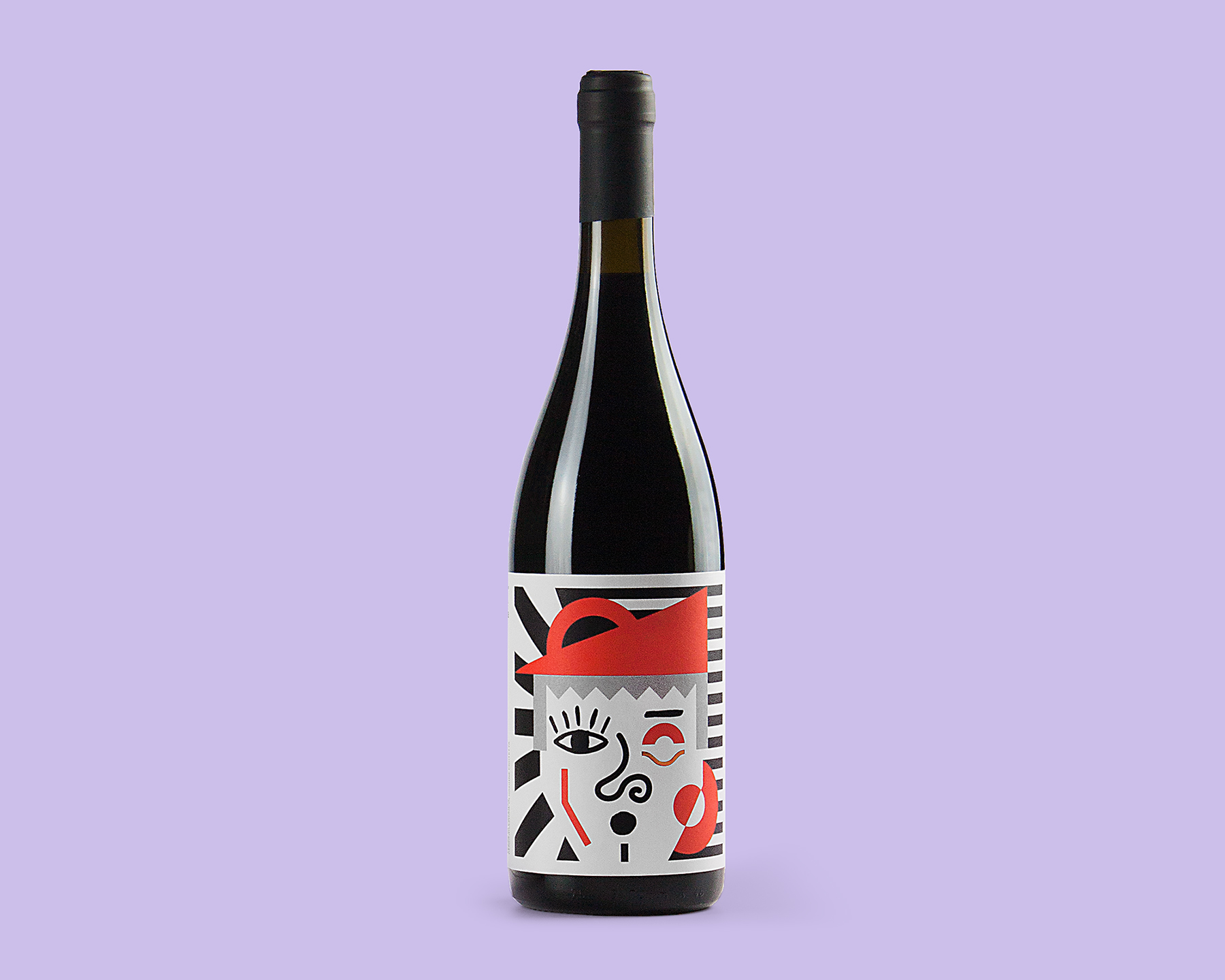
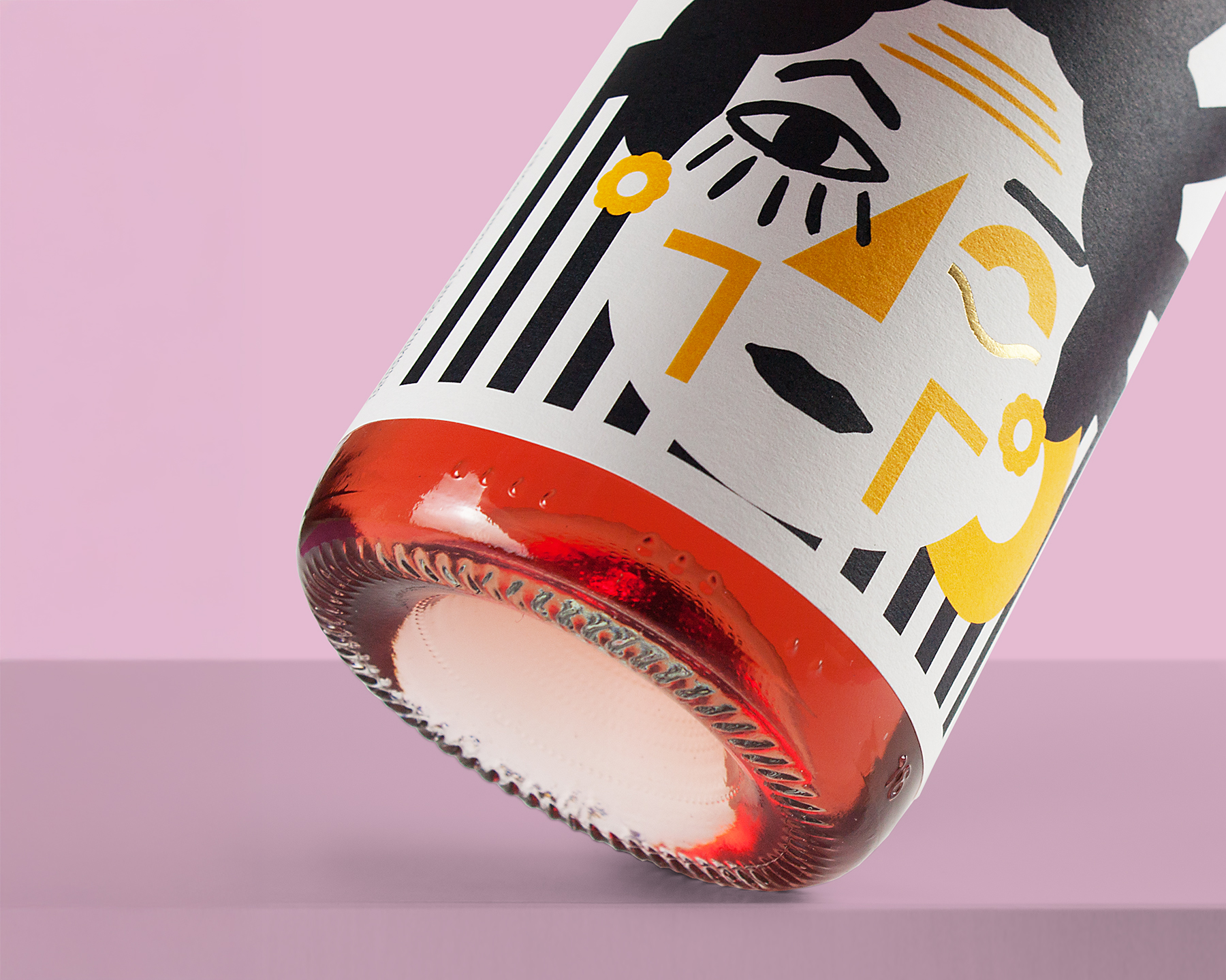
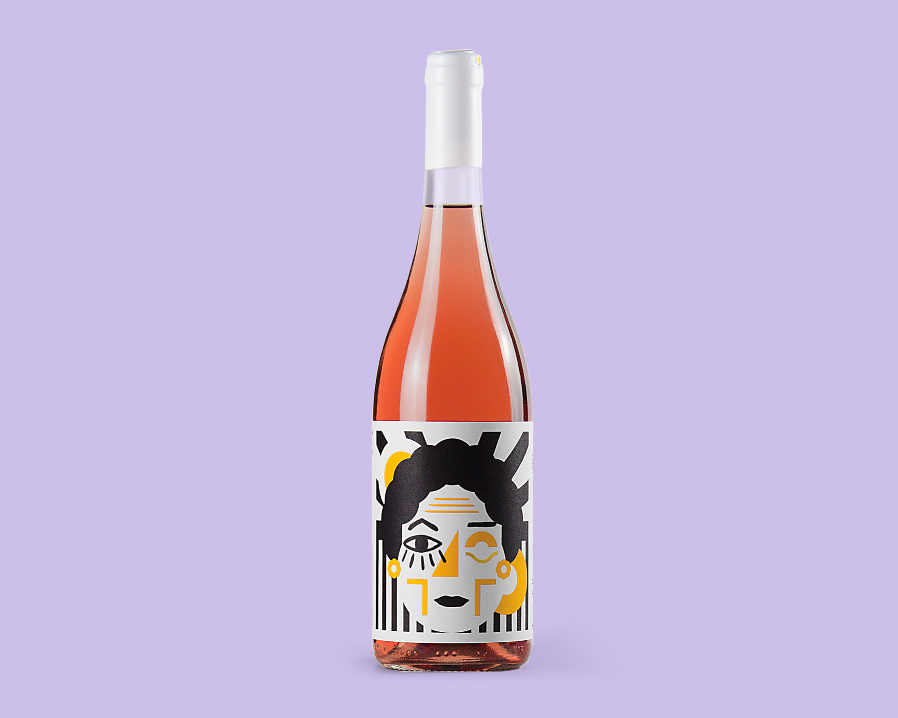
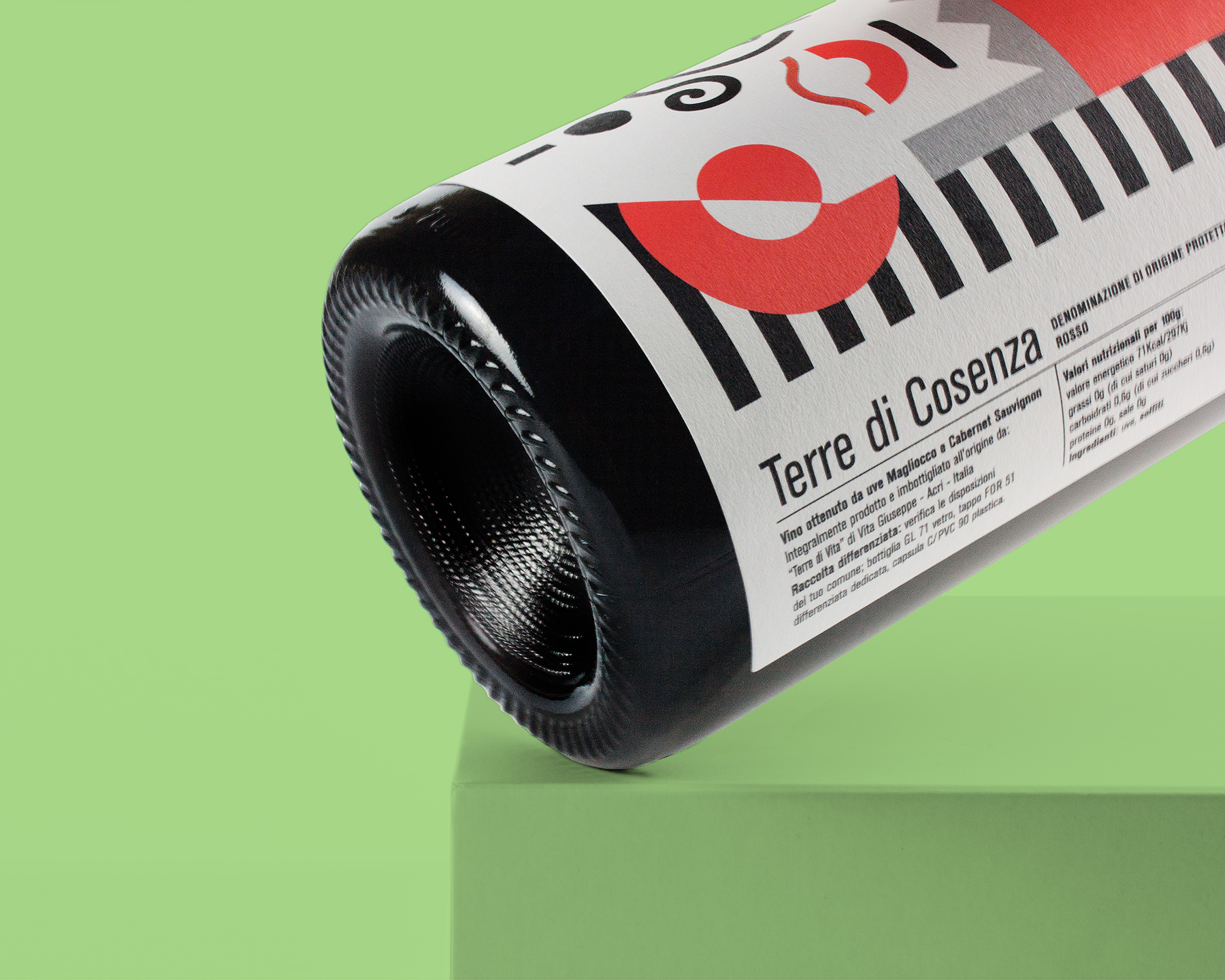
"Tell me about your family” is the story of the first encounter with Giuseppe Vita, owner of the “Terre di Vita” agricultural company, located in Acri, in the province of Cosenza (Calabria). During the first meeting, Giuseppe expressed his desire to dedicate each of their wines to his grandparents because, in addition to the natural emotional bond he had with them, he wanted to thank them for the sacrifices they made to buy the land on which the family vineyards and olive groves now stand. The first of the two wines is a red one, dedicated to Enrico: “Grandfather had his hair combed back, a ‘potato’ nose, and thin eyebrows. His character was reserved, slightly introverted, few words but at the same time ironic with a sly smile. He dressed elegantly, always with a jacket, tie, vest, and his ever-present hat. The second wine, on the other hand, is a rosé dedicated to Rosaria: “Grandmother had dark, curly hair, pronounced cheekbones, and a flattened nose. Her lips were thin, and on her forehead, you could see the signs of time from a life spent working in the fields. In everyday life, she didn’t dress elegantly, but she always wore small flower-shaped earrings. The two labels are born from these stories and depict grandfather Enrico and grandmother Rosaria: their faces are drawn in a simple, sometimes cubist manner, but without neglecting some of the details that distinguished them. Below their left eye, a hot-foil stamped element recalls the company’s logo, emphasizing the connection with a story born thanks to their work.
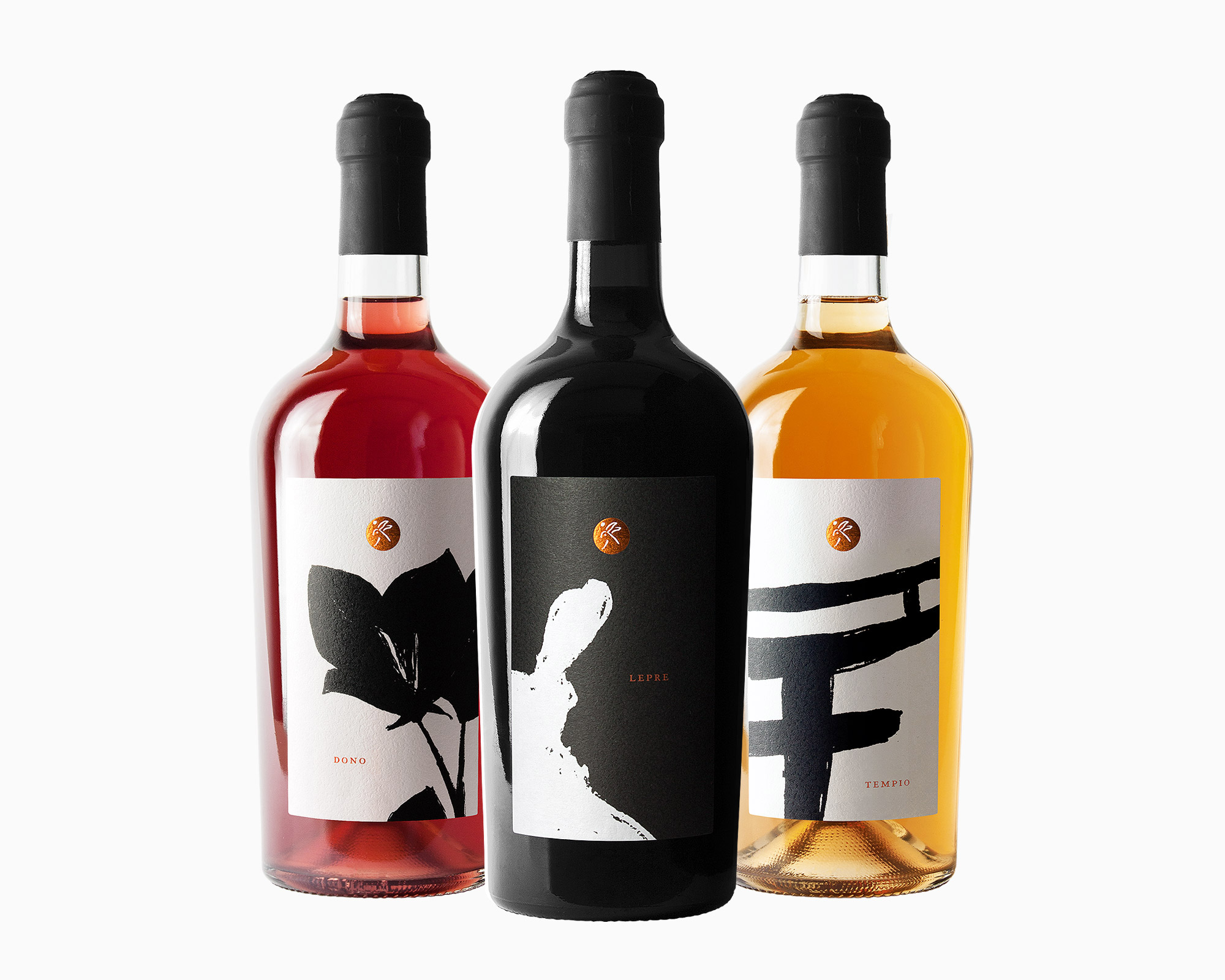
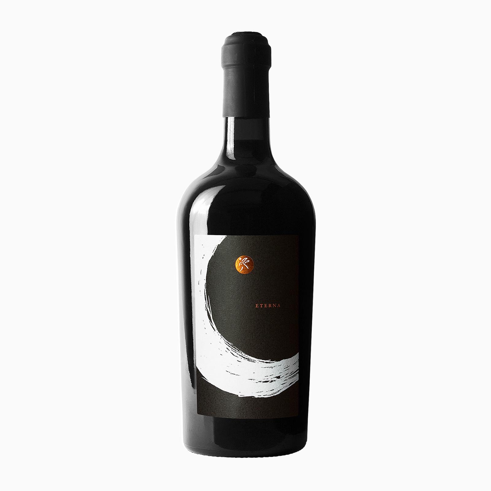
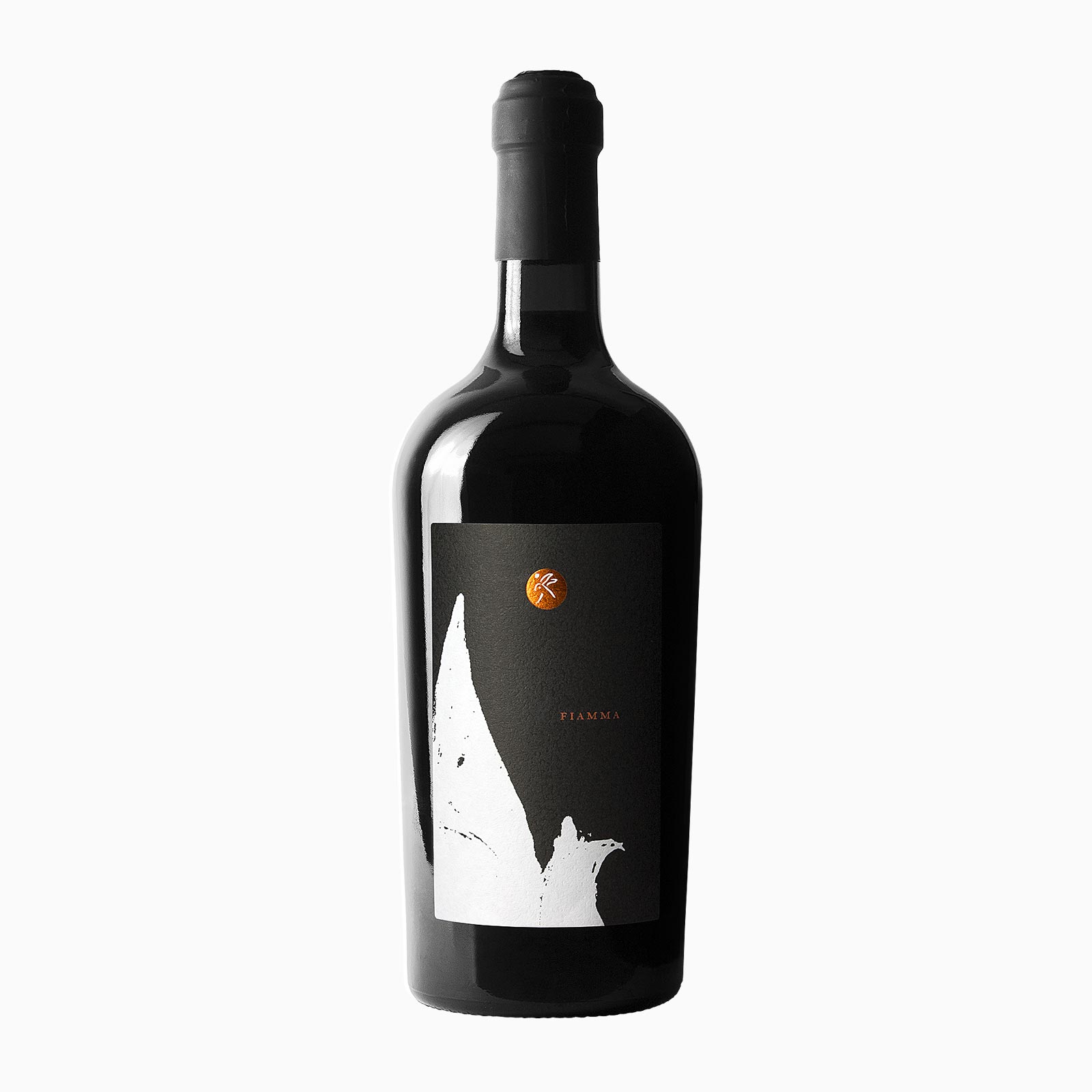
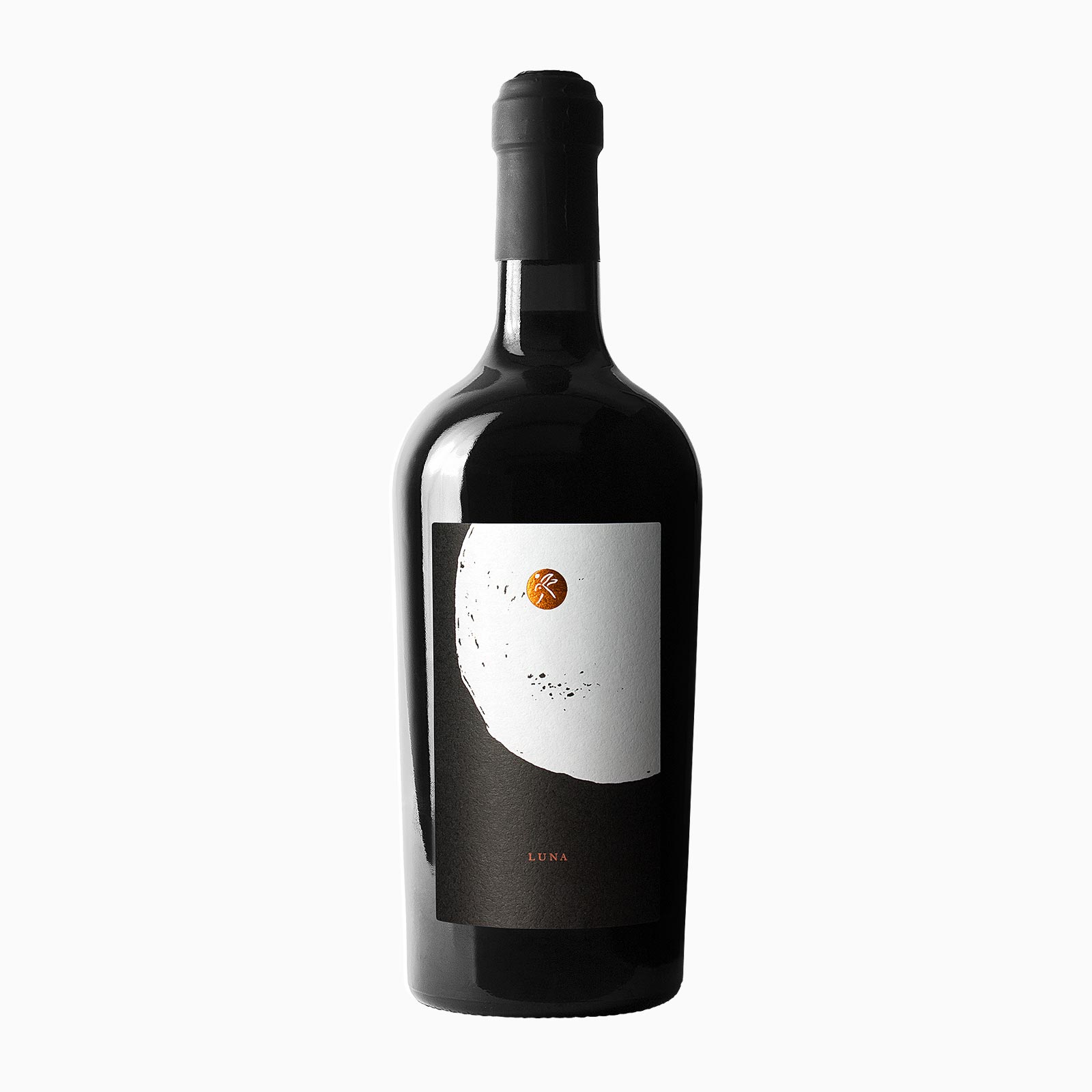
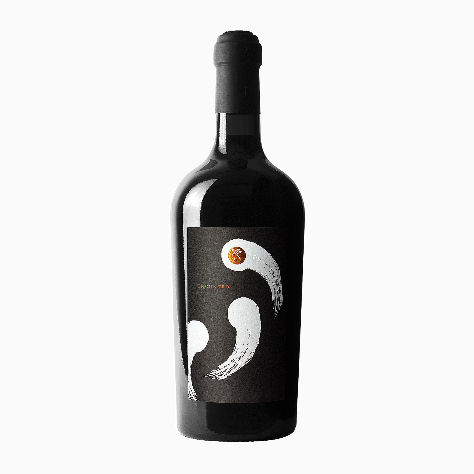
The hare and the moon” is an ancient Oriental legend from which this Italian winery took its name. The story tells the adventures of three friends, a hare, a fox and a monkey living and roaming around the woods together. One day, they meet an ancient wanderer asking for food: the fox, being a cunning hunter, brings him some wild game; the monkey, being good at climbing trees, gives him some fruit. The hare, not having any particular skill, jumps into the fire and offers herself as a gift. Moved by her sacrifice, the ancient wanderer reveals himself to be God and decides to take the hare’s remains to Heaven, to imprint her image on the moon and make her eternal. The wines and labels of this series are named after the characters and the symbols of the legend, retracing its story. Each subject was drawn by hand and printed on martele to imitate the pages of a book, and to enhance the value of a harvested-by-hand product, that macerates in terracotta amphorae. The brand is a copper-colored round foil, as the moon in eclipse.
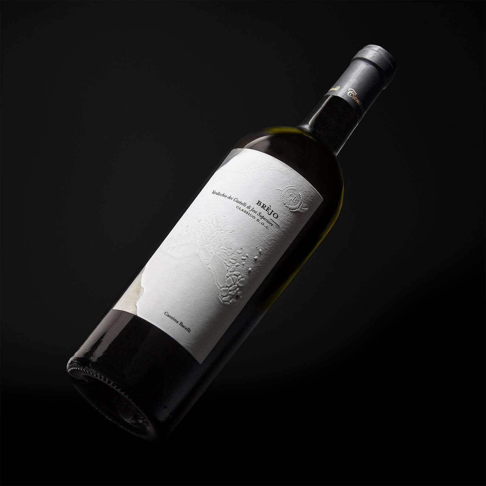
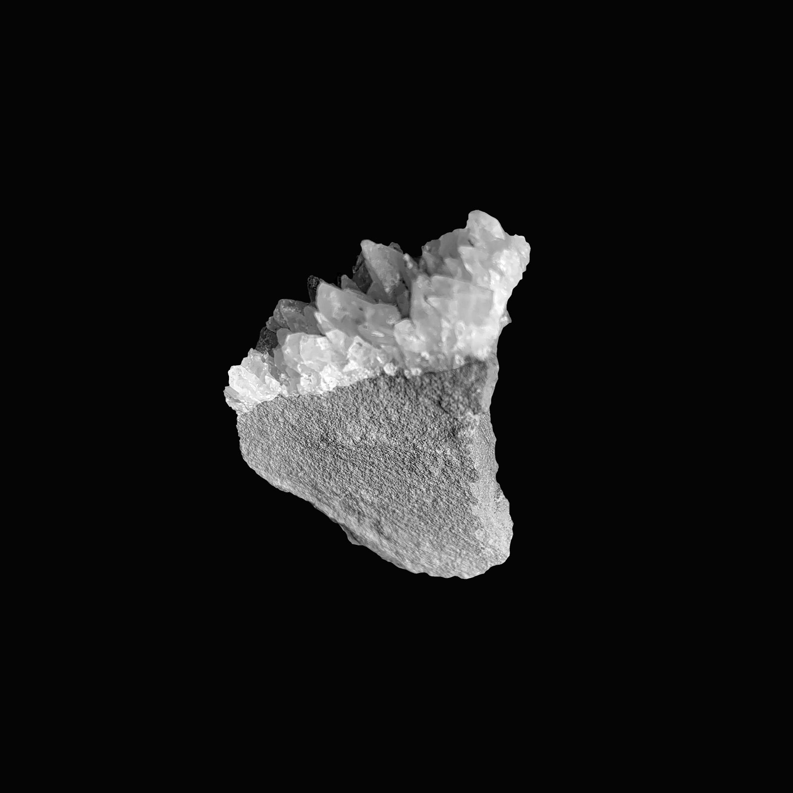
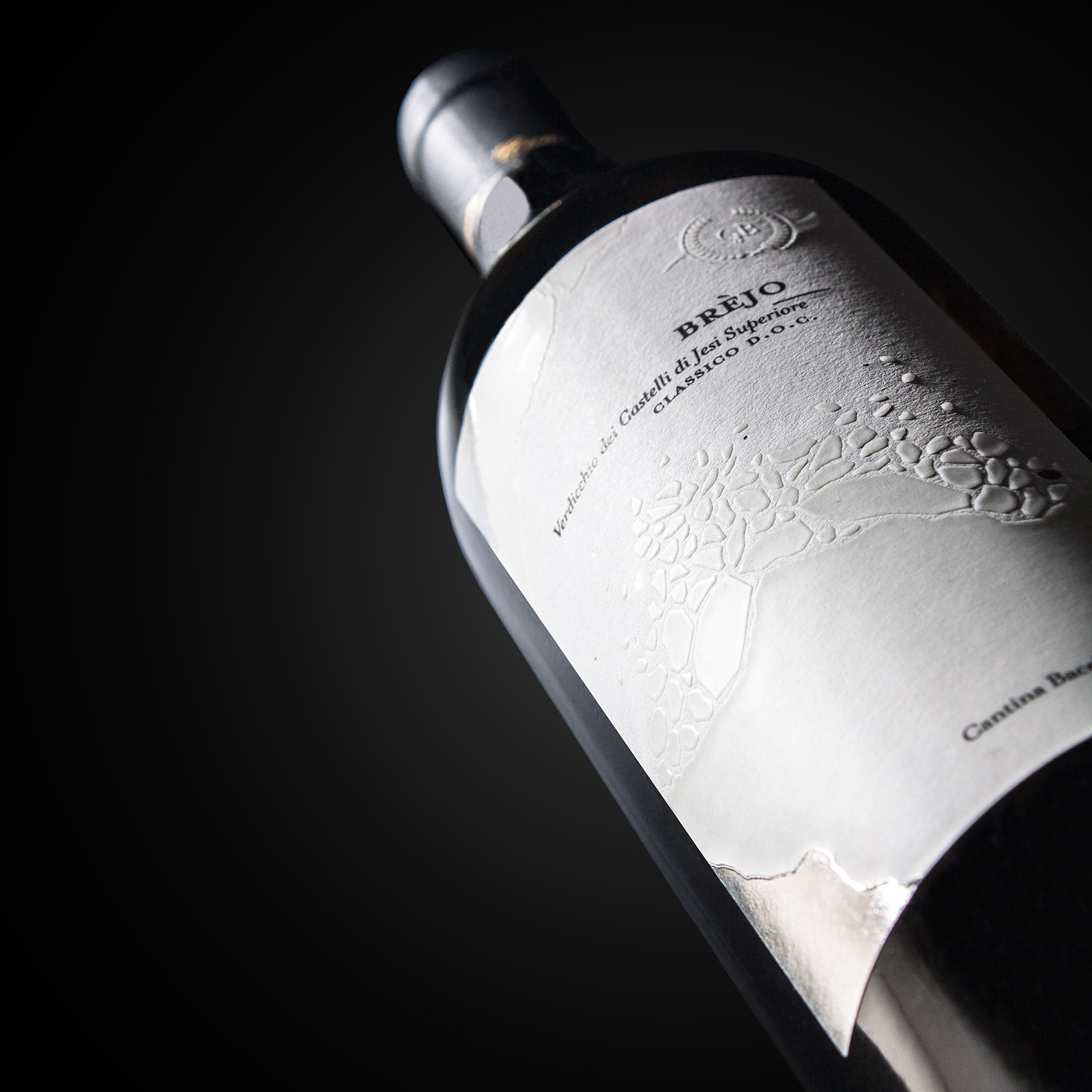
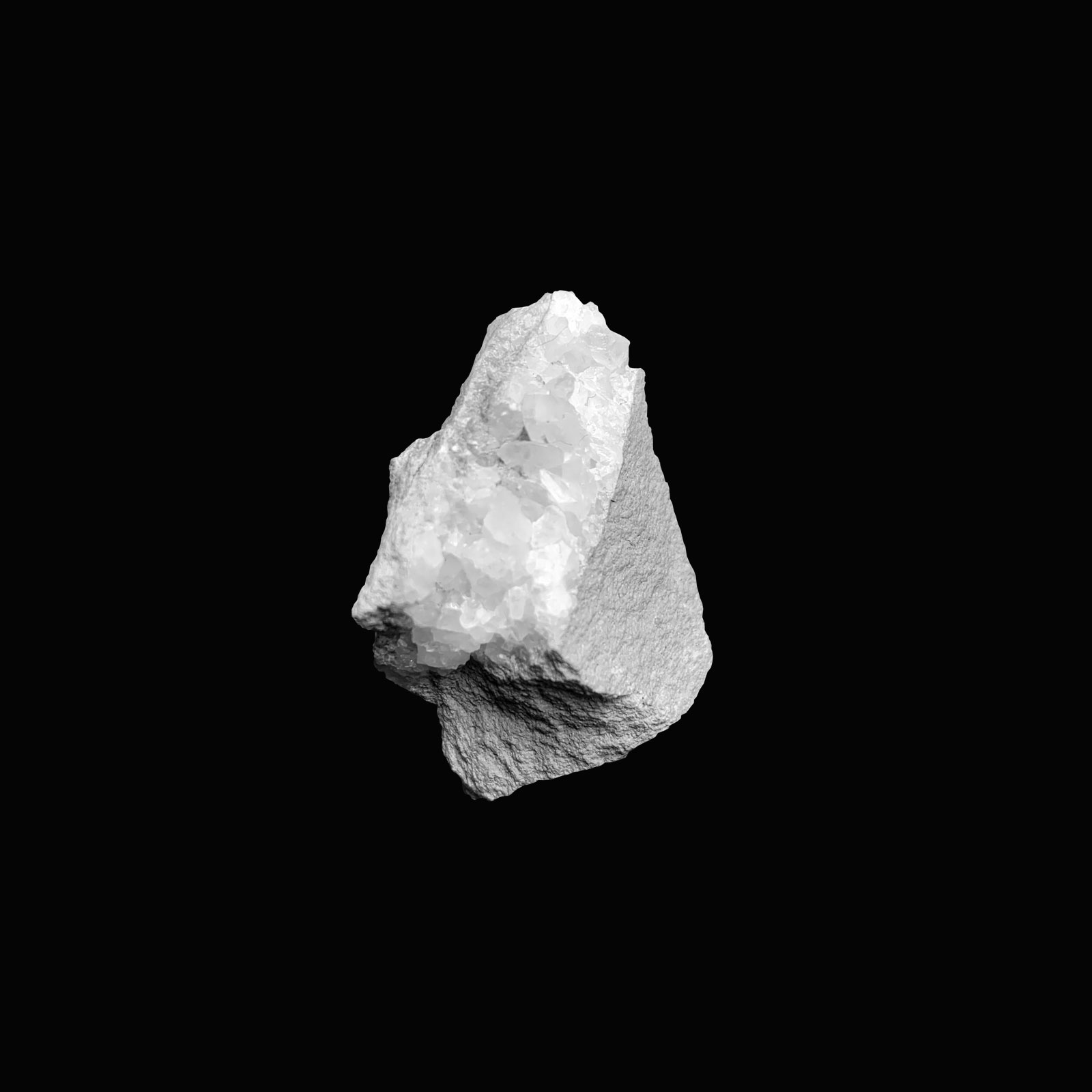
The Bacelli winery was born in Cingoli, a village known as “ the Marche region balcony” for its stunning panorama, located in the centre of Italy, halfway between the Adriatic sea and the Sibillini mountains. Bacelli’s vineyards cover an area of six hectares and the love of this family for wine has been handed down for nine generations. The most delicate processes of production are still handmade, in order to dedicate a targeted care to plants and to get the best selection of grapes for their wines. Expressing the greatest respect for Nature, Bacelli winery aims to the goal of reducing soil pollution and environmental impact by using biodegradable materials in pruning and tying their vines. The Bacelli vineyards boast a very special feature: the ground underneath the vines is crossed by a vein of calcite, a precious mineral that enriches their Verdicchio with unique characteristics. The new labels, Brejo and Monte Circe, were inspired by this specific mineral composition of the soil. In order to replicate this peculiarity of their wineyards, no coloured inks were applied: the subject was printed by using a matt UV painting with Braille effect, to reproduce the shapes and colours of these very ancient mineral rocks, and to create a tangible and visual contrast with the porosity of the chosen paper. Each subject in the two series of labels depicts a different fragment of crystal broken off from the mineral vein of calcite that runs underground the wineyard soil. To distinguish the two wines, in addition to the matt UV varnish with Braille effect, hot pressing was used, too: Brejo (a D.O.C. Superior Verdicchio wine) is featured by a silver hue, while Monte Circe ( a D.O.C. Classic Verdicchio ) by a copper one.


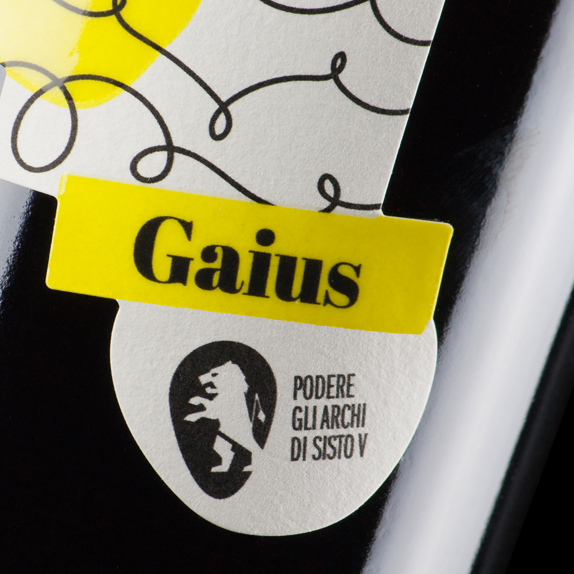
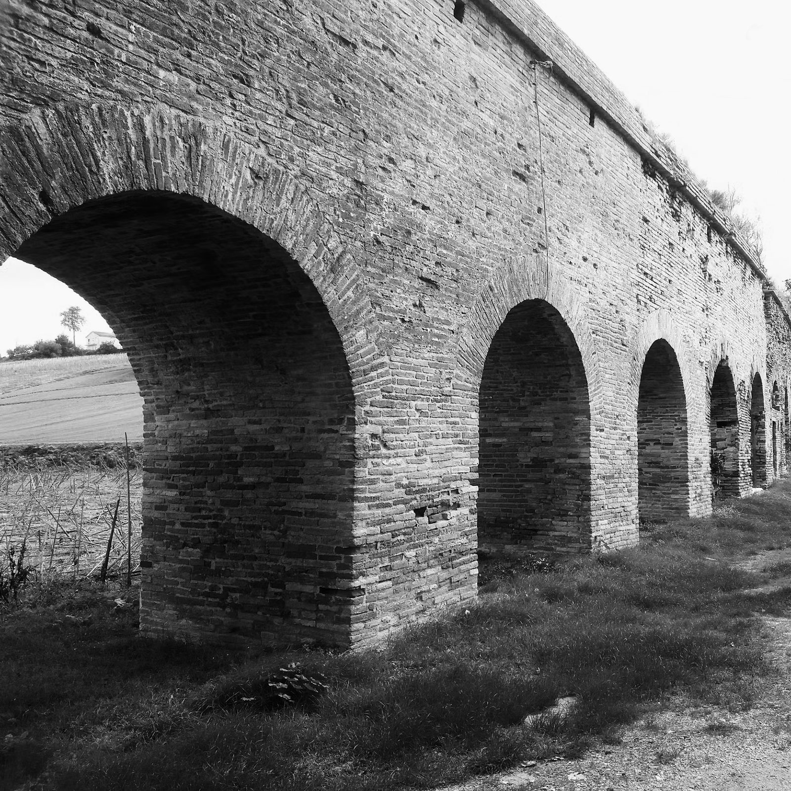
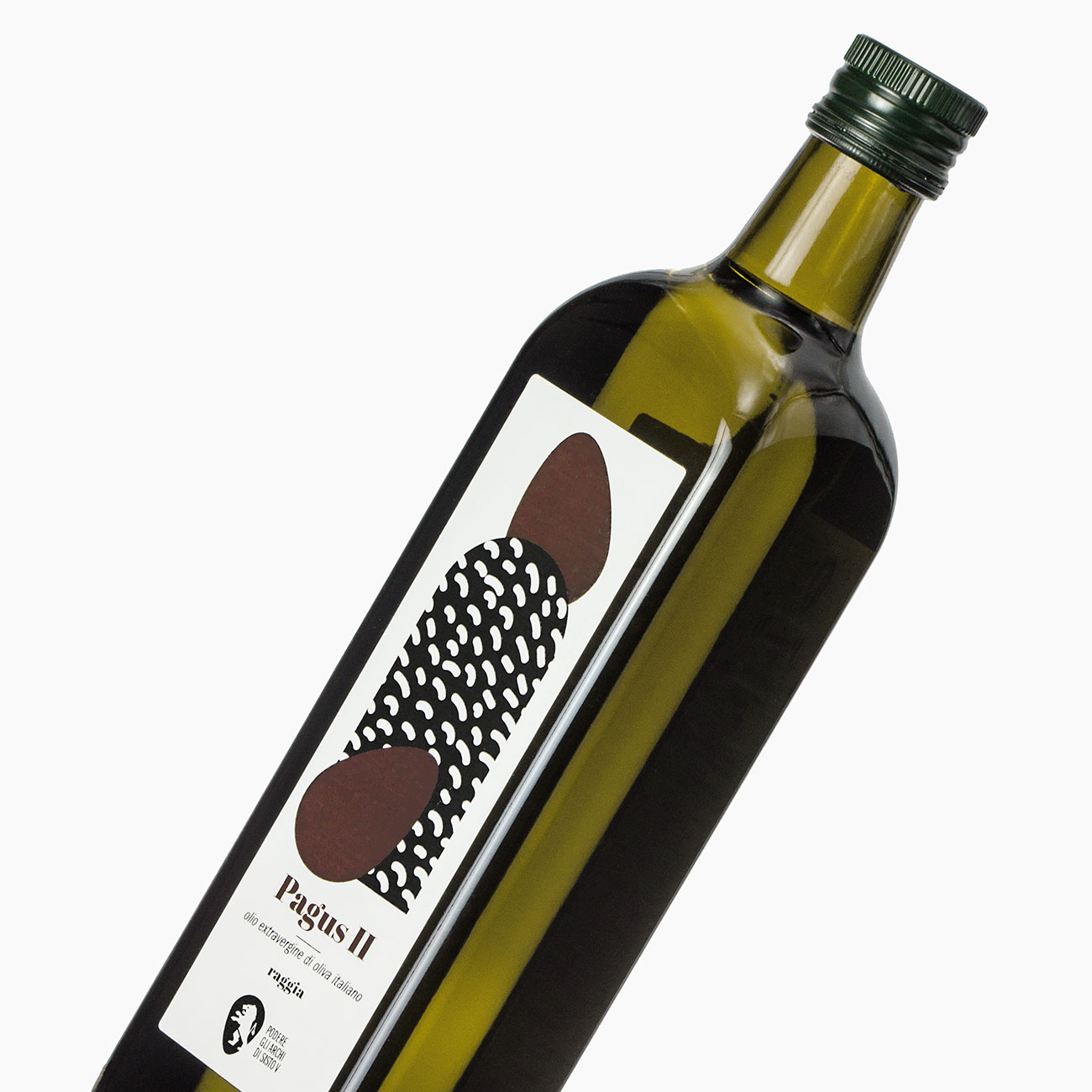
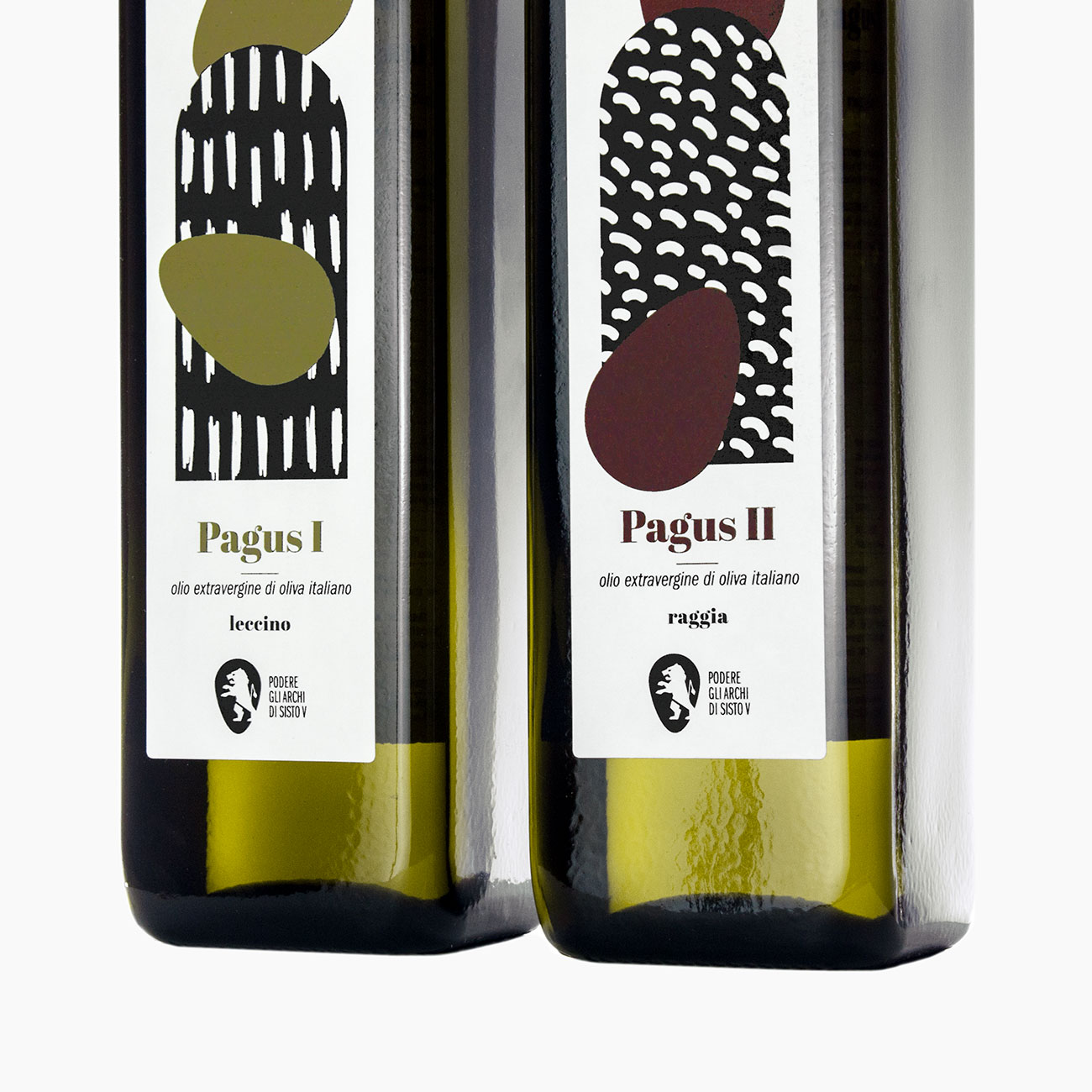
Podere degli Archi di Sisto V is the name of an agricultural company located in the Marche region, in central Italy, specializing in the production of high-quality wine, pasta, and olive oil. The company takes its name from the Pontifical Aqueduct of Loreto, an extraordinary late Renaissance hydraulic architectural masterpiece constructed in 1620 by the order of Pope Sixtus V in response to the rapid development of the town and the increasing flow of pilgrims. This ancient aqueduct is the only one remaining in the Marche region with its arches still intact, representing a special place that bears witness to the pilgrimage to the Holy House of Loreto and Italy’s historical and spiritual heritage. The estate lands, which serve as the inspiration for the series of labels, are named after this monument. Designed to be displayed side by side, the illustrations reconstruct the ancient aqueduct and its arches, allowing one to glimpse the hills and typical cultivated fields of this central Italian region. The series includes a white wine (Malvasia) and a red one (Montepulciano). Each label is distinguished by the color used in the illustration and the texture of the background, which recreates the patterns of countryside crops. The colorful shapes have been printed with UV painting with Braille effect to evoke grape clusters in the vineyard. A small rolled-up sheet of paper with an elastic band has been placed on the bottle neck: inside, we can read a dedication to Alberto (the founder of the agricultural company), who made the realization of this dream possible.

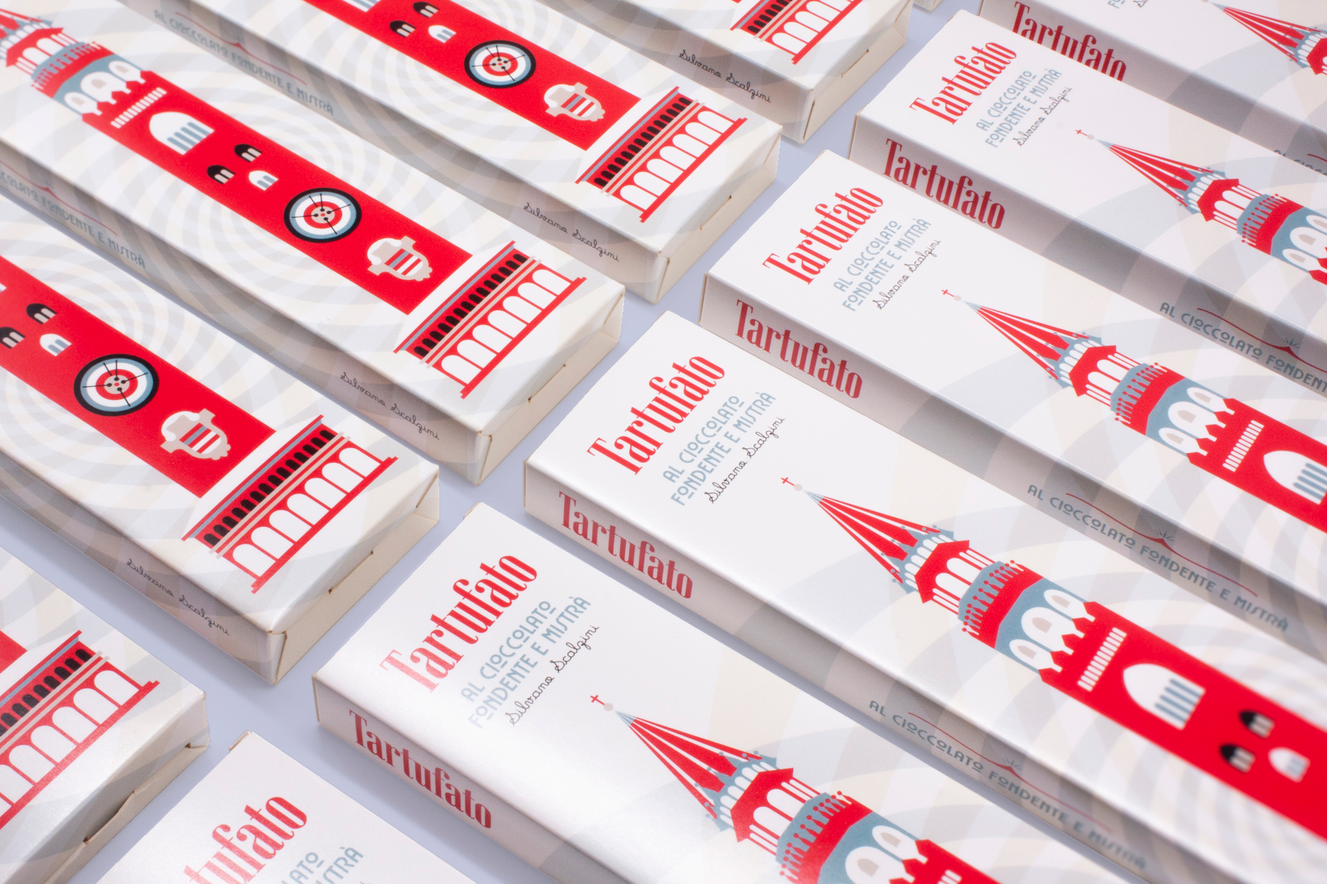
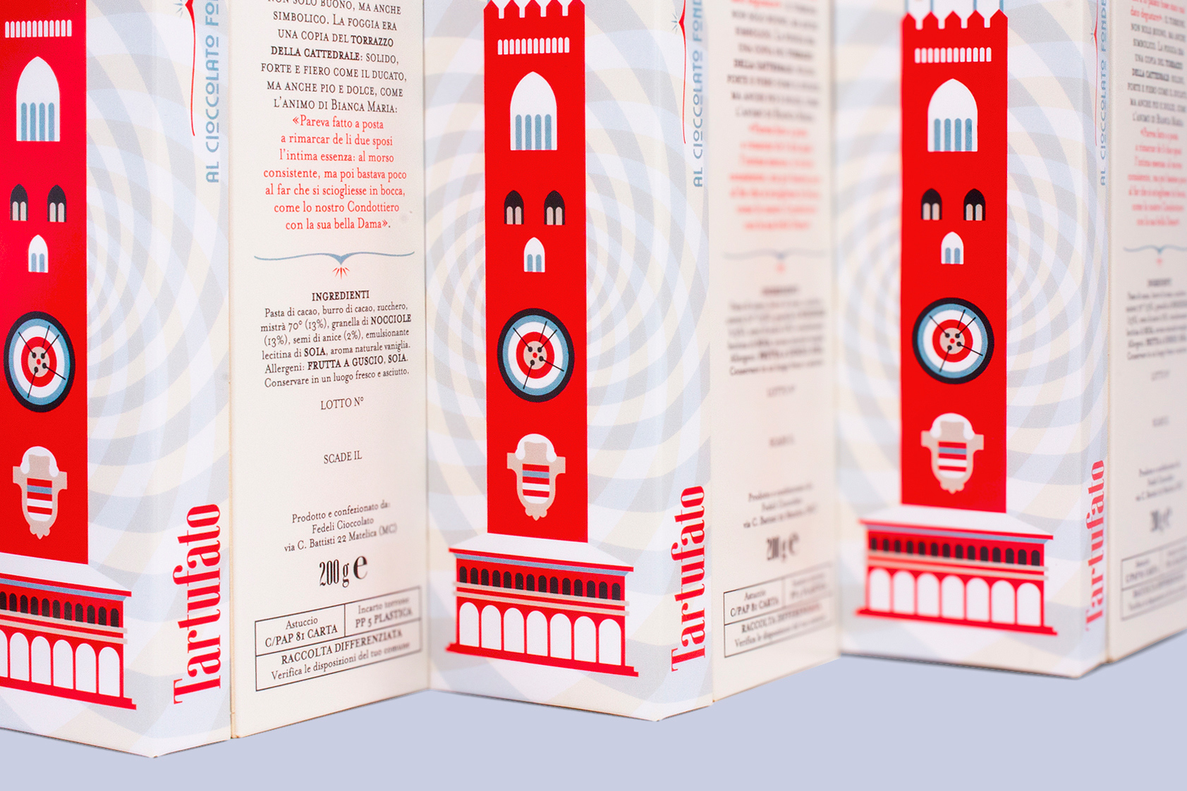
In the history of nougat, one cannot overlook the memorable day when Bianca Maria Visconti married Francesco Sforza. Bianca Maria, the only heir to the prestigious Duchy of Milan, united her fate with Sforza, a bold and ambitious mercenary soldier eager to build his kingdom at her side. Their wedding, celebrated in Cremona, marked the beginning of a new chapter not only for them but also for the history of Italian confectionery. The citizens of Cremona, eager to honor the union, decided to offer the newlyweds an extraordinary gift. From their ingenuity came a creation as delightful as it was unique: nougat, a treat that soon became renowned for its exceptional flavor and cultural significance. But this confection was not merely a delicious dessert; it also carried profound symbolic meaning. Its design mirrored the Torrazzo, the iconic bell tower of Cremona’s cathedral. The nougat’s form reflected the virtues of the duchy itself—solid, strong, and proud—while its sweetness represented the pure and gentle nature of Bianca Maria. As the story goes, “It seemed crafted to encapsulate the essence of the couple: firm and steadfast at first bite, but soon melting into a rich, velvety sweetness, much like the brave Condottiero and his tender Lady.” Inspired by this enchanting tale, Numeroquattro developed the packaging for Silvano Scalzini’s Tartufato al cioccolato fondente e Mistrà. This artisanal dessert reimagines tradition by incorporating Mistrà, a classic anise-flavored liqueur from the Marche region. The result is a refined confection that bridges history and innovation, evoking the timeless romance of Bianca Maria and Francesco while offering a modern twist for today’s connoisseurs.

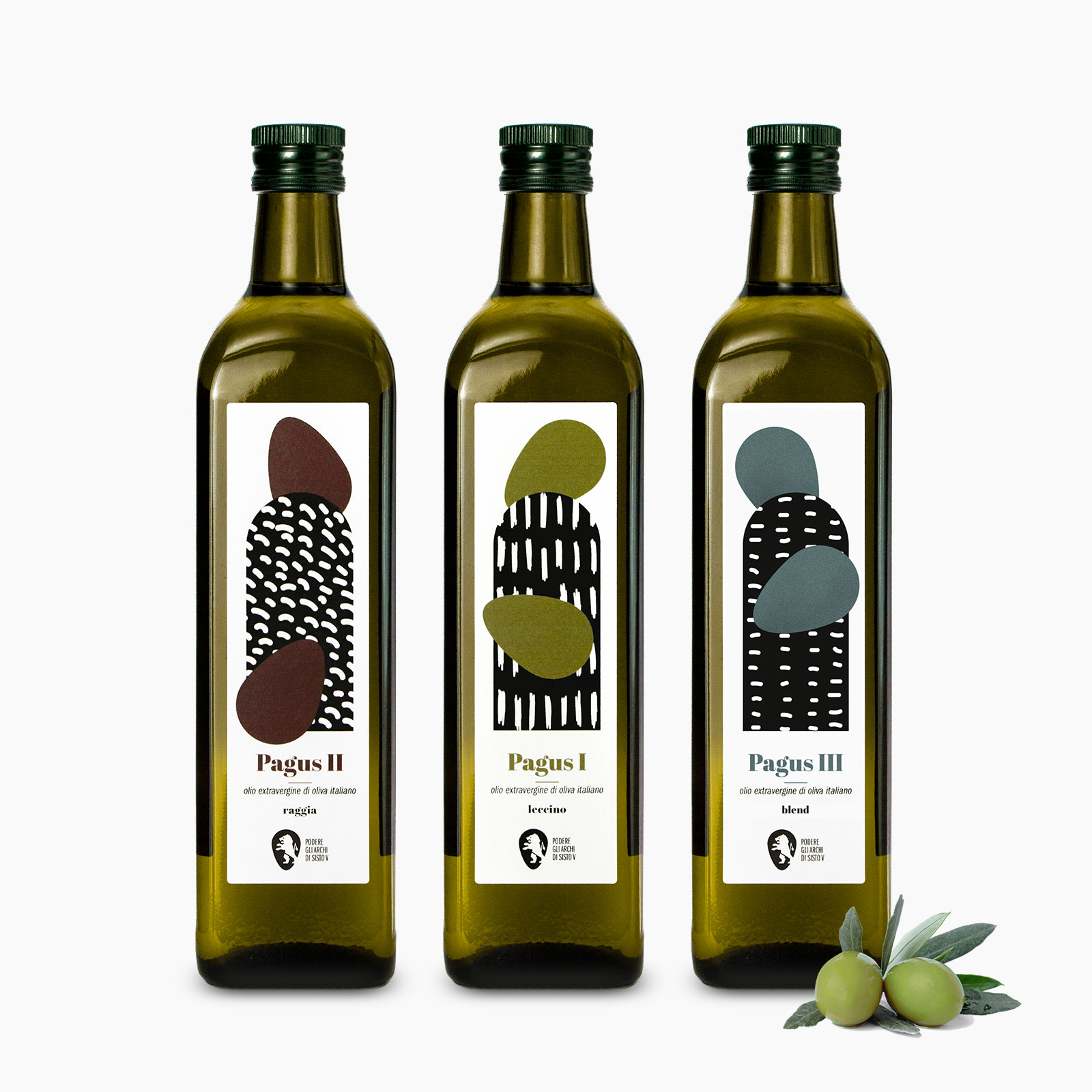
Podere degli Archi di Sisto V is the name of an agricultural company located in the Marche region, in central Italy, specializing in the production of high-quality wine, pasta, and olive oil. The company takes its name from the Pontifical Aqueduct of Loreto, an extraordinary late Renaissance hydraulic architectural masterpiece constructed in 1620 by the order of Pope Sixtus V in response to the rapid development of the town and the increasing flow of pilgrims. This ancient aqueduct is the only one remaining in the Marche region with its arches still intact, representing a special place that bears witness to the pilgrimage to the Holy House of Loreto and Italy’s historical and spiritual heritage. The estate lands, which serve as the inspiration for the series of labels, are named after this monument. Designed to be displayed side by side, the illustrations reconstruct the ancient aqueduct and its arches, allowing one to glimpse the hills and typical cultivated fields of this central Italian region. The series comprises three different types of olive oil: “raggia,” “leccino,” and “blend.” Each label distinguishes itself through the color used in the illustration and the background texture, which reimagines the patterns of the crops in the countryside. The colorful shapes serve as a reference to the company’s logo and evoke the image of mature olives falling from the trees. The printing was executed on greaseproof paper highly resistant to oils and vegetable fats, making it stain-proof.
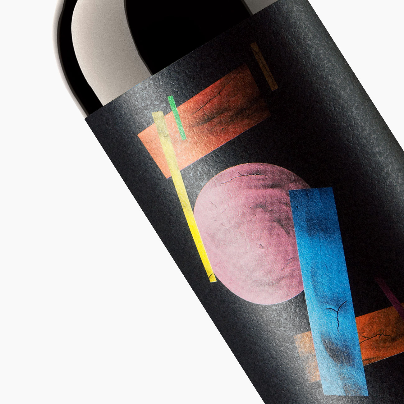
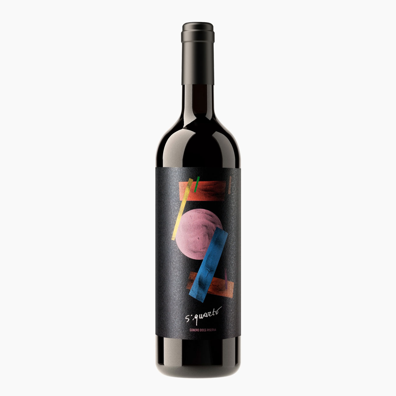
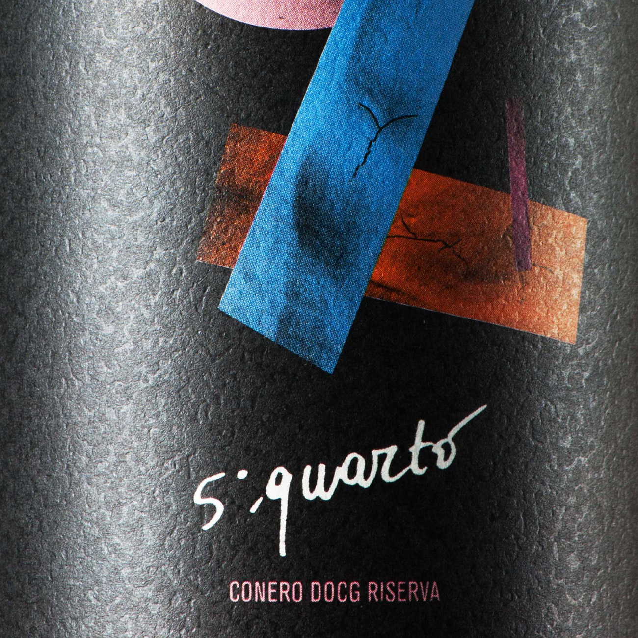
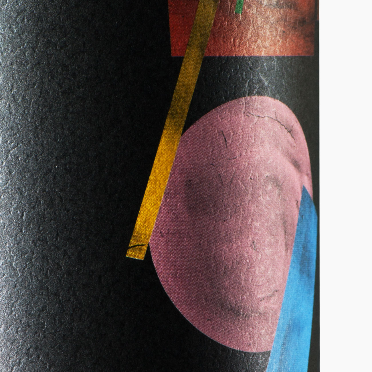
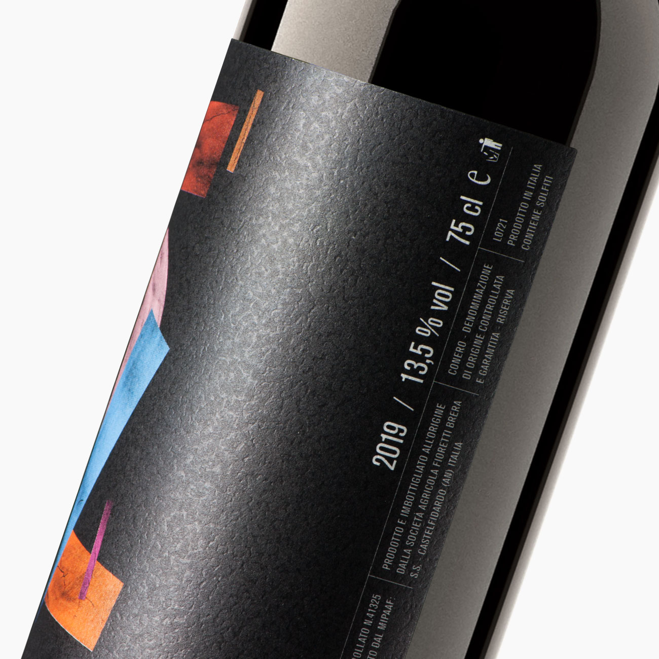
Fifth quarter (in Italian, “quinto quarto”) is one of the most interesting and curious dishes in Roman tradition. Originally, it was a humble recipe made with the leftover parts of the beef that were thrown away, until it was rediscovered by modern cuisine, now becoming a trendy dish even among young people, offered as a delicacy in both typical trattorias and high-end restaurants. To pay tribute to this dish, the Fioretti Brera winery has chosen to give its name to a unique and extraordinary Rosso Conero DOCG wine, typical of the area of Monte Conero, which stands between the Adriatic Sea and the inland hills, in the central-eastern part of Italy. In the subject of the label, the two words (fifth quarter) are depicted with the numbers 5 and 4, reminiscent of Suprematism, an artistic movement created by the painter Kazimir Malevich, a part of the broader phenomenon of Soviet avant-gardes active in the early decades of the 20th century. Suprematism embodied the artist’s freedom from the constraint of representing reality in order to achieve an essential, supreme expression of vision through extreme geometric simplification, which thus became a premise for a new abstract art. All the shapes were painted with tempera colors and subsequently photographed, creating an intersection that reproduces the lettering with the name of the wine. The label was printed on hammered barriered adhesive paper to simulate a canvas on which to paint a work of art, in a fusion of food, wine, and culture
