


Bare August: bringing summer vibes to foot care packaging
Necula Creative transforms Bare August's packaging with a playful, summer-inspired design that stands out in the foot care industry
Necula Creative transforms Bare August's packaging with a playful, summer-inspired design that stands out in the foot care industry
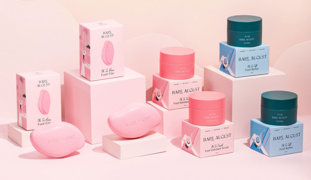
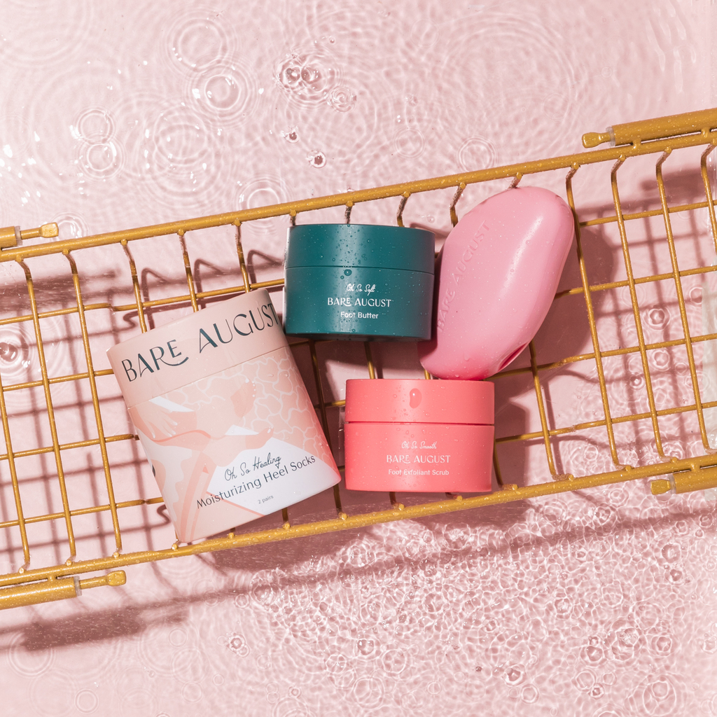
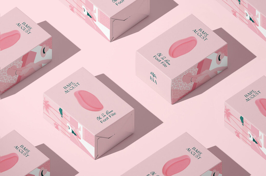
Bare August, with the creative direction of Necula Creative, is revolutionizing the foot care industry with its fresh, vibrant approach designed for women on the go. While most in the category lean towards clinical, plain aesthetics, Necula Creative introduced a playful, exciting brand identity that evokes the carefree feeling of a summer getaway.
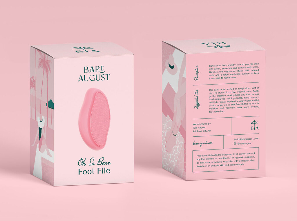
The packaging design centers around a palm logo—an unmistakable symbol of vacation and relaxation. To elevate the brand, they selected a modern vintage feminine font system and paired it with a summer-inspired color palette. Monochromatic, classy illustrations add a sophisticated yet fun touch.
These design elements not only shape Bare August’s packaging but also guide the look and feel of their Shopify website, ensuring consistency across all touchpoints.
For more information on the design, visit Necula Creative's website or follow them on Instagram .