


Your most liked packaging from 2023
Need a bit of inspiration? Look no further. We're always looking to recognise the best packaging design from agencies around the world, so we have pulled together the top 12 designs we shared in 2023 across our social media channels
Need a bit of inspiration? Look no further. We're always looking to recognise the best packaging design from agencies around the world, so we have pulled together the top 12 designs we shared in 2023 across our social media channels
Take a look at the below for the 12 most-liked packaging designs from 2023
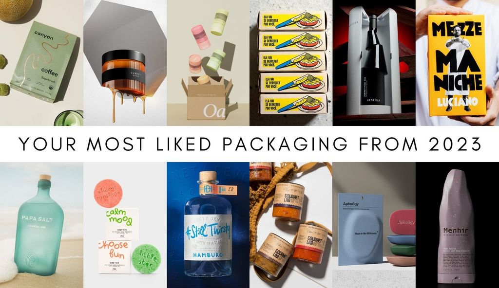
Canyon Coffee by Studio Lami
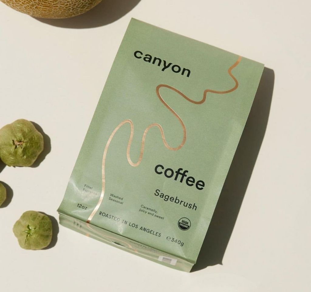
Studio Lami's packaging design for Canyon Coffee
Delivering fully compostable coffee bags, the packaging brings together the natural warmth of the letter-pressed kraft bag juxtaposed with a beautifully crafted matte gold foil in the shape of a meandering canyon river.
Find out more about Studio Lami here.
Still Thirsty Gin by Hajok Design
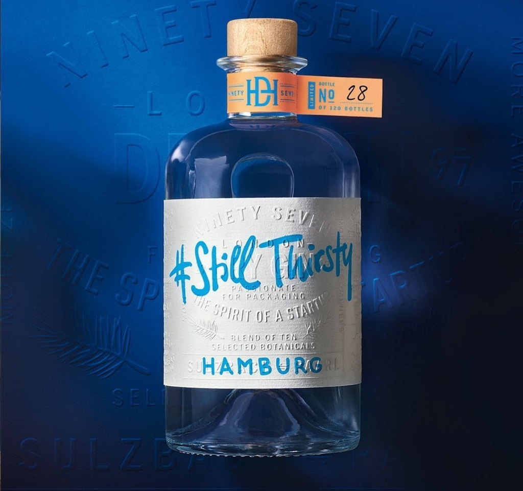
Hajok Design's packaging for Still Thirsty Gin
Developed as a self promotion project, the result is a perfect mix of the studio heritage combined with always looking into the future with great curiosity, conveyed through artisan printing methods and self-confident typography.
Find out more about Hojak Design here.
Oasis by Nirvana Studio
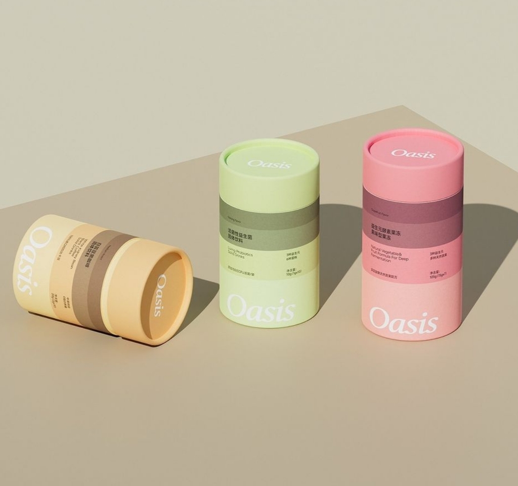
Nirvana Studio's packaging design for Oasis
The Chinese studio delivers a consistent and pleasing packaging design system by using different pastel colour palettes paired with elegant typography to distinguish the different products within the range.
Find out more about Nirvana Studio here.
Menhir by KISS Branding
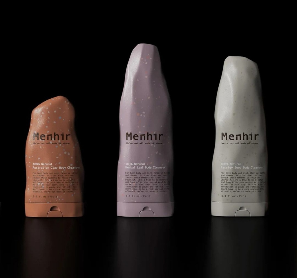
KISS Branding's packaging design for Menhir
Natural textures and tones from rock formations inspired the bottle colours and imagery, supporting the grounding nature of the brand. At the same time, a mono typeface evokes the edges of the Menhir ruins but translates well on the pack.
Find out more about KISS Branding here.
Jam Packed Preserves by Studio Unbound
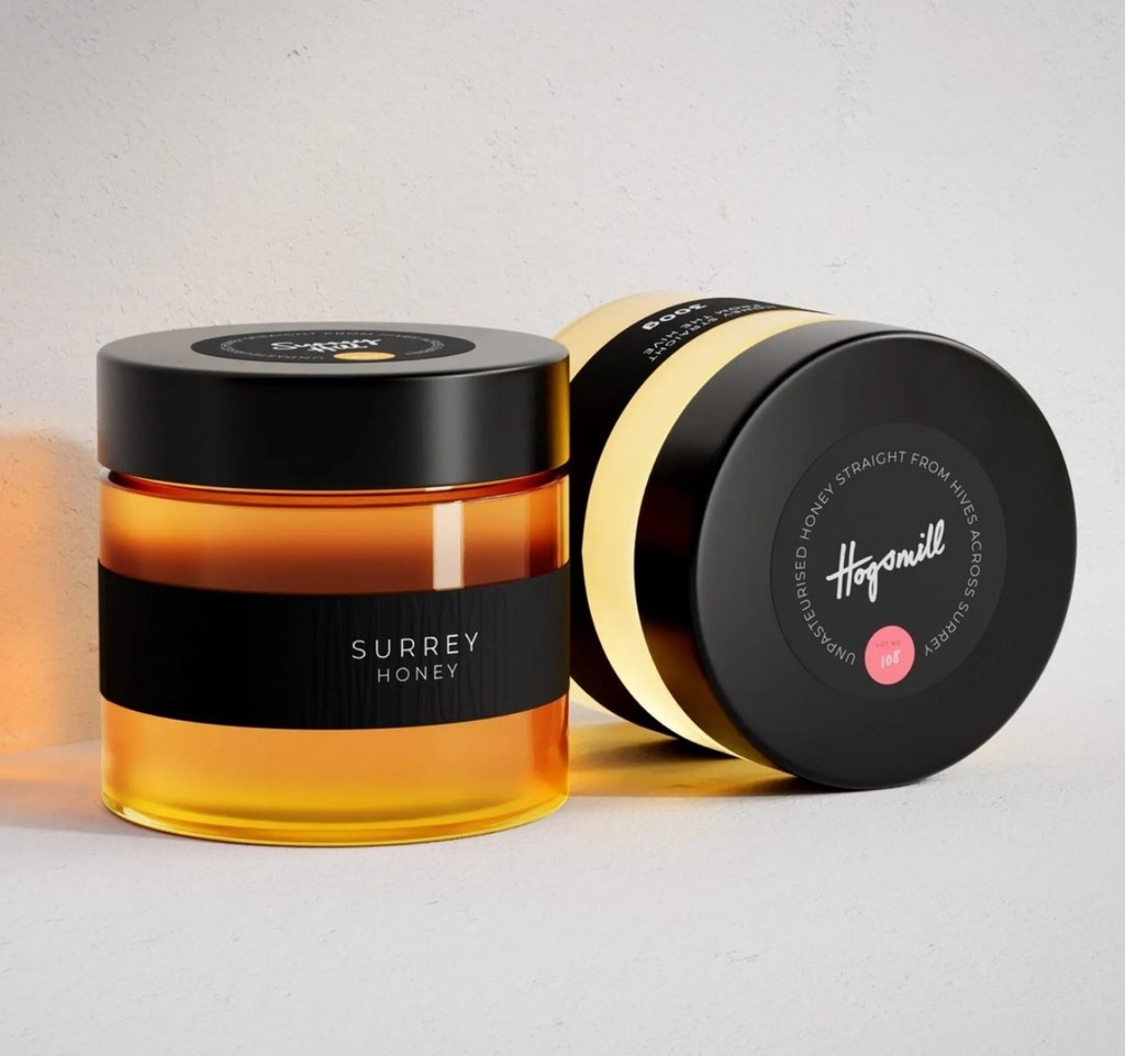
Studio Unbound's packaging design for Jam Packed Preserves
The packaging uses a simple black label and honey-coloured lid to create iconic honeybee stripes, paired with a colour-coded sticker and handwritten element adding to the artisan feel. The multipack is also designed to resemble an apiary, with a wooden box and honeycomb-inspired cardboard.
Find out more about Studio Unbound here.
Zara Kids Play & Care by Lavernia & Cienfuegos
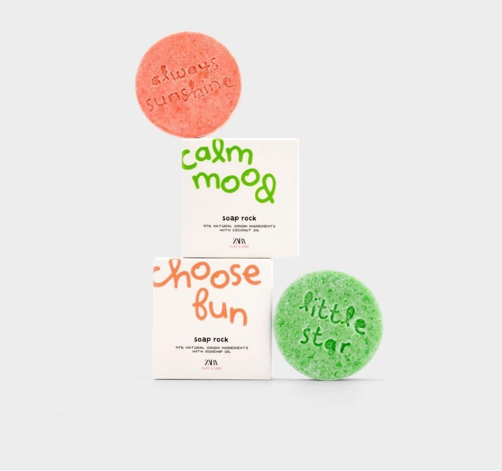
Lavernia & Cienfuegos' packaging design for Zara Kids Play & Care
Turning bath time into a game, the Spanish agency delivers soaps that, without being toys, are an attraction for children from the box itself. The font is mostly playful, brightly coloured on white backgrounds and embossed with a glossy varnish. In contrast, the product information is in black, thus avoiding an excessively naive design.
Find out more about Lavernia & Cienfuegos here.
Gourmet Lab by Non Gravity Agency
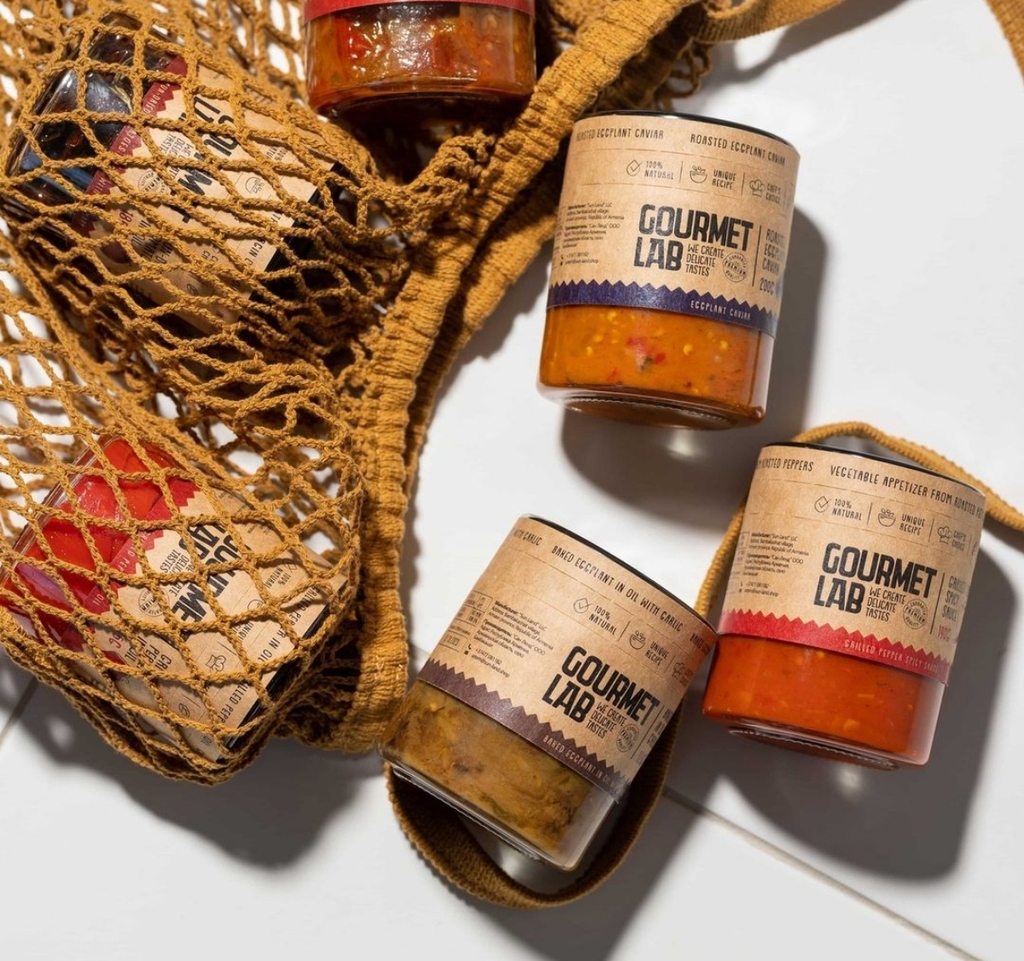
Non Gravity Agency's packaging design for Gourmet Lab
Both the logo and packaging designs showcase a contemporary and elegant appearance, embracing minimalist typography and subtle visual cues that evoke the sensory delights of food.
Find out more about Non Gravity Agency here.
Papa Salt Gin by Squad Ink Studio
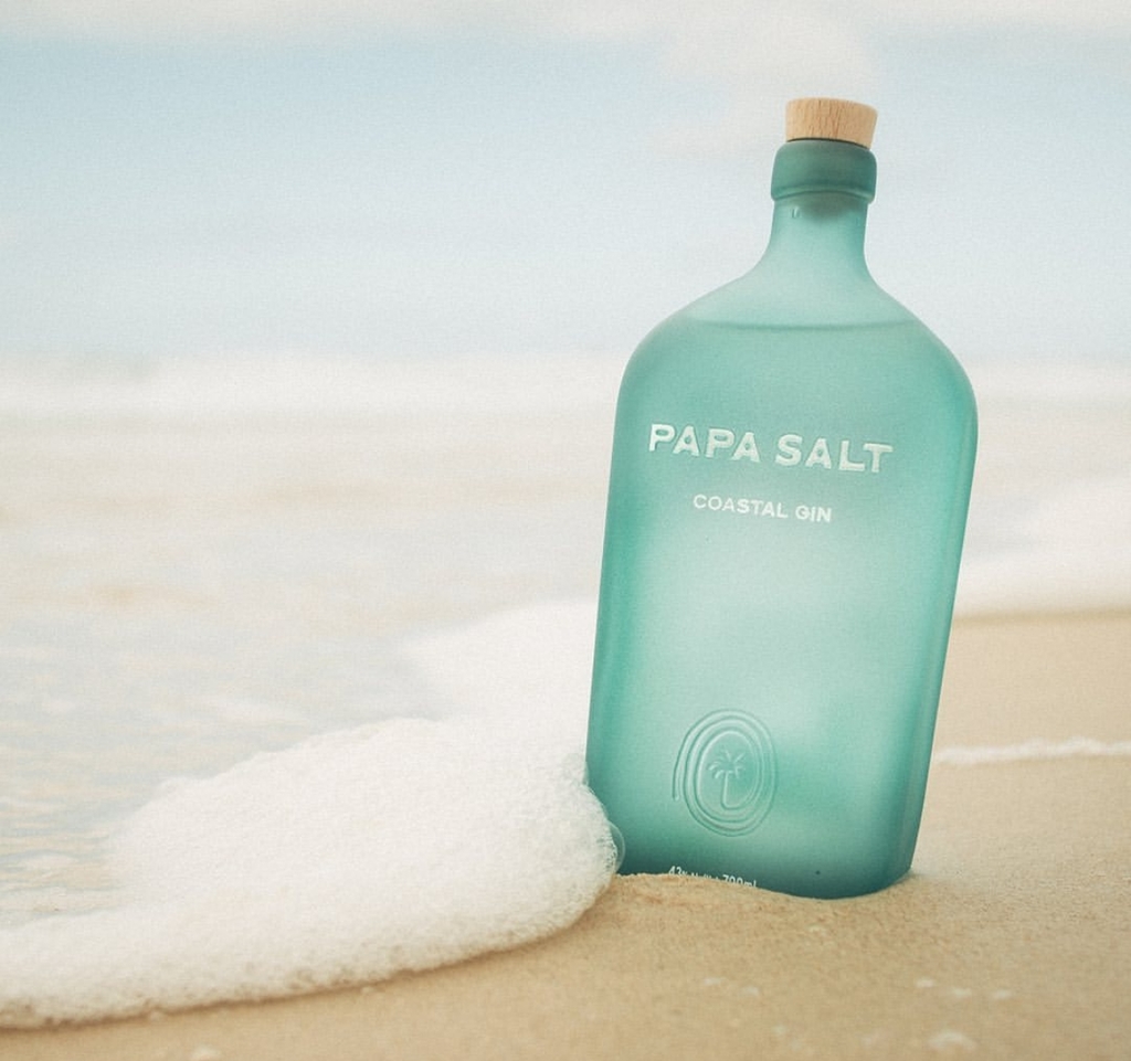
Squad Ink Studio's packaging design for Papa Salt Gin
The agency delivers an intentionally simplistic design by reducing it down to its bare essentials: a distinctive form with edges smoothed over, as if shaped by the sea, an aqua-like blue that radiates freshness and a proud brand moment that alludes to a coastal story yet to be told.
Find out more about Squad Ink Studio here.
Aphoógy Handmade Soap by Resauce Design Studio
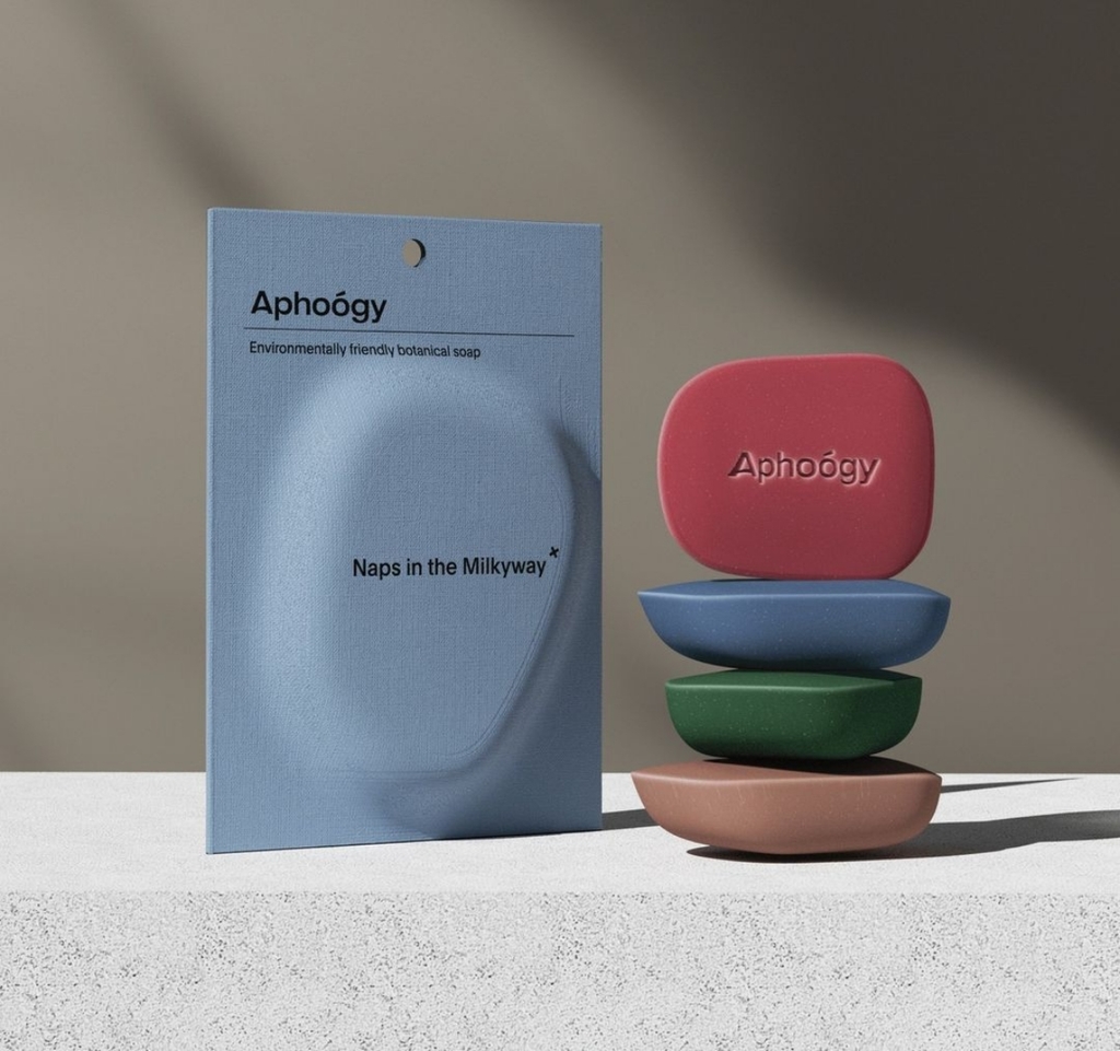
Resauce Design Studio's packaging design for Aphoógy Handmade Soap
The visual identity inherits the brand's pragmatic spirit, featuring strong edges, natural curvature and a soft matte finish, linking skin science's precision with skin smoothness.
Find out more about Resauce Design Studio here.
Stratus Wines by Karim Rashid
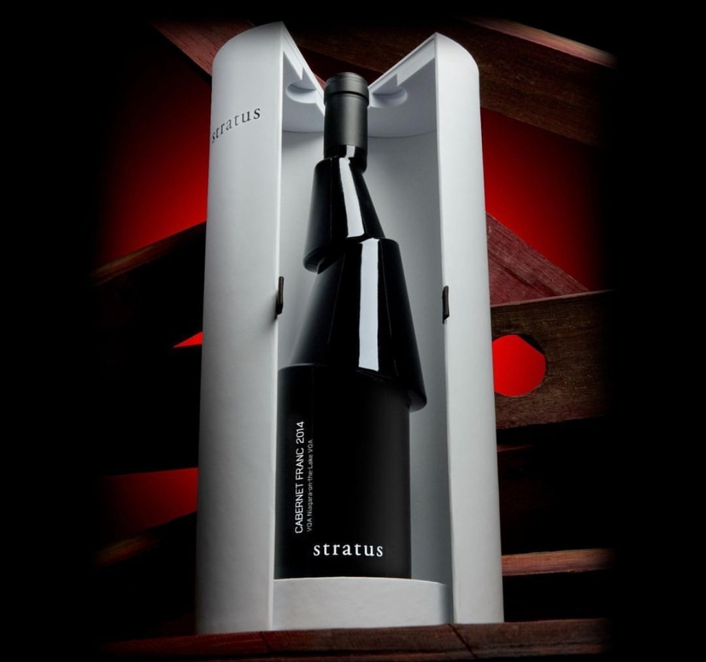
Karim Rashid's limited-edition packaging design for Stratus Wines
Inspired by the traditional method of leaving the wine on its lees (yeast sediment) in the bottle, the designer delivers a deconstructed bottle design where the segments trap the lees so they don’t end up in the wine glass, whilst allowing for comfortable pouring and a better grip.
Find out more about Karim Rashid here.
NAVEIA vegetable butter by Hardcuore
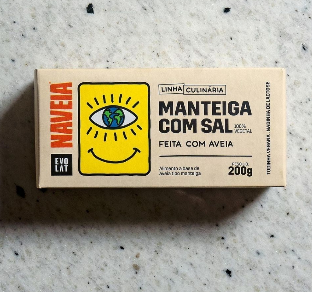
Hardcuore's packaging design for NAVEIA vegetable butter
The agency delivers a playful and eye-catching design, featuring bold typography and striking contrasting colours to showcase the goodness of what's within.
Find out more about Hardcuore here.
Pastificio Luciano by Studio Dispenser
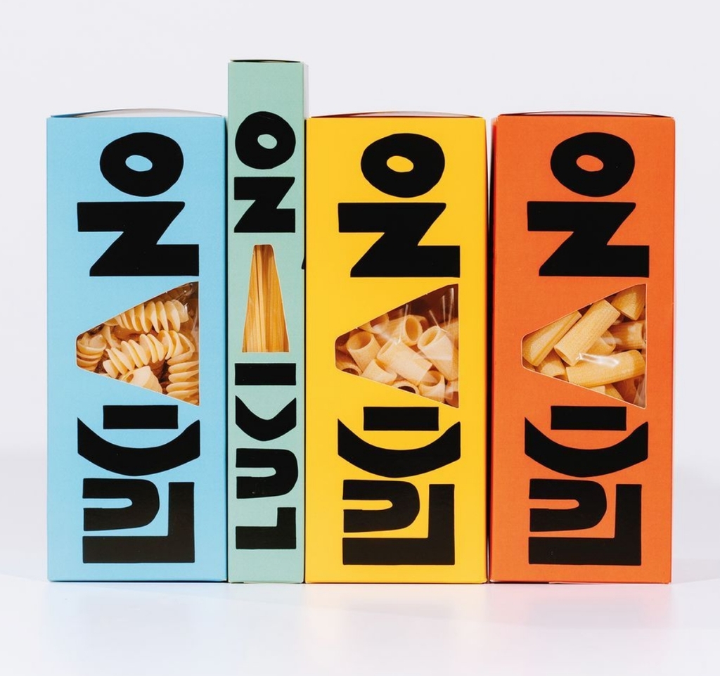
Studio Dispenser's packaging design for Pastificio Luciano
The vibrant colours that distinguish the various shapes mirror the liveliness of Luciano's offerings. The typeface is irregular, bold and stimulating, leaving a lasting impression, just like the pasta inside.
Find out more about Studio Dispenser here.