Shirin
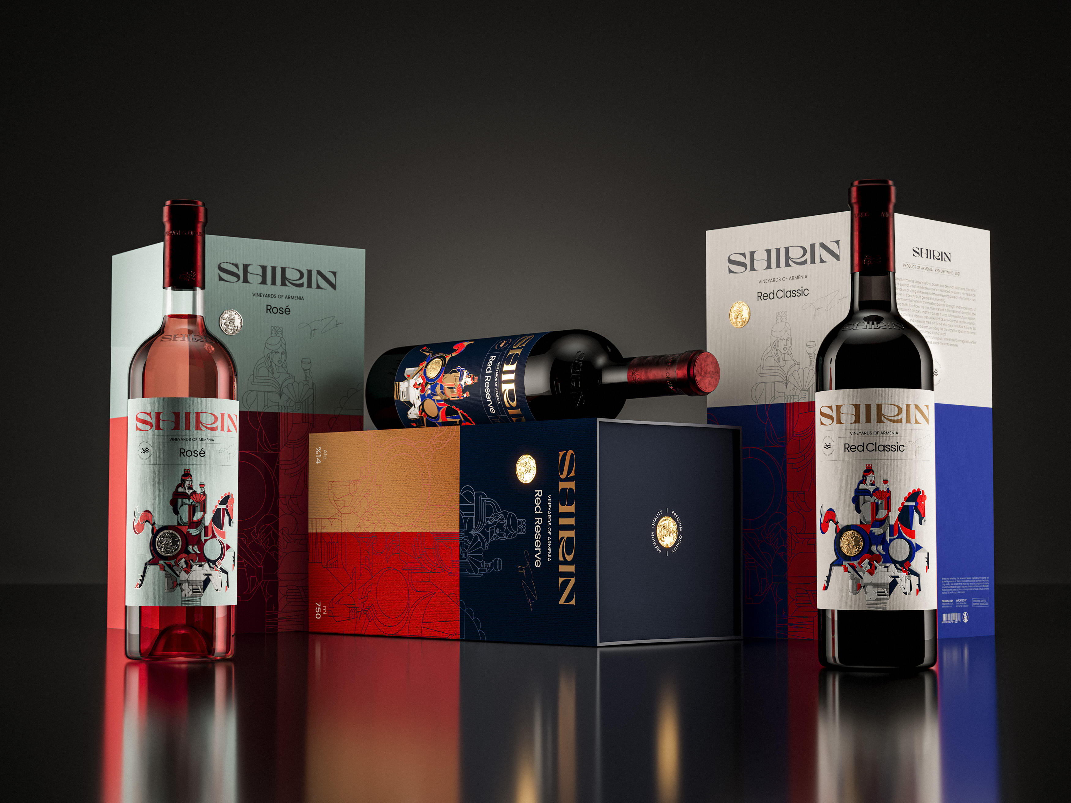
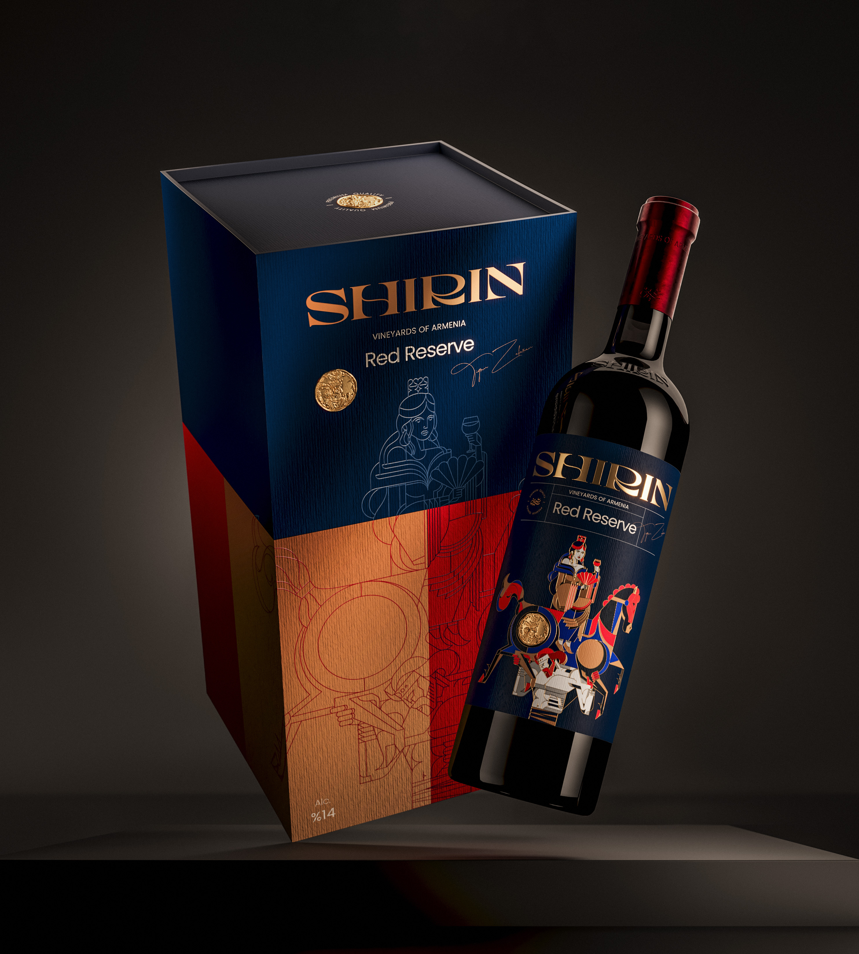
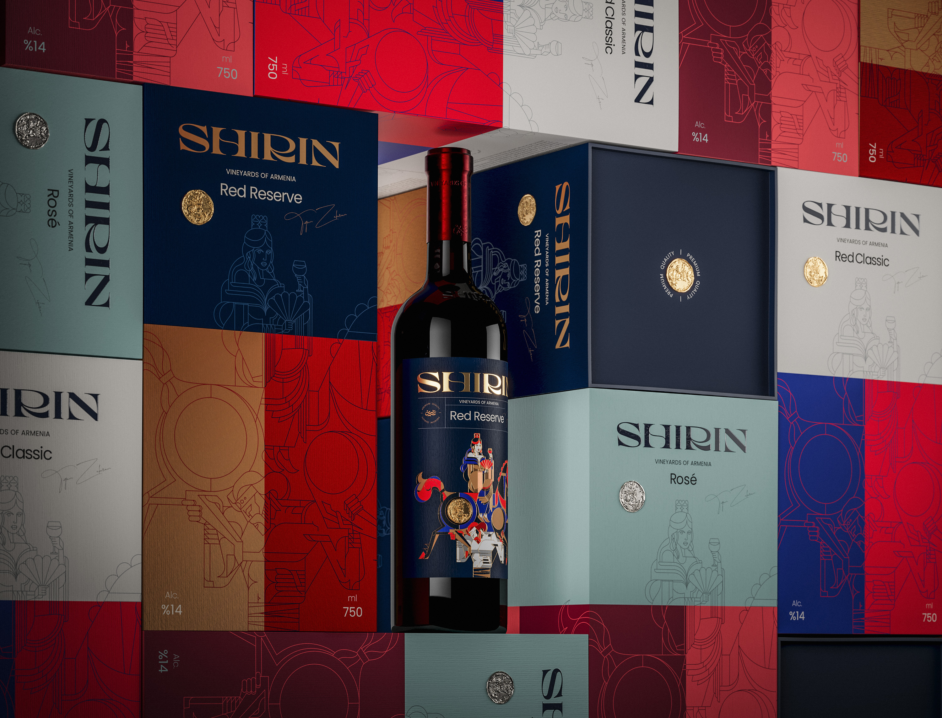
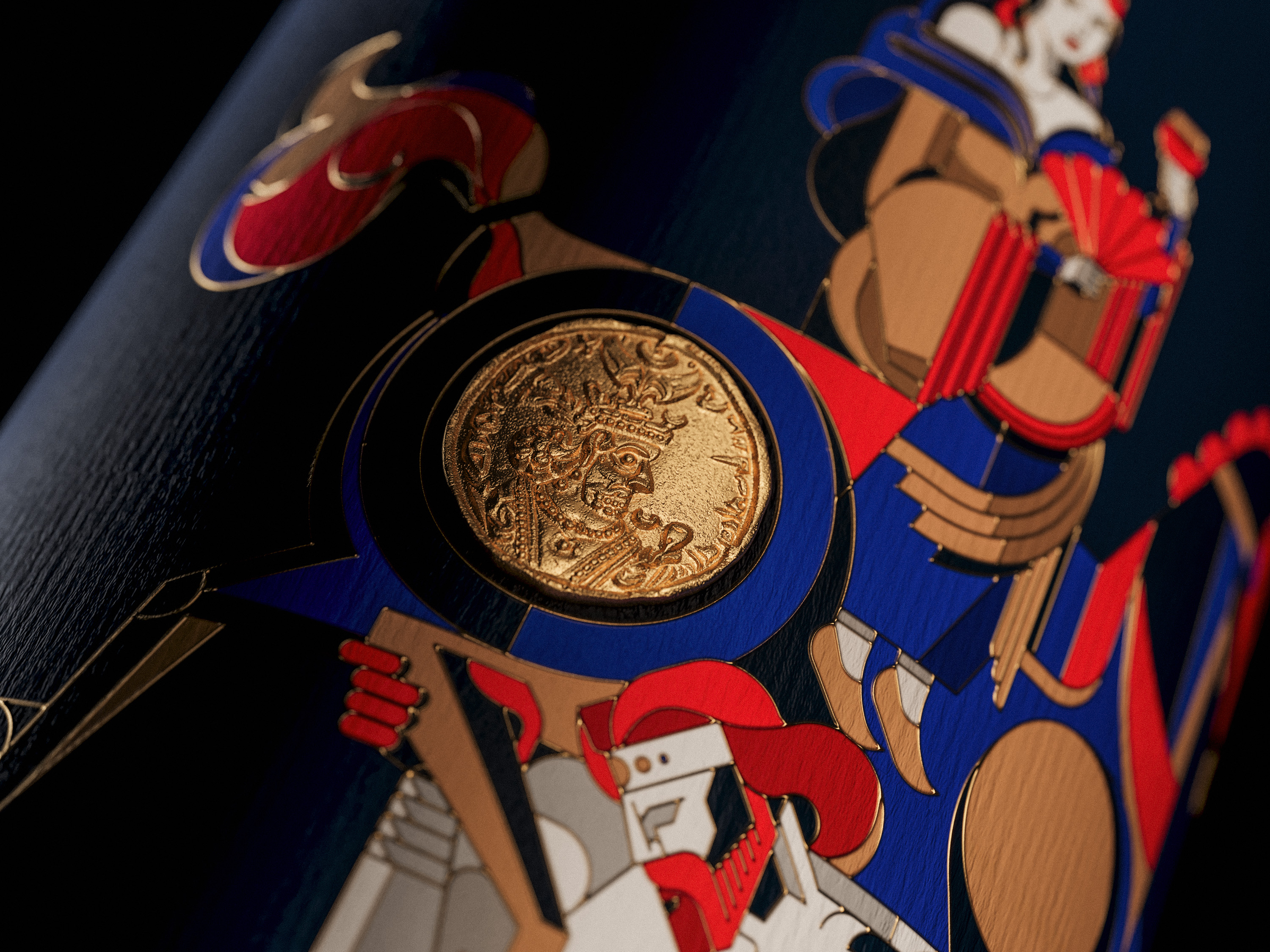
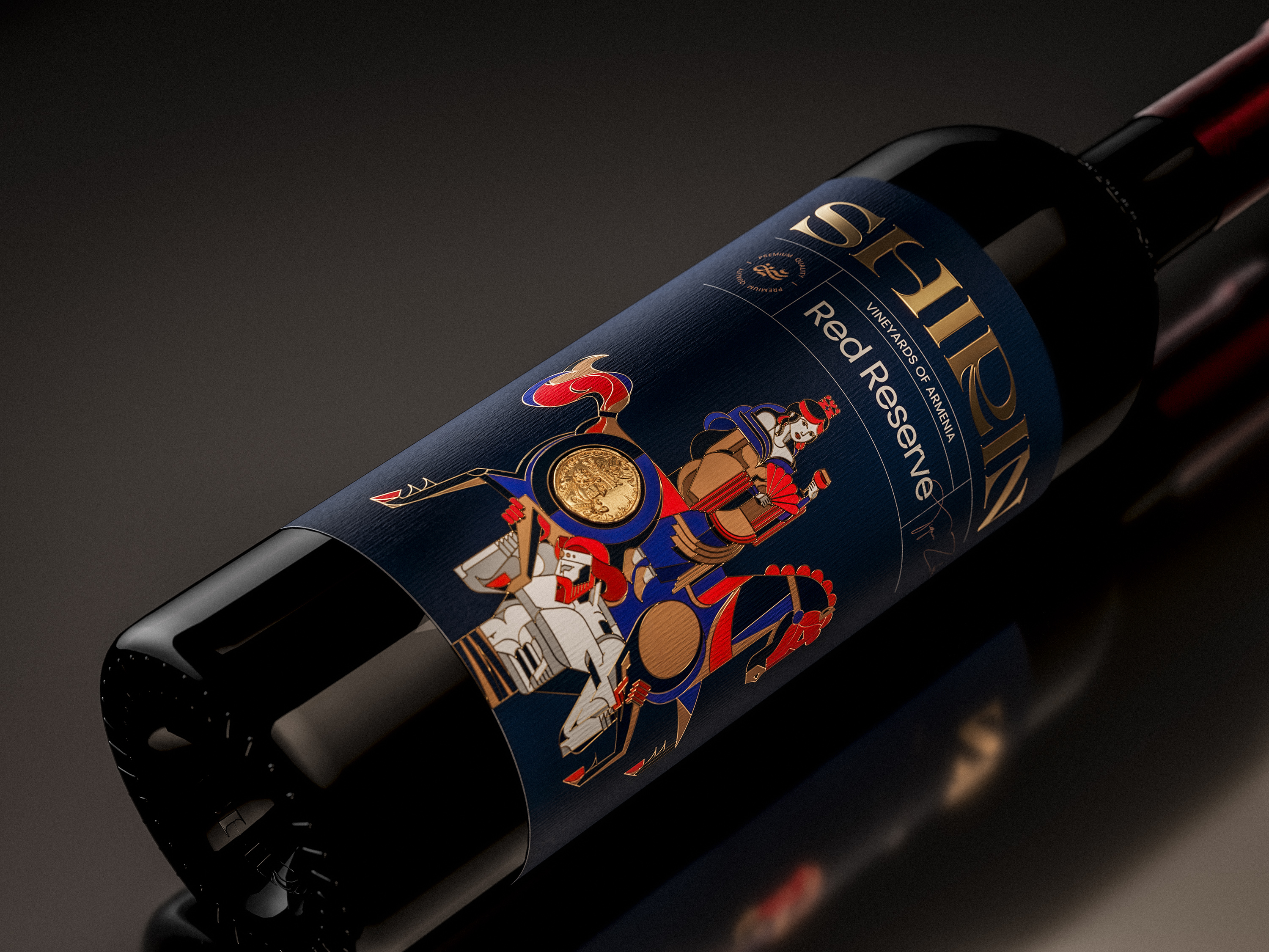
Shirin is a wine brand whose name was inspired by a cherished love story in Persian literature. This emblem of unwavering love, has woven itself into the cultural memory of Iran so deeply that lovers are often likened to its main characters Shirin and Farhad. Naming the brand after the story’s main character, summons the concept of love and beyond the story, Shirin literary means “sweet"; a fitting reflection of the wine tase itself. What distinguishes this packaging is, without doubt, the narrative and heritage that run through its core. Wine is a drink of intimate moments and romantic encounters; how fitting, then, for a brand to carry within it an ancient love story. To carry a premium feel, the challenge lay in the selection of materials and production techniques. We employed embossing, foil stamping, premium paper, and high-quality materials, as well as matured tones harmonized with gold accents to create a sophisticated identity. From a design perspective, the key question was how to strike a balance between the authenticity of a classical narrative and the sensibilities of a younger audience. To avoid positioning the brand as overly traditional, we created a visual language that exists in-between. And what better way to tell a story than illustration? The illustrations follow this same delicate balance: not so traditional as to create distance, and not so modern as to dilute the essence of the story. Shirin is pictured on horseback, journeying toward Farhad, with golden coins she brought as gifts. The illustrations are inspired by Persian miniature painting, reinterpreted in a modern abstract style. The logotype and color palette were carefully chosen to suggest Persian sensibility. Shirin is more than wine; it is a tale of love, a thread of culture, inviting each sip to become a moment of connection.