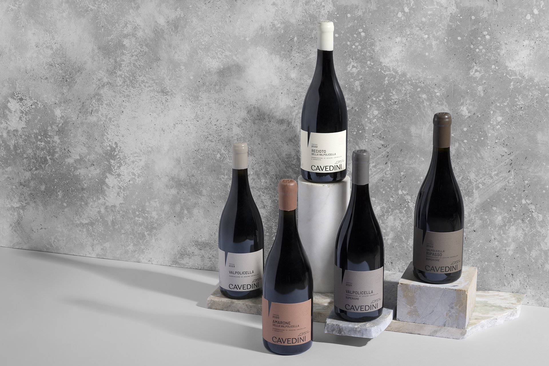
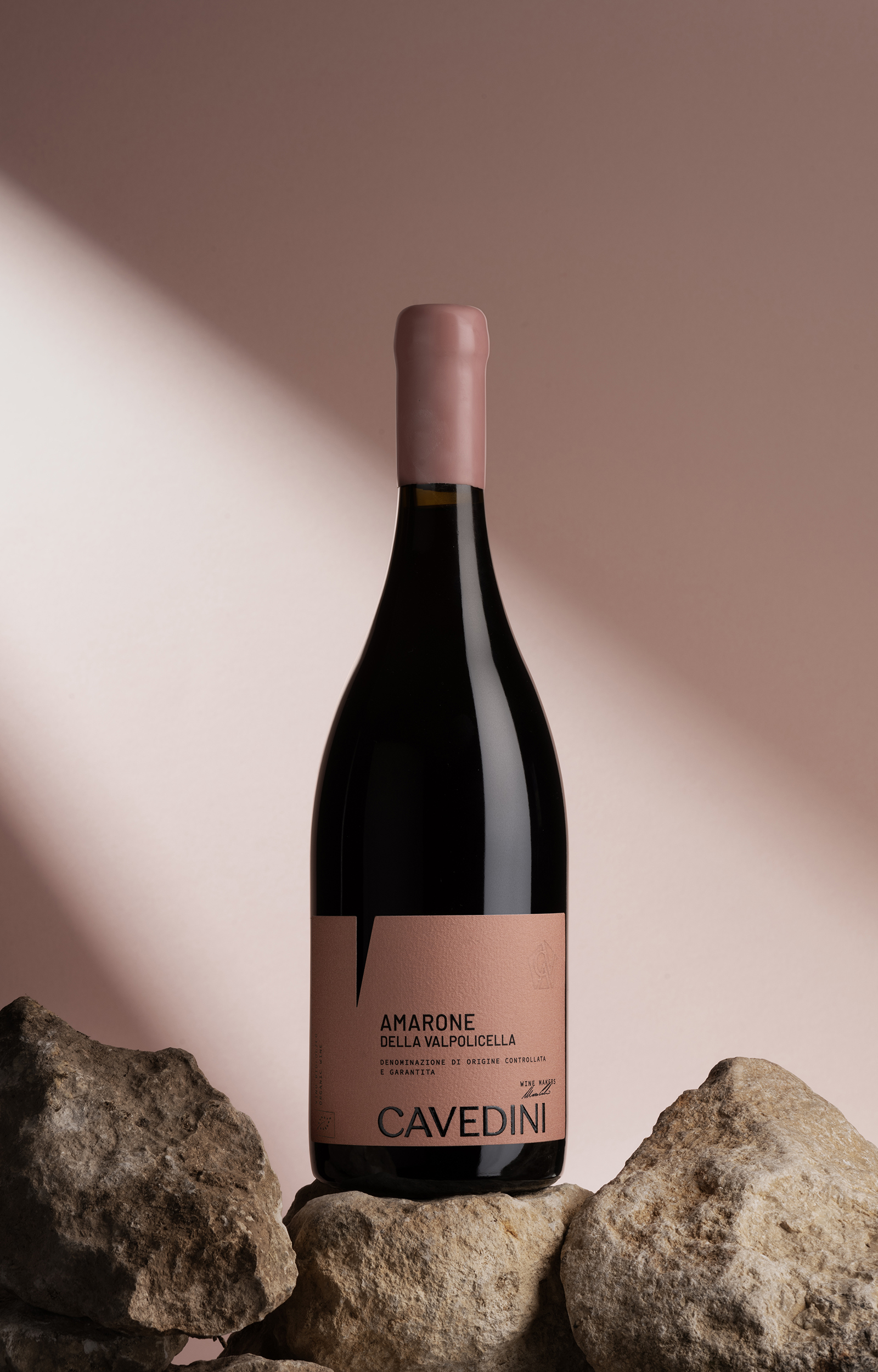
Corte Cavedini — Rebranding
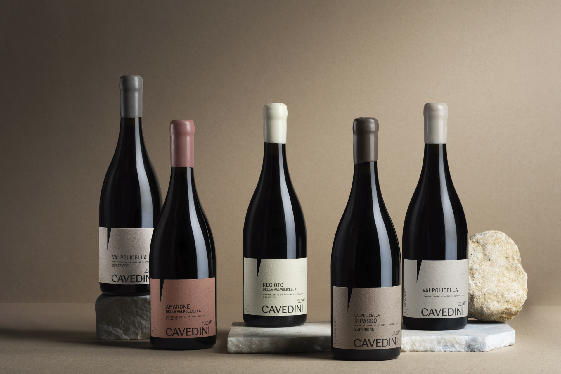
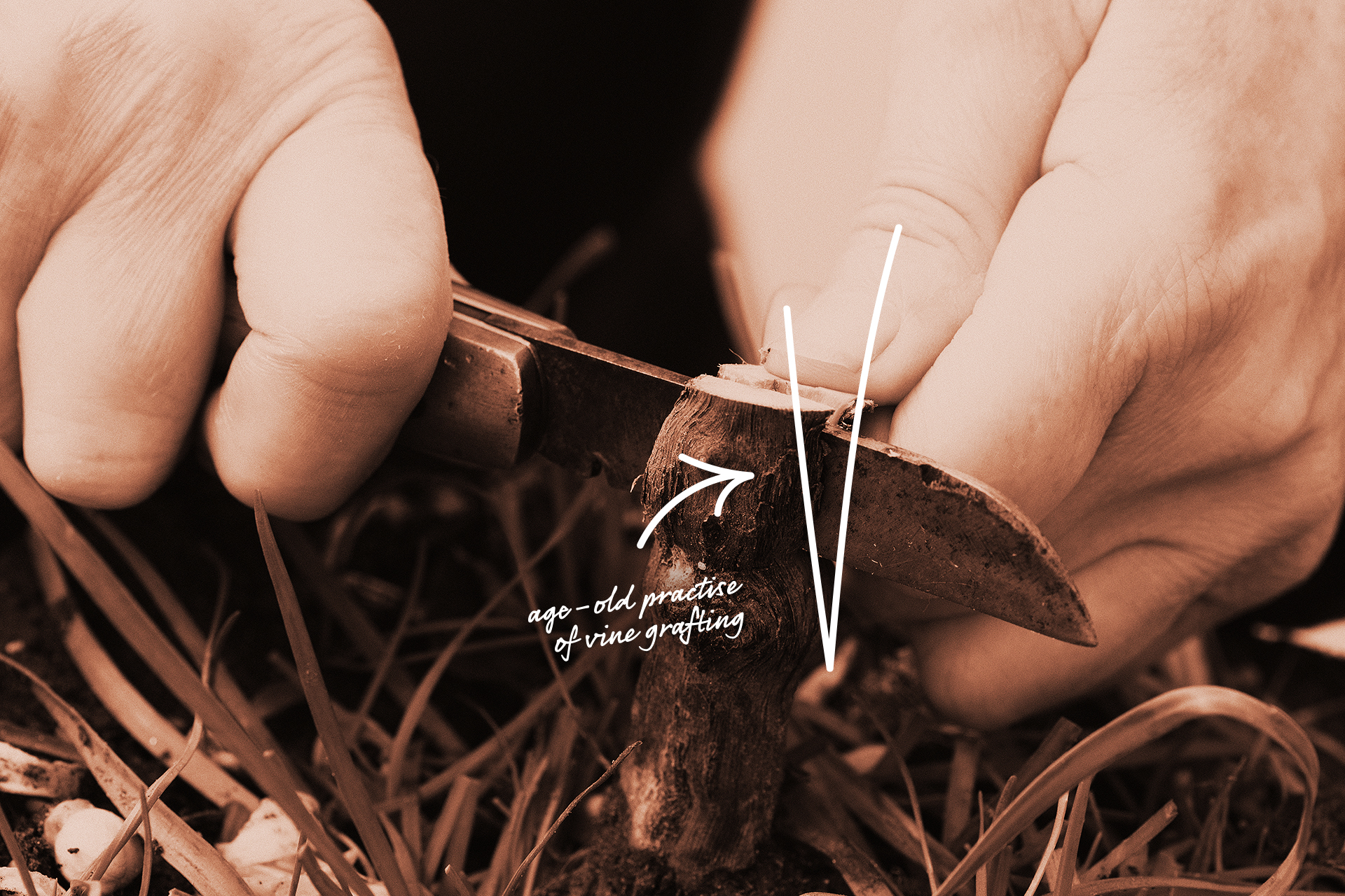
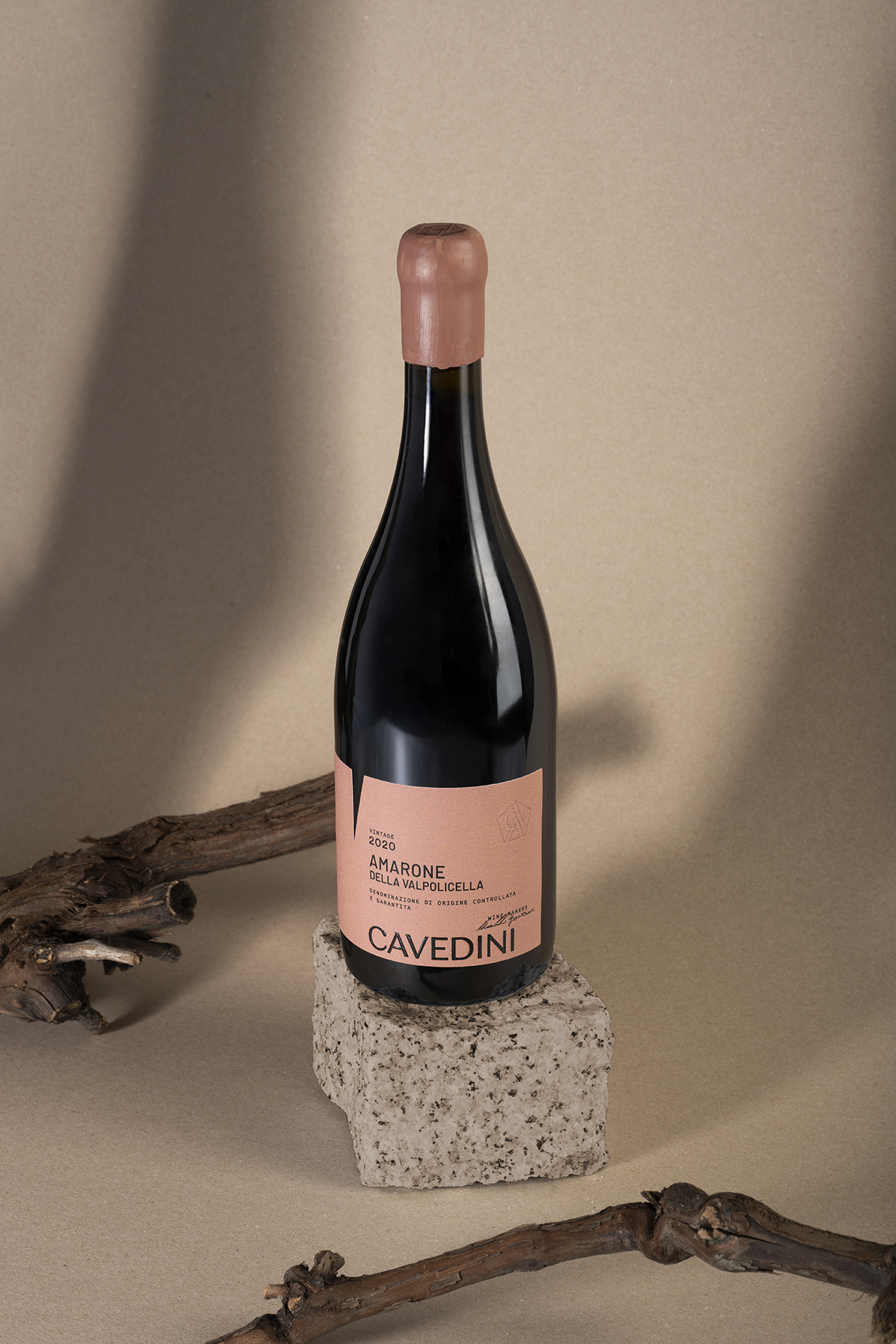
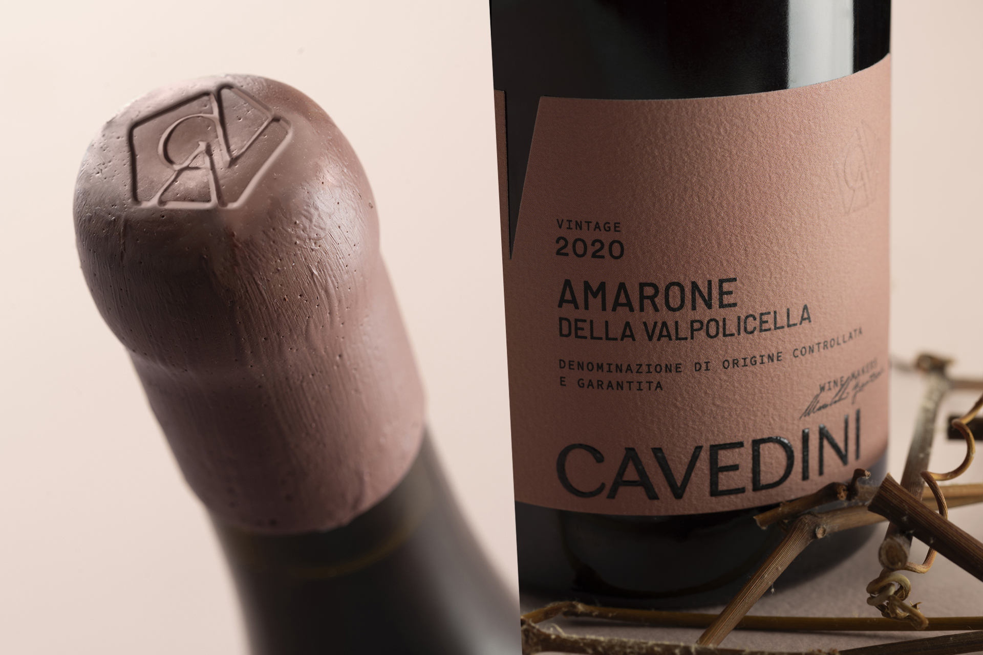
Deceptive simplicity formed of hints and hidden meanings. The restyling performed on the labels for the whole range of Cavedini Valpolicella wines uses space and geometry to express the family vocation. The organic lines of the vine leaf – represented through the bas-relief pentagon surrounding the family monogram – and the triangle in negative evoking the age-old practise of vine grafting become symbols of a craft passed down from generation to generation.