G.Low - Go low and Shine on!
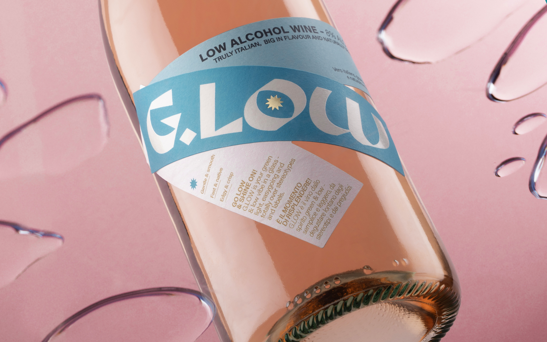
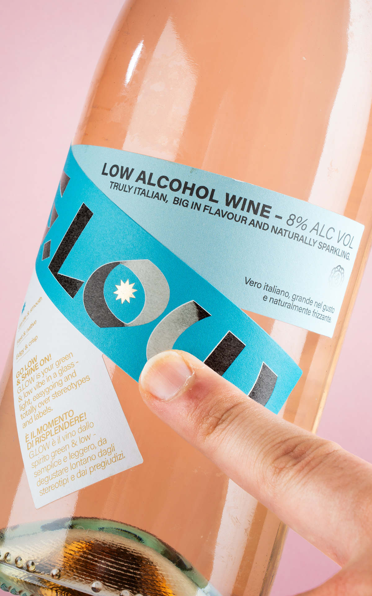
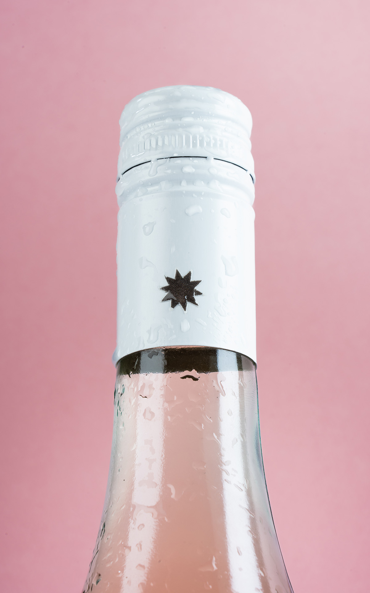
The creative process behind G.Low began with a clear and inspiring brief from the client: “To offer an experience of conviviality and lightness through an innovative low-alcohol wine that redefines the aperitivo ritual with taste, freshness, and a touch of originality. With fully sustainable packaging, we are committed to promoting a responsible lifestyle that celebrates the pleasure of good drinking without compromising environmental respect.” From this vision, we developed a creative path that merged visual provocation with strong, value-driven coherence. After a thorough phase of research and brainstorming, we shaped a concept that breaks with traditional wine label conventions, aiming to speak to a young, conscious, and curious audience. Our main inspiration came from eco-brutalism: a movement that combines the architectural rigor of brutalism—with its geometric forms, concrete structures, and raw aesthetic—with the spontaneous, harmonious return of nature. This contrast between structure and vitality guided us in creating a bold yet balanced and light visual aesthetic, just like the wine it represents. The choice of materials reflects this philosophy: we used Tintoretto Gesso Re-play paper, developed through a pilot project in collaboration with Fedrigoni, which reuses production waste from Cantine di Verona to create an elegant, natural, and fully recycled paper. A tangible symbol of the circular economy. Finally, to add an experiential dimension and make the product even more memorable, we introduced thermochromic ink: transparent at room temperature, it activates as it cools, revealing a black graphic at the wine’s ideal serving temperature. An unexpected detail that engages the consumer and makes the aperitivo ritual even more iconic.


