Nuclear Pigs
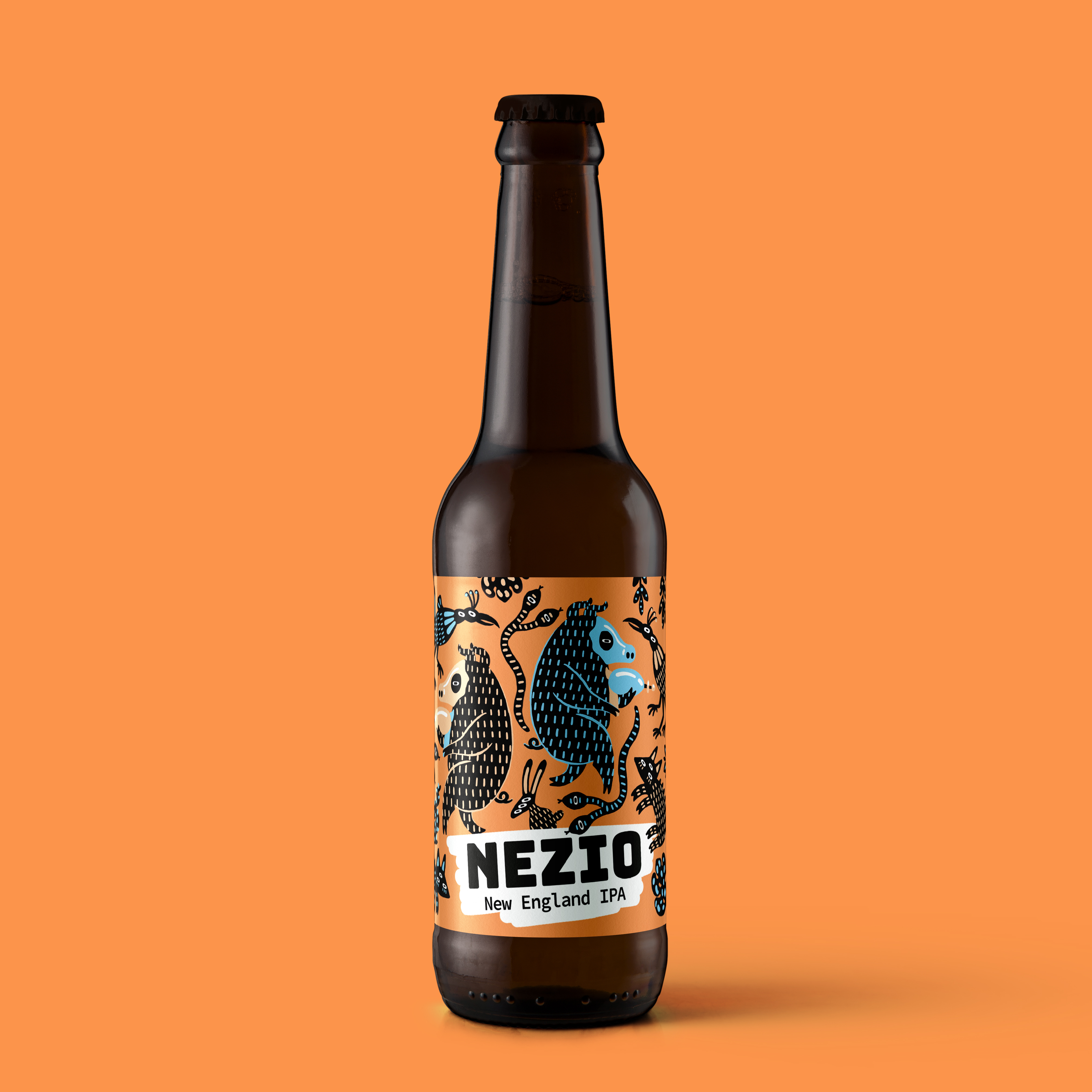
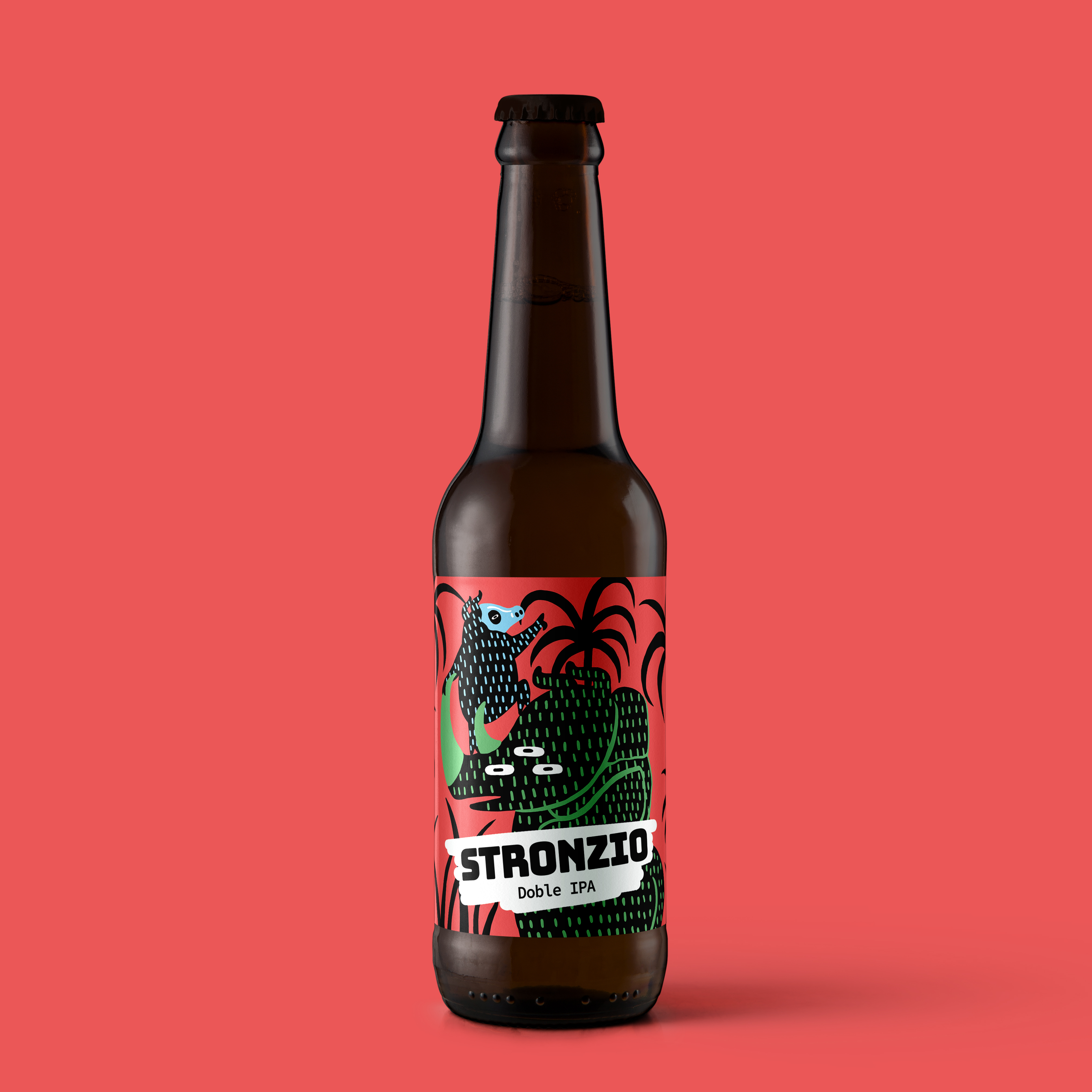
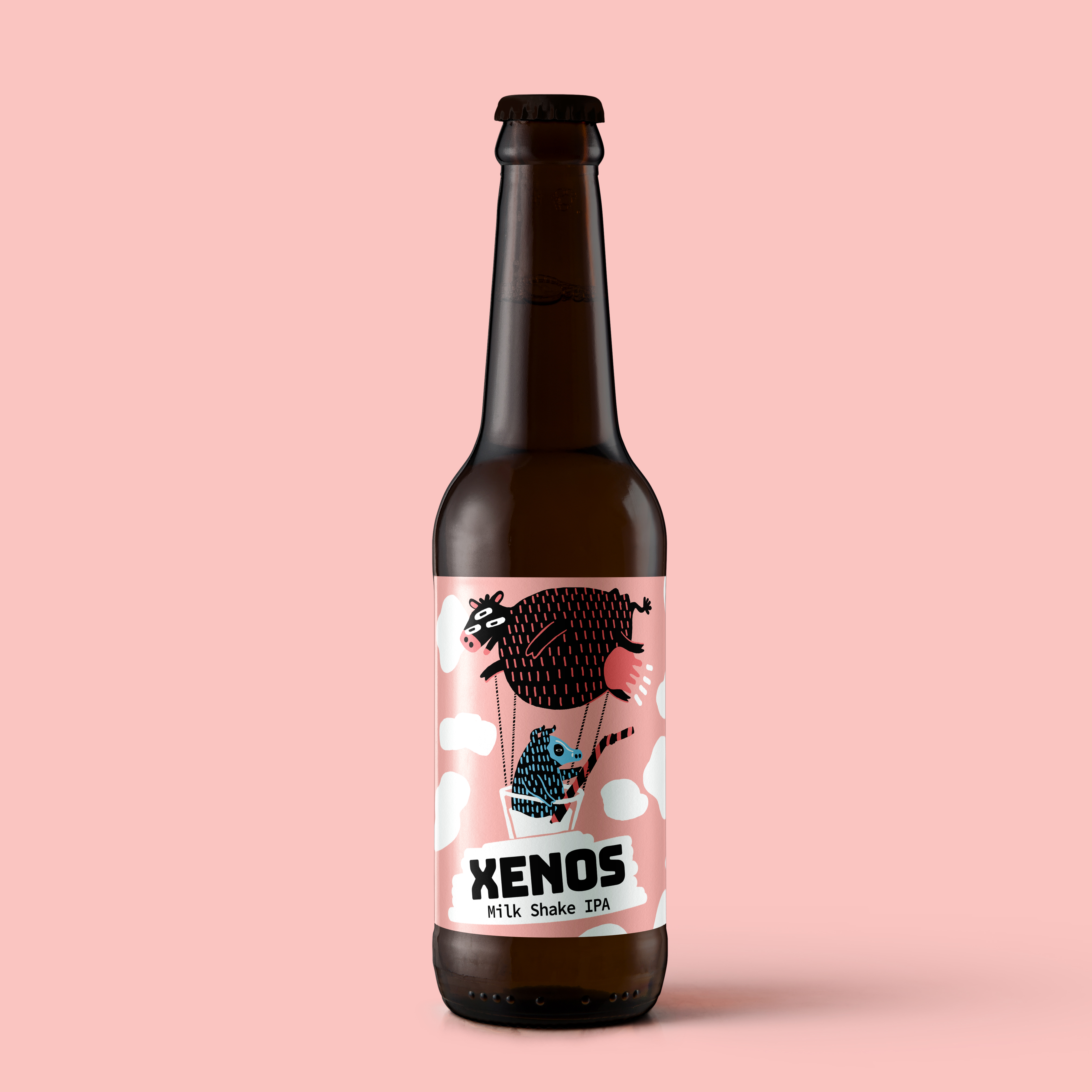
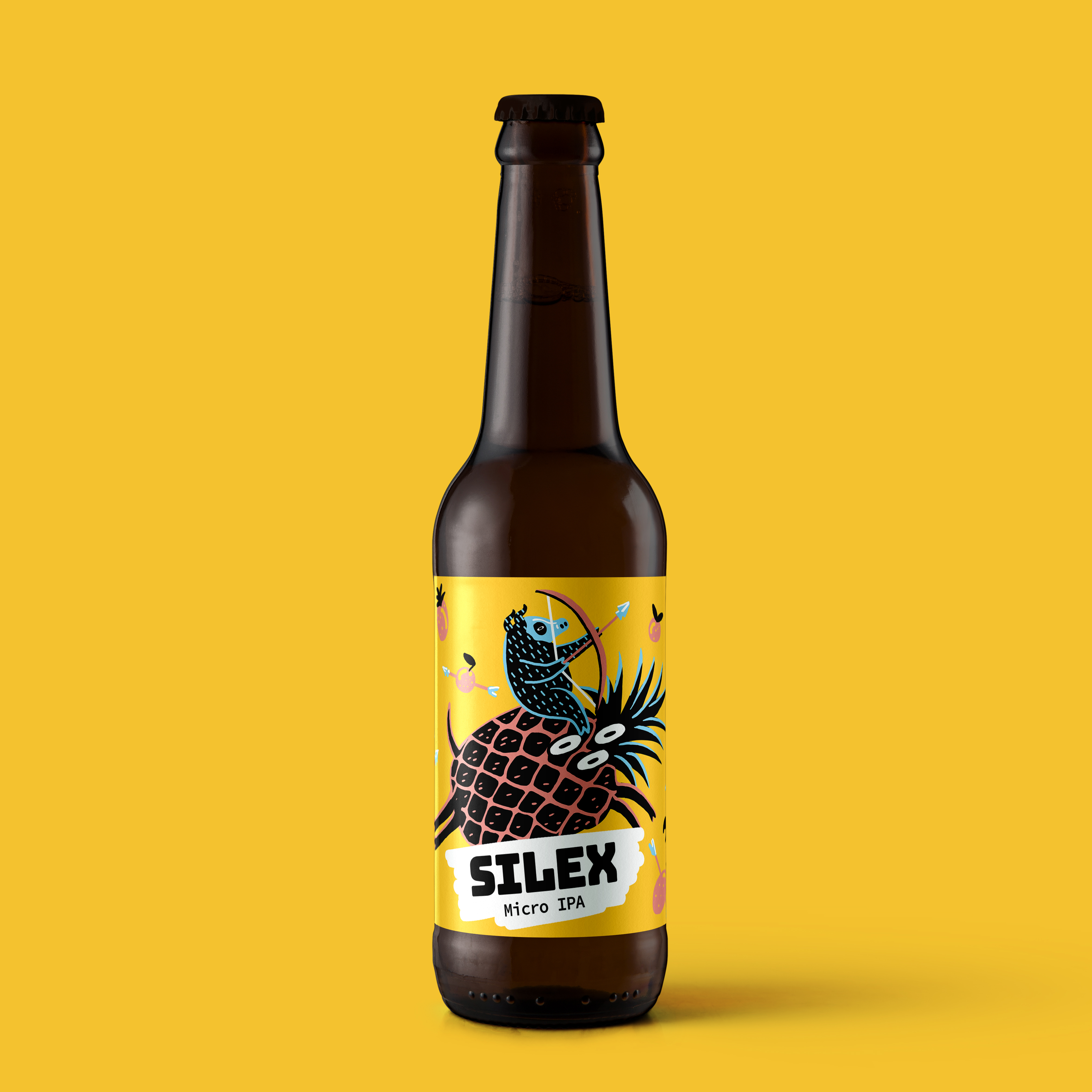
The Nuclear Pigs project focuses on designing a collection of labels for a line of craft beers produced by a small independent micro-distillery. The goal is to break away from the traditional aesthetics of the sector by embracing a bold, irreverent, and highly recognizable visual language that stands out on shelves crowded with similar products. Each label works as a small narrative graphic piece, where color, illustration, and humor take center stage. The core concept revolves around the “nuclear pigs”: mutant, exaggerated characters placed in chaotic, playful, and slightly absurd situations. These pigs become the heart of the brand’s identity, symbolizing rebellion, experimentation, and an uncompromising artisanal spirit. The color palette is intense and vibrant, using strong contrasts to reinforce the brand’s mischievous attitude and instantly capture the consumer’s attention. The typography is bold and dynamic, supporting the light-hearted tone while maintaining clarity and visual consistency.