Join our global community of inspiring packaging design
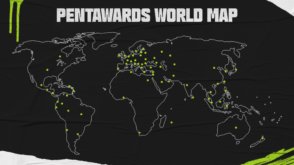
From New Zealand to Chile, Sweden to Canada and South Africa, entries into the Pentawards competition come from all across the globe. We explore 10 packs from our latest winning countries.
From New Zealand to Chile, Sweden to Canada and South Africa, entries into the Pentawards competition come from all across the globe. We explore 10 packs from our latest winning countries.
Since its launch in 2007, the Pentawards annual competition has received over 30,000 entries from over 95 countries across the globe. International brands and design agencies from all over have taken their shot at winning a Pentaward, with many making their mark on the global packaging design stage.
Below we take a look at some of the winning packs from last year's competition that showcase the different styles and expertise across different countries.
For your chance to make your mark in 2023, make sure you enter this year's competition , open until 24 March!
AUSTRALIA
Maybe Sammy by The Bar Brand People


Pentawards 2022 Gold Winner, Beverages, Cocktails
The Bar Brand People’s packaging design for Maybe Sammy's bottled cocktails takes us back to the 1950s. The labels boast a minimal and refined imprint with customised debossed gold foil, adding a metallic touch that provides a visual impact against the deep green of the box. The complete series consists of three sophisticated bottles and miniatures for each cocktail that communicate premium quality and ooze 1950s chic.
CANADA
BANG. An unconditional love for coffee by BangBang


Pentawards 2022 Platinum Winner, Brand Identity & Connected Packaging, Self-promotion
Inspired to give consumers an energized 2022 start after the accumulated fatigue of 2021, BANGBANG has created BEANBEAN; 6 types of coffee beans produced as a limited edition with the invaluable collaboration of ZAB café. 'By creatives, for creatives'; this self-promotional initiative is offering coffees named after fonts with each paying tribute to all the beautiful typographic "B"s that come from The Fonderies from around the world.
This series of 100% compostable bags, screen printed by hand with water-based ink, will be sent as a thank you to customers and collaborators who have contributed to the studio's successes in 2021. Part of the production and a few coffee-inspired merchandises will also be available to purchase for everyone at beanbean.cafe
CHILE
DOX, Bou Barroeta by JVD Estudio


2022 Pentawards Silver Winner, Beverage, Luxury Spirits
Drawing inspiration from the country of origin, the DOX, Bou Barroeta’s bespoke bottle is synonymous with greatness and gravitas. The horns of the ox are symbolized in copper as the representative element of Chile, anchored in the heart of the origin of Gran Pisco DOX — the Rosario vineyard in Atacama.
The labels reflect the natural and mineral resources of the earth, where everything is a unique experience for the senses. The stopper symbolizes the harmony between heaven and earth, which are constantly changing and moving yet are also perfectly balanced, with the stars the revolving around the earth represented in copper wire. The heart on the reverse refers to the family history and the nobility of each of his creations and the sensory packaging reflects the evolution of copper in its various colours and textures.
CHINA
Taste of countryside by Alibaba Design


2022 Gold winner, Food, Private label - Food
Developed to support agricultural industries in former national poverty-stricken countries, this packaging was created for online channels. The design itself brings hand and brush decorations, trendy and cute patterns for a vivid and attractive design. The packaging is made degradable environmental-friendly wheat straw materials, and it reduces the use of printing colour. All packages are made of primary color paper, so while protecting environment, it also restores the simple texture of agricultural products.
NEW ZEALAND
Talbot Forest Cheese Co. by Onfire Design


2022 Pentawards Silver winner, Food, Dairy and soya-based products
Onfire Design was tasked with the recreation and challenged to bring to life its story, quirky personality and unique perspective in cheese making. Inspired by the local forests in the South Island of New Zealand, the visual identity is brought to life with bold typographic woodblock patterns through which weaves botanical style local flora, fauna and birdlife illustrations; the size of which allows for multiple crops applied across the cheese styles. This creates an ever-changing forest scene in retail. Inspired by its new motto, 'United in the love of cheese', a shield-shaped label is applied with refreshed taste descriptions with a pale colour palette aiding in shelf standout.
REPUBLIC OF KOREA
Emoticon Sand by SPC Design Center


2022 Pentawards Gold Winner, Food, Desserts & Sweet Foods
Emoticon Sand is a dessert product that comes in a box set featuring 10 biscuits. 8 different emoticons are engraved on each biscuit found exclusively at the Pangyo branch of the Korean franchise bakery, Paris Baguette.
SPC Design Center used wit, and contemporary visuals, and focused on the brand’s visual identity of Paris Baguette intending to capture the youth’s attention. The packaging is strategically designed to complete a full emoticon when two boxes are placed side-by-side.
SOUTH AFRICA
Cape Saint Blaize by Bravo Design


2022 Pentawards Bronze Winner, Beverages, Spirits (Clear)
Drawing inspiration from the landscape of Mossel Bay on the south coast of South Africa, the design process yielded a genuinely unique packaging that speaks to the brand’s values of authenticity and innovation.
The lighthouse, an icon on Mossel Bay’s coastline since 1864 inspired the design creating a unique, 360° packaging solution paying homage to the brand’s ethos of creating handmade, artisanal products delivering a unique product to the South African market. A ceramic bottle represents the clean lines of the Cape Saint Blaize lighthouse and rugged coastline cliffs taking centre stage and would be offset with a clean design and high-quality labelling that embraced the distillery’s logo complementing the ceramic.
SPAIN
Valderiz al Alba by Vamos Estudio


2022 Pentawards Gold Winner, Beverages, Wine (dark)
The famous work of the illustrious Spanish photographer Ramon Masats was donated by him to bodegas Valderiz for use on the winery's labels. To delve into the meaning and experience of working in the countryside, hand in hand, it is an allegory of memory, dedication and care in the ageing of wine.
The bottle and packaging reflect the moment captured in the photograph. The bottle is painted, and the photograph of the lady is adapted to the box to give the sensation of whitewashing the "bodega", the box containing the wine. The grapes are harvested at that time of the morning, at dawn, so that the grapes keep all their freshness. Many farm tasks are also carried out, such as the whitewashing of the houses. Hence the text that goes both on the box and on the bottle "The work in the fields, by hand, from dawn and without rest".
SWEDEN
Mevolution by Opposite House


2022 Pentawards Silver winner, Body, Health & Beauty, Private Label - Body, skincare and beauty
Intended to cover all consumer need from head to toe, Mevolution - an affordable personal care brand was launched in Sweden in 2021. Using a blend of words, ‘me’ - refers to the sense of self and ‘evolution’ denotes a constant change giving the brand its name.
The identity was created to work in unison with the brand's wide range of different product categories. The packaging design works with playful product names and happy visuals to bring joy into daily personal care routines. A symbol with the tagline “For me every day” was created to symbolize everyday routines, day and night around the clock.
USA
Doritos’ SOLID BLACK by PepsiCo Design & Innovation


Pentawards 2022 Gold Winner, Food, Limited Edition
SOLID BLACK is a multi-platform initiative backed by action, designed to bolster the voices of black innovators and creators. To mark the launch of Doritos SOLID BLACK, the design team brought to life two custom Doritos bags that featured the artwork of Megan Lewis, a Baltimore-based award-winning artist and multidisciplinary illustrator who is known for her large-scale murals, use of bold colours, and 'Blk Women Period LLC' series.
The Doritos SOLID BLACK packs featured beautifully bold illustrations representative of Black men and women combined with geometric shapes and pops of colour anchored to a solid black background. The packs feature hand-drawn typography that celebrates what it means to be black.