Packaging without borders: Pentawards winners from around the world
Pentawards is proud to champion talent from every corner of the world, shining a spotlight on the agencies, brands and designers shaping the future of packaging - both locally and globally
Pentawards is proud to champion talent from every corner of the world, shining a spotlight on the agencies, brands and designers shaping the future of packaging - both locally and globally
From India to Sweden, Poland to Mexico, our winners prove that great design transcends language, culture and geography. Discover a selection of last year’s global standouts below.
SWEDEN: Arla Stripes by IW Agency
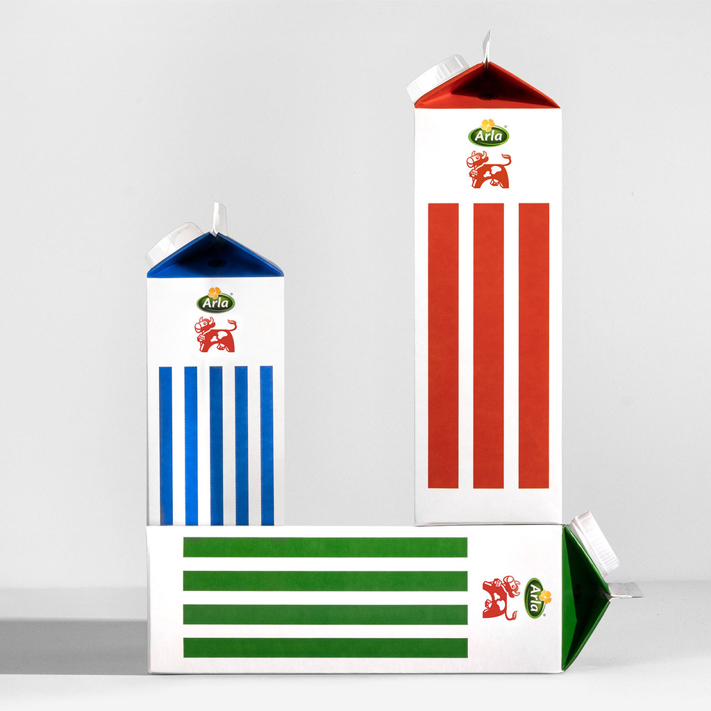
Arla is Sweden’s leading dairy brand and a staple in Swedish households, with its iconic milk carton designed by Tom Hedqvist in 1992. This design, relying solely on stripes to indicate fat levels, has been a symbol of trust and simplicity for decades. However, over time, the design lost its clarity, becoming cluttered with additional details, claims, and messages. The dairy market became increasingly competitive, with private labels challenging A-brands like Arla.
To reclaim Arla’s iconic status and market leadership, the solution was to return to simplicity. The redesign stripped back the elements, bringing the bold, iconic stripes back to the forefront.
A key design decision was to allow one entire side of the carton to carry only the stripes and the Arla cow logo, enhancing visual impact. This move was not just aesthetic but strategic, positioning Arla’s packaging to stand out in-store. Arla’s striped cartons are not just packaging; they are a piece of Swedish design history.
INDIA - mezete BY Bombay Design Centre Private Limited
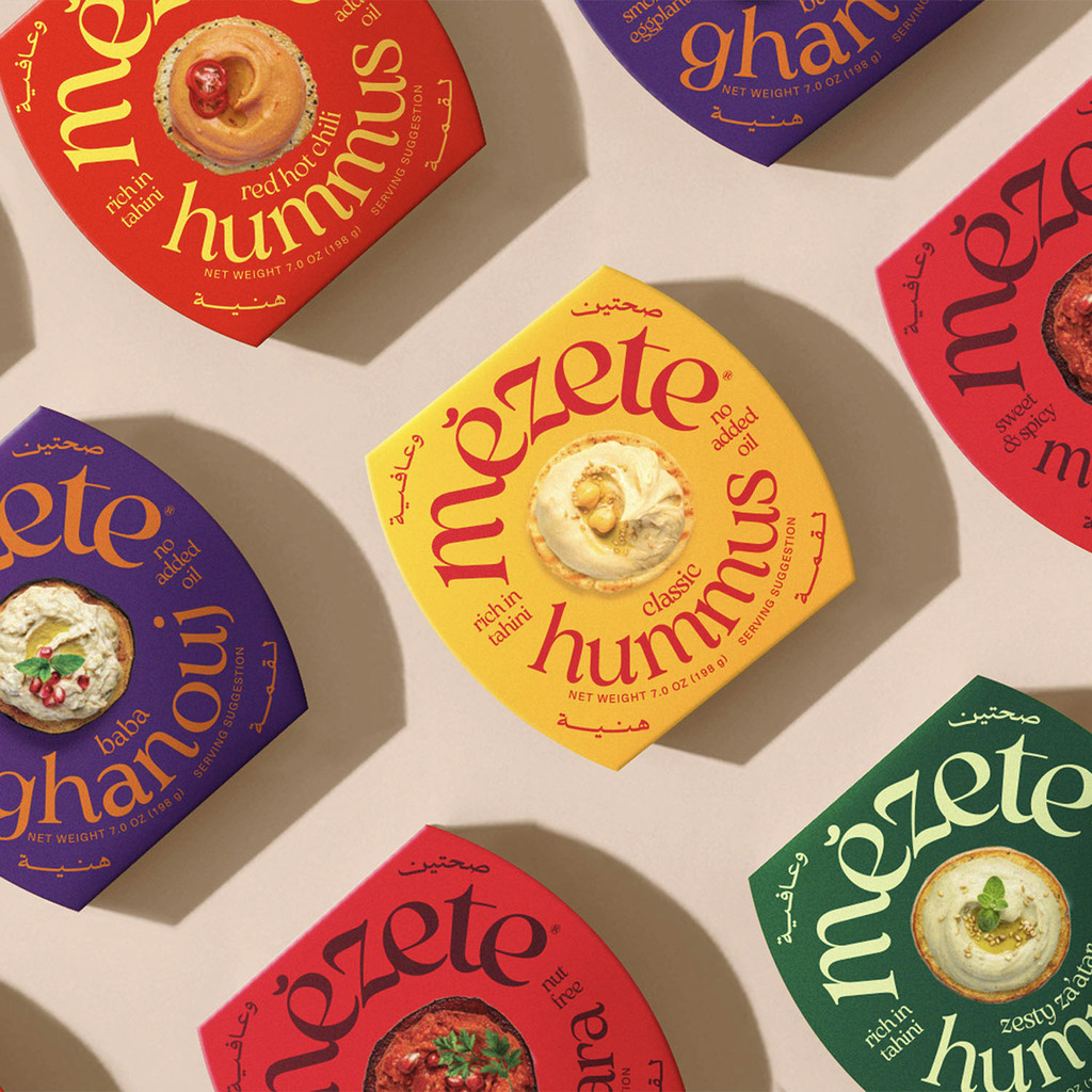
Mezete’s redesign was created to address the challenge of establishing cultural authenticity for a Middle Eastern food brand in a market saturated with Western imitations of Middle Eastern cuisine. Mezete, a Jordan-based brand, offers authentic Middle Eastern flavours preserved through innovative Ultra Heat Temperature (UHT) technology, allowing it to be transported globally without refrigeration.
The original packaging lacked the cultural authenticity and visual impact necessary to distinguish it in Western retail spaces. The final product was achieved by drawing inspiration from the vibrant, bustling souks of downtown Amman, capturing the region’s rich energy, colours, and textures in the design. By blending Arabic calligraphy, bold colours, and modern design elements, the packaging reflects the real Middle East, making the product both authentic and exciting in American and European markets. This approach balances cultural authenticity with global relevance, ensuring the design resonates with consumers while maintaining a strong connection to mezete’s heritage. The packaging’s dynamic typography and playful calls-to-action create an immersive experience, while cohesive design elements like custom logos and a unified colour scheme ensure that mezete’s products stand out in a competitive global market.
POLAND - DAWTONA by BNA/ Brand New Attitude
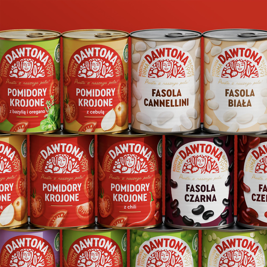
Dawtona, a family-owned food producer operating in Poland’s tomato and canned foods market, was struggling with a brand identity that failed to reflect its real strengths—local farming, quality produce, and family heritage. Perceived as abstract and foreign-sounding, the brand lacked emotional resonance, while its uniform packaging system diluted product distinctiveness and shelf impact.
BNA repositioned Dawtona as a proud, rooted brand by embracing its agricultural origins and crafting a narrative inspired by Slavic culture. The new brand hero—a symbolic goddess of crops and abundance—gave the brand an emotional anchor and visual cohesion across categories. The redesigned packaging introduced category-specific colours, fresh produce illustrations, and storytelling elements like “family-owned since…“—all reinforcing quality and authenticity.
The redesign also introduced a strategic system to distinguish tomato-based products from the broader range. Two color-coded versions of the logo—white-on-red for tomatoes, red-on-white for others—anchor the shelf presence while bringing structure to the brand architecture. Combined with broad colour palette, tailored illustrations and refined packaging layouts, the result is a brand that unites tradition, design intelligence, and commercial clarity—ready to stand out and scale up in a highly competitive category.
MEXICO - GRAN MAIZAL by HUMAN
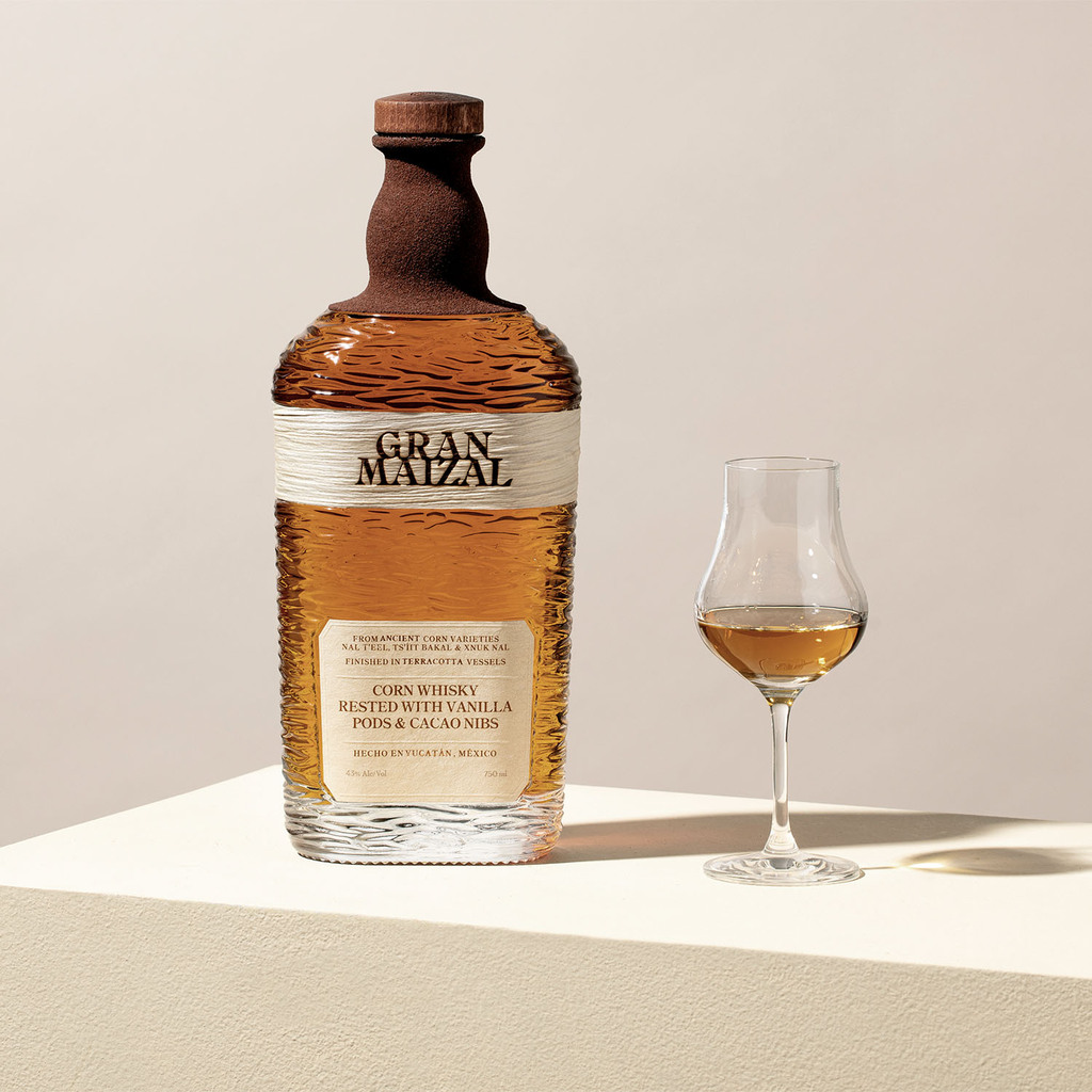
Gran Maizal is a Mexican corn whisky crafted from ancient corn varieties native to the Yucatán Peninsula, including Nal T’eel — the oldest scientifically recognized lineage. Created to honor the agricultural and cultural legacy of Mesoamerica, it embodies a deep connection to land, ancestry, and tradition. The packaging is designed as an extension of this narrative.
For the primary label, HUMAN introduced an industry-first by incorporating actual corn leaves — a material never before used in spirits labeling. The secondary label uses Fibers paper, enhancing the artisanal, tactile quality. Aging takes place in terracotta vessels, a detail translated into the packaging through the use of mud applied to the bottle’s neck — physically binding the vessel to the process. The internal texture of the glass evokes the mangata — the moon’s reflection on cenote waters — grounding the product in its native landscape. Every element invites touch, reflection, and reverence.
Gran Maizal is more than a spirit — it is a sensorial artifact of ancient Mexico.
NEW ZEALAND - Salash by Onfire Design
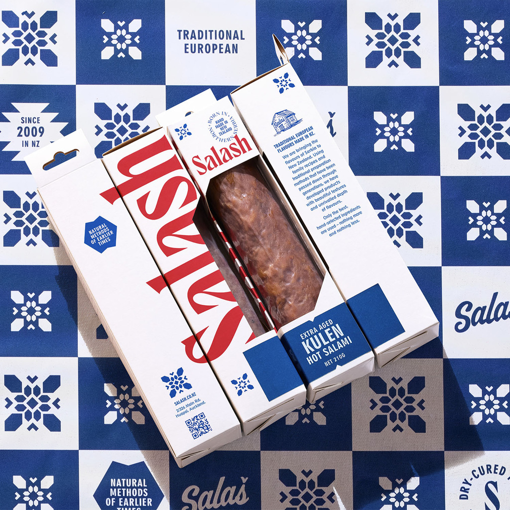
Salash Delicatessen is a family-owned smallgoods business in Auckland, with a rich heritage rooted in Northern Serbia. For four generations, they’ve been crafting dry-cured meats, developing unique flavours, textures, and styles. Since moving to New Zealand in 2009, Salash has built a loyal following at local food markets, known for their authentic and high-quality products.
To expand nationwide, Salash recognized the need to enhance its brand and packaging to appeal to discerning "foodie" consumers. The design process drew inspiration from Eastern European visual styles, incorporating elements of Serbian culture.
The large, custom wordmark, influenced by the Cyrillic alphabet, features sharp serifs, evoking imagery of butchery tools like knives and hooks. Patterns and icons simplify traditional regional textiles, while the colour palette – inspired by the Serbian national flag – uses bold blue, white, and red tones, contrasting with earthy competitor packaging. The new packaging accommodates various meat sizes and formats, minimizing print runs and packaging waste. A simple, utilitarian sticker system, featuring bold typography, is hand-applied during packing, giving the brand a modern yet authentic feel.
EGYPT - THE 8TH SIN by Leo&Co Design Studio
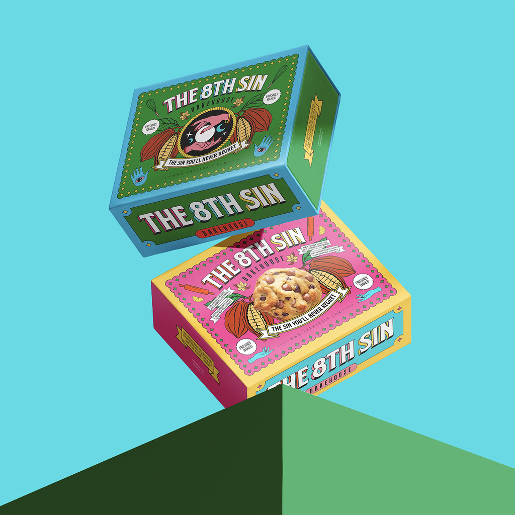
The brief was to develop an identity and packaging design for a bakehouse specialized in gourmet cookies & treats. The challenge was to maneuver away from conventional bakery names and emphasize their rich, bold flavoured creations.
Leo&Co Design Studio's solution: “The 8th Sin” - a name inspired by the seven deadly sins.
In a world where desserts are often seen as guilty pleasures, we’ve turned temptations into an experience—because treating yourself should never be a sin! The concept is to transform indulgence into a crafted design by redefining temptation as something to be savored, not resisted.
For the packaging design, we managed to create an irresistible visual that immediately sparks curiosity and craving. Inspired by Mexican folk art, we used daring color combinations and bold illustrations to complement the brand. The goal was to create a lasting impression while making each treat impossible to resist.
Although having the brand name as “The 8th Sin” could lean towards a gloomy and gothic vibe, we balanced this expectation by choosing a vibrant visual approach to highlight indulgence in a way that feels exciting rather than forbidden. This contrast achieved the brand’s purpose, ensuring it stands out while strongly portraying its essence.
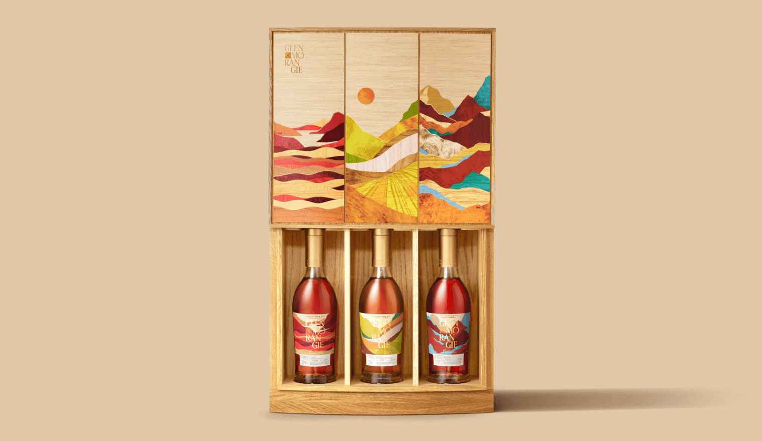
UNITED KINGDOM - Glenmorangie Wine Cask Collection by Butterfly Cannon
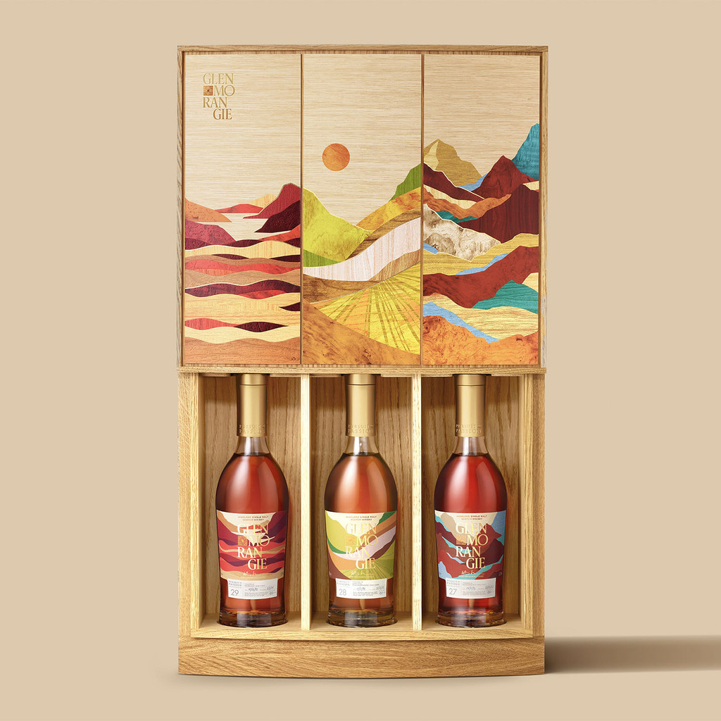
Whisky meets wine in an extraordinary collaboration celebrating terroir, craftsmanship, and adventure, brought to life in a masterfully designed oak presentation case. Hand-crafted using intricate marquetry, the case is a vibrant wooden triptych that captures the essence of three iconic wine regions: Bordeaux’s coastal light, Burgundy’s rolling charm, and Piedmont’s alpine drama.
The front panel features bespoke artwork inspired by each landscape, while the reverse is inlaid with alternating vertical wooden detailing that nods to the staves used in traditional wine casks. Every element has been carefully considered, from the tactile feel of the wood grain to the precise alignment of the joinery. Slide the front panel upwards and the case transforms: each bottle is revealed in its own cask-inspired chamber, held securely in place and beautifully framed.
But the experience doesn’t stop with the case. Art-directed photography, luxury retail displays, and curated dining experiences echo the collection’s 'landscape identity', ensuring it commands attention far beyond the case. Together, they form a complete expression of the concept: a celebration of provenance, process and place, brought to life with the same precision and care as the exceptional whiskies within.
CROATIA - Famìa by Studio Tumpić/Prenc
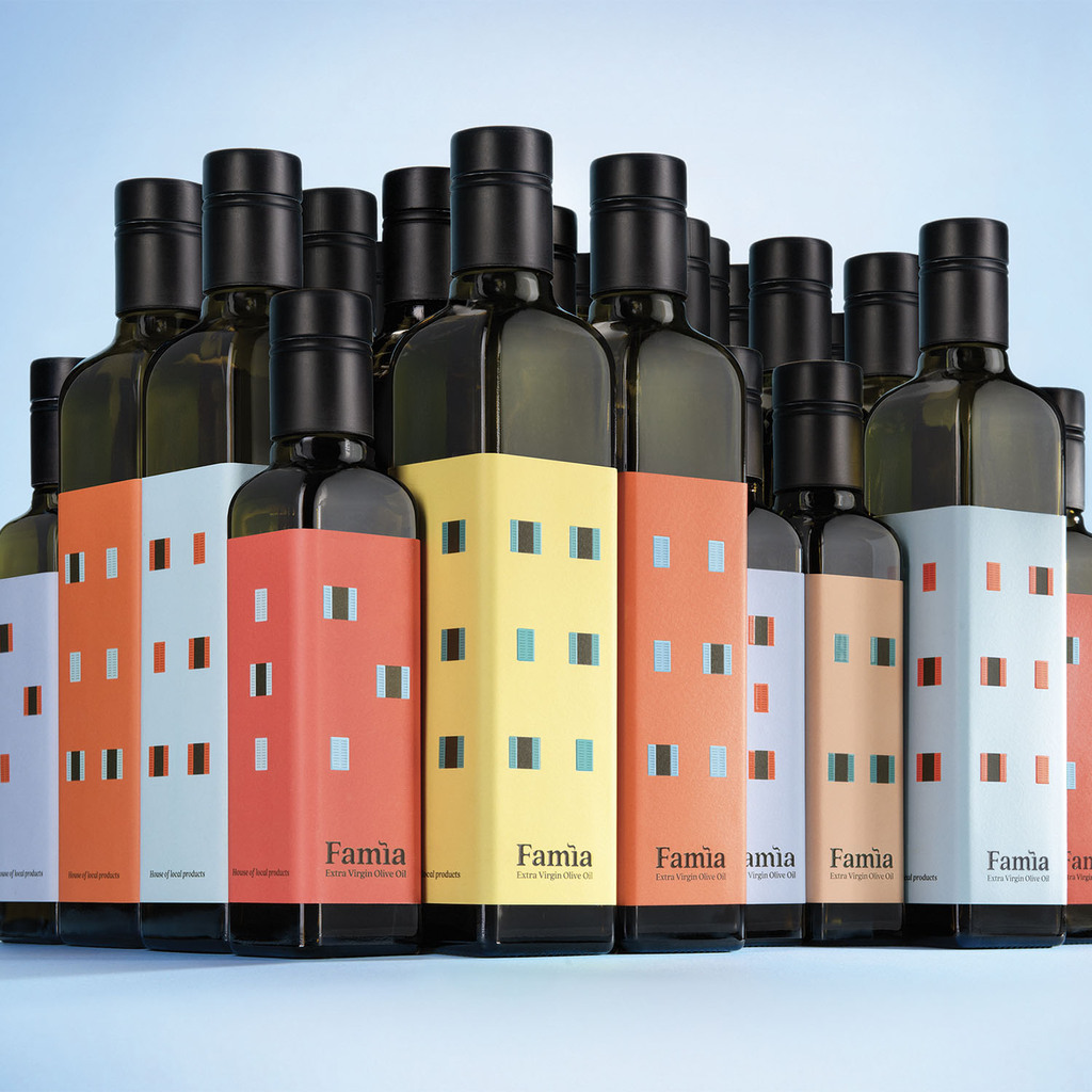
Famìa is an olive oil brand from Rovinj, a charming Istrian town, located in the northern part of the Croatian Adriatic. Rovinj has long thrived on fishing and small-scale agriculture, including olive oil production, a key element of Mediterranean cuisine.
Studio Tumpić/Prenc created a new name and packaging for the “House of Local Products” stores. Inspired by Rovinj families, the name Famìa comes from the local dialect word for "family." The original store name remains as the brand’s slogan.
The logo subtly transforms the letter ì into a chimney with rising smoke, symbolizing home, warmth, and cooking. The bottle design is inspired by Rovinj’s architecture—houses tightly lined along the sea in various colours and sizes, reflecting the diversity of the families living there. We translated these iconic Mediterranean houses into the appearance of the bottles, using their distinctive colours and windows—some open, some closed—to capture the dynamic spirit of town life.
A simple label has turned the bottle into a small family home, with colours representing different oil intensities for 0.5L and 0.25L sizes. By combining various bottle sizes, dynamic compositions resembling a charming Mediterranean town are created, naturally attracting customers' attention without requiring additional physical elements in stores.
EL SALVADOR - KAHA Supplements by BLANK SPACE STUDIO
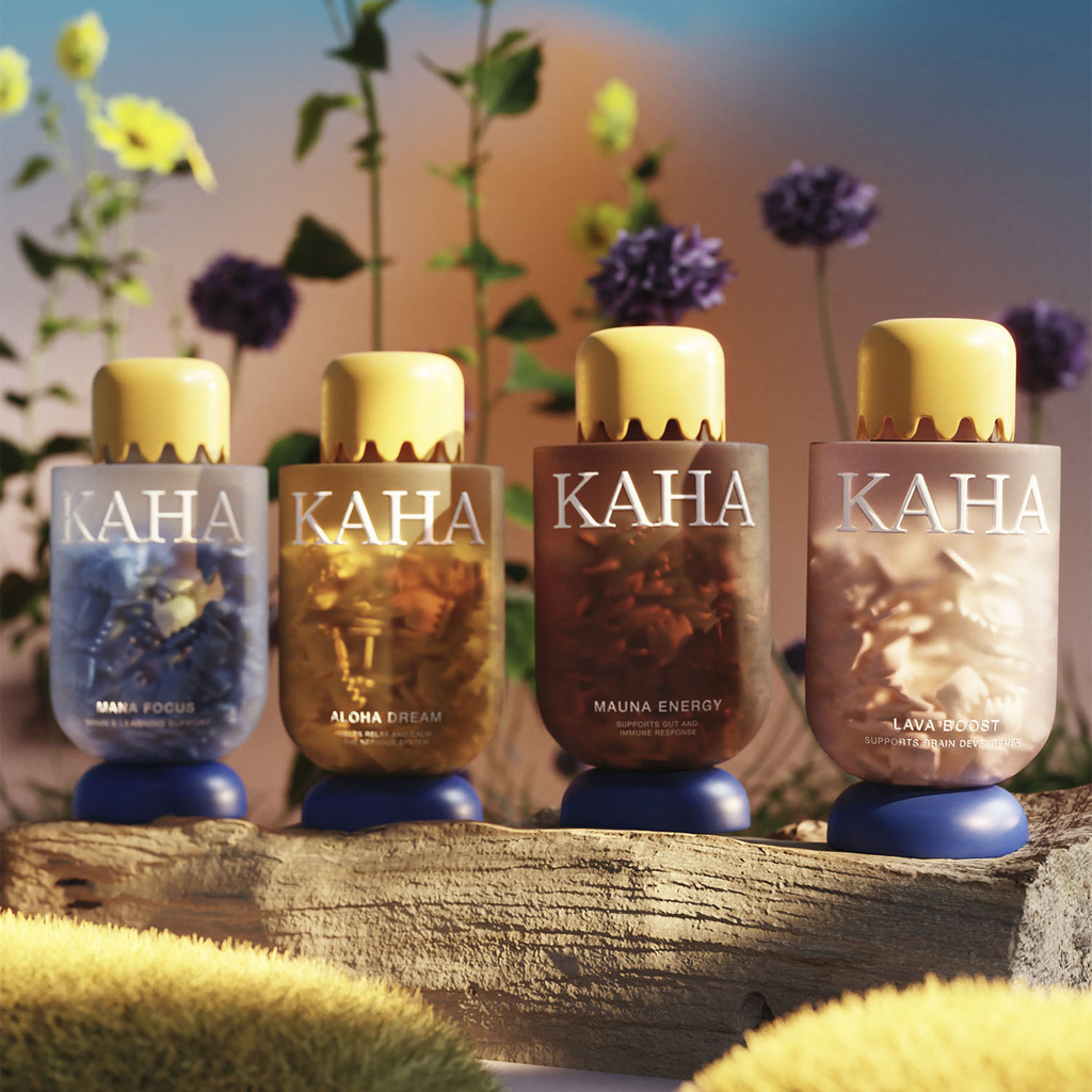
KAHA is a children’s supplement brand inspired by the natural power of Hawaii, blending volcanic minerals, oceanic nutrients, and island superfoods into delicious gummy vitamins. The purpose of the brand’s creation was to develop a visually striking, culturally rooted, and functionally effective supplement that makes daily nutrition both engaging and beneficial for kids.
The final packaging was designed to reflect the raw energy of the islands, incorporating earthy gradients, sculptural caps inspired by volcanic formations, and translucent bottles showcasing the vibrant gummies inside. This intentional approach creates an immersive sensory experience, making wellness feel both playful and premium.
Cultural relevance is embedded in the design through the use of Hawaiian-inspired typography, natural color palettes reflecting land and sea, and traditional storytelling elements. The packaging embodies strength, adventure, and connection to nature, reinforcing KAHA’s mission to provide holistic, island-powered health solutions for the next generation.
JAPAN - Fuu by Dentsu Creative Pictures Inc.
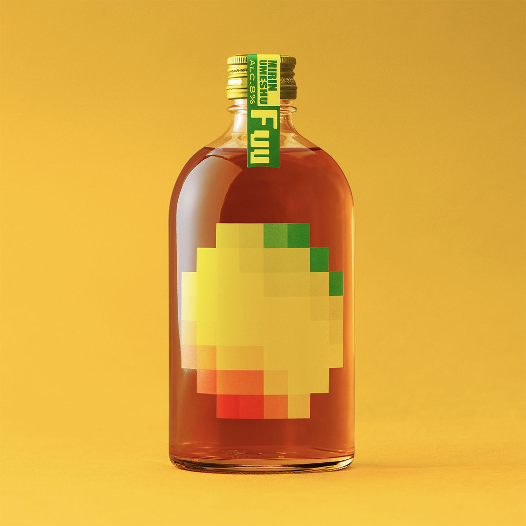
A new-concept umeshu developed by soaking fully ripe Nanko plums in Japan’s traditional seasoning, mirin, for six months. Unlike typical umeshu, which uses large amounts of sugar, this product contains no added sugar or sweeteners.
With a lower alcohol content than conventional umeshu, it caters to those who seek a balanced and health-conscious drinking experience. The name “Fuu” is a Japanese onomatopoeia expressing a sigh of relief, reflecting both a universal emotion and the umeshu’s smooth, comforting taste.
The design represents plums through pixel art, blending nostalgia with a playful twist. It captures the essence of a "traditional umeshu with a completely new taste." By abstractly depicting the shape of plums in pixels, the design visually conveys the pleasant sensation of a light buzz.