
We create beautifully crafted branding and packaging for the great and the good.
We help visionary brands and start-ups with goodness at their heart bring their ideas to fruition, responsibly.
We’ll make it real.
Whether it’s food, drink, beauty or wellness.
With Creative skill + Conscious will,® we’ll combine our decades of design expertise with a steadfast commitment to producing the most responsible packaging possible, always.
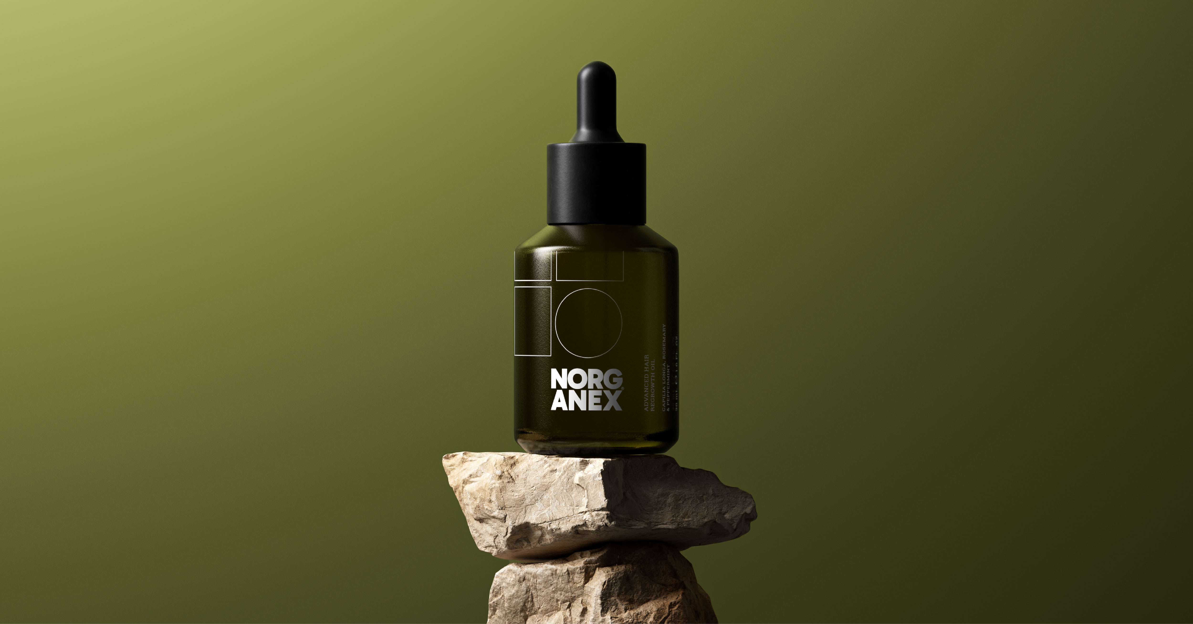
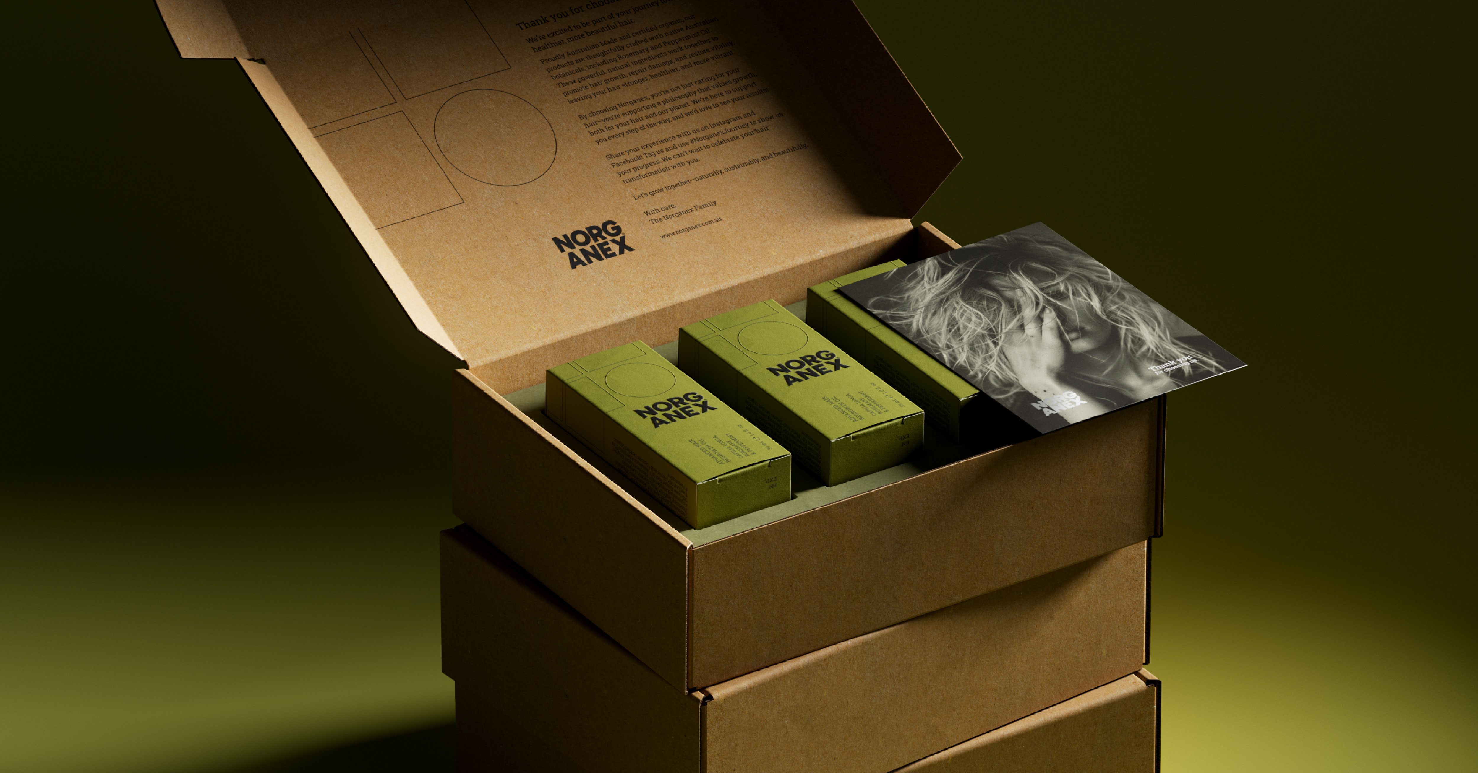
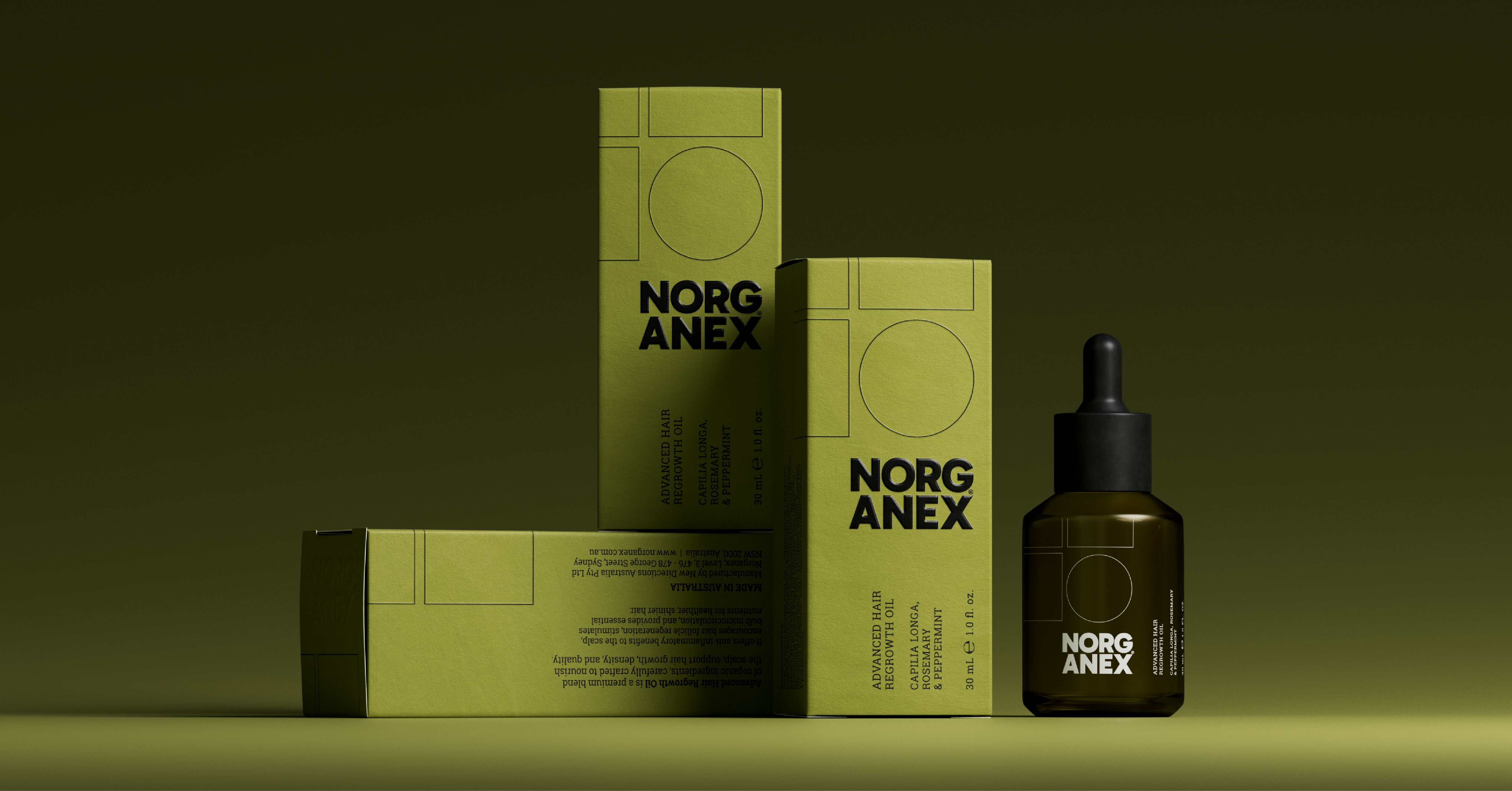
In a market where efficacy needs to be seen before it’s experienced, Norganex didn’t need just a new label. It needed a system. A clear, intelligent brand and packaging design solution—built to signal clarity, credibility, and quiet confidence from the very first glance. The Opportunity: Launching with Purpose in a High-Performance Market. The premium beauty and wellness category is evolving fast. According to Beauty Matter, prestige haircare sales rose 10% in the first half of 2024. Styling and treatment products are leading growth, with items priced over $30 growing three times faster than lower-cost counterparts. Simultaneously, the rise of quiet luxury is redefining how efficacy looks. Think muted tones, structured typography, and visual restraint—over loud or literal cues. For Norganex, the opportunity was clear: launch with intention and authority. Build a brand identity that reflects performance, while holding space for emotional connection. The Design: From Metaphor to Meaning. We moved Norganex from symbolic to strategic, stripping away sentiment in favour of clarity. The resulting identity system is grounded in the biology of hair and the expectations of modern luxury. At its core is a modular graphic grid: - Squares represent damage and breakage. - Circles signal repair and renewal. This elegant system became the foundation of the brand’s visual identity—minimalist yet meaningful, technical yet approachable. The core brand colour, olive green, was selected as a direct nod to the oil’s certified organic sourcing. Its tone—natural, grounded, and intelligent—sits between clinical trust and botanical care. Typography was redefined to express clarity and confidence. Gone are decorative flourishes; in their place, a modern, legible type system that feels structured and composed. Finishes were intentionally refined: blind embossing, uncoated stock, and spot UV gloss. Each element elevates tactility and conveys quality—essential in a category where packaging is proof of performance. The Result: A System Built to Perform. Norganex now has a strategically grounded brand identity, supported by a cohesive packaging design system that reflects its efficacy from shelf to consumer. Visually intelligent. Quietly confident. Ready to grow.

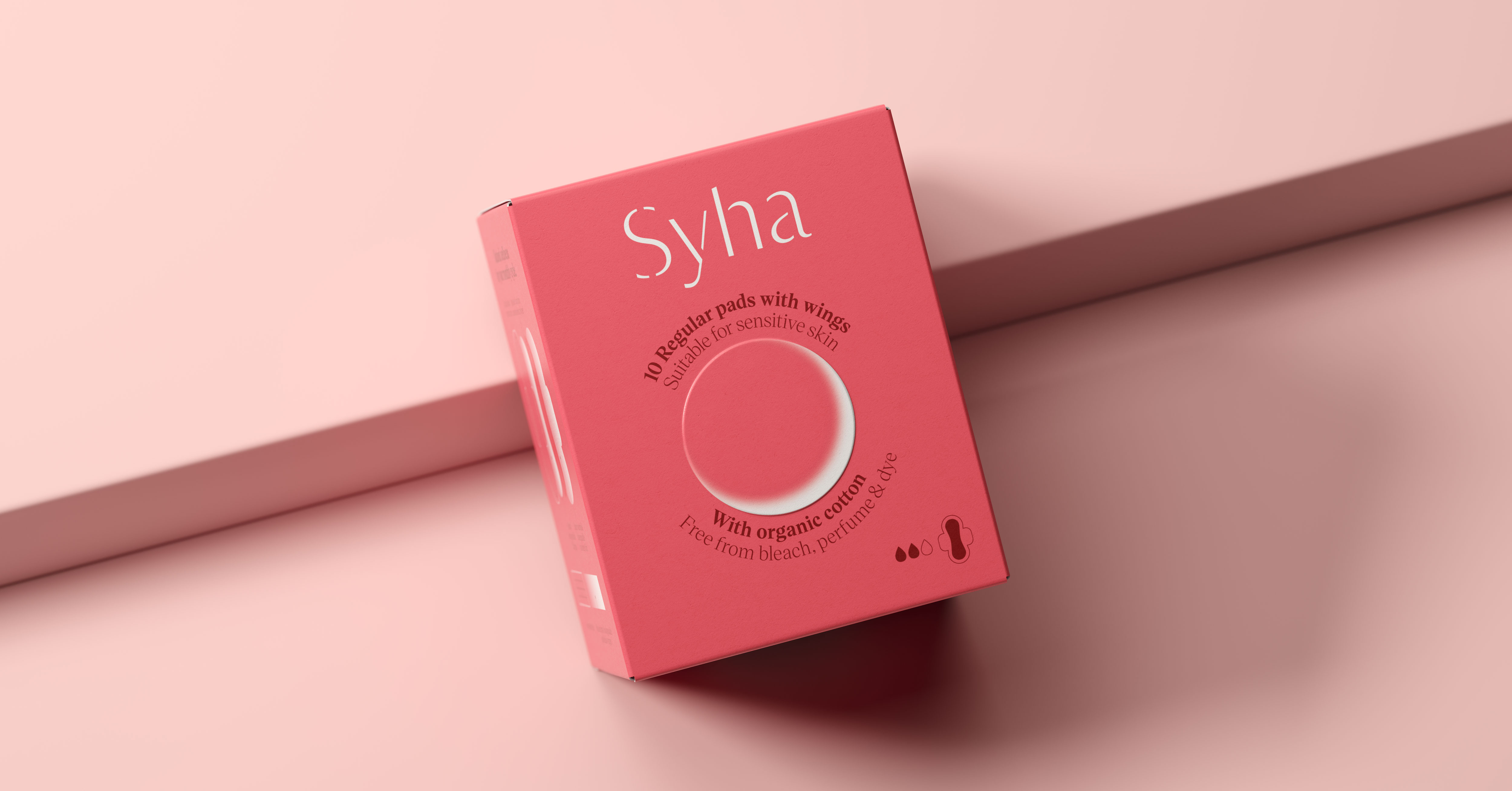
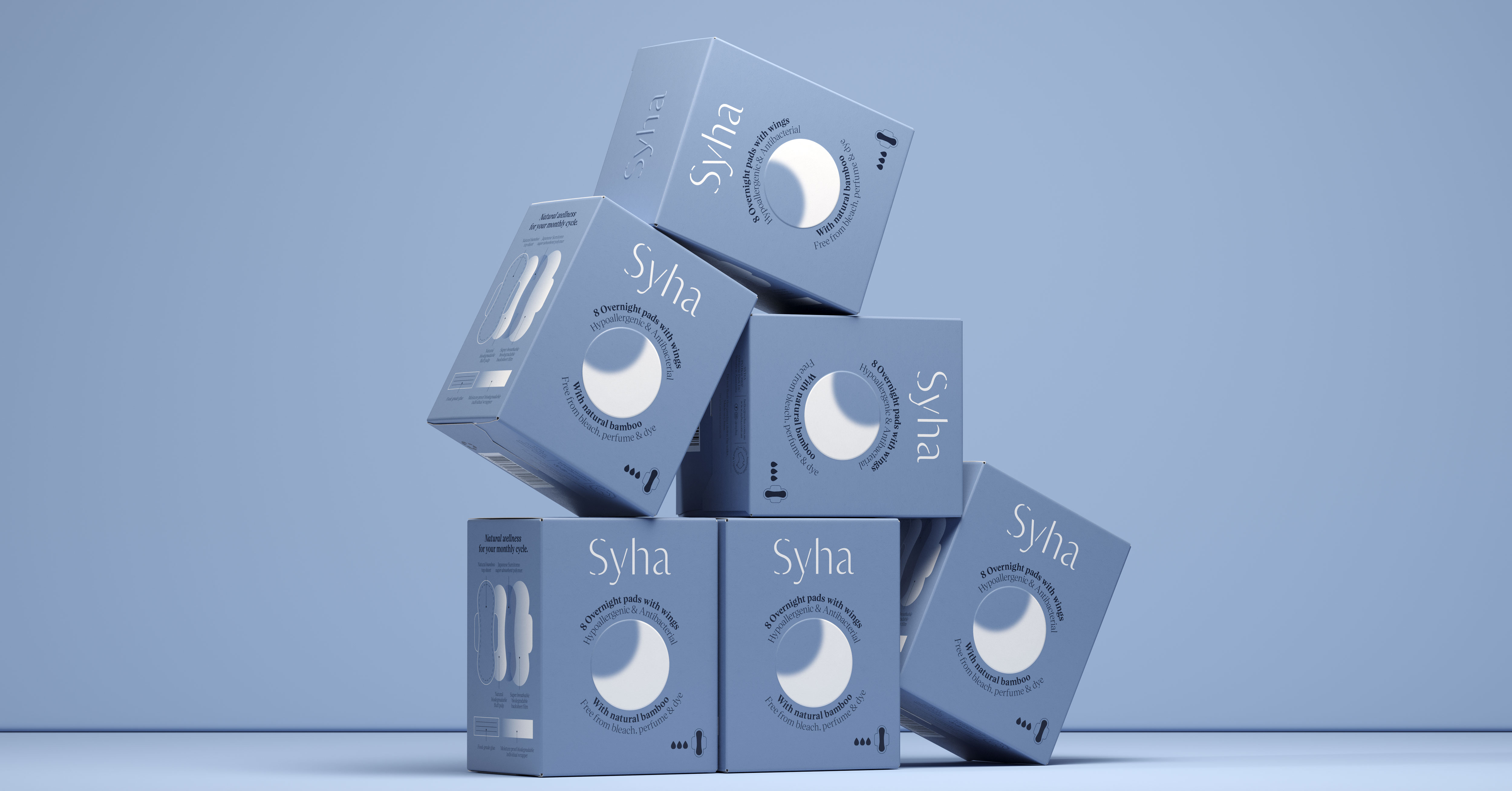
Our approach was to craft a tone of voice that is warm and friendly, aligning with Syha’s mission to not only offer relief through natural products but also provide advice and inspiration for navigating the challenges of the menstrual cycle. In developing Syha’s refreshed branding, we drew upon the timeless symbolism of the moon—a symbol that has long been associated with the cycles of women’s lives. The moon represents empowerment, reflection, and renewal, which made it the perfect central motif for Syha’s identity. The moon’s subtle phases are integrated throughout the packaging, mirroring the natural rhythms of life and honoring cycles of change and renewal. The moon unites the range, grounding each product in a shared visual language that reflects the brand’s values. Our refreshed branding and packaging celebrate resilience, beauty, and a deep connection to the earth, resonating with Syha’s core message of holistic wellness. Inspired by the richness of Western Australia’s terrain, we chose a colour palette that reflects both the serenity of nature and its fiery strength. This blend not only enhances the visual identity but also aligns with the product's purpose and function, offering a balance that feels soothing and energizing—just like the brand itself. To further elevate the packaging we integrated subtle finishes such as blind embossing and a flat matte finish. The blind embossing technique subtly draws attention to key elements of the design without overwhelming the visual narrative, offering a tactile yet refined experience that reflects the brand’s authenticity and care. The overall identity celebrates the harmony between nature, sustainability, and self-care, empowering Syha’s customers to move through life’s rhythms with confidence and ease. Every design element, from the colour palette to the tactile details, reflects Syha’s deep commitment to wellness, sustainability, and the natural cycles of life. The refreshed branding and packaging serve as a reminder to embrace the journey of life, honoring both the personal and universal rhythms that define us. Our collaboration with Syha embodies our belief that branding is not just about visual design—it’s about creating a powerful, meaningful connection with the consumer. Through thoughtful design and a deep understanding of Syha’s mission, we’ve helped them connect with women on a more personal, empathetic level.


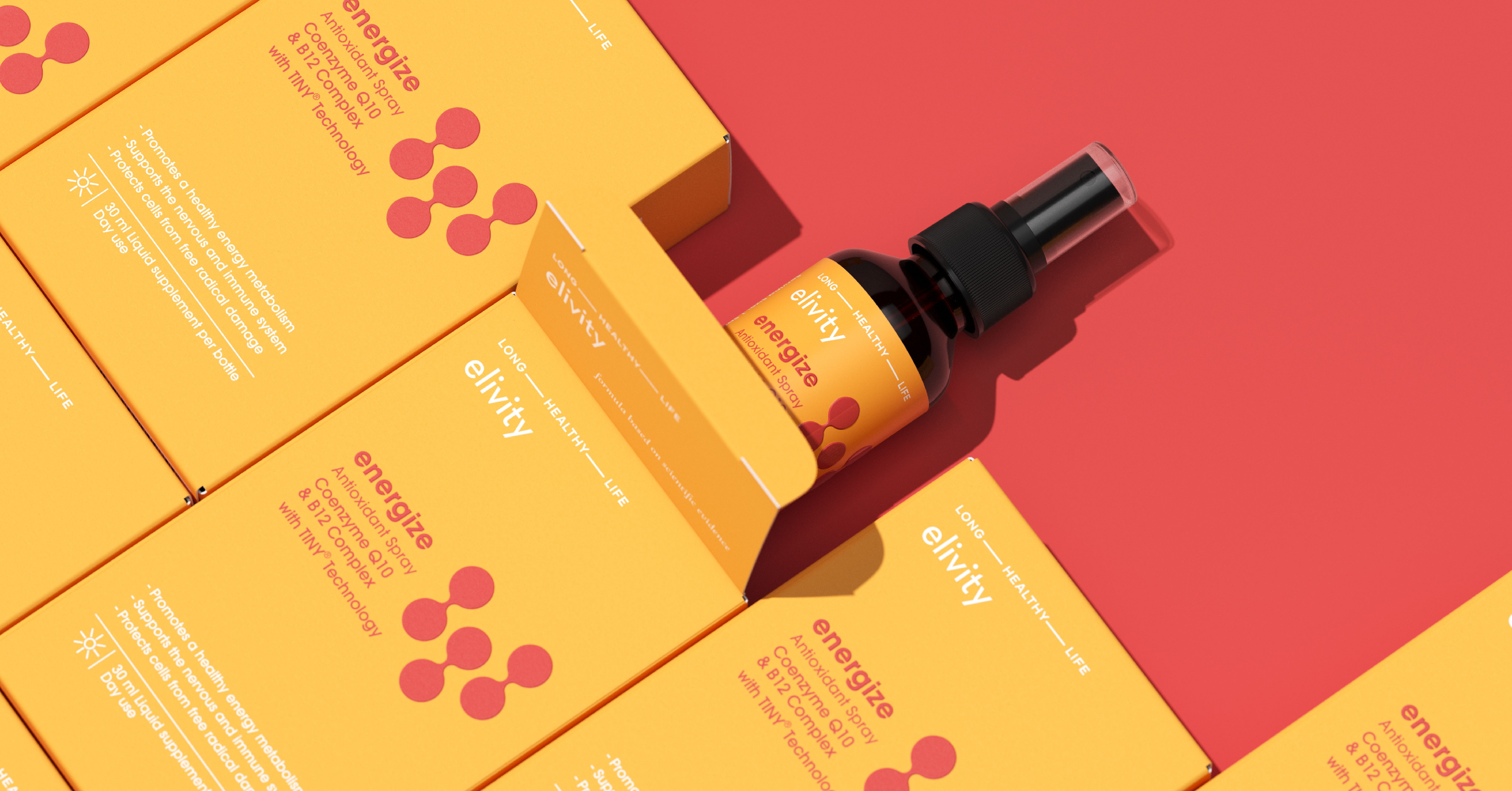
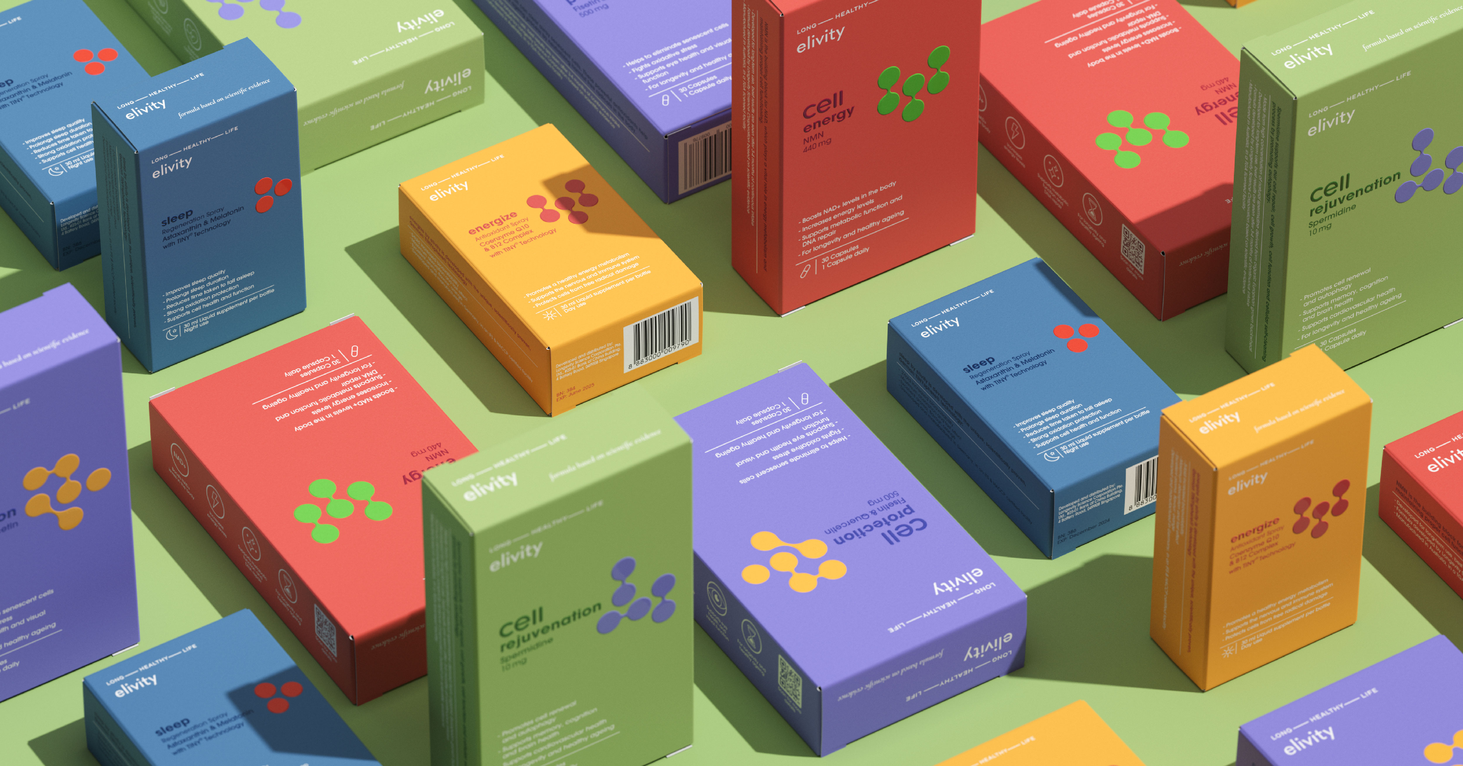
In a world where aging was once viewed as a risk, elivity® transforms it into an opportunity for a dynamic celebration of life. By targeting aging-related processes at the cellular level, elivity® empowers consumers to proactively prevent the signs of aging. Our packaging design solution redefines health as dynamic and vibrant. Gone are the days of viewing health and wellness as a static state; instead, we welcome a future where vitality knows no limits. Our sustainable packaging commands energy and impact, departing from convention with its bold colour scheme and graphic representations of cellular forms. With a strong shelf presence and standout appeal, this packaging design ensures the product commands attention and leaves a lasting impression on consumers.

