PENTAWARDS BEST NEW COMER STUDIO 2025.
"We're storytellers creating bold and memorable design".
Simple Packaging Studio is an independent creative studio committed to developing innovative and memorable designs that capture the essence of each brand. Through a strategic and emotional approach, we transform ideas into visual experiences that resonate with people and create lasting connections.
Simple was founded in 2021 by award-winning graphic designer Gaizka Ruiz after a career of more than 20 years working in the FMCG sector. He has worked for brands such as Mahou-San Miguel, Adam Foods, Coca-Cola Group, Grupo Pascual, Moritz, Carrefour, Aldi and Laboratorios Cinfa, among others.
We develop branding and packaging design projects with a strategic vision focused on simplicity, helping brands from the creation of their narrative to the final development of their products.
At our agency, we believe that branding is much more than just a logo or a visual identity. It’s about how you communicate with your audience across every touchpoint—from the tone of voice in your advertisements to the delightful unboxing experience your customers have when they receive your product. That’s why we’re here to guide brands through every step of the creation process.
Make it simple, but significant!
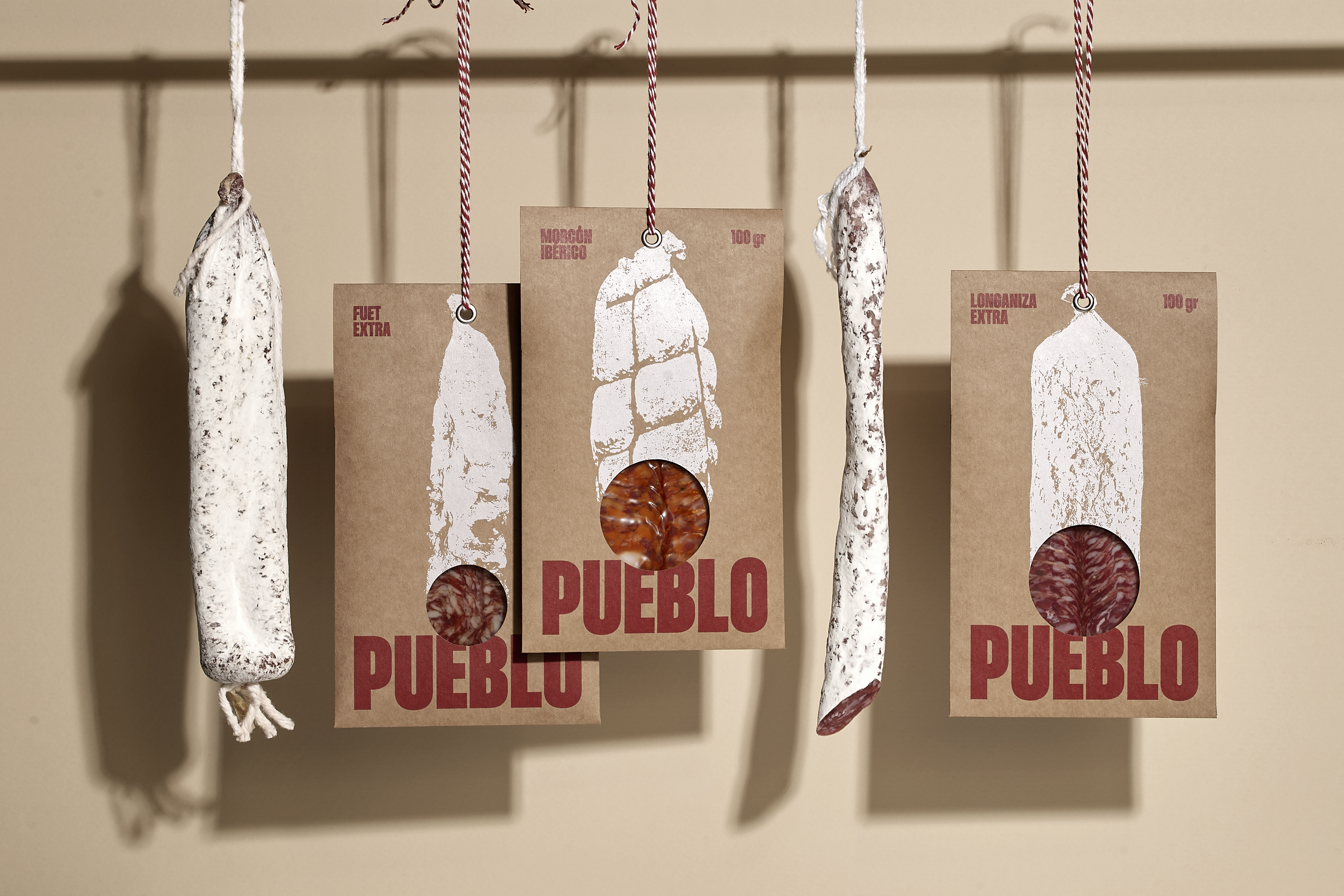
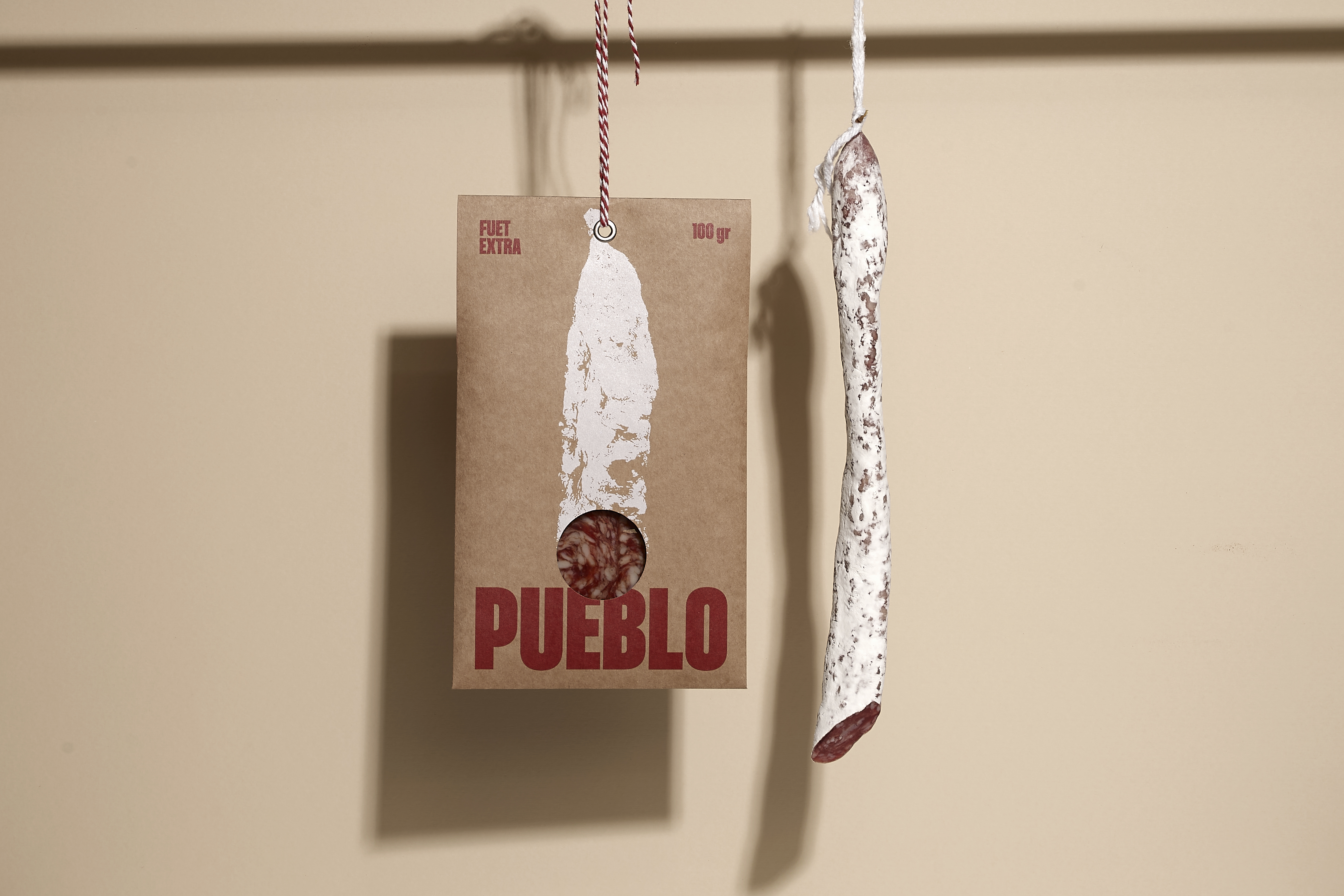
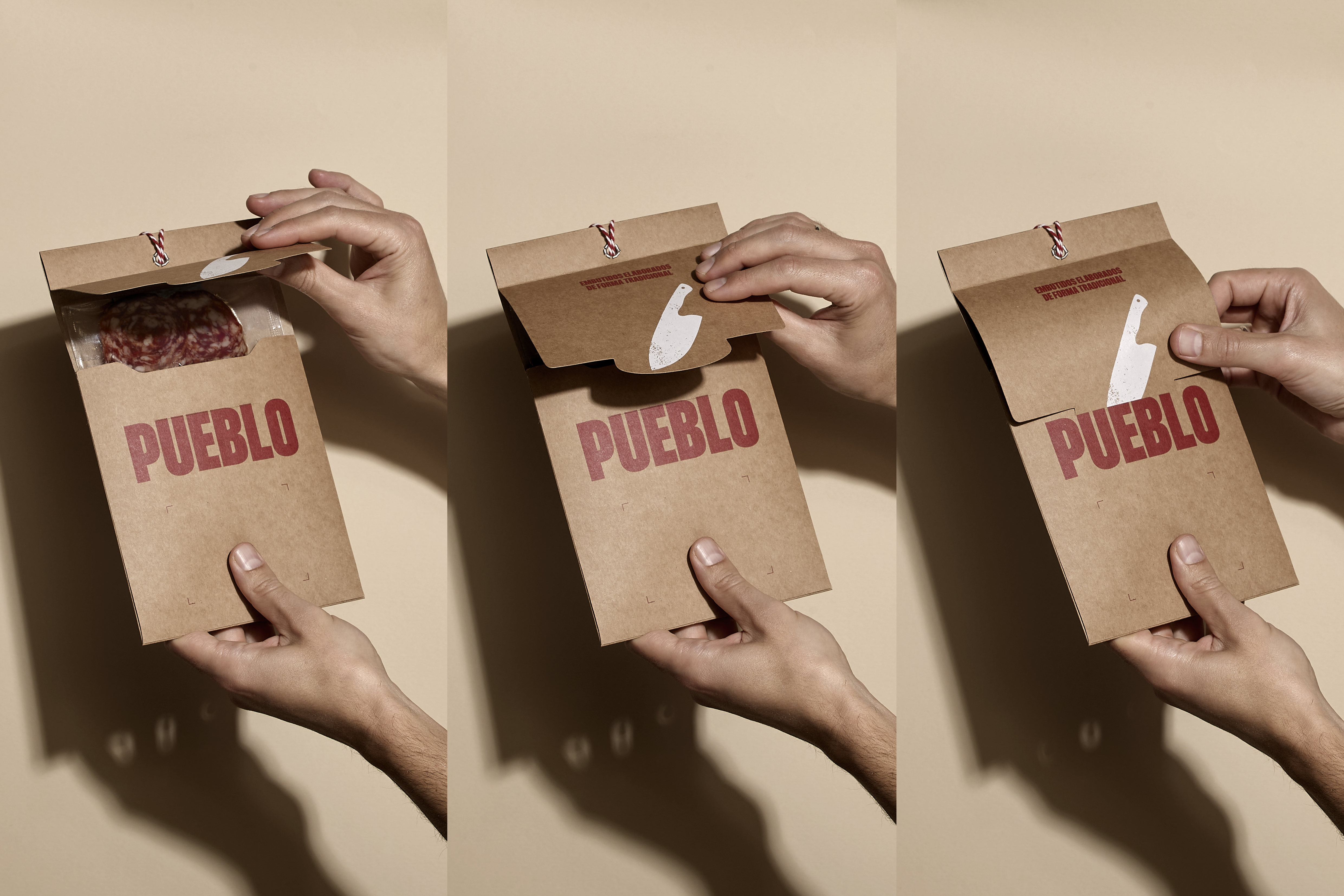
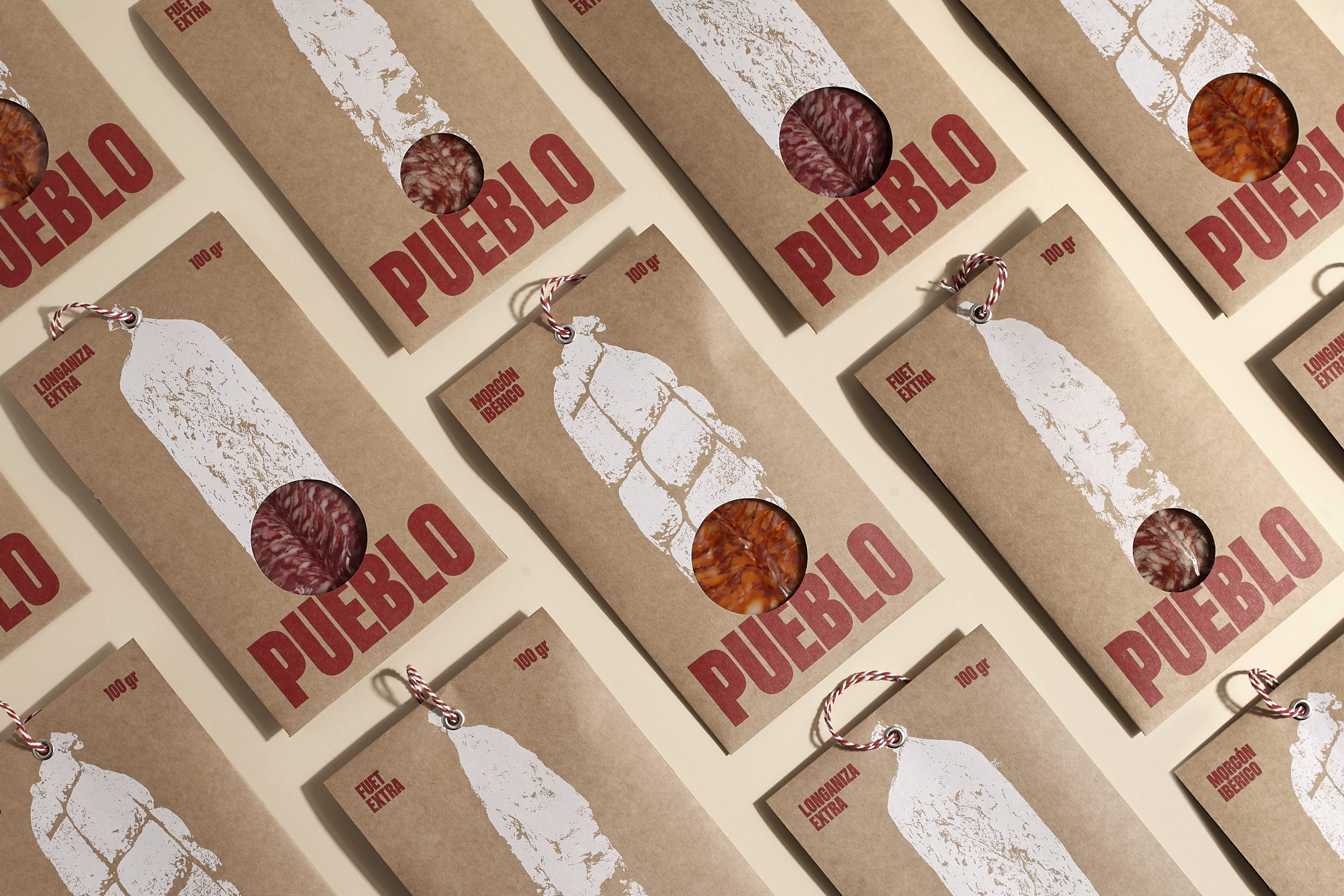
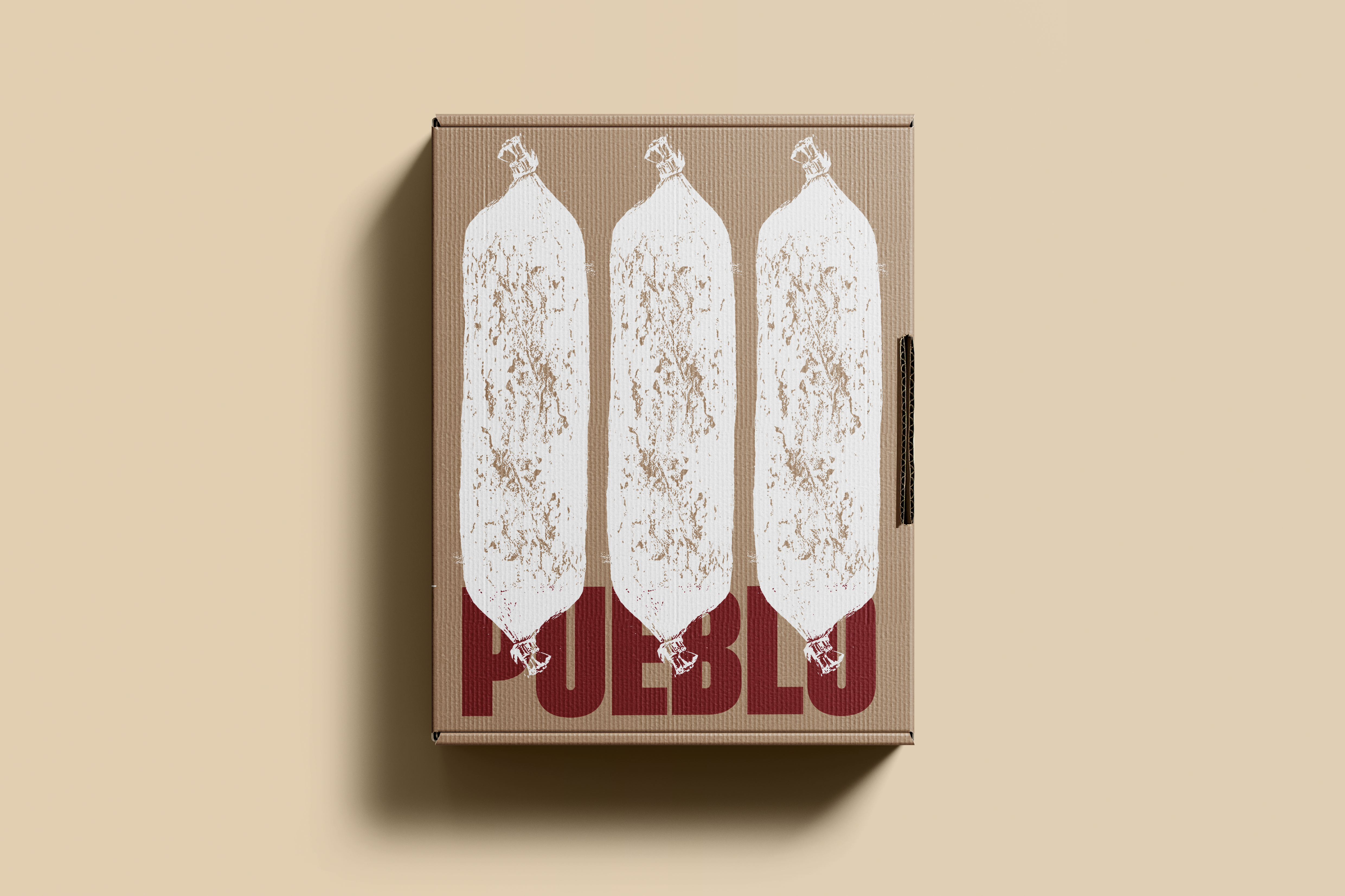
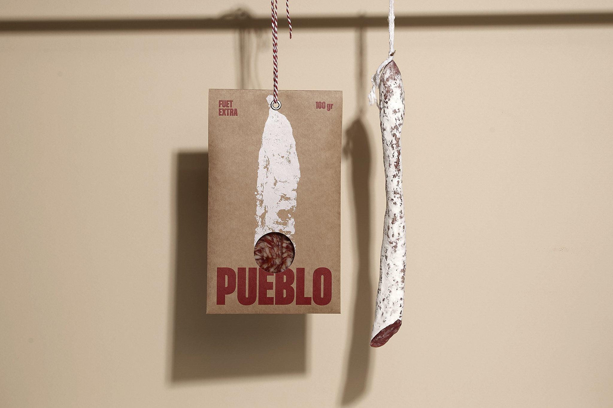
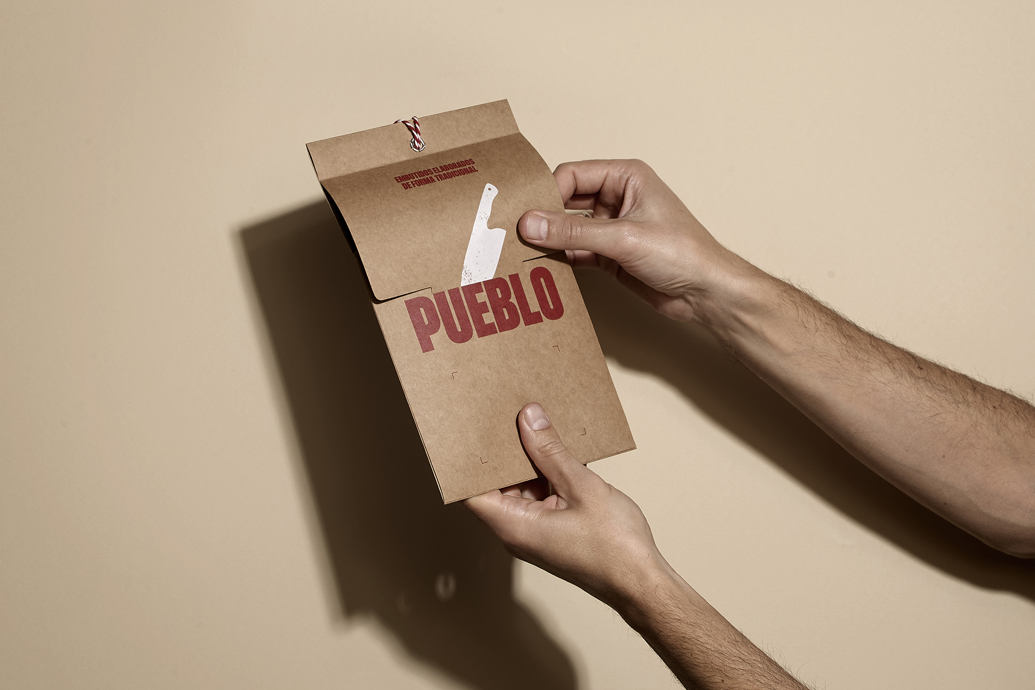
“Pueblo” (village): a bold tribute to our roots. It’s about celebrating the things that matter—authenticity, tradition, and a craft that’s been perfected over generations. Deep down, we all carry a piece of the village in us. To bring the spirit of “Pueblo” to life, the design leans on three pillars: typography, materials and presentation. The name itself exudes strength and meaning, so it became the focal point of the design. Bold typography, paired with earthy, nostalgic colors like the red of adobe bricks from old village homes and the golden yellow of sun-dried straw, evokes a deep connection to Spanish heritage. Finally, no Spanish cold meat would be complete without the iconic rope used in the drying and curing process. This essential detail adds the perfect finishing touch to a minimalist yet impactful presentation.
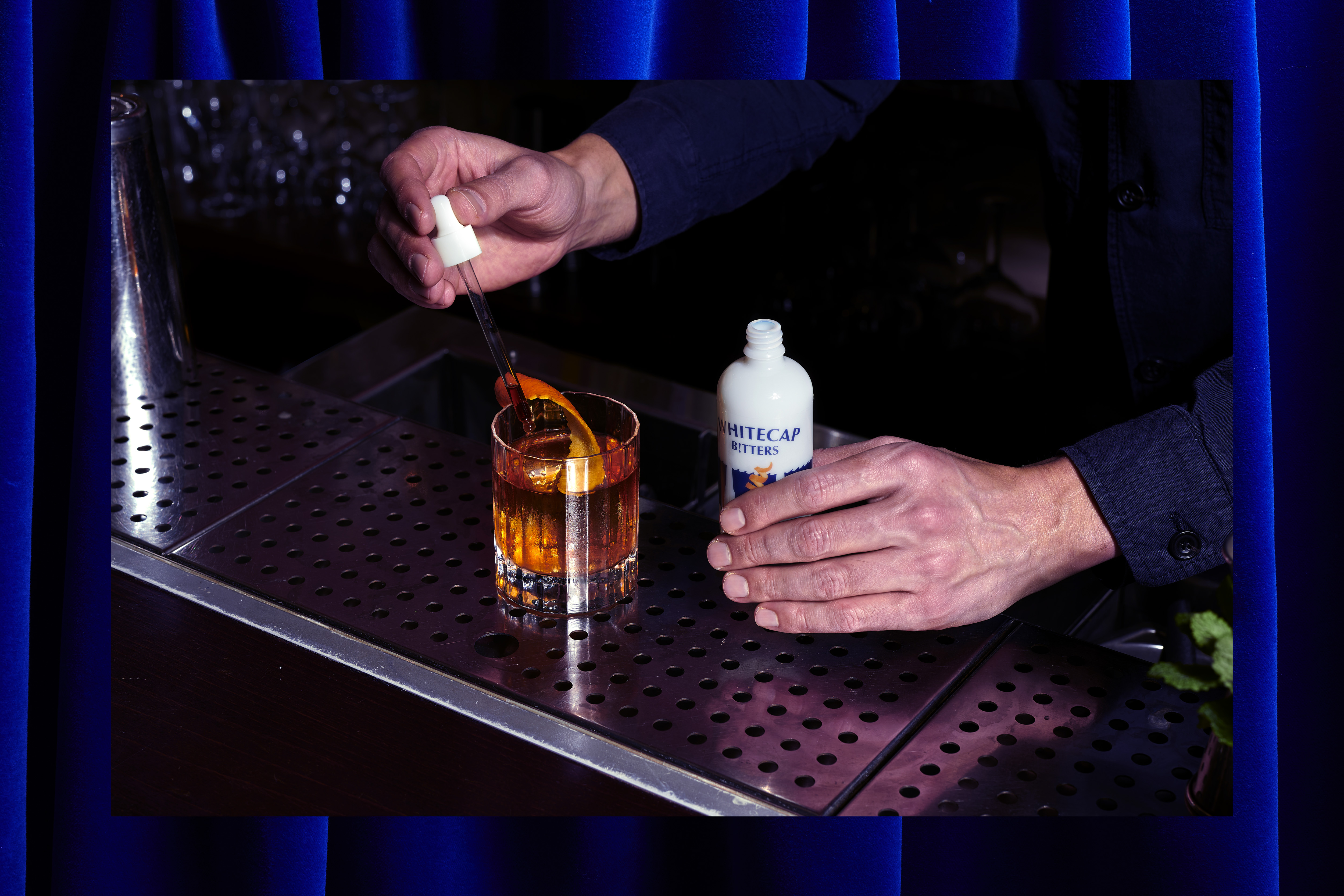
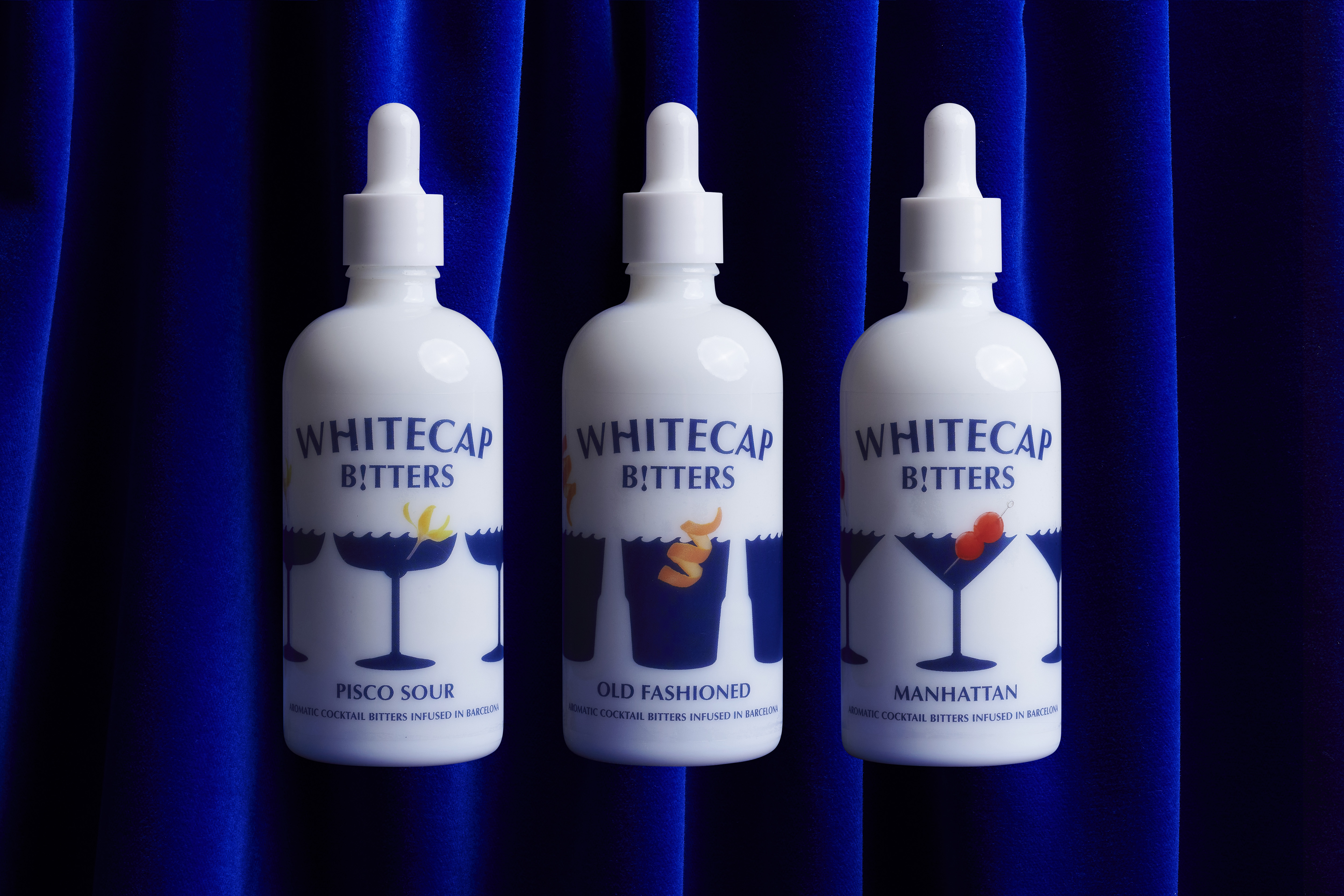
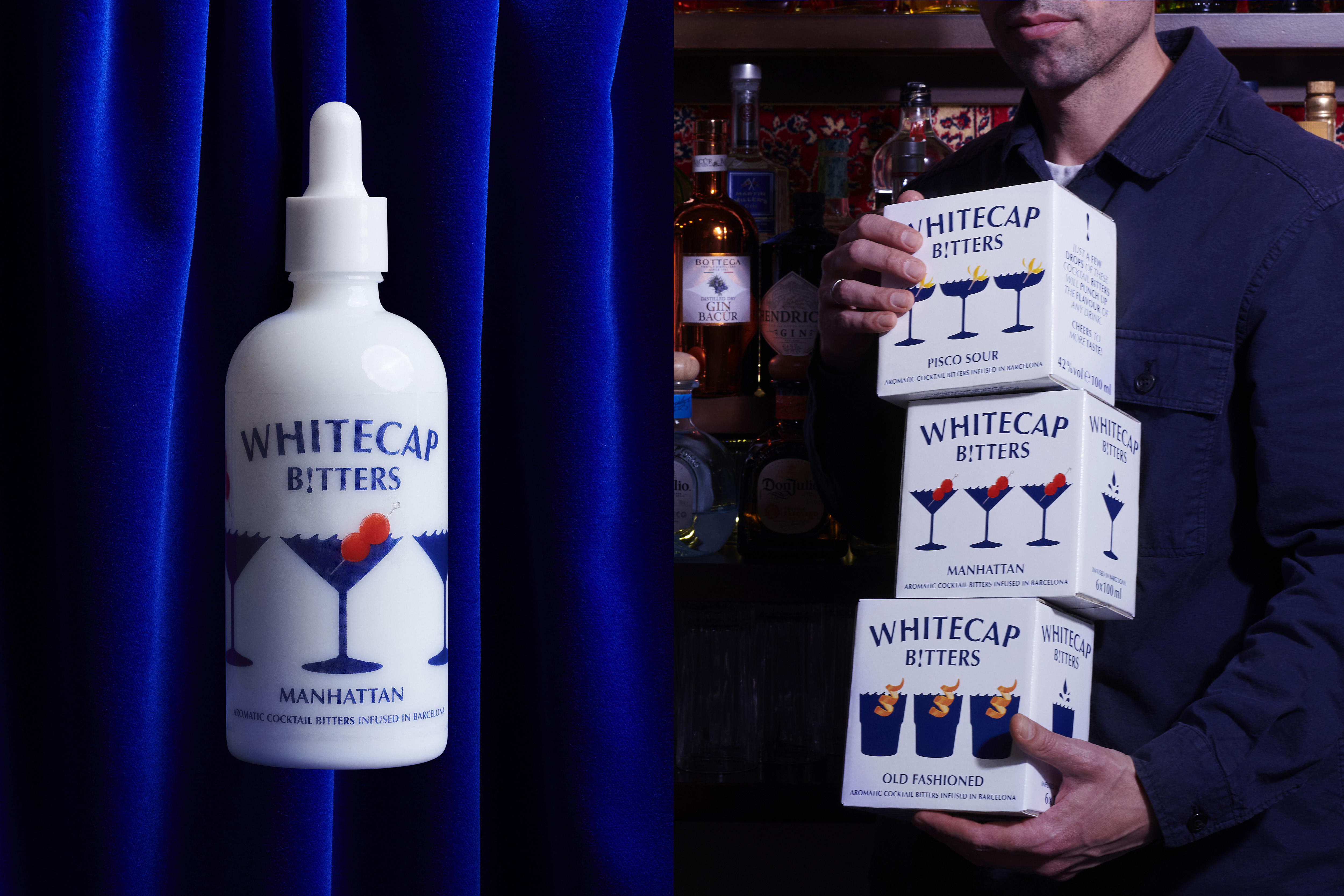
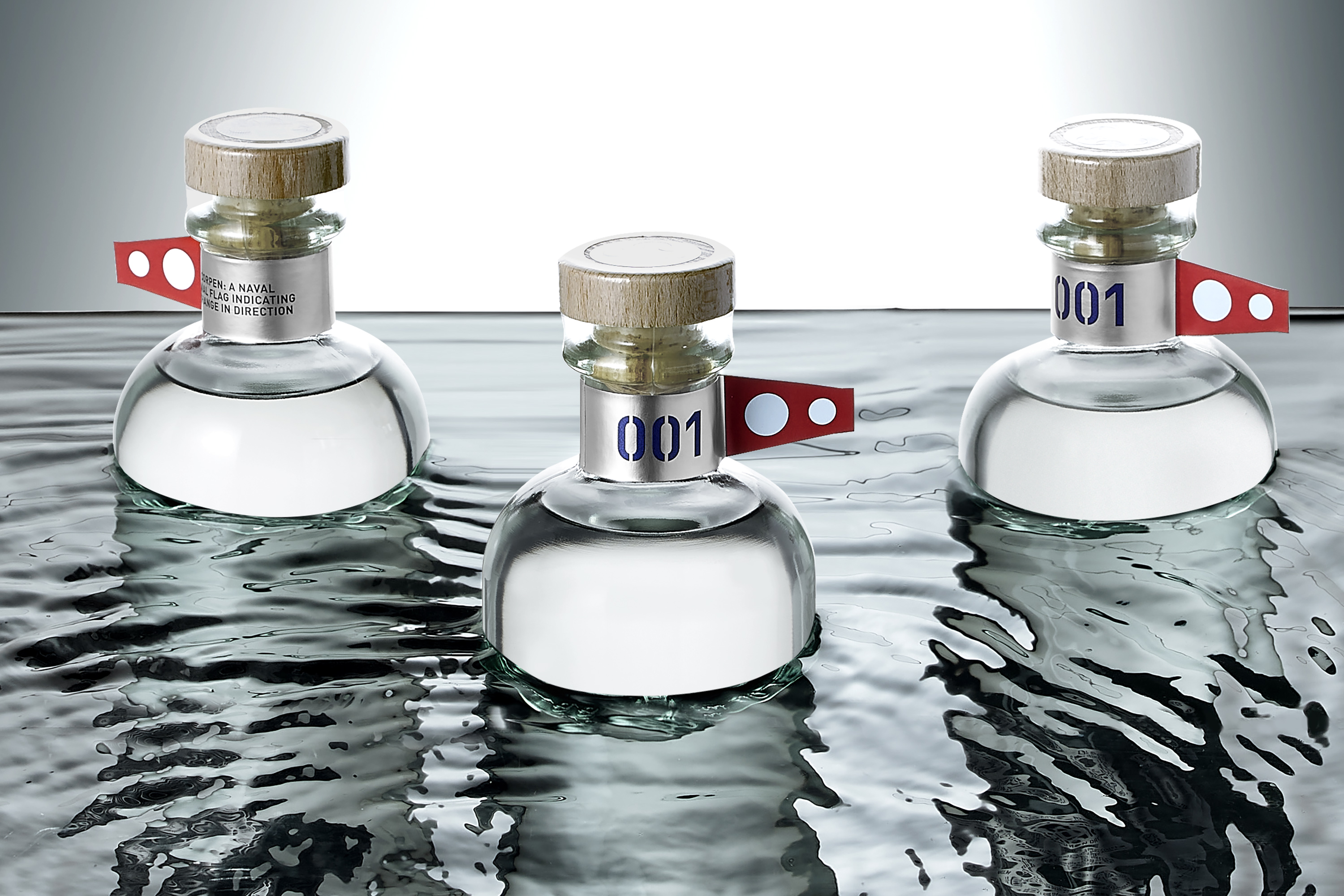
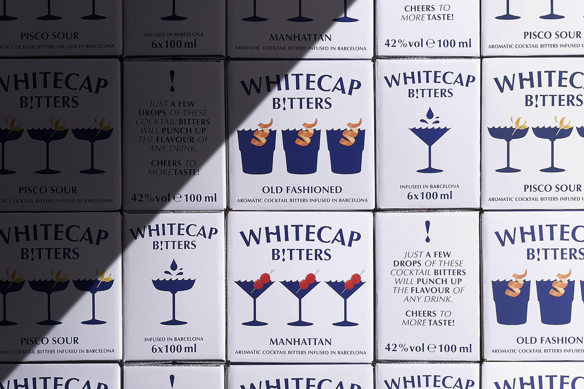
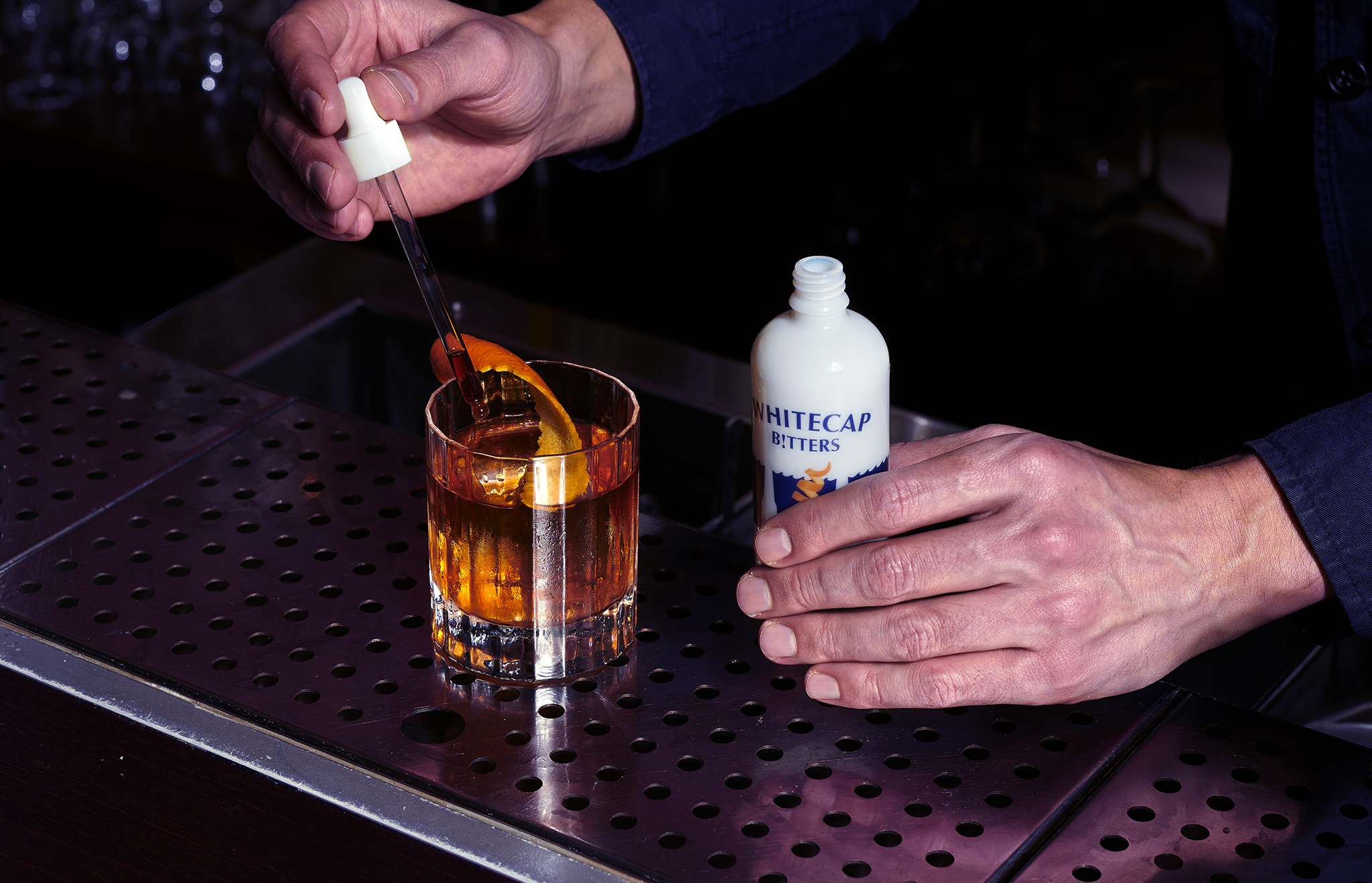
Located in the Mediterranean, Corpen Gin embodies a spirit of the sea, and the name "Whitecap" is inspired by the breaking wave crests that can be observed in windy conditions. With this concept, we have developed a distinctive cocktail glass icon for each product, where the flat surface of the cocktail stirs like the waves of the sea, transforming a boring cocktail into something unique and exciting with just a few drops of Whitecap Bitters.


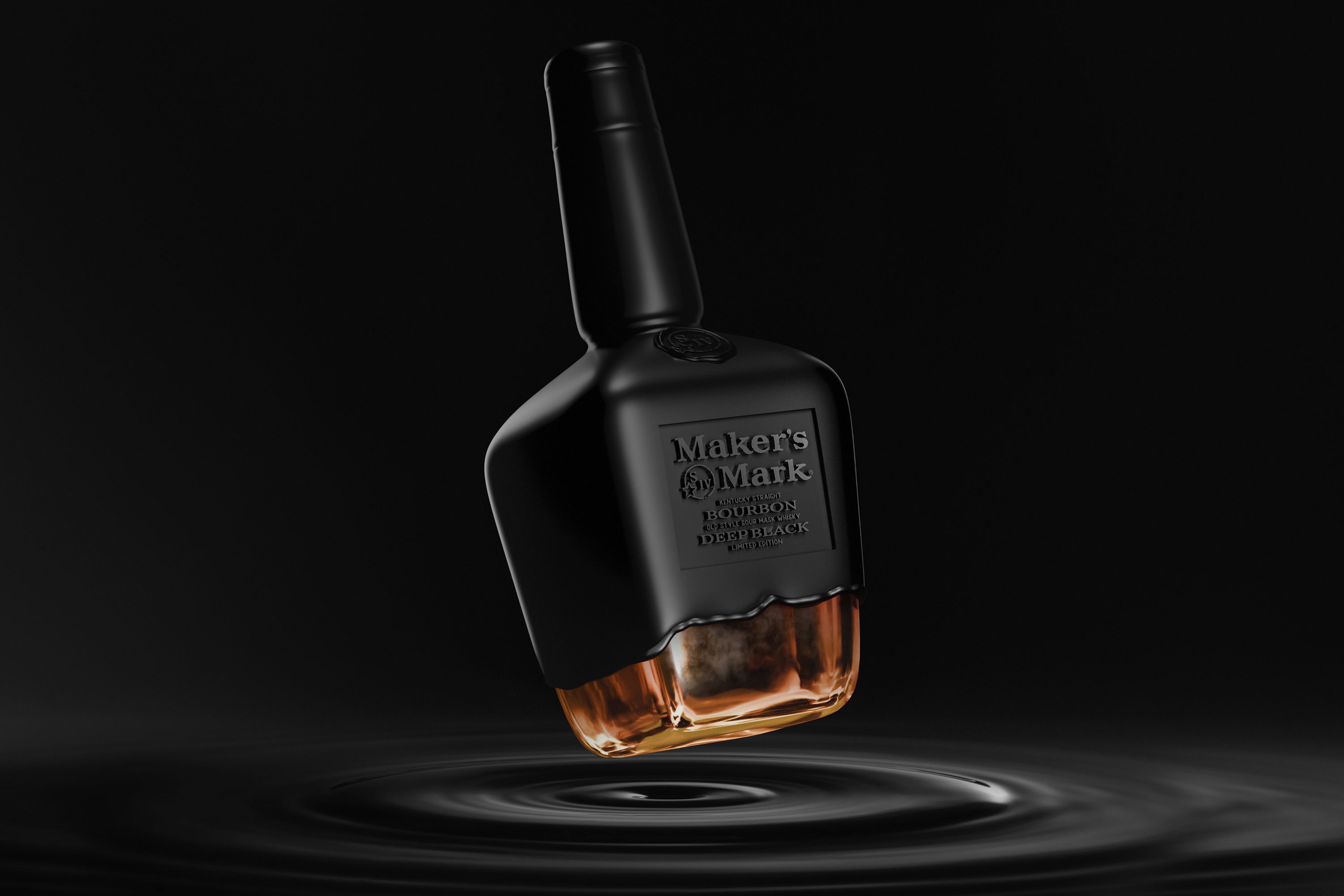
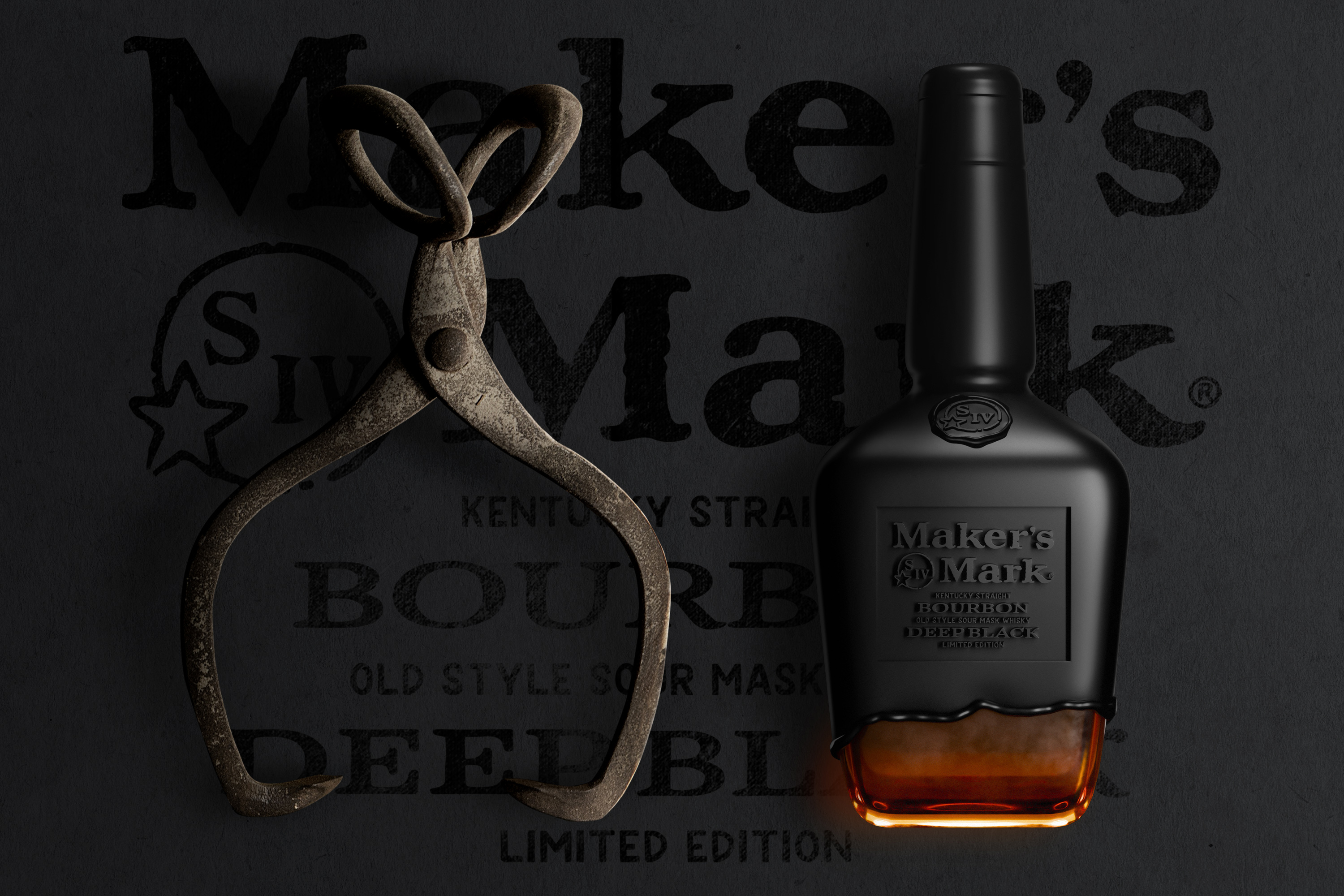
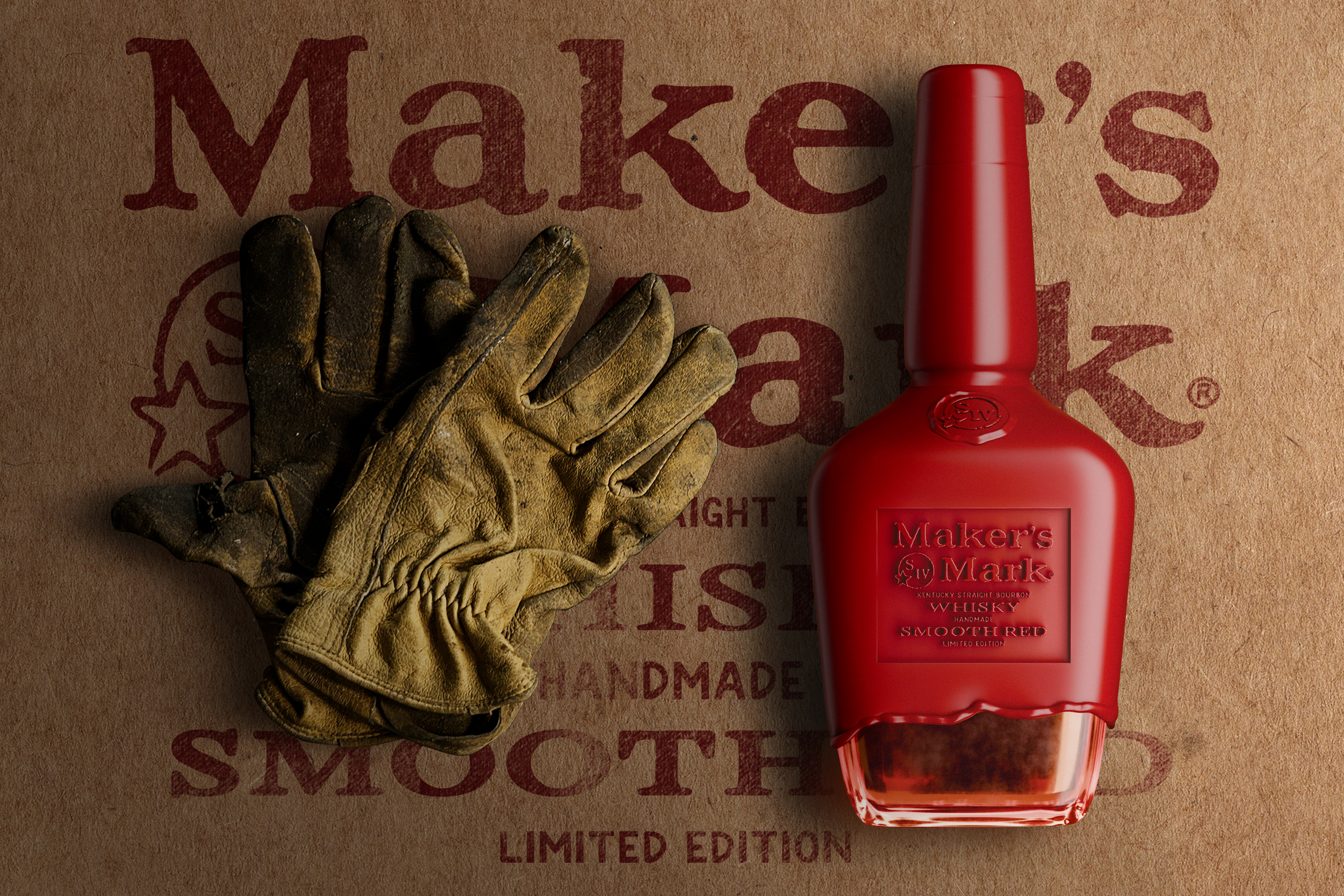
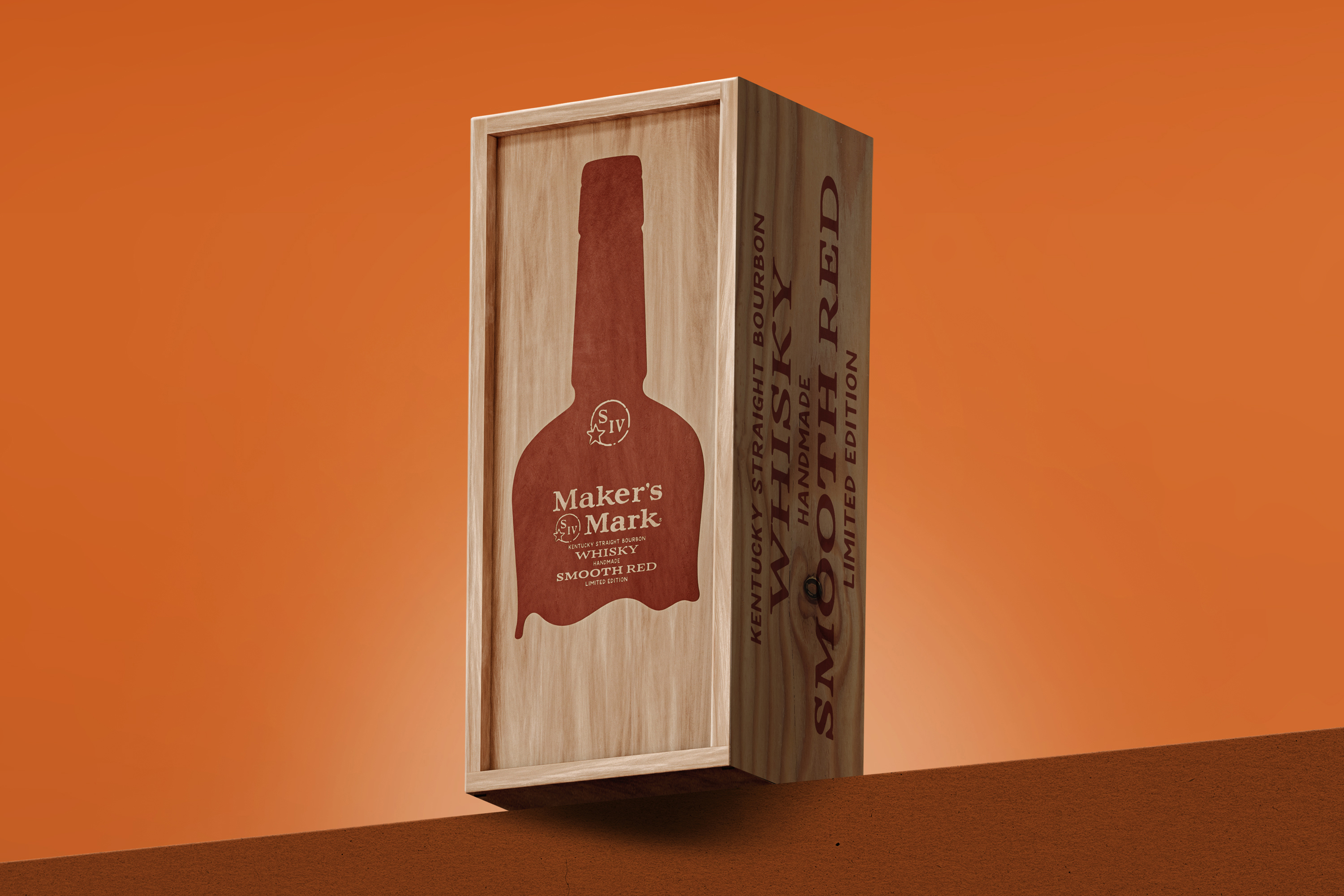
There is no whisky brand that works better on the concept of uniqueness than Maker’s Mark, since, through the sealing process, they manage to make each bottle unique. That is why we wanted to stress this concept, proposing a bottle without a label, where the graphic is stamped directly into the wax, achieving extreme exclusivity. A simple and inspiring concept for a brand with an artisan soul. Cheers!
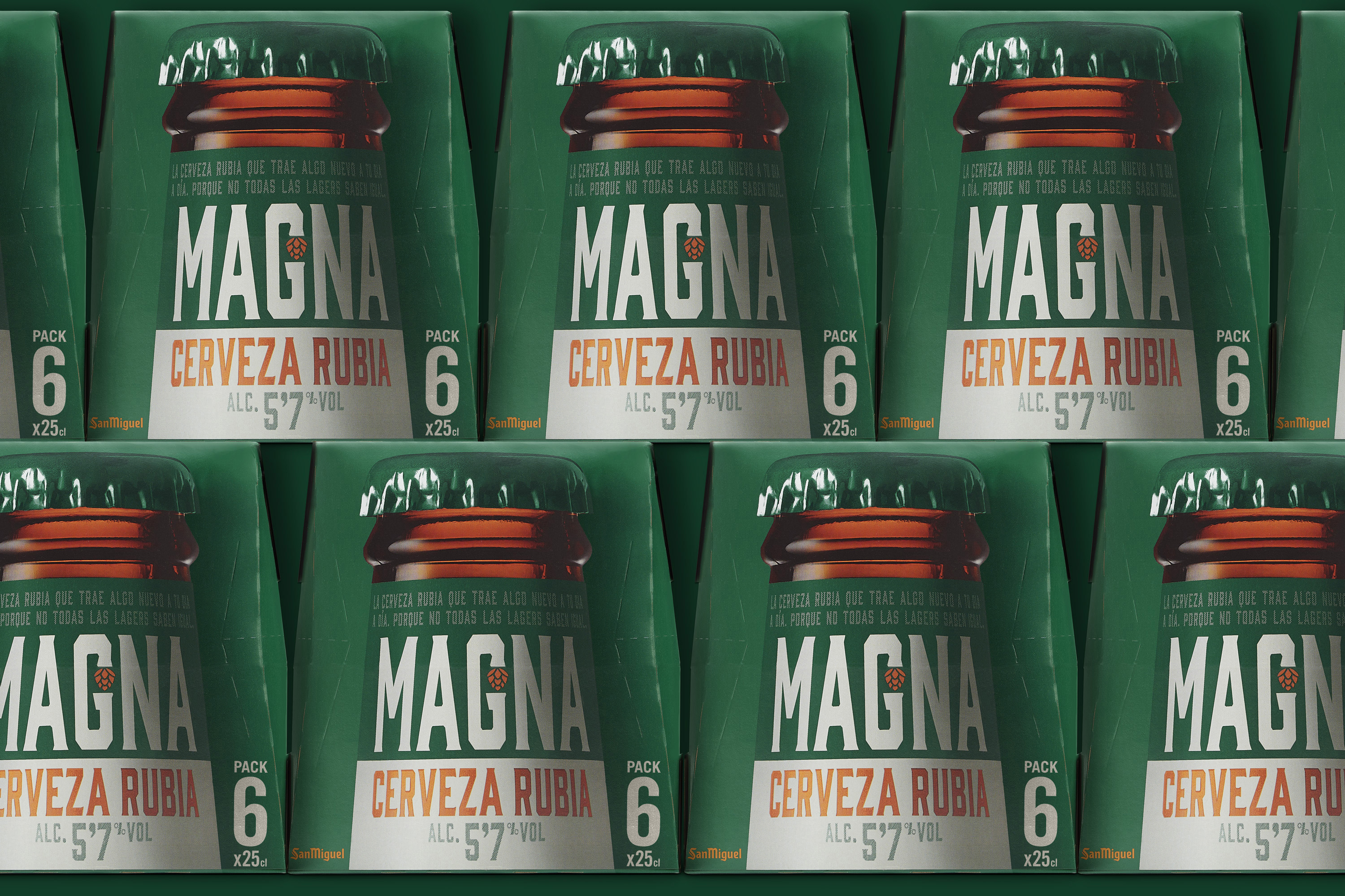
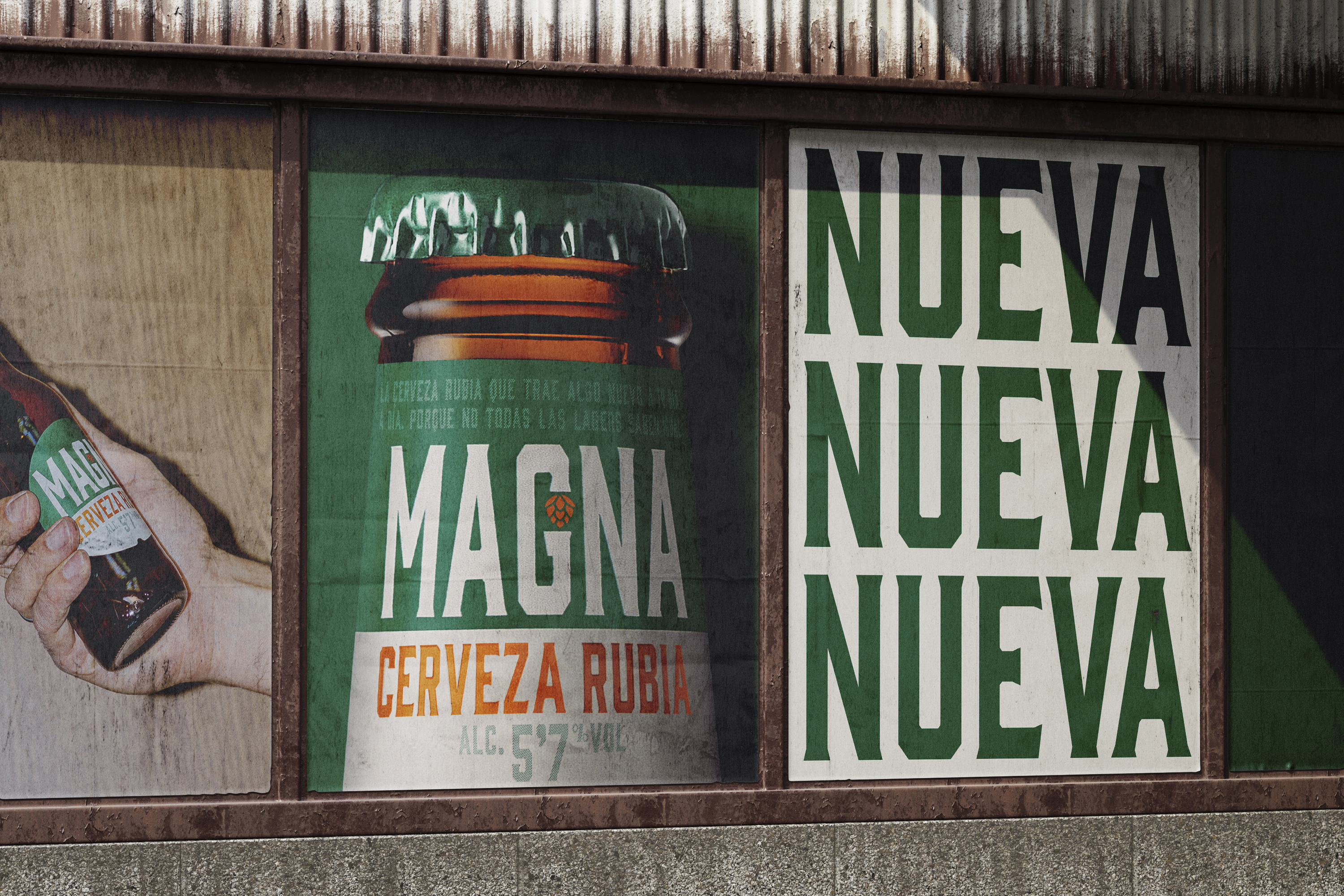
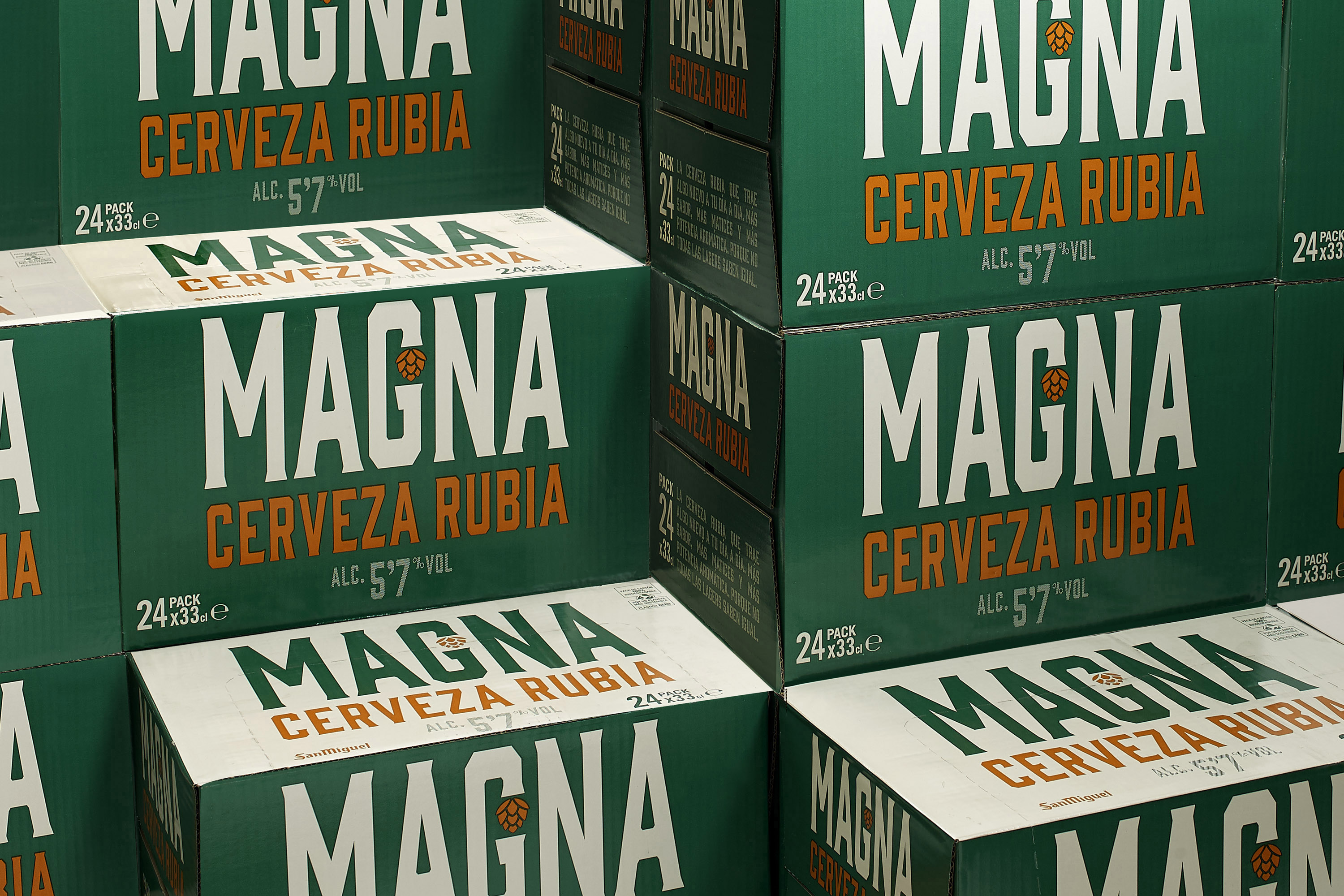
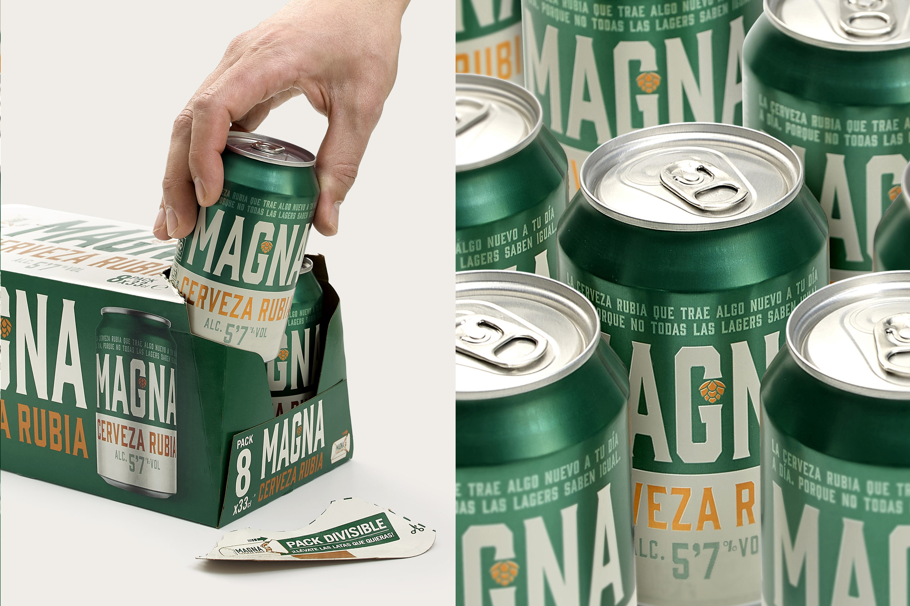
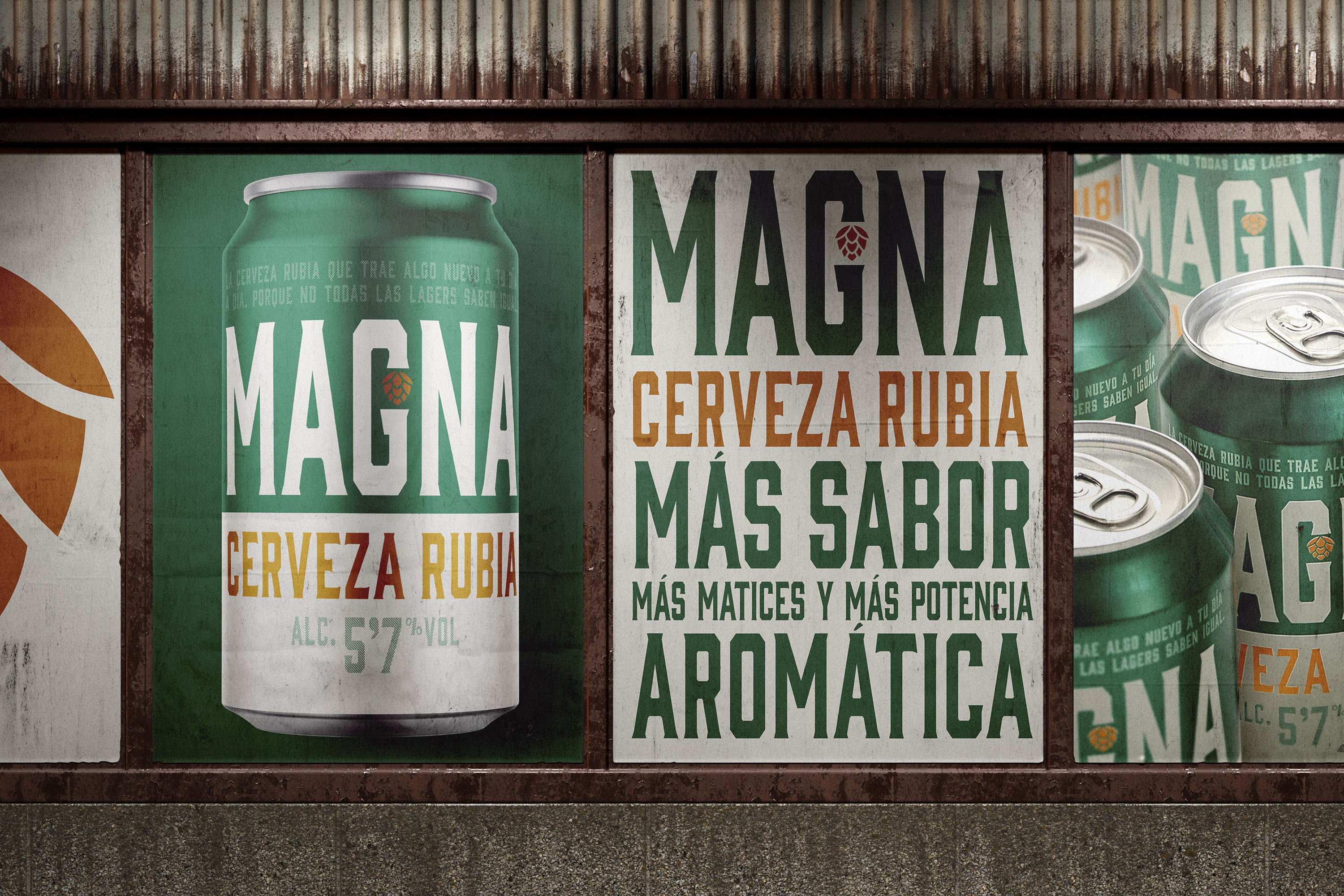
San Miguel is one of the oldest beer brands in Spain, with more than 125 years of history, and redesigning one of its many beers is a task that requires not only a creative vision, but also understanding the DNA of the company and respecting its values. We started from the basis that the previous design of Magna breathed classicism and a certain beer tradition. We had to break this barrier to find a place in the market among the most modern drinks, where simplicity is the trend that connects most with the new generations, without losing certain beer codes. That is why we worked with the name “Magna”, as a communication strategy. Where everything is “magnified”, with super-enlarged images and texts, to communicate directly with clear messages and eliminate any superfluous ornamental element that reminds us of times gone by.
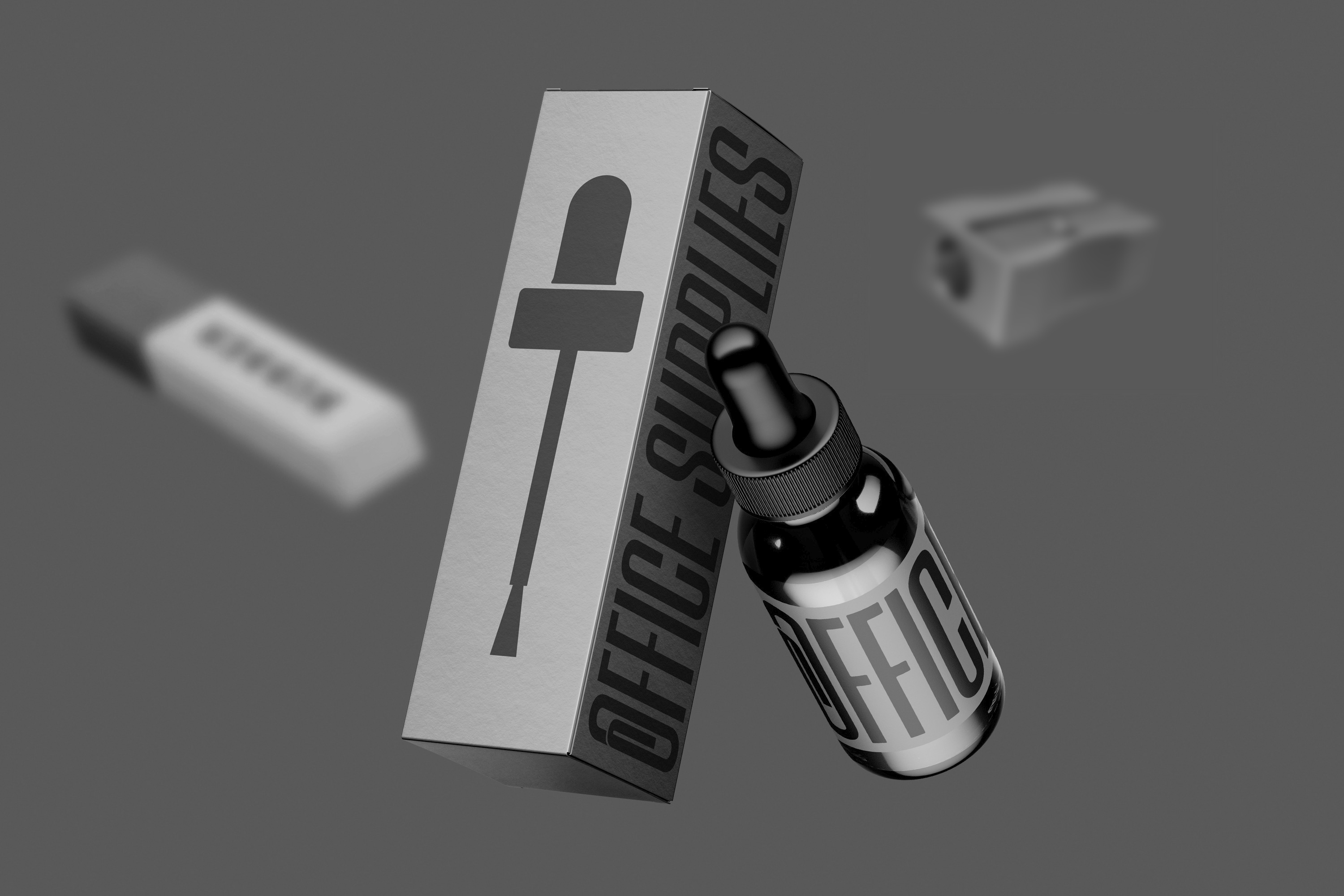
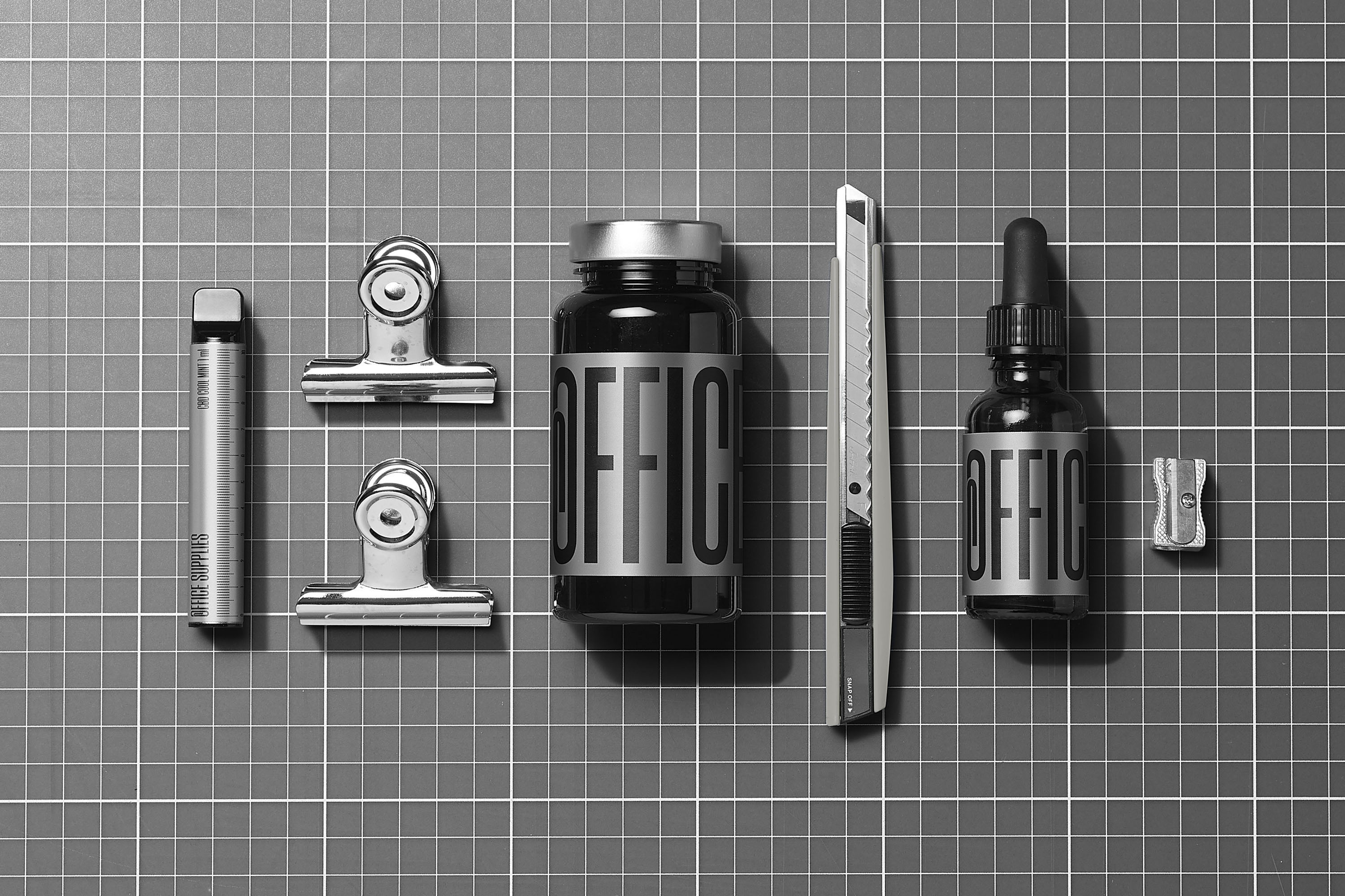
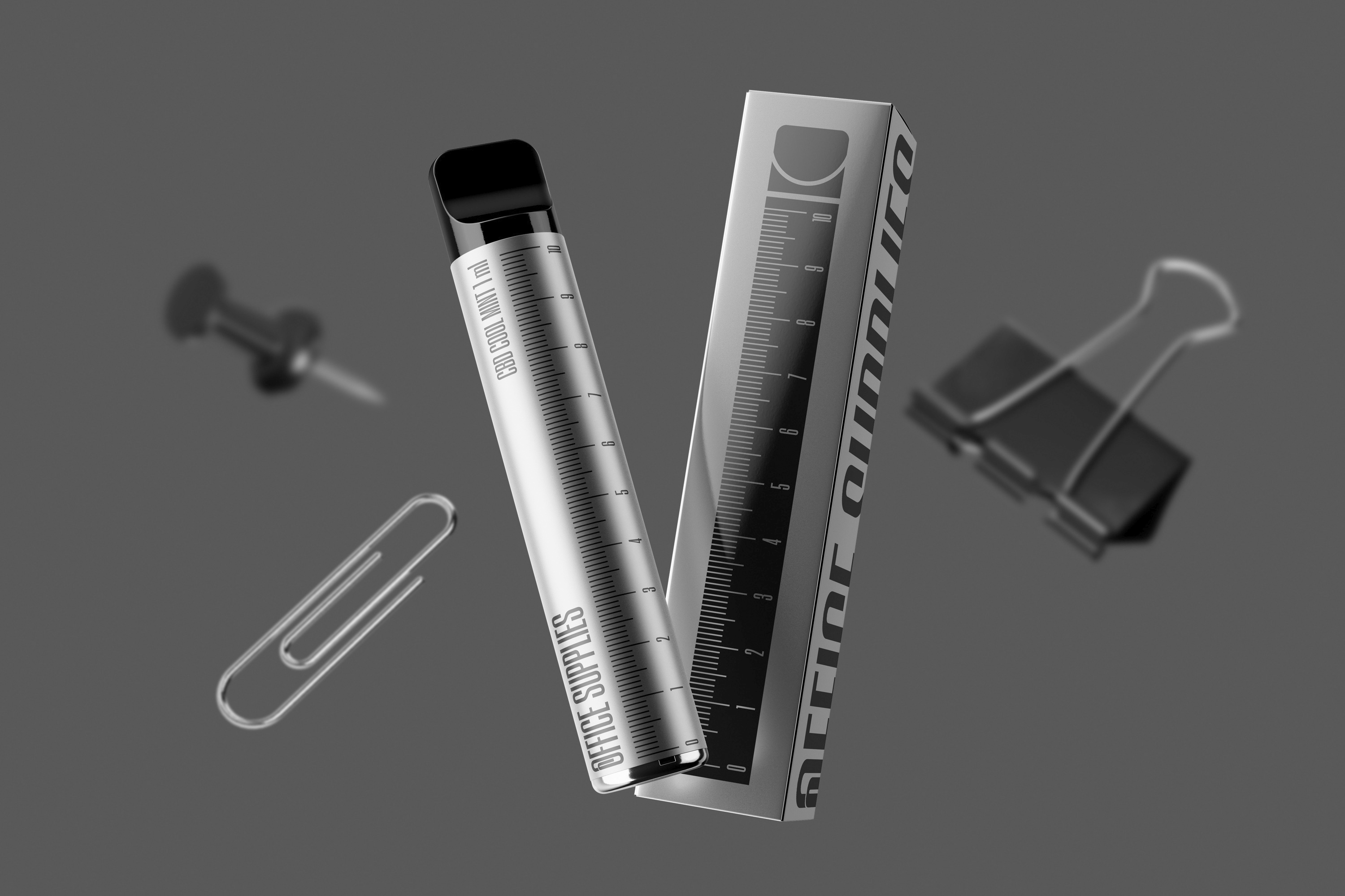
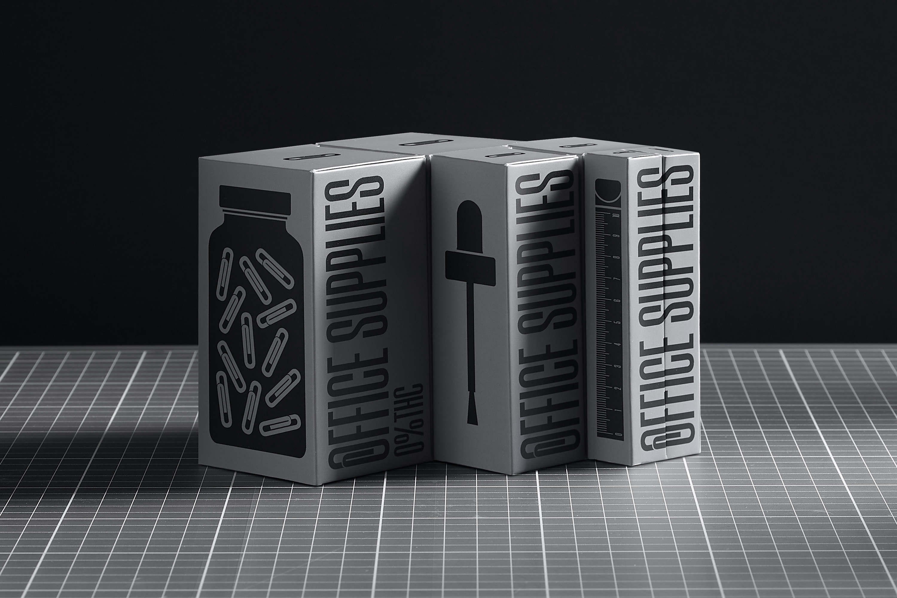
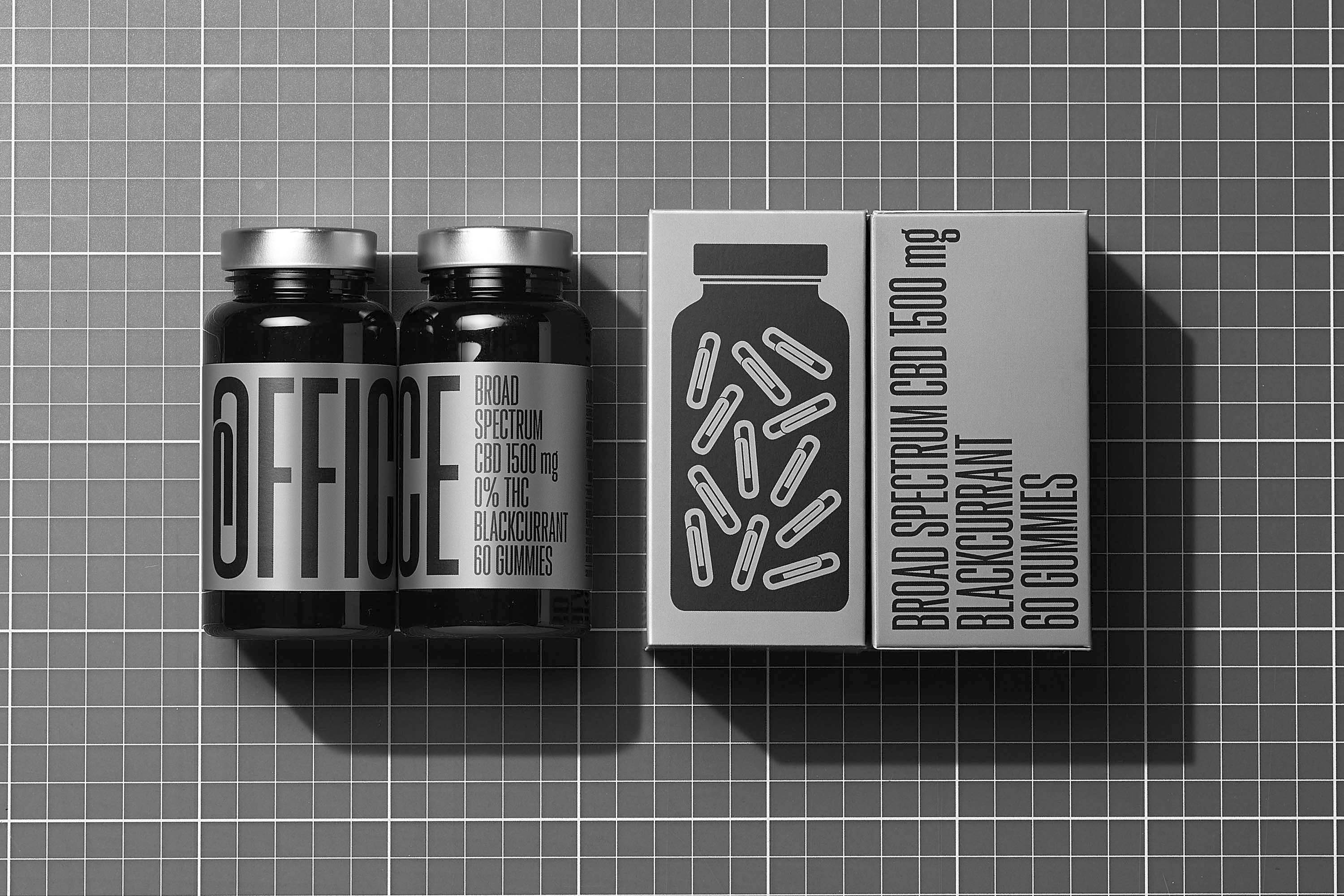
Finding a name is always complicated, but we were clear that the name would be key to developing an identity around it. And the long, stressful workdays we are accustomed to gave us the inspiration to create Office Supplies. A name that was apparently generic in other categories allowed us to play with the concept, decontextualizing its products to incorporate them into offices as just another work tool. We created a bold, eye-catching design of workplace essentials, using monochrome packaging and industrial elements for a CBD range that blends into a professional environment. Paper clips, erasers and rulers are part of everyday office life and make our lives easier. And a simple design serves as a communication strategy, transmitting the values of effectiveness and creating its own language that helps the brand to differentiate itself and be remembered.
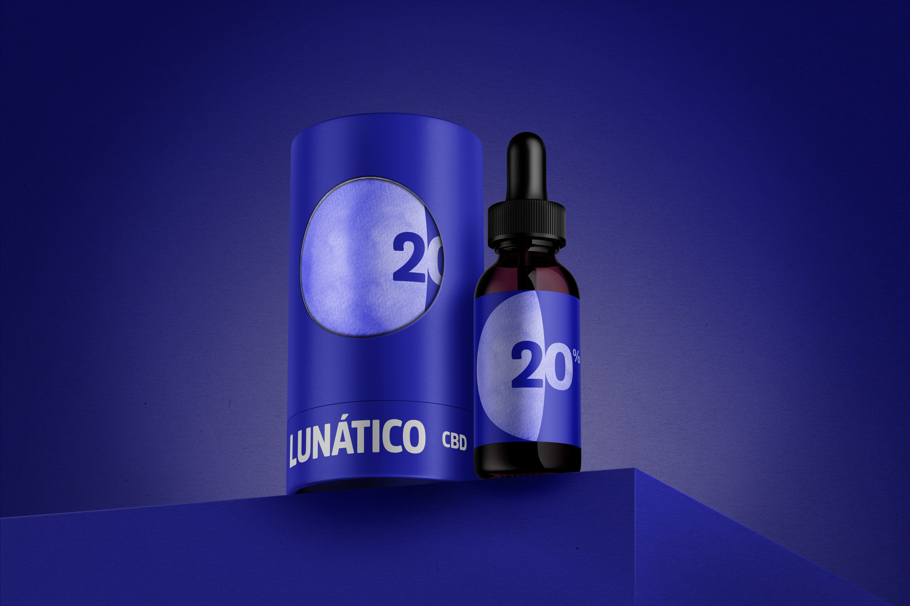
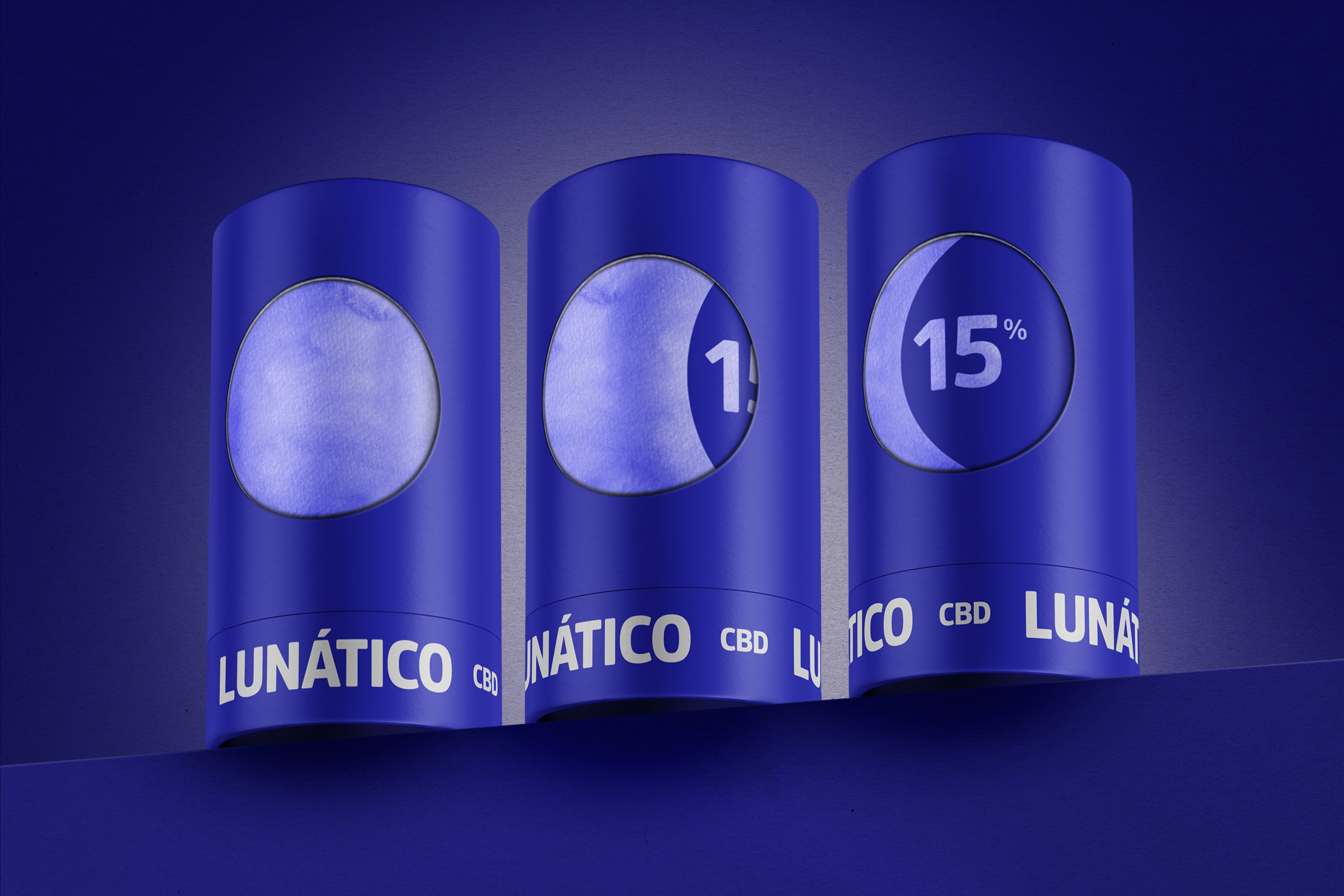
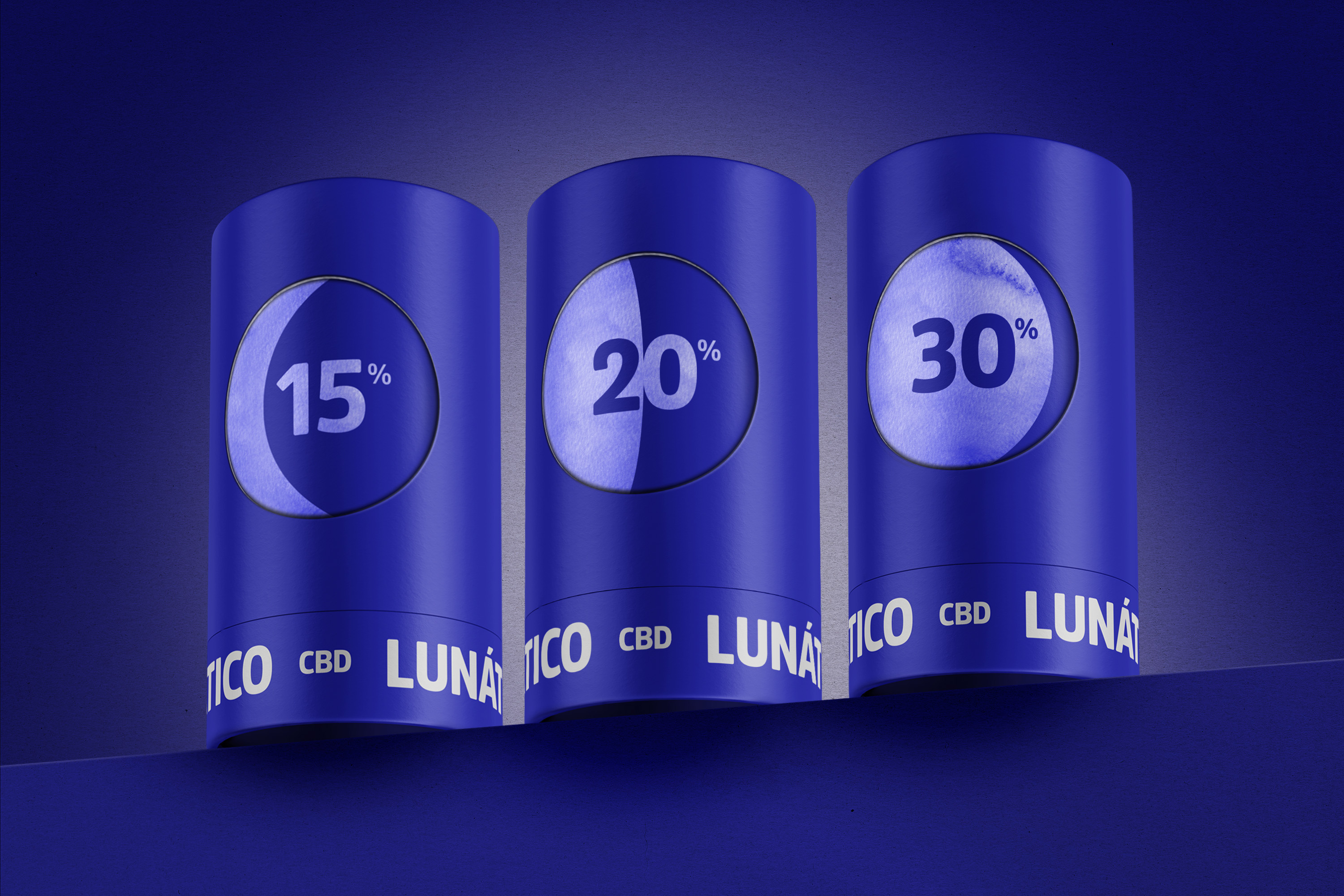
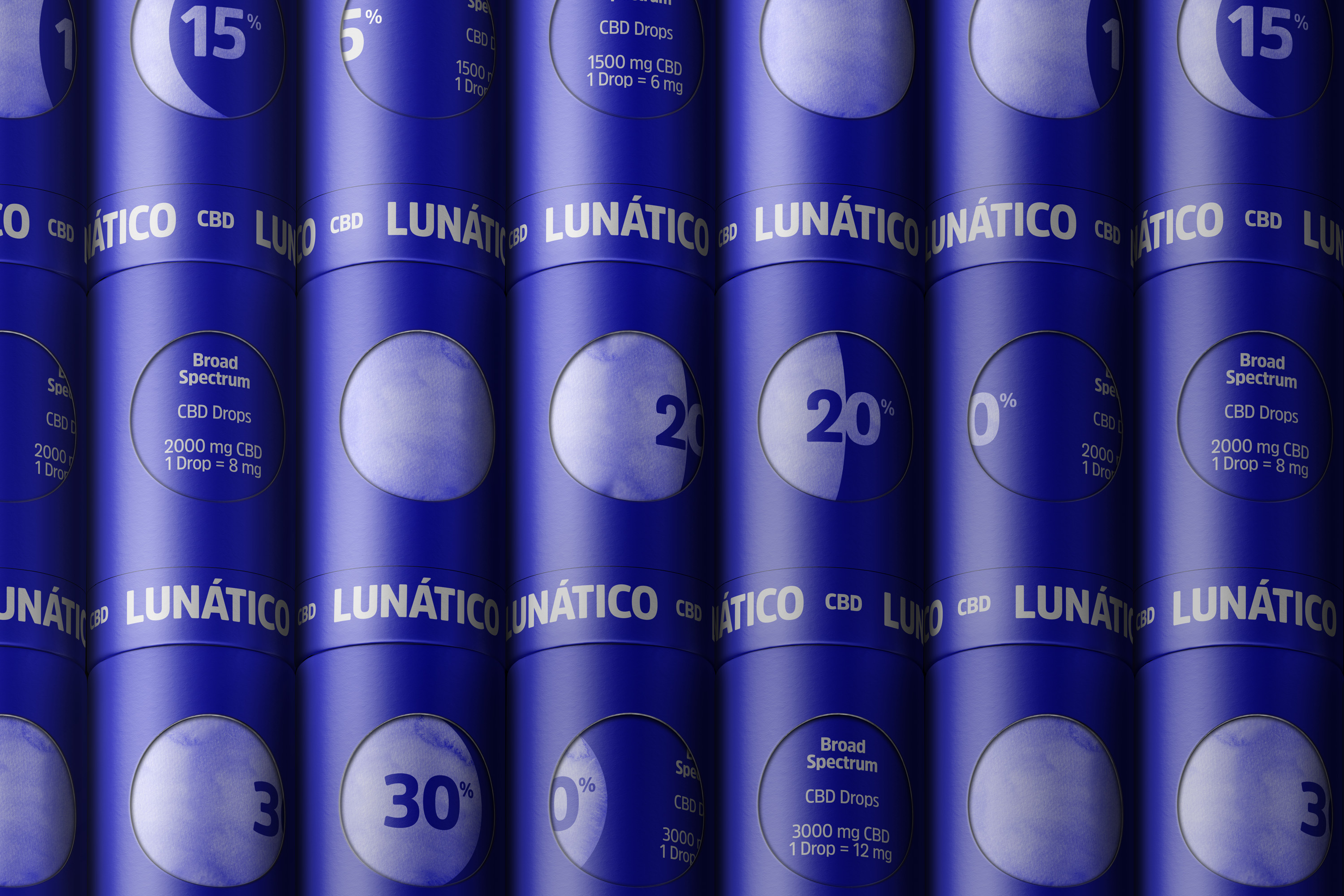
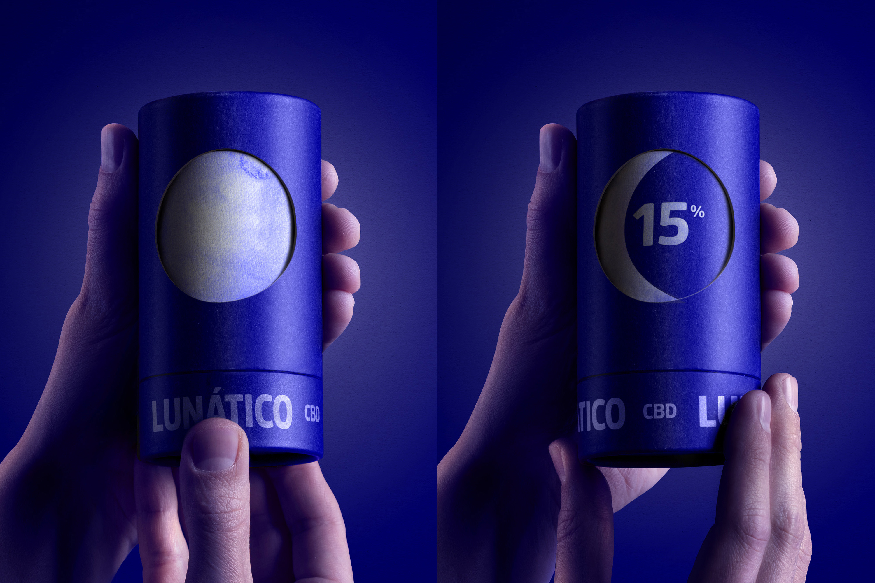
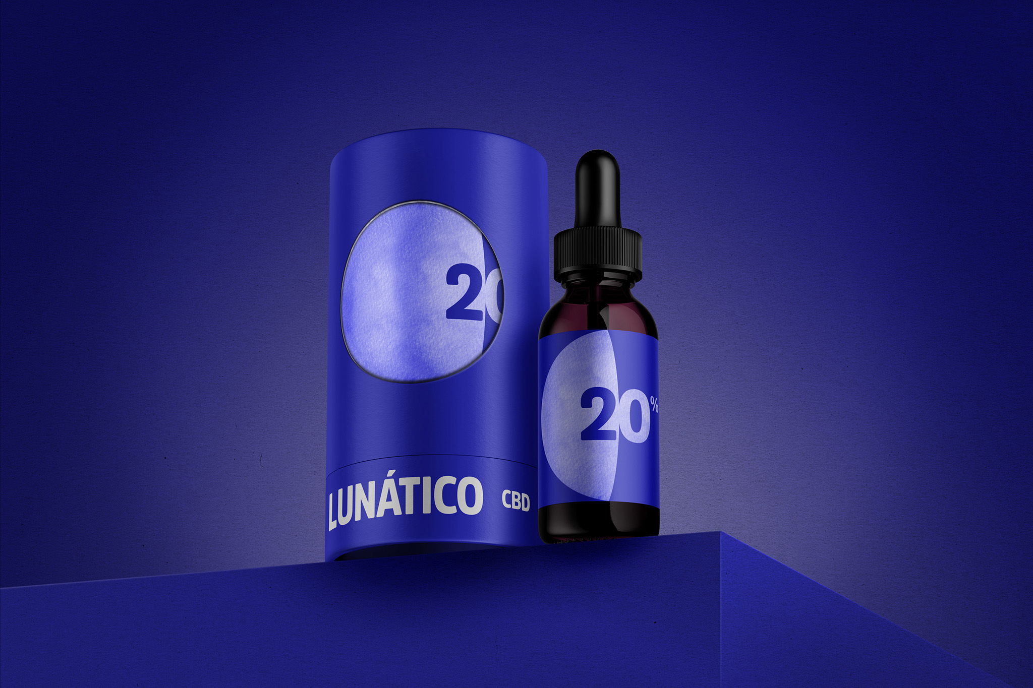
The legend of Vilanova tells of a boy who wanted to catch the full moon when he saw it reflected on the seashore. Since then, the inhabitants of Vilanova have been known as “lunatics” for trying to achieve impossible feats. Lunático is a line of CBD products focused on helping people with sleep problems. The moon as an icon generates the code with the different phases of the moon to highlight the intensities of CBD that the product offers.
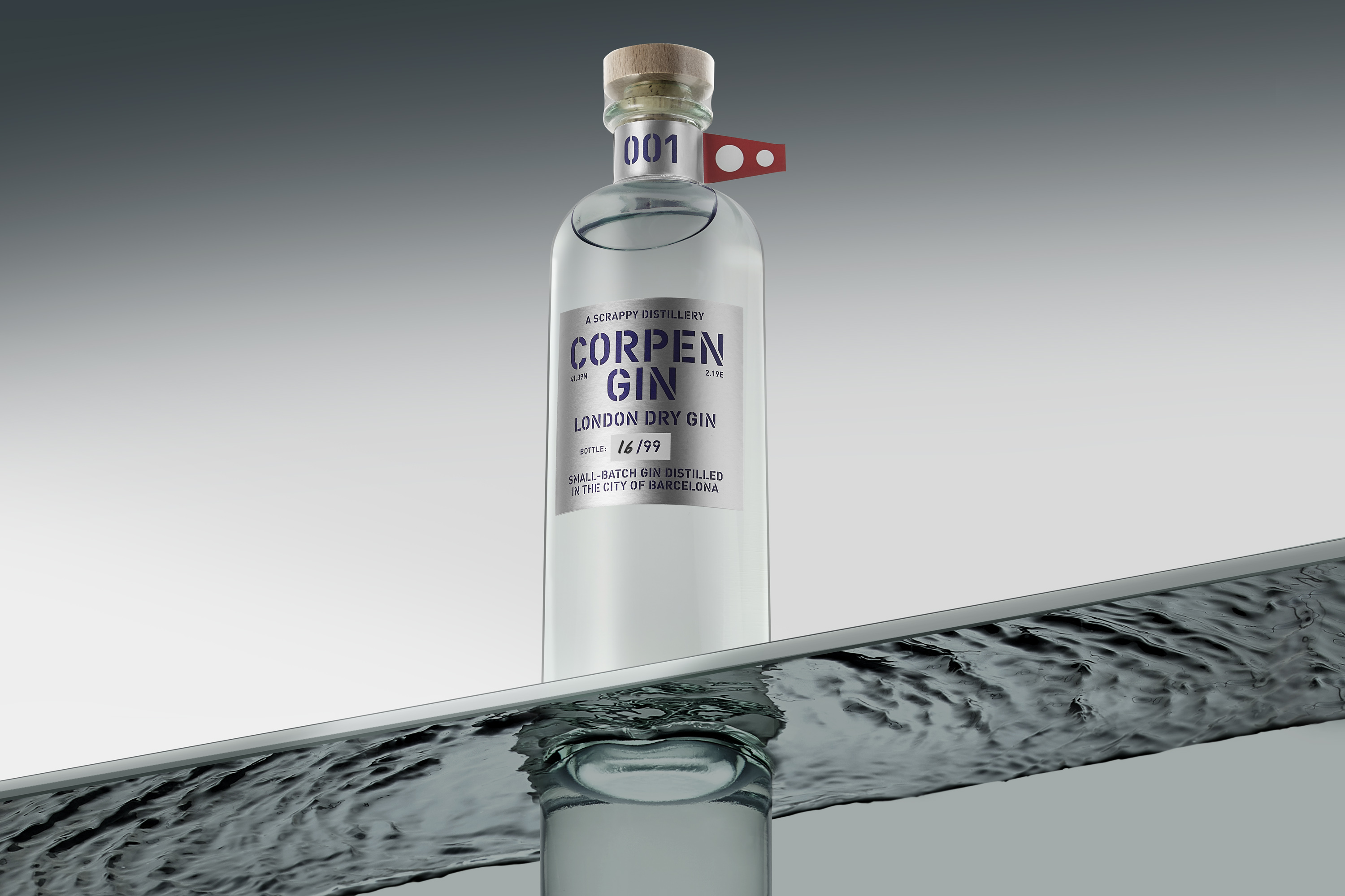
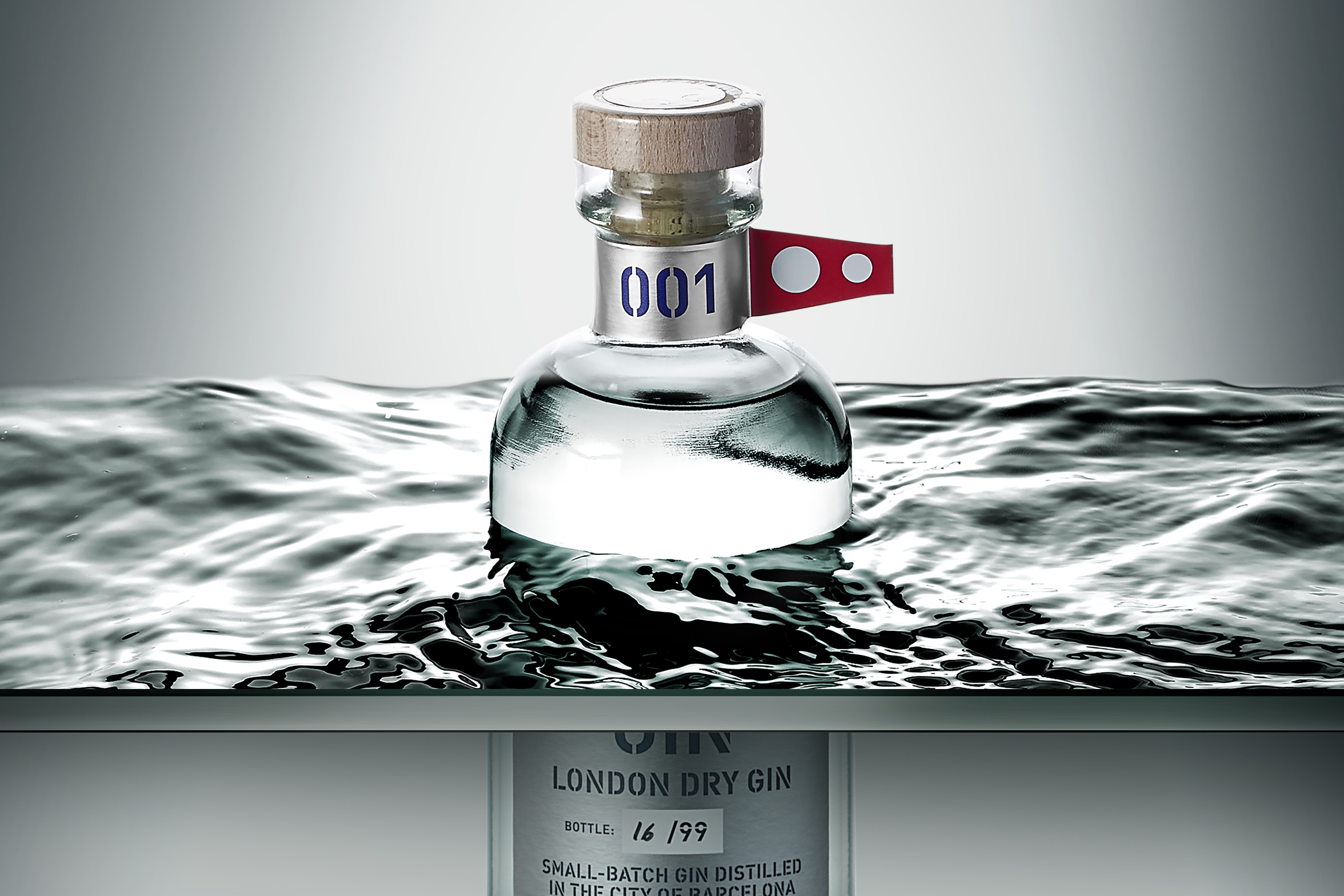
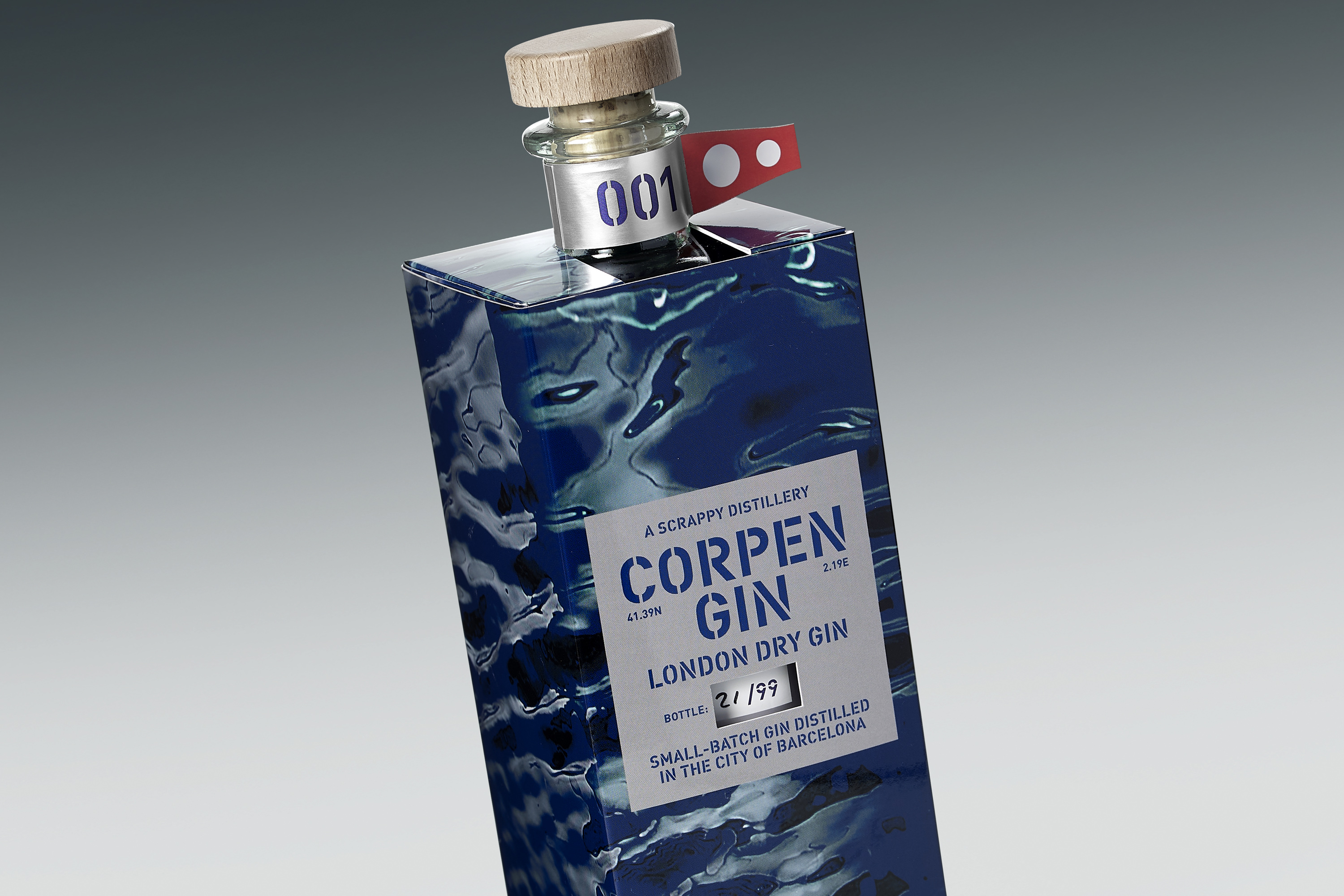
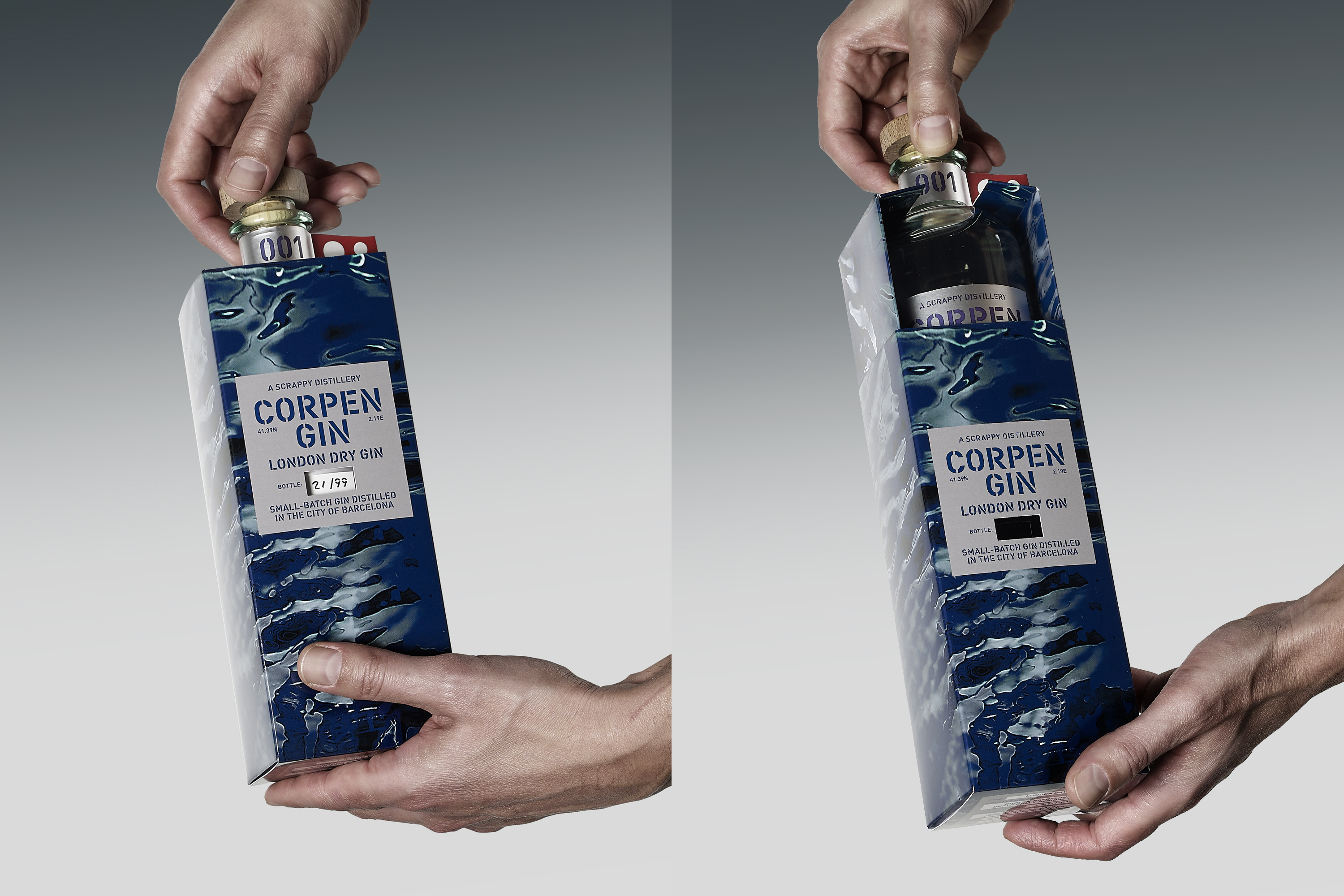
Flag signals are a very old form of communication that are still used today in navies around the world. Corpen gin is named for a naval flag that indicates a change in direction. When ships are moving together in formation, the lead ship raises the “corpen” flag to communicate an upcoming change in course to the other ships. With this limited edition, a tribute has been paid to all the people who embark on a change of direction in their lives to face new challenges. Cheers!
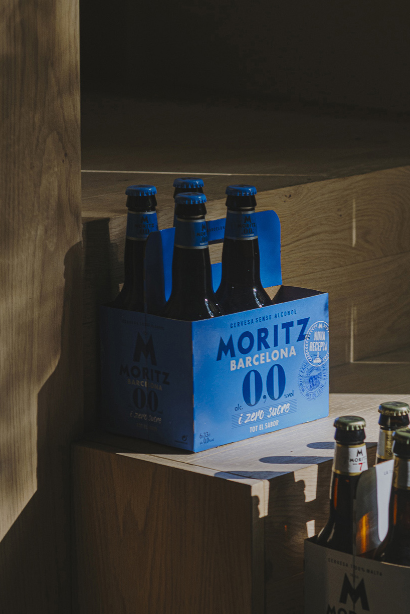
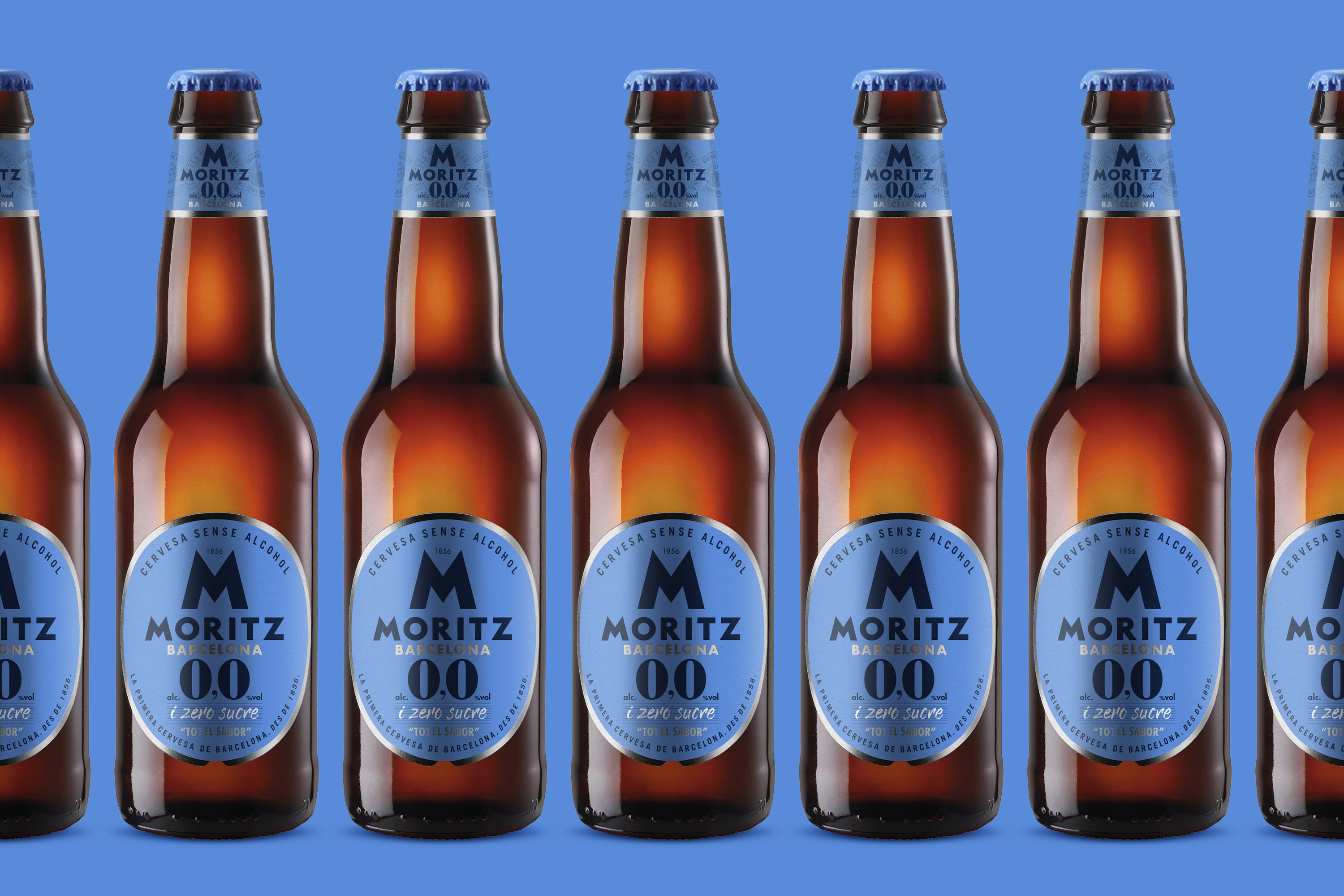
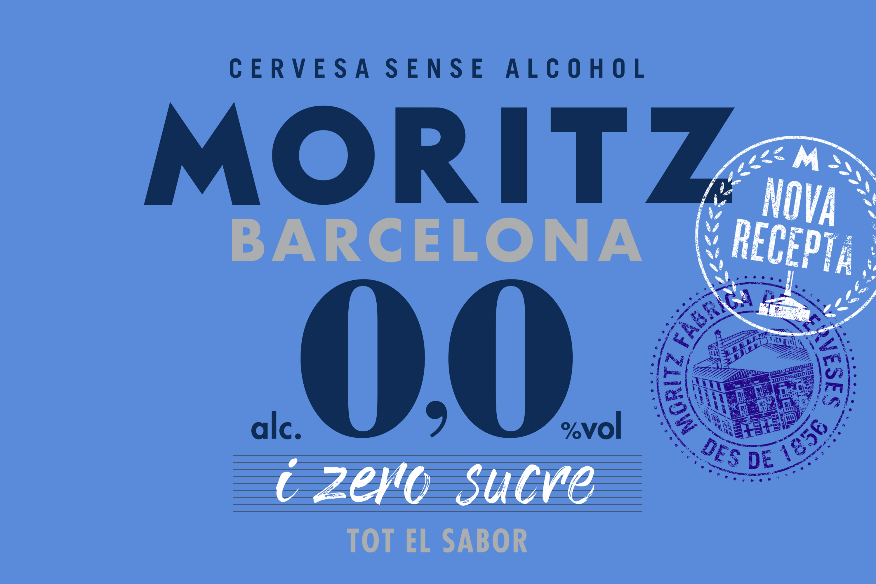
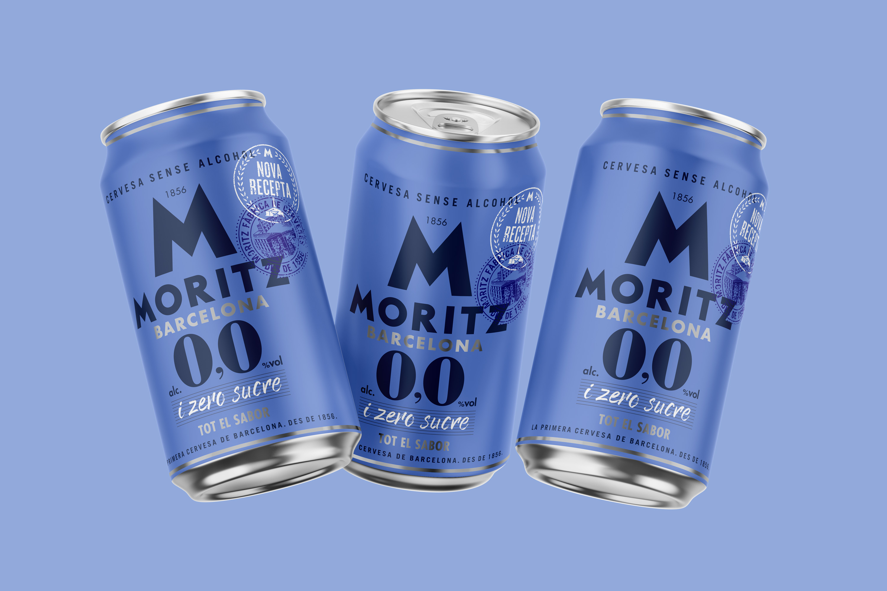
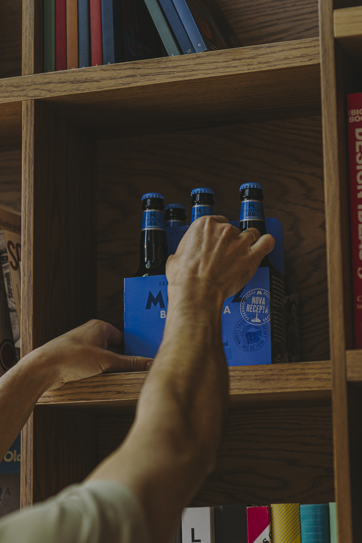
Moritz faced a significant challenge: changing the perception that consumers had of their non-alcoholic beer. Up until that point, many viewed it as a weak, flavorless option that lacked appeal, which limited its potential in an increasingly competitive and demanding market. To address this, we decided to completely redesign the visual identity of Moritz 0.0, aiming to convey the true essence of an authentic, high-quality beer. The new design successfully captures attention and communicates the bold, flavorful character of a genuine beer through strategic use of typography. We selected a typeface that reflects tradition and strength, reinforcing the idea of a well-crafted, storied beverage. Additionally, we incorporated seals that evoke craftsmanship and heritage, conveying that Moritz cares about the details and doing things the right way. These visual elements not only add authenticity but also build trust and prestige around the product. The revamped Moritz 0.0 not only maintains its authentic beer flavor but also offers a modern, healthy alternative: zero sugar, without sacrificing taste. It’s a unique option for those who want to enjoy a non-alcoholic beer without compromising on flavor or health. Ultimately, this redesign has positioned Moritz 0.0 as an innovative beer, rich in flavor and with a visual identity that reflects its quality and tradition—standing out clearly in a competitive and ever-evolving market.
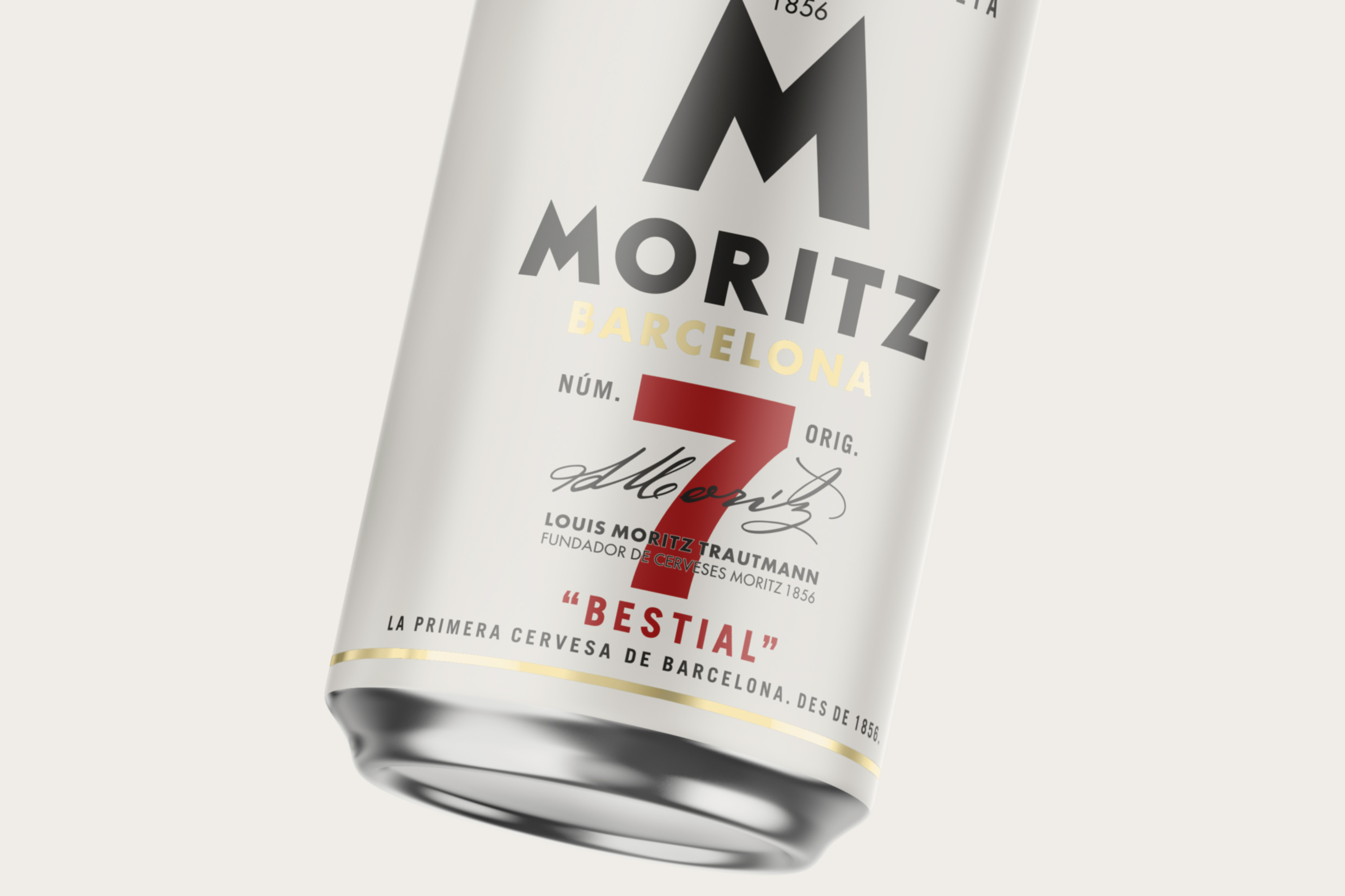
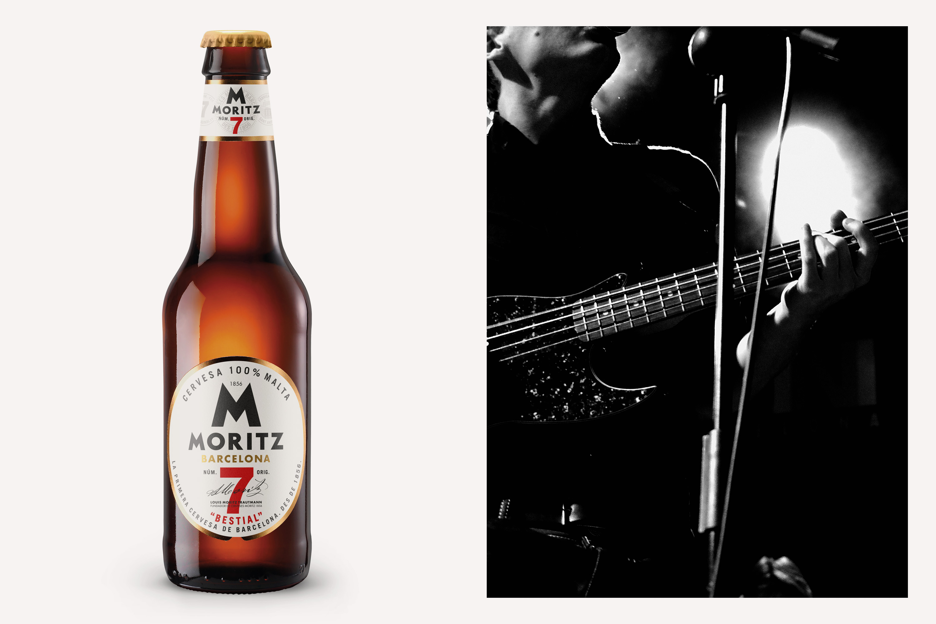
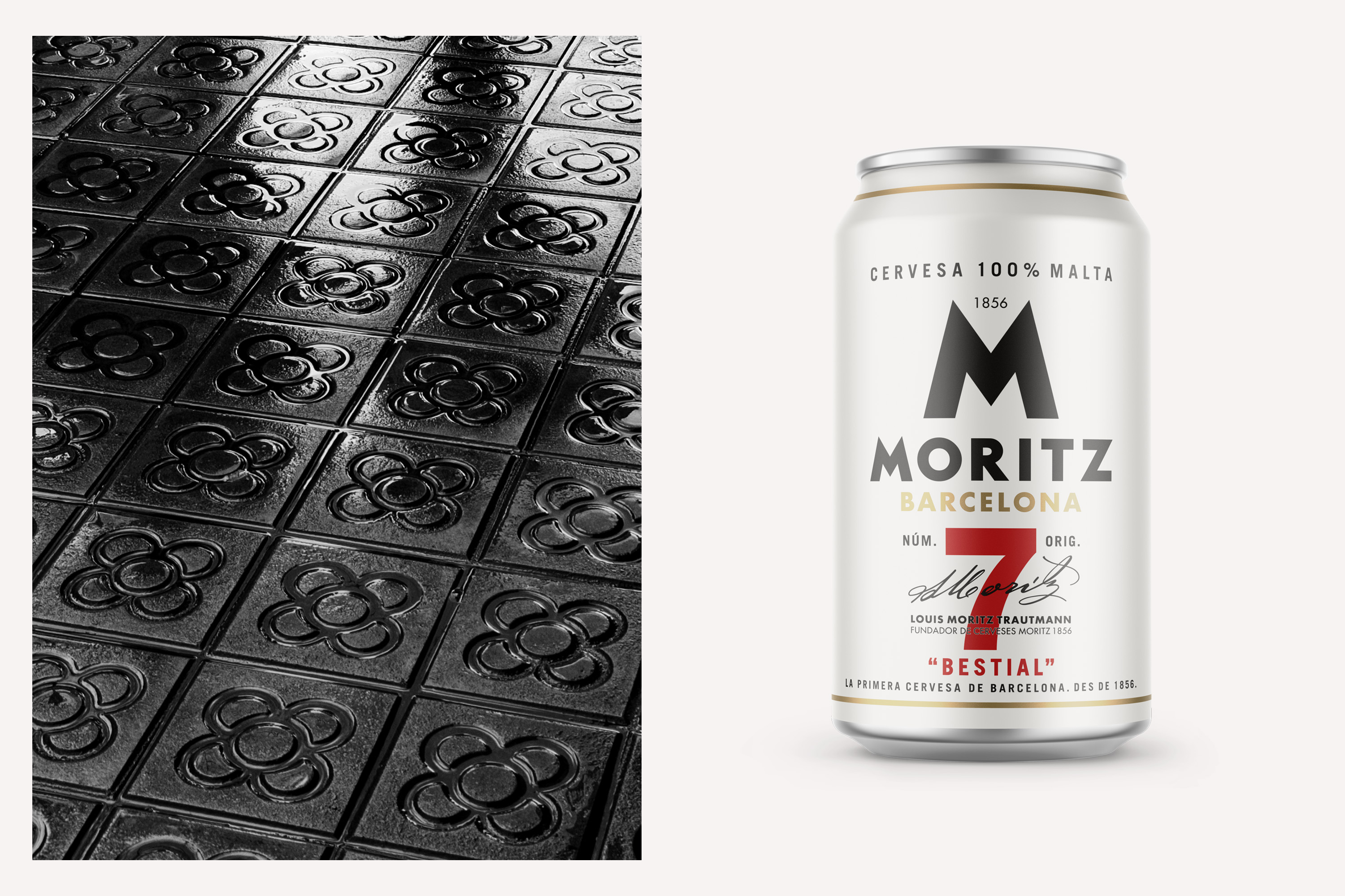
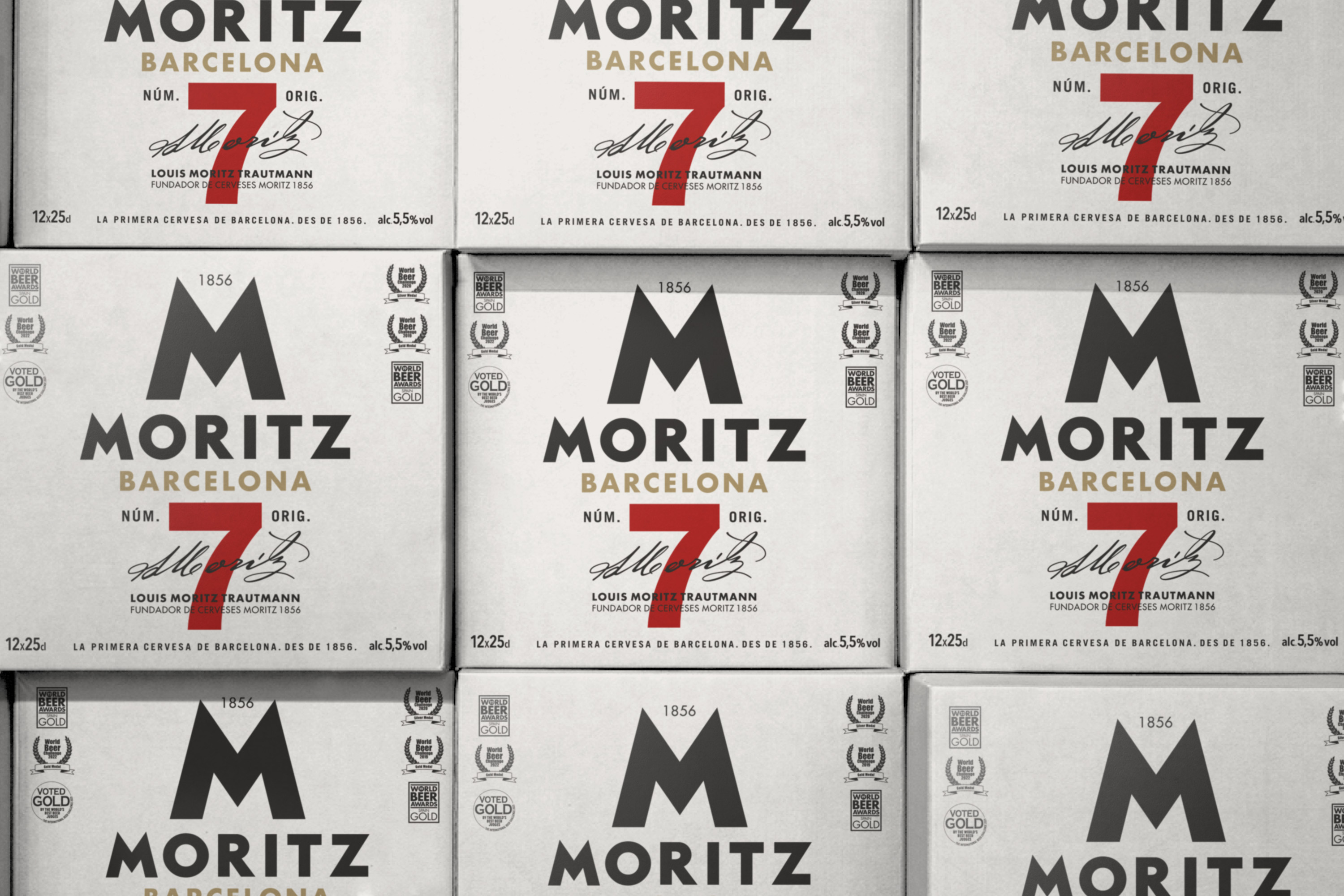
Moritz is the first beer from Barcelona, a brand with a history dating back to 1856, when it was founded in this vibrant Catalan city. From its beginnings, Moritz has been synonymous with tradition, quality, and character, establishing itself as a symbol of the local brewing culture. The story goes that on one occasion, the master brewer of the factory tasted one of his new creations and, impressed by its flavor and body, asked curiously, "Which one is it?" The answer was, "The one from tank 7." At that moment, they knew they had found the perfect beer—one that had all the intensity and character they were looking for. It was a creation that combined the strength of 100% malt, with a robust body and an intense flavor, reflecting the essence of a beer with character, strength, and personality. To honor that history and adapt to modern times, a redesign of the Moritz 7 brand was carried out. In this process, the goal was to create a perfect harmony among all visual elements, achieving a balanced and elegant symmetry. The new visual identity features a harmonious integration between the letter "M" of Moritz and the number "7," forming the brand M7. This redesign not only updates the image of one of the most iconic brands of the house but also reinforces its distinctive character and historical legacy, projecting it into the future with a modern and sophisticated aesthetic.