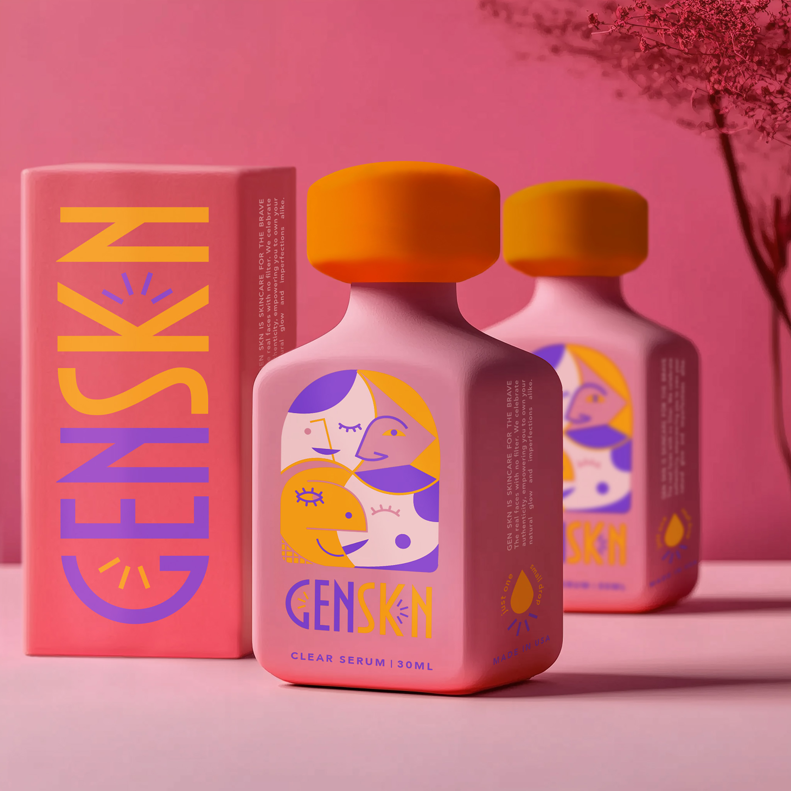
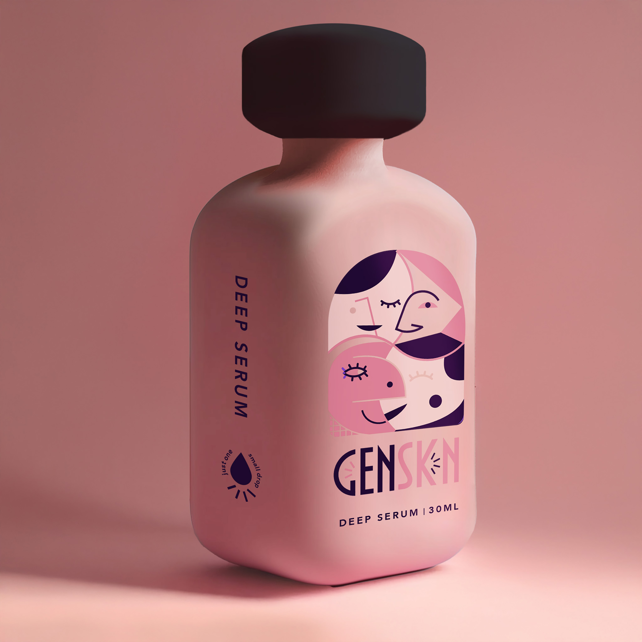
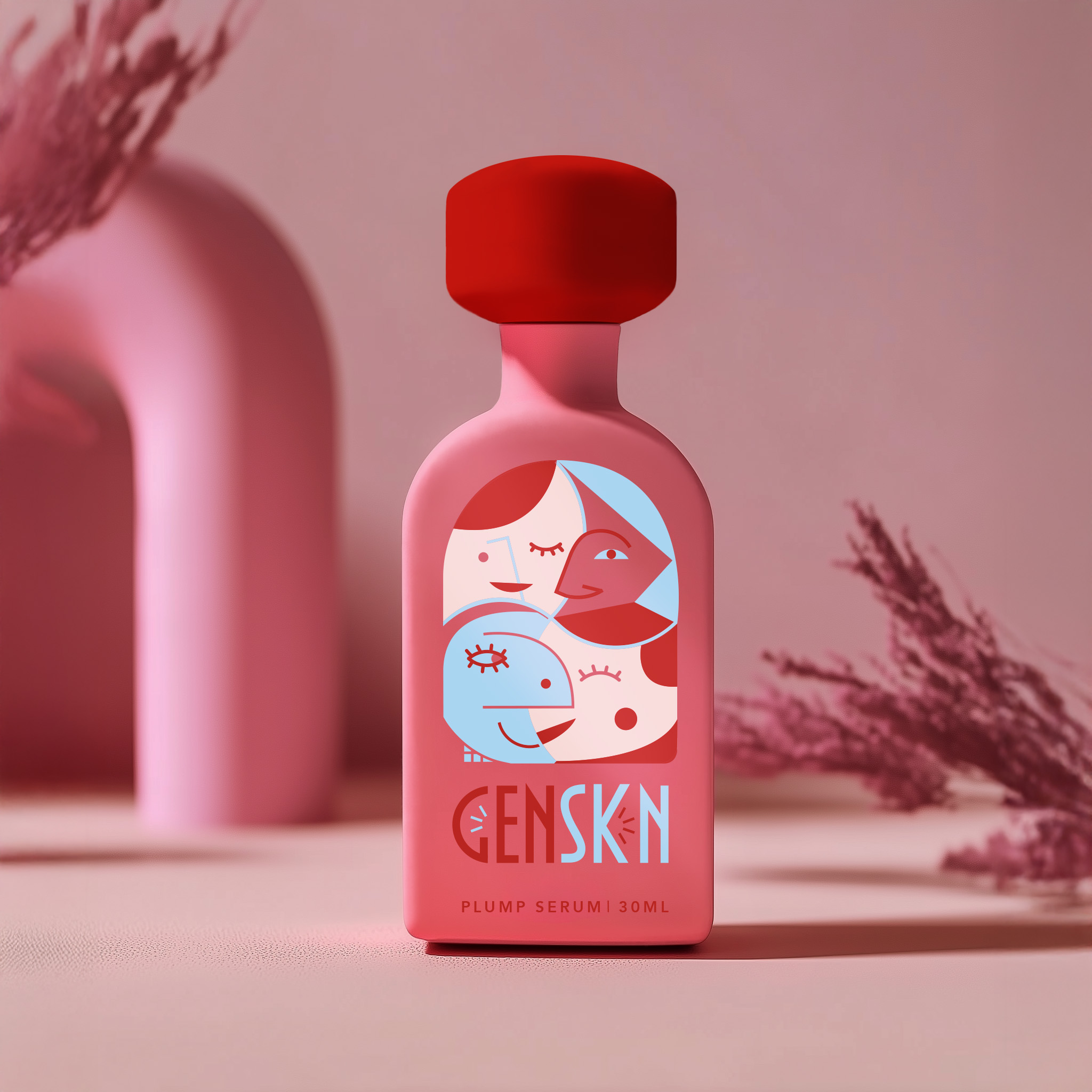
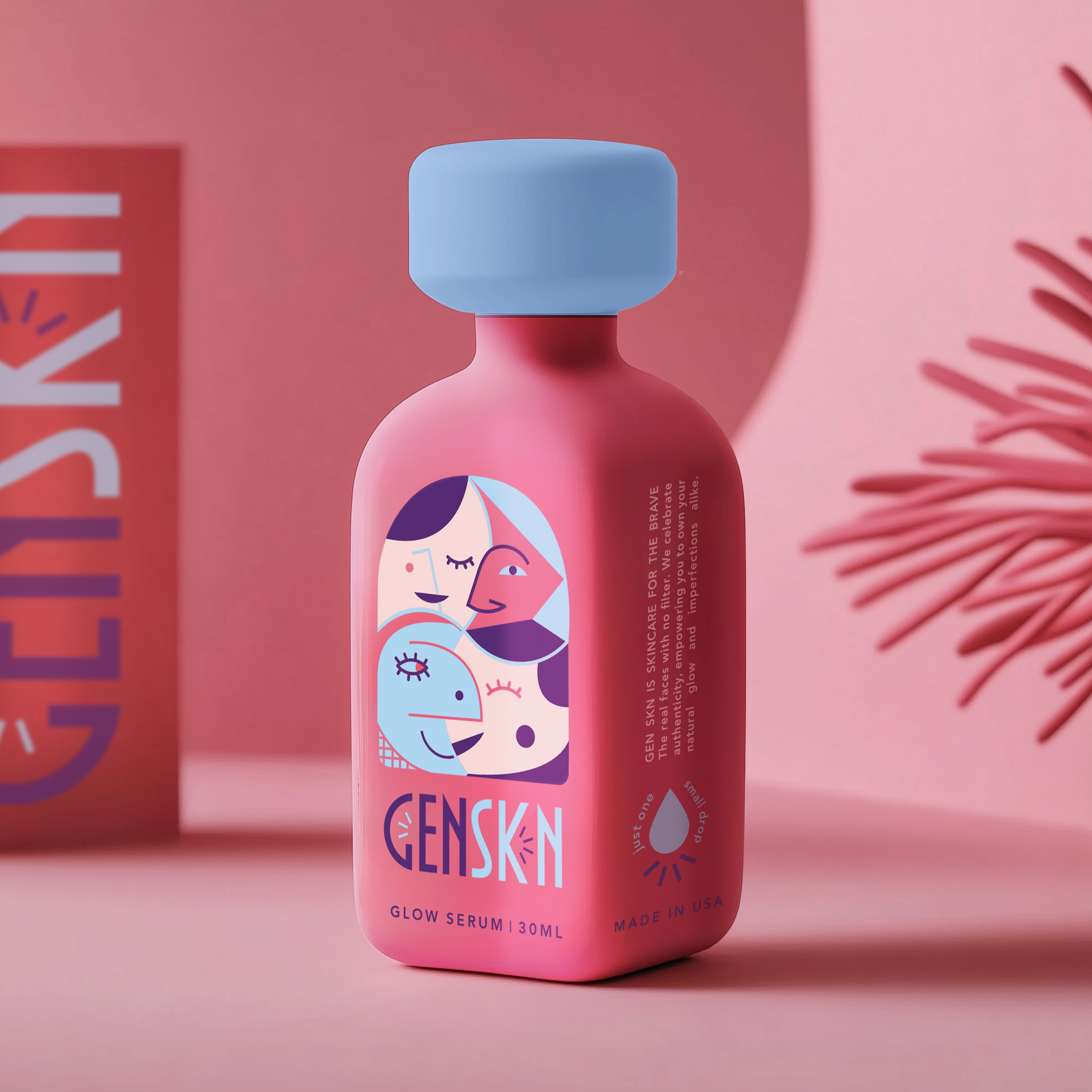
GenSkn
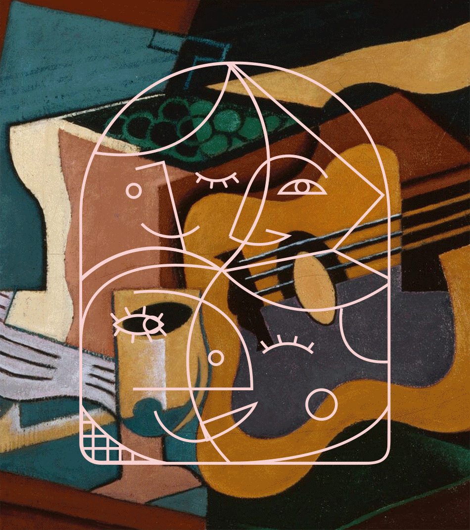
GenSkn is a bold, inclusive cosmetics brand redefining luxury in the world of serums. Unbound by gender and unapologetically expressive, the brand lives primarily online—where its visual identity speaks for itself. The packaging balances clarity and structure without feeling sterile. Each product features bold, straightforward typography set in a grid-like layout, complemented by soft blue-greens, off-whites, and bright reds that create contrast without being loud. Diagrams, graphic overlays, and playful mid-century-inspired type give the brand a design-forward, slightly scientific edge. At the core of GenSkn’s identity is a striking logo inspired by Cubist linework: a tangle of abstract faces flowing seamlessly into one another, a visual metaphor for the fluidity of identity. This bold, illustrative approach extends across the packaging, transforming bottles into mini art objects. Matte-finish pastels with oversized, color-rich lids give each product a sculptural, collectible feel—soft yet unapologetically assertive. This is packaging that takes up space—luxurious, expressive, and unmistakably GenSkn.