


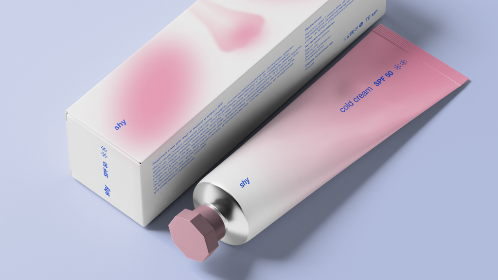
Anastasia Alekseevskaya's conceptual packaging design for shy - cold cream
Student designer Anastasia Alekseevskaya delivers a packaging that subtly communicates the formula’s protective strength
Student designer Anastasia Alekseevskaya delivers a packaging that subtly communicates the formula’s protective strength
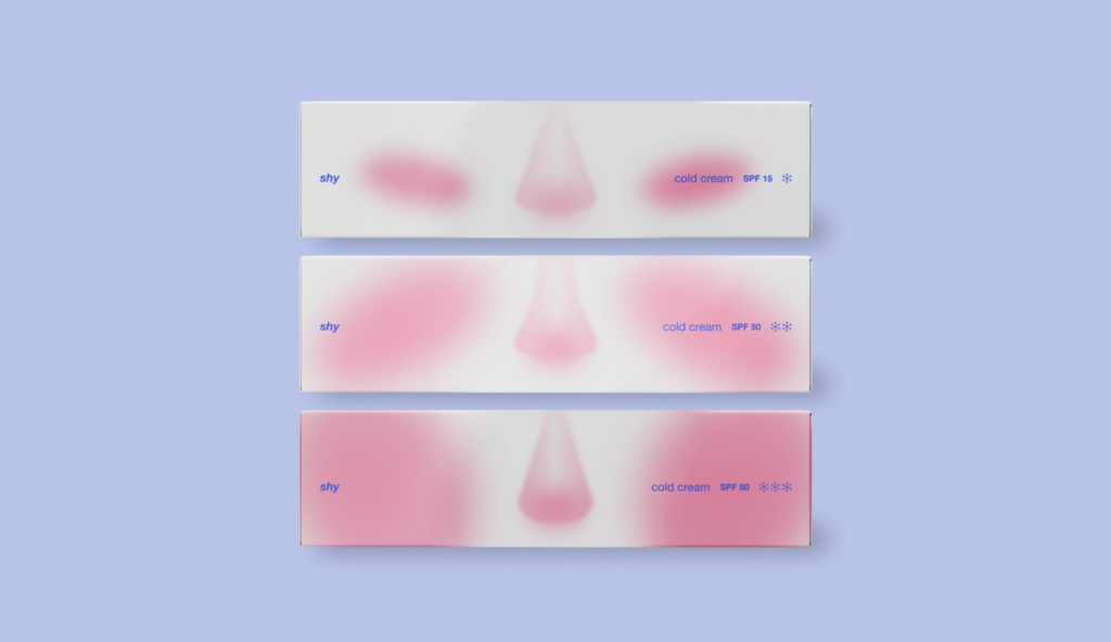
“shy” speaks to those who value softness, quiet care, and subtle beauty. The brand explores the space between emotional and physical sensitivity — like a natural blush on a cold day, or the gentle touch of wind on the skin.
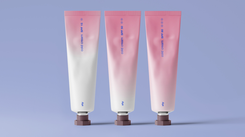
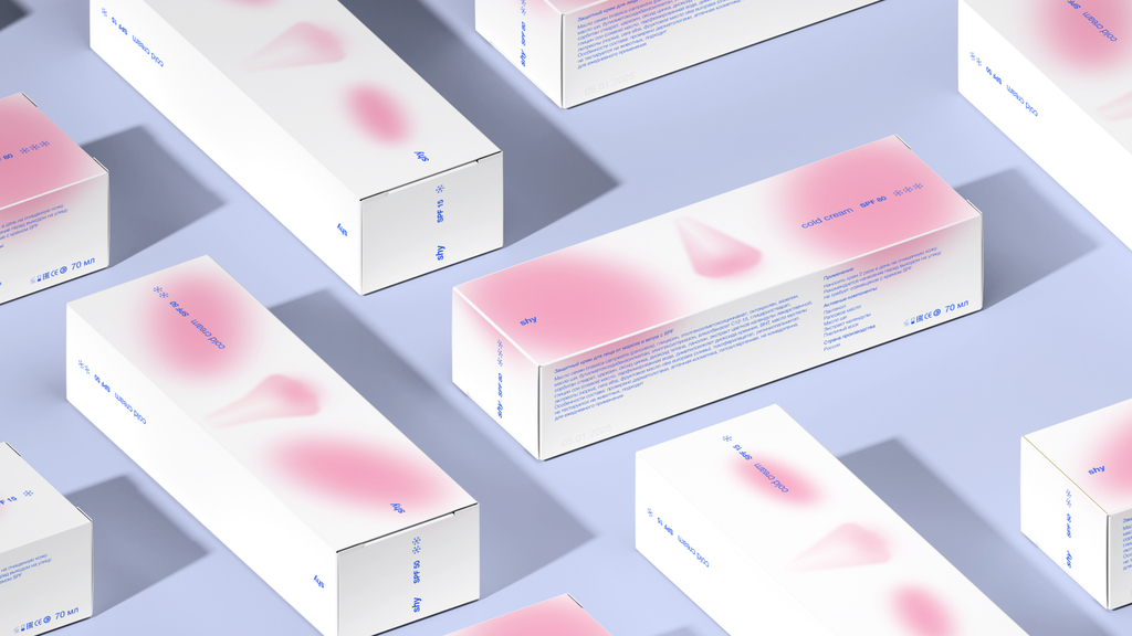
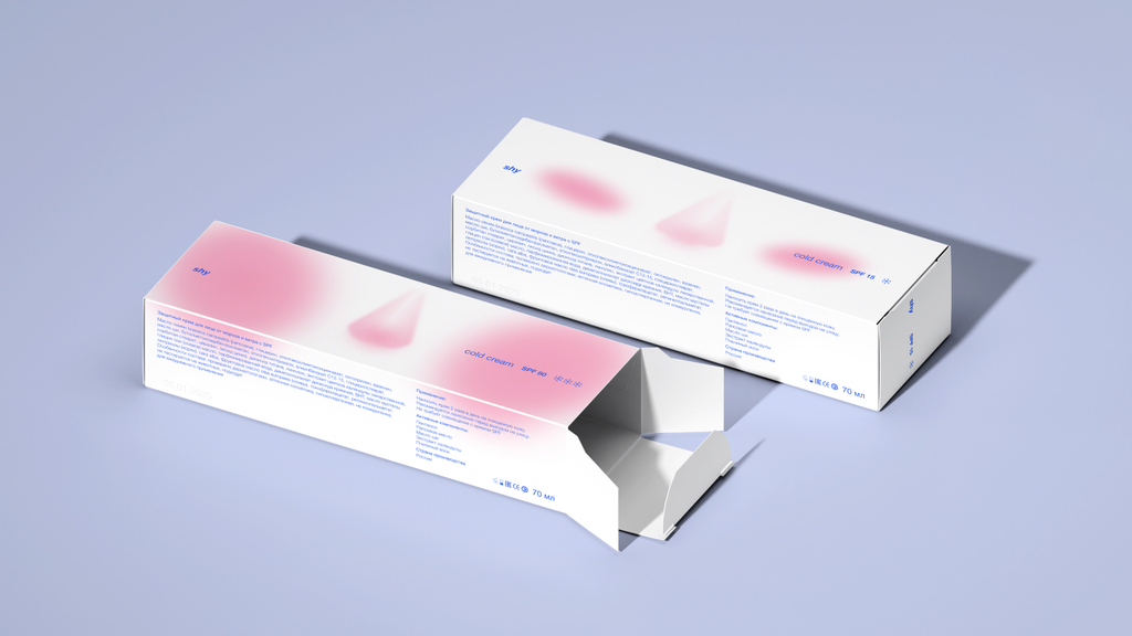
The visual identity is clean and understated, with a colour palette drawn from natural blush tones. The packaging reflects a quiet approach to self-care, while the depth of the pink hue subtly indicates the level of protection—the deeper the shade, the stronger the formula.
For more information on the design, follow Anastasia.