Alacuerno is a creative design studio based in Gijón, Spain, with a strong focus on strategic branding and standout packaging design. We believe deeply in the power of sustainable brands and the role design plays in shaping a better future for products and people alike.
Our approach blends strategic branding vision with thoughtful creative processes that craft unique visual identities and meaningful brand experiences. We are specialists in branding and packaging design, where each project becomes an opportunity to communicate a brand’s values, personality, and purpose through purposeful and distinctive design.
Over the years, we have developed branding and packaging solutions for a diverse range of clients, from home fragrance products to organic, spirits, eco-oriented goods and lifestyle brands. In every case, packaging is treated as a central component of the brand experience, capable of elevating perception, enhancing usability, and reinforcing emotional connection.
Our design solutions help brands stand out in competitive markets and communicate their value clearly to audiences. Whether through elegant structural packaging or thoughtful visual storytelling, we shape memorable brand experiences that resonate.
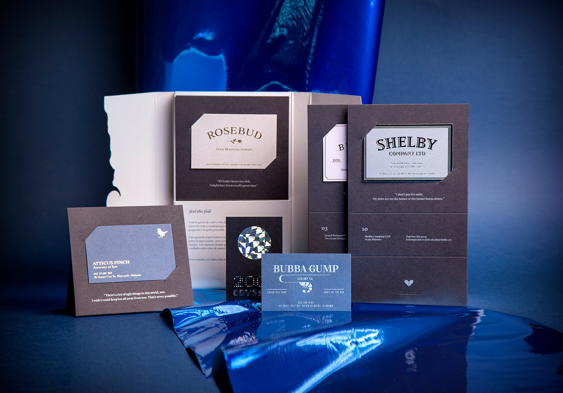
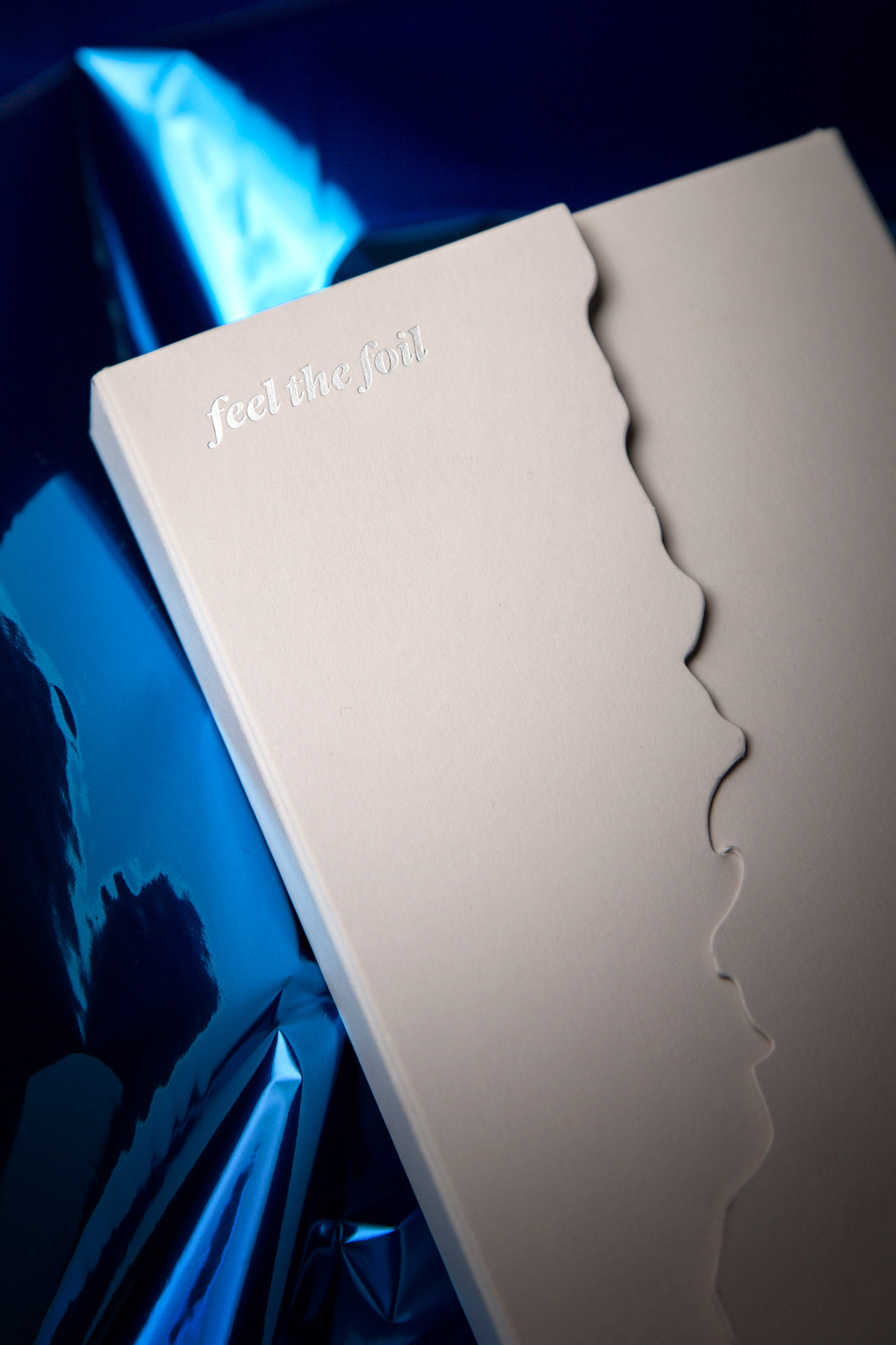
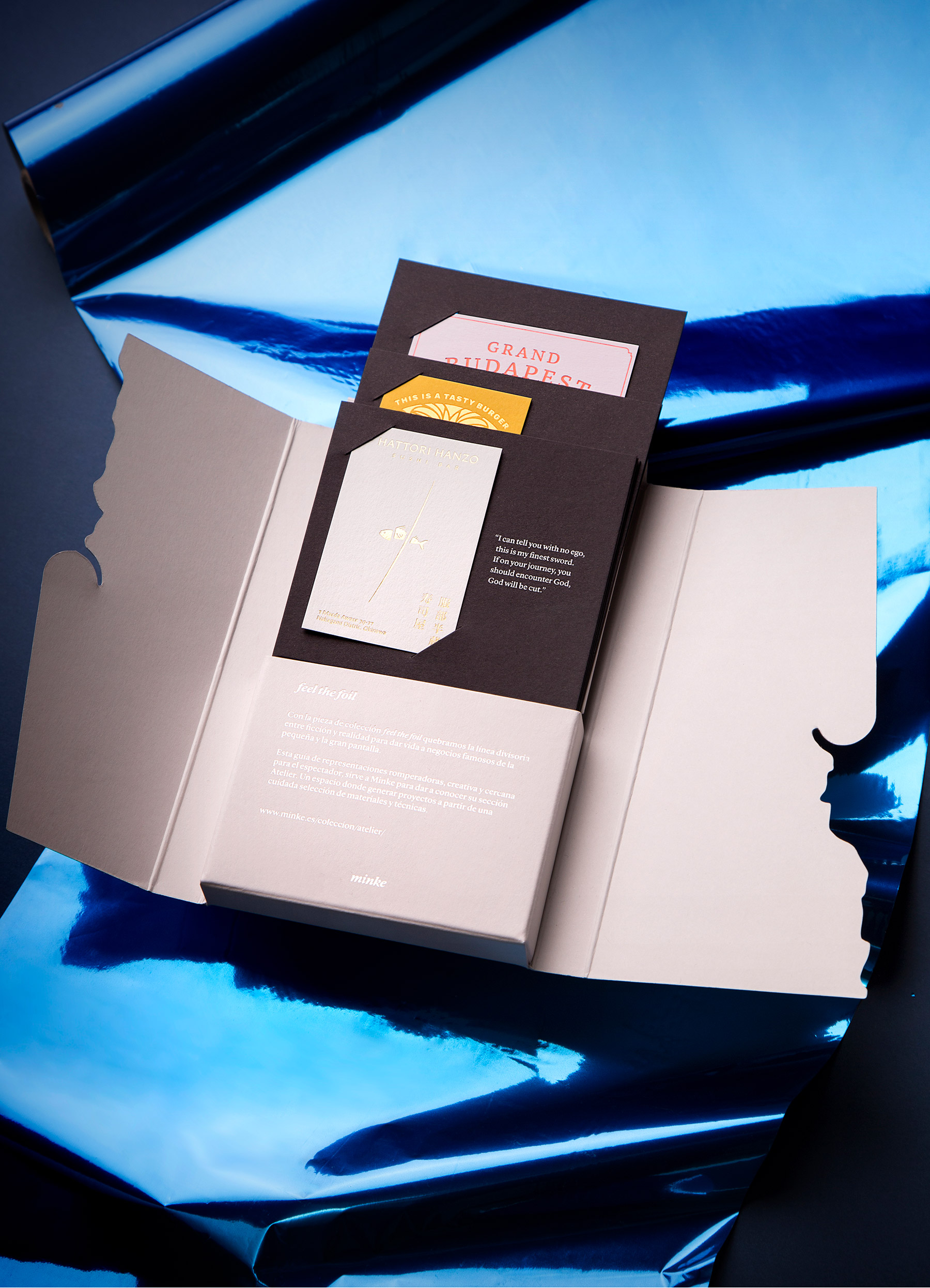
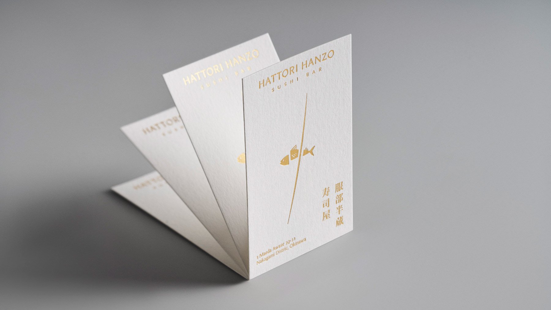
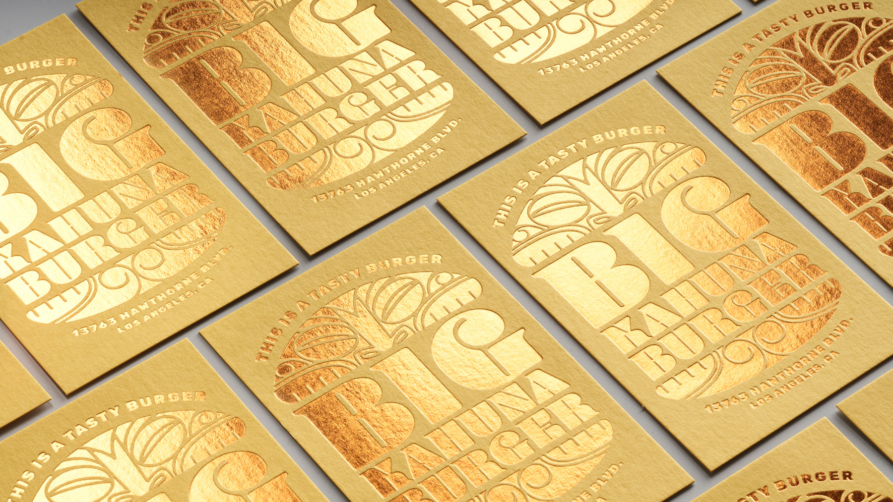
Minke, a printing company from Madrid, commissioned us to create a promotional piece for the launch of its new web section, where users can configure their business cards by combining creative paper with stamping films, foils. feel the foil breaks the line between reality and fiction. Through a design exercise, a set of representative brands of fictional businesses is reimagined and redesigned, giving rise to this guide to groundbreaking presentations. feel the foil is both a creative promotional piece and a tool for the designer.
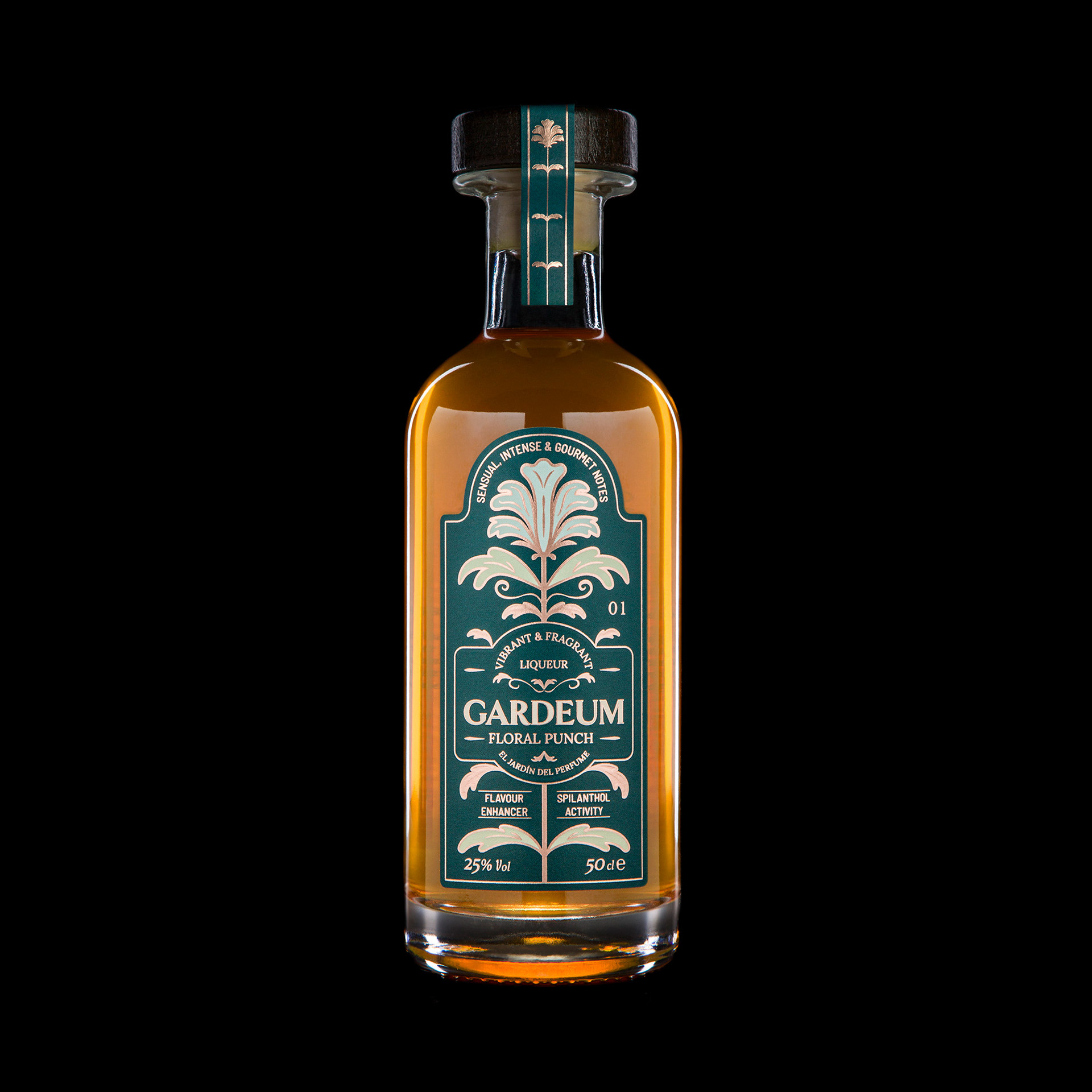
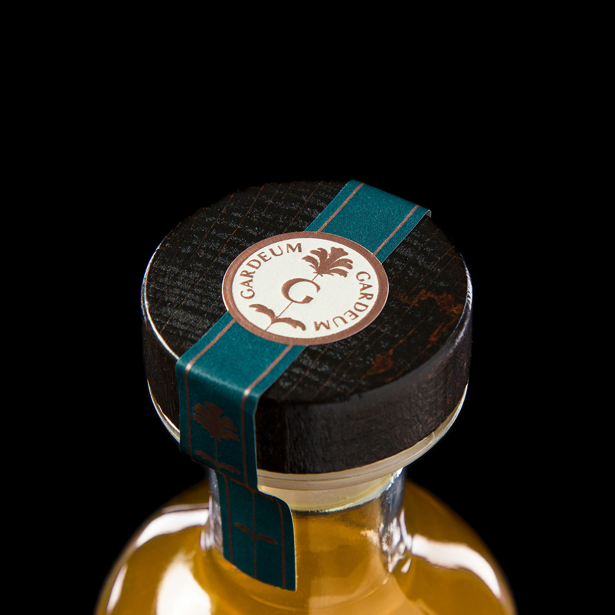
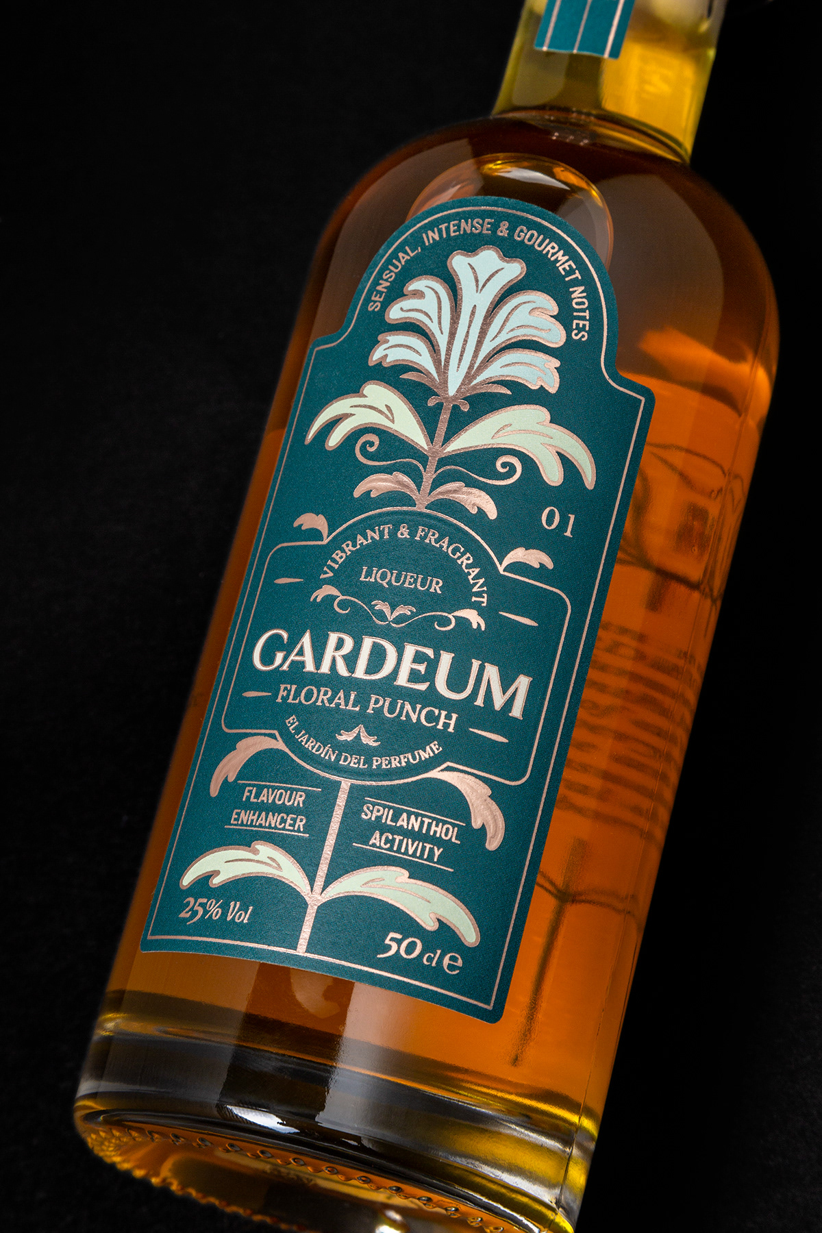
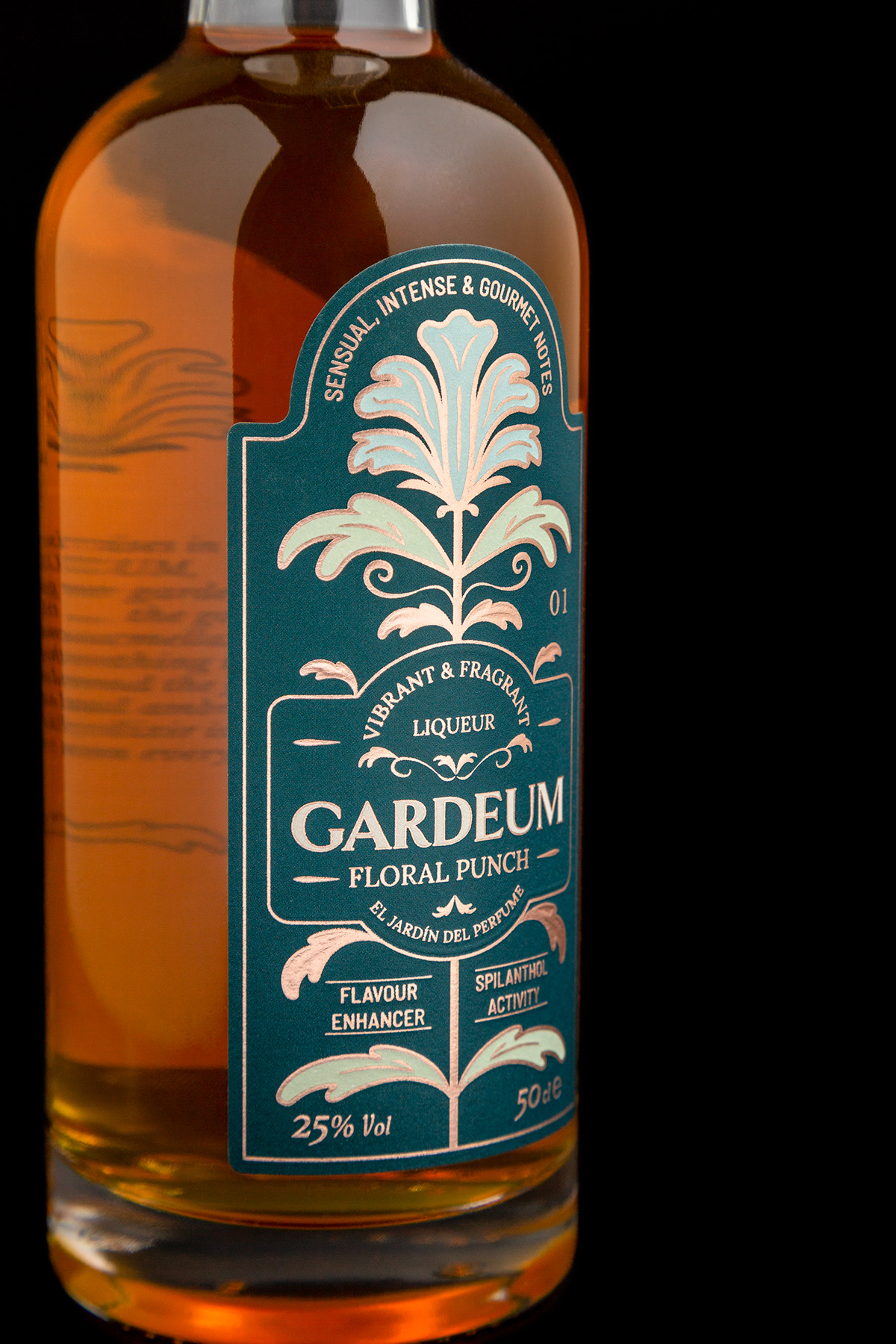
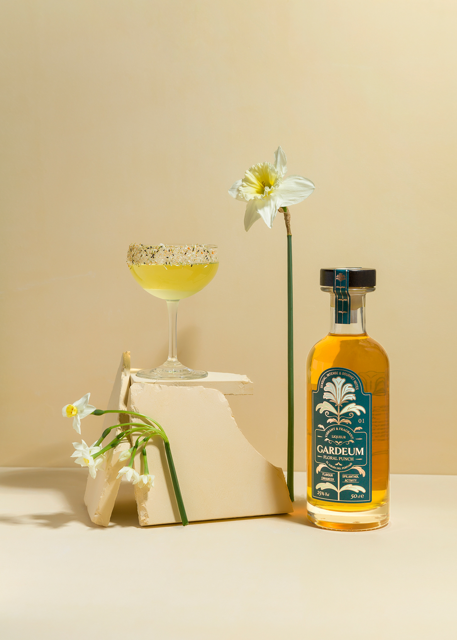
Floral colours, flavours and fragrances are the soul of Gardeum, a handcrafted liqueur made from the exquisite flower, Acmella oleracea. The process from plant cultivation to manufacture produces a vibrant and fragrant drink of complex nuances that walks the fine line between liqueurs and perfumes. Gardeum is the culmination of a long and thorough research to achieve a balanced drink of great intensity and elegance, hence we present it in a bottle characteristic of classic liquor stores, with graceful and bright lines and a floral design inspired by arts & crafts.
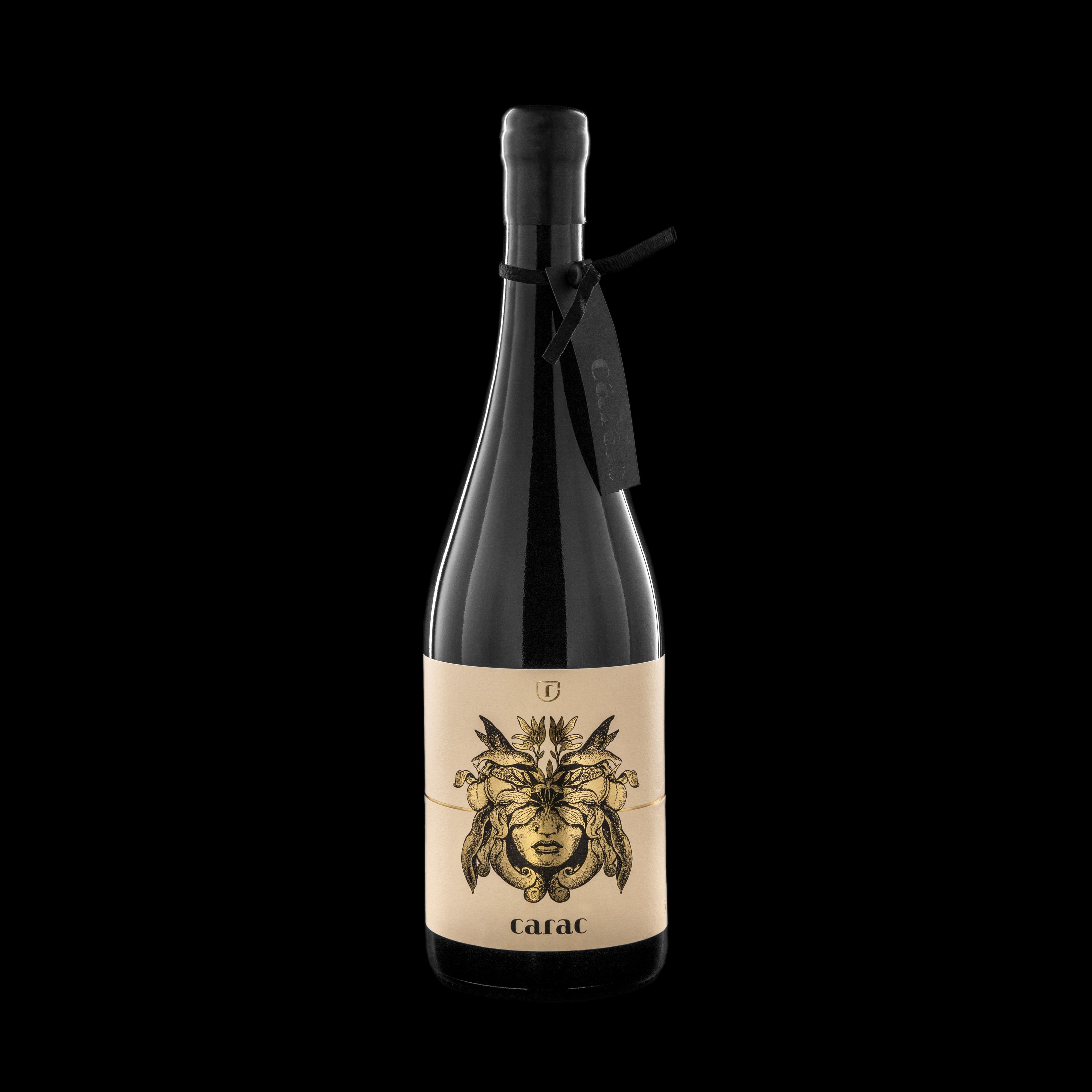
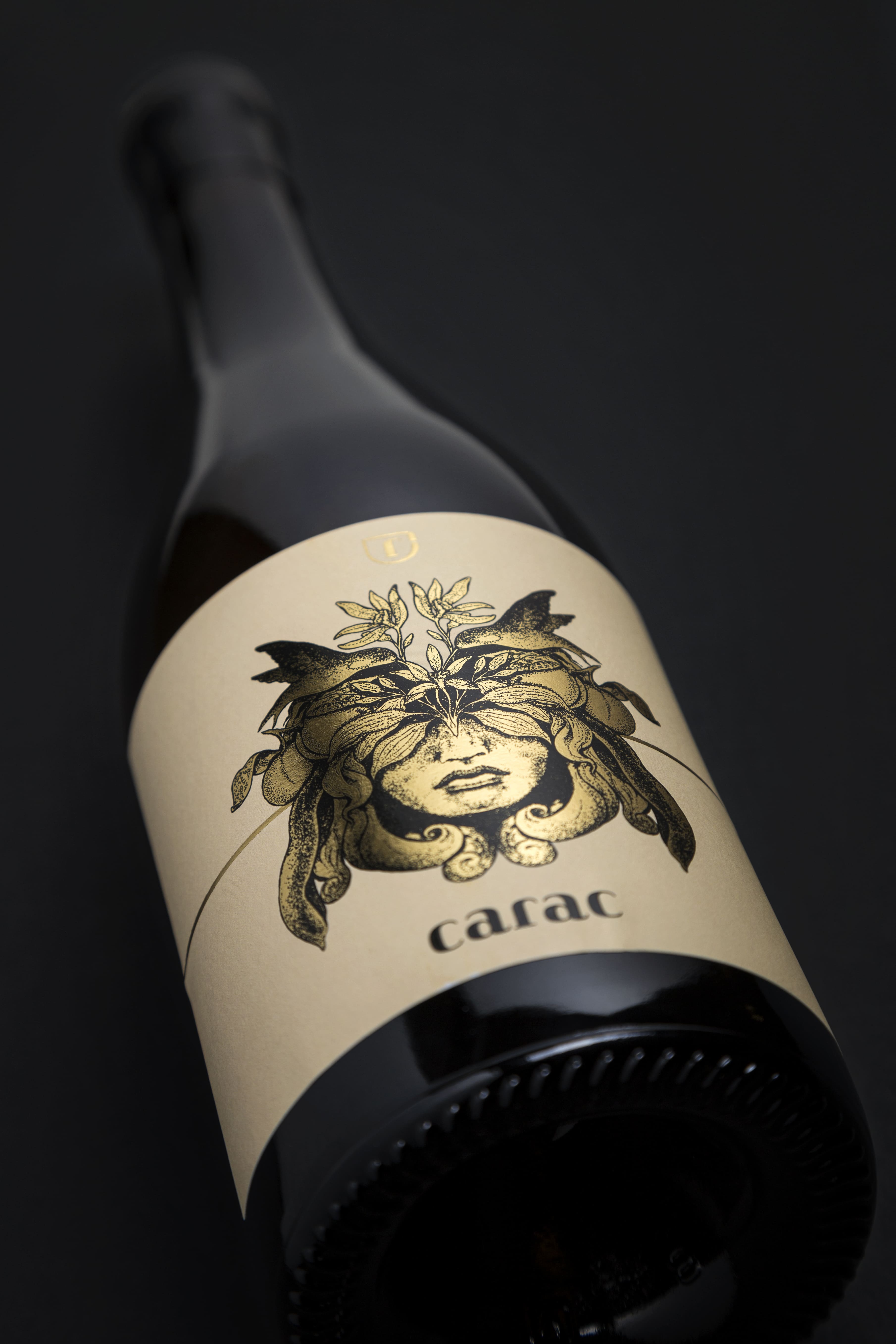
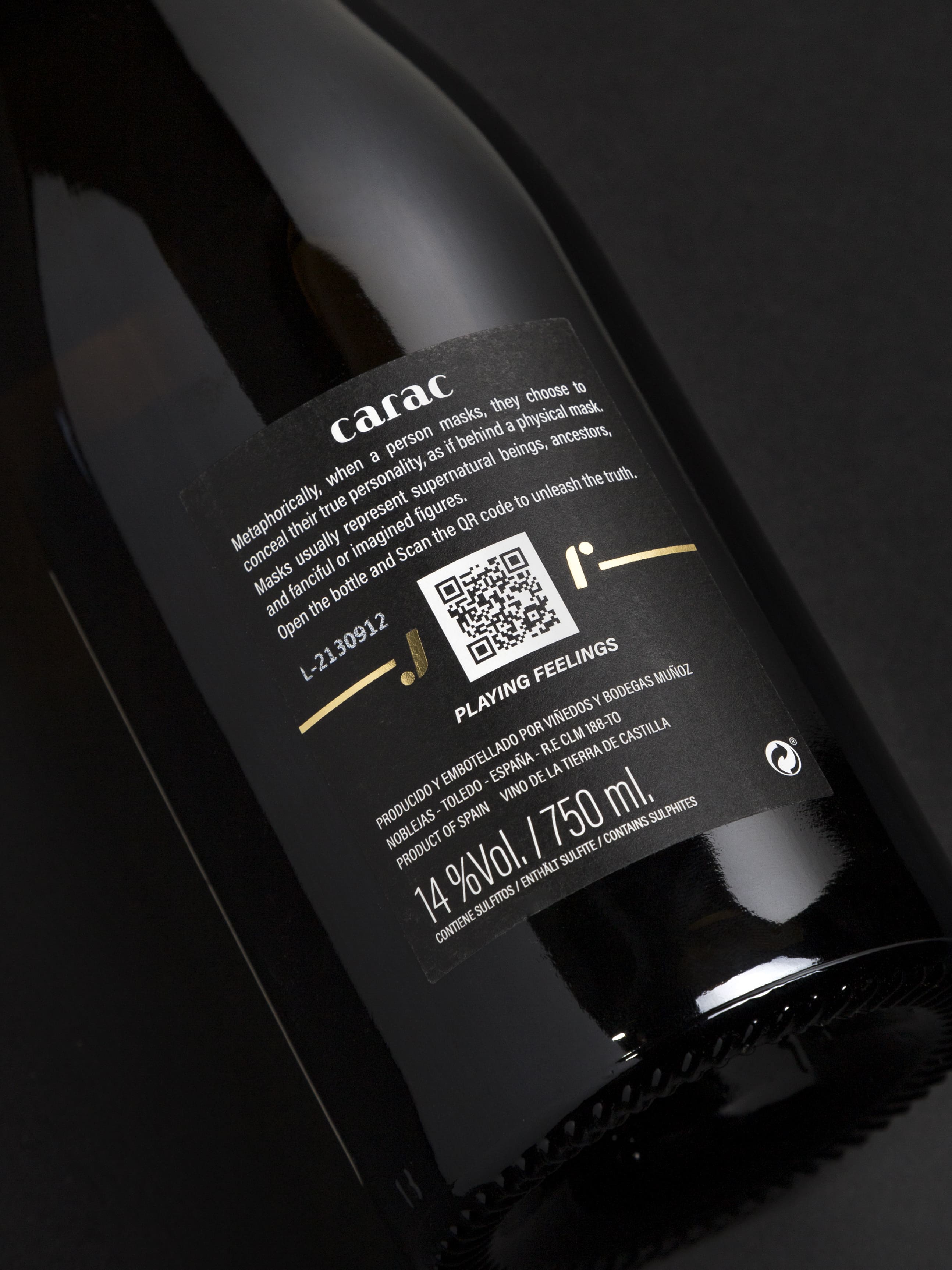
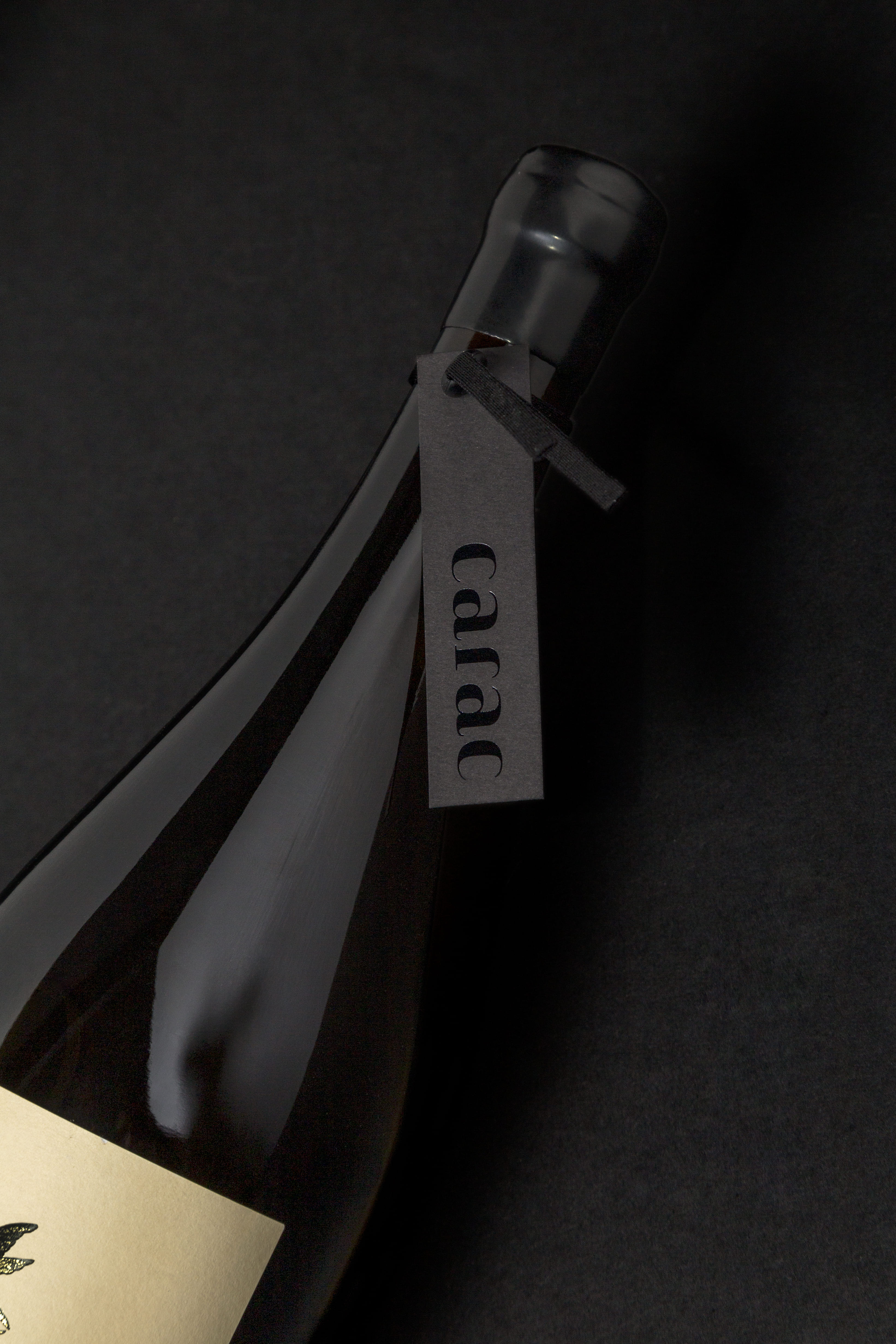
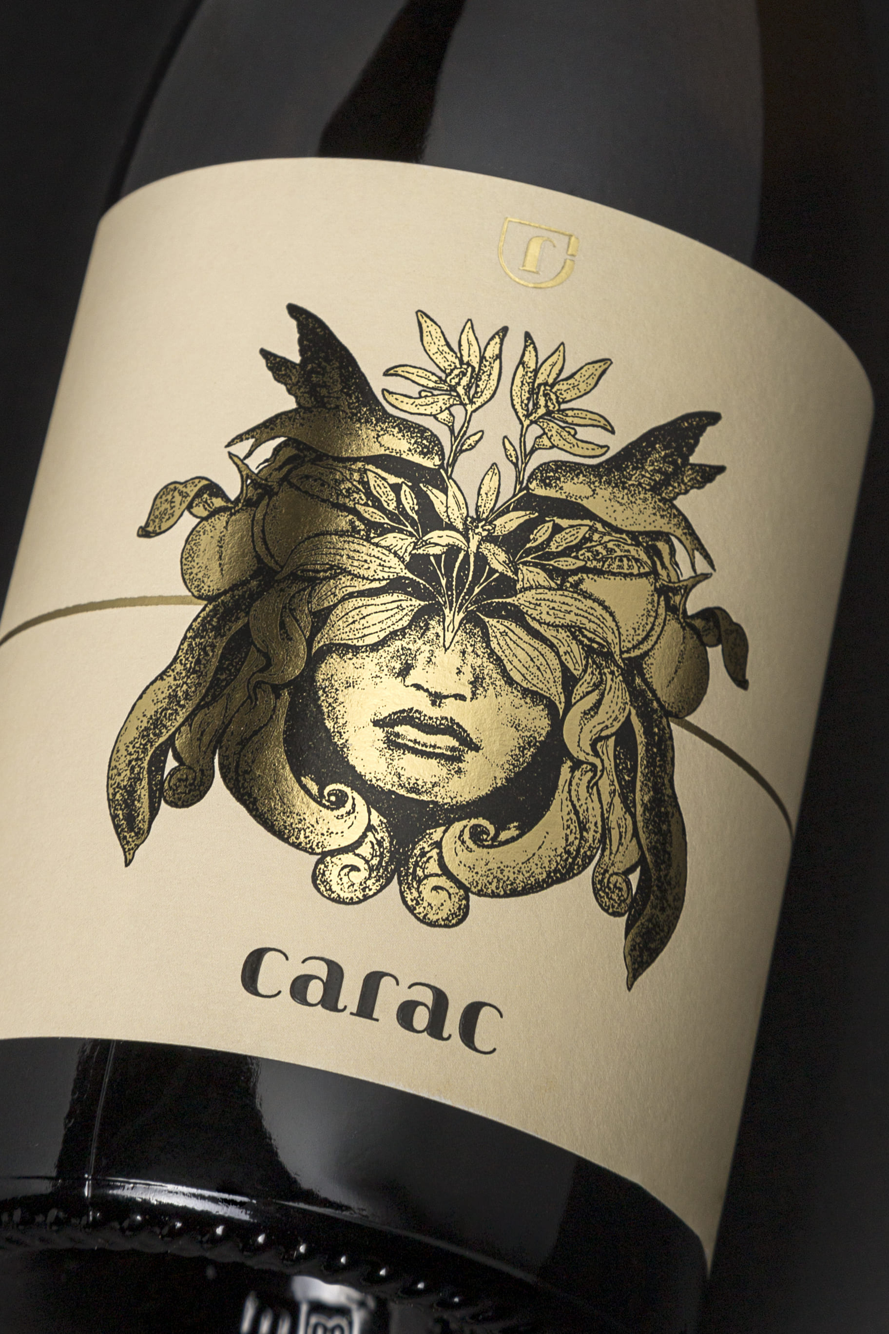
When we masqueraded, we decided to reserve our true selves for a select few. The virtue of Carac lies in hiding its flavor and potency behind a white wine mask. Carac is about the marriage of music and wine as a unique sensory experience. The DJ and wine lover Jordi Ruz has selected and mixed themes that marry perfectly with the wine tasting notes, creating a beautiful journey. The intense golden color of the Chardonnay grape after more than a year in American and French oak barrels, together with the aromas and flavors of peach, vanilla and its super creamy texture, were the inspiration to create this brand.
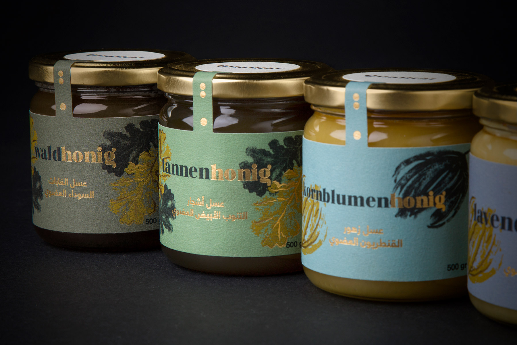
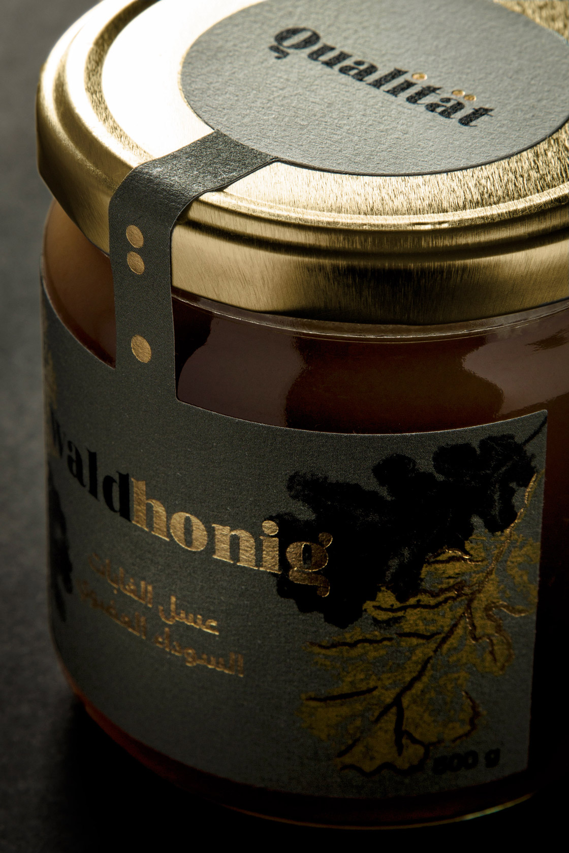
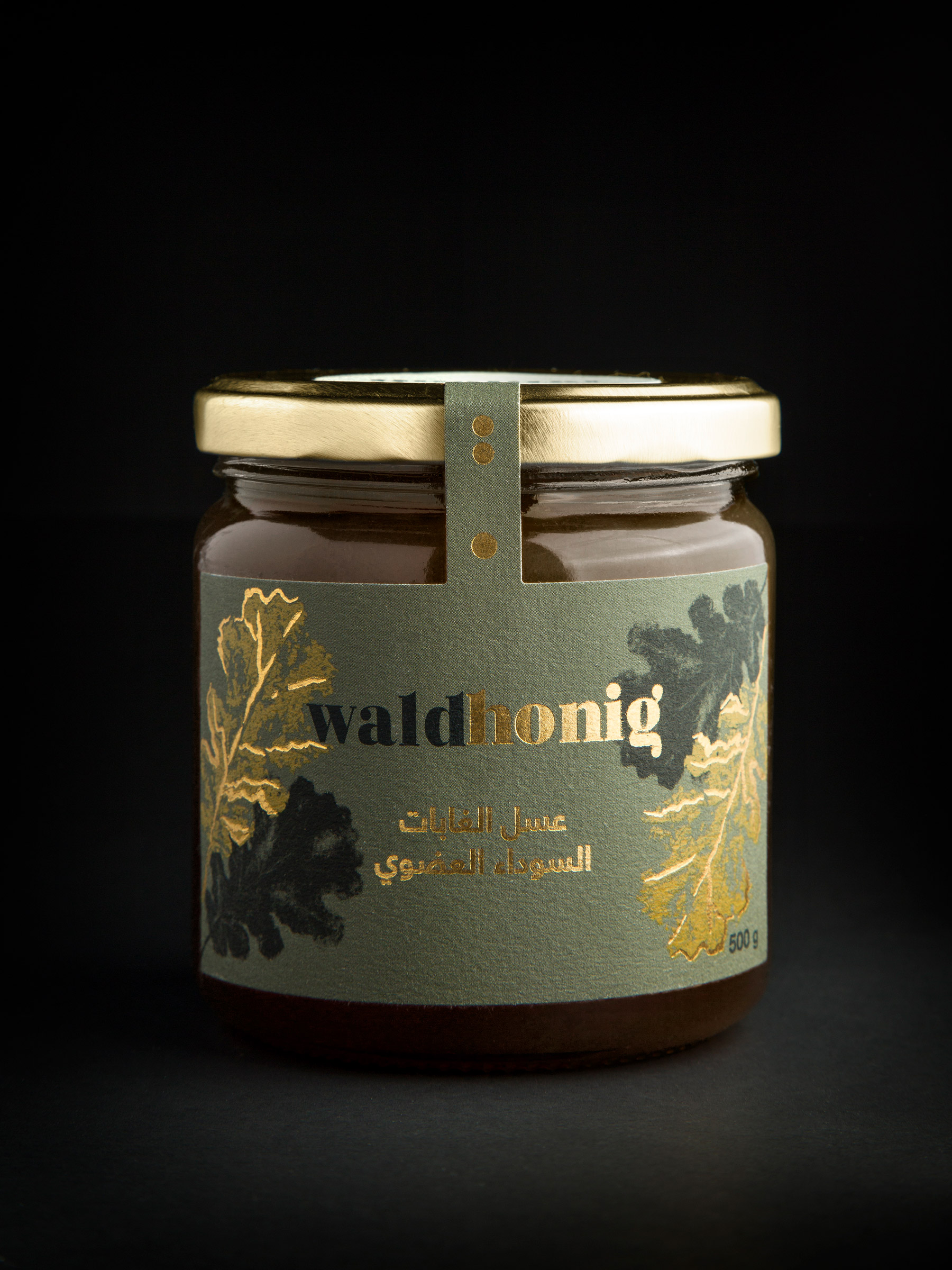
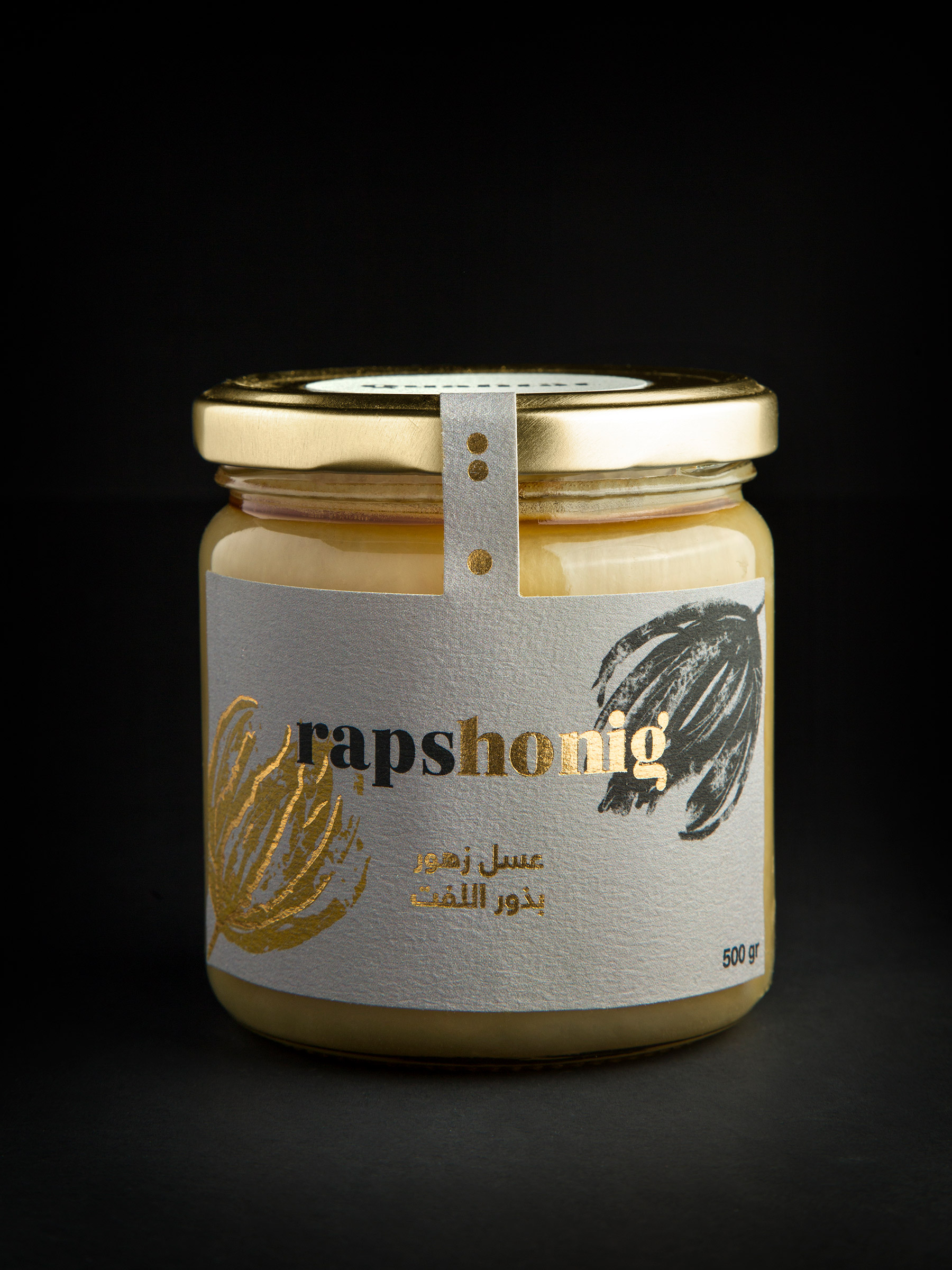
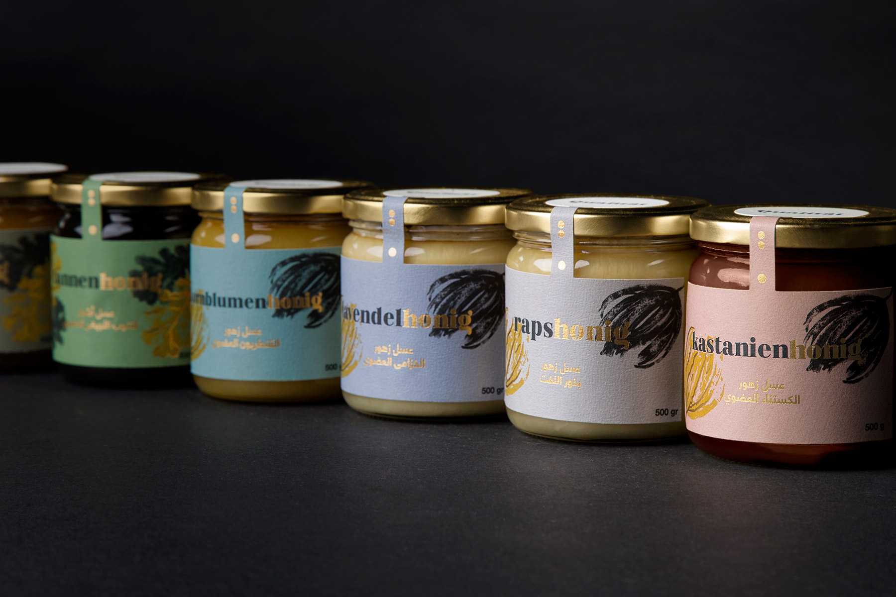
Designing the Qüalitat brand and packaging involves mixing visual cultures as different as European and Arab. Qualität offers a selection of German organic honeys, marketed in Saudi Arabia. The typography mixes wide and thin lines, reminding us of the organic movement of the honey. In the jars the typography divides into two colors (black and gold) wich represents the color of bees. The Arabic text shows a more minimalist typeface, to balance the visual design and give it a fresh touch. The dots present in the letters of the brand’s logo, become the last drops of a stream of honey wich seals the front of the jars, being the minimal expression of the brand.
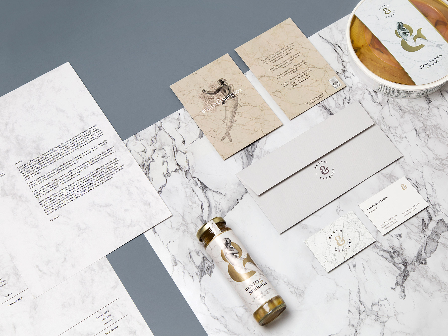
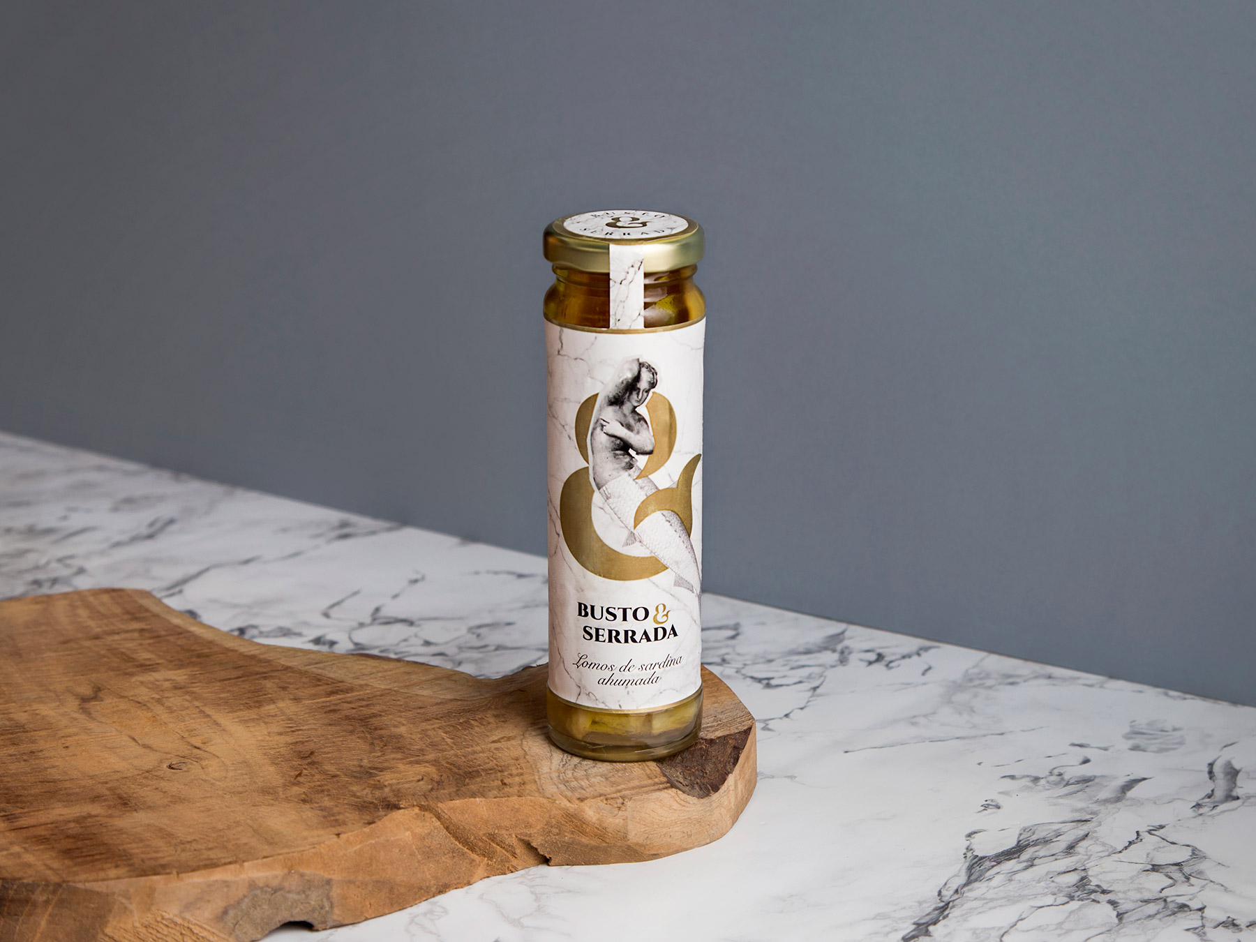
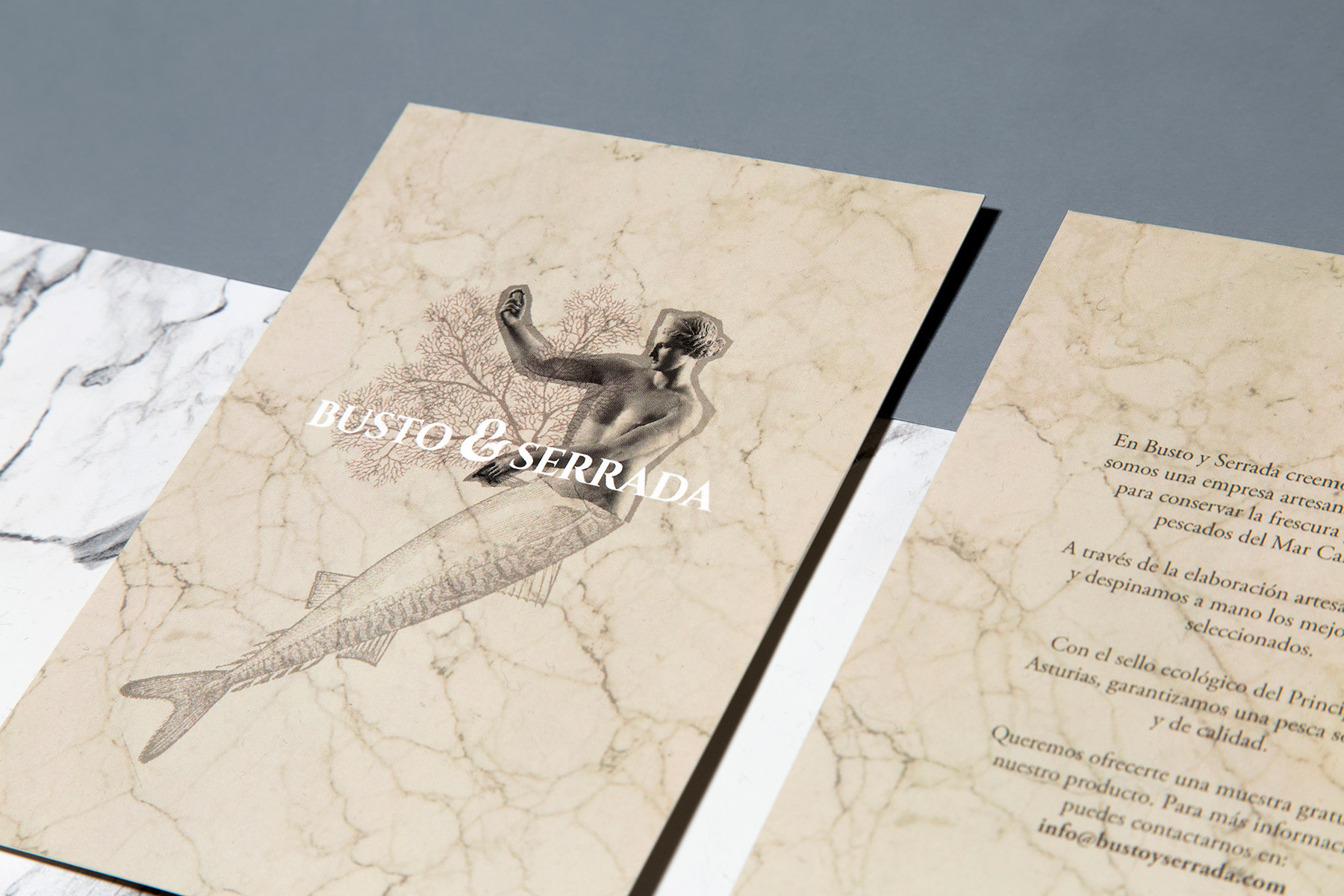
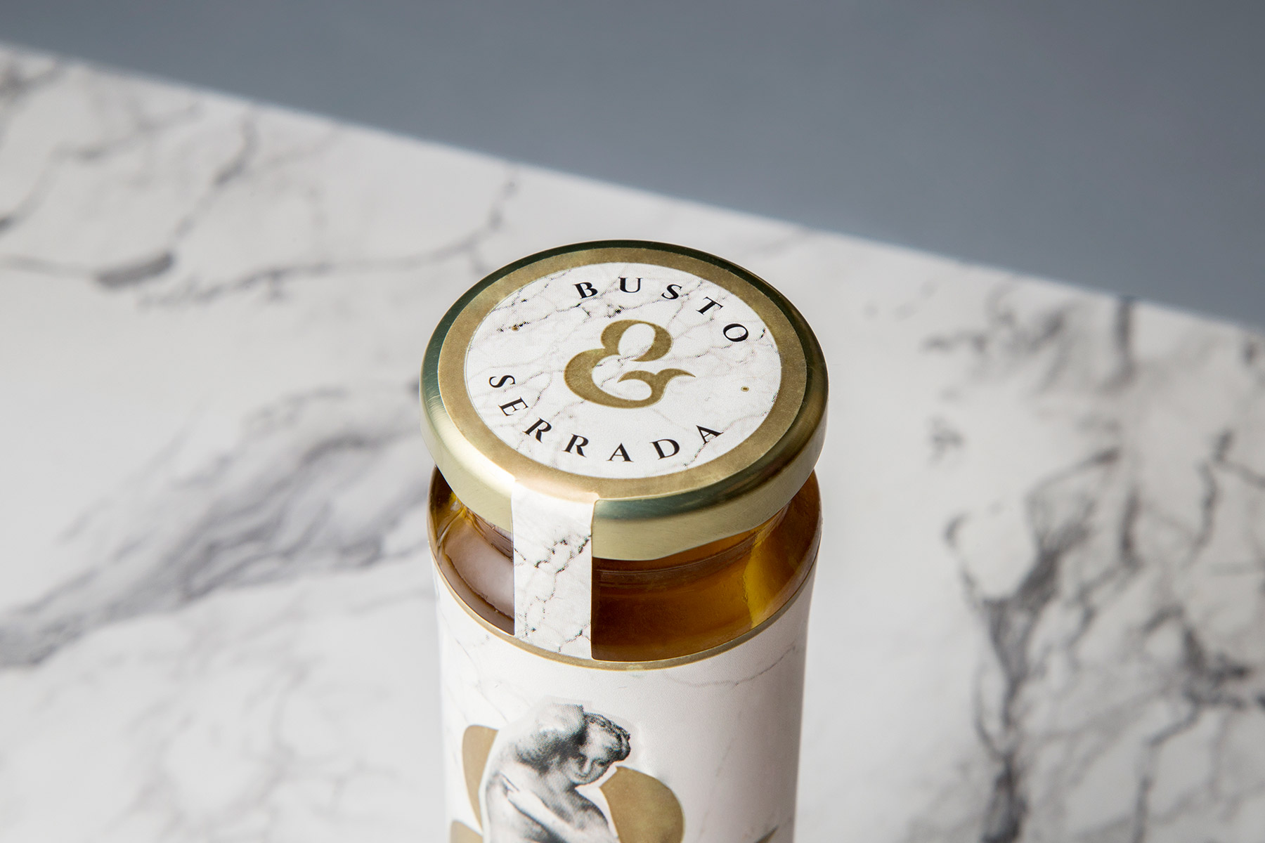
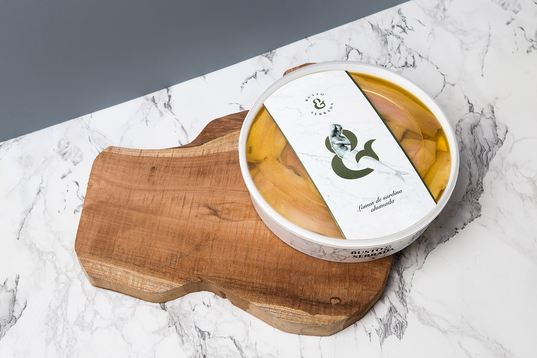
Branding and packaging for the Busto & Serrada preserves brand, a company that is characterized by the craftsmanship with which they treat their products. We have recreated this essence through the statues and engravings that make up the packaging collages. We use marble as a union between the kitchen, premium and sea concepts.
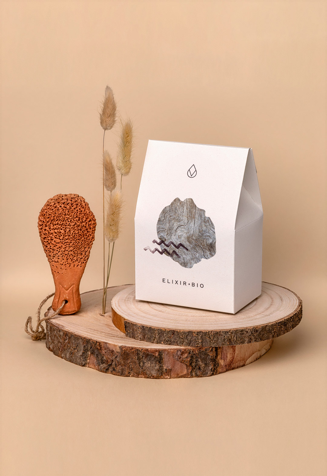
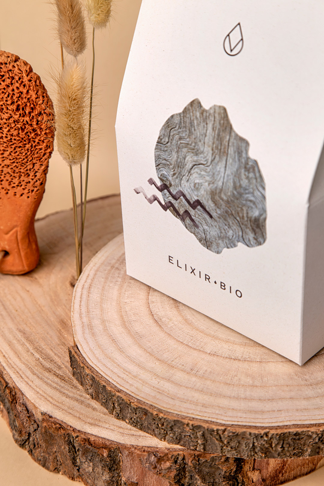
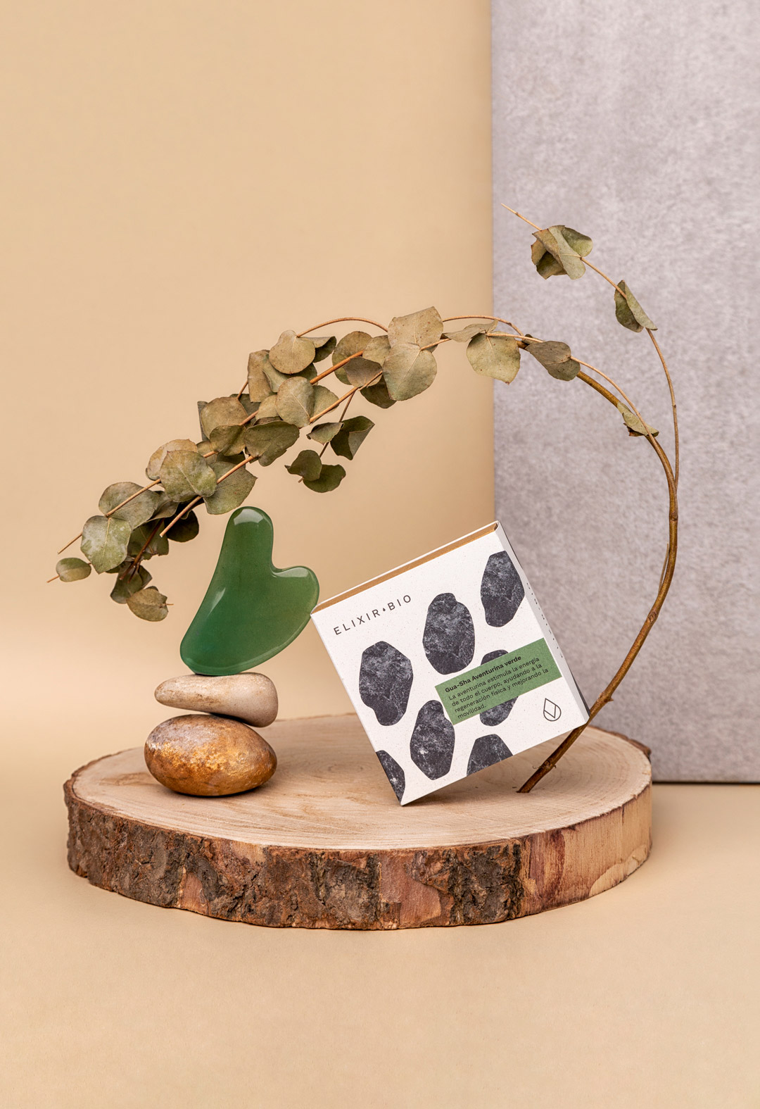
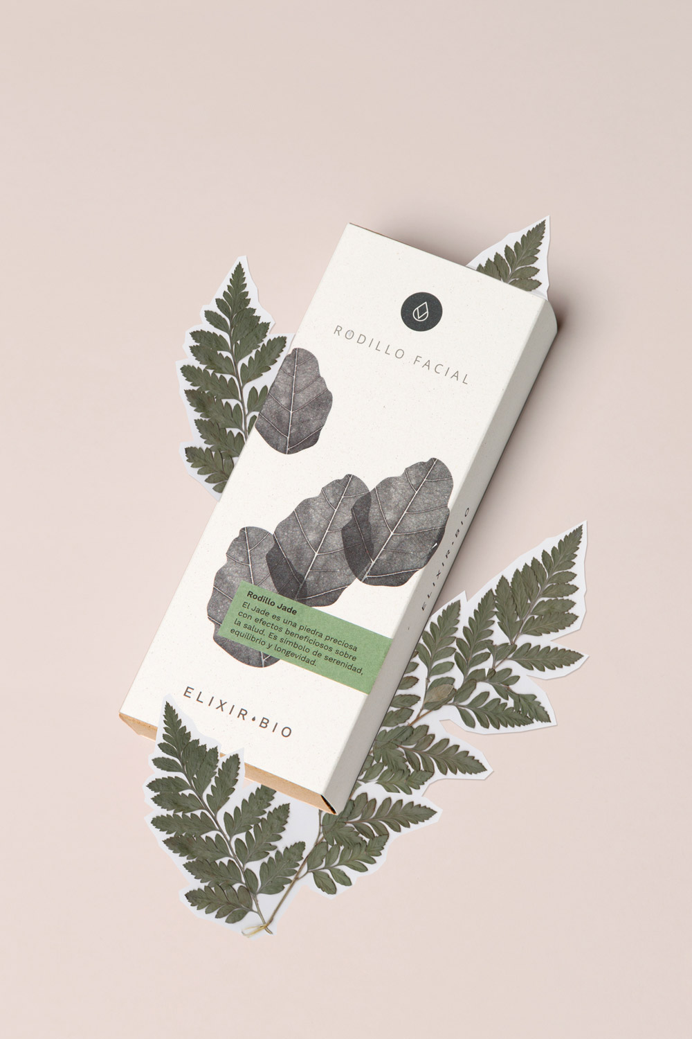
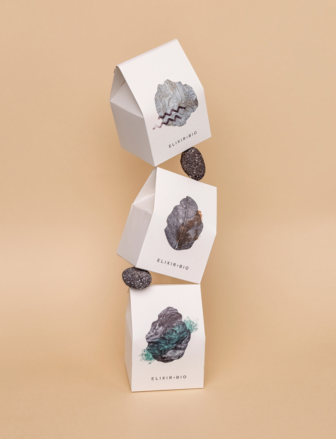
Elixir Bio offers a collection of different, original and quality products from various corners of the world. Ecological, handmade and sustainable, far from industrial manufacturing. These values are what we want to convey in its brand identity, full of graphic resources that transport us to the natural world, such as the shapes and textures present in different ecosystems.
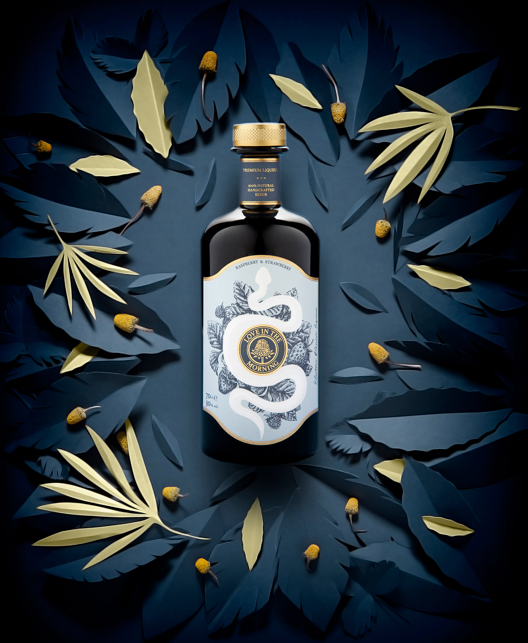
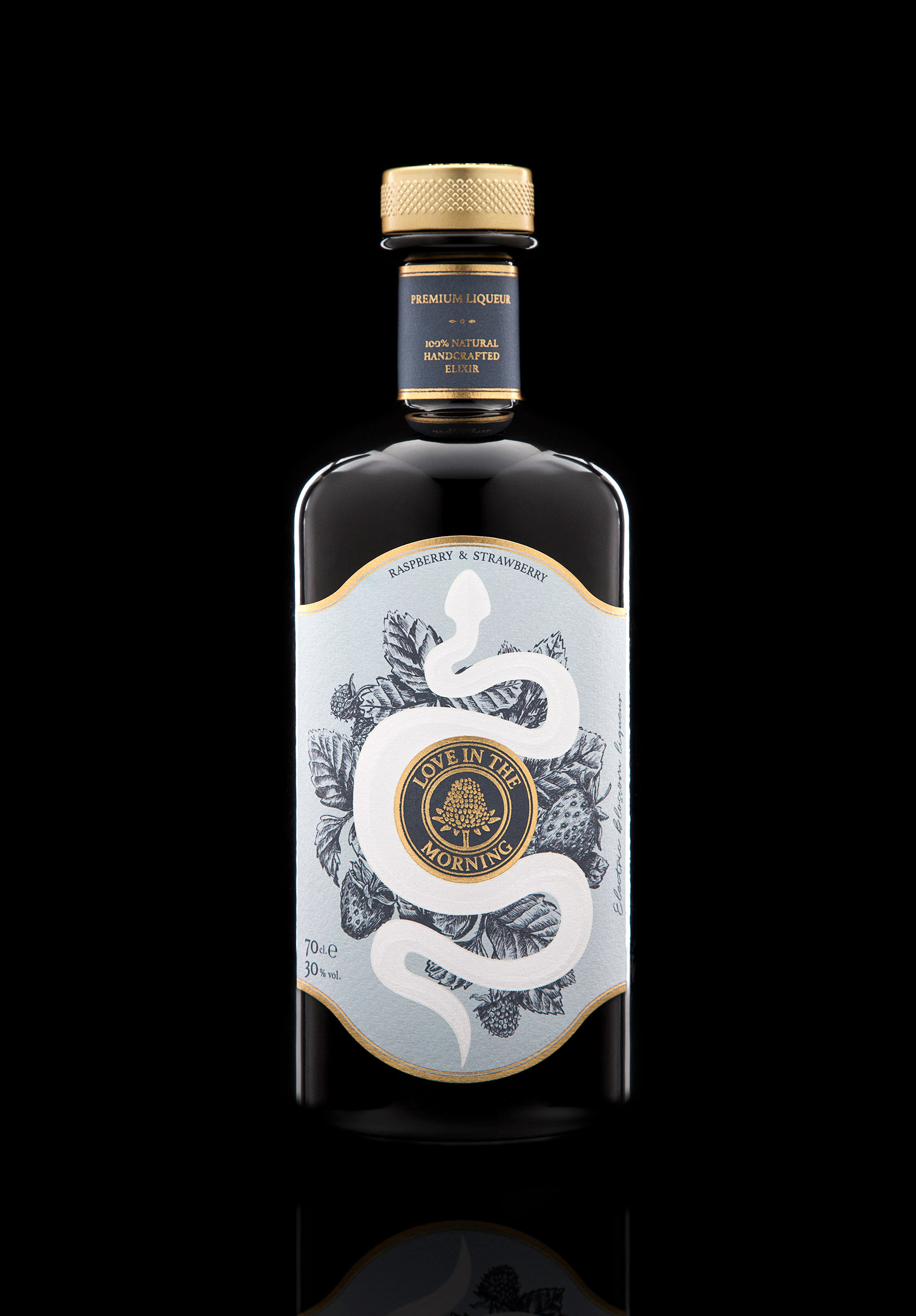
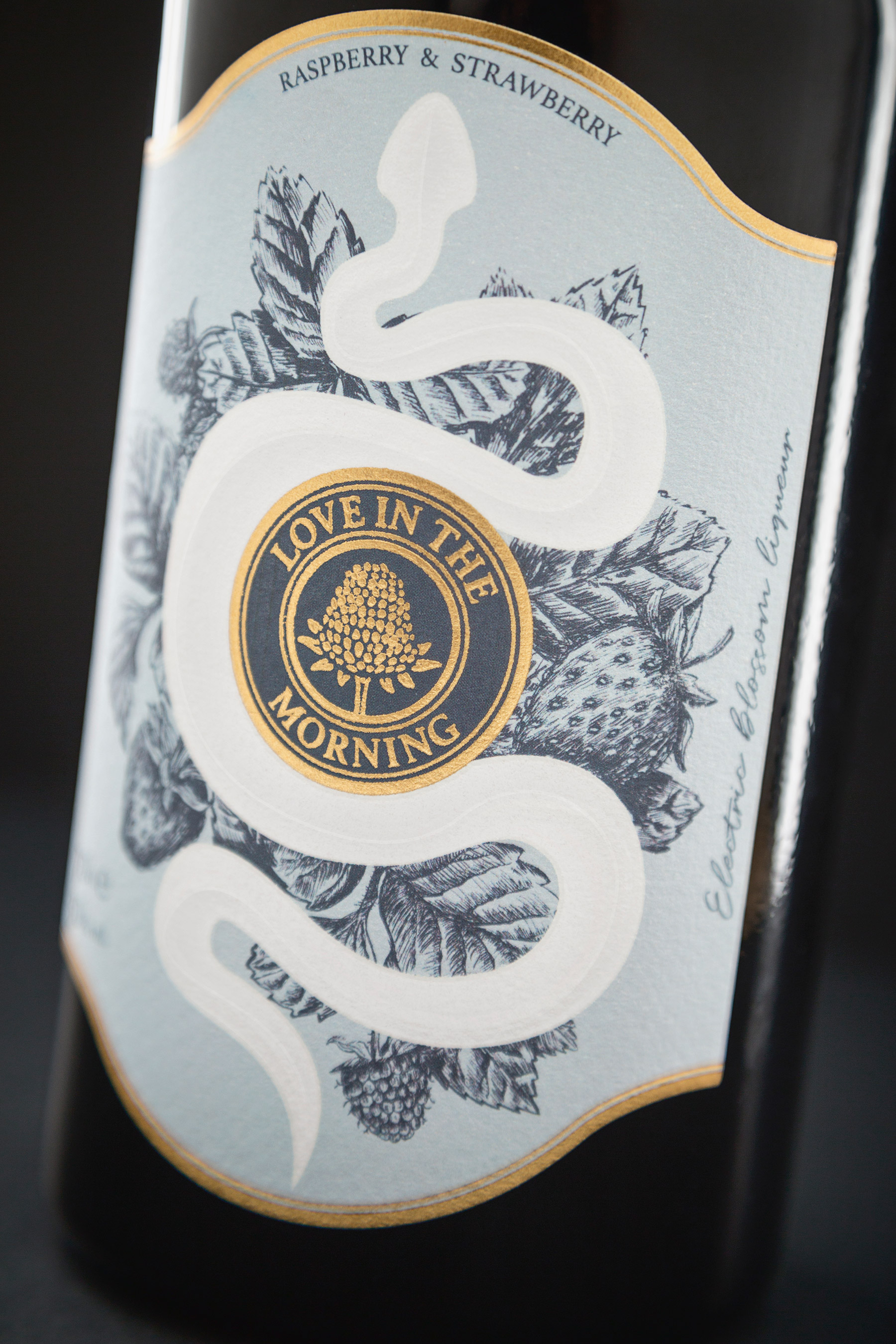
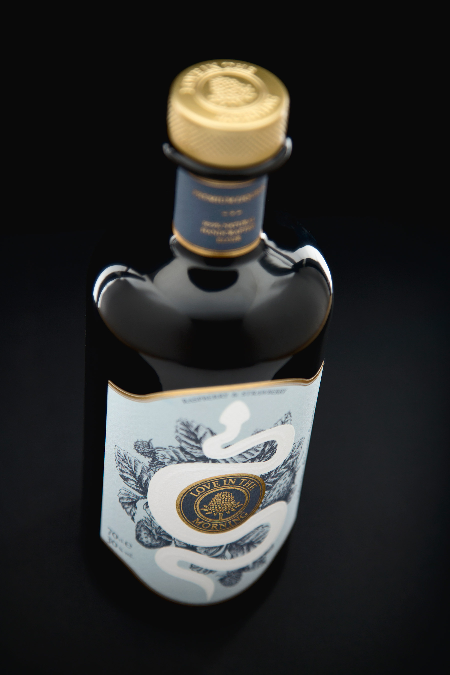
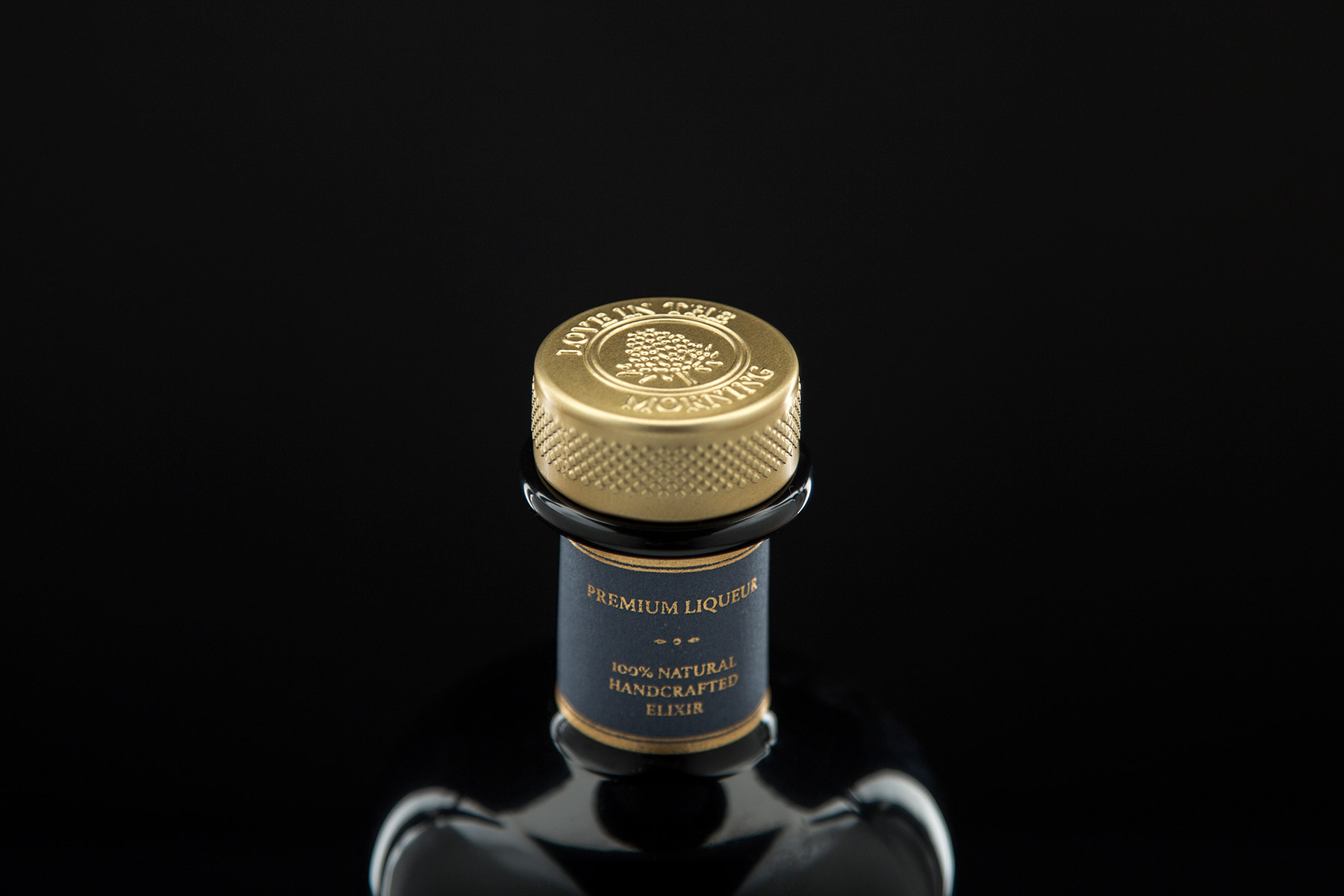
“Love in the Morning” is a handmade production liqueur made with raspberry, strawberry and «electric blossom», a flower that produces a soft tingling sensation in the mouth. The sensuality of the sinuous forms of the snake in composition with the wild elements transport us to Eden, in which the forbidden fruit is the flower itself.
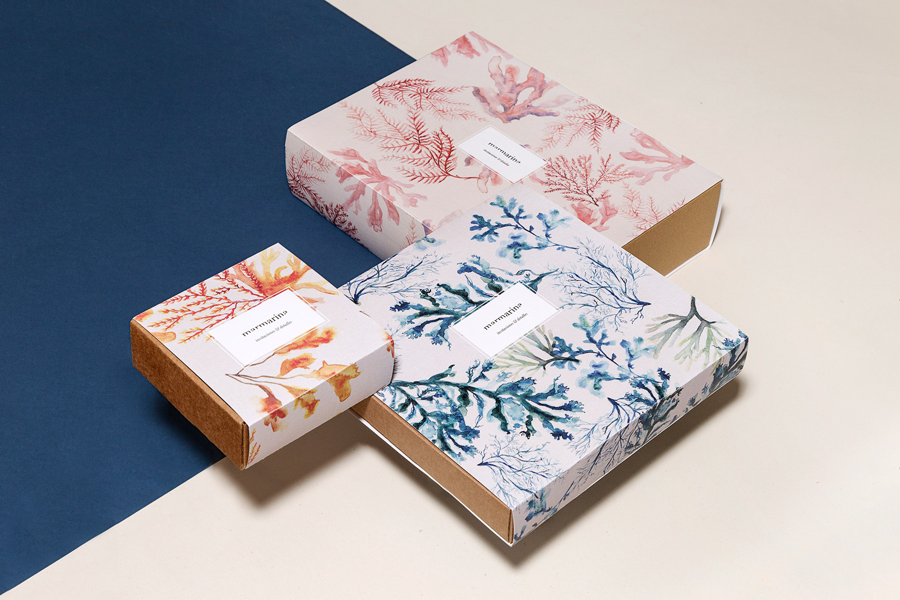
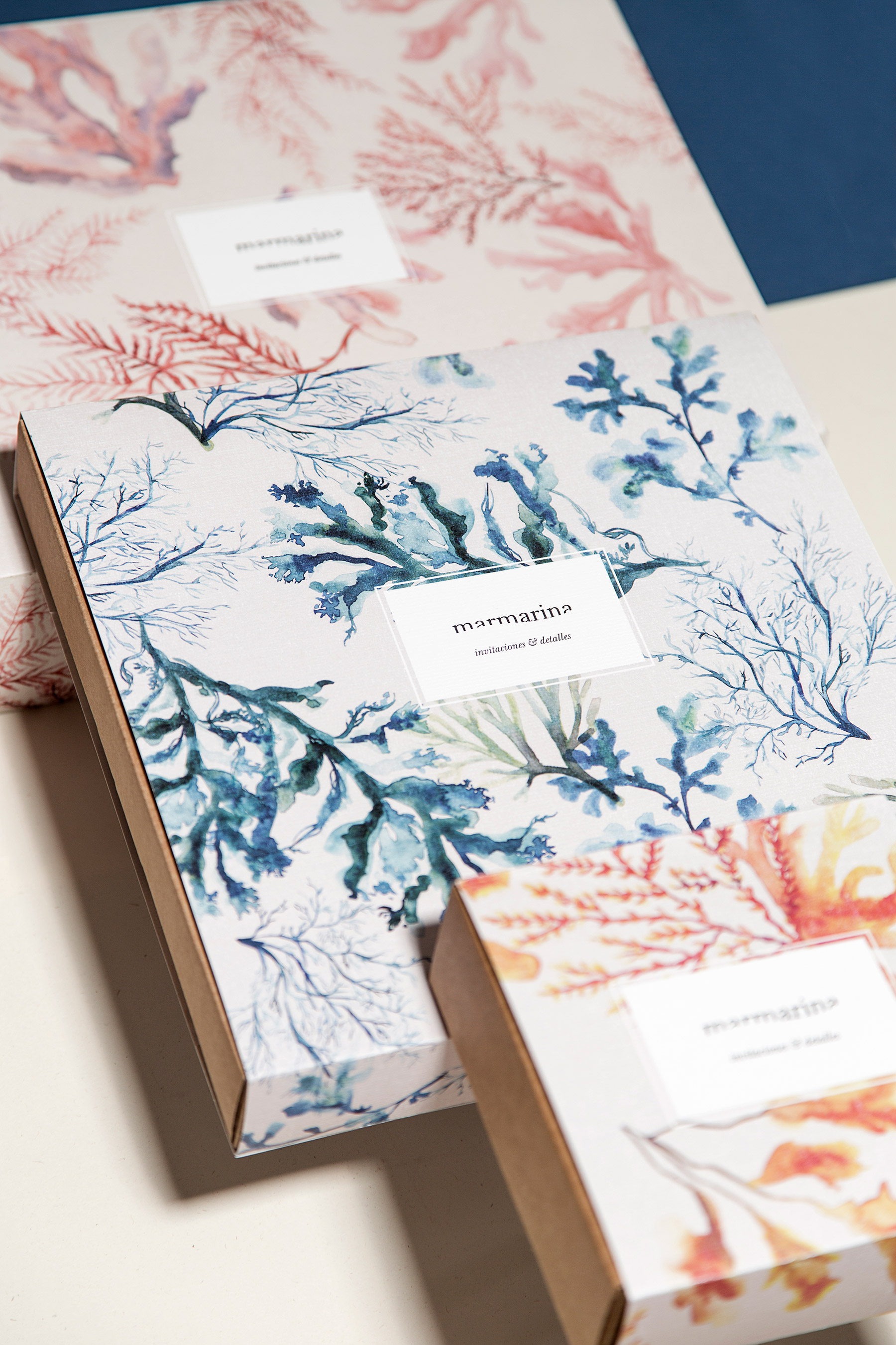
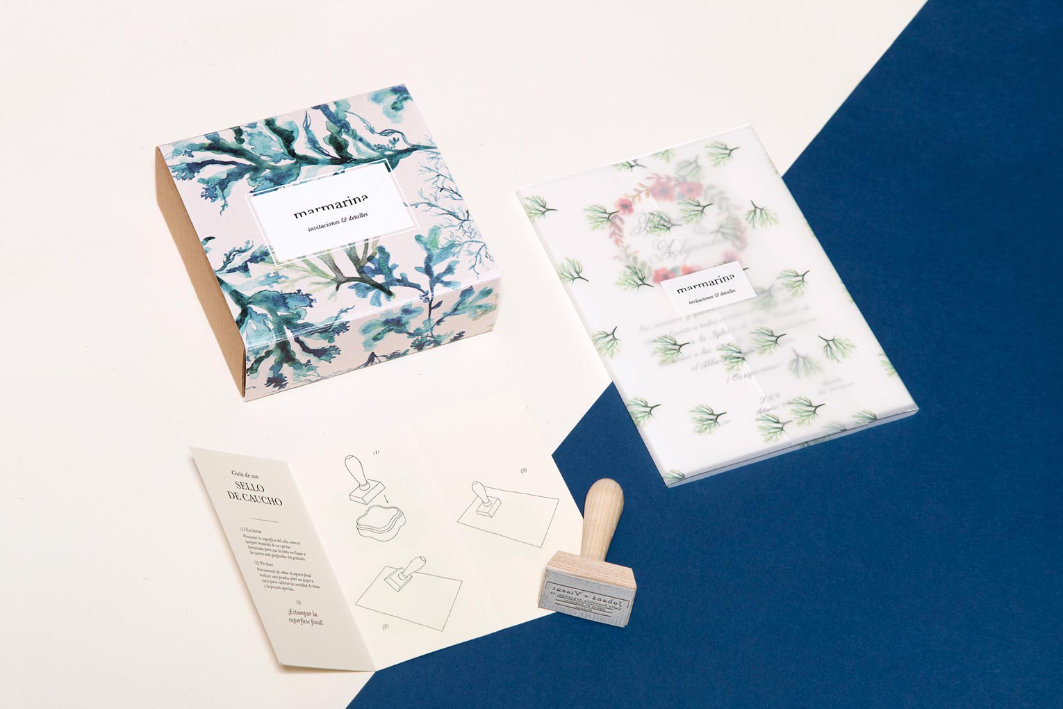
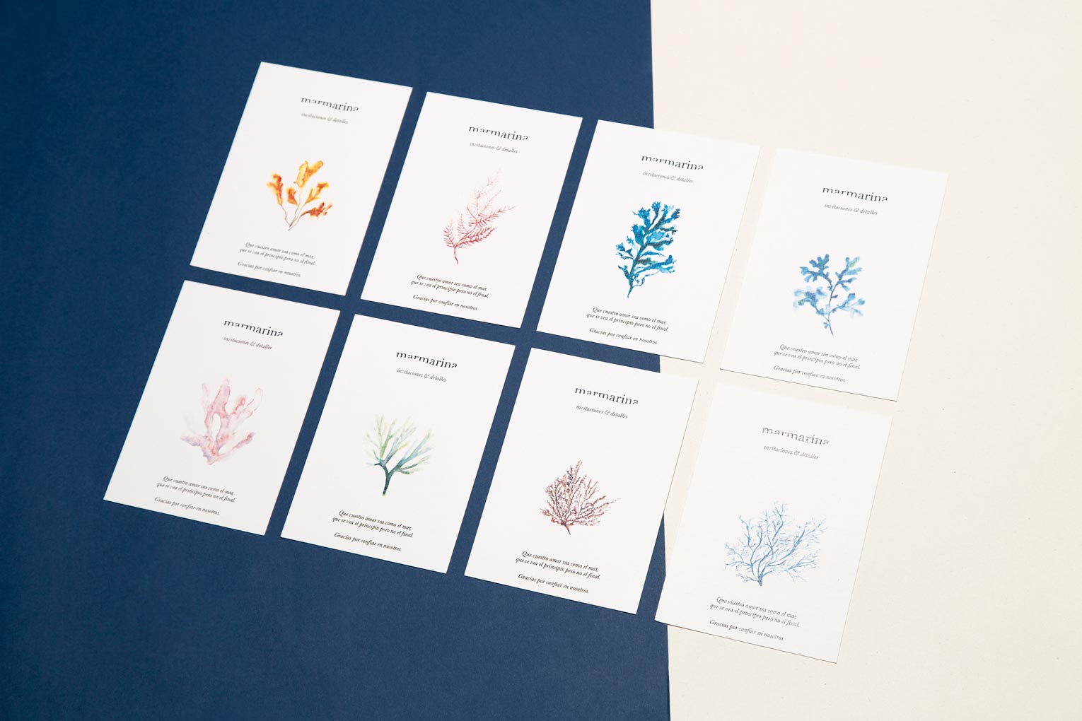
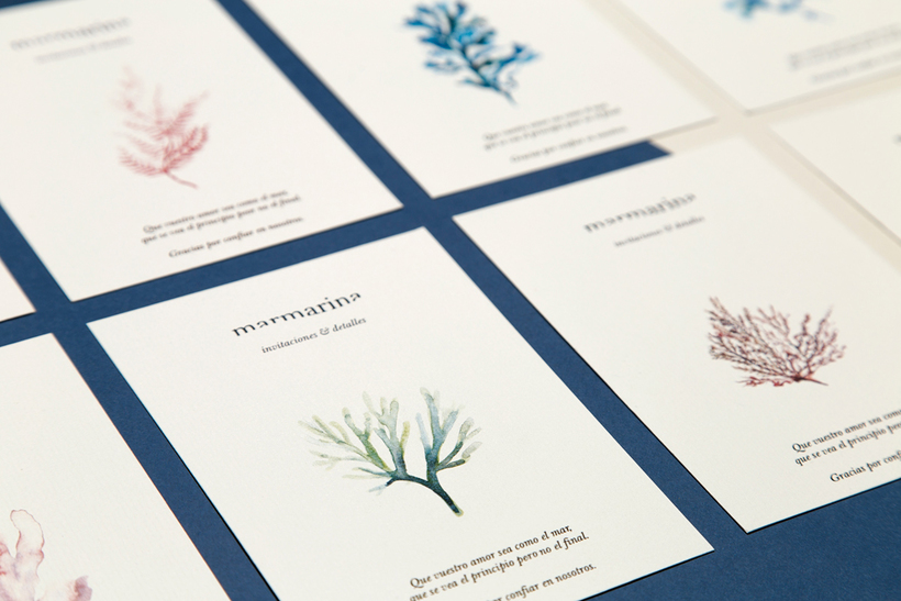
The sea transmits a characteristic sensation of peace and calm that awakens the creativity of those who contemplate it. A simple environment but at the same time full of details, which describes the essence of Marmarina: a wedding details firm born in the Cantabrian Sea. Hand-painted watercolors are part of the brand’s hallmark and have prominence in their stationery and packaging
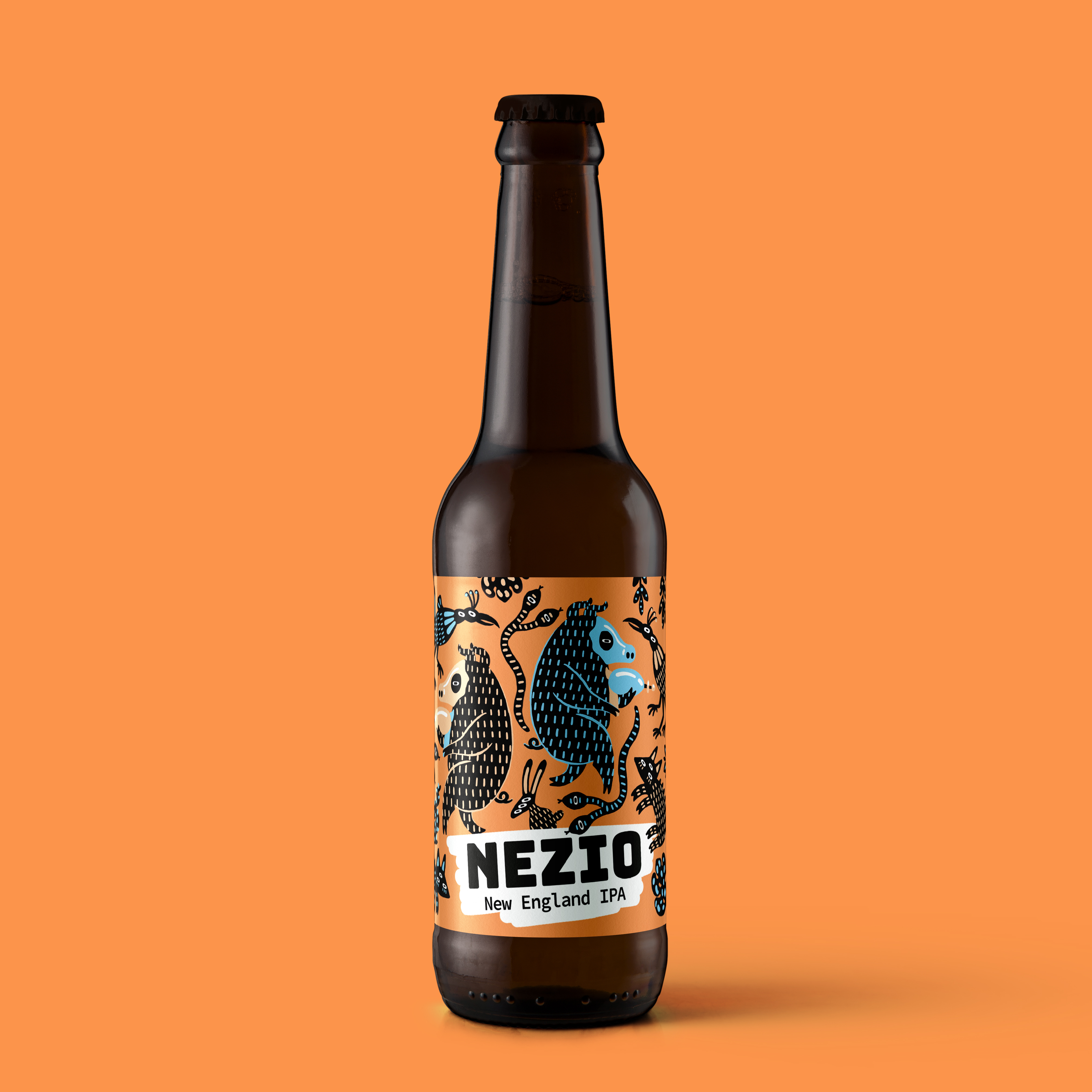
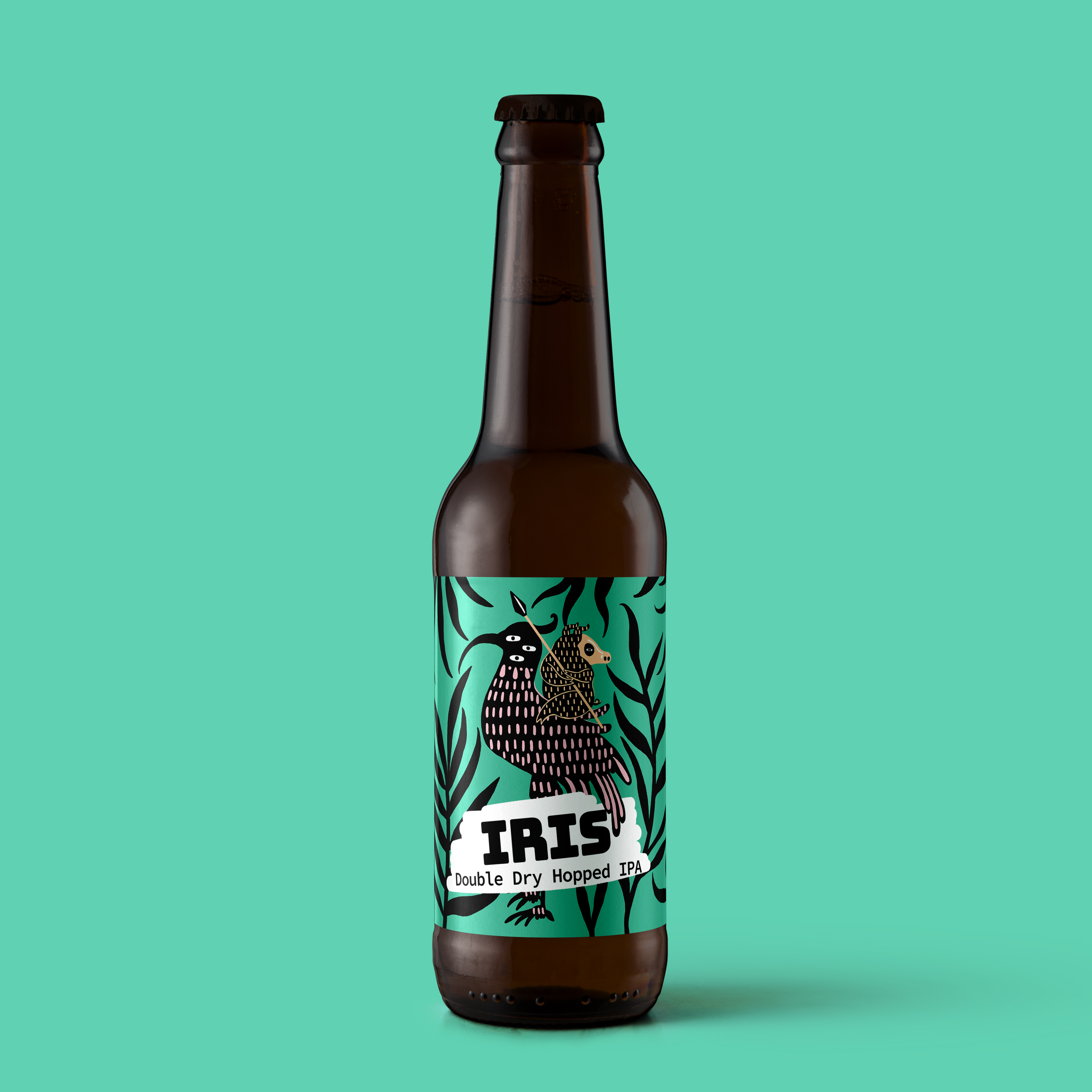
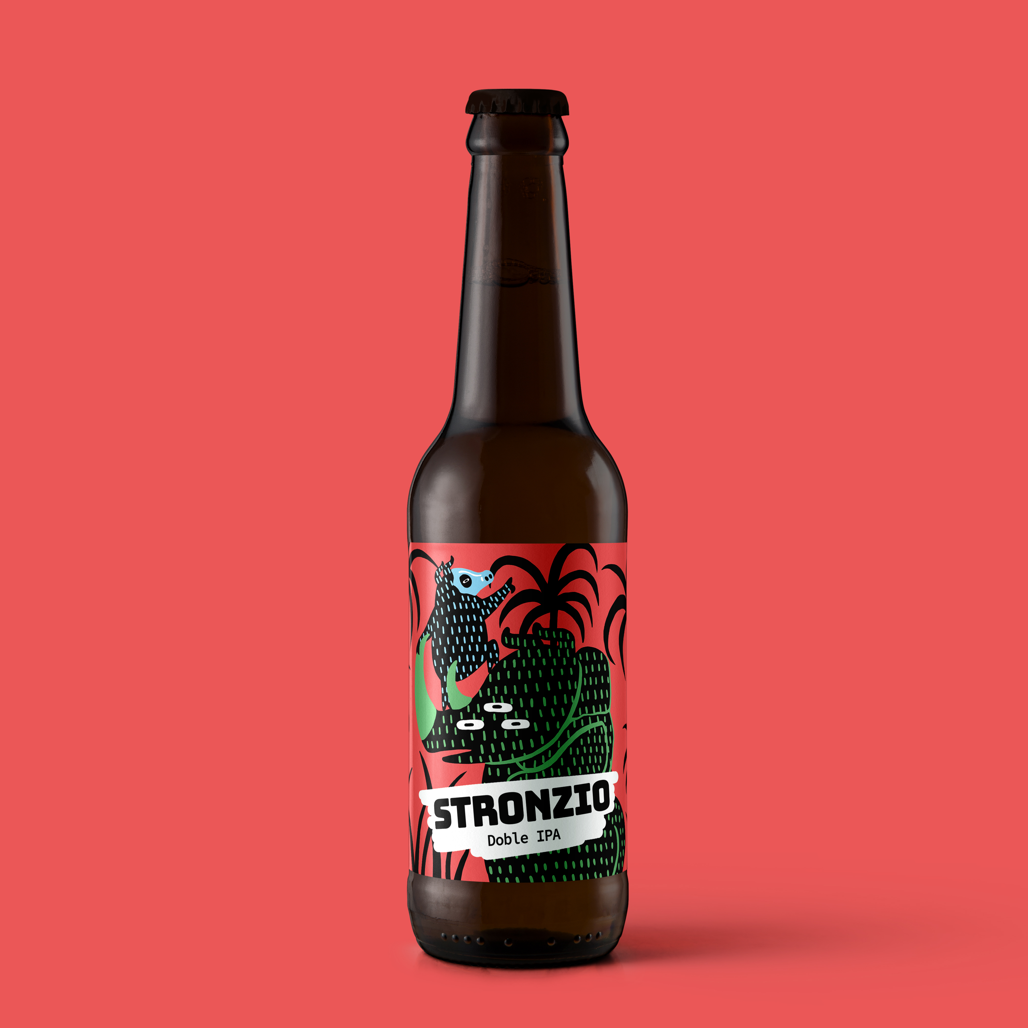
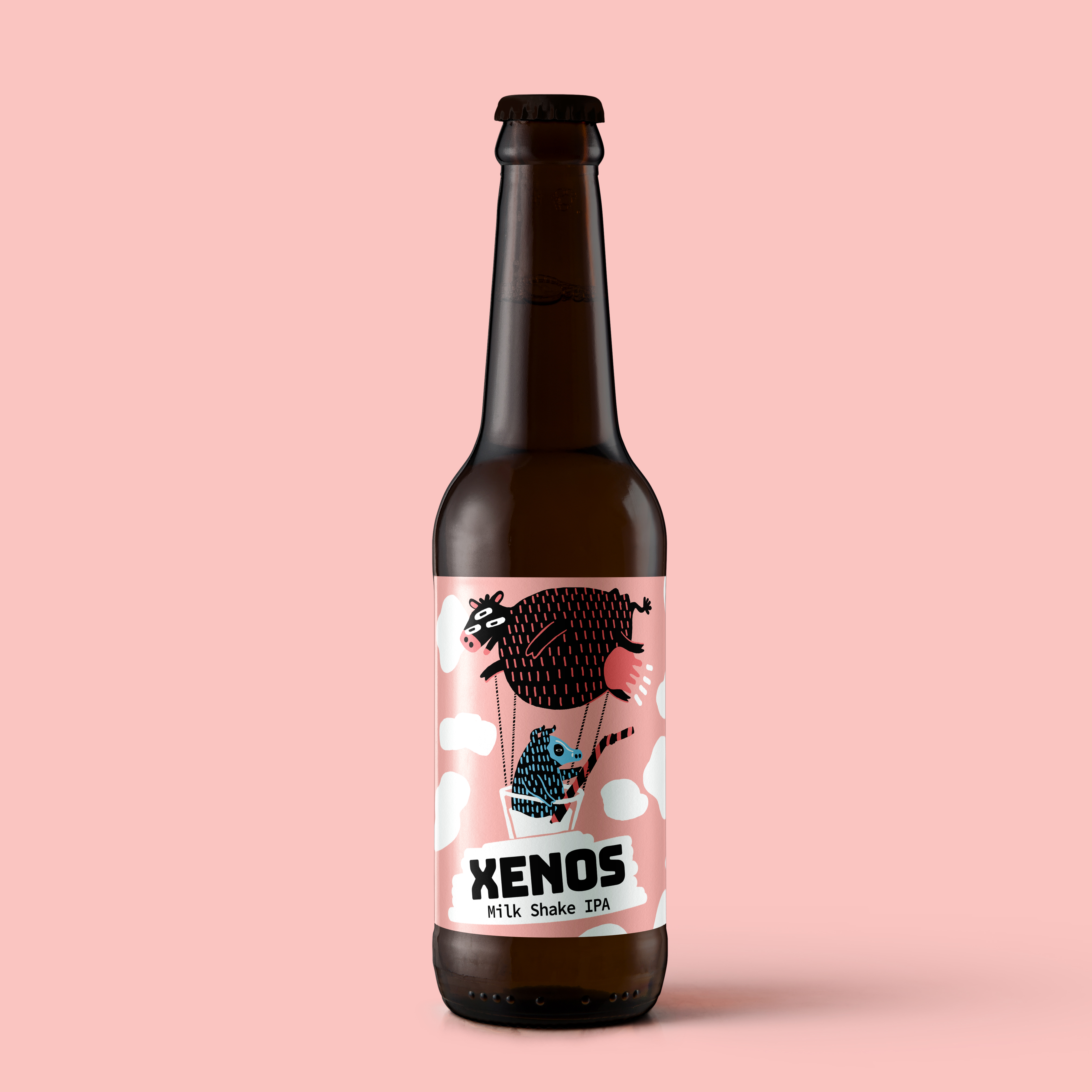
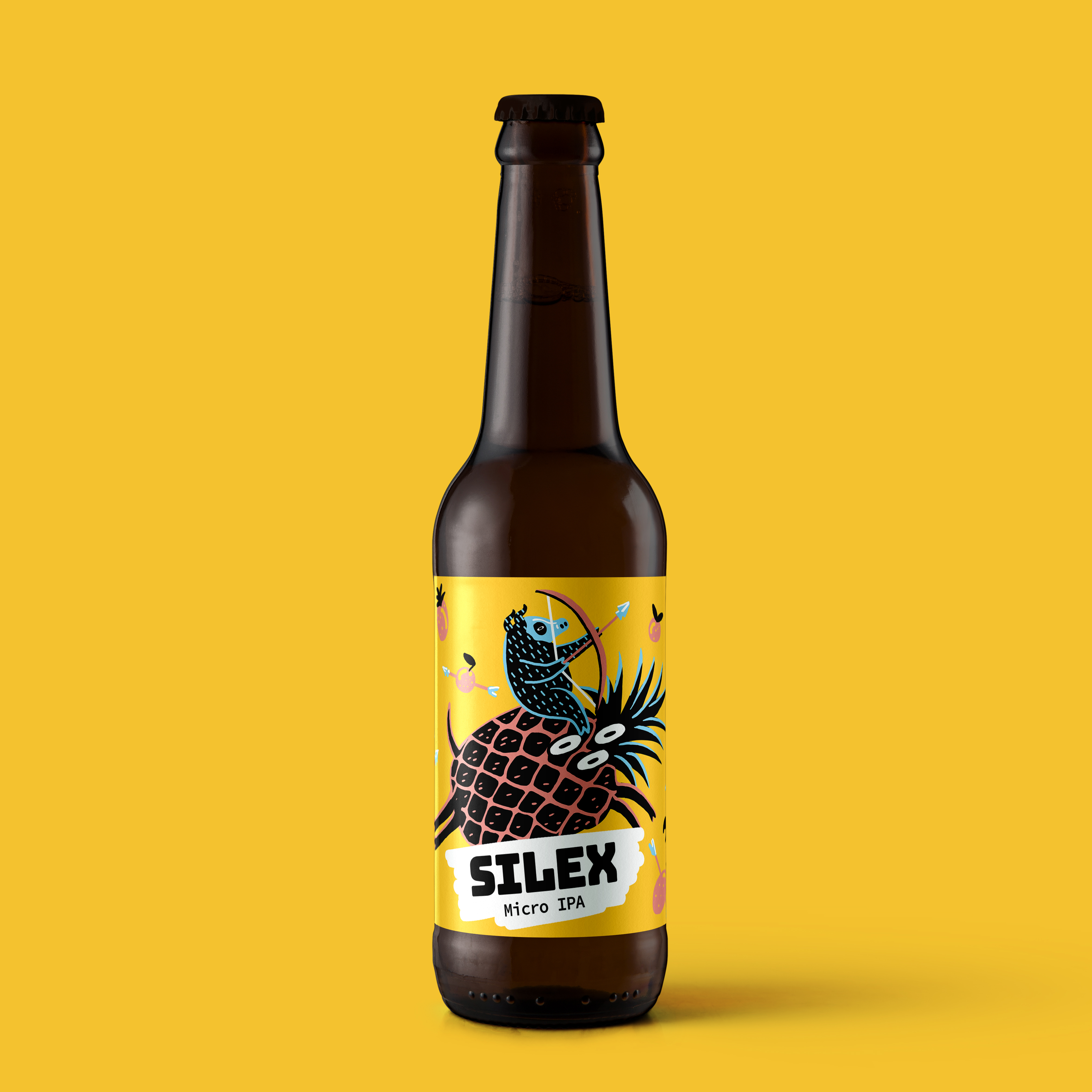
The Nuclear Pigs project focuses on designing a collection of labels for a line of craft beers produced by a small independent micro-distillery. The goal is to break away from the traditional aesthetics of the sector by embracing a bold, irreverent, and highly recognizable visual language that stands out on shelves crowded with similar products. Each label works as a small narrative graphic piece, where color, illustration, and humor take center stage. The core concept revolves around the “nuclear pigs”: mutant, exaggerated characters placed in chaotic, playful, and slightly absurd situations. These pigs become the heart of the brand’s identity, symbolizing rebellion, experimentation, and an uncompromising artisanal spirit. The color palette is intense and vibrant, using strong contrasts to reinforce the brand’s mischievous attitude and instantly capture the consumer’s attention. The typography is bold and dynamic, supporting the light-hearted tone while maintaining clarity and visual consistency.