
We are a strategic brand design agency, based in London.
We create and rennovate brands and this is often manifested in packaging design.
We believe that beauty creates desire and that storytelling makes memories.

A visiting dignitary brought the gift of London dry gin to the Forbidden City, and in return the empress gave him a rare bird, held within a beautifully crafted cage. The exchange of gifts is a traditional part of Chinese culture, to show solidarity when attending a formal meeting, where tea was served. The Forbidden city had its name-sake because outsiders were refused entry, until Empress Cixi began to relax these rules. The concept embraces tradition: easily understood by the Chinese Baijiu drinker, whilst also being forward facing, to establish a new completely category in China. The liquid combine Classic London dry Gin botanicals with a hint of infused premium Chinese tea and locally grown citrus fruits. The range includes a juniper Variant, as well a mandarin liquid and a gin with a hint of Yuzu. The premium spirit is idea for making a Gin Martini with depth and complexity, or a refreshing G&T. The project includes brand strategy, naming, flavour innovation/range architecture, bespoke 3D bottle design, and brand identity, with all illustration and typography being done in house at Intertype Studio. The bottle is available to buy in T House Time, a chain of premium Tea Houses, as well as being sold online. The Gin will eventually be available world wide. The bottle structure is inspired by & functions like a bird cage, whilst the glass stopper is influenced by the traditional head-wear worn by Empress Cixi. The illustration style & technique is inspired by a Quing dynasty vase and creates the illusion of the bird held within the cage. The bottle is hangs within the box to complete the concept. The paper label reflects the layout of the forbidden city in plan view, with the empress positioned to the rear centre of the courtyard, where she would typically host visitors.


Introducing a design by Intertype Studio for 'Natty Boh' orange twist vodka. The brand is the local price of Baltimore, Maryland, and is currently known for its much loved brewery. The work moves the brand into a distilling space, and is inspired by the spirit of mid-century optimism; a time of positive ideals and astonishingly simple brand messaging. The bottle takes cues from the famous sign that sits atop the brewery itself, whilst the graphics are inspired by the labelling and wax seals found on fruit labels of the 1950's. the branding invites you to 'live pleasantly' and enjoy a simpler kind of lifestyle, taking you back to a laid-back time when everything seemed less complex. The liquid is inspired by a famous local Baltimore favourite: the "Orange Crush" cocktail. The bottle closure is dipped in orange wax and features a gold pendant detail, which was inspired by an original gold cufflink collectable, which was made for the brand in the mid-century and can still be found for sale on auction websites today. The cufflink is suitable attire for "Natty Boh" himself, the nickname of the charming character who is the mascot for the brand and has long been an icon of the city of Baltimore. The dictionary definition of "Natty": Stylish and Tidy in very detail. It therefore follows that the design should live up to this! The bottle label features gold foil details, debossing and blind embossing, and an illustration of the oranges in a bold and simplistic 1950's style. The bottle comes in a tissue paper wrap which features a repeat pattern of the brand iconography and messaging and is reminiscent of a green grocer’s orange wrap, giving the impression that you're unwrapping a fruit when you first unveil the bottle. The almost spherical bottle shoulders exaggerate this effect, and this circle device is repeated throughout the design in an echo of the unusual proportions of the brand icon himself. These effortless and yet beautifully crafted details elevate the brand to a premium craft space. The liquid credentials are also enhanced with batch numbering and the signature of the distiller on the side of the label. As Natty Boh himself exclaims... "Oh boy, what a vodka!"


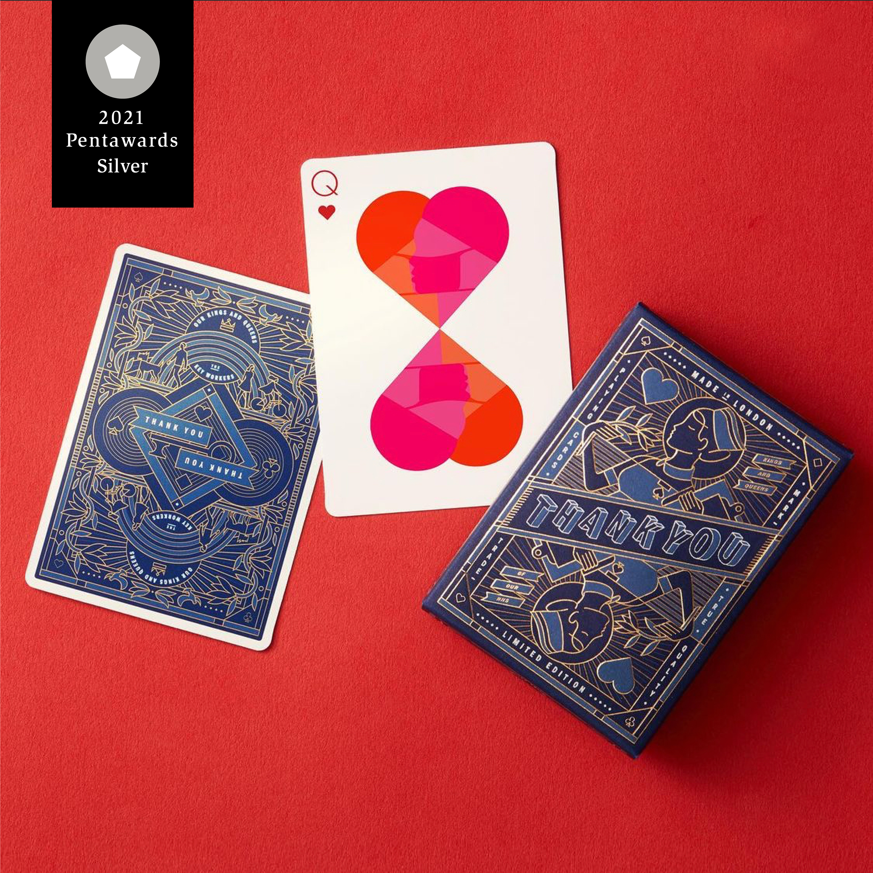
Last Spring we came up with the concept to create a limited-edition deck of playing cards as a tribute to the Kings and Queens of the NHS and other key workers who put themselves on the front line while the rest of us spent more time at home. The cards act as a long-lasting reminder of their dedication and bravery during the COVID 19 crisis, with all proceeds going to charity; 75% to NHS Charities Together, supporting the health and emotional well-being of those on the frontline of the NHS; 25% to Mind, which provides advice and support to anyone experiencing mental health problems, including key workers. 18 incredible artists and illustrators created their own interpretations of the heroes of the covid crisis, turning them into unique ‘royal cards’ cards for the deck, which was printed onto Casino quality stock by our highly skilled friends at LNS Print, London. The first limited edtion of 200 decks was launched on Instagram in July 2020 and quickly sold out, raising over £5,000 in the first 4 days. They are now being adapted by ‘Flick solitare’, a card game phone/ipad app, raising more money, and we’re in the process of creating a second release on a larger scale with playing card company ‘Riffle Shuffle’, so the fund total is increasing all the time. The artists involved have also been selling the original work to make additonal donations. The artists include: Archie Proudfoot, Iain Macarthur, Rob Draper, Steve Simpson, Rachel Joy Price, Dima Krab, Steve Wilson, Charlie Davis, Alex Machin, Jonas Devacht, Maria Barnaby-Norris, Jordan Robertson, Nicolae Negura, Cali O, Si Scott, Ana Marques, Kaloian Toshev, Valentina Brostean and Caroline Slade (copywriting). The cards were shared with the hastag #nhsthankyoucards on Instagram, creating hundreds of thousands of impressions and contined demand for the cards.


