
Hello, I am Mattéo Tabutieaux, a young French student in the field of visual communication. Since 2019, I am passionate about the world of graphic design such as creating visual identities, advertisements, object designs, packaging or even motion design. I am inspired by everything around me, and I aspire to innovate to find the idea that will make my project unique. To succeed in conveying emotions in a graphic or advertising concept is fascinating and I love this feeling of sharing, it motivates me to surpass myself and especially to question everything.

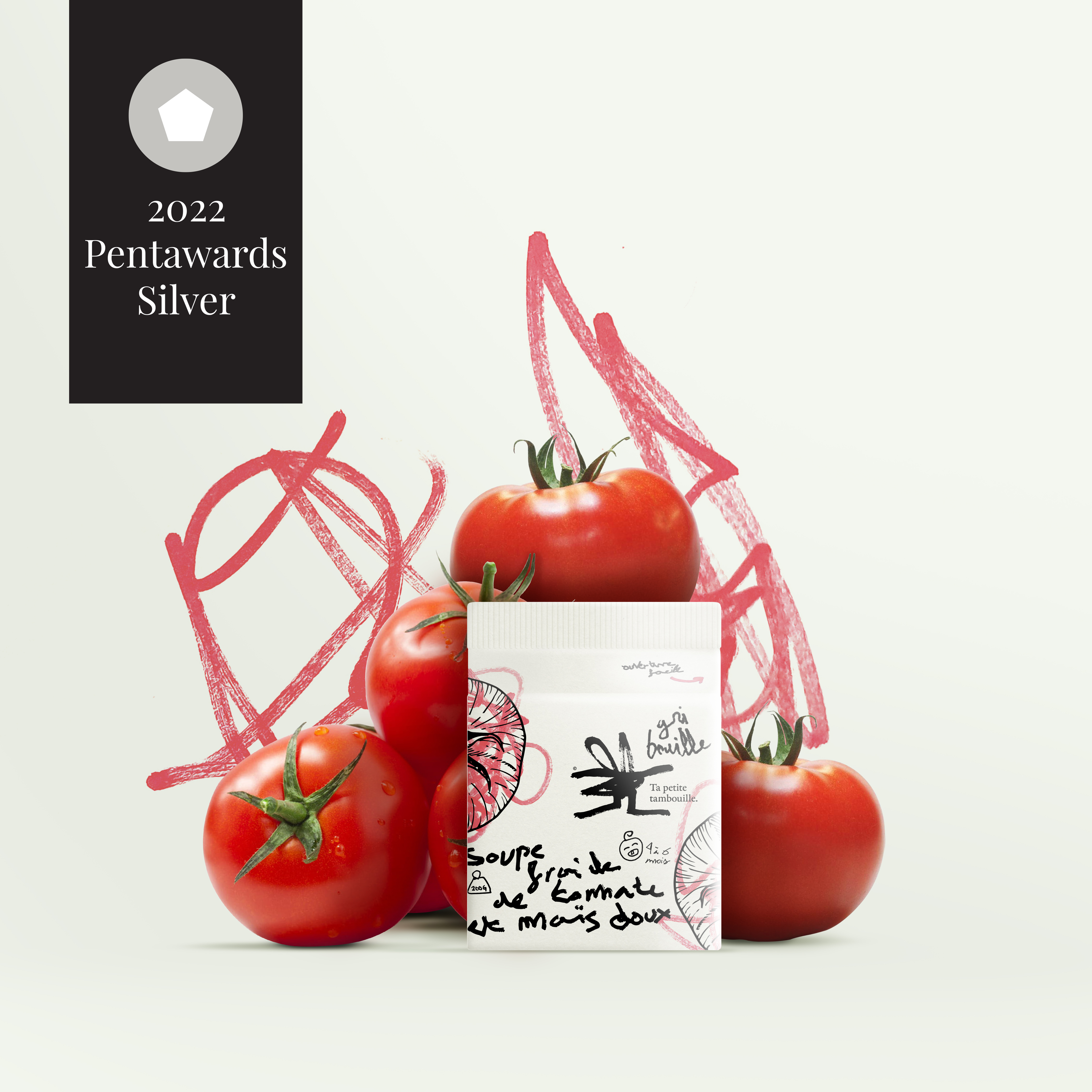
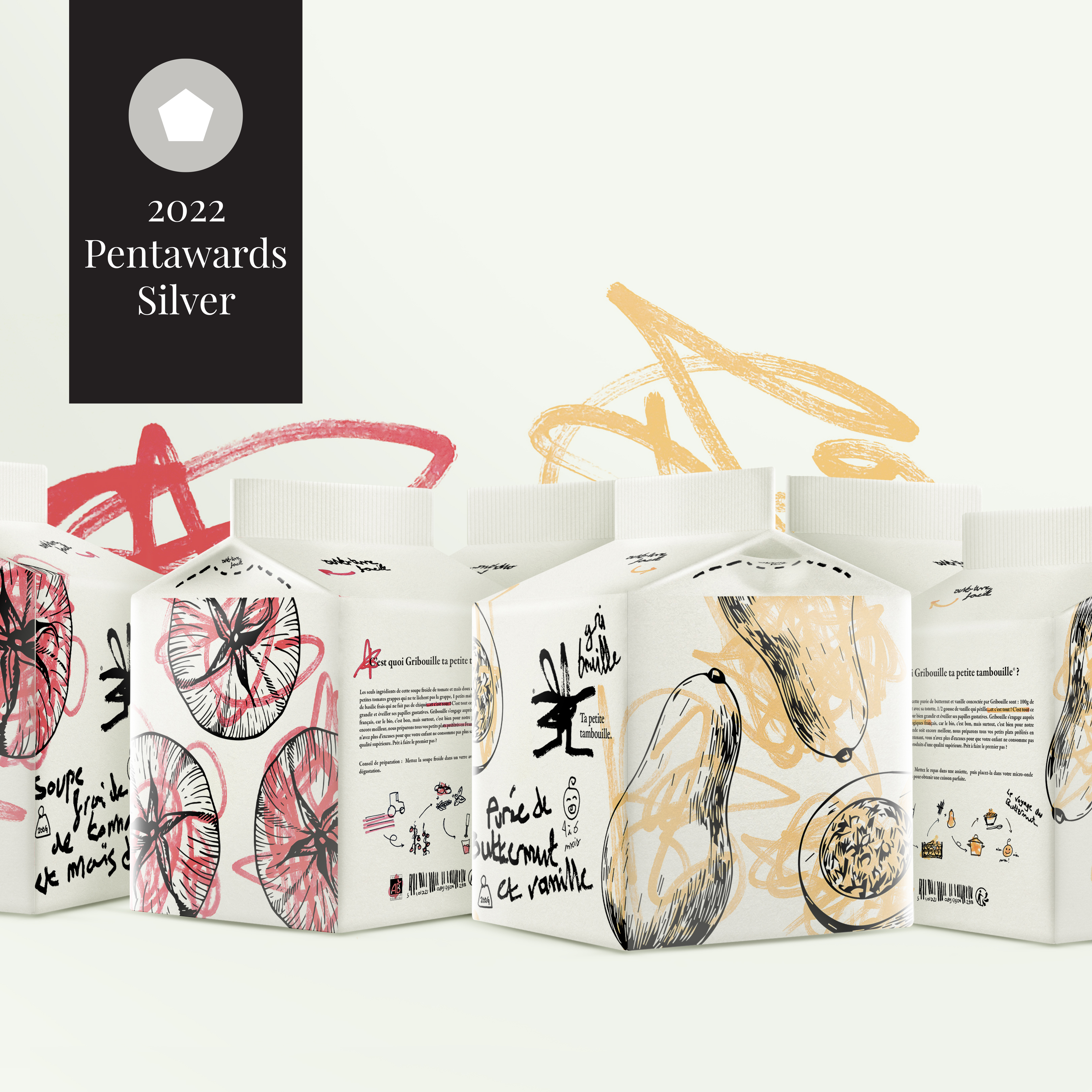
Gribouille is a brand offering organic ready meals for babies. Newborns are constantly discovering new things and learning. Scribbling is one of these discoveries that is universal to all babies. lt allows them to shape their imagination and practice while communicating with others: it’s spontaneous and limitless. Gribouille takes up this theme that speaks to both parents and children to transmit its main value: the simplicity of its recipes that leads to a healthy dish. A doodle is just as simple to make as Gribouille's dishes. This pictogram with its strong personality is open to interpretation and is as spontaneous as a doodle. The very childlike writing refers to babies and in particular to their beginnings in writing. The layout of the logo is deliberately disordered to give the illusion that a young chiId is at the origin of it. The baseline "ta petite tambouille" is phonetically similar to a children's rhyme and is a familiar French way of referring to a meal. The logotype is thoughtfully designed to look like something a baby does without thinking. The little dishes prepared by Gribouille are cooked with healthy vegetables produced by our French organic producers. These little cardboard bricks are made up of several things that make up the world of childhood. First of all, the doodles on the vegetable illustrations. This is a nod to all the coloring where babies or young children are constantly scribbling on them. This spontaneous movement, understood by all, is an immediate reference to childhood. The typography allows to support this aspect of "discovery" already present in the scribbles. Indeed, a young child discovers and tries his hand at writing. It is not neat or even neat, but that is the charm of Gribouille: imperfection. The texts are also very meaningful because the description on the back is written like a nursery rhyme, another characteristic of the world of childhood. The small handmade pictograms placed in such a way as to "fill in the gaps“ punctuate this packaging with a soft, childlike note. The scribbles, the writing, the texts and even the pictograms are drawn in the manner of a child and this is what makes this packaging meaningful for them but also for the parents who can see their child through Gribouille. This packaging attracts the eye because it goes beyond the framework of "perfection". This little brick could be entirely made by a child himself and it wouldn't matter. This is the message that Gribouille wants to put forward: to put oneself in the place of the chiId in order to know him better.


ln Greek, Okeanós means the ocean. I made this choice to give the brand a top of the range feel. Similar to the words in the sustained vocabulary, it brings a certain nobility to this visual identity, just like the products offered by Okeanós. The name inspires Greece and its freshness in the colors, with a bright white and an intense and characteristic blue. The typography, with its "engraving" look, is taken from the Greek style. The logo has a lot of personality. The fish illustrations are the essence of the Okeanós packaging. The grain of the paper is felt on the illustration and gives charm while keeping the typical Greek "white stone" spirit. The graphic motifs contrast with the simple, even basic shape of the fish. The principle of opening the packaging is common, but combining it with the illustration, making it part of it, is new. By doing so, the packaging gains in originality and is recognizable, it even becomes its main characteristic. The typography chosen complements the very angular logo perfectly. lt brings a touch of modernity while remaining in line with the brand's universe. The small details such as the circle made in the same way as the illustration, the side motif that takes up that of the fish and the "stamp" on the back confirming the date of fishing of the product bring a "handmade" side and emphasize all the traditionalism in fishing that Okeanós promotes.


I created El Poco, a new brand of hot sauce with Mexican origins. I was inspired by the Mayan civilization to create its visual identity. The logotype is a wordmark made of letters organized in the way of Mayan representations and with bright color codes evoking Mexico. A "worn" effect, inspired by Mayan engravings, was applied to the logotype giving an authentic look. Inspired by a maracas, El Poco's packaging is shaped like the famous Mexican instrument. To fully enjoy the taste of the sauce, you have to shake the bottle to mix the ingredients, which echoes the maracas. Latin American-inspired motifs adorn the handle of the bottle and Mayan mask-like caps enhance the whole. These masks bring a mystique and intensity to the product. The spiciness of the El Poco sauce is only accessible to hotheads.


“Ô comme 3 pommes“, “Me prends pas pour une poire“ and “Ramène pas ta fraise“ are product names for a French brand of children's compotes. Coming from popular expressions, they are often heard by children as for example "Haut comme trois pommes" (high as three apples) designating the latter. This touch of humour from the brand allows it to communicate simply about its products so that children understand better. On the Ô comme trois pommes pictogram alone, arms give energy and make them more expressive. These small stacked apples are enough to understand that this is an apple-based product for young people. The typography used in the logo gives the impression that it was written by the child himself and is therefore linked to his daily life (learning cursive writing at school). The whole has a strong personality that allows it to stand out from the rest and to develop a recognizable universe at first glance. Here are three product names "Ô comme 3 pommes", “ Ramène pas ta fraise“ and “Me prends pas pour une poire" for a compote brand. Their names are taken from French humorous expressions such as "être haut comme trois pommes" (to be tall like three apples), which refers to a child's short stature. The packaging of these products takes the shape of the fruit and is assembled in groups of 3 (or more) by means of a straw symbolizing a fruit stalk that fits together on the underside of each package, its separation recreates the sensation of picking a fruit. The shape of the container allows instant identification of contents. Arms and eyes added to the packaging give life to playful characters for children. As compotes are often snacks at school, I chose to put games on the back to distract them during a school break. These little compotes play with our curiosity and encourage us to discover them.


Beeo is a concept for a new brand of honey that strictly adheres to the criteria of organic farming and above all the good remuneration of the affiliated beekeepers. Modern in its way of producing honey, it is also modern in its graphic identity. Beeo is the contraction of the words "bee" and "organic". The name is a powerful evokes the world of honey and organic products. I created the "B" pictogram of the logotype from the symbol of a natural hive. I associated this pictogram with a freehand typography for the authentic aspect and an orange panel reflecting the diversity of honeys. The Beeo container is the perfect reflection of the brand itself: modernity and authenticity, two key words of this object study. It stands out from conventional brands using cheap design and communication. Beeo wishes to convey the taste of excellence through an innovative honey pot whose shape is inspired by a simplified hive icon. Exception and excellence highlight the authenticity of this elixir appreciated by all. Noble materials such as wood and glass evoke and respect nature while remaining distinguished. The packaging is as unique as the honey it contains.


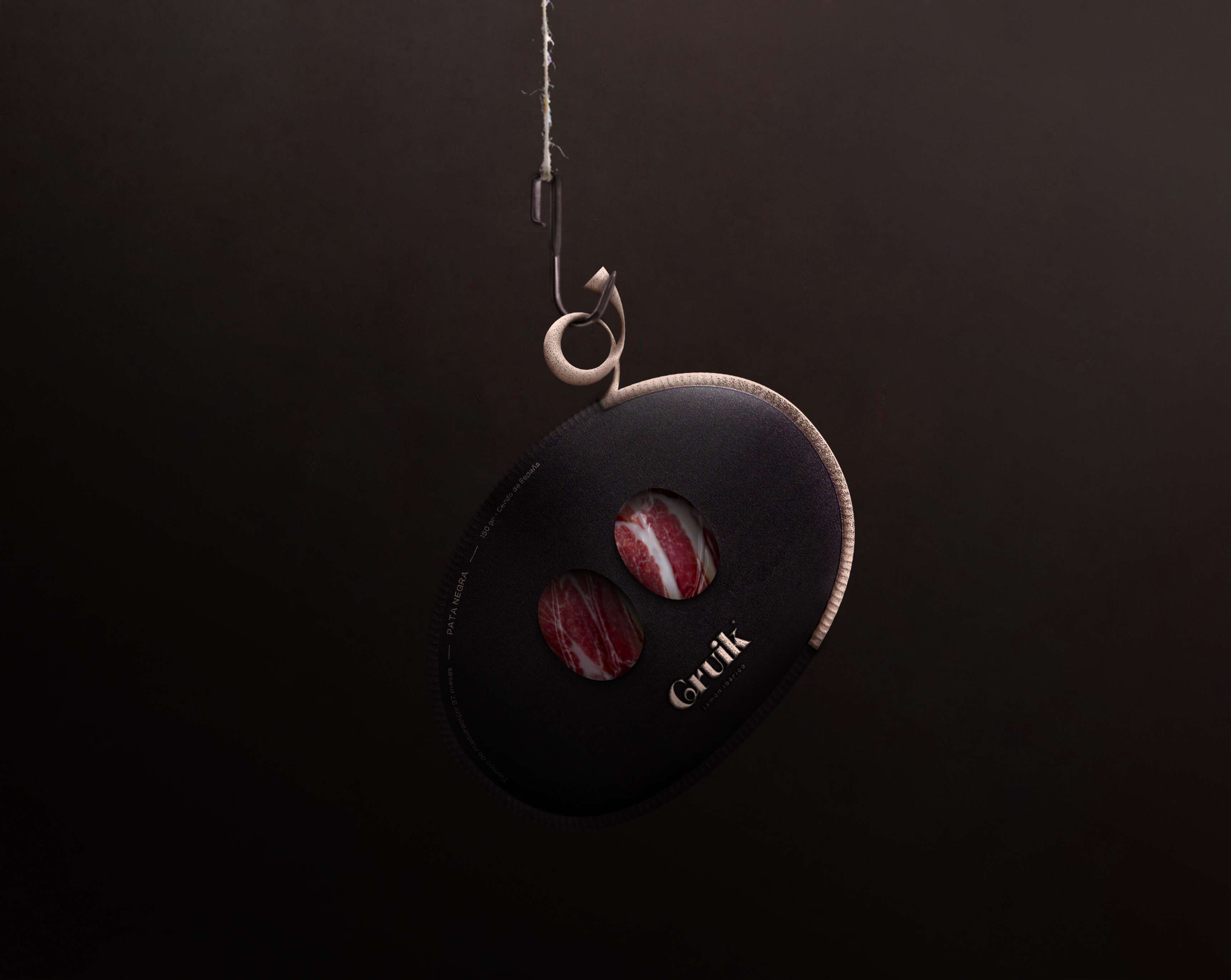
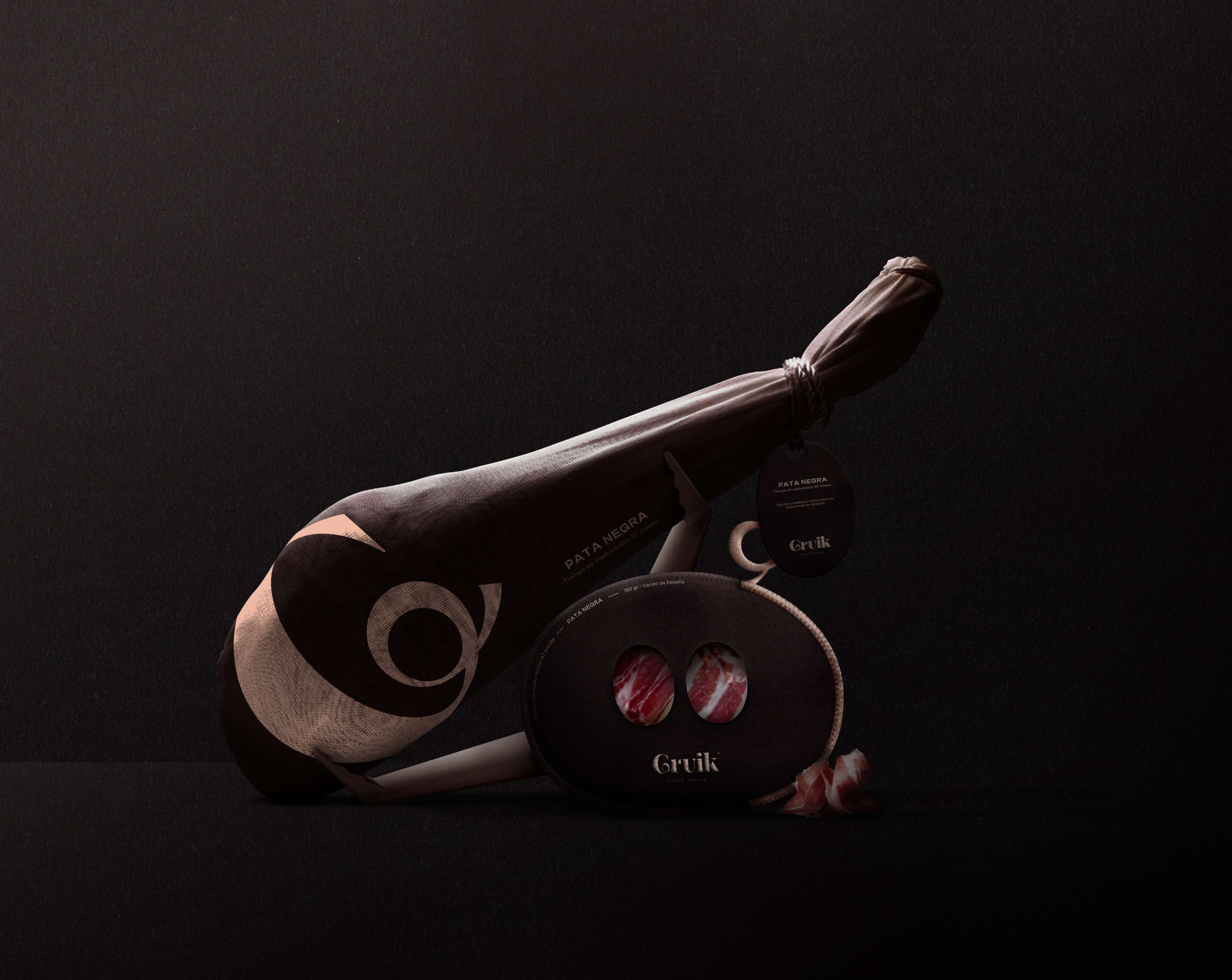
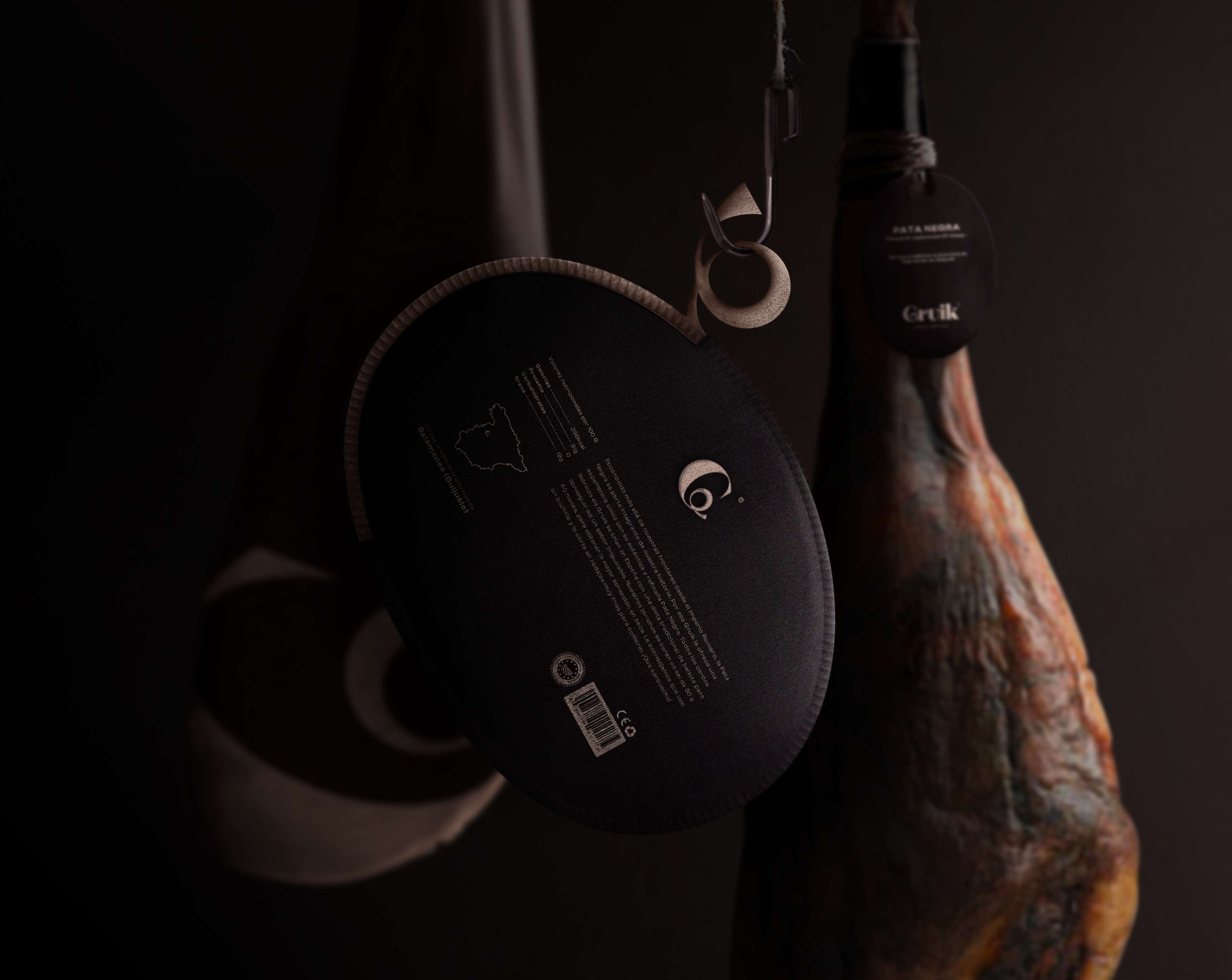
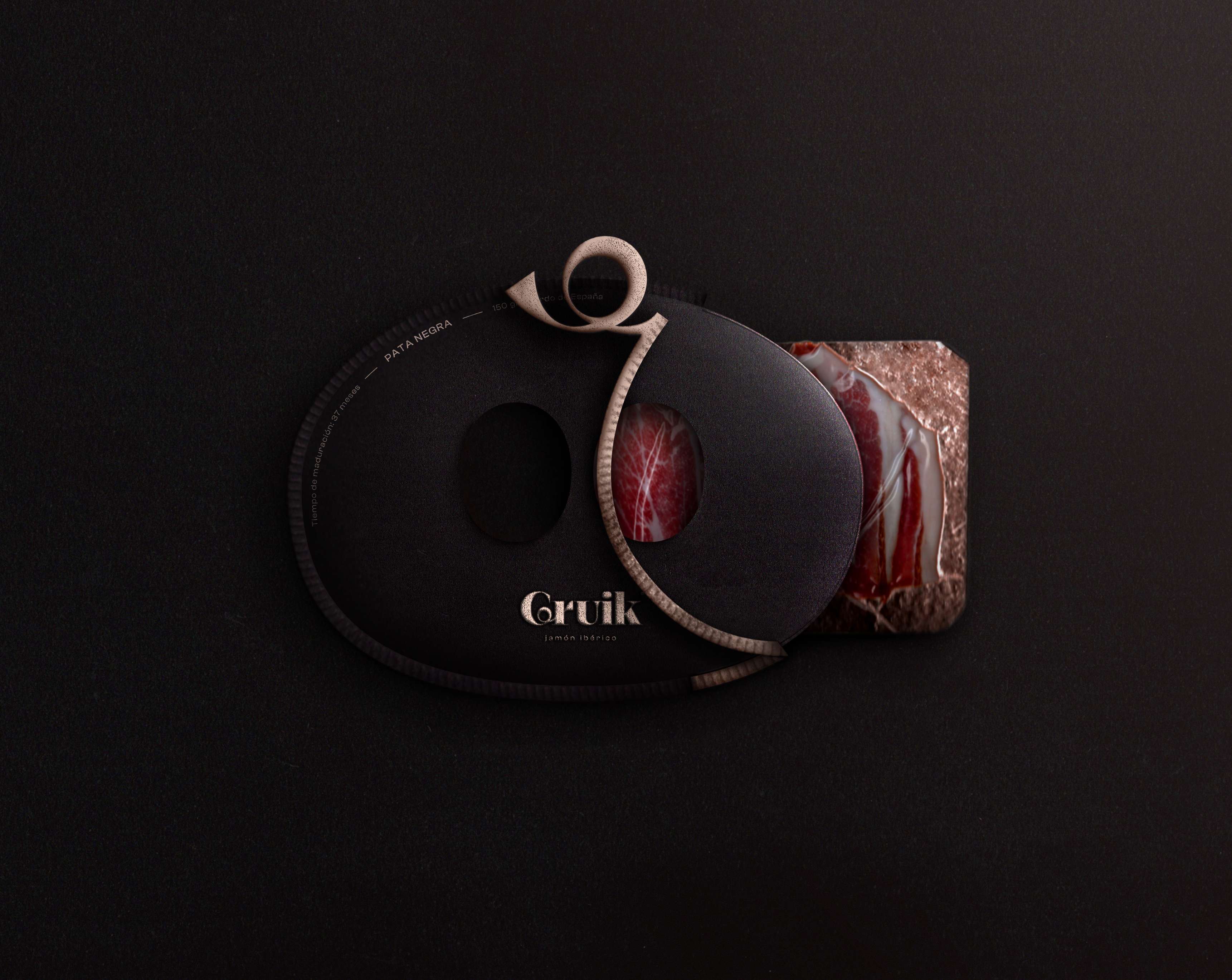
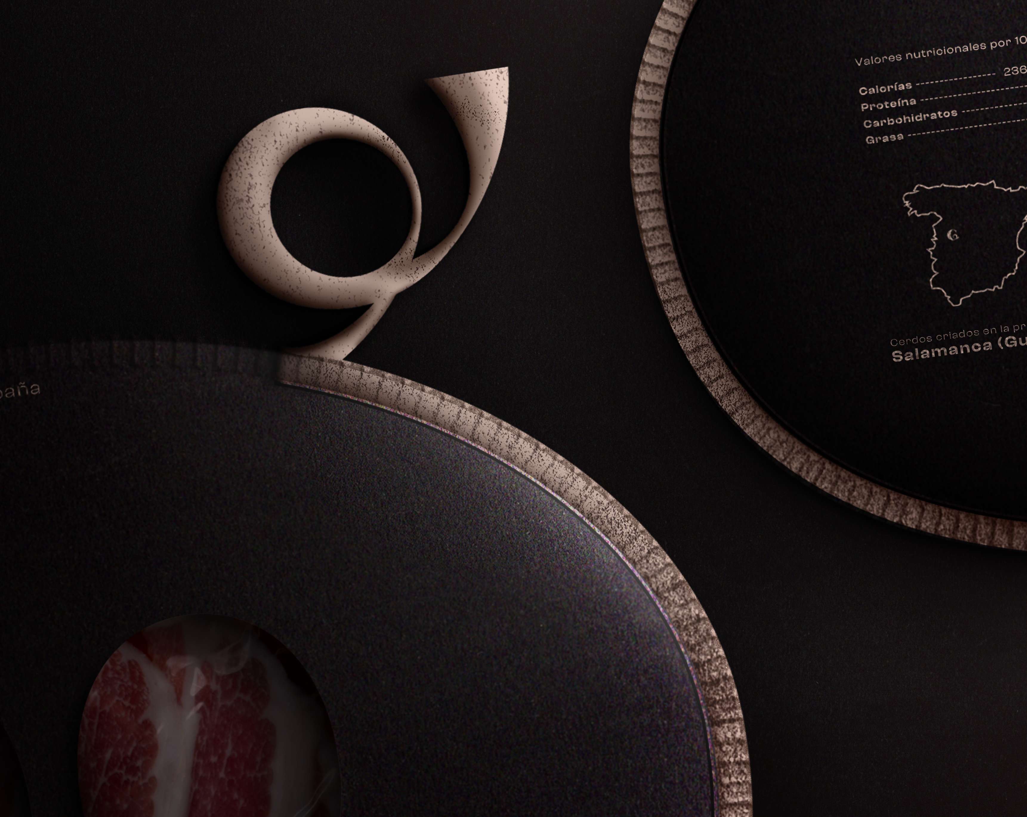
Recognized as THE ham of exceptional quality, Gruik strives to perpetuate the expertise and authenticity of Pata Negra. This gives it an exceptional identity, just like its product. The oval shape and cut elegantly reveal the precious ham. This obviously evokes the snout of Iberian pigs, as does the pull tab to open the packaging in the shape of a pig's tail (featured in the logo). The harmony between the brownish black color reminiscent of Iberian pigs and the slightly brass-colored pink emphasizes this refined aspect.
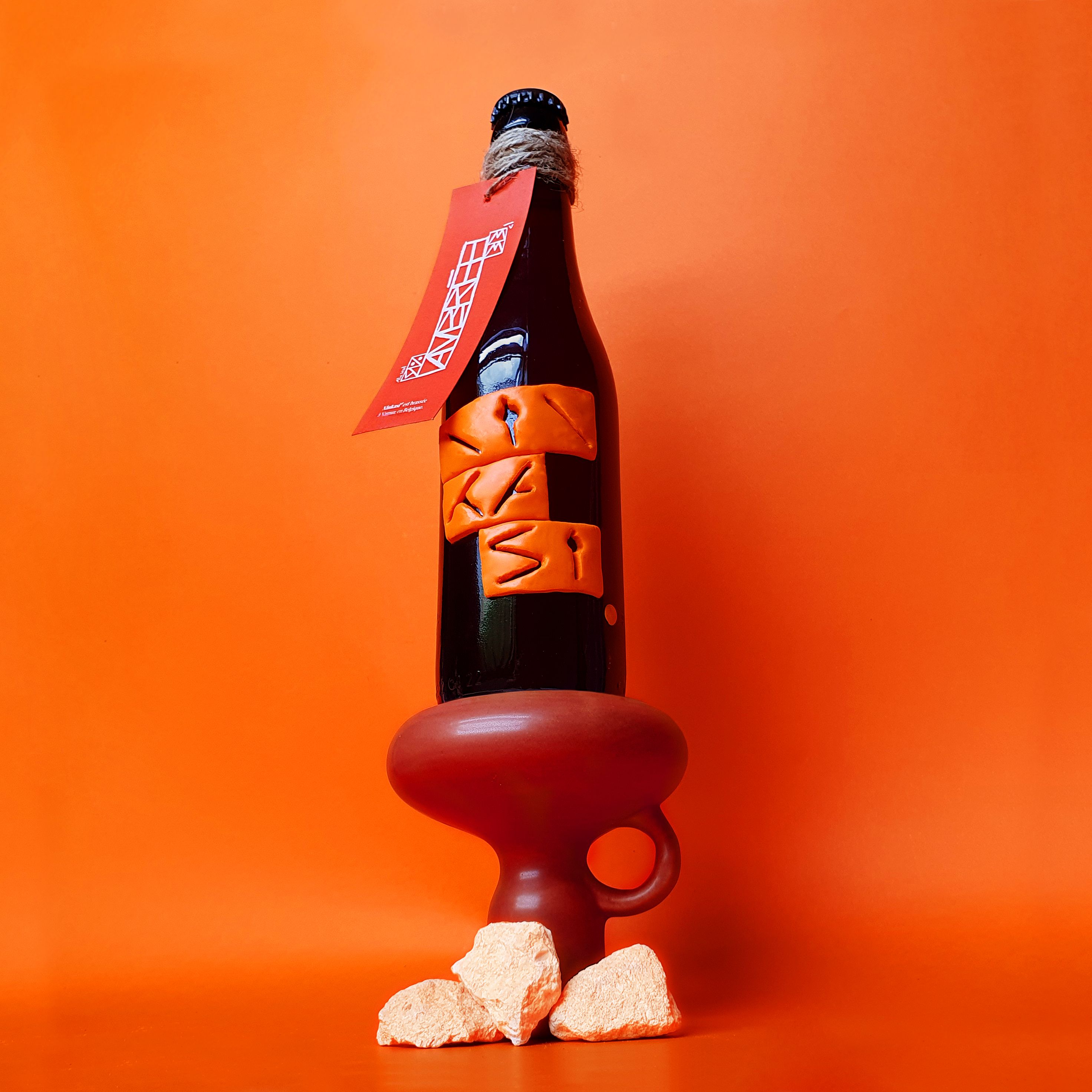
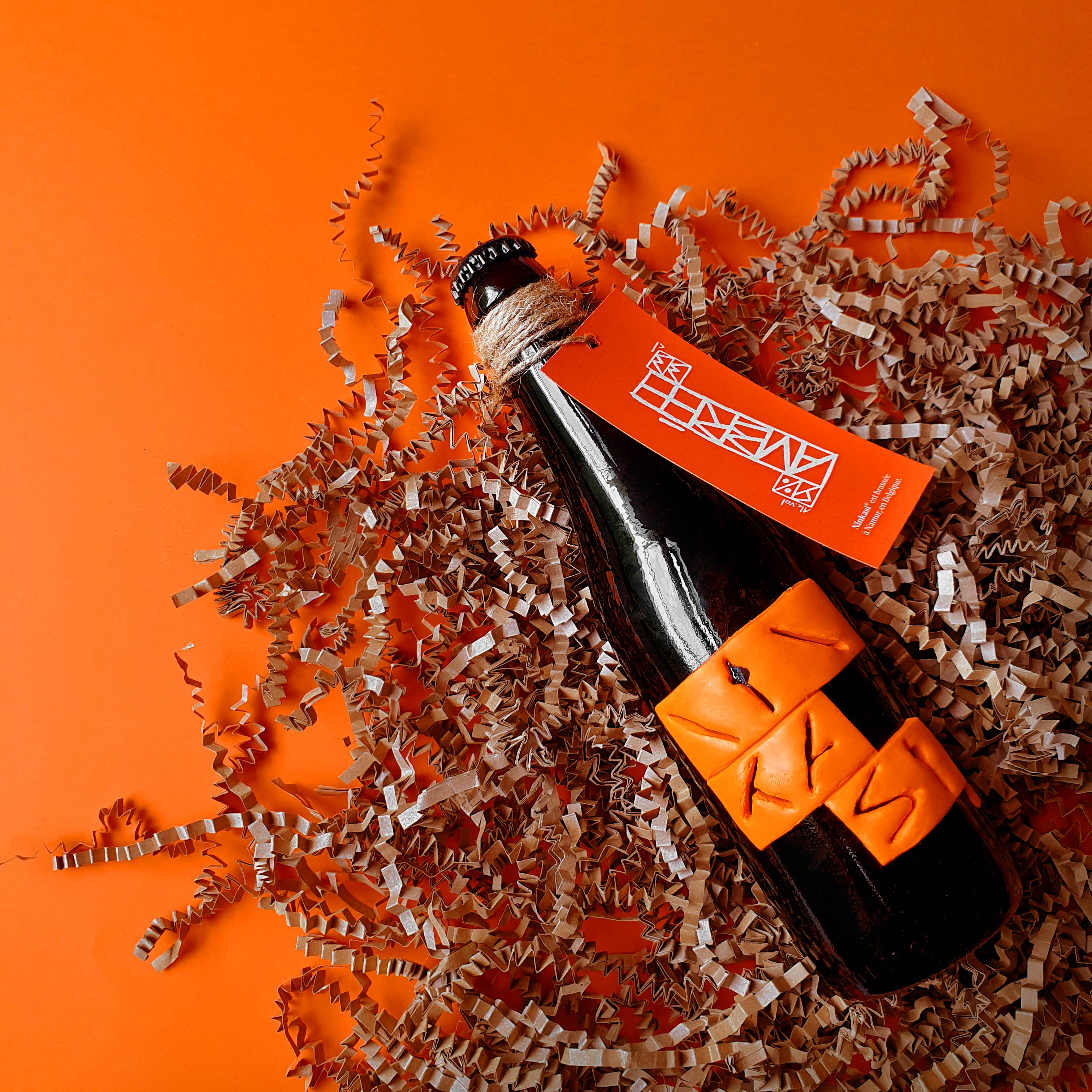
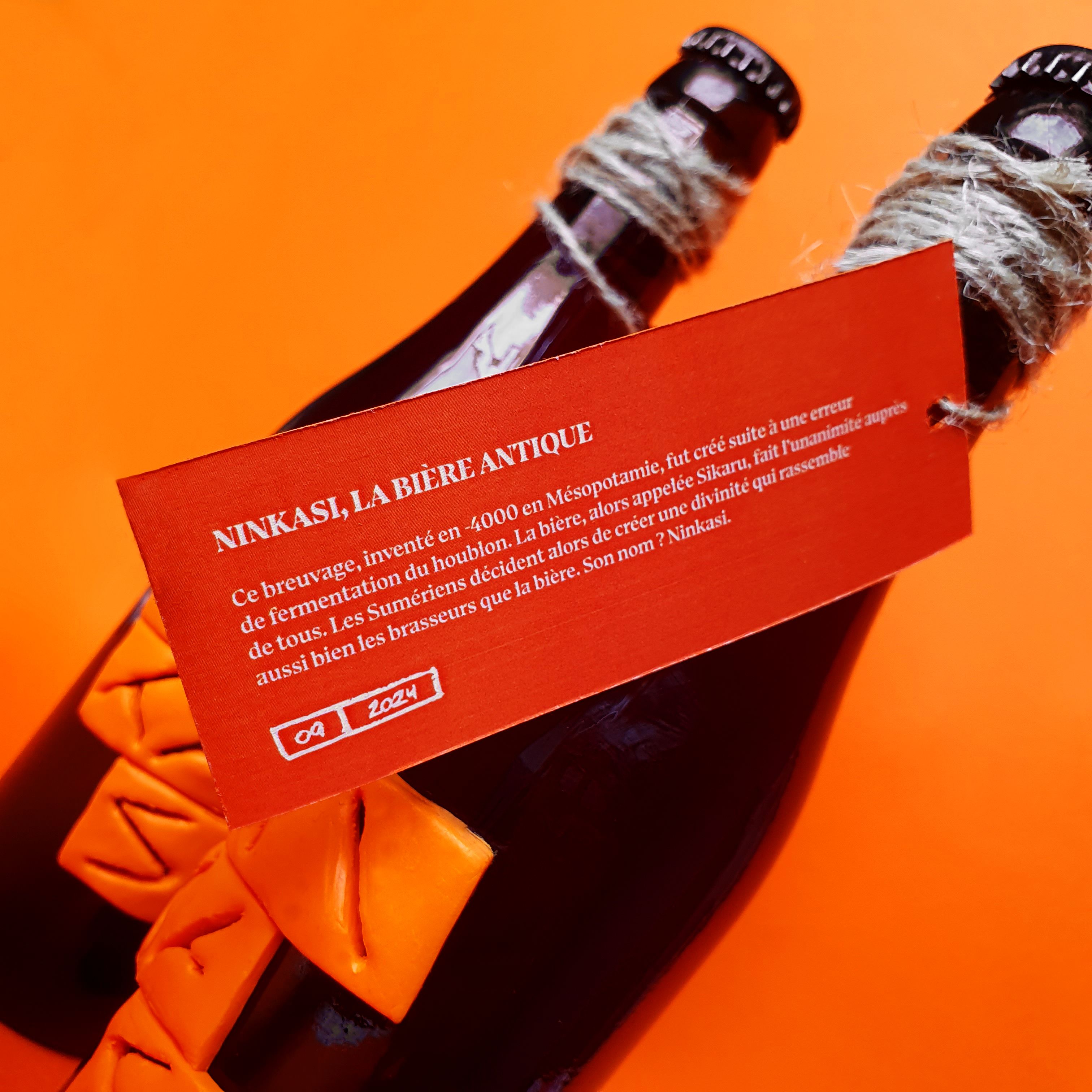
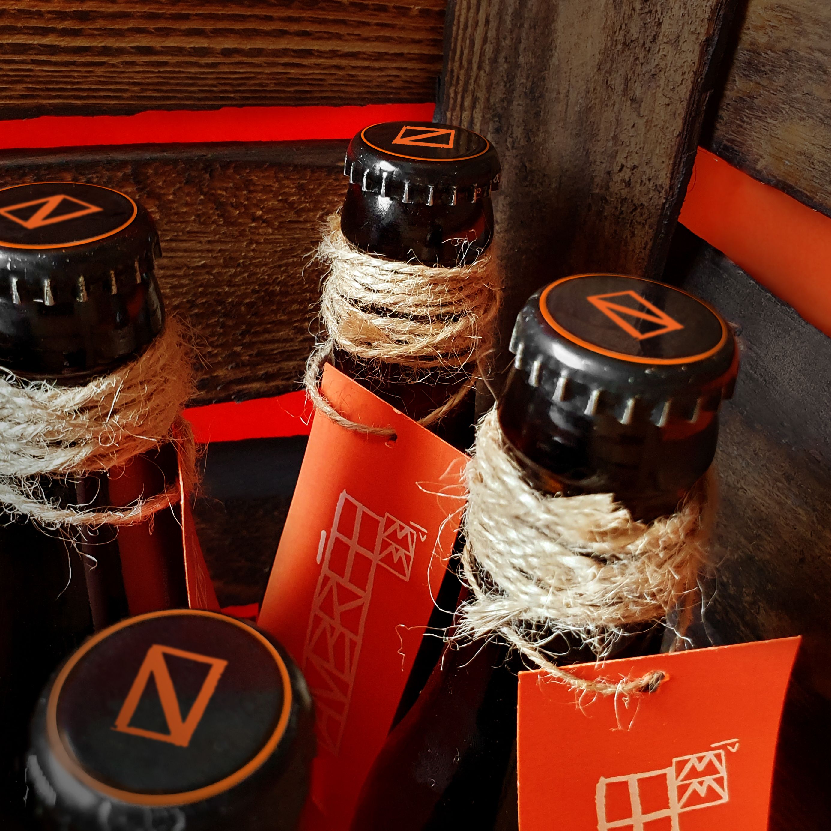
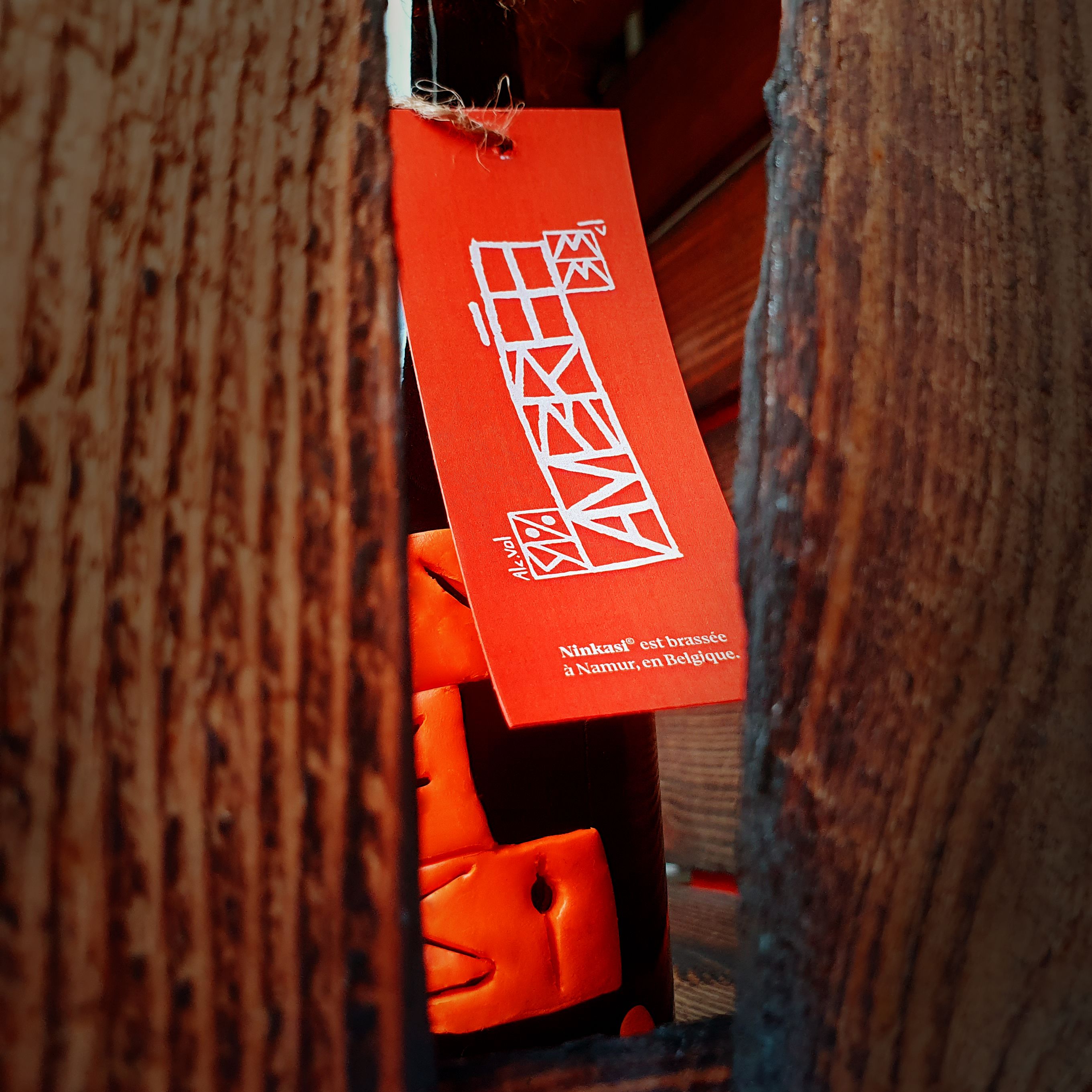
Beer, this beverage, invented in 4000 BC in Mesopotamia, was created as a result of an error in the fermentation of hops. Beer, then called Sikaru, conquered the Sumerians. So much so that they decided to create a deity in its own right. Its name: Ninkasi. Placed on a pedestal, Ninkasi beer became an ancient statue that has been worshipped for thousands of years. ‘The goddess of amber’ conferred a certain aura on the beverage, making it almost an honorary title. To tell many stories and pass on the recipe for beer, the Sumerians engraved clay tablets using cuneiform writing. The identity takes up these codes with letters that are somewhere between legible and symbolic. The framing of these glyphs evokes the shape of these clay tablets. An ancient atmosphere emanates from this logo, transporting us back to that era. It is as if Ninkasi has always existed...
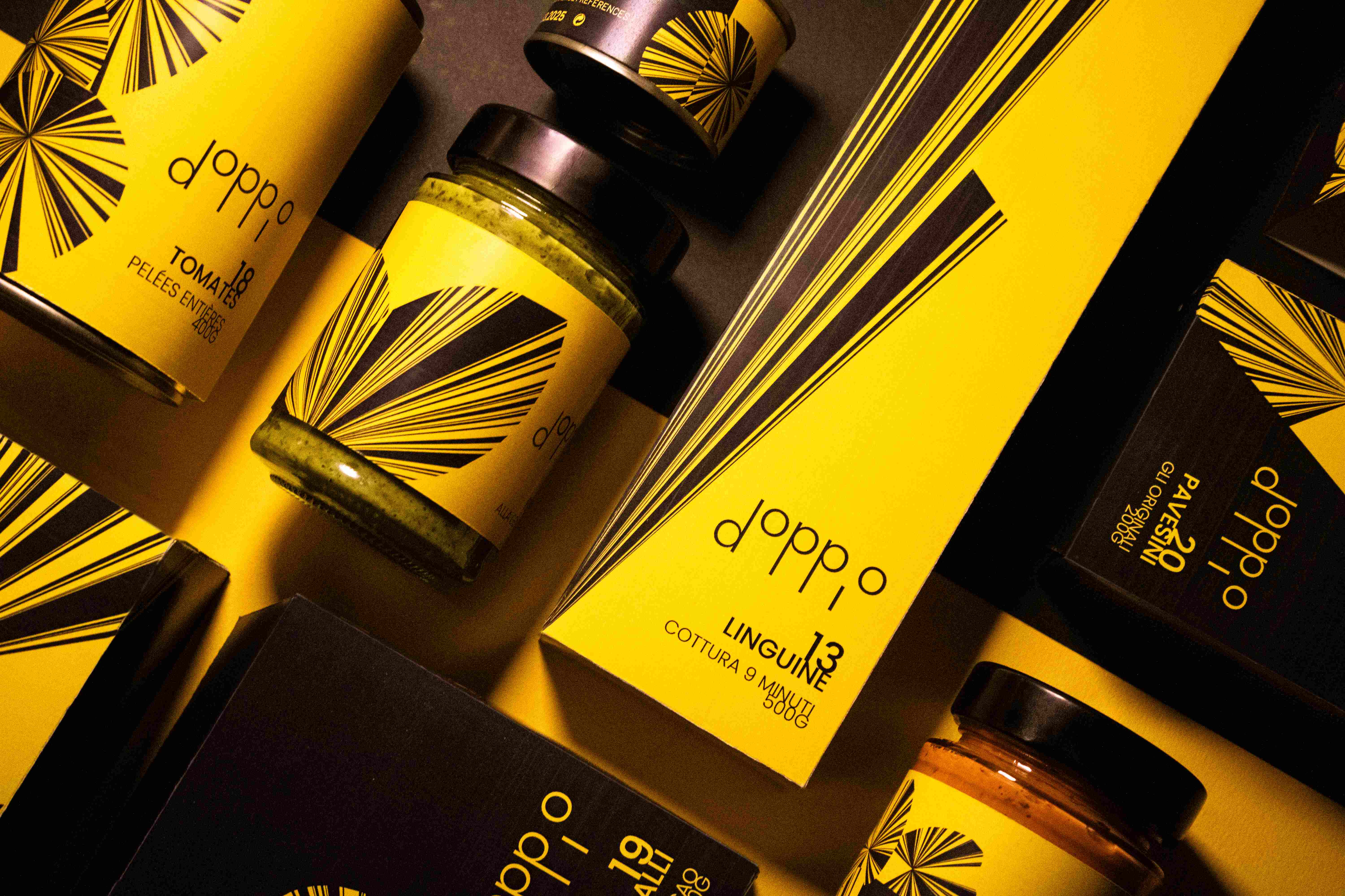
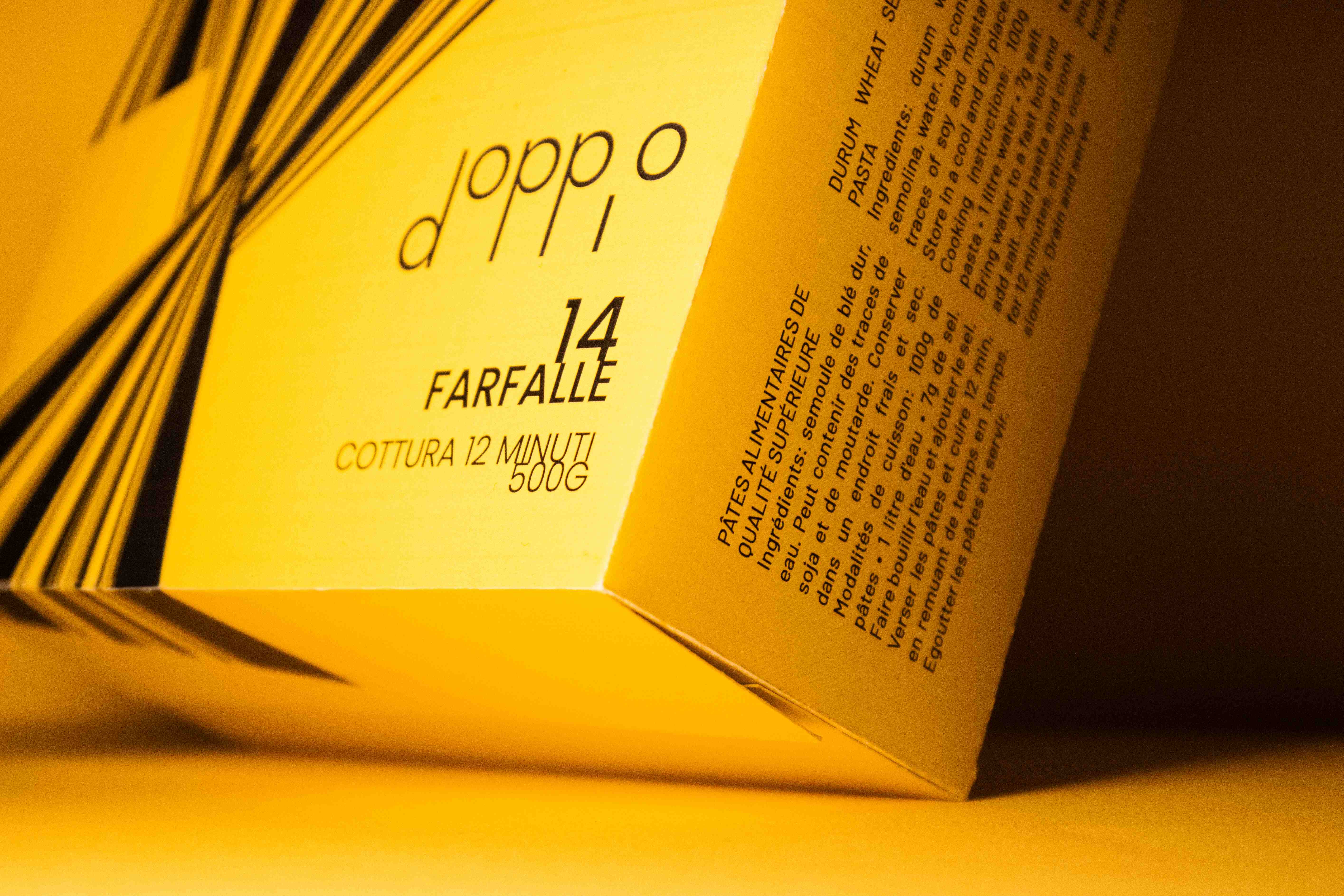
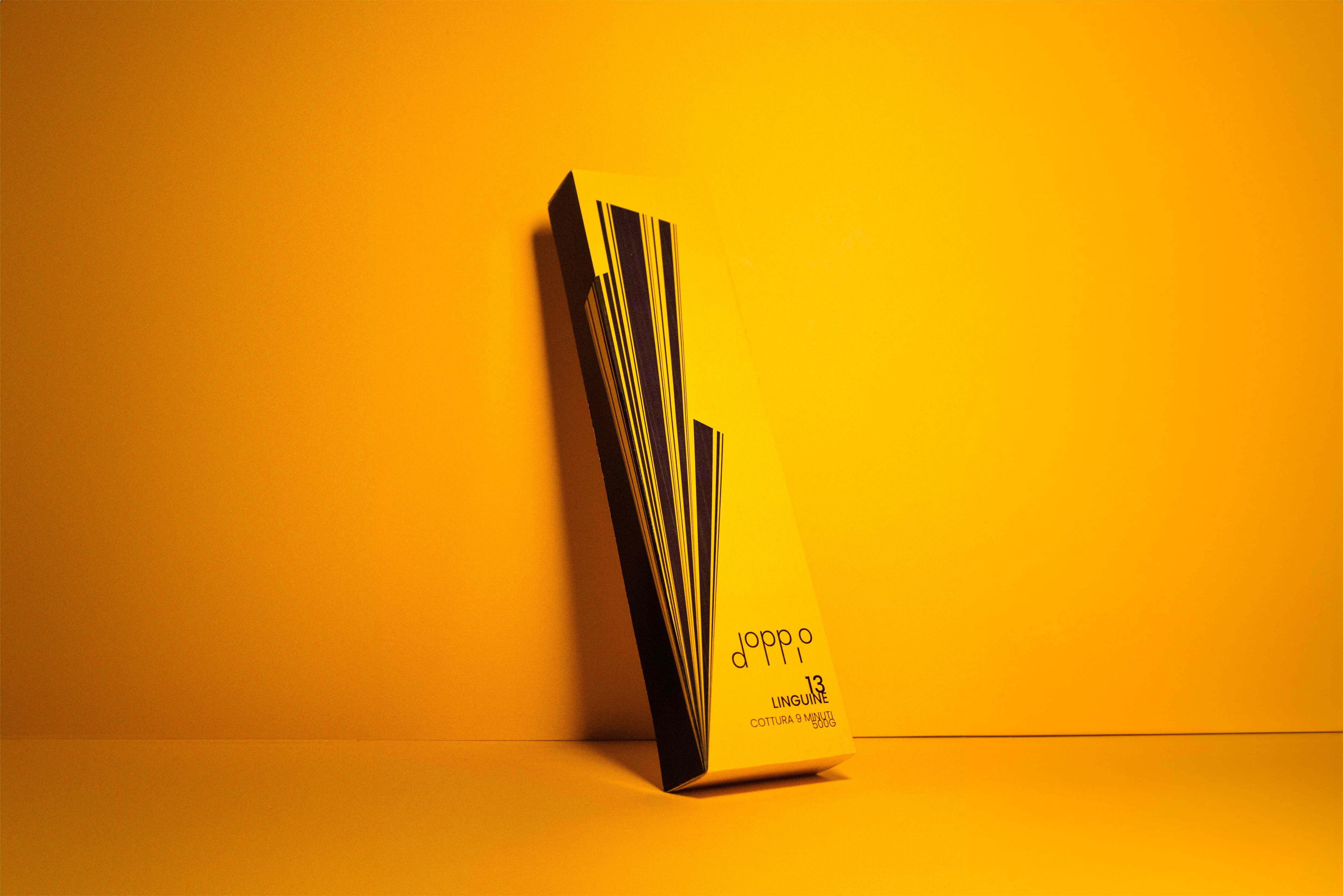
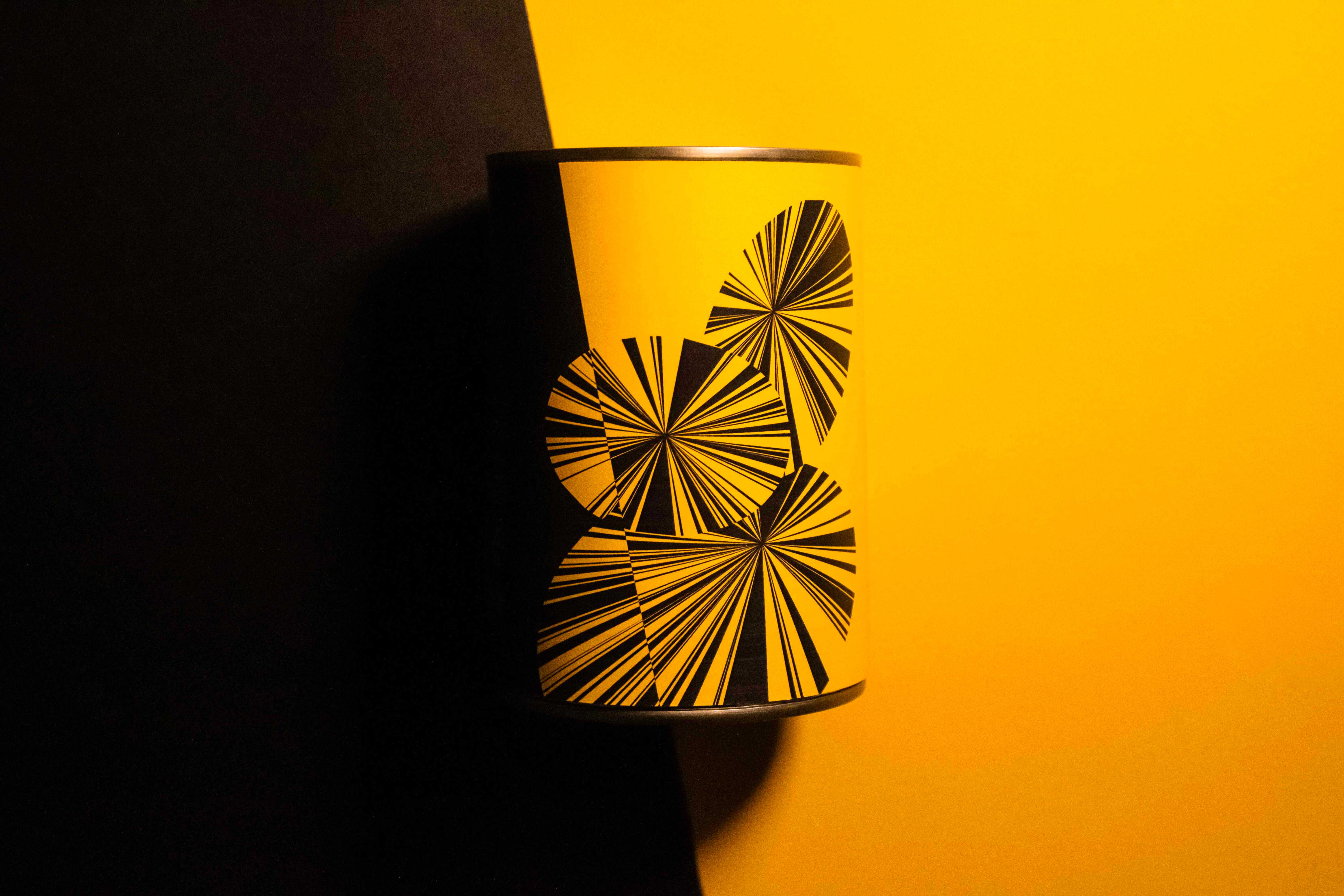
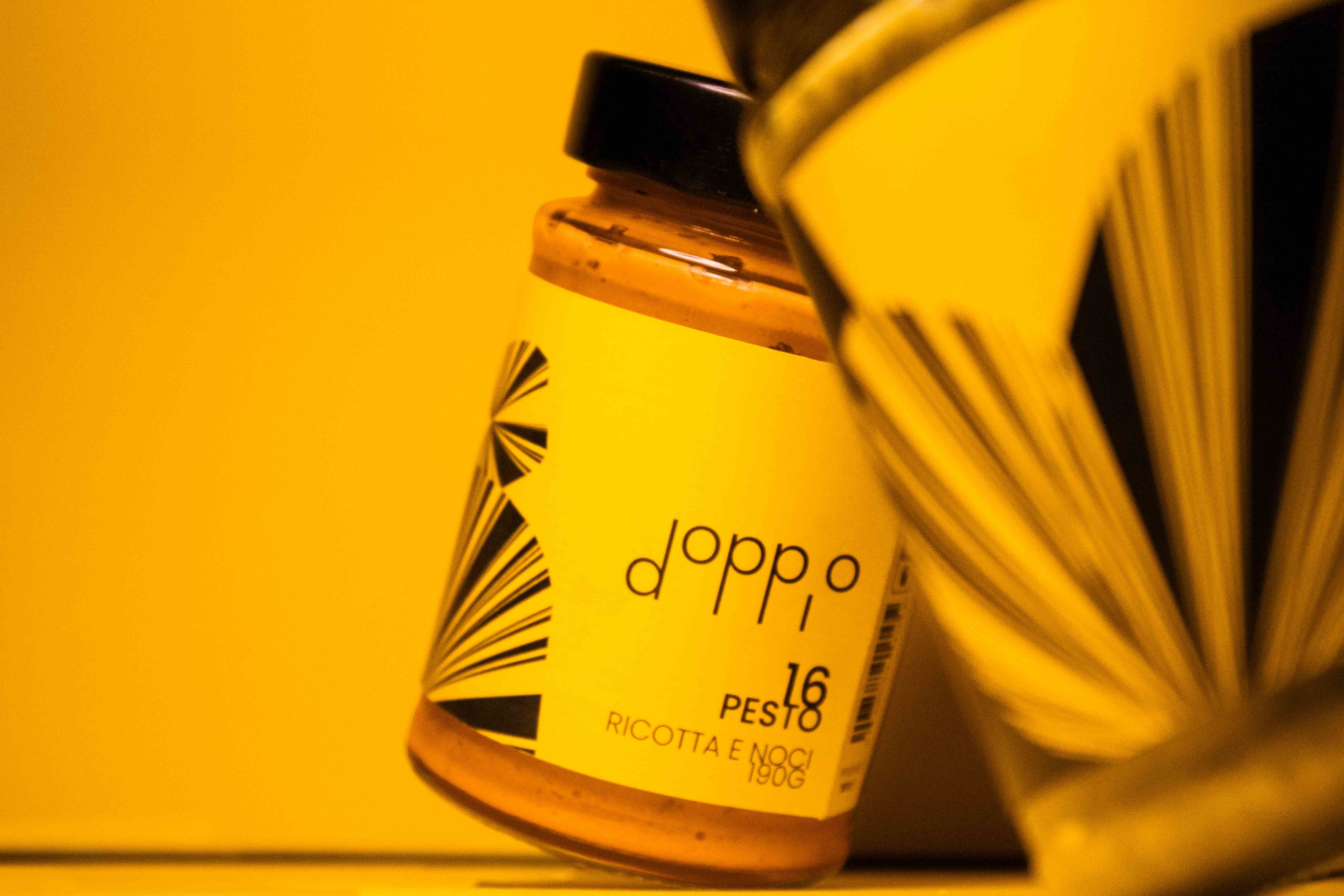
Venice and its carnival, an ode to elegance and an invitation to celebrate. We don our masks to portray the iconic characters of the Commedia dell'arte. Masking ourselves means splitting our personality in two. The notion of duality is central to Doppio's identity. The duality between the refinement of black and the liveliness of yellow recreates the atmosphere of the Venice Carnival. The logo design echoes the structure of Venetian masks connected by a thin rod. The elevation of the ‘O’ brings a touch of lightness and pleasure that is characteristic of this event. It is almost like an opera score. Doppio's Italian range offers more than just an experience; it is an invitation to enjoy unique moments.
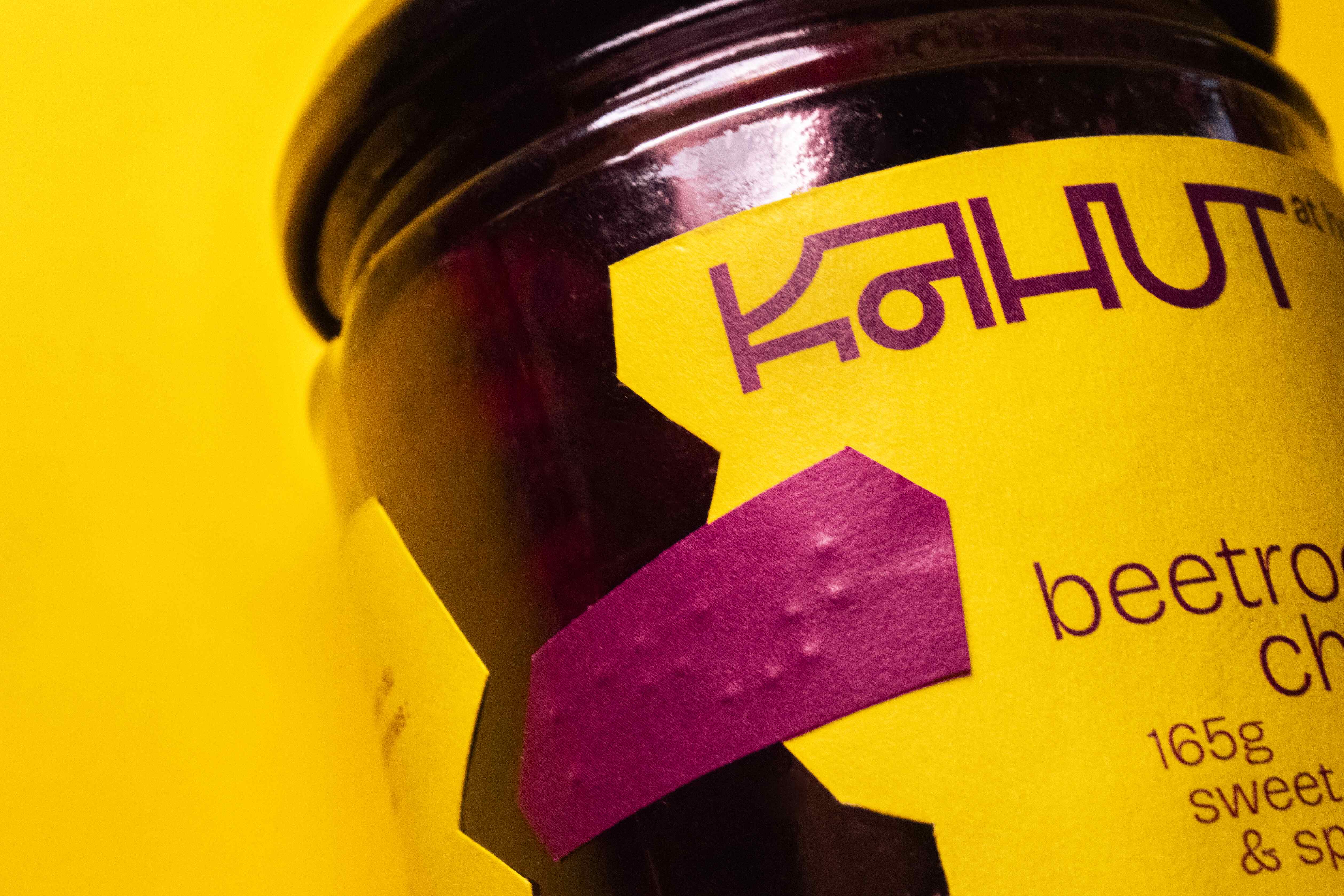
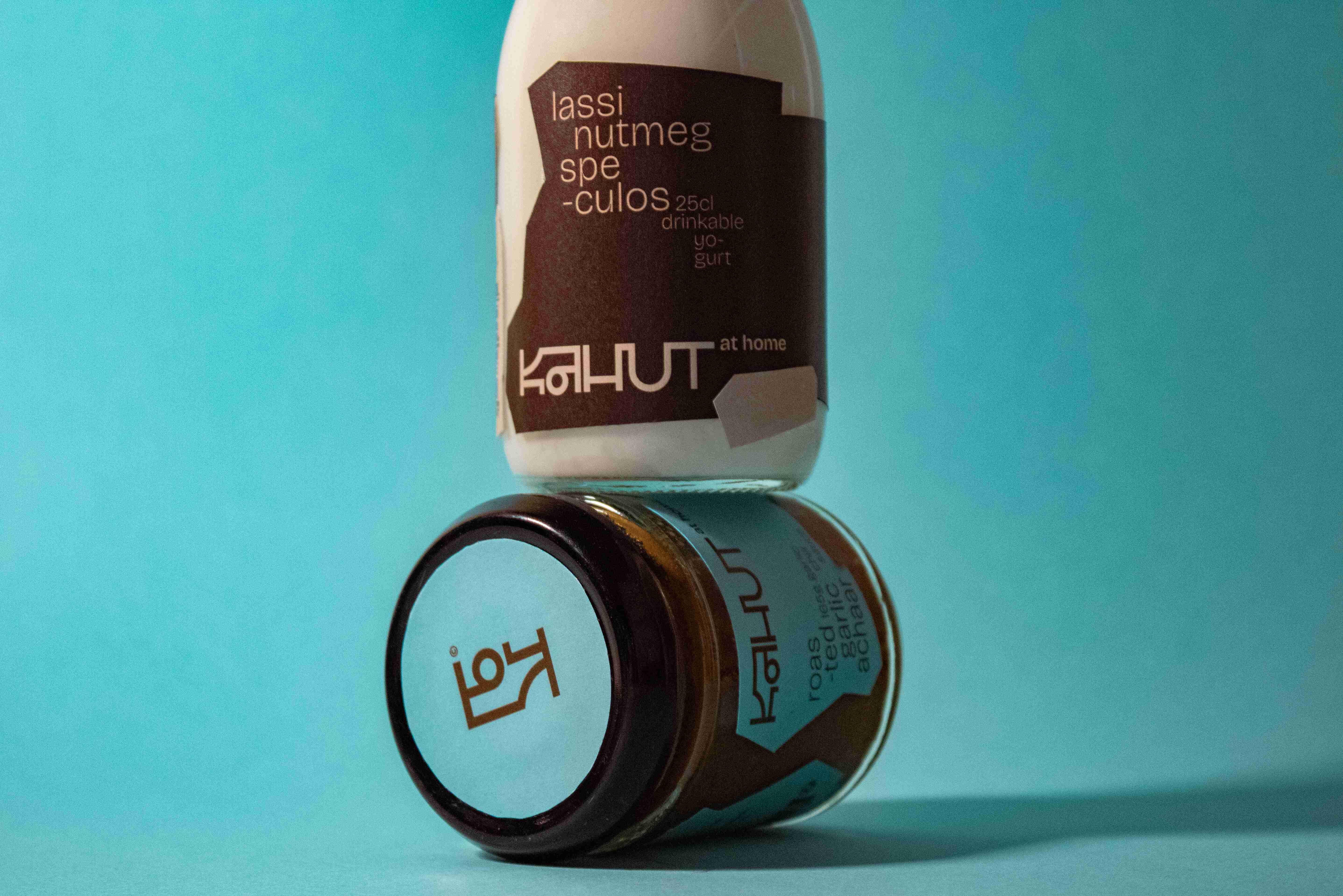
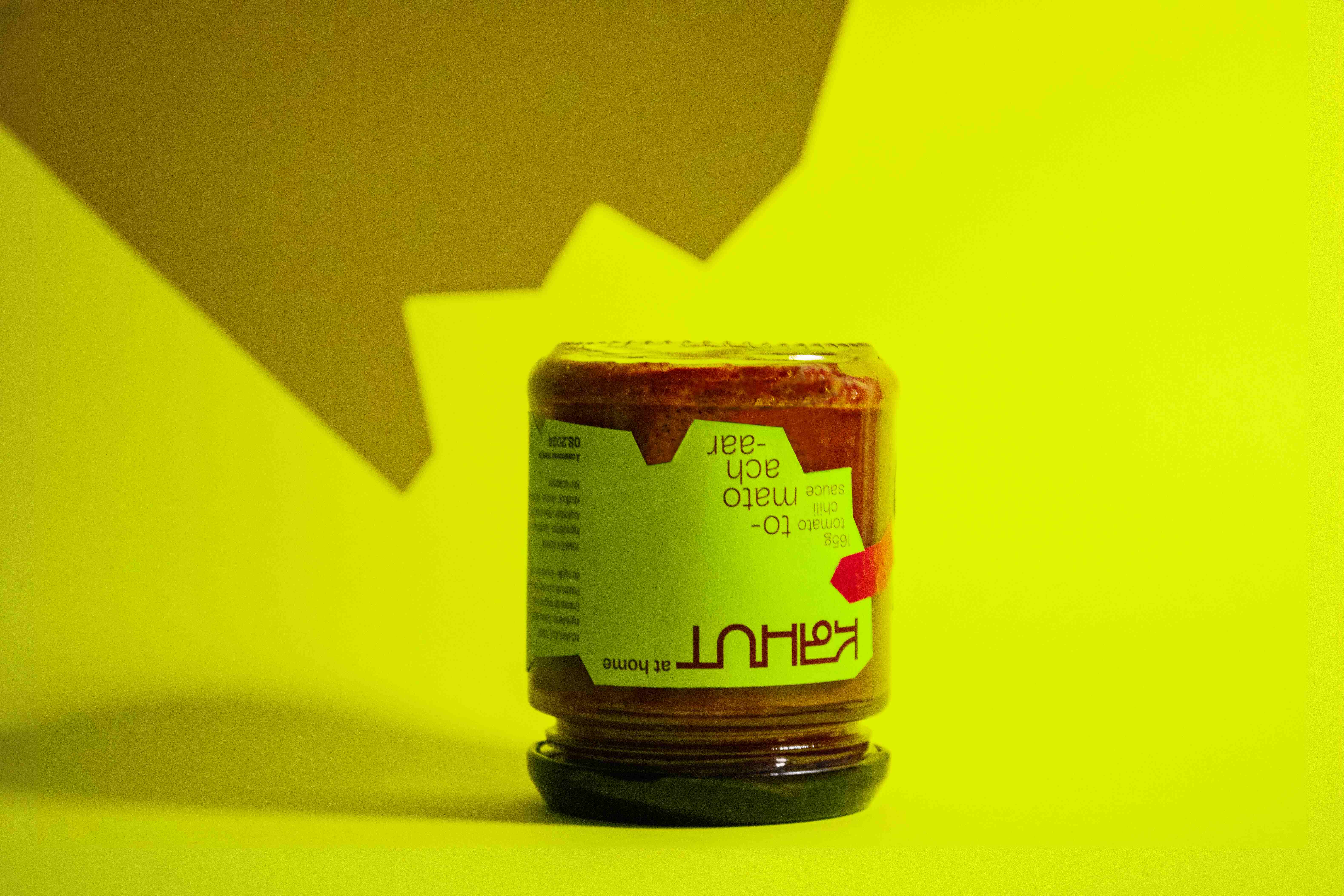
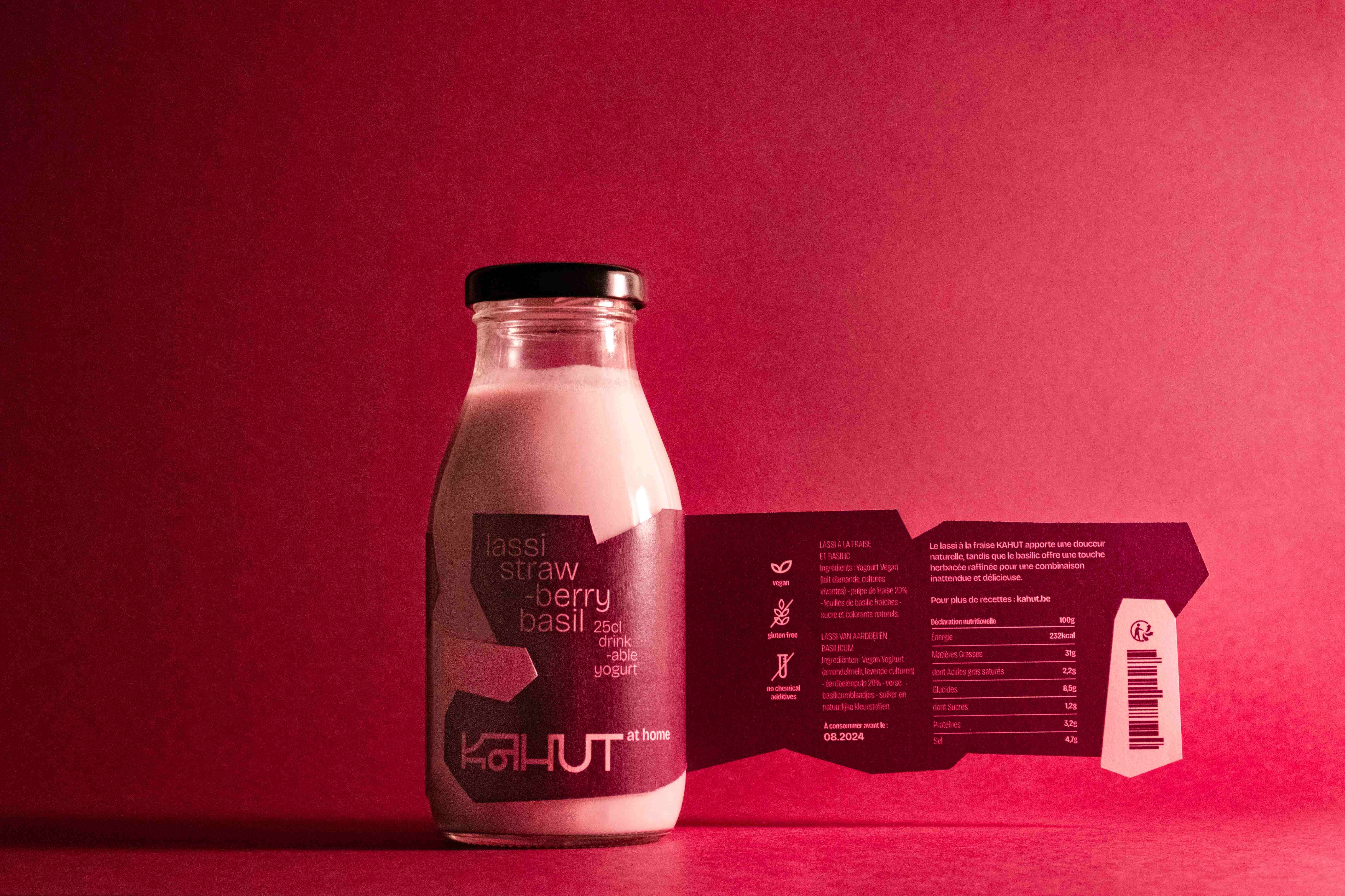
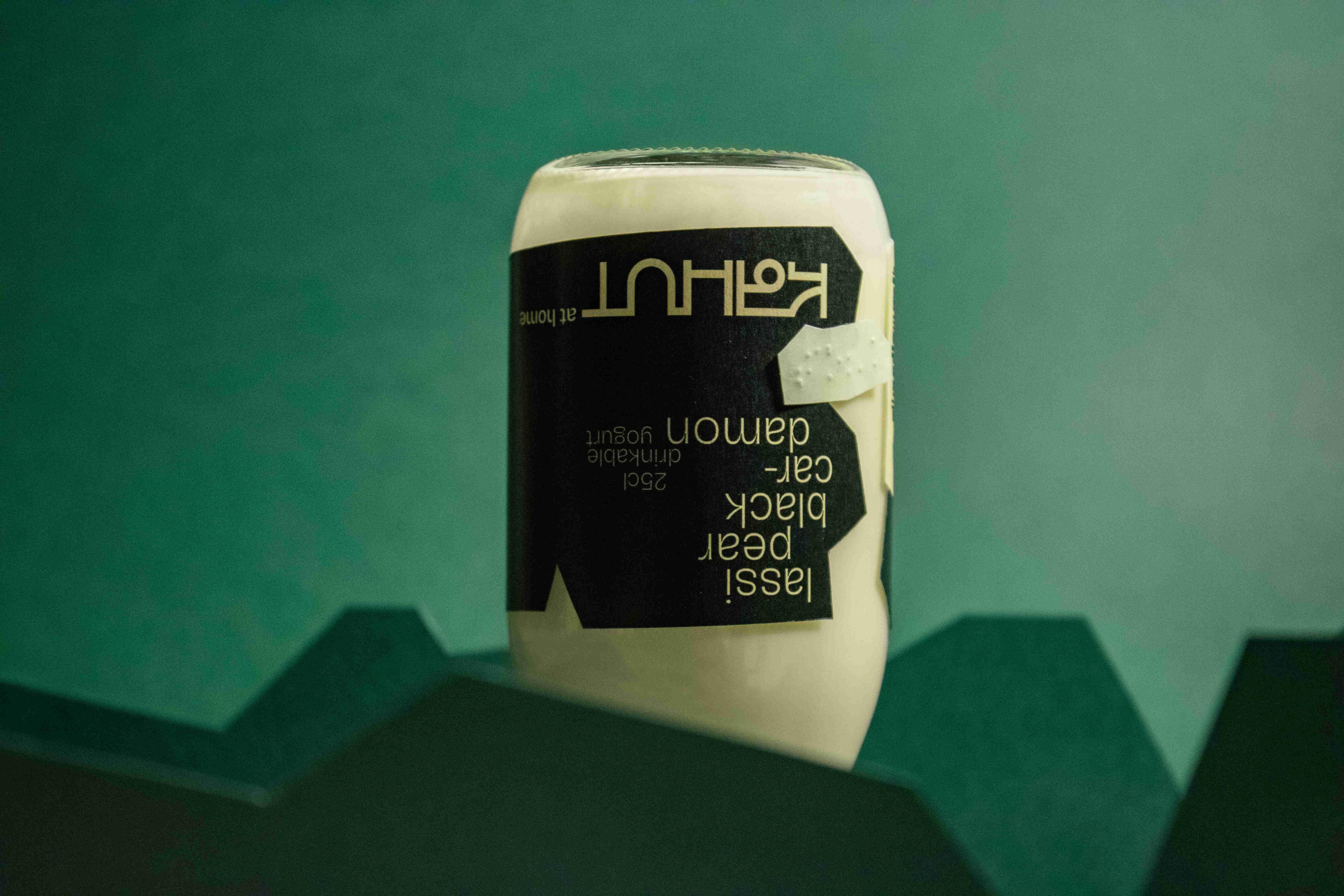
Kahut is a restaurant combining Indian and Ayurvedic traditions with Belgian traditions. The Warlis, an Indian tribe from the state of Maharashtra, are our main source of inspiration. The hut is both their home and a place of exchange and tradition. The hut is the place to go in Belgium to get your chips. Kahut is already a fusion of these two worlds, as the entire logotype. This typeface uses the iconic head bar, characteristic of Devanagari, in its ligatures. Created just for Kahut, it picks up on the Warli style of painting while giving it a more contemporary, western feel. The marriage of cultures is perceptible in the color combinations. The dark tones are taken from Warlis clothing, while the bright colors come from the West. The two-color process reduces the amount of ink used, which is in line with our commitment to the environment. Each label is unique, irregular and imperfect, just like each of us. Inclusion is also a value we hold dear. Our team welcomes everyone and, above all, integrates everyone as they are. We strive every day to make inclusion a normality. The Braille label adds the finishing touch, making our range accessible to everyone.
