Independent, award-winning design agency specialising in aspirational brands.
#powerofbeauty

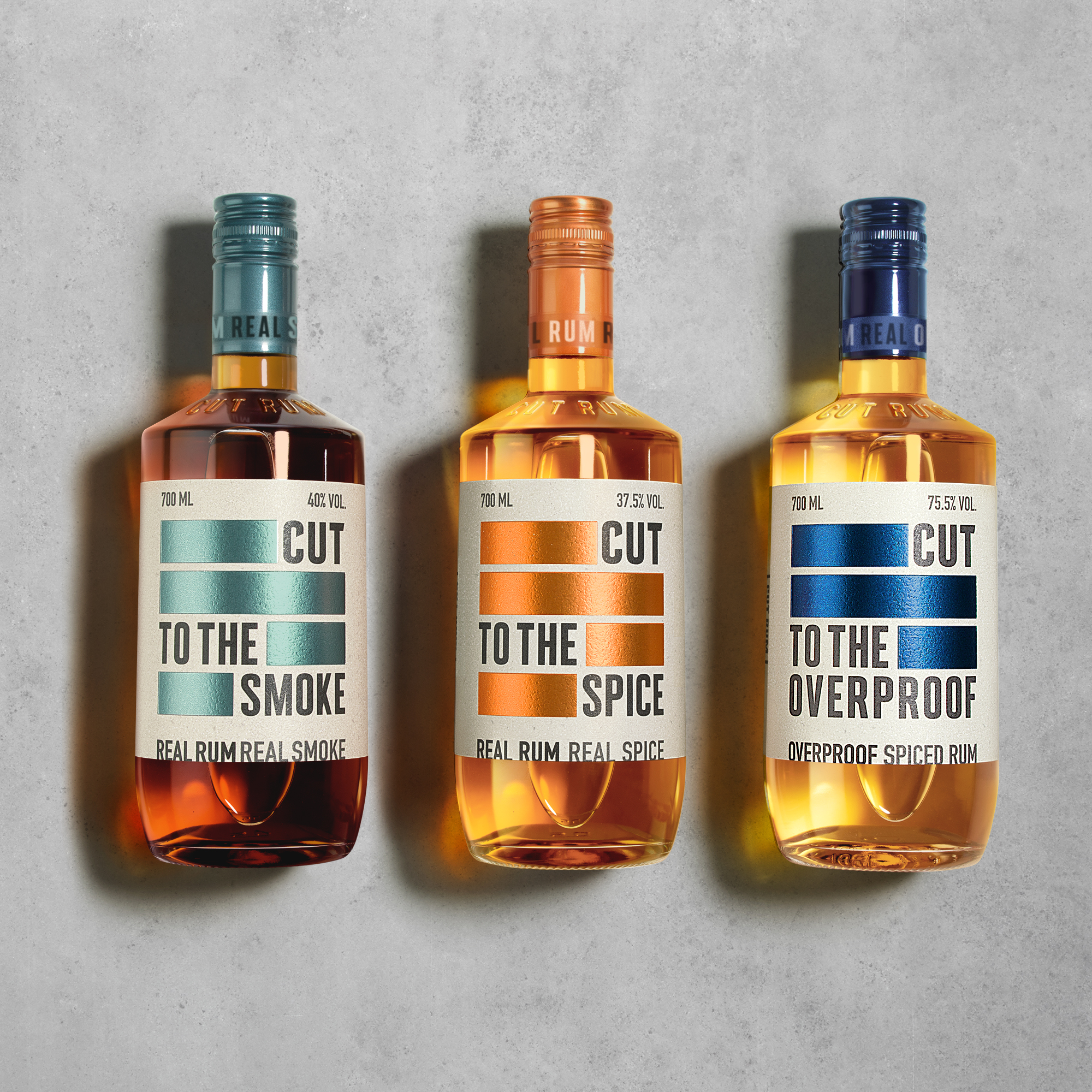
CUT RUM is a premium rum range, aimed at young urban consumers and made from real ingredients with no artificial flavourings. Focusing on the uncomplicated natural ingredients and flavour profiles of the liquids themselves, we created the brand from the ground up to disrupt the expected category norm of pirates and sea-faring, Caribbean stories. With a youthful, edgy attitude and visual aesthetic that instantly communicates its unique and urban nature, CUT RUM has been an immediate success in both the on and off-trade.


We were asked by Johnnie Walker to find a culturally relevant partner to co-create a vibrant limited-edition Blue Label release based on the blend’s extreme rarity. We selected and commissioned textiles manufacturer Timorous Beasties as they shared the same craft, creativity, beauty and Scottishness as Blue Label. Working together we guided and adapted their illustrations featuring Scotland’s ‘rarest’ beasts to come alive on the packaging and through the brand’s activation. Producing something that was as naturally beautiful as the liquid inside.


This great little British chocolate company needed their adventurous & joyful brand story to be better told through their packaging. Our vibrant Montezuma’s big M identity playfully invites you to discover a wonderful world of exotic flavours whilst integrating a bit of eccentric British humour, through quirky icons & playful ‘innuendo' naming. We then reinforced Montezuma’s premium craft sustainable ethos by using our ‘Conscious Design’ process to specify eco-friendly packaging across their entire range, making them the first British brand in the premium segment to do so.


F&B commissioned us to design the identity for a rare new colour range created in collaboration with the Natural History Museum. The colours had been inspired by Werner’s Nomenclature of Colour, a reference book used by Charles Darwin, the original sitting in the vaults of NHM. Framing the iconic F&B logo, our design (set across multiple SKU’s) has a unifying hero colour and an explosive “natural” illustration that references the flora & fauna described in Werner’s book and that directly links to the paint colours in the range. There is nothing more colourful than nature.


To create the brand for Israel’s first Brewstillery, literally from the ground up, we built their story, name, product names and visual & verbal identity before executing it across packaging, merch, posm, digital and ultimately their destination home. We balanced their Israeli provenance, the founders’ playfulness and the global aesthetic of craft drinks to create Shevet’s first release of ‘colourful & characterful’ beers. “HOP ON” now, with recent interest from US distributors, this brand is going places.


Our brand redesign for REAL balanced the brand’s raw, radical and disruptive nature with the refinement of its carefully crafted products and the sophisticated world of the 60+ Michelin star restaurants in which it is now stocked. Working in harmony with the newly introduced full-size Champagne bottle and in a more leading role with the smaller single-serve format. Our bottle labels became our canvas, with each variant’s name and character articulated by a single brush stroke icon, such as the crown for Royal Flush – made from first flush Darjeeling tea, often referred to as the ‘Champagne of Teas’. These are emblazoned over clashing textural colours inspired by the flavour profile of the liquids, representing the bold, expressive and pioneering attitude of the brand that goes into making the sparkling fermented teas themselves. REAL is a brand with something to say, so intertwined into each design in a bespoke hand scratched typeface, are updateable and challenging topical messages that reflect the brand’s activist mentality and help promote positive change.


