We want to bring to life the intangible values underlying each project, every company, every person. We use empathy, immersing ourselves achieve greater understanding and reach a deeper dimension. We reflect to build brand strategies based on an essence that we distil, drop by drop, with clients and designers, everyone working together. We are multidisciplinary, pooling our knowledge in search of multi-faceted visions.
We free our clients of uncertainty. We try and test until we find the best, most beautiful solution. We are own hardest critic. The project is not finished until we see it blossom in real life. We are with our clients every step in the way. We believe in lasting relationships.


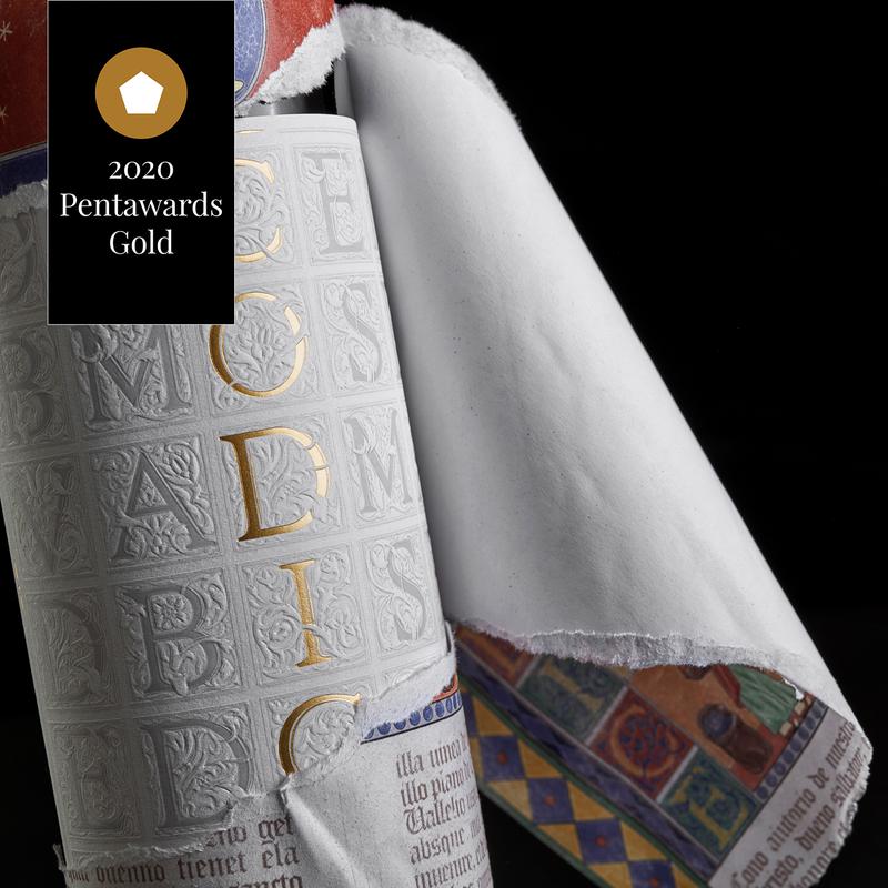
The Codex wine design is a new take on a classic piece that captures the meaning of a name heavy with meaning. Codex were manuscripts of books before the invention of the printing press, when capital letters were tremendously important and were works of art in themselves. Large capital letters in relief grace the surface of a delicate, sensual label, almost sculpted on paper.


Design a Bag in Box range of wines for export called Bravo Carmen. The brand is intended to evoke folkloric ideas of tablaos and flamenco. A powerful, Latino woman's who is mistress of her art.


Rebranding of the La Labia range of sausages, to improve its positioning towards a more gourmet audience and horeca channel. Through a defined palette, a personal use of typography and the graphic resource associated with a pig’s tail, we propose the entire graphic universe of this brand.


Destilerías Bernal set us the task of creating a rum that would revitalise its existing Constitución brand and reach out to a younger customer base with a more casual “summer nights” style. We could not, however, ignore the company’s 80-year history or its founder, a figure of eminence and the inspiration for the original brand.


Maltium's design takes an approach to graphics and concepts from ancient writings, through a current treatment to give rise to a superb personality.


One more year, Albariño La Marimorena covers its label for the new edition. The challenge of the briefing for the design of this vintage was to sophisticate and raise the tone of communication without losing its personality. The illustration of the fish involves taking a look back at the classic illustrations of the old nature and botany cards, adding a good dose of emotionality to this visual code.


Gin has the peculiarity of being the perfect tipple in two vastly different settings. During the day, after the lunch, in a relaxed, casual atmosphere, and at night when things get festive, active, and boisterous. A gin that works at such different moments is the key to developing this new gin brand made to a London recipe. A brand that breaks


A family of natural wine which reflects the personality of the winery, a small family business rooted in its land and managed by Juan whose silhouette forms the identity of the brand. A personal project, in which Juan Pascual as viticulturist, oenologist and winemaker brings this natural wine to life from his perspective. The project has provided to the company a way of expressing itself with simplicity and natural beauty.


Design for a line of nougat inspired by perfumes and the most famous desserts by Jordi Roca. A color range to reflect the nuances of flavors and a gradient that emulates textures and aromas as they dissolve on the palate. Labeled as a perfume, the collection is declined in a family of six different ones, composing a harmony of their own on the shelf.


Maquinon was already provided with an identity. A small Smoking Robot built in the 60s, which at the time seemed powerful and robust, with a disturbing touch of smoke that exhaled through its mouth. The tasting notes of the wine spoke about a clean and bright red. Our intention was to design a packaging full of light, colour and rythm. The idea was to refresh a wine from the Priorato denomination of origin, so full of peculiar personality. The back label is related to the front label, extending the narrative and turning the challenge of incorporating legal texts into a playful exercise. The box is an opportunity to act as an exhibitor in those stores that need it, generating a large stain on the transport pallet itself.


A collection of delicately inspired herbal tea set within a line of 17 references, each with its own particular story. Tea, in all its variety, colours and infusions, is consumed all over the world. Each packaging transmits the essence of the variety it holds within, always with a relaxed, dreamlike aura that makes each box a unique piece within the collection. El Club del Gourmet


